#though I feel like that's because the Hell/Bad Place and its implications was sidelined for the ethical discussions and such
Text
Thinking about the inherent and almost cartoonish evil of Hell as a concept and how different fiction handles the implication of it being a concrete reality the characters have to deal with
#I'm rewatching Supernatural just after watching a few eps of the Good Place and Lucifer#as well as having watched Helluva Boss recently#and it's FASCINATING how fiction deals with Hell#or the Bad Place in the case of the Good Place#they all deal with it in such different ways#though with Helluva Boss and Hazbin Hotel it's still a little too soon to tell where they're taking it beyond being the main setting#weirdly enough I like how Supernatural handled Hell the best#like in terms of worldbuilding and how characters react to it#even over the Good Place which is objectively better#as a whole#though I feel like that's because the Hell/Bad Place and its implications was sidelined for the ethical discussions and such#which to be fair is the main focus
4 notes
·
View notes
Text
Economy and Thematic Structure: Symphony of the Night's Level Design
[N.B.: This piece was originally featured on Gamasutra. I was inspired to post it here too after watching the Boss Keys YouTube video on Symphony of the Night’s world design and finding the analysis shallow and unoriginal.]
"Why is Castlevania: Symphony of the Night good?" is a question that's been asked countless times over the years since the game's release on the PlayStation in 1997. People seem almost desperate to know the answer to this in the wake of similarly modeled but less acclaimed titles such as Aria of Sorrow and Order of Ecclesia. It seems that no matter how many explicative lists are written, Symphony of the Night (hereafter shortened to SotN or Symphony) is representative of an unplaceable magic; thus, its staying power. That's the typical narrative, anyway. As someone who does think that Symphony is indeed good, I have my own answers -- answers that I think stand out from the usual enumerations -- to that question. I'll attempt to lay some of them out here.

The most common thing you're bound to hear in support of SotN's quality is its maximalism: that the game is so stuffed and gilded with "pointless" details that one comes to adoringly approach it as a curious, jewel-like creature. It's a trait that's perhaps more valued now than ever before, as mainstream game development has become a monstrous, multi-million-dollar endeavor that discourages strangeness and obtuse secrecy partly for fear of lacking recuperative sales. As worn out as it is, this is a good point. Symphony expresses a sort of creative freedom that's all the more reinforced by Koji Igarashi's comments in this video from 2015 -- a freedom that came from the purgatorial point in time in which the game was made, when Konami's direction for the series was vague. What we got was a game made by a small group of people who had little resistance to including every trifle, even if that trifle's inclusion meant several more hours of work.
I'll come right out and say that Symphony's castle is my object of interest as a player and a critic. I've always been entranced by how a wide range of elements -- the backgrounds' incredible rendering, the variety of colorful monsters, Michiru Yamane's indispensable score, and more -- came together to make the castle have a life force that felt like it existed beyond the constraints of a television screen. So what's sort of interesting, in the context of this discussion, is that SotN's castle isn't really maximalist in look or layout. It's certainly eclectic, if you're comparing one of its sectors to another, but it's not defined by excess, and to call it "sprawling" is only half-accurate. In fact, as the series progressed with the return of Igarashi as producer on 2002's Harmony of Dissonance, there came to be a sort of inverse maximalism, relative to SotN, at play in the overall scheme of things. All of the rococo stuff that intertwined with the mechanics (e.g., a familiar spirit being able to tell you where hidden rooms were) got whittled down; meanwhile, the game worlds grew in quantitative size, culminating in 2006's Portrait of Ruin that boasted a 1000% (hey: that's bigger than 200.6%!) completion rate.
"Economy" and "focus" are words you'll pretty much never hear spoken in reference to SotN, but they're nonetheless, and perhaps surprisingly, good words to use when trying to explain what makes its castle stand out from the other so-called Igavanias. I'm going to be speaking in somewhat broad terms here just to avoid getting too entrenched in specifics, but I'm also going to try to avoid cherry-picking comparative material. After all, it's not as if Symphony's qualities were entirely unrecognizable in its progeny. The point I want to make here isn't that SotN is perfect, or that everything went to hell after 1997. I'd rather like to say that Symphony's level design, in general, has a clarity and consistency that never resurfaced with the same potency in the series since its release.
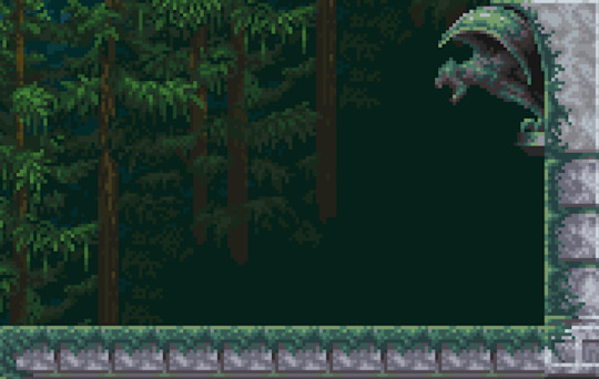
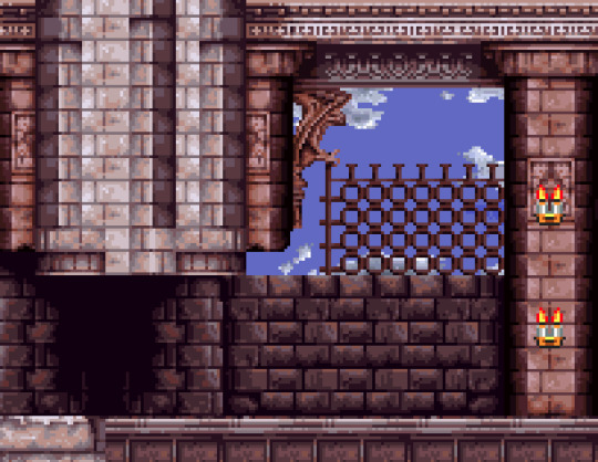
Let's first take a look at the Royal Chapel. This is one of my favorite places in Symphony, and a great example of the qualities I mentioned. Now look at Harmony of Dissonance's equivalent: the coupled Corridor in the Air and Chapel of a Heretic. The difference here is striking. Although there are parallels between the two (for example, the Chapel of a Heretic has several halls that are modeled on those jutting out from the Royal Chapel's towers; note the windows' shape), the Royal Chapel has a cleanliness, even a linearity, to its organization. It's easy to follow with the eye, and there's no mistaking that the navigational theme, starting from the bottom, is ascent. And this sense isn't just something selectively derived from the perspective of seeing the whole map at once. For one, you've got the longest continuous staircase in the game; for another, there's a central tower that's allowed to rise as tall as it wants without any horizontal redirections, and a couple of also unbroken shorter towers thereafter. This ascensional theme is also bolstered by the progression of environmental details you can see beyond the Royal Chapel's borders. A hilly coniferous forest gradually gives way to an indigo sky and a stream of clouds, with the forest now a distant sight.
So, we've got an environment here that directs our movement along a specific main route, and it's complemented by the theme of escalating verticality. When we come to Harmony's Corridor in the Air, though, it's difficult to figure out what the layout is trying to communicate. The spaces are visually unified but structurally disorganized. It's as if the level design is trying to pull off a bunch of stuff at once at the expense of letting any of it develop. Although disorganization can be interesting (and there are arguably other ways, outside of this essay's range, to interpret Harmony's castle), in this case the environment is missing the narrative of progression that's part of what makes the Royal Chapel such a pleasure to go through. A bit of focus is brought in with the Chapel of Heretic, if only because there are no branching paths, but its appearance seems to ask more than ever for a comparison to the Royal Chapel, and it can't favorably compare. You're undeniably ascending, but the majority of the rooms you're traversing are horizontal, and this dulls the actual feeling of ascending.
The top of the Chapel of a Heretic -- that large room with the long staircase -- brings to mind another subject, due to its parallel to the Royal Chapel's staircase, and this is the use of a room as a dramatic device with fulfilled, or unfulfilled, implications. The Royal Chapel's staircase is interesting because it's a dramatic structure (extensive, singular, complemented by richly ornamented recesses, and the way in which you're properly introduced to the Royal Chapel) involved with the navigational theme of descent that produces a sense of anticipation (e.g., "This staircase is so long; I wonder what it's leading to"); and this is fulfilled in the form of the gorgeous chapel sidelined by stained-glass windows and terminating in an altar. In elementary terms, the Royal Chapel's staircase displays a set-up/payoff dynamic.
Rather than compare this to the Chapel of a Heretic's staircase, though, I'd like to pit it against Portrait of Ruin's Great Stairway, whose namesake is a pair of chambers containing long staircases. Comparisons to the Royal Chapel here are perhaps most apt because the Great Stairway's stairs are similarly staffed by Corner/Hill Guards and also have overhanging ledges with collectible items. The problem the Great Stairway runs into is that neither staircase offers anything aside from sheer size and those aforementioned call-backs. The chambers' opposing extremities lead to nondescript transitional rooms with no major or minor drama beyond, and each is side by side, which only calls attention to how similarly structured both chambers are. This is especially bad because these chambers are the largest rooms in the castle (as demonstrated by the game's map), on top of locationally representing its "heart", and yet the take-away is that the designers were more concerned with filling space via copy-pasting than with having the architecture be engaged in any sort of dialogue with itself.
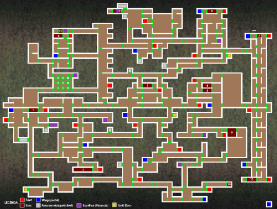
Something else I'd like to talk about is how generous Symphony is with giving its places breathing room. Breathing room is important because it allows environments to better develop on their own terms, helps to thematically distinguish areas, and assists in our ability to mentally organize them individually and in relation to the entire game world (something that is its own form of entertainment). This is a trait that ties back into the visual lucidness of the Royal Chapel's layout. It's illuminating to compare Symphony's map with that of Dawn of Sorrow. It becomes clear here what I'm talking about with breathing room: Dawn's map appears to be on a mission to cover as much space as possible (so much so that the bit of negative space on the top left feels like an oversight), but when we look at Symphony's, it's not too much of a leap to estimate that nearly half of the map is negative space.

This isn't a detail that's only appreciated in the abstraction of a map, either. If we review Dawn of Sorrow's Dark Chapel, we can pick out points of visual continuity and hierarchical structure. For instance, the second boss' room (Malphas) is stacked directly atop the first boss' room (Dmitrii) with the shared visual element of the organ, and Malphas' room is headlined by a corridor that follows the three rooms' progression from the "underworld" to the "heavens." We might also note that the belfry rightly sits at the Chapel's highest point and is situated above a visually unified and equally wide pair of rooms. But the Chapel's upper body is so compressed that architectural decisions such as these fall flat; the literal compression becomes an expressive compression that isn't particularly relevant to the environment. The fact that I, as the player, am in that top corridor, suspended above the distant mountains, is something that's really only communicated by the background. In action, entering the corridor feels abrupt -- I've only ascended two "rooms"' worth (represented by a single square on the map), relative to Dmitrii's room -- and this abruptness is reinforced by looking at the map and seeing how awkwardly squished the corridor's supporting columns are against the roof of Malphas' room.
Does Symphony have no compressed environments? Absolutely not! Let's be attentive here, though. Its castle's two most compressed places, by far, are the Colosseum and the Catacombs. If there is any criticism to be made of this pair in terms of how their parts interlock, it is perhaps the immediate transitions between the bed of lava in the Catacombs' natural halls and its built rooms' foundations. But beyond this slip-up, these are successful instances of compression because that trait feels thematically relevant. It works for the Colosseum both because it renders the macro-structure's hard symmetry as even more explicit, and its smushed quality recalls the cramped quarters of an actual colosseum's hypogeum. Similarly, the Catacombs' compression works because it reinforces the area's claustrophobic associations, and the overall thrust of the environment -- strongly horizontal, and never higher than two "rooms" -- really drives home the sense that this truly is the castle's bedrock.

"Compression", in this context, can also refer to how sectioned an environment is. To this day, in my opinion, Symphony feels like the 2D explorative Castlevania with the largest scope, and I'm more or less convinced that feeling is partly, yet intimately, supported by its castle having relatively more rooms that are allowed to expand to larger extents without transitional splits, as indicated on the map by a lighter or broken line within a room's border. This perhaps sounds counterintuitive; we might rather suppose that more rooms equates to a larger scope. But this isn't necessarily true. The dimensional quality of a space's entirety is not solely communicated by the quantity of its partitions; it's also how willing it is to give us the time and room to dwell on that specific space before it switches to something else. Look at Symphony's map again and notice how the Outer Wall is mostly one vertical block; how the Clock Tower and the Long Library are two large chunks bookending a minority of smaller bits; how the Castle Keep is a big L-shape with a rectangular cluster to its right; or how the Underground Caverns largely are three horizontal rooms and three vertical rooms. In fact, the trend of building subsidiary spaces around dramatically primary spaces is Symphony's rule -- not the exception!
By the time of Harmony of Dissonance, this trend had already become a scarcity; and although things did improve irregularly (Aria of Sorrow is perhaps the closest a title produced by Igarashi ever came to matching Symphony's spatial dynamism), it's a trend that could not be more alien to 2008's Order of Ecclesia. It's curious that the only follow-up to Symphony which did not aggressively slenderize, straighten, and divide its castle's parts was 2001's Circle of the Moon, handled by the Kobe branch of Konami, and I don't think it's a coincidence that, of the GBA and DS Castlevania titles, its castle's scope is the most substantial. One part of me wants to say that things developed as they did because of a vastness of variables: evolving teams, tighter deadlines, an absent concern for the emphases of this article, and so on. Another part of me wants to say that the obsessive-compulsive leanings of these games became guiding principles; which is to say, the toning down of big rooms and the emphatic sectioning came about because it made grinding easier. It's hard to not side with this interpretation when there are moments such as a hall in Ecclesia that's split down the middle for seemingly no other reason than because the hall is long and each section has a different set of enemies.
I want to elaborate on the comment above about "straightening", because it probably isn't clear what I mean (and even if it is, it's worth picking at). When I refer to a castle's parts, or rooms, as "straight", it's a way of saying that their border-lines unite to make a shape that's either a square or rectangle. This is the standard, no matter which Castlevania, starting at Symphony and ending at Ecclesia, we're talking about; yet, like other things we've examined in this article, it's a standard with degrees of prevalence. Scan this map of Symphony's castle I've edited so that all of its irregular rooms -- fourteen total -- are marked by a green star (note how nine are of the primary/large variety, increasing their significance). Now scan this similarly edited map of Harmony's castle. Upon KCET's return as the series' developers, the number of irregular rooms shrank to four, and two were based upon a couple of rooms from Symphony: the Royal Chapel's stairway, and the Marble Gallery's basement chamber. After Harmony, the only map allowing irregular rooms was Aria of Sorrow, with a whopping single room at the castle's pinnacle.
It is again curious that KCEK's Circle of the Moon stands so decisively apart from these other titles: its castle has nearly forty irregular rooms. There's no way to know how Circle's developers approached designing the castle, but the presence of such a dramatically quantifiable characteristic suggests some kind of approach that differed from KCET's developers. How else do we account for that contrast? All things considered, it's my opinion that Symphony's castle is the most dynamic, thanks in large part to how thematically distinguished its areas are; but if we're talking about the varied usage of pure geometric space, Circle comes out on top. You might be wondering where I'm going with any of this, and in response I'd like to quote from a write-up I did of Circle back in 2012: ". . . it’s easy to overlook how a game’s boundaries affect our experience of its places, perhaps because a boundary is treated as the line where the level design ends. But a boundary is really a continuation of the level design. Though it may not be interactive with one’s avatar, it does interact with the enclosed content. It organizes the extent of our movement, and its geometry feeds into all those ineffably subtle reactions we have to the spirit of a place."

What else can be said? A lot, actually! We could discuss how frequently room-types are reused; how precisely and visually segregated an environment's districts are and its link to thematic articulation; or the rough interactive textures that Symphony's inverted castle affords, in spite of how "lazy" the procedure was to create the inverted castle. But I'm satisfied with breaking things off here and saving those ideas for future analyses or -- something that interests me more -- the input of readers. What do you think? Does any of this help you to understand Symphony of the Night in a new light? Have you been thinking these thoughts all along? Do some of the interpretations seem conceptually strained?
Thanks to Revned, Edsword, mephea, TerraEsperZ, Wileee, and Zeric for their hard work on screenshot-mapping Symphony of the Night's castle.
You can support my work on Patreon.
#Castlevania#symphony of the night#metroidvania#level design#videogame analysis#Harmony of Dissonance#Akumajou Dracula#order of ecclesia#portrait of ruin#Gekka no Yasoukyoku
31 notes
·
View notes
Text
RtS 21-24
These chapters should come with a trigger warning. They do feature some harsh scenes and some sexual assault, though it is from afar. I don’t dwell on those parts during my analysis. Some are mentioned in passing, but the focus is on Cassie’s doings. Each chapter is labeled with the type of trigger that it contains. I would add page numbers, but ebook page numbering is different from the print book so they wouldn’t match for everyone.
This is another long one!
Ch 21 *trigger warning, assault, slaver camp chapter*
We pick up directly after her battle with Gertie on the cart. And poor Cassie winds up right back where she started with the slavers. Last chapter, the power told her that the cart driver was supposed to die, but Cassie choose a different route and he ended up not dying. She considers the implications of that now. The power again didn’t flare or stop her from changing time. We know because there is a big ass battle coming up shortly that pretty well decimates the area and likely kills a whole bunch of people. Anything Cassie messes up now, can be taken care of later during that battle. She doesn’t know that yet for sure, but she’s starting to wonder now.
Now Cassie and Rosier make it to the actual slaver camp. Cassie sees what’s happening to all of the women and it’s finally too much for her. She starts to break away to help. Rosier calls her back and reminds her that all of this has happened 1500 years ago from her point of view. It’s all over and done with and all of the women and their children are dead now. He’s right and she knows that but she hates standing back and doing nothing. I wonder if she’s thinking of how this almost parallels her own life. People have been taking her, without her consent, her entire life. First Cassie was taken from her parents by Tony. Then Mircea took her from Tony, in a way. Next, after she finally thought she broke away from that life, she was taken from her chosen life by the Senate. Now Mircea’s trying to take her again. Jonas has been trying to steal her away too. Everyone wants a piece of Cassie and no one asks her opinion on the matter. I am so glad to see Cassie start to take back her power from all of these people and refuse to be taken anymore.
We meet the 6th century Witches. They remind me a lot of their 21st century counter parts. With some hair dye and some modern clothes, I bet you couldn’t even tell the difference. I love the “Come at me bro” attitude.
Cassie about the power’s lack of response even though she was actively participating in and screwing up the time line, “If I had to use a word to describe the overall response, it would have been “meh.” We’re going to have to work on our communication, I told it grimly.”
Ch22 Trigger warning, still in the slaver camp
Cassie chats with the coven witches. Their “man inside” is Pritkin, of course. We find out that the Green Fey are the ones behind the slave trade. We knew that, more or less, through some context clues, but actual confirmation is nice. Ah, it’s the Green Fey who are at war with the Dark. Baby!Pritkin has a seemingly good relationship with the Dark Fey. But it also seems he has a decent relationship with the Green (except Nimue) I wonder how that works with them being at odds with one another. It’s hard to tell his relationship with the Blue but it doesn’t seem awful. His relationship with the Svarestri is trash, but they hate half breeds so that makes sense. Interesting. This is something I need to consider further.
Anyway, the witches explain Nimue’s plan to steal more women to bring her numbers back up after her war with the Dark fey. (Side note does Nimue make it out of all of this alive?) As the Witches talk about their plan Cassie realizes that their boy is Pritkin, lol, she's getting pissed. And then he finds them.
I love the visual of him running into the tent, thrashing around like crazy, confused as shit, running out head whipping back and forth before he sees them. The Pritkin of today is so calm under pressure, having centuries of practice. This one is new and raw still. All his elements are there, we see it, they just aren't finished yet. I love that KC lets us see character development in this unique way. No other story line can give it quite like this.
Cassie slaps him, he acts hurt, she yells at him. "It's mostly my feelings-" I mean really, lol. In his mind it was perfectly logical to stash her with the slavers and tell her nothing. He's annoyed that she doesn't share the idea that it was a brilliant plan. I mean, on some level it makes sense I guess. But he simply cannot see it from her point of view either.
Then we have the Witches reactions.
W: “Friends?”
P: “Friends” C: “it's complicated.” And then they reverse it
W: “I've had friends like that”. They get the right idea all right.
Ch23, the fey assault Cassie scene
The bracelet is serving as magical weapons mule again. I love that the bracelet is seeing serious use this book after being sidelined for 2 books. It’s put to a good use too, not just used for killing. Since it always comes back to Cassie, both she and Pritkin use it with that property in mind. I also like the throwback to CbS, with Pritkin using it as a magical charm bracelet again (or for the first time, damn time travel).
According to HtM the Green Fey have thrown in with the gods. It seems the Svarestri have too. Jury’s still out on Blarestri. I can’t see the Dark turning to them, especially after the Fey Blessing Radella gave Cassie. More things to think about.
Pritkin and Cassie start to get personal here because Cassie is stalling for time. It’s interesting. Pritkin trusts her, even though no one else does. He doesn't know why he trusts her but he does implicitly and right away. Pritkin knows her even before he knows her. He just trusts her. Big difference from Mircea from EtN when Cassie shifts to the past, he didn't trust it was her at all. It took FOREVER for her to convince him. Even when Cassie accidentally shifted to Pritkin early in TtS he trusted her from the start. It was only after he checked the spell he placed on her that said she was upstairs that he just got suspicious. It took little convincing after the slamming that TtS Cassie was who she claimed to be. These two are damn soul mates. Their souls just know. (Side note soon after Cassie says she hates his fake eyes she talks out loud again accidentally).
Pritkin brings Cassie into the hall as his prisoner. The fey make her strip. Pritkin doesn't want to allow it but Cassie relents quickly, knowing it’s the least risky course of action. Then the fey turn even more asshold-ish Ugh, I hate the fey. Welcome to one of my triggers. Fuck you neighborhood boys who thought I was their play thing. Yuck yuck yuck. At least Pritkin comes to her rescue
Ch 24, Cassie Pritkin sex scene
Then we have a Casskin sex-scene, depending on your definition of sex. Even though the sex will get them out of trouble and Cassie is more or less willing, Pritkin is Not On Board. Not even a little. This is the first time the tables are turned. Usually Pritkin does oral for Cassie. Now it's switched. While this scene is coerced it doesn't bother me too much. They had other options and this is the path Cassie choose. She could have done a lot of other things. Plus, she admits she would have minded doing this under other circumstances. She loves and wants him (as she says later). The feedback loop kicks in and it saves their asses. She finally gets to see his O-face.
Pritkin uses the power and distraction to throw a fireball. And then we have chaos. It’s practically their signature style at this point. “Chaos by Casskin” available at all major department stores and Augustines. Awwwwww Pritkin learned the word “Shit” from Cassie. And he uses it in the proper context too! I’m almost as proud as when my 5-year-old learned the word “Fuck” from me and used it in the proper context. (He told me to “get those fuckers” while I was playing Zelda.)
The tapestry scene, omg. I should not read this at work....This the first time they have gotten close where they weren’t immediately pulled away. That's why we have this big after effect this time! Every other time they have been interrupted and taken away from each other. Interesting!
They agree doing this is a bad idea and do it anyway, lol. Yeah, been there, done that guys. He needs her name here so bad, he won't do it without her name, just in case. Sweet in its way. We find out why later.
TMI time, read at your own peril: I both loved and was frustrated by this scene. Loved it because it's hot as hell. Getting it on in the face of danger is hot!! In public, where you could get caught (and they do). Frustrated because I wanted penis in vagina goddammit! I mean I get that later, but still. Their angle of the action and the kissing sounds a bit awkward though. They are so close to the same height that it wouldn't work so well. I mean, ow! Not that I know from personal experience or anything. Shut up! I hear you snickering in the back.
Yeah, um yeah….
12 notes
·
View notes
Last Seen Blogs

delta-extract
dexpacito

leeyuns
supernova ⚡️

patagoniaworks
patagonia works

pineapple-frenzy
my fellow chicks and dicks from Yokohama

m0n3m96-blog
Moneem Thought's