#this is only good quality on mobile i hate giffing youtube videos <3< /div>
Explore tagged Tumblr posts
Note
your gifs are so nice! would you be willing to share your sharpening? and if it's not too much trouble do a quick rundown of your coloring process?
hi anon! it's no trouble at all, if it helps i'm happy to share <3
first i'd like to say that the size and speed of your gifs is key for the sharpen to look good! an incorrectly sized gif will look wonky on desktop (mobile is not very noticeable but desktop is where your gifs can potentially look bad if you size incorrectly) and same for slow-ish gifs, the slower your gif is the more the imperfections show so a correct speed hides the ugly parts lol
these are the standard tumblr photoset sizes

now with that out of the way i'm going to put everything under the cut bc it's probs going to be very long lol if you have any questions after reading all of this, do not hesitate to come back and i'll try to explain better!
okay! first i’d like to point out that i use an older photoshop, simply bc i like how they work lol i work on photoshop cs6 so to enable the same options i’m going to show you here you’ll have to have enabled the legacy option in the smart sharpen filters.
my sharpen varies depending on my source material tbh here are some examples:
source material: music videos
i actually use mvs downloaded from vimeo but these take longer to be up bc the directors don't usually upload at the same time the video is coming out unlike youtube mv, so if i'm working with something from youtube i like to get the biggest format available, so 4k and if it's not available then 1080p will do
i like to do big gifs for mvs so thats 540px width, these are my crop settings (putting it like that i don’t have to manually resize to 540px after cropping bc it’s going to be already the correct size)

and my sharpen for these is this

and then i lower the opacity of it to 75/80%, double clicking here

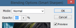
this is the result:


and my gif speed for mvs in particular is this

looks very crispy and ready to color away!
source material: stage videos in .ts format
for stages i like to work with .ts files since they are very high quality recordings of the stages and generally the gifs come out nicer. for stages that are from youtube the next part of this will probs help but this part will be focused on .ts files.
i get my files from kpop24hrs which is invite only right now and invites are a bitch to get a hold of but if you have access it’ll make your life so easy when giffing stages, there’s also twitter to look up files! for stray kids the fastest .ts uploader on twitter is @/STEii_e but if you look up the date + stray kids + .ts the tweets will show! anyway, back to the important thing
for .ts files i work with AviSynth! my computer hates vapoursynth so i use it’s older sibling lol it does the work just fine for what i use it imo bc i usually end up sharpening on photoshop. if you’d like an avisynth tutorial, this is what i used to learn about it and if you’d like to try vapoursynth there’s tons of tutorials from tumblr if you google, the most complete one is from user realstraykids
i modified my avisynth processor for it to have a denoiser (which is a feature from vapoursynth) to have my gifs look a little more smooth but that effect can also be achieved using topaz tbh

these are the output settings i get on the resizer

like i said i modified some things to have a denoiser so it won’t look like this on a regular avisynth
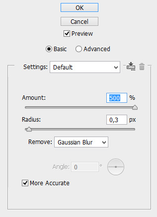
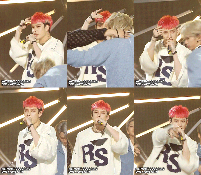
using debilinear usually makes my gif already look a bit sharp, so if i see it’s good i don’t use a sharpen, if i see it need a little push i’ll use a smart sharpen of 500% radius and 0.3px amount, and i’ll use a gaussian blur filter set to 0,3 and i lower it’s opacity to 75/80%


results:

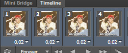
and my gif speed for .ts stages
now it’s all ready to color!
final source material: your regular youtube/twitter/vlive video
anyone that ever worked with a lq-ish video know how they just look ugly no matter how your try to sharpen, specially vlives and now channie’s rooms on youtube (*shaking fist in the air* damn you 720p videos!!) so i found a way to make them look decent, in this case i oversharpen using a 500% 0.4px smart shapen and then i slap a gaussian blur of 0,3 (lowered to 50% opacity) on top of it to smooth things out, more often than not it works very well but some videos are just plain bad (looking at you twitter) so this will work if you tweak the gaussian blur to your liking. i also recommend to work with small gifs if your video is not 1080p bc they’ll look better, but if you like pain like me and love big gifs this is what i do:


my results:


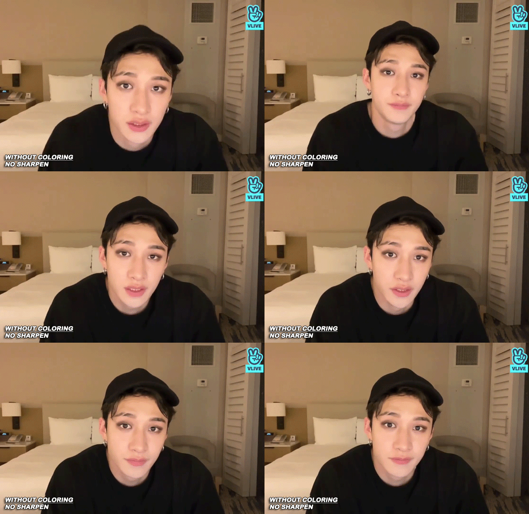
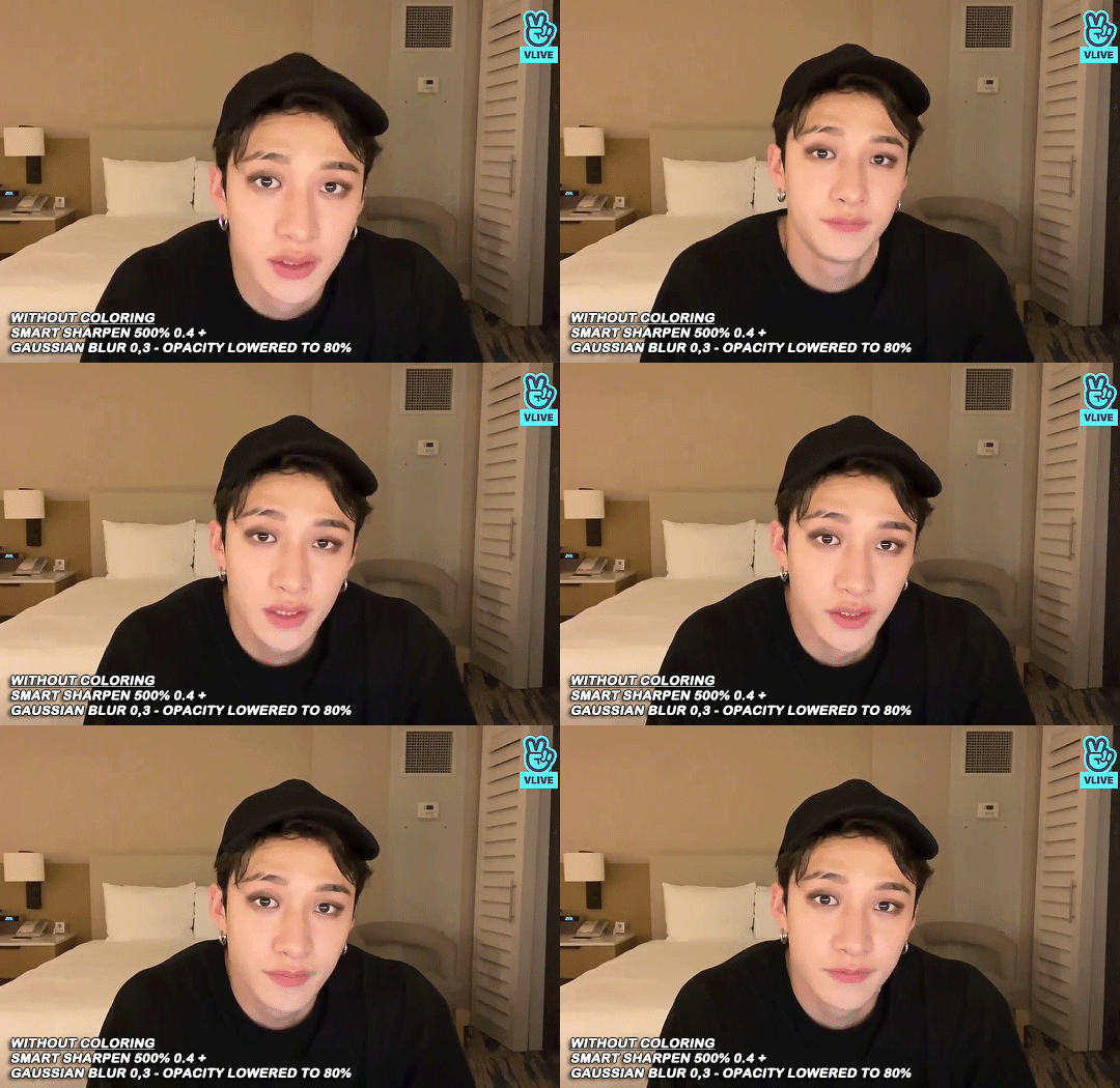
and my gif speed for these kind of videos

that’s about it for my sharpen tricks!
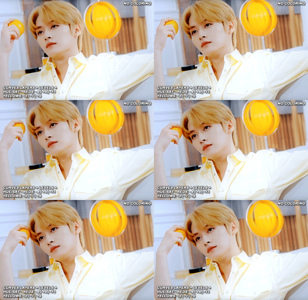
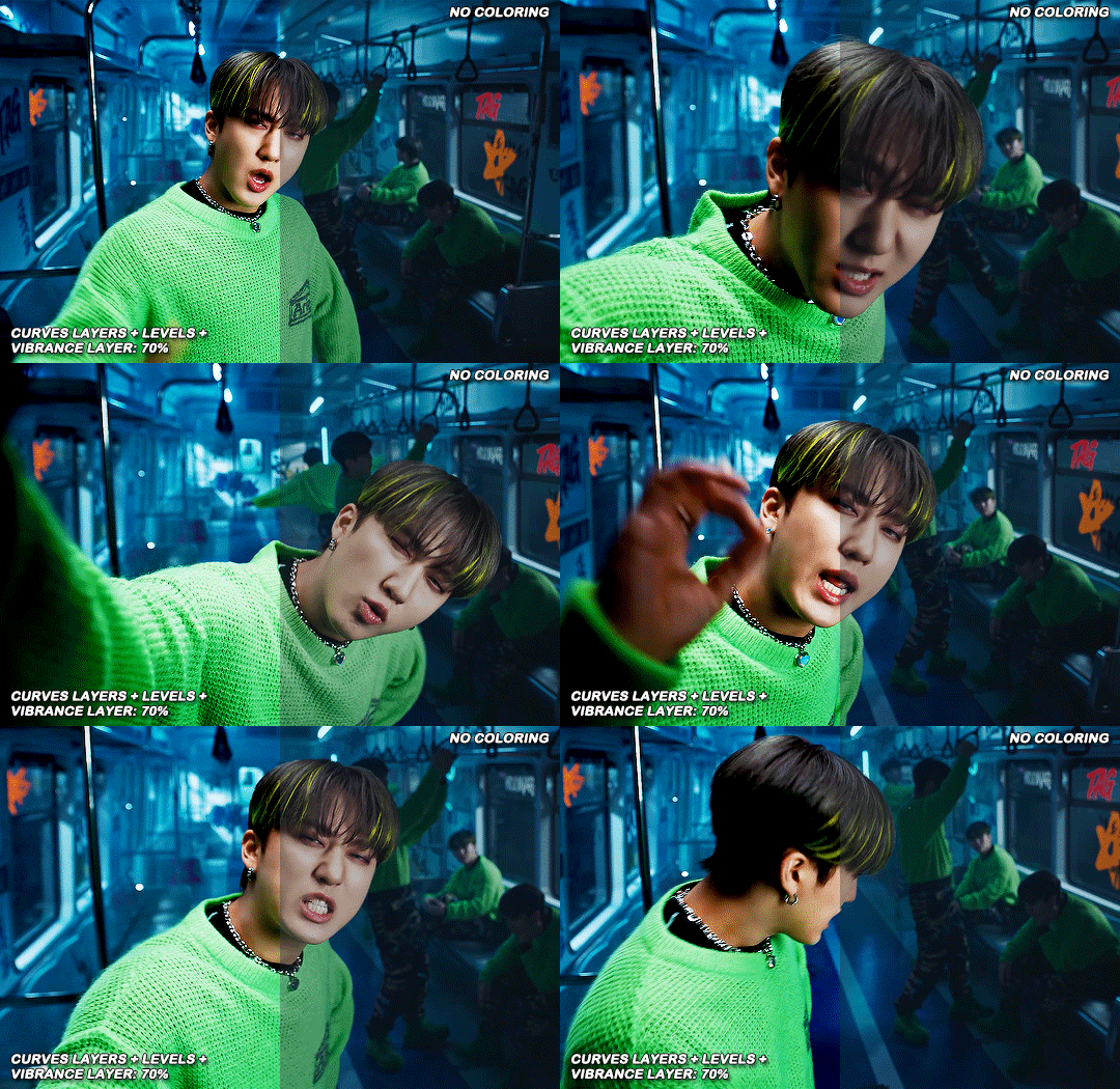
for coloring i like to do vibrant gifs, i adapted my latest method from this and this, and another tutorial that i can’t find rn, but for my base what i do is two curves layers, a levels layer to bring up darks, then i do a hue/sat to fix up colors, then i do vibrance and finally i selective color to fix things up. i’m going to show you on this binnie and minho gifs
first we use a curves layer and we set it on automatic (no worries if it gets too bright, we’ll be fixing as we go)
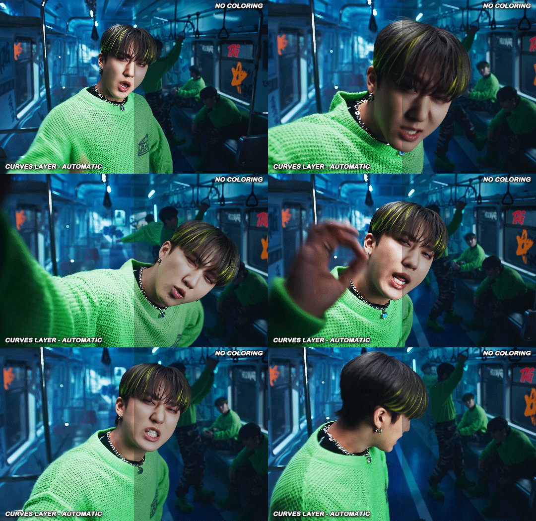

now we do a second curves layer, for this one we’ll use the black color picker from the curves layer and pick the darkest point on our gif
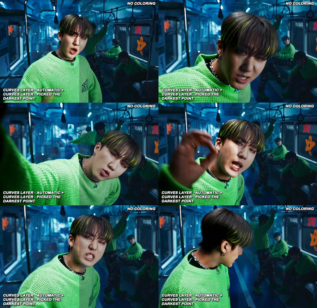

now we fix the darks and we bring some brightness with a levels layer
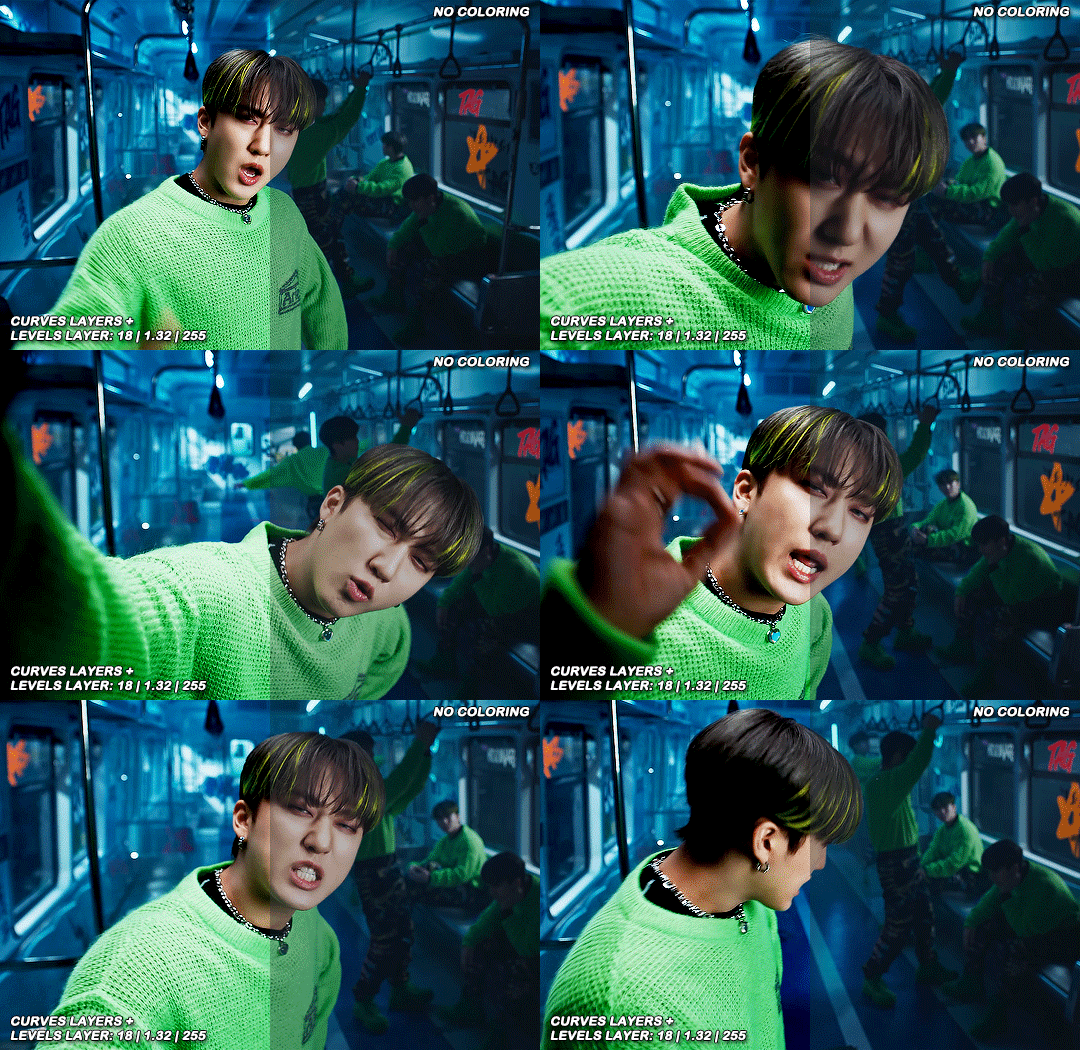
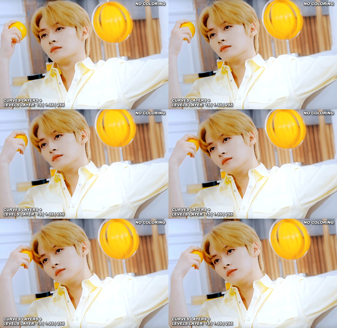
now we do a hue/saturation layer, here i fix up the reds and yellows, sometimes i skip it if the gif already looks good after the first 3 layers if that’s the case i go directly to the next step which is vibrance, in this case i only did minho in this step bc i felt like binnie’s was okay after the first 3 layers
now it’s the vibrance layer, for making the colors pop out more

and now the final layer: selective color! here we fix again red and yellows

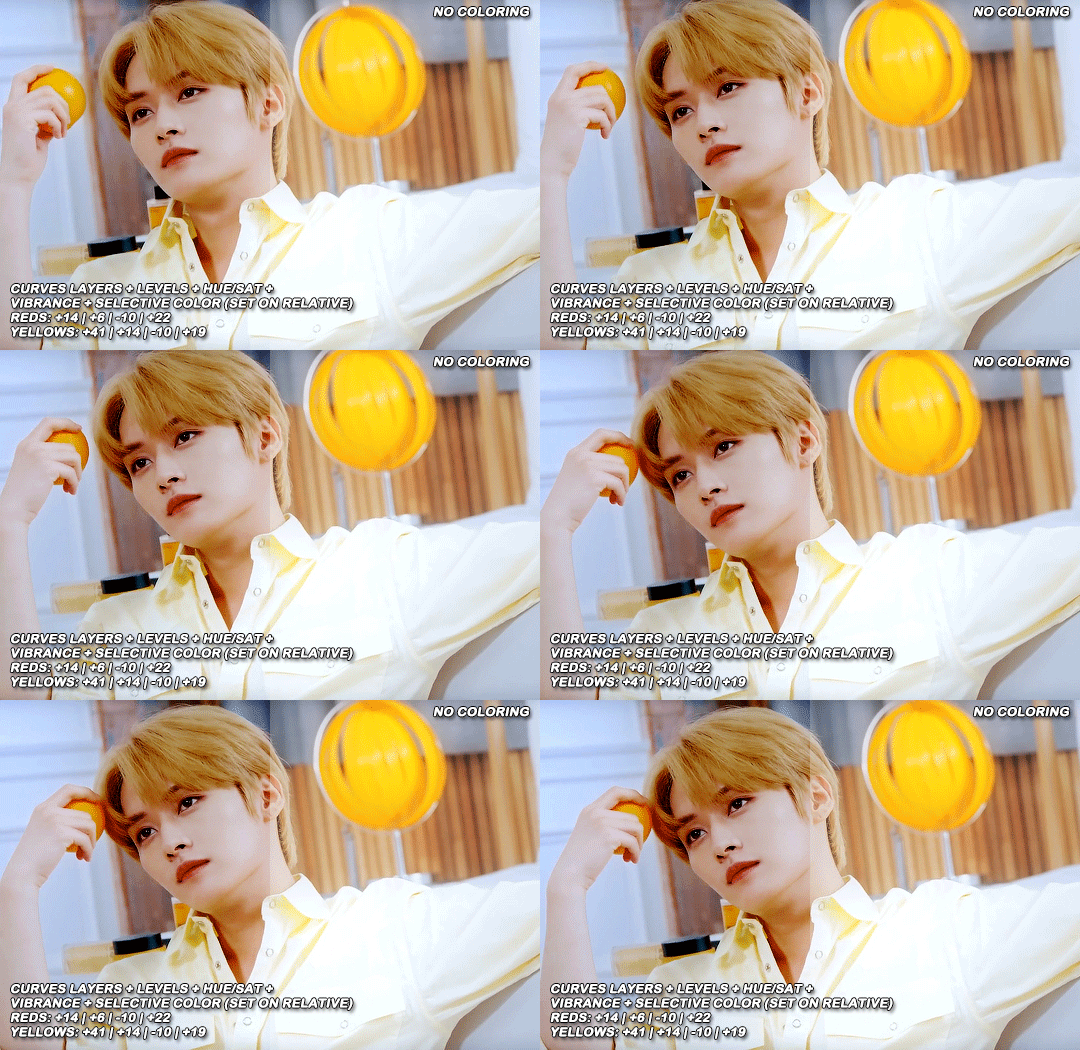
that was my base coloring! sometimes i put in a gradient map in between the curves layers and the levels but only sometimes. after this if i want to mess around with colors i mostly go with another hue/sat layer or just use selective color, hue/sat is great for color manipulation. anyway, this is the finished result and my saving settings!

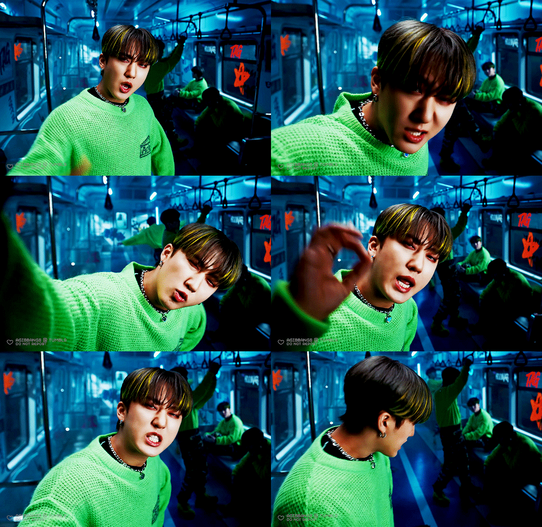

that was really long lmao, i hope it helps somehow? like i said if anything isn’t clear pls come back and we’ll go around it again <3
114 notes
·
View notes