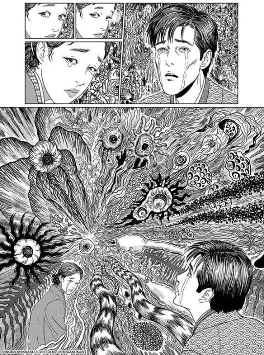
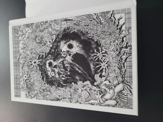
#this is inspired by junji ito's illustrations for no longer human
Explore tagged Tumblr posts
kaitcake1289 · 9 months ago
Text
Tumblr media
love of my life. // follow up to yesterday's claudia post
2K notes · View notes
yougetsu · 7 months ago
Text
Books & B-T
Books/stories that might have inspired B-T lyrics or albums:
Salome by Oscar Wilde Midsummer Night's Dream by Shakespeare Hamlet by Shakespeare Mona Lisa Overdrive by William Gibson Neuromancer by William Gibson Solaris by Stanisław Lem Do Androids Dream of Electric Sheep by Philip K. Dick Alice in Wonderland by Lewis Lewis Carroll Season in Hell Arthur Rimbaud The Stranger by Albert Camus Fantomas by Marcel Allain & Pierre Souvestre Locus Solus by Raymond Roussel Les Enfants Terribles by Jean Cocteau The Fall of Icarus by Ovid Dada Manifesto by Hugo Ball The Surrealist Manifesto by André Breton The Rosicrucian manifestos The Story of Little Black Sambo by Helen Bannerman JoJo's Bizarre Adventure by Hirohiko Araki Hearts by Kumi Himeno The Soul of the Night by Chet Raymo Vita Mechanicalis by Inagaki Taruho Akira by Katsuhiro Otomo
Books mentioned by Acchan:
Villain by Shuichi Yoshida A Collection of Crime Stories by Shuichi Yoshida Ikari by Shuichi Yoshida Kokuhou by Shuichi Yoshida Kokoro by Natsume Soseki Audition by Ryu Murakami Coin Locker Babies by Ryu Murakami The World Five Minutes From Now by Ryu Murakami No Longer Human by Osamu Dazai The Setting Sun by Osamu Dazai Hakyoku by Tono Haruka Kairyou by Tono Haruka Neko Nari by Numata Mahokaru Shibireru by Numata Mahokaru Kugatsu ga Eien ni Tsuzukeba by Numata Mahokaru Yurigokoro by Numata Mahokaru On Decadence by Sakaguchi Ango Confessions of a Mask by Yukio Mishima  Death Spirits by Yutaka Haniya Living Tips by Itsuki Hiroyuki Grotesque by Natsuo Kirino Shiki by Fuyumi Ono Bride of Deimos written by Etsuko Ikeda & illustrated by Yuho Ashibe The Flowers of Evil by Charles Baudelaire The Picture of Dorian Gray by Oscar Wilde Crime and Punishment by Fyodor Dostoevsky Notes from the Underground by Fyodor Dostoevsky Night on the Galactic Railroad by Kenji Miyazawa Gedou no uta by Daisuke Watanabe Tokkou no shima by Satō Shūhō
Other authors mentioned by Acchan:
Junji Ito Randi Taguchi Ryunosuke Akutagawa Yasunari Kawabata Natsuhiko Kyogoku Ayatsuji Yukito Sakuraba Kazuki Nobuyuki Fukumoto Hermann Hesse Johann Wolfgang von Goethe
Sources:
nopperabou.net Jrockarchive This is not greatest site Buck-Tick Zone Vk BT group Book list gathered by fans (twt) FT bulletins Ongaku to hito interviews Kurumi chan no Heya (FM COCOLO) B-T profiles through the years I've saved Personal scans & magazines
Feel free to add more books/novels/mangas <3
99 notes · View notes
bluemooniegif · 9 months ago
Note
hi! this is very random so please feel free to dismiss this but i really admire the way you discuss bsd and the works associated with the characters and i want to ask your opinion on something!
i am an art student majoring in illustration, and for one of my classes we've been assigned to create a full book sleeve for a classic book. we had to choose a few from a list to thumbnail out but we were also allowed to pick one or two books off of the list. normally, we aren't allowed to do fanart pieces for any of our classes but naturally i was like this is the perfect oppurtunity to do subtle bsd fanart!
i ended up deciding on wanting to no longer human since i just finished reading it not too long ago
i dont have any bsd friends irl or mutuals on here, so i wanted to see if you may have any ideas on a potential book cover (thats also just thinly vieled dazai fanart),, again no worries if not this is a pretty random request so i get it
anon I am so sorry to have let you down with my reply, I kinda forgot tumblr asks existed again ;-; I hope you did well with your assignment, I would've chosen NLH too! now let me try to make it up to you and respond as if I got this ask a few hours ago!
when I hear "No Longer Human illustration" my mind immediately goes to Junji Ito's manga adaptation. without knowing what your style looks like or how you go through the process of making art, I think of Ito's full-page spreads straight away. something about the chaos, the fine detail, and the balance of it all really draws me in. I think it beautifully captures the subtle horrors of this story and draws them to the attention of the reader in that classic style of his.
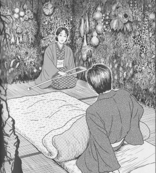
Tumblr media Tumblr media Tumblr media
in terms of what to actually include on the cover, I have a few ideas that walk the line between dazai fanart and nlh-inspired:
needles: a nod to Mersault and Yozo's addiction. indicates dark themes and a story of one's life told via addiction (to which you could argue, Yozo was always addicted to something. I'm sorry, aot will always be within me now)
a glass of whiskey: incites buraiha, both fictional and real, and again, one of Yozo's addictions.
cigarettes and/or matches; match boxes (say it with me... addiction!)
a gravestone: odasaku; the general vibe of death
it'd also be cool to make the cover look like one of Yozo's comics, but instead of depicting his characters, depict Yozo (or even Dazai!), though this runs the risk of looking too cartoonish. or maybe a rendition of his most perfect self-portrait?
perhaps a portrait that reflects not only Yozo, Dazai (fictional) or Dazai (real), but whoever looks at it? a portrait to reflect the reader, and humanity?
I ramble. I hope this will make up for my late reply, at least!
8 notes · View notes
k1716553tombates · 5 years ago
Photo
Tumblr media Tumblr media Tumblr media
Bloog Entire   Entry2
Alright so here we go another instalment of talking about stuff I like. It’s been a little while since the first entry in my second attempt at blogging and since then I finished a couple of things I was reading, and I’ve made further developments with my summer film which I will talk about this time.
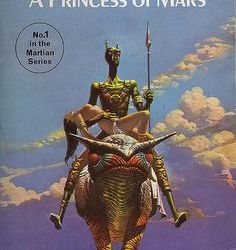
First off, I finished reading A Princess of Mars by Edgar Rice Burroughs. While I was reading this book I thought it was what someone refers to when they say “pulp fiction”, it’s really not pushing any boundaries in the sci-fi genre, it doesn’t flesh out it’s characters and the hero saves the world and gets the girl with very little difficulty. As the protagonist John Carter is from Earth, once upon Mars the lesser gravity grants him super strength, not only this but the telepathic means of communication used by the martians is no obstacle for him, as he seems to be fully capable of using the ability to a higher level than the martians the moment he arrives on the planet. You never really feel like he is in any true peril, and if the book was much longer it may have gotten a little boring, however as is the theme with pulp fiction the book is a fun read for the short time it takes to read it. A Princess of Mars doesn’t provide grand new ideas or a deeper look human realtionships, but it does give a very dungeons and dragons feeling approach to sci-fi, with monsters, duels, a war between species, dungeons, princesses, tyrants and handsome Conan style protagonist. Now, upon finishing this book I wanted to send a friend a picture of the cover, I looked at the inside cover to find an artist’s name and was frankly shocked to see that this book was first published in 1912, and what I though to be a fairly rudimentary sci-fi was actually crazy ahead of it’s time. Props Edgar.
Just recently I have finished a series I mentioned in my last entry, Akira. Katsuhiro Otomo’s mastapeece spans 6 large books each costing around £15-£20 and can be easily read in one or two sittings, so it’s fair to say Akira is not particularly cheap to read unless you want to read it online which unfortunately grosses me out just thinking about. Frankly I’m glad I splurged and bought the books, Otomo’s work is in my opinion unrivalled in terms of it’s appeal and a must have for any weeb’s manga collection. It never ceases to amaze me when reading any manga that most of what is produced is created by a single person. It seems with most manga, the artists have spent their entire lives becoming intensely skilled in illustration, and a lack of ability in writing good narratives is occasionally present. As I was saying about A Princess of Mars, not every story has to be an incredible feat in storytelling, but in more mangas that not, the narrative comprises of a protagonist who walks around and fights a guy, then finds a stronger guy and beats him, then finds a stronger guy and beats him, and so on. It clearly doesn’t deter me from reading it as there are lots or other elements of creativity outside the overarching narrative, along with incredible artwork, however Akira is the first manga I’ve read that has strayed so far from the norm, juggling many different characters with integral roles in the story, protagonists who’s moral compass is far from perfect, and antagonists with complex motivations. Not one person is solely responsible for any big plot points, and at no point does a character fully understand what has happened or will happen. This juggling of information is reflected in action sequences, often having many different groups, all with different goals colliding together in huge set pieces, there is so much going on at one time that you can’t help but read quickly, and at times it feels like such a clusterfuck, but really that’s probably how it would be in real life. The amount of information in Akira is just handled so well that I never felt lost, it doesn’t fail to answer questions then call it abstract, it is a wholly satisfying read and deserves it’s title of one of the greatest manga ever made...
The film’s pretty good too.
Finally I’ll talk a little bit about my summer project. I decided to make an adaptation of the ending of The Time Machine by H.G. Wells, as a whole the book is good, obviously with historical context this book was a huge jumping off point for story telling, however objectively it doesn’t delve into the possibilities of time travel as much as other more modern stories have done. Effectively a turn of the century scientist in London invents a time machine, travels forward to a point where humans have evolved (or devolved) to a point of being vastly different, he farts around a bit then go’s home. However just before he does so he travels further forward to the Earth’s last years, it’s drifted out of orbit and nothing grows except an algae like plant on the surface of rocks. The sun now only drifts above the horizon, and for some reason there are giant crabs and moths. The description given of the dying Earth was really appealing to me, something about it being at the very end of the story and was unintentionally witnessed by the time traveller made it feel beautiful but a little bit spooky. The evolution of my adaptation has proceeded into the production stages. Quite a few of my visual ideas have just come from making it and things coincidentally happening then deciding to go for it. I am about of third of the way through animating and haven’t made an animatic which I know is a terrible idea but I’m going with it. The found that the longer I’ve gone not sticking to any sort of plan the further away from the original text I’ve gotten, however the key things I liked about it are still there and to be honest I like that it doesn’t look like any other adaptations. From what I’ve done so far there are influences from everywhere, my time machine looks like the monolith from 2001, the rocks look like Junji Ito’s work, the time machine controls are inspired by my keyboard. I know what I still have to do and I have about a month to finish it. The only issue I see in the foreseeable future is sound, as I haven’t done an animatic I have no idea if I’m having any music or not, and what sound effects to use. I’ll probably just wing it in Premier.
0 notes
jakecgraphicdesign · 7 years ago
Text
Simple Folk - Digital Avatar
Tumblr media
Today we took part in a short workshop focused upon simple character design in the software Adobe Photoshop. The purpose of this workshop was to show us how simple and easy it is to create characters in digital programs. 
Task 1 - Inspiration: 
At the beginning of the session we looked at some sources of inspiration, to provide some guidance when creating our own characters in a similar style. We began by looking at a few illustrators who often use a very simplistic and cartoon approach to their character designs. We looked at 4 main creators:
Tumblr media
All of these illustrators share common share a common style. They all use simplistic shapes and designs to portray their characters and objects. Their illustrations are always extremely bare, with very little detail meaning there is nothing to distract you from the characters important features. As well as very little detail, these illustrators also tend to use a very limited colour scheme, often preferring to use only one or two main colours, with differing saturation and levels of vibrancy, which ties the entire image together. More tactile and peaceful ways of colouring include the use of water colour and inks, which seem to perfectly match and couple with this watered down, simple style of drawing.
One other key element is the use of bold black lines, like classic comic books which highlight each section of the characters body. Or sometimes, the lack of outline is used, creating a more stylized approach and giving the characters a more realistic yet still cartoon like aesthetic. 
Tumblr media
An artist who inspired me personally this project, an artist who i have cited before, was Joan Cornella, and his similarly simplistic illustrations. Joan Cornella shares a very similar style to the artists we looked at before hand. He also uses very minimal detail, pastel colours and over exaggerated expressions.
His characters also have that childish, very naive style to them, however, the actual contents of his comics and illustrations certainly isn't child friendly. For my design i wanted to take a similar approach by using the innocent visuals with a character design which perhaps more mature and less naive.
Much like the rules we created after studying Saul Bass’ graphic designs, we came up with a set of rules which we could follow to generate stylised work similar to the artists. Here are some of the rules i came up with:
A use of bold, black outlines - outlining the characters limbs, facial features and every individual aspect of the design.
Alternatively, no use of outlines at all, instead letting the different colours show each section of the design.
A very limited use of colour - only one to two different colours, however, different levels of saturation and darkness can be used too.
A muted use of colour - instead of bright primary colours use pastels and less vibrant shades.
A very limited use of detail - often presenting only the bare basics of a character to show their personality. 
Exaggerated features to show the characters personality or behaviour type, including extreme facial expressions, poses and body types.
Task 2 - creating a character:
Now that we had a good understanding of the key elements of characters in this style we were tasked with creating our own batch of simple characters. As the session was about creating a small avatar we focused only on designing the characters head and not the body. 
We began by creating simplistic pencil sketches, experimenting with the shape of the characters face, the arrangement of their facial features and what shapes we could use for their facial features in general. For my designs i started with very basic designs, using ovals, circles and other simple shapes for the head, however, i began drawing characters which got continuously more distorted and abstract, i tried using less simple shapes and more abstract arrangement of facial features in the characters. I wanted to see how far and how abstract i could take the designs while still looking childish and naive in aesthetic, and still looking like a human being. Extending from this, i also wanted to over exaggerate the features of the character, in order to better communicate what type of person and what personality this character may have.
 Eventually, my face illustration developed into that of a severely overweight man with a receding hair line. This design for my caricature contrast against those drawn by the influences we looked at; While their characters mostly looked happy and pleasant, mine goes against this by having unfavorable traits and somewhat negative connotations. Much like Cornellas work, my design almost deceives the viewer through the pastel colours and soft design - choices often synonymous with childrens illustrations, however, the features of the characters face suggest a more mature audience - creating a strange relationship between these two contrasting themes.
It was fun to quickly and easily generate a range of characters, each of them with slight alterations making them unique, but i always kept to the key rules in order to keep the designs in that simplistic, naive visual style.
As i mentioned, i also took influence from Joan Cornellas illustrations, i tried to capture and recreate the lifeless, slightly creepy gaze his characters posses. I wanted to create an unsettling feeling in the viewer and to create the effect that the longer you stare at him the more disturbed you feel. 
Once we had settled on a basic design we were task with simple redrawing the characters face over and over again. This technique helps us to familiarize ourselves with the character, and also helps to ensure us that we are happy with the design. Alternatively, when redrawing the design, the face will inadvertently change ever so slightly each time. it is very difficult to recreate the image perfectly. However, these small alterations build up, eventually creating a page of unique designs - which all came from one initial design. We can then choose our favorite out of these faces in order to recreate digitally. 
Task 3 - Digital Development 
Tumblr media
The third task was to actually begin creating our characters digitally, using the digital program Adobe Illustrator. Firstly, we were given a quick tutorial on how to use Illustrator to actually create our characters, the process was very simple:
Tumblr media
The technique was to build up the characters face by using the in built shape tool - with the idea being that each shape would build up to create the overall face. 
Tumblr media
Every section of the face would be created using a simple shape such as a circle, triangle square etc, but placed on separate layers - meaning we could place each part of the characters facial features above or below each other, for example, the main face shape you be right at the back (the layer would be at the bottom of the chart), while the eyes of the character would be above this back face layer (meaning this layer would be on top of the face layer within the chart) The technique was very simple and easy to get a hang of, its very similar to the way we drew the characters faces before hand - starting with the outline of the head and then filling in the details such as the facial features.
The Shape tool provided us with a range of basic shapes we could use to build up the characters face, however, these pre set shapes were quite limiting, and theres only so much you can do with them as they originally are. To create a larger range of more interesting shapes we manipulated a range of settings. One of the most important, and the effect i predominantly used, was the ability to change the roundness of the shapes edges. The technique allows you to turn the straight corners of a rectangle into much softer curves, this can also be used to fully round the rectangles edges, creating more of an oval shape. This is the main technique i used to create most of the character features, the most clear example of this is the characters main head shape, which was used by setting a rectangles edges to a max roundness.
Tumblr media
Another technique we used to alter the shapes was the use of the Direct selection tool, which when used on a shape allows you to alter the edges, so you can transform the shape’s points and roundness;allowing for basically infinite shape possibility. 
Tumblr media
Through the use of this shape we could create more interesting and human feature. I used this tool extensively when creating my digital face in order to make the more complicated shapes which aren’t instantly available within Illustrator. For example, i bent the end of a curved rectangle into a point, giving me the shape for the characters eyebrows. 
Overall, at first i found some of the features tricky to get the hang of, however, i quickly got to grips with these simple techniques and the way which illustrator works. Here is a short gif showing the process which i went through and the techniques i used to create another similar face: 
Tumblr media
Distorting the norm:
While drawing the original pencil sketches for my characters face i experimented with the idea of creating a more mutated, distorted appearance; by using more liquid, organic shapes such as stretched ovals. This idea of distorting the human form is very prevelant in my project, and is shown through out my research. I’ve been looking at how body horror has been presented and looking at different sources where its been shown such as the illustrated manga Junji Ito and films such as The Thing.
Linking to these research points i thought it would be interesting to try and mutate the character avatar which i created and see how it would look. I thought the easiest tool to do this would be the Liquify technique within photoshop - a tool which allows you to shape and manipulate the form of your photo any way you please. I used this Liquify tool to drag and distort areas of the characters face. I would then copy this frame, distort it slightly more and repeat that process, up until the characters face was unrecognisable and a mess of flesh:
Tumblr media
I then assembled each of these frames into a timeline, giving me a frame by frame transformation of the character going from normal to horrifically disfigured. Here’s the animation i produced: 
Tumblr media
I’m happy with the way the animation turned out, the transformation even unsettles me slightly and greatly reminds me of the transformations from The Thing, which inspired me while making this. 
Tumblr media
Alternatively, a lot of people said that the animation would look better if only part of the mutation was shown, instead of the complete explosion look. I created this alternative gif of the shortened version, and i must agree i prefer this animation as the face becomes distorted, but not too distorted, meaning it is still recognisable in its mutated form, which i think makes the imagery even more unsettling.
Tumblr media
Next steps and developments: 
In the future i don’t really have any plans to use these techniques, as i am focusing on more hand drawn illustrations, however, once i have made some a possible development could be to transform the drawings digitally, using this simple illustrator method. 
Extending from this, an interesting idea could be use the same Liquify animation technique on my illustrations to create a GIF or short animation of the drawings, bringing them to life and adding another dimension to the horror imagery - which also links to my research of horror films and moving imagery. It is definitely something i am considering for the future. 
0 notes
studioacs-blog · 8 years ago
Text
Kant's Aesthetics & Simmel's Theory of Fashion
Kant’s Aesthetics & Simmel’s Theory of Fashion
Introduction
Pictured: Kant on top & Simmel on the bottom. Notice how similar their pictures are; is there some type of fashion convention behind how scholars should look to be taken seriously?
George Simmel was a sociologist whose philosophy was made from a nonpositivist view, and presupposed cultural plurality. Simmel, together with other sociologists such as Webber and Durkheim, were the fathers of critical theory and the Frankfurt School. Simmel’s writing on aesthetics were inspired by Immanuel Kant’s writings. Even though Kant didn’t put a compelling importance to fashion in comparison to Simmel, he did dive into some important aspects of it, creating a basis to which Simmel could develop his ideas.
In fact, Simmel was part of what Podoksik (2014) has called the neo-Kantian movement, a movement which in part embraced some of Kant’s ideas and simultaneously moved away from other Kantian premises. Simmel saw Kant’s approach to philosophy as having logic as a crucial factor, to which aesthetics, amongst other studied concepts, were subordinated to. However, Simmel’s philosophy asked questions of a different nature than what Kantian epistemology would. Simmel aimed to investigate the phenomenal world, instead of staying true to Kant’s noumenal world and metaphysical foundation. Thusly, what Simmel’s sociological view has added to Kant’s philosophy was basically to explore another side of the same coin; while Kant would propose the question “what is nature?”, the sociologist proposed instead to ponder “what is society?” Both Kant and Simmel are forefathers to some of the groundwork that forms the discourse of nature versus nurture; a topic that we still know little about when comparing it to the breadth of potential knowledge we have still to gain.
On Cern & quantum mechanics: https://www.youtube.com/watch?v=3dDlSYl3J6c
On recent discoveries on the deep seas: https://www.youtube.com/watch?v=dzIPjLwNgmo
Spinach Leaf Transformed Into Beating Human Heart Tissue: http://news.nationalgeographic.com/2017/03/human-heart-spinach-leaf-medicine-science/?utm_source=Facebook&utm_medium=Social&utm_content=link_fb20170325news-spinachheart&utm_campaign=Content&sf65838089=1
On reversing ageing: https://www.theguardian.com/science/2017/mar/23/purging-the-body-of-retired-cells-could-reverse-ageing-study-shows (English)
http://www.ad.nl/gezond/rotterdamse-onderzoekers-ontdekken-verjongingskuur~a5aa0441/ (Dutch)
Listed/Pictured: A small collection of recent knowledge gained and knowledge humankind is currently exploring in various areas
Pictured: We have learned and enacted so little in face of what there still is ahead… but tell me, are you feeling the sublime or did that Dunning-Kruger effect not kick in yet?
Connections
Let us get back from the sublime plane and delve back into Kant & Simmel’s theories…per Kant, there is no link between fashion and genuine judgments of taste (Geschmaksurteil), but instead, it is the outcome of ‘blind’ imitation (Gronow, 1993). This means that it is contradictory to what we would call ‘good’ taste.  It comes from human conceit and social competition where everybody competes and tries to increase their social status (Gronow, 1993). It can be argued that, per Kant, the way society behaves towards fashion is an enactment of mass mimesis.
Kant agreed with Simmel that fashion shouldn’t be neglected or avoided but rather acknowledged and followed- a hopeless effort that is also beyond the bounds of possibility.  Kant understood that fashion is temporary because if not, it would result in traditions (Gronow, 1993).  The factor of novelty when it comes to fashion is crucial because that is what encapsulates the whole concept of fashion- its elusiveness.
Simmel argued in his essays that fashion being a phenomenon of modernity, helped increase the distance between the individual and society.  There are two aspects: the need of union and the need of isolation.  One wants to distinguish oneself from others but at the same time not too much to alienate himself from society completely.  On the other hand, Kant’s aesthetics show that an individual can be independent and free without having to estrange himself from the society at large (Gronow, 1993).
Pictured: Fritz Lang’s Metropolis (1927) as the original Avant Garde piece (far left) and an alternative model, Lady Gaga and Beyoncé (respectively from the left) committing mimesis.
Our own moment of mimesis: Sing to the tune of Eurhythmics’ Sweet Dreams, but change the lyrics to “Fashion and distinction are made of this, who am I to disagree? I travel through time and multiple theories, everybody needs union and isolation. Some of us wants to distinguish, some of us want to pursue mimesis…” Check it here: https://www.youtube.com/watch?v=tLmfSvy4rmo
Pictured: Cheeky, aren’t we?
The question Kant asks is: How can something, which is purely based on a subjective feeling of pleasure be universally accepted? The fact that something is universally regarded as beautiful does not mean that we shouldn’t be careful about combining the aesthetic (disinterested) pleasure with sensual pleasure.  There is no way we can stop others from agreeing with our subjective view on aesthetic judgment.  When we call something beautiful we assume it is universal, not that there is a need to convince others of thinking the same.  Just like Kant’s explanation of taste, fashion is constantly being created and disappearing- it doesn’t exist.  Once it stops being fashion, it simply vanishes forever (Gronow, 1993).
https://www.youtube.com/watch?v=_Ahc-oEFQ7k
Caption: Per Kant, what no longer applies will cease to exist…Ah, but if only this would apply perfectly to the music industry’s oligarchies…Then Adorno would have nothing to complain about eh?
To both Kant and Simmel, fashion doesn’t fulfil any objective criteria, it all boils down to subjective perceptions
Caption: If only some fashions would be considered objectively “bad taste”, we wouldn’t get these back on the market …
Pictured: Fashion is temporary, and indeed boils down to subjective criteria…but the science behind what makes something aesthetically pleasing continues to apply, and perhaps that is why some things never leave fashion, some things never come back to being fashionable and some things come back after a while…Above are some examples of the golden ratio in Da Vinci’s works, golden ratio found in nature and illustrations from Junji Ito’s famous manga Uzumaki, in which a city from countryside Japan becomes obsessed/diseased by the concept of spiral shapes, which follow the golden ratio.
Our own moment of mimesis: Sing to the tune of John Paul Young’s Love Is in The Air, but change the lyrics to “Golden Ratio is everywhere, everywhere I look around, aesthetic rules are everywhere, in every sight and every sound. Check it here: https://www.youtube.com/watch?v=OVswTfCtwYI
Thinking Further…
Furthermore, here we identify an opportunity for sociology and cultural economy students to make further connections - In lieu of Simmel’s Theory of Fashion and Kant’s aesthetics, we can further see here an opportunity to apply Veblen’s concepts of Flanerie, conspicuous consumption & leisure and Veblen goods. Can you make those connections yourself?
Pictured: Veblen & a related comic
A second opportunity for sociology students can be identified here; can you link Adorno’s concepts of Baby Talk, repetition, pseudo-individualization and his general thoughts on the culture industry to Simmel’s Theory of Fashion and Kant’s aesthetics?
Pictured: Adorno & a related comic
Lastly, media and culture industries students, can you link for example, how Simmel’s Theory of Fashion and Kant’s aesthetics can be applied to contract theory via the concept of information asymmetries and inequality of bargaining power? Adam Smith & Max Weber were some of the first to underlie these concepts, but there are many other more contemporary sources…
Exemplifying the concepts: The no man’s sky fiasco - A story of hype, novelty and disappointment in the video game industry. Current fashion for randomly generated algorithm based games and overly ambitious claims create hype, however the aesthetic promise of the game proves to be subpar. Check it here: https://www.youtube.com/watch?v=6wsFhv_Kz38
Main References:
Gronow, J. (1993). Taste and Fashion: The Social Function of Fashion and Style. Acta Sociologica,36(2), 89-100. doi:10.1177/000169939303600201
Podoksik, E. (2014). Neo-Kantianism And Georg Simmel’s Interpretation Of Kant. Modern Intellectual History,13(03), 597-622. doi:10.1017/s1479244314000663
Additional References (you can use to answer the thinking further part):
Adorno, T. (1941). On popular music. Cultural theory and popular culture: A reader, 202-214.
Bernstein, J. M. (1992). The fate of art: aesthetic alienation from Kant to Derrida and Adorno. Penn State Press.
Smith, A. (1817). An Inquiry into the Nature and Causes of the Wealth of Nations (Vol. 2). Рипол Классик.
Veblen, T., & Banta, M. (2009). The theory of the leisure class. Oxford University Press.
Weber, M. (2009). The theory of social and economic organization. Simon and Schuster.
Pictured: On the left - All right assignment is over, let’s spend money with stuff we don’t need to celebrate the end of an era. On the right -  A disappointed Adorno is judging you.
0 notes