#they've been very consistent with their colour coding
Explore tagged Tumblr posts
Text
A thing I've been thinking about a lot as I've been obsessively re-listening to the Rivers of London books on a loop and putting colour coded bookmarks into my paperbacks (in short, being Extremely Autistic about the series) is just how interesting it would be to explore what it would be like to be an autistic wizard in that 'verse.
Like, take vestigia. It's a whole extra category of sensory impressions on top of everything else that you're picking up on, and you only get more sensitive to it the longer you train for. Peter wonders at one point if Nightingale isn't just straight up listening to the magic of the city in order to find out about cases, and even if he isn't doing that he's still got to be picking up on a Huge amount of sense impressions from the magic around him. Would an autistic practitioner be even more sensitive to vestigia? Just how much of a sensory overload trigger would it be, given that it's not a true smell/sound/whatever? Do really skilled practitioners like Nightingale ever get overloaded by just how much they can sense? Would an autistic wizard have to train themselves to shut out their sense of vestigia so they didn't get overwhelmed?
And then there's how you learn magic in the first place, which is a lot of repetition, doing the same thing over and over again until you produce an effect, and then continuing to repeat it until the effect becomes consistent. And you build spells by learning more and more formae, memorising them in the process. Which sounds to me like Such an autism-friendly way of learning to do anything, I fucking love repetition and memorising huge amounts of information.
Also, it's pointed out a bunch of times that Nightingale has almost scary levels of focus. In Broken Homes he spends ages watching CCTV footage, and then a full half hour just staring at the dog batteries at Skygarden. And it's pretty obvious that his level of obsessive focus is what's made him such a powerful wizard, since he's willing to put in the hours of practice, so autistic obsessiveness would be useful too.
(Sidenote, but I'm not sure if I actually think Nightingale is a character I'd read as autistic. He's definitely got a bunch of traits in the right direction, like the single-minded focus, the scary levels of concentration, the things he's very particular about and the way he can miss Peter's sarcasm sometimes, but in his case I think it's more just his personality and training and age, plus all the trauma. But I do think it would be a fun possibility/what-if to explore.)
And when it just comes down to it, I don't think I've ever encountered a magic system that appeals more to the specific way that my brain works than the RoL one, it seems like it would be So fun to learn. Even, tbh especially, the Latin and all the other studying that's also involved. So it does rather entertain me that I've gotten really autistic over a book series that has such an autism-friendly magic system, it feels Good and Correct.
Although. Ben Aaronovitch. My guy. Give me a list of all the formae and how they work, I am Begging you. I've never wanted an in-universe textbook tie-in book as much as I do for this series and Eventually I'm going to get my hands on the TTRPG book and obsess over every little detail of how they've interpreted the magic for that.
#rivers of london#it's Such a good magic system and it scratches my brain in just the right way#also i think these books might have convinced me to pick up latin again#i did five years of it in school and i'm a bit rusty#but suddenly i really want to get back into it#but yes i've been bouncing off of various type of sensory overload for a month#and it's really got me thinking about how vestigia would interact with that#so here are some Thoughts#personal stuff#wizard nonsense tag#autism stuff#actually autistic
61 notes
·
View notes
Text
Z can change how they look, sometimes on a whim if they're not full happy with their apperance, though they definitely has a type, appearance wise. As the personification of the city, they didn't really have much concept of gender, sex or age, though they'll always be Japanese-coded. They’ll try and stick with one appearance for as long as possible, but if they feel like changing it up or people are getting suspicious, they'll definitely change their looks. Whether it’s the colour, length, or consistency of their hair, how tall they are, the physique of her body, the structure of their face, or having a beauty mark, they’ll do what they think is necessary to make themselves blend in and to make themselves happy. They know it’s vain, to be able to change ones appearance on a whim, and very lucky, but in their position, sometimes it’s necessary.
Granted, they've had to do it quite a few times times out of necessity, and a couple times more to throw people off. Sometimes people are way smarter then Z has given them credited for and they've been very suspicious about what Z is. They've gotten outcrites of being a witch, a heretic and a spy sent from Bevelle, some kind of demon, all sorts. Whenever instances like this happen, Z has to go into hiding for a couple of years and change her appearance drastically to ensure they're not going to get caught again. They've only been able to get out of these situations once or twice by lying their ass off, but it's not something she likes doing and has always ended up with her changing her appearance anyway. Thankfully, everyone who’s been suspicious of them has died, so the vast majority of the suspicion has died with said person, but that's not to say there aren't a couple of rumours, myths and legends lurking around.
That's not to say they haven't had fun experimenting over the years. Sometimes presenting as male, sometimes female, sometimes as non-binary, sometimes genderqueer. Over time, they have indeed found a ‘type’ to settle into and that’s the black hair, red eyes, gothicy, decked out in jewellry, kimono wearing type. They sometimes sport the more, neon gothic, sportwear type whenever that tickles their fancy.
#zanarkand { 🌇 } headcanon#when I say Z has a type I really mean I (dusk) have a type 8)#I really wanna look into some potential new fc for Z but I don't wanna make it really confusing if I switch between 3 or 4 different#ones for 1 verse adasdf
2 notes
·
View notes
Text

Found this one too, and haven't seen it floating around so here. I can't tell if this is meant to be Tim or a young Jason but GOD the soft smile on Bruce's face
#gotham knights#gotham knights spoilers#bruce Wayne#maybe#jason todd#or maybe#tim drake#I'm leaning towards jay purely because red shirt#they've been very consistent with their colour coding
320 notes
·
View notes
Text
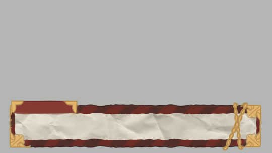
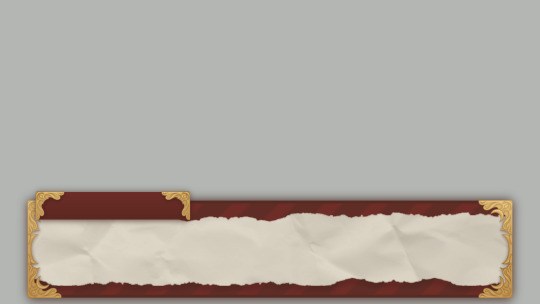
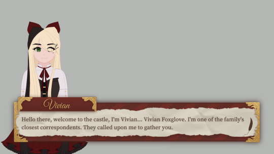
The process and completion of the dialogue box.


~ Hello there! Tokki here ~ Recently I completed the dialogue box asset, so I thought it'd be interesting to share what the very first prototype looked like! As well as share the concept art with you. The prototype was made in the quest to really jump into the game and then start developing it from there, it was a starting point. We knew we wanted our game to have dialogue and the ability to speak with different characters, so that's where we began. At first, I made a mock-up with it and then I provided Crisp with a blank version so that he could begin coding a dialogue system. It started off as green because that's both Crisp and I's favourite colour. The characters used for the demonstrations are currently my original characters, I'm using them as placeholders until we have official character portraits of our own characters. Tabitha was used at first, however, once a core aesthetic was decided Vivian made for a better placeholder visually. ( Thank you for your initial help though, Tabi! ) From then on, we started to discuss what kind of themes we wanted to have and what setting it would be in. After that, I started to have a lot of ideas in my head about what it would look like visually and decided on a specific, cohesive aesthetic. A victorian-inspired journal/diary. So I started to doodle until I fell in love with the look of something, and that's where the concept art was chosen as something to model off of. Part of my artistic process is working until I love what I've made, if I don't feel anything then it's not right yet. And if I've been working on it for a long time and I still feel nothing, I know it's time for me to change directions and try again. The chain was incorporated as part of an idea I had, where based upon the player's progress/relationship with the character they were speaking to, the chain would gradually weaken until it fell apart. It would have been to give the player a sense of progress, a reward for their work once it fell and a visual metaphor of the storyline. Ultimately, I decided that it was visually disruptive and based on the nature of a dialogue box, it would have just covered up the dialogue text. I think it was a neat idea, but I just didn't care for it and it would have posed a lot of problems. Honestly, though, I do much prefer how it looks without the chain. When I was working on creating the official, polished asset, I ended up adding some nice detailing on the golden frames as I wanted to give it a really unique character/style. If the story ends up in the direction that Crisp and I spoke of, the detailing will be visually representative of some of the story's concepts! At first, the assets did not have any shadows around them but I later added them to make them able to retain visual strength and not have any difficulty with the background art that was to be added in future. It shouldn't blend in, but it also shouldn't stand out. The shadows also helped to make sure everything was visually consistent as the selection boxes I later made also have them. ( Something I heard whilst researching UI was that what makes a good UI, in a way, is that it isn't noticeable at all. It should be so seamless and pleasant to interact with that it's something a player barely notices. ) I later took a ridiculous ( maybe to some ) amount of time deciding on the fonts. I'm very happy with the selection I made! I'm glad I spent so long on it, after all, I believe every single thing matters and adds to the visuals of a game. I believe that the right font can help make a game whilst the wrong one can help break it. ( I'm talking about you, comic sans. ) One font I really loved for the name title didn't have the right licences so unfortunately, I had to remove it and replace it with a different one. I wasn't sure about it at first but after I gave it some time, it grew on me! I really feel it adds to the victorian feel, I wanted to give the player the sense that they've 'been formally invited' to the location the game takes place in. I feel as though the nameplate feels like it honours the
characters that are speaking. Something about that pretty, gold, handwritten calligraphy feels special to me. I've been researching like my life depends on it, trying to learn as much as I can about UI design and UX and in my research, I came across a UI/UX designer that said there should be around 15-26 words per dialogue box because it's far easier on the reader. And it also allows the characters more chance to use different expressions alongside their dialogue. This totally opened my eyes as it was something I hadn't thought of before, and he's right! My prototypes were far too dialogue-heavy, so I resized the box to be smaller and that ended up making it look a lot more visually appealing, too. I was unsure about the character portrait sizes so I took a look at lots of visual novel games to see what they had done and I realised that my characters were scaled far too small. I personally didn't love the sizes that most games chose to go with, I find them to cover up too much of the screen, so I decided to go with my own in between. Not too big and not too small. The last thing I'd like to talk about is the indicator! After staring at our mock-ups intently for far too long, I couldn't help but feel as though something was missing like I could add one last thing to really perfect it. The cherry on top. And then it occurred to me that we're going to use an indicator to indicate that the dialogue is finished and you can click to see the next dialogue. So I played around with it for a bit and then I had the perfect idea! A quill!! What better way to add to the visuals of the dialogue box than to make the indicator a feather quill. I'm ridiculously in love with this detail and think it's the best idea I've had so far, haha. Sorry to write such a long post, but this is the first update I have and a lot ( not a ton but a significant amount ) has happened since the game's inception. My next updates should be a lot shorter, I just wanted to take you through the process and progress of how we've gotten to the place we are now. One thing I'd like to mention though is how important these small things are to me. I really truly believe that every single detail is incredibly important and that's why I take it all equally as seriously as I would with any other aspect of the game. I believe it all adds up eventually. If every single thing shines as an individual, the whole thing can shine together to make something beautiful. Every single thing is part of the game, so every single thing should be treated with care. I want that to show. I want the player to be able to look at this game and see straight away that a lot of love and effort went into it. Thank you for your time reading this, I hope you have a wonderful day and I hope that it was of some interest to you! ~ Tokki 🌸
1 note
·
View note