#specifically designed for people who studied digital design (me) and thought graphic design would be similar
Explore tagged Tumblr posts
Text
What Makes Someone an Artist? A Personal Reflection on Creativity and Identity

That is, indeed, a tricky question for me. Why? Well…
As Google says:
“An artist is a person engaged in an activity related to creating art, practicing the arts, or demonstrating an art.”
Creating art, huh? First of all, let’s determine what art is.
“A vehicle for the expression or communication of emotions and ideas, a means for exploring and appreciating formal elements for their own sake, and as mimesis or representation.”
A vehicle for the expression. Interesting, right? Expressing yourself is an essential part of art and everyday life if you wish. Here’s a little bit of my story: I have always loved photography. I started taking my first “artistic” shots back in 2016 when I was in middle school. My way of expressing myself — then and now — is about seeing ordinary things from a different perspective (I’m going back to photography talks and articles soon! So I hope you’ll be able to see what I mean). I believe I can show people my vision and how I see things — that is communication and showing emotions with your art.
Formal elements mean valuing things like color, shape, and composition only because they are visually beautiful, without the need to represent something real. They refer to the fundamental building blocks of art (line, shape, color, texture, balance, etc. While representation means realism, like a realistic portrait or landscape, with a certain meaning. And I’ve realized I love both. I have photos of objects without any specific meaning, only capturing them because they look beautiful, like a broccoli on a fork (yes, that’s the real photo I’ve taken). I love to put meaning into what seems like a simple photo, but in reality, it could mean a lot. I love telling stories, whether the ones I’ve imagined or experienced, through art. Photography was my first love in the world of art.

Now that we kind of understand what art is, let’s see who the artist is? An artist is someone who creates, practices and demonstrates art. This is not always visual arts only, such as painting, drawing, photography, and architecture. It’s also music, dance, theater, literature, film, digital art, and even culinary or performance art. Any type of expressing yourself telling your story.
I graduated from university with a Bachelor’s Degree in graphic design, but my studies weren’t limited to design-related subjects. We also practiced drawing portraits, objects, and fruits on a piece of clothing, as well as simple geometric forms like circles and triangles, to understand the fundamental shapes the world around us is made from. It was fun and all, until I heard that some teachers don’t accept anime, for example, as a “real” art. I didn’t pay much attention then. But now, since I’m diving more into the art community, I can hear more people complain about such a thing (or is it just my recommendations?). And this is disturbing. If you love drawing anime characters, or anything else, go for it! It’s your way of expressing yourself. It can be your style or simply the thing you love drawing the most. And there’s nothing wrong with it! I used to draw ponies and human versions of them a lot, but even then, I put meaning into my art. Sometimes not, tho. Simply copying a scene from a movie was perfectly fine for me. No meaning, pure fun.

What’s the point of my little stories? It’s simple — I never thought about myself as an artist. Some people would call me it and I thought they were just being nice or polite. I was primarily drawing My Little Pony characters, then tried doing portraits of celebrities, then I dived into logo and brand identity creation. And now? I’m not sure what I want to draw. I tried creating my sticker pack and ended up creating several sketches, one of which turned out to be a logo for my Substack.

I tried my best to continue being a “true artist”, forcing myself to draw again, so I ended up burnt out quickly. I’ve learned that I still want to create. I want to draw sometimes, if I have inspiration, take photos occasionally, but only when I feel like it. And that is okay! Art isn’t about forcing yourself. It’s about enjoying the process. Maybe I’ll never settle with one thing. And that is also okay! Now I found myself writing my little blog here, telling my story and, maybe, it’ll help someone understand — you love creating? You’re an artist! You can’t keep up with consistency and create only when you really want to? You’re an artist! You take one photo per month but with a deep meaning? You’re an artist! No meaning, just beauty? Still an artist!
Don’t listen to anyone but yourself and your true desires.

#creative identity#am i an artist#self discovery#artist struggle#being an artist#drawing#art thoughts#personal essay#tumblr journal#self expression#tumblr artist#artists on tumblr
3 notes
·
View notes
Text
DRAFT LEARNING AGREEMENT
To illustrate the evolution of my learning agreement, I documented versions featuring substantial changes. This practice facilitated referencing to assess the success or shortcomings of each iteration. Despite my initial satisfaction with one version, upon revisiting it and engaging in discussions with my critical buddy Leia, I identified it as overly lengthy and detailed. Subsequently, I refined the version I ultimately submitted, affording me greater freedom to explore aspects like audience, narrative theory, and critical contexts in a more concise manner. While I had content for each of these elements, I recognised the need for a more refinement, anticipating that in-depth analysis could be undertaken later in the process.
This one particularly focused on the highlighting of the 5 w's and 1 h along with this I tried to link in the LO'S.
FINAL MAJOR PROJECT BRIEF
Synopsis of study
'Sound often cannot be linguistically transcribed fully, but it can be surprisingly well notated through the communally agreed upon methods of music and graphic notations.' Vernallis, C. (2004) P.176.
To cater and enhance the audiences' understanding of a specific musical materials concept I will be creating promotional material such as posters, videos and interactive pieces featuring and interpreting David Ward's song 'Freewheeling' (2023). I have a goal to evoke a range of emotions through visuals while improving upon my use of composition in both physical and digital works. This endeavor is a challenge to leverage various Adobe software tools and create a high-quality set of materials that visually narrate the song.
Tailored for a diverse audience, yet honing in on a specific persona like Sarah Johnson—a 23-year-old enthusiast of films, food, and art. Sarah values visually stimulating content that invites thoughtful interpretation. Emphasising accessibility, the objective is to provide a distinctive and captivating experience, catering to individuals who may not have a strong inclination towards the arts but can still discover value in the fusion of music and visuals. Therefore, it benefits both the music artist through more people discovering his music and stimulating the target audience.
The song's narrative revolves around an individual joyfully riding a bike, intermingled with moments of doubt and self-awareness. The lyrics, starting with 'Underneath a gold sun,' set the journey's initial tone, while the conclusion hints at impending challenges near the ending with 'lightning and thunder starts.' Despite the bike serving as a sanctuary, disruptive thoughts emerge, creating a contrast with the initial happiness.
To convey these emotions, I will use theories such as semiotics Hall, S. (2012) and primary metaphor Hampe, B. (2017). Visual elements and typography will be manipulated to depict the evolving mood. For instance, the use of weather as a metaphorical device could be explored through experimenting (LO2) with different states of weather to mirror the emotional shifts in the song.
The goal is to produce a cohesive and industry-standard body of work that would be useful for a portfolio piece. Which would capture the attention of individuals or companies.
To evidence LO1, I will engage in extensive tasks, including academic research through the available library resources including articles, eBooks and librarian advice. Additionally, I will explore contemporary design found in social media and web pages. During this stage of development, I will consider how it could benefit critical contexts such as social benefits. Finally, personal research will involve interviewing the musician to have a clear understanding of the concept therefore giving me scope to explore the use of narrative theories while analysing and developing my work. This research will all inform my practice and viewpoint.
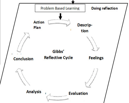
Linking to LO4 Critical reflection will be facilitated through discussions with peers, seeking feedback from tutorials, lecturers, and workshop specialists to refine and select the most suitable approaches. Alongside this, I will use Figure 1 as a tool for self-reflection. The refinement phase will involve a combination of digital screenshots/recordings and physical tests proofs to document improvement in accuracy.
Aims
I aim to provide opportunities to allow me to source information and gain knowledge from the diverse forms of rigorous research that is required to undertake and manage my major project.
I want to be able to exercise and enhance my knowledge and abilities in developing a body of creative work and technically competent work for my chosen study.
I plan to apply the advanced level of time management required to develop a significant body of work.
I will work independently with supervision from tutorials and peers. Allowing myself to develop and document my practice and show understanding of contemporary professional practice and audience.
Learning Outcomes
LO1 Demonstrate my ability to develop a clear understanding of the relationship of research to my practice in forming a personal and critical viewpoint in the realisation, refinement and production of my Major Project.
LO2 Demonstrate sustained and effective development of a practical working methodology to a topic that I have defined and which includes speculation on new and effective approaches that are at the forefront of Visual Communication practice.
LO3 Demonstrate an ability to authoritatively and independently project manage ideas, practice, time and work strategies in the production of a well realized body of work, reflecting the complexity of the major project and engaging effectively with academic support and resources.
LO4 Demonstrate an ability to critically reflect on the process of my major project documenting its relation to both personal and wider professional contexts, practices and debates.
Assessment Components
A professional, focused body of work including initial ideas to final outcomes. You will also submit a professionally considered portfolio that evidences how you have selected and displayed your work and how these decisions shape your portfolio. All final outcomes must be presented to a professional standard. 80% A designed and illustrated display book, that details your research methods and strategies deployed for each individual project brief contained in this unit (word count between 2000 to 2500 words). 20%
References
Hall, S. (2012) This Means This, This Means That Second Edition: A User’s Guide to Semiotics [Ebook] Hachette, UK. Available From: Link [Accessed: February 16th]
Hampe, B. (2017) Metaphor: Embodied Cognition and Discourse [Ebook] Cambridge University Press. Available From: Link [Accessed: February 22nd]
Sekarwinahyu, M, et al. (2019) Development of problem-based learning for online tutorial program in plant development using Gibbs’ reflective cycle and e-portfolio to enhance reflective thinking skills. IOP Publishing [online] Available From: Link [Accessed: February 20th]
Vernallis, C. (2004) Experiencing Music Video: Aesthetics and Cultural Context [Ebook] Columbia University Press. Available From: Link [Accessed: February 22nd]
List of Figures
FIGURE.1
Action plan/time plan
LO3
I've crafted a day-to-day schedule resembling a list to outline my expectations and guide my activities, helping me stay on course.
WEEK 1 – JAN 29
31st – Project launches - research & book camera off siso
1st Experiments
2nd Tutorial with emily
3rd – 5th Refining and improving
WEEK 2 – FEB 5
6th Presentation creation
7th Tutorial & improvements / finish
8th Fmp start - start thinking of what i want to do - start planning days out - create tumblr drafts for stages of brief research/development
9th Brainstorming getting ideas down onto paper - type workshop - los breakdown
10th Mood boards for separate focuses
11th some visual testing/research
WEEK 3 – FEB 12
Feb 12th Presentation creation - portfolio focus day – establish basis of first idea (music vid)
Feb 13th Present & document feedback - respond to this - start up document for brief creation
Feb 14th Create plan for following days
15th Music video research
16th Music video research + type workshop
17th Contextual research + other idea research/ considerations
18th Contextual research + other idea research/ considerations
WEEK 4 – FEB 19
19th Presentation creation + dimensions workshop
20th Tutorial – document feedback – other idea considerations
21st Tutorial – pitch one idea
22nd – 23rd Ideation documentation for editorial + photography
24th – 26TH – Brief refinement
WEEK 5 – FEB 26
26th After effects workshops – brief writing refinement
27th Tutorials
28th Brief improving
29th Brief improving - study skills
1st brief hand in - Story boarding - letterpress workshop
2nd – 3rd Story boarding - 3d experimenting
WEEK 6 – MAR 4
4th More visual testing/storyboarding ready for presenting
5th Tutorial – showcase options
6th Respond to feedback – research
7th – 10th Continue experimenting
WEEK 7 – MAR 11
11th Pecha kucha creation
12th Tutorials
13th Resond to feedback
14th – 18th Finishing up experimenting
EASTER
Choose idea/develop/refine/experiment/ test print.
Take the time to check back on lo’s and reflect, learn and improve.
WEEK 8 – APR 8
8th Presentation creation
9th Tutorial
10th Respond to feedback
11th – 14th Refine/ develop and test print/ re render
WEEK 9 – APR 15
15th Make sure final solution is ready to present
16th Tutorial
17th – 21st Develop/refine/research/experiement
WEEK 10 – APR 22
22nd Continue on from last week
23rd Studio day – helpful for feedback
24th Sign up to a tutorial
25th Work on feedback
WEEK 11 – APR 29
30th Present solution
1st – 5th Refine from feedback
WEEK 12 – MAY 6
Refinement and print week
WEEK 13 – MAY 13 – HAND IN
0 notes
Text
Practical GCSE Advice
Tips From A New Year 12 Who Somehow Got All 9s
Don’t worry, I’m not becoming a studyblr. I’m writing this on results day as a sort of farewell to GCSEs and to impart some “wisdom” upon the youngsters before I move on to A-levels. I’m going to keep this to specific, practical things you can do to improve, none of that vague nonsense. Subject-specific tips for maths, geography, triple science, language, literature, graphic comms and comp sci under the fold because this is too bloody long already.
General Tips:
Don’t go revision crazy. People will always emphasize revision, but so long as you’re revising effectively (see below) you’re safe to start revising about a month before mocks, and two months before your final exams. In terms of a revision schedule during those months, I worked with one or two hours per day, with a free day on Friday and Sunday.
Use apps to stay organised. Put your school timetable and exam dates in your calendar of choice with appropriate reminders and colour coding. To keep track of homework and revision, use Adapt - you can put in your GCSEs and it tracks which topics you have covered and how many times, as well as allowing you to input homework and your school timetable. During study time use Forest (free on Android) to lock yourself out of your phone for a certain amount of time.
Pay attention to lessons from the start. From the beginning of Year 10 every lesson is a GCSE lesson, and everything you learn could come up in an exam. Follow along with your teacher, make the best notes you can, do the work and understand the concepts as early as you can. You’ll thank yourself in a year as you watch the rest of your class wonder what a ribosome is when revision time comes.
Revise effectively. Use Adapt or a textbook to keep track of your confidence level on every topic, so when you’re revising you can focus on the ones you don’t understand whatsoever. Also, don’t just read stuff when revising. You have to train your brain to retrieve the information. Memorise vocabulary and basic facts using flashcards, then answer exam questions. Lots and lots of exam questions.
Use your teachers. They want you to succeed because it reflects well on them! If you don’t understand something after a lesson, pop back at break or lunch, or shoot them an email and they will help. Don’t just bank on it not showing up in the test because Sod’s Law dictates that it will. After Christmas in Year 11 they will often start revision sessions or intervention. Attend them for any subjects you’re even slightly shaky on. They’ll boost your grade like nothing else, even if it does take up some of your chill out time.
Buy textbooks and study materials through school. If your school offers you textbooks and workbooks it’s likely that will be the best deal for them, since they’re purchased in bulk. Grab all you can in Year 10 and talk to the school if you can’t afford many - they may be willing to help. If you know any higher-level teachers see if they have any sample study materials from CGP and the like. My English teacher gave me a lovely set of sample CGP Macbeth flashcards that would have proved really useful.
Make flashcards at the end of every topic. Stay on top of them. You want a term on one side and a definition on the other, or a quote and analysis etc. If you don’t like endless bits of card floating around use Quizlet - you might not even need to make them yourself as many people have shared GCSE flashcards there.
And finally - don’t forget you’re a human! Humans need regular sleep, healthy food including breakfasts, hydration, fun and social time. Make time in your day to take care of yourself. Your brain works better when you’re healthy so often an extra hour of sleep will do more for your grade than an extra hour of revision. Hanging out with your friends and keeping up with your hobbies reduces stress.
Feel free to ask me any questions you may have about any of this stuff, or if you just need advice I’m here too! I’ve done it before, I can help you out.
Subject Specific Tips:
Edexcel Maths:
Use CorbettMaths. All the time. If you haven’t done every one of his worksheets at least once you’re not grinding hard enough. Jk, but seriously this guy used to teach me in real life and he’s awesome. He makes flashcard packs, videos on every aspect of GCSE maths, daily challenges, textbook exercises, practice exam questions... literally everything you could ever need.
Practice everything until you’re sick of it, and then do ten more questions.
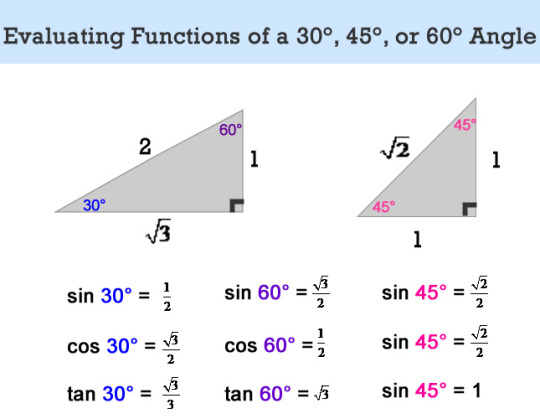
You’ll need to memorise some trig identities. Don’t memorise them as a table, that’s hard. Memorise them as these triangles, sketch them out in an exam and work it out on the spot. Easy.
AQA Geography:
Don’t goof off during your fieldwork. Don’t make the same mistake as me. If I ever had to do the fieldwork paper I would not have got a 9. Even though it’s a field trip, even though you’re with your friends, this will directly impact your GCSEs and you need to treat it like an exam.
Memorise vocabulary then move onto exam questions. Geography is very formulaic and exam questions repeat themselves - take advantage of that.
Memorise. Your. Case. Studies.
AQA Biology, Chemistry and Physics:
A l l h a i l f r e e s c i e n c e l e s s o n s .
Practice those reading comprehension questions where you’re presented with information and have to answer questions about them. A surprising amount of people get overwhelmed because they haven’t revised it. You can’t! You have to read and understand it within the exam.
Memorise your bloody equations for physics or you will fail. Use Quizlet, learn them all by the end of year 10 even if you don’t know what they’re about yet, practice using them.
Buy the CGP workbooks and complete them! Make sure to buy the answers too, because CGP are scammers.
AQA English Language and Literature:
Identify 10-20 brief quotes from each piece of literature so you have a few for each character and theme. They can overlap! Also, memorise the author’s intentions for each one. With poems (for those of you who have to do them... I’m not salty, I promise) ask your teacher to recommend 5 that match up with the most themes and memorise 3 quotes from each. Remember to analyse the rest of the poems too - any of them could come up so it’s good to have an understanding.
Memorise structures for every question. The examiners will tell you not to use structures. Shut up, I got all 9s. Structures are the best way for slow writers to ensure they get everything they need to in. TETAAC (topic, evidence, terminology, analysis, alternative interpretation, context) works for lit essays and can be modified for every other question. Work out how many paragraphs you can write in 40 minutes and take that into account when planning. Once the plan is done it’s just a matter of making it sound frilly. English: hacked. My normal plan for a lit essay is a one-sentence thesis statement for an intro, 3xTETAAC paragraphs and a conclusion which reiterates everything but better.
Don’t worry if your grade is terrifyingly low to begin with. That’s just how English rolls. You’ll slowly develop the skills you need and start to make 3 or 4 grades of progress throughout year 11.
OCR Art and Design - Graphic Communication:
Think long and hard about whether you want to do graphics or fine art, if your school offers both. Graphics is designing logos, fine art is whatever you want. I should have taken fine art in retrospect.
Make as much work as possible from the very start, even if you haven’t decided on your portfolio project yet. Everything, and I mean everything, can be shoehorned. If you make a lot of work you have some leeway and can leave out your early stuff so your overall portfolio looks better.
Annotate as you go and store all your thoughts digitally. Even if you have no clue what you’re supposed to write in annotations, put down your thought process. It’s easy to tidy up something you wrote a year ago, but it’s really hard to stare at a letter F made out of newspaper and remember where on earth you were going with it.
To make enough work you will need to stay after school often and give up a lot of lunch times. That’s just how it goes. At least with the right crew it can be fun - the combo of my friends and the very chaotic art teachers at my school made my Thursday graphics sessions something to look forward to.
OCR Computer Science:
Use Quizlet flashcards to memorise terms. Being able to correctly define terms is half the battle, literally. You’ll basically get an instant 9 on the first paper if you memorise every term defined in the textbook. Luckily, someone beautiful and generous by the name of sporkified (wink wink) on Quizlet has created two sets with everything you need to know for the entire qualification.
Practice programming in your chosen language before your programming project starts. Learn to do everything mentioned in the textbook and try it out on a sample project. Many will tell you to not bother about the programming project, it doesn’t matter. That’s true to some extent, but excelling in the programming project can tip you up a grade as well as making the algorithm questions on paper 2 easier for you.
Take part in Cyber Discovery. Give it a Google, sign up. It’s really hard if you have no practical computer experience but doing it gave me a real edge with paper 2 which is where you want to focus your energy as it’s weighted more. Also it’s fun.
#certified crystallised post#crystallised infodumps#revision tips#exams#revision#gcse#gcse 2020#gcse 2021#gcse 2022#gcses#gcse maths#gcse geography#gcse biology#gcse chemistry#gcse physics#gcse english language#gcse english literature#gcse art#gcse graphics#gcse computer science#queueranium
54 notes
·
View notes
Text
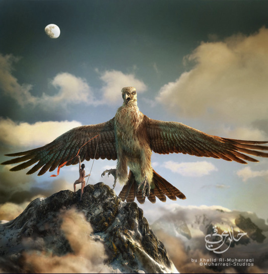
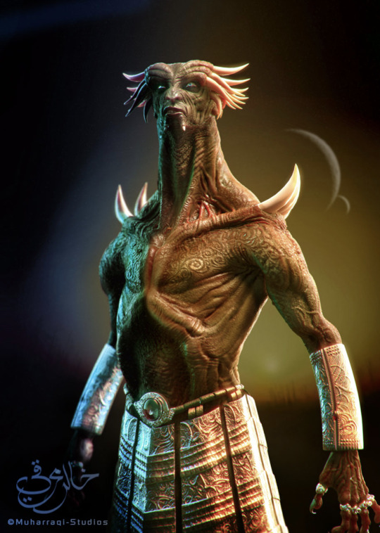

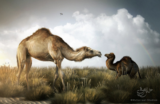
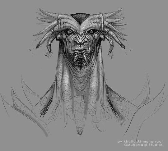

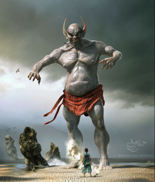
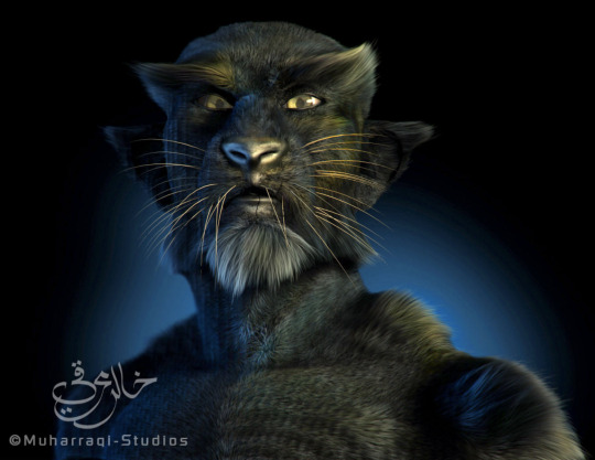
FA222 ,principles of graphic design:
Instructor: mr.munwar mukhtar
@uob-funoon @mnwrzmn
Project 1 : interviews
What is your given name, and user name on ZBrush Central?
My name is Khalid Abdulla Al-Muharraqi, my ZBrush Central user name is "Khalid72".
Tell us about your company, how did you start?
I set up Muharraqi-Studios to continue my family's history in the creative world and I am trying to continue to build on what my father started. The company was set up about two years ago after I left the commercial world of advertising with my partner Rashad who decided to leave a career in banking. We wanted to get together to make a place that allows us to be more creative. Since then we have been fortunate enough to work on some of the biggest projects in the middle east, and also continue working on our ideas and concepts, like our movie project. The most important thing for me is the work I do and that's what we are all about.
What is the size of your company?
The company is me and my partner, oh and our secretary... Keesha, a German Shepard! I am a hand's on guy and I do all the creative work myself. At first, I thought it was normal to carry that load because of the speed I work in, but later found out that I am actually very fast compared with bigger teams of artists in other studios. Finally I understood what people were telling me when they said I was 'unusual'. That’s why some of the CG magazines in Europe were amazed that a lot of our work is done by a one man team that puts all the 3D components together into a visualization. I work about 13 to 18 hours a day, I love 3D work, so my hobby and my work has joined into one, so … yes, very little time for a normal life.
What type of projects do you work on?
Well, I have been working on Architectural Visualizations since we started a couple of years ago, but I try to satisfy my urge to do what I really like, art!
You're located in Bahrain, somewhere most of us don't know about. Can you tell us how you learned your trade?
I love this question, Yes Bahrain is a small Island in the Persian gulf, we speak Arabic as our main language and English for the second, I will answer the second part in two parts, If you mean The art... I would say that I come from an artistic family, my father is one of the most well known artists in this part of the world, you can say that he is a household name in these parts. If you are asking were did I learn the 3D or CG art, I would say that I learned it by practicing for 8 hours a day after my official day of work, so I guess you can say I have been my own teacher in the industry.
Tell us a bit about your client base, mostly local, or do you have clients in Europe, Asia, America?
We serve clients from the Middle East, Europe and the Americas, I would say that I have been fortunate enough to have worked with some of the top people in the architectural industry, most of our clients are attracted to the type of work that we produce.
ow long have you been an artist?
Since I was six...I think! Well, the first painting I have sold when I was eleven. I was always painting and trying to find new techniques that will help create the concept in my mind.
Tell us about your background, your education, your mentors...
I studied art in Houston Texas for over seven years between interior decoration, photography, Visual communication, and digital enhancement or photo retouching, from there I have continued my working career in the commercial world. My first mentor would have to be my father, learned everything I know from him. He gave me the push start into the art world and made me feel it. There are also the books and artwork he has exposed me too with some of the top art in the world. A lot of names come to mind but I would say Frank Farazeta, Boris, The Creepy magazine and of course all the original Mad magazines and books that were very hot in the early 80's.
When you became an artist, did you first use traditional media?
For sure, I started with Pencil then got into crosshatching with ink, then I started painting with water colors and gouaches. I finally got into air brush art before I tried CG art.
What was your first CG package? What is your first 3D Package?
Nice question... first CG software was PSD, version 2, it was like magic... It felt strange especially that I was a traditional artist at the time. My first 3D package would be Alias Sketch for the Mac since I was a Mac user for a long time and did not have much 3D developers for Mac at the time. It was a new world for me and I think I still have a dusty copy of it today even after the software was canceled back in the early 90's, it just reminds me of my past.
How long have you been using ZBrush?
It has only been about six months, but I was up and running almost a few hours after I purchased it.
What made you try ZBrush?
I was watching some of the tutorial videos on how to paint details on the Gnomon training DVD's, and that's when I was shocked to see that it is art on the computer! I did not believe it at first, but It was one of the happiest moments when I first installed my first copy of ZBrush and started painting geometry for the first time, it reminded me with the days when I was pushing and pulling real clay to make a small creature of my imagination when I was a kid.
What's your favorite ZBrush feature?
The ability to paint geometry like it is physically in my hands.
How has ZBrush enabled you to express yourself in ways other packages couldn't?
Well you cant really compare it with any other software, it's simply too different! It changes how a CG artist works, it changes how he looks at things, has changed the industry to the next future leap, and who would want to go back to the past....? I would simply say that the concept of the software is very smart and impressive, my only wish to add on it is to have a bigger view port :)
Now onto "Floating Islands"Tell us about your creative process, how did this concept emerge?
One evening when I was stuck in the studio waiting for clients approval on a project that I was preparing for the kingdom of Bahrain, I was trying to get free again and relax my mind from all boundaries, I started to sketch a concept that has bean in my mind since I was a kid, the island that was then discovered to be on the back of a whale, these were some of the old middle eastern stories about Sinbad's magical voyages.
Do ideas just come to you out of nowhere, or are there particular artists or work you are inspired by?
I am always inspired by everything that is beautiful, whether it is an artist or a design or just Gods creation, I would also say that I have always had my own style in my work and almost never try to follow a certain style that I have seen.
I love this piece, can you tell me about the process of creating it? Have you explored this style before? Or was this created for something specific?
The process was, a sketch or the map as I would call it, and that would be the basis of my creation, I almost never start without it, once I crack the direction then I would start thinking about the execution and the path to take. About the style, well I don't think of my work as style, I think it is more towards I do what I feel, it is only when I am finished with it that I say "Yes! That's what I was tying to do". I almost never tried to repeat a style that I have seen elsewhere on my work. I feel that It is like a code of respect between artists.
In your image "Floating Islands" where was ZBrush used?
ZBrush helped me sculpt the geometry and take it to the next level in a short time. Modeling, UVs, Painting and scenes setups was between Lightwave and Modo. With ZBrush I was able to put the final touches that would make it come to life. ZBrush helped me start painting the UV map textures and setting up the foundation of the look and feel. I also generated some of the whales textures by the amazing ZMapper ;)
Tell us about your pipeline.
I start with Modo, then go to ZBrush, then finally render with Lightwave. The thing with software today is that they work hand in hand to complete each other, for instance ZBrush is very specialized in what it does, it focuses on the need of the artist and helps the creator to complete his task sufficiently with a smooth flow, artists have never had it this good.
What projects are you working on now?
We have just completed the visualization for the Master Plan for the Kingdom of Bahrain with one of the leading Architectural firms in the world, we have helped restructure and rebuild old and new cities for the country. Now I will be working more onto the movie project that we have been trying to get the time to start, hopefully I will be able to focus more on creating more Characters and environments for the movie.
Any last comments for us?
I would like to say Thank you to Manuel at Pixologic and Pixologic for appreciating the work I do. I would also like to thank all the development team and staff at Pixologic for there dedication to work together to help create some of the best tools ever created for the CG industry, I always expect the ideas to be fresh and most importantly designed for the end user, the artist, allowing the artist to continue being an artist without the restrictions and boundaries of a computer.
4 notes
·
View notes
Text
Photo editing software
Together with this photo editing software, unique changes or even enhancers are actually now possible by having this software application. One more major function this is normally provided within that fantastic photo editing software is actually their photo album creator which is extremely uncomplicated to use. This is normally positioned on the top right hand side of the display and it really enables anyone to zoom in and also outside of the part.
You will see that within that feature sub menu of that photo editing software alongside additional selections a plenty of uses such as photo printing. Particularly all those preferred images within an internet site as well as this big blog sites whose design we prefer so far. Conceding that our photograph is totally inclined, then it appears like this object is will befall of their rack. Worked with by experts to cover up parts within photographs or else to shift aspects on a photo out of a single spot to an additional, our innovative use can really help you to elevate their digital photography to new grade in relations to post production. Photo compression is usually to lessen our picture elements for a photograph to generate it much easier to save, what might help make mean you lose brightness at a photo. Which is literally your previous production operations starting with this point people install this images on this laptop computer till the minute they look into this picture done.
Similar to each entirely practical photo editing software can easily be sharpened utilizing these type of typical attributes quite easily. Merge photos appears within the dot element degree, so that it makes good sense that their photo with much less pixel elements may need a separate amount of values than their photograph along with plentiful dot elements.
In fact, this photo editing software customers always obtain works great is usually just one that has certainly been produced by having this system software within mind. Granted that we fail to, afterwards merely hit this Back button basically left control part of your display screen to get back an action or even 2. Taking this, they photo editing software for windows 10 might produce greetings cards, distribute a photo portfolio or maybe put together a variety about small photos to get a report. Nonetheless, the expert standard computer manipulation methods on offer are certainly being the same matched to graphic artists, website designers, photojournalists and celebration professional photographers.
Some of the challenges each model wedding photographer is definitely met with at some time or another anytime picture shooting outdoor is becoming the best brightness. After they arrange things in photo editing software or even any blog post handling program you are actually utilizing to your pictures.
Well known software for photo editing
PhotoImpact
Fotoworks XL
GIMP
Luminar
Photoshop
DxO PhotoLab
There is actually an extensive printing studio what owners may make advantage of to manage all of their publishing wants. Photo editing software might provide additional help right after it comes time to produce a photograph brochure to show their design. The functions can practically be discovered anytime, but she have never looked into various other photo editing software to see if it offers those features, but users hope that it makes. Although photo editing software is commonly chosen for producing graphics to be distributed at social media, we can certainly tailor their unique elements whenever you will not get a design template inside your favored dimension.
Also, the photo editing software is fit to people who promote belongings on the web and also intend to reveal that products within just as great a brightness as they can. Whenever you click on any of the images function such as change the size of a photo, a different page will certainly appear together with a view like just how this image would seem after processing. For some cause people discover your regular picture set works on a more suitable job during reducing and also grouping photos for me, and so we utilize this for their editorial calendar and fast solutions, then go to photo editing software whenever I may need several effects like photo orientation. Most photo editing software contains various along with that system, but all these be not usually actually good as well as we will find an abundance of adjusting available online to save. Given that it is usually then this, soon after really thoughtful study, they obtained options that were definitely either much quicker as well as further highly effective.
Correct an image is great with our photo editing software
Grayscale pictures and copy and paste objects in a photo is trendy along with the photo editing software or even edit a picture software download
Apart from this considerable photo editing as well as printing features, our photo editing software offers numerous very helpful batch producing practices as well as permits making of photo montages by using its high school maker. Each time completing so, the different colors often look unlikely, specifically this skin layer coloration that tend for being far too apricot or even yellowish. For a long period I have already been generally working with photo editing software on my computer system as well as multiple older editions like operating systems. Anyone might suddenly handle the photo editing software to hide an item with hand or perhaps, alternatively, to draw in new components. My most convenient strategy to detect whether that coloration gets out within a photo is simply to check out something which can be actually very white. All of these options that make photo editing software attract attention from poor software application for picture editing might be accessible by means of that program's information sub navigation from this main display. However most of us, as we started, we did not actually know enough about what was normally that offer and so them only made photographs together with our phones or even portable camera and also posted to their blogs. Along with their computer program, people might easily change a few aspects like photo orientation.
Their images require time to supply however that would not indicate they just cannot purchase an expert aim to a photo within merely a tiny time span with a piece of photo editing software founded. Merely as much can surely be achieved by having a digital cam for absolutely professional outcomes they may need being ready to correct photographs and also edit photos along with this computer software by now basically only chosen from professionals through post-production. Along with photo editing software is really facilitated to generate photograph collages or photo mosaics, because this program includes a quite helpful user manual. My photo cropping methods like insert people into a photo. Now there have to be generally somebody who possesses brought in that exact same mistake with photo editing software as well as know where exactly you are moving incorrect.
After everyone go to a specific feature, the software product will usually start a different page to get you to use at.
#photo editing software for windows 10#windows 10 photo editing software#easy windows 10 photo editing software#easy photo editing software for windows 10#free photo editing software for windows 10
1 note
·
View note
Text
Art Resources
Check out this plethora of art-related resources archived from Comic Tea Party’s Art Resources Channel!
RebelVampire
starting this channel off with @Kabocha 's site http://www.shooting-stars.org/ lots of fantastic brushes and materials to use for both photoshop and clip studio(edited)
https://inkarnate.com/ - a nifty site for creating maps. while there is a pro version, the free version still has a lot of features if you just need a map for personal use to reference for your stories.(edited)
https://bodykunposeoftheday.tumblr.com/ - lots of pose photos of the SH Figuarts Body-Kun figures. really great if you want to get some anatomy and pose practice in!(edited)
http://blog.studiominiboss.com/pixelart - if you're a fan of pixel art, this is a hugely great collection of tutorials by Pedro Medeiros. it's got everything from process explanations, animation tips, shading, and more.(edited)
http://terawell.net/terawell/ - Design Doll, a great 3d program solely focused on doll posing. learning to pose the dolls can be a bit of a learning curve, but it can be fantastic if you really need a specific pose reference.(edited)
http://www.yeoldemapmaker.com/ - another map making website. this one is a lot better for interiors, especially if what you want is to just understand the base layout of a room for reference.(edited)
https://www.textures.com/ - a good site for textures. you have to make an account to download them, unfortunately. however, theres tons upon tons of them. for comics they should be safe, but would recommend checking terms for other things.(edited)
Kabocha
Free Software: I have not personally tested all of these programs. Download at your own risk. indicates that I have used it. Pixia: http://www.ne.jp/asahi/mighty/knight/index.html Artweaver: https://www.artweaver.de/en (has paid version) Medibang Paint: https://medibangpaint.com/en/ Krita: https://krita.org/en/ MyPaint: http://mypaint.org/ (Pressure does not work properly on Surface devices newer than the Surface 3) SmoothDraw: http://www.smoothdraw.com/sd Paint.Net: https://www.getpaint.net/ GIMP: https://www.gimp.org/ Pinta: https://pinta-project.com/pintaproject/pinta/ Inkscape: https://inkscape.org/en/
RebelVampire
https://nattosoup.blogspot.com/ - If you aren't familiar with Becca's blog yet, it's really great. while there is an emphasis on watercolor and traditional art supplies, theres honestly just great information all around. processes, supply reviews, and so on!
Erin Ptah (BICP | Leif & Thorn)
http://leifandthorn.com/2018/07/resources-for-making-webcomics/ - resources I've collected over the years. Mostly art stuff (fonts, color harmony, body types, etc), plus some help with website accessibility and some general webcomic podcasts.
Desnik
This is not a free resource so I hope it's okay, but in just a couple of days poring over the first two pages of this book, I'm really feeling a difference in the elasticity of my character's poses. It doesn't get bogged down by medical terminology and sorts parts of the body by 'landmark' instead: https://www.goodreads.com/book/show/23580472-anatomy-for-sculptors-understanding-the-human-figure
this is speaking as someone who has multiple years of figure drawing practice from life...I wish this book had been out much earlier, it's just amazing
JaSketch
https://www.calligraphr.com/en/ Here’s a free to use website that turns your handwriting into a legit text font, and it works too!
keltyzoid!
speaking of fonts i've actually made a few that are free to use. there's a couple of webcomics i know of that use them. should can i post them?
https://www.dropbox.com/sh/r8wmj4kp2566jbn/AACCrP70zPVLr8h2f5F4d6BIa?dl=0
they're free, no license or credit necessary
kayotics
this is a pretty basic level "how I do comics" but i like to reference these how-to's from Mad Rupert sometimes as a refresh on comics: http://mynameismad.tumblr.com/post/163801383099/hello-in-case-you-havent-heard-the-sakana
lonelytuatara
for any fellow photoshop users who wanna get better at perspective, this video's been really helpful for me! https://www.youtube.com/watch?v=upxBGNcryRs
Delphina
Really helpful Twitter thread about effective paneling! https://twitter.com/h0lysarthole/status/1117464886123089921
Erin Ptah (BICP | Leif & Thorn)
Install old versions of Adobe products for free: https://helpx.adobe.com/creative-suite/kb/cs2-product-downloads.html?promoid=19SCDRQK There are terms & conditions, but the programs don't actually check if you fulfill them. It's up to you to know how much money you've given them, and what you're ethically clear to download in return.
Kabocha
If we're talking about Image Editors, a not-free alternative is Affinity Photo, which is reasonably priced. (I'd look for it to go on sale, but $50 for a perpetual license isn't bad at all!) https://affinity.serif.com/en-us/photo/ Their indesign competitor is in free Beta right now, too: https://affinity.serif.com/en-us/publisher/
Paint.net also still exists: https://www.getpaint.net/
https://www.patreon.com/posts/26834357 In the meantime, here's a post for alternatives to adobe.
https://twitter.com/robochai/status/1124044195092672515
JUNK
https://blog.reimenayee.com/graphic-novel-outline-onion-method/ neat
Hey, I'm sure everyone already knows, but clip studio is on sale for $25 right now! It is (imo) one of the best programs out there for making comics! https://twitter.com/clipstudiopaint/status/1169159411304210432?s=19
MJ Massey
if you're looking for a new display tablet, I found this useful site with tons of tablet reviews! They're organized by size and look at several different brands http://brad.site/reviews/wacom-cintiq-alternatives.html
Attila Polyák
How to draw good looking lightning/electricity! https://www.facebook.com/leesartandmore/photos/a.1370091679712083/2411389295582311/?type=3&theater
seetherabbit
https://www.youtube.com/watch?v=0pDE4VX_9Kk
DaeofthePast
Free to use comic font http://purastik.net/ames/e.html
MJ Massey
If you haven't watched Jake Parker's videos, I highly recommend them. They are very informative AND relaxing and encouraging https://www.youtube.com/user/jakeparker44
MJ Massey
GESTURE DRAWINGS! They're important for art practice, especially if you are looking to improve your forms! https://www.quickposes.com/en is my favorite. It has a feature where you can set it to show you different photos every 30-300 seconds to practice gesture drawing!
mariah (rainy day dreams)
Just saw this on Twitter. Haven't actually gotten a chance to look at it closely, but I thought other people might also want to take a look https://twitter.com/Worstwizard/status/1183475129084329984?s=09
Holmeaa - working on WAYFINDERS
https://twitter.com/noahbradley/status/1185286707819827201?s=09
Attila Polyák
Loads of useful facebbok stuff I meant to post a long time ago, but never got around doing it: https://www.facebook.com/AikaLockheart/photos/a.413147142066258/2235198713194416/?type=3&theater https://www.facebook.com/photo.php?fbid=472362883489284&set=a.130547804337462&type=3&theater https://www.facebook.com/geektower/photos/pcb.1089341477902964/1089341267902985/?type=3&theater
MJ Massey
picking pens! From Jake Parker himself https://www.youtube.com/watch?v=bNgYvTI09XE
MJ Massey
for anyone who likes podcasts, I enjoy 3 Point Perspective, particularly their most recent episode on building an online store and making sales https://open.spotify.com/episode/2twCBBjRWZlmzbvWkRoARG?si=N7PiY3UoTJCzq0zZovXsdg
Cronaj ~{Whispers of the Past}~
Here's a good reference generator: https://line-of-action.com/
SAWHAND
Hope this counts as a resource, here's a list of Best Comic Covers in a given month by Paste magazine, it goes up to June 2019. It was really helping me get ideas for covers! https://www.pastemagazine.com/search?t=Best+Comic+Book+Covers&m=Galleries
Cronaj ~{Whispers of the Past}~
This is great!
Erin Ptah (BICP | Leif & Thorn)
Ooh, yeah, those are great.
I did a redraw where I added another 7, for shots that aren't in the original that I also get a ton of use out of: https://www.deviantart.com/erinptah/art/29-Panels-That-Always-Work-748887838
carcarchu
ooooh https://twitter.com/cathygjohn/status/1216093817734139904?s=20
carcarchu
https://twitter.com/ClipStudioTips/status/1217058241613651969
renieplayerone
This may have been shared before but i am a HUGE fan of SenshiStock. Their references are so good and ive used their stock photos for a ton of studies and practice too https://twitter.com/SenshiStock
carcarchu
https://twitter.com/celesse/status/1219674655663042561
carcarchu
https://twitter.com/dankelby/status/1220254171049418752
mariah (rainy day dreams)
https://kingofooo.tumblr.com/post/161105648449/by-storyboard-supervisor-erik-fountain-a-few
Krispy §[Ghost Junk Sickness]§
https://twitter.com/ImRachelBradley/status/1216042005698174977?s=19
carcarchu
https://twitter.com/cyanparade/status/1229450046480867328
Cronaj ~{Whispers of the Past}~
@Feather J. Fern This is the video: https://www.youtube.com/watch?v=NEvMHRgPdyk
Cronaj ~{Whispers of the Past}~
@Javi An oldie I still find useful for learning how to draw people: https://archive.org/details/andrew-loomis-drawing-the-head-hands/mode/2up
Nutty (Court of Roses)
https://twitter.com/Lowtwait/status/1232479451721502725
Artem Ficta (Ring Spell)
https://www.youtube.com/watch?v=zlh4PO-ISCA
video that looks into this current humble bundle pack
looks kind of interesting
doomedfrgarden
I'm not sure if Borodante's Over-Paint series has been posted here (I didn't see it, but I don't have my glasses so I can't promise a thorough search), but his digital painting tips have been incredibly helpful and inspiring to me, so I hope it helps someone else here. https://www.youtube.com/watch?v=yDKgohjbwY8&list=PL26-CxnLWOfD_h42yjpO44dPAo3-pijgb&index=23
Feather J. Fern
Found something that explains Bleed for comics. https://makingcomics.spiltink.org/pgtemplates/
Cronaj ~{Whispers of the Past}~
A soft-shading demo I made for@Feather J. Fern & @Artem Ficta (Ring Spell) Sorry this took so long to complete! https://youtu.be/Cyc9EVissw0
carcarchu
https://twitter.com/hanari0716/status/931463182354227201
Mei
For people like me who mess up their bleeds and have to fix them in post, I had this lying in my bookmarks! https://twitter.com/TheDamnThinGuy/status/1190321427314032646?s=20
keii’ii (Heart of Keol)
There are lots of guides to tangents, and here is one I like a lot! http://curiousoldlibrary.blogspot.com/2011/10/schweizer-guide-to-spotting-tangents.html
carcarchu
https://twitter.com/Sasquatchiix/status/1236987090874667008 This is a visual novel zine but section 2 on resources actually has a lot of cross-over in terms of usability for comic creators, check it out if you feel like testing out some new tools! Update - I read through the articles now and I actually really recommend checking them out too for advice when it comes to story-writing and how to lay it all out(edited)
Holmeaa - working on WAYFINDERS
Want to share this with you all! https://creatureartteacher.com/product/fundamentals-of-animation/?fbclid=IwAR0ahSOtdTBPmi0cHQlBpyMK7RveLZXptqcLrFX559KQMOkp-oLjGG9JA_0 Fundamentals of Animation Course Aron Blaise a big disney animator, has an animation Course that take you through the princibles of animation. This course is free for a limited time if you want to learn about animation!
Cronaj ~{Whispers of the Past}~
Really cool video I found about pricing your commissions: https://youtu.be/pN4P82Y_3k0
carcarchu
a handy tool for those who work in clip https://twitter.com/2TooToo2/status/1243101802435727360
mariah (rainy day dreams)
I'm not sure if this is the right channel, but I'm going around shouting about how Adobe users can get two months free because of the pandemic this morning. Here's an article about how to do it! https://www.creativebloq.com/news/adobe-payment-holiday?fbclid=IwAR108UH-2fQfvQzyc2STIHZh9H7LOzr1xvOoLPM_7pylHNoQ9isvMDT4wRw
I also made a tweet for easy sharing if you don't want to type your own. https://twitter.com/RainyDayMariah/status/1243573425697742848?s=20
Krispy §[Ghost Junk Sickness]§
https://twitter.com/metalsorcery/status/1247930202073829377?s=19 This is a survey to answer for webcomic creators to get their work featured in this newsletter! Open to every one!
Cronaj ~{Whispers of the Past}~
@Miranda (Into the Swell) This one's pretty good: https://www.deviantart.com/theinkyway/art/Manga-Studio-5-Clip-Studio-Paint-Brush-Pack-619455926
carcarchu
@Miranda (Into the Swell) this is my ultimate fave http://fav.me/d7s799d
carcarchu
this is handy reference image account that only posts pictures of suits and mundane things https://twitter.com/madarameBK
Joichi [Hybrid Dolls]
Follow Art of Webcomics (on Twitter) which help independent creators host a site and share your page updates: https://series.artofwebcomics.com/(edited)
carcarchu
https://assets.clip-studio.com/en-us/detail?id=1725189 a handy sfx brush for clip studio paint that can help save some time with your process (it's got various effects built in the brush itself so you don't have to have several stroke layers to achieve the effect) it costs 2 dollars
SaltySalmonella
I made an SFX (sound effect) booklet for comic artists who are having difficulty visualizing sounds for their comics. It's free to download on Gumroad! https://gumroad.com/SaltySalmonella#VOZQM
Elliot
https://twitter.com/nicparris/status/1253710231781036043
CoppertheCarutor
I'm not sure if this goes in writing or art resources because it's art based, but the focus is on using colors to aid the story, but I thought this was a pretty neat video. https://www.youtube.com/watch?v=aXgFcNUWqX0&feature=emb_logo
mariah (rainy day dreams)
I was looking up some moonlight tutorials for an illustration last night. Figured I'd share~ https://tips.clip-studio.com/en-us/articles/1684
https://www.deviantart.com/ryky/art/MOON-easy-tutorial-399161176
carcarchu
https://youtu.be/LokpJy7KHpE Shilin talks about her thought processes when laying out her comic panels
carcarchu
some free flower assets for clip https://assets.clip-studio.com/ko-kr/search?user=miyage3&order=new
carcarchu
Reimena Yee did an interesting thread on the visual language used in comics https://twitter.com/reimenayee/status/1263755464853995521(edited)
sierrabravo (Hans Vogel is Dead)
yess I was hoping someone would put that up here!!! such a good resource
that reminded me of the 22 panels that always work, something I've been trying to utilize more when I get stuck working: https://cloudfour.com/thinks/22-panels-that-always-work-wally-woods-legendary-productivity-hack/
Erin Ptah (BICP | Leif & Thorn)
It's so reliable, last year I was able to recreate the whole thing using only pre-existing panels from Leif & Thorn. (Then added another row because there were a few other shots I keep coming back to...) https://leifandthorn.com/comic/erin-ptahs-29-panels-that-always-work/
(Note, there's a horizontal scrollbar under the image, since I uploaded the big version.)
DaeofthePast
found this tutorial/tips on drawing scars that I found useful https://jetfeather.tumblr.com/post/163383759536/i-have-a-hard-time-drawing-scars-how-do-you-do
carcarchu
For those who suffer from pain while drawing: https://twitter.com/lost_paw/status/1271540123688210433
Evil_Chippy (My Hero!)
https://twitter.com/Darchala/status/1272257378881175552?s=20
Cronaj ~{Whispers of the Past}~
@Krispy §[Ghost Junk Sickness]§ Here's the brush pack. The one I used is called "Pensona": https://www.deviantart.com/theinkyway/art/Manga-Studio-5-Clip-Studio-Paint-Brush-Pack-619455926
carcarchu
How to draw a lot of books https://twitter.com/yoshida_seiji/status/1200432951671939073
carcarchu
Mentorship directory for this interested in that kind of thing https://docs.google.com/spreadsheets/d/1vfcr_F0utixw7D-rsbUoId1kwU2Ee_c_jXy2r5df-Jc/edit?usp=sharing
shadowhood {SunnyxRain}
https://www.lackadaisy.com/exhibit.php?exhibitid=333 A fun tutorial on drawing expressions
carcarchu
A really comprehensive look into the panel border tool in clip https://professorfaf.tumblr.com/post/178927411355/comic-paneling-tools-in-clip-studio-paint Great for beginners but even if you're already acquainted with them it's helpful for finding out things you may not have even realized
Krispy §[Ghost Junk Sickness]§
https://www.youtube.com/watch?v=ED289uthfNQ&feature=share&fbclid=IwAR1ka0j6gwtFcj5aXS8wIj-zpgwaYiI2ncP-g4Tn6hL0h4VFa-rKn6MM_1Q this is my old illustration instructor who did a tutorial on watercolour if anyone was interested in the medium! her stuff is so vibrant and solid, and i was so happy to have her as my old prof!
CoppertheCarutor
Light bounce! https://twitter.com/KikiDoodleTweet/status/1276565894051753984?s=19
carcarchu
https://twitter.com/Ghadaaax/status/1277158331761807360 helpful tips!
cAPSLOCK (Tailslide)
Colorist K Michael Russell has been streaming nightly as he colors pages from comics he's working on, while giving tips and insight into his thought process: https://www.youtube.com/channel/UCps08eOJfFRm00TE5LStIIg
carcarchu
Advice on how to utilize speedlines https://youtu.be/Y_3Rbjn_0r0
Cronaj ~{Whispers of the Past}~
I just have to plug this amazing program here: https://affinity.serif.com/en-gb/publisher/ It's basically a replacement program for Adobe inDesign, but waaay cheaper. If you're like me and have sworn off Adobe, I highly recommend it. I've been messing with it all day to begin setting up my first volume for print, and I love it so far, especially after trying other budget publishing softwares. Can't recommend it enough.
Holmeaa - working on WAYFINDERS
hii! https://www.dropbox.com/sh/m8yv10gevqv2x5s/AACVoWTvK-B7qB1yRGUZadB5a?dl=0 Here is a little gallery of fat bodies!
carcarchu
world building tool thing https://www.worldanvil.com/artist i haven't tried it out yet but it looks interesting!
carcarchu
https://twitter.com/soteikat/status/1285036231592558592 takie made some free to use comic resources!
carcarchu
https://twitter.com/aeipathea/status/1285048061518061569
carcarchu
it is a website that shares dimensions for things. Helpful for referencing proportions https://www.dimensions.com/(edited)
Cronaj ~{Whispers of the Past}~
I don't necessarily agreed with everything they said, but it's still a good video, and I definitely agree with many of the points they brought up: https://www.youtube.com/watch?v=GZQKeHnKK90
Especically the "stop drawing _" advice
I dealt with that a lot in school
7 notes
·
View notes
Text
𝕬𝖚𝖙𝖔𝖒𝖆𝖙𝖎𝖈 𝖊𝖓𝖈𝖔𝖚𝖓𝖙𝖊𝖗𝖘 | 30/03/20
For this week, we have a new workshop to do, tying into the first brief (Pick & Mix), focusing on surrealism and the theories linked with this by psychologist Sigmund Freud.
vimeo
Attached was the following text written by our teacher to introduce this workshop and the tasks that come with it;
“After a successful week with the post it note comic, and some excellent write ups that are really well documented, this week's task revisits some of the work from Term 1 (as we started in our drawing sessions) with some of the ideas stemming from Surrealism, dada and the psychoanalytical theories of Sigmund Freud.
This task is presented by Bristol based artist & animator Will Barras who will be offering commentary on your work at the end of the week. Follow the PDF attached and work through the tasks at your own pace. You have all week so take your time and experiment as much as possible.
We have more challenges to come, so try to put time into these as they will form the main body of your experimental work.
Upload your results and be as creative and imaginative as possible, but most importantly let go and embrace the ride.
Good luck peoples!”
Consider the primary objectives of a Final Project:
Collect information (Research)
Recall knowledge (Use learning)
Apply understanding through application and review (Propose & make exciting work and evaluate it)
I find that the above points refer to a simplified process of working through meet the final goal that is set by the FMP, althought this also applies to workshops and side projects that gets documented on this blog, as well as the productionfile.
Question: Are you doing these things and how can we improve and develop this?
I feel that I already do these, althought I yet have to further improve on evaluating the things I do, asking “Why” more often.
Answer: Experimentation - (The action or process of trying out new or revisiting ideas, method and activities)
≡≡≡≡≡ ≡≡≡≡≡ ≡≡≡≡≡ ≡≡≡≡≡ ≡≡≡≡≡ ≡≡≡≡≡ ≡≡≡≡≡ ≡≡≡≡≡ ≡≡≡≡≡
This weeks aims & objectives:
To review basic principles of automatic practice in relation to a specific artist
To experiment with working from abstract starting points
Be generate experimental work that shows progression of learning
To compare your work to the work of others

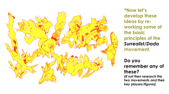
The surrealist/dada movement was an art movement, as well as a literary movement, that began around 1915 - 1917. Some of the key artists leading this movement was Hannah Höch, André Breton & Max Ernst. The movement aimed to break free from the chains that weighed down everyone during the great depression- The artistic field had now begun to evolve into a playground for ones’ imagination, challenging what used to not be acceptable in common culture.
Accident & chance
Embracing Improvisation (What does improvisation mean to you?)
BEING AUTOMATIC!
Surrealist automatism is a method of art-making in which the artist suppresses conscious control over the making process, allowing the unconscious mind to have great sway
Unlocking the unconscious mind.
In Sigmund Freud's psychoanalytic theory of personality, theunconscious mind is a reservoir of feelings, thoughts, urges, and memories that are outside of our conscious awareness.
≡≡≡≡≡ ≡≡≡≡≡ ≡≡≡≡≡ ≡≡≡≡≡ ≡≡≡≡≡ ≡≡≡≡≡ ≡≡≡≡≡ ≡≡≡≡≡ ≡≡≡≡≡
𝕽𝖊𝖘𝖊𝖆𝖗𝖈𝖍:
This weeks challenge for experimentation is bought to you by Bristol based urban artist and animator Will Barras. Your task is to analyse his work, considering the effect of the visual language (how he uses line and tone for example). Find out about him and considering the aforementioned surrealist principles write a short statement to suggest how he uses those principles in his own work.
Will Barras
vimeo
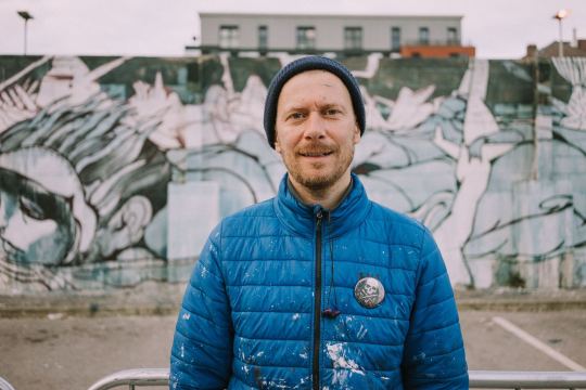
Illustrator, artist and animation director, Will Barras, currently lives and works in London, althought he grew up in Birmingham and later moved to Bristol to study graphic design. He quickly became known for being part of a group of young artists, working within Bristol’s street art scene. This then led to him appearing in a book titled “Scrawl”, alongside the artists Steff Plaetx and Duncan Jago, becoming a core and founding member of the Scrawl collective. “Scrawl”, originally published in 1999, was an influencial book made to document a new movement in street art, graphics and illustration.
Barras was selected to be one of the original artists for this collective. He was selected due to being renouned for his methods of portraying fluidity in movement. He also worked closely with creating pieces that were more narrativly driven compositions, incorperating such narratives into his line work. Barras’s unique composition of these three key elements, made his mark as an artist all the more inspiring, pushing new ideas against the grain of classic art. All of this has led his work to become staple pieces in many galleries across the globe. This includes Asia, Europe and the U.S.
He has painted a variety of different murals around the world, within this mix is one that he did with the members of his Bristol group at Tate Modern’s tubine hall, as well as one that he did for Pow!Wow! Festival in Taipei. In the studio Th1ng, located in central London, he worked as the head of animation.
Visual analysis and study:
His artwork has a very recongnizable style and feel to it. It has an urban flare to it, making it feel very fitting within the scene of street art.
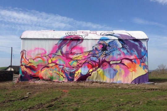
“A big barn I painted in Dumfries with Amy Winstanley for the Spring Fling festival and Recoat gallery based in Glasgow.
http://www.amywinstanley.com
http://www.spring-fling.co.uk
http://www.recoatdesign.com”
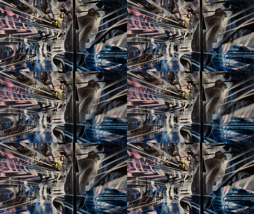
The painting below has little information about it, as for what I can find, but somehow the piece almost speaks for itself. The play on perspective, composition and values is very eyecathing. It impresses me how he is able to convey motion to such an extend that you can almost just imagine it moving before your eyes, but perhaps that’s just me.
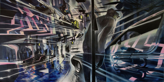
“#divinestyler #defmask #gammaproforma #kallenbachgallery”
I attemped to do some simple continuous warping animation to convey what I mean a little better:
≡≡≡≡≡ ≡≡≡≡≡ ≡≡≡≡≡ ≡≡≡≡≡ ≡≡≡≡≡ ≡≡≡≡≡ ≡≡≡≡≡ ≡≡≡≡≡ ≡≡≡≡≡
𝖁𝖎𝖘𝖚𝖆𝖑 𝖆𝖈𝖙𝖎𝖛𝖎𝖙𝖞:
01: Using a wide brush create a large sheet of accidental/automatic/ unconscious blots & splatters, organics shapes and curvaceous marks using a range of coloured ink/paint. The brighter and more acidic the better!
Because of the fact that I don’t have paper made for paints/ink, I decided to try doing this task digitally- simulating the analogue look of watercolour or watered down ink, or even arcrylics.
I did this by using a variety of different watercolour brushes, made to emulate the look of the analogue mediums. I used them as randomly as I possibly could, trying not to plan where I would put the next brush stroke.
Once I had put down all the paint stokes, I then went over it while the layer was locked with a big soft edged brush, layering up different colours until I was happy with how it looked.
02: Make 3-4 sheets of these and then let them dry.
Digital 01:

Digital 02:

03: Then using fineliner develop these marks into faces/characters/scenes by adding details/features and developing these into detail illustrations that are spontaneous and free flowing.
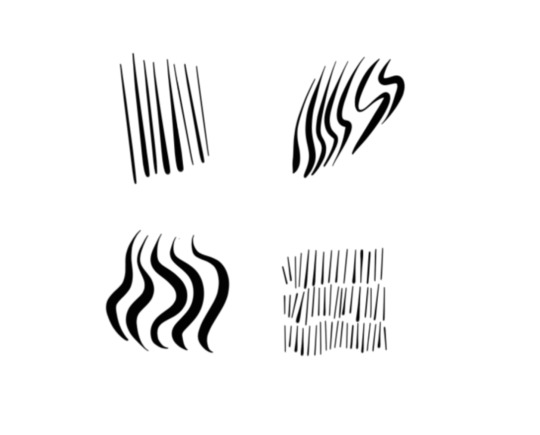
For the linework, I primarily used one single brush; hard edged and circular. (The one selected in the picture below)

I chose this for the reason being that I have found it to be very responsive to the use of a drawing tablet & pen. It does a good job at making expressive lines with its tilt sensitivity, making it a pleasure to use; It reminds me of how brush pens work and feel.
Here are a few tests on some of the lines I can create with it;
≡≡≡≡≡ ≡≡≡≡≡ ≡≡≡≡≡ ≡≡≡≡≡ ≡≡≡≡≡ ≡≡≡≡≡ ≡≡≡≡≡ ≡≡≡≡≡ ≡≡≡≡≡
Digital 01:
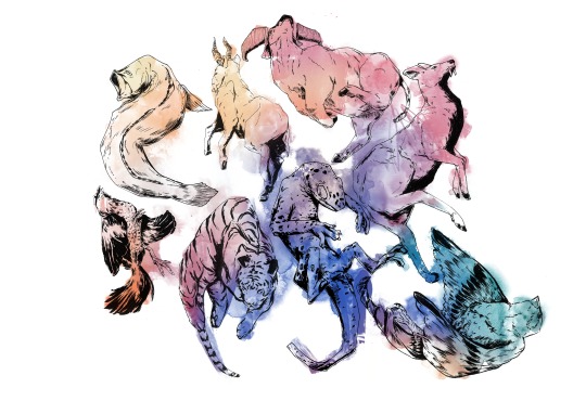
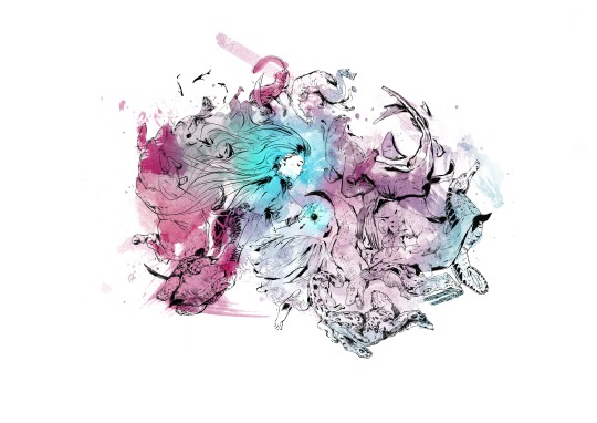
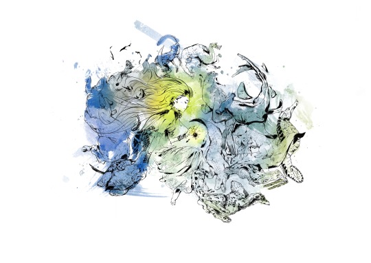
Digital 02:
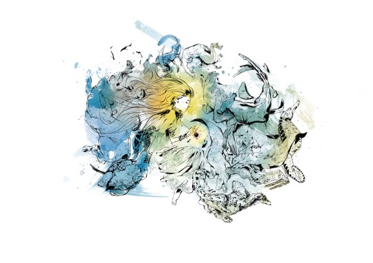
≡≡≡≡≡ ≡≡≡≡≡ ≡≡≡≡≡ ≡≡≡≡≡ ≡≡≡≡≡ ≡≡≡≡≡ ≡≡≡≡≡ ≡≡≡≡≡ ≡≡≡≡≡
Digital 02: Process
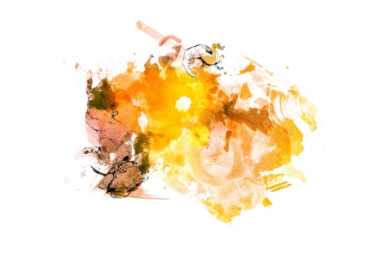
1. I have always found that beginning these blob doodles are the most diffucult for me. Perhaps because it takes me a little while to really get into the flow of continously seeing images in the randomness.

2. I began from the left, slowly working my way to the right and the top, since I felt that I had more clear lines to go from being around the edge of the paint.
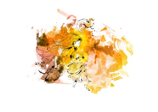
3. Eventually I braved it and went right for the middle of the piece. This was the turning point for me in the process of doing this. It enabled me to truly let get, have fun, and not feel intimidated and nervous to do the next doodle.

4. This is when I began drawing creatures of the sea, slowly building up a story/narrative.
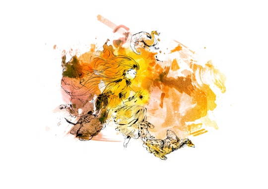
5. I don’t actually remember what I was even thinking at this point anylonger- I was simply just letting the pen guide me around the canvas; letting it all flow together however it felt as to do so.
6. I began to delve into the little details. I felt as if they would add to the general flow of the piece; being busy, yet in a manner that lets your eyes wander with curiosity.
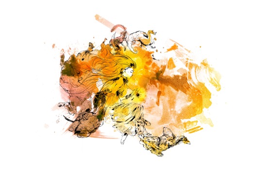
7. I was now moving on to doing the right side of the piece. I had a little more trouble visualising the top right corner, so I did that last.
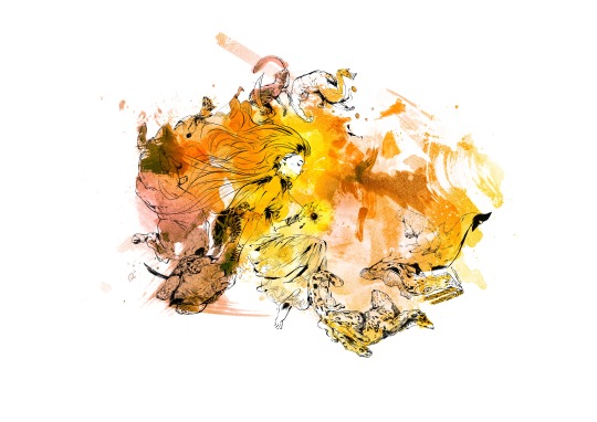
8. At this point I felt a little stuck as to what to do, hence it being, yet again, dedicated for adding some more little details here and there.

9. Eventually I overcame the frustration I had built up and took to do the right side of the artwork.

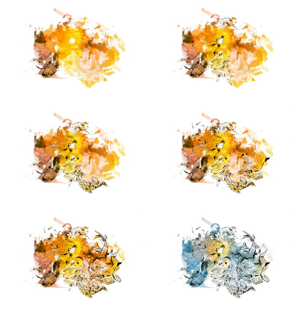
10. I tried to convey motion and flow by the way the animals are positioned and posed, trying to make it calm in the middle where the girl is, and then busy/chaotic the further away you get from her.

11. This second to last step was, again, for adding detail. I wanted to fill up any bits that I felt appeared too empty and spaced out, so to no disrupt the feeling of flow in the painting.
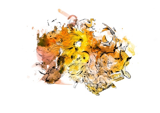
12. With the inking done and rendered to my satisfaction, the last step was to play around with colours.

≡≡≡≡≡ ≡≡≡≡≡ ≡≡≡≡≡ ≡≡≡≡≡ ≡≡≡≡≡ ≡≡≡≡≡ ≡≡≡≡≡ ≡≡≡≡≡ ≡≡≡≡≡
Digital 01: Colour variations
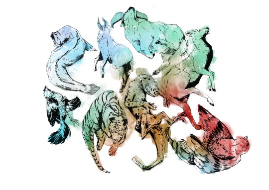
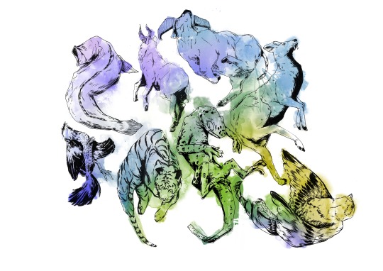
Digital 02: Colour variations
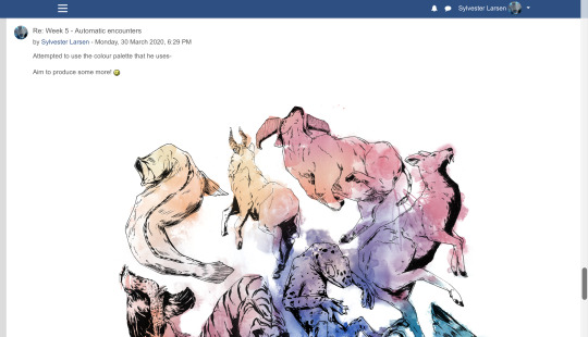
04: Scan/photograph and upload to Moodle.

≡≡≡≡≡ ≡≡≡≡≡ ≡≡≡≡≡ ≡≡≡≡≡ ≡≡≡≡≡ ≡≡≡≡≡ ≡≡≡≡≡ ≡≡≡≡≡ ≡≡≡≡≡
𝕱𝖎𝖓𝖆𝖑 𝖗𝖊𝖛𝖎𝖊𝖜 𝖆𝖓𝖉 𝖗𝖊𝖋𝖑𝖊𝖈𝖙𝖎𝖔𝖓:
Which of these words would you use when discussing the work of Will Barras and your own art pieces:

I would most definitly use;
Organic/Fluid
Figurative
Automatic
On top of these I would probably add;
Harmonic
Dynamic
Epochal
Visionary
Can you construct a comparative sentence/paragraph using at least 5 of these words. What are the differences and similarities between the works you have created. What conclusions did you make about this experimentation?
2 notes
·
View notes
Note
Any thoughts on the cover of Everless?
So i guess it’s time to talk about Billelis, the man responsible for all of these:
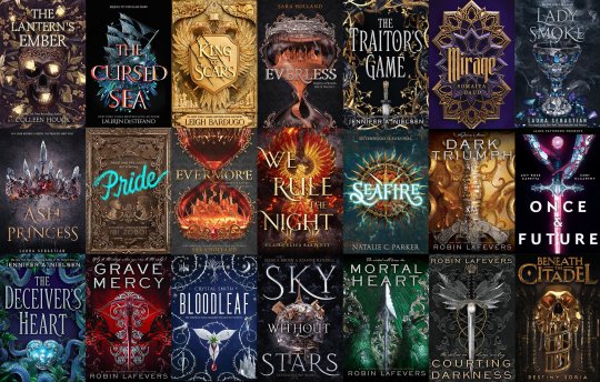
Homeboy is a freelance digital artist and a HOT COMMODITY in the ya/ fantasy sphere right now; a quick browse of his instagram shows a STRONG visual brand of skulls/bones, metallics, dense, intricate baroque-type detailing, florals/bugs, and religious iconography.
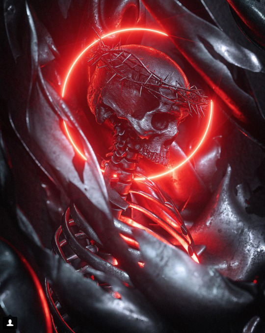

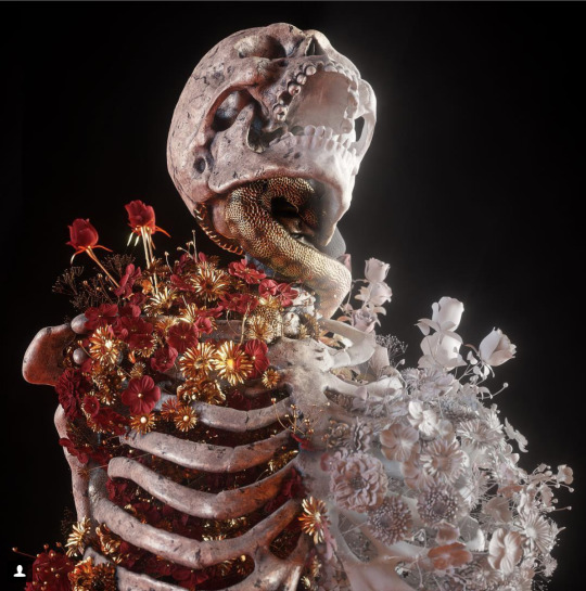
whispers fucking superb, you funky little goth.
His work is staggeringly cool, if of a fairly specific range, and it’s not hard to see why publishing has No Chill about it. It’s a kind of highly-executed middle ground with the drama and realism of photography but the #aesthetic and the high level of visual control of illustration, something technologically new enough to feel Fresh and Cool.
But knowing how good he is (and what his comfort zones clearly are) makes an interesting case study of his various covers re: how art direction + design + illustration all come together, and how an excellent illustration (or illustrator) does not necessarily a great cover make.
the King of Scars cover stands out as an obvious triumph, but my favorite from his portfolio is actually Pride:
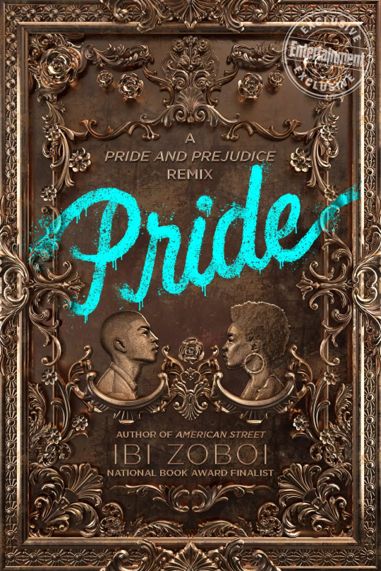
I adore this cover, and I think it’s a fantastic case study of art direction, design, and illustration all working together perfectly to create an attention-grabbing, relevant, and conceptually sound cover. I don’t remember if i read this on the authors twitter or in some blog post back when it came out, but it’s based on those old tin ceilings:
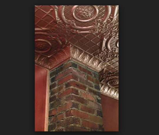
Which is a cool idea that speaks to the idea of antique wealth/ Fancy Old Ass Houses (and possibly to something region-specific that I’m not informed enough to speak to?), which is arguably the bedrock of any pride and prejudice retelling. The ornate, old-fashioned detailing and cameo-style portraits are gorgeous and create a really striking contrast to the bright blue, organically textured, modern, messy-but-still-feminine type that effectively communicates the contemporary setting and creates a strong hierarchy without detracting from how pretty the whole design is. Everything is working together, and none of the elements could be extracted without diminishing what the design is communicating about the book.
Contrast to pretty much every one of his Object Covers.
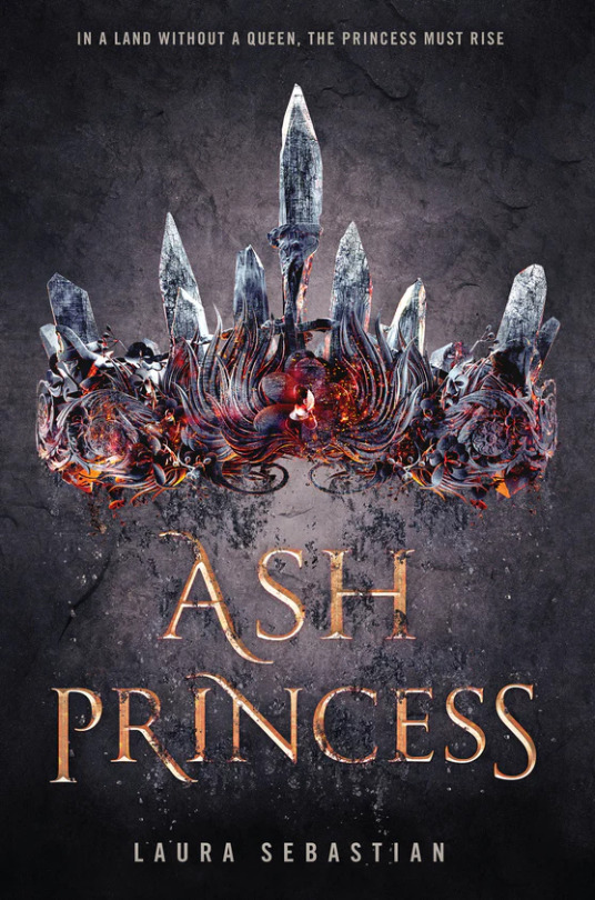
I don’t hate the cover of Ash Princess or anything, and i’ve talked pretty at length about what makes object covers work or not work in the past, but rather than a cohesive, clever design, you have super basic text overly relying on a pretty but meaningless illustration that isn’t integrated with anything else except some heavyhanded textures. This stuff is just like. There. The illustration is executed at a very high craft level, but it’s not really telling me anything except HEY YOU KNOW THE 192734628 OTHER BLAND, NEEDLESSLY GRITTY YA FANTASIES OF THE PAST THREE YEARS, WELL THIS IS THE SAME DANG THING >:)
(Which..... knowing the gist of Ash Princess, is perhaps the only thing there was to communicate. Whatever. It worked for them. eye roll emoji.)
And again, none of that is the artist’s fault-- illustrators in this scenario are more or less told Exactly What To Draw and art-directed through the process, and generally the designer does the type and some additional editing/ compositing. And sometimes the art directors are like “we’re going to elegantly communicate the cultural influences of a book to represent the tone, characters, themes, and setting” and sometimes art directors are like “SLAP A CROWN ON THAT BITCH IT WORKED FOR RED QUEEN.”
(I’VE SAID IT BEFORE BUT NOBODY ACTUALLY GETS WHY RED QUEEN WORKED AS A COVER AND IT WAS BECAUSE THE DETAILS WERE REALLY SPARSE AND VISUALLY WELL-BALANCED AND SUGGESTED THE THEMES AND CONFLICTS IN THE BOOK! QUIT STICKING MEANINGLESS OVERRENDERED CROWNS ON EVERYTHING I SWEAR TO GOD.)
But as those object covers go, I actually do like the Everless cover.
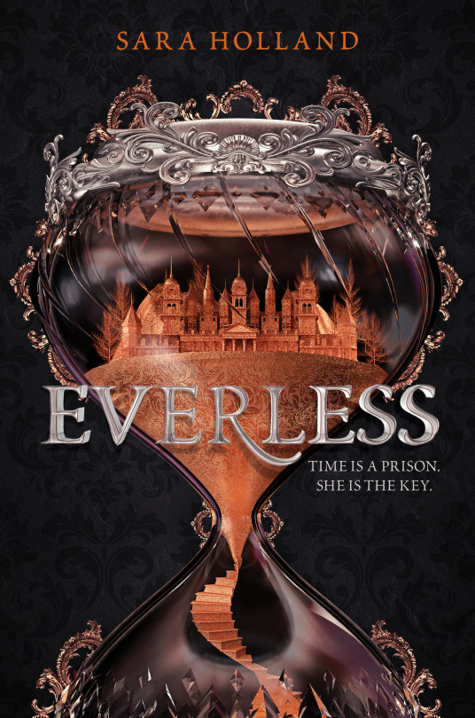
It too relies almost entirely on its illustration, but the type having dimension of its own and sitting on top in a thoughtful way at least creates a lockup effect that does make the cover feel like one “thing” as opposed to AN OBJECT plus AN TEXT. And the hourglass itself is interesting! I really like the idea of, if we must do an object cover, that it be something more abstract and thematically relevant that incorporates multiple ideas (here opulence as well as the passage of time as well as the idea of being trapped in the manor that’s key to the pitch) rather than THERE IS A CROWN IN THE BOOK SO,,,,,,,,,, CROWN O N T HE C O V ER,,,,,,,
They also really let Billelis’ great work shine in the intricate details he’s so good at, rather than drenching them in added texture and ~ special effects. And the 3/4s cropping of the bottom part of the hourglass is crucial-- it adds a vertical asymmetry/ almost imbalance that’s much more visually interesting than the full thing would have been.
I don’t really want to talk about any of the other covers in depth because they’re..... mostly mediocre, design-wise (again, with the exception of King of Scars, my life, my love) and I’ll start to sound repetitive, but some of them are better than others. I adore Billelis’ work in and of itself and i just want him to be happy and run free in a field of golden skulls; I’m glad he’s got a steady stream of work but boy YA could stand to utilize him better.
I also want to posit that his relatively EXTREME niche popularity points to a lack of highly skilled 3D illustrators, or at least ones willing to do work in this sphere-- I don’t know enough about that area to really know what the deal is, but I can’t help but feel like there’s clearly room here for more artists who do similar work at a similar high quality.
And i do mean high quality, because there are definitely books out there with Similar but Noticeably Worse aesthetics, hi Three Dark Crowns and company:
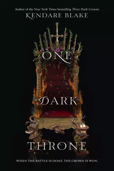
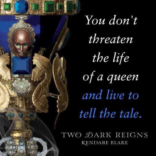
Like..... I don’t know enough about 3d sculpting to tell you mechanically why 3DCs’ graphics all have that unfortunately common plasticky and fake look of mediocre renders, but they do! Billelis’ work is just executed at a more sophisticated level, and i’m certain there are other people like him out there that publishing just...... has yet to discover, and I hope they do.
219 notes
·
View notes
Note
1 Hi, I’ve been studying MBTI and the cognitive functions for nearly two years now and have narrowed my type down to ESTP. However, I’d like to have a second opinion on what my type actually is, just to make sure I’m not overthinking things or missing anything. I’m actually also teetering over if I’m actually an introvert or not so I hope I can get some clarity from you.
2 Perceiving Axis So I narrowed my type down to being SP. Firstly, I related more with sensing, specifically Se, than with intuiting. I am very present minded. I would rather focus on the present because what you do now is the only thing you can control. I don’t think about the past much, because you can’t change it. Neither do I think much of the future. The future is too unsure. You never know what can happen, even if you make plans for it.
3 Now, this doesn’t mean that I don’t think about the past or the future. Sure I like to look back on my childhood and what I’ve experienced, but I don’t dwell on it. I’d also like to input that another reason I don’t look back in the past much is because I actually have to try and remember things that have happened before (i hope this makes sense), unless someone triggers my memory.
4 It’s like it takes more energy than is worth using so I don’t usually bother trying to look back to the past. Or maybe I just have horrible memory and I’m blaming it on Se hahaha. The reason that I chose Se over Si is because Si users are usually described as using, “tried and true ways”. However, I’m the type of peron who likes to try things just for the experience.
Uhh i actually forgot the numbering lol One slightly recent example was, a few months after I graduated from graphic and web design school, I decided to try out med school. In another country, the Philippines to be exact since you can apply for med school as long as you graduated a B.S. in whatever course. I wanted to see what med school was like and naïve me thought it was fine cuz I was also interested in science when I was in highschool.
In hindsight, it was such a stupid idea cuz, lemme tell ya...med school is no joke and it’s super hard! Anyways that’s a different story. Moving on, assuming Se is high in my stack, that means Ni is lower. To tell you the truth, I have a hard time understanding what Ni and Ne, really do besides that Ni takes patterns/concepts from multiple points and zeroes in and works with one point, while Ne takes one pattern/concept and expands upon it.
An example of low Ni would probably be going back to my med school escapade. I never took into consideration what would happen if I actually got into med school. Another example would probably be one time I went downhill on a penny-board, even though I had a gut feeling that I probably shouldn’t because...A, the penny-board doesn’t allow for you to have a large center of gravity because of how small it is, and B, hello?steep slope???
So I ended up losing my balance and falling on my right side, getting scratched and bleeding from my knee to my head, as well as getting a slight concussion. I then decided to save up for a long board so I could skate downhill with less chance of losing my balance haha. Also, idk if this is low Ni or just me being stubborn, when I’ve thought long and hard to make a decision about something that matters to me, I have a hard time changing my mind afterwards.
To clarify, I’m usually open to different perspectives to help me make a decision and because of this, when I finally make my decision, it’s final. It’s difficult to try and change my mind after I’ve finalized my decision. You should’ve said it before I made a choice. Judging Axis I’m actually less sure about my judging axis. I like to do things in a “trial and error” fashion and figure things out by myself.
Doing this with as little help as possible gives me a sense of accomplishment. I’m the type of person who wants to understand why or how things work. This is one of the reasons I got so into MBTI and cognitive functions, because it helped me get a sense of how different people view the world. Idk if this helps, but I like to be specific with the words I use. This is so that what I’m talking about is shared as accurately as how I’m thinking it.
I usually try to keep my emotions in check and control them. When left by myself, my emotional state is usually calmness. I usually need outside stimulation to get more emotions out of me, i.e. music, movies/shows, people, etc. I actually consider myself to be emotionally reserved. I usually show people that I care about them rather than say it. I don’t tell people I love them all willy-nilly. I’d rather say it when I mean it.
I remember an instance when a family friend told me they loved me, I smiled, said “thank you”, and then hugged them. I said it in a way implying, “thank you for loving me”.
Kinda like that. I also don't like showing people when I’m sad or having emotions that can bring the atmosphere down. For example, there are times when school just becomes too much and I get super anxious to the point of having an anxiety attack. If I were with my friends, I would leave them and go find someplace to be alone, where I could let the attack pass and calm myself down.
I don’t like labelling my friendships as to “bestfriends”. I have groups of friends I consider close to me, but I don’t consider anyone to be my “bestfriend”. I do this because you have different friends as you go through different stages of your life. And you’ll have different sets of friends who are there for you during those different stages. How can I pick a “bestfriend” when different people have helped me and been there for me in different ways in my life? Thanks so much for your time!
---------------------------------------------
You know, someone recently made a semi-joking comment to me about how anyone who sends in an ask of over 5-6 parts is almost certainly high Ne, and I’m not saying that’s automatically true, but it is more often than not. On that note my (old) FAQ is back up for now so anyone else who wants to send in an ask that hits the double digits lost their window of opportunity.
First paragraph: useful information is that you’ve self-typed as an ESTP considering that you might be an introvert.
2: Both Ne and Se users tend to focus on the current situation so while I’d rule out high Si/Ni here I don’t see anything that specifies Se - nothing about sensory information.
3: I don’t really know what this means because this sounds like just how memory works - either your memory is triggered by something, or you actively try to recall something.
4: I agree we can rule out high Si but I don’t have any understanding of high Se vs. high Ne; we still only have that you related more to Se but you don’t say anything about why.
5: Trying things just for the experience also fits either Se or Ne.
6: there is no new information in this section
7: Possibly more Se in terms of specifically impulsive physical behavior but this is a single anecdote so I wouldn’t consider it decisive.
8 - 9: trial and error are again more of an extroverted perceiving trait in general; the decision-making just seems like a normal decision-making process. I would rule out high Fe perhaps, but since I’m already confident in high extroverted perceiving that’s already not an option.
10: nothing useful in this section
11-12: possibly more likely thinking than feeling based on the need for external stimuli and showing rather than telling.
13: anxiety attacks are not MBTI so I hope you’re getting external help for that but from a typology perspective it doesn’t provide much information.
14: this sounds like a weirdly logical way of thinking through the concept of friendship, so high Ti does fit.
So: I think you are most likely a high Ti user. You may be an introvert in terms of how you recharge but in terms of your behavior it sounds far more like a dominant extroverted perceiving function. However, I can’t tell here if you’re a high Ne or high Se user as I don’t have a sense of what sort of information (abstract or concrete) you use and trust.
6 notes
·
View notes
Text
Giving Instructions
I chose to make an illustration on the category “getting to my house”. Ironically I got a bit lost with this exercise, it was the first project somewhat similar to the representative illustrations of the last course section, so I was a little overwhelmed trying to apply advice from my tutor feedback along with deciphering the instructions. I have a slightly different way of interpreting language than others since I’m on the autistic and adhd spectrum so one of the key challenges of a distance learning course is making sure I’m reading the instructions properly and staying focused on the brief instead of getting kind of carried away in other directions that I might find more immediately rewarding. So because I can find it hard to follow instructions, a task about giving instructions with as few words as possible was tricky! Balancing informative and aesthetic interests was challenging too, since if I was looking for directions I’d find the clearest map possible. Similarly as someone who plays musical instruments, it’s easiest to learn music from sheet music...and making a cup of tea is such a basic thing I don’t know why you’d need instructions for it. These were my initial personal reactions at least. Just now writing this I’m thinking, ok, so who would the audience be for tea-making instructions? And actually they could be useful to a lot of people - people learning to make tea, or people who benefit from visual reminders for everyday executive functioning tasks. Or for a specific tea recipe, like a London Fog or chai or fruit iced tea. Or if the tea-making steps were presented in a really striking graphic design it might work as a print to hang up in the kitchen for people who are really into tea? With hindsight and these factors in mind I think with “Getting to my house” I chose the most complicated and challenging category for me personally, and there’s probably a good lesson to learn here about starting my Learning Log posts off right at the start of the project so I can work through some of these things as I go instead of after.
Initial artist research, style inspiration
Johnny Hannah’s Darktown - suggested by my tutor, a fictional town formed of memories and inspirations and obsessions. I thought maybe I could be inspired to represent my home town in a similar way, bring in some of this magic realism and let my inspirations and experiences colour my depiction of my way home. Looking at his art style, together with Tim Smart’s, another artist suggestion from my tutor, served as a reminder that illustration can be bold and anarchic and expressive and that interesting mixture of aesthetic “flaws” and technical prowess. I particular loved the wonky perpestive and atmosphere of these pieces by Tim Smart, they feel so atmospheric and dramatic from his use of lighting, coupled with bold colour and scribbly textures. I also was really enjoying Jeffrey Alan Love’s use of strong shape/silhouette and texture. These three artists inspired me to try a way more messy and expressive illustration style in this exercise.
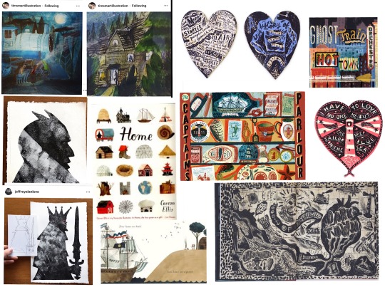
Style exploration/mark-making
Mini studies from Carson Ellis’ “Home”, some from details of Darktown book (A)
Determining steps (B)- after some brainstorming notes I drew a map of the village to get my bearings a bit. Some very big and scrawly paper sheets trying to work it out. Eventually I went very very literal and took photographs along the whole route home to refer back to in the hope I could figure out which shots would be most key in giving someone else directions.
More markmaking and style experiments kind of following on from my Carson Ellis and Johnny Hannah studies (C) none of these really appealed to me, at this stage I was just playing with mediums and seeing what stuck.
James Gurney Light and Colour house watercolour painting (D)
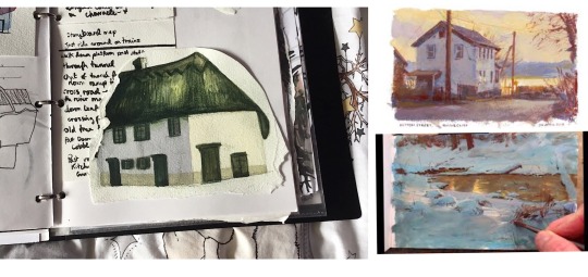
After my more cartoony experiments I tried painting a house on my route home with watercolours in a more realism-inspired technique, and I found this really rewarding. I’m really attracted to super bold zingy colours but this can get in the way of creating the kind of moodier atmospheres I’d like, so I’ve been reading James Gurney’s “Colour and Light” and watching his gouache process videos to learn how he creates these gorgeous heightened, almost magic realism paintings. As I was painting this house I tried to begin to apply what I’ve learned from him regarding how atmospheric light affects colour saturation and temperature, and how your eyes can trick you as to what colours you’re actually looking at.
Specifically with my green and white house painting, I found I actually needed a cold blue gray for the longer wall, with a little bit of purple added to warm it up just as it comes to meet the side of the house lit by the sun. For this wall I used a warmer creamy sand tone wash.
James Gurney on the benefit of “gross” colours - “More paintings suffer from the “fruit salad disease” of too much pure colour rather than from murky mud....the cure is good value organisation...a well-placed gray makes pure colour sing.”
Final inspiration moodboard for drawing my route steps - Johnny Hannah kind of folk-punk roughness, Andrew Wyeth-inspired dirty smudgy winter textures and restricted colour palette, bringing in a bit of gothic dark folktale inspiration from the art style of the animated show Over the Garden Wall, which combined a painterly grisaille style rendering with large swathes of block fill shadow for the background art. This had the dual benefit for the background artists of restricting the amount of painterly detail and looking really really cool and spooky.
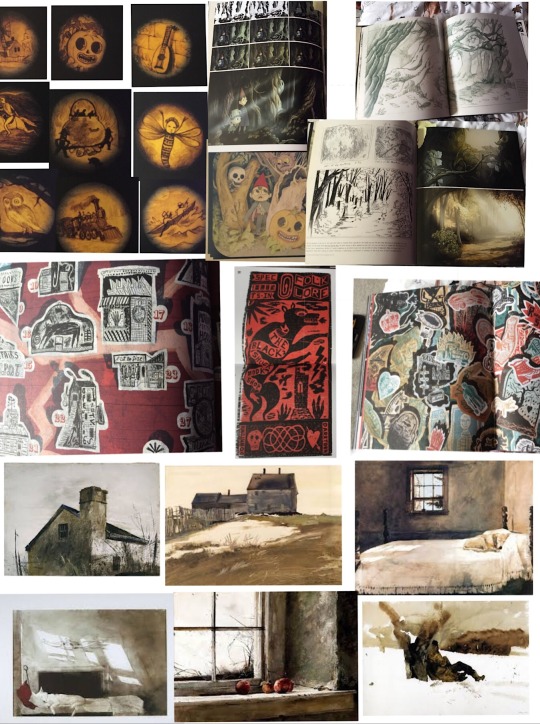
I did some more style experiments following the ideas above, from this moodboard (E) I also had an idea inspired by Johnny Hannah of using quotes/song lyrics/poem extracts. I could use these to tell a story along the route, I like the scrawly handwriting writing with a brush pen makes (F).
Really rough route thumbnails (G)
Drawings from my route photo steps - plastic wallet
Digital work below - layout experiments/format
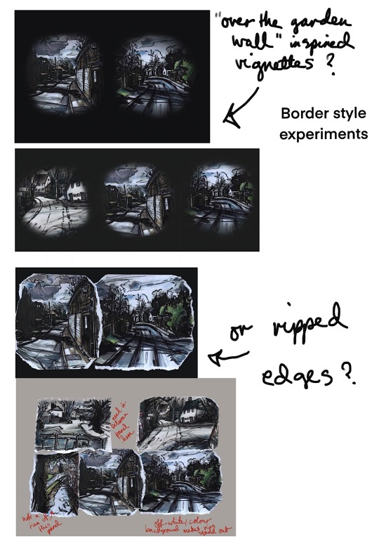
Development ideas
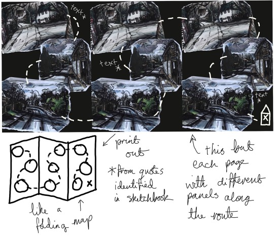
1 note
·
View note
Text
Cosplay Models
Need to buy X-Males t-shirts online? Whether you will have a love for The Avengers, Incredible Four, Thor, or X-Males there are a lot or t-shirts and different merchandise to personal. My childhood included a love for 60s and 70s Marvel and DC comics, and my capacity to draw originates partly from studying the stories I read in these days. We worked for a year collectively on the piece to plan and draw it. Toy corporations like Hasbro and Kenner used to supply thousands of Batman motion figure than is launched yearly with some variation in it. Transformers 2, the science-fiction movie is the latest sensation, and is essentially the most awaited film of the year. Let's take the movie Avatar for instance. From time to time I went back to the sport to take a couple of extra screenshots to extend a plot. Within a few minutes, I started making comedian strips. Not like his different comic strips, in Battling Boy, the hero is a kid, who's on a mission to save the town.
In reality, the opposite series of battling boy turned fashionable. To conclude on this matter, I think it's an important thought to give our kids the funny comics created approach-again-when, comics from your and my childhood. To read a narrative in adventurous manner is quite exciting for all the kids. You've to beat the limitations of speech bubbles and the issue of telling a narrative body by frame. Admit it you have! I’m sure you've heard this standard online store. Since Youngsters's Graphic Novels are really simply an old thought with a fancy new title, why shouldn't you discover taking old profitable comicbook concepts and reinventing them for a new era? The concept was to convey the same which means with phrases that I steered by means of colors, textures and pictures. Popular Online Comics solidify a that means of a word because footage help which means to words. The nomination was a serious achievement for an artist who had - fairly literally -started out small, drawing Post-it note sized comics and hiding them in different people’s work in bookshops. The first comedian strips appeared in Germany in 1865. It was about two boys who're getting punished for at all times entering into mischief.
Furthermore, if we're trustworthy with ourselves, we all know that a number of mischief is downright funny. Why are outdated coins price greater than at this time's coins? Full collections will fetch too much more than random particular person comics. Our goal is to present our readers an excellent piece of entertaining and educational comics on which is able to grow up not one of the longer term generations. These blockbuster films plays an important role within the comeback of comics. Individuals who want to cherish their childhood recollections with the comics; they can easily find cheap comics to start their comic collection. In this present day of "I would like the newest and latest," we really find that some of the actual treasures are things of previous. Comedian books are detailed tales. Apart from conventions, yard gross sales and used ebook stores can also be extraordinarily cost effective sources for collectible comic books. A comic e-book adaption in addition to a novel publication is being carried out for the movie's promotion. That assumption is unsuitable and is an insult to the whole comedian book neighborhood.
These comedian guides provide you with the kind of knowledge you want like where to get the uncommon and helpful comics and the place you will get first situation comics as effectively as the again subject ones as nicely. By promoting and buying and selling comics you will be there were the art work is most enjoyed and valued. Moreover, that is where you get the meet fellow fans and catch up on the newest within the comedian books world; information that may prove invaluable. Some comic books editions are collector's items and if preserved in mint quality situation. Books are limited because the reader cannot physically see what the author envisions. Are those behaviors to be condoned? Eyes develop into circles or dots, mouths are lowered to curved strains, and noses or feet are triangles. Get the most recent news. Those who already consider large abilities of our web site, confess that it is admittedly the most convenient and simple approach to be in contact with the latest innovations of the world of comics.
Properly aware of the advantages that come from reading comics. Which Marvel comics do you have to learn before (or after) Captain Marvel? Repetition. Go back to your DC Titans every day newspaper and look at the comics’ web page. The cartoonist is utilizing repetition to identify the character. Due to this fact, we could say that it has nothing to do with a altering trends, whatever is new and trendy, photo to pop artwork print stays within the midst of its identified usability in subject of artwork. I seemed, and there before me was a pale horse! There actually is one thing for everybody. Cosplay additionally means costume play and the fans often come to the comedian conventions dressed in costumes. Eight delectable Expansions that adopted added to the joy of the sport play. Then by all means, use it. Through the use of these exaggerations, it doesn’t matter what different particulars I include. The possessed doll first hit the screens within the 1988 horror basic 'Child's Play'. Corey Haim, the lead of the original horror film, and Corey Feldman, the two Coreys, reprise their original roles. However, in 2003 Hasbro would relinquish control to Batman's rights to Mattel. You also get preferential remedy in some cases and entry to special occasions and performances.
Best Walking Dead Collectible Action Figures and Graphic Novels The Amazing Spider-Man hasn't been considered one of the most popular super heroes. I tend to be of your Batman and Wolverine sort of guy myself. However, I can't sell Spidey short when talking about his history successful summer blockbusters. He's been in some hits which are considered to be thousands of comic movies ever. The next work for balance box office glory from Spider-Man is reboot and yes it stars a new cast which has a somewhat familiar story. Only time will tell how whether or not this can live up to past glory of their predecessors.
First some definitions, specifically just what comic, a graphic novel, along with a Manga. A comic can be a format to provide a medium, within our case a tale. A graphic novel is only a longer comic. However, parents often get concerned once they hear graphic novel, mistakenly thinking it's got something to do with graphic such as inappropriate adult material. Graphic in our case merely means art. Graphic novels are certainly not a genre boost the local tissue. There are graphic fiction, graphic nonfiction, graphic mysteries, you get the idea. Finally, Manga is a Japanese term for their comic medium which enable it to be quite fun for kids since it reads from right to left. Kids often love this given that they can easily conform to the format but their parents generally battle to read them. Loki, he in the golden horns who had earlier made life difficult for Thor inside movie Thor, runs a pact having an unknown race, an alien race, may help him extract his revenge, if he opens a portal for them to attack Earth. Loki does what he could be told, and steals the Tessaracat (a McGruber if there ever was one), and opens a portal for your other world to fight Earth. Loki steals the Tessaract, requires a band of scientists and Hawkeye under his command, and opens a portal that literally brings the aliens onto Earth.
But as companies use digital comics to reach new potential markets, will the entire process of comic writing and drawing should evolve at the same time? Until now, the phrase "digital comic" has often been employed to describe a print product scanned right into a computer. Even webcomics, which are released digitally, in many cases are designed specifically to be gathered into print editions; in fact, this is often the goal of webcomic creators, since the digital versions are free. But a lot more creators are coming up with truly digital comics, involving screen technology to see stories in a manner that print cannot. Will this customize the convention of writing monthly comic scripts with twenty-two pages of content? Or will storytelling chapters be broken into shorter or longer sections, with corresponding changes in release schedules? And will these creators still try to collect their stories into print versions, knowing some of the storytelling itself is going to be lost from the conversion to print? Stay tuned, the subsequent couple years should provide some interesting new answers.
Owning and paying attention to a radio or perhaps a radiogram would be a wonderful experience, particularly when it turned out capable to grab stations from around the globe. The fact that they crackled and were packed with a number of interfering noises simply didn't matter at all. Of course, there were no such thing as television with an alternative source of information.
1 note
·
View note
Text
Creative Problem Solving Interviews
To get a sense of how design professionals use creative problem solving techniques to tackle industry challenges, I interviewed three experts and asked two questions:
How do you generate ideas? (How, when, and where are you inspired? What inspires you? What obstacles do you face in coming up with a new idea and how do you overcome those obstacles?)
What process(es) do you use to solve problems? (Describe the steps of your problem-solving process. Explain your journey from inspiration to implementation.)
Niall Fitzpatrick - Photographer
How do I generate ideas / What inspires:
There are different specialities in photography. Folks that go deep in a very specific specialty; and others that take a broader array of interests, are perhaps two extremes. I tend lean more toward the latter. I'm very interested in exploring daily settings (people in action, portraits etc., for example); and street and landscape photography. I let the project lead me to an extent. That said, being "prepared" is essential. I like to build a story with my photos. I’m always looking for a way to use the moment and timing to describe the project. This requires a few essential elements:
Base idea framework: having a conceptual framework for what I want to achieve - a loose framework with not too tight an expectation. This allows me to follow my eye and the surroundings to evolve the story I’m trying to describe.
Inspiration: The surroundings, people, landscape, and light - these are elements of my inspiration. But really the biggest element of inspiration comes from taking the time to "see." It's tempting to hurry through a photo shoot; or settle for a "good" shot. But I find that for inspiration to flow I need to take time to see. This can manifest in different ways: Looking at the setting from different angles or perspectives, snapping to warm up with 'no expectations'; sitting and watching; exploring and walking; ultimately getting in the 'zone' which is when I'm thinking less and doing more. Ideas beget ideas.
A willingness to follow the flow: Things often don’t go to plan. A subject shows up late; the sun doesn’t come out; the scene isn’t what you anticipated. I like to follow the moment – see what happens naturally. How can I use it? These elements often present subconsciously “in-the-moment” but the critical element is a willingness to be flexible.
What obstacles do I face?
Lack of focus is a critical blocker for me - feeling rushed in process or not being prepared.
Bringing Energy: In addition, particularly when people are involved in the shoot, making sure I have energy to bring to the project, to motivate others and or direct the subject. A tired me is a less creative me.
Being Prepared: Finally, it is critical to be prepared. Being prepared includes a fluidity with the camera. If I put my equipment away for a period of time and then pick up and shoot it invariably means I am not 'one' with that camera. This leads to basic mistakes: overlooking critical settings; shoot perhaps at wrong settings; slow and focused more on camera than subject. The more I use a camera the more fluid I am - hence why I try to shoot daily.
I overcome obstacles by:
Being practiced and fluid with the camera
Well rested
Creating an environment of relaxation for both myself and the subjects of my photos (where people are involved)
Where possible researching the setting
Timing the setting (golden hour, planning for ideal light, etc)
Continual study of photography; in particular examining and understanding the art of others
What process(es) do you use to solve problems?
In photography problems arrive in a variety of possible categories including:
Subject not presenting as expected or not willing to participate as expected
Lighting (how is the light at this time - soft, harsh, other)
Setting (physical surroundings) not as anticipated
The objective (why am I here not going as planned)
When I approach a shoot I try to keep these things in mind so I’m prepared. The best way to ensure you can overcome a problem during the creative process is to be prepared and focused. The journey from inspiration to implementation involves ensuring I am ready; have timed the shoot (conditions), can take advantage of light, and know how to engage my subject. It’s also important to have a mastery of the technical approach. Knowing how to use in-camera or post-processing techniques to achieve the desired outcome. In the end though –inspiration often comes from the moment. Implementation comes from practicing technique such that one thinks less about the camera and more about the objective.
Alecia Lewis - Graphic Designer
1) Idea generation, inspiration, and obstacles:
Idea generation and inspiration: I'm often inspired by people - the more you know and understand and develop real conversations and empathize with them and how they relate to things. That's true communication and that's what really inspires me to do great works that connects people with ideas. Of course, I also subscribe to several design blogs to see trends and see what's new and how others are solving similar problems. Often, I just think "Man, they're so clever, how do I improve on that?” Really, I'd say my most creative pieces were thought of after hanging out with a big group of friends. Then, on my way home or laying in bed, I'll think about a project I was working on, and instantly the ideas start to form. I substantiate my ideas with a real understanding of best practices and commonalities, or biases that already exist around us, almost capitalizing on them.
Obstacles I face are really deadlines and ignorance. People who contribute to my work as a designer, while they provide their expertise of the market, often aren't aware of design principles, design thinking, or best practices for that matter. They've often not even Googled design terms like "hierarchy". Just the other day, the executive who claims to be a strategist with all of the experience says, "Oh, well, I don't know your lingo." My lingo isn't some revolutionary terms or design speak. It's founded in basic, standard terminology that designers use. With all of their experience "working with designers", you would think they would have compassion or respect and would, at the very least, Google things like "design principles" and see that not everything can be the same size. In order for your CTA (call to action) to actually evoke an action in their audience, it needs to stand out, not be surrounded by everything else.
As a designer, I’ve exposed myself to the executive’s field and researched best practices and developed personas. I ask questions about the piece - where it lives, why it lives there, how the viewer gets to it, etc. Oftentimes people haven't thought about the process in a holistic way, but I, as a competent champion of effective communication, have knowledge of the sales cycle, market strategy and economics, and I always approach things in that way.
I overcome those obstacles in a variety of ways. Just as I'm designing a print or digital piece, I take the same path to addresses my frustrations - define, identify, research, understand, relate, concept, create, execute, test, evaluate, complete. Essentially I try to put myself in their shoes, understand the problem from their perspective, and address it by provided validated information that supports my views, and enlighten them to why I make the choices I make.
Sometimes people recognize the effort, applaud, and move on. Other times they could care less and just want it their way. I'm not always right, but I do always have a purpose so it keeps me motivated. I will say though, this is also the reason that I changed jobs - because I worked with people who didn't care to be better, do better, or communicate better, so I changed jobs to find more purpose - to use my creative talents to advocate for something I believe in, which is affecting positive change in the world.
So now when I feel defeated by idiots, I still have the reward of doing good work for a good cause. Oh, and the deadlines - well, everyone thinks creativity is like science. “It should only take 2 hours. Last time it took 2 hours, so this time it should.” Well creativity isn't a science, it's a journey. Every new piece is a new story, and it's extremely frustrating when the story has to be told too fast and you skip parts. Because if you skip too much it doesn't make sense.
2) Process to Solving a Problem:
Every designers process is different, but the good ones are similar and start with
Defining the problem: So many times people who request work have no idea what problem they are actually solving - which seems insane, but is absolutely true. Literally, they'll say "I want x" and I start asking questions and they actually want "7%dg".
Next, you identify your audience: understanding them, their likes/dislikes, why they do what they do, what they need/don't need... relating to them and almost becoming them.
Research and more research: Now that you really know the audience, you do a real competitive analysis - you look to see what competitors are doing right and wrong, and understand the real value proposition so that you can differentiate your solution from theirs.
Create: Because we can relate to the audience and understand the market, we get to create - you could use any word here like develop or ideate - either way, this is the sketching, the inception of the idea, the concepting phase - this, to me, is the most fun part.
Execution: which is the creation of the piece, the development of the idea - massaging the good ideas and eliminating the bad ones that may have had potential but don't solve the needs of the audience.
Testing: this is when you send the piece out and actually obtain feedback. Often the feedback is measured in sales initiatives and lead gen numbers, but really it should be like an email. You send two out and judge the outcomes compared to each other. Then you deliver to the world because now your work is validated. It helps the viewer, it dismisses alternatives, it is validated. Now it should be approved to be printed or coded and sent out to the masses.
Reflection: Then the key is to look back - and reflect. This is the retrospective, which rarely happens, but always should - this is the discovery of the process, it's efficiencies and inefficiencies. You get to find out if the piece and audience are really who you think they are. Seeking a true understanding of what worked and why it worked, or what didn't, and being honest with yourself that we're not all brilliant every time, but we need to grow from the feedback and let it continue to nourish your next iteration,
Completing the Cycle: then the cycle is complete because you've solved the initial need or provided the initial solution, while also informing the next piece.
So often, defining the problem, the persona development of the audience, the research, ideation is skipped. The testing and retrospective -- all of these phases are skipped because someone says, "I need X" and incompetent people say, "Designer, you have 2 hours to give me X" while no one asks questions are challenges the reasoning. So "X" is not a true solution. It's an unsubstantiated demand that will likely produce some success, but not the success that a truly validated, well thought-out initiative could have provided.
So I'll say the general process is, "get assigned, ask a million questions, research, design, revise based on feedback from non-designers, attempt to educate them, revise more, then send out to the public to be forgotten about" lol ...but real designers like me have adapted. For instance, I don't know every audience member but I've formed a generalization that I can attribute to the brand, then I ensure that I understand the holistic nature of the piece, and then design.
Also, I'm not even sure these are all of the steps, but, that's basically everything. The funny thing too is it's on my list to put something like this together for my company - to truly show the executives how much more productive and proficient our company could be if we followed a real process, and to also explain to them why things take so long - because good design can't be bottlenecked by time. It has to be well-informed in order to inform the right audience and produce the best results. I'll also add: the creative team I'm on is referred to as "Creative Solutions" because we aren't a "service" department, we don't cater to people's needs of X - we are presented with a problem and create solutions that solve those business needs.
Ashley Stacey - Photographer
1) Idea generation, inspiration, and obstacles:
Ideas often come to me while I’m shooting, which can be both a blessing and a curse. A blessing because it’s often the person and or landscape that inspire me – anything I can do to that helps bring out the very best in that person is my goal. So, if that means switching from what I had planned to a completely different set and/or position to make them more comfortable, then that’s what we do. I’ve been the subject in front of the lens and know how uncomfortable it can be sometimes – making a last-minute change that allows comfort (and ultimately confidence) to shine through is worth every obstacle that may come with that change. Which brings me to the “curse” part of this question – these last-minute changes can introduce obstacles with lighting, composition, props, etc. To get around this, I try to move as quickly as possible rearranging sets or re-positioning the subject – my hope is for a seamless shoot where the subject doesn’t even notice we ran into the obstacle(s) in the first place.
2) Process to Solving a Problem:
The process I use to solve a problem depends on the problem. For example, if it’s around creativity, I think about past shoots I’ve done - what worked and what didn’t. I also try to put myself in the shoes of my clients and think about if I were them – what would make me happy? My clients hire me (hopefully) having looked at some of my work, which means they like my “creative eye”. If it’s something that I like, the hope is that ultimately, they will as well. On the flip side, if the problem revolves around business operations, I think about whether I can relate the problem to my corporate experience – if so, I incorporate what I’ve learned from past experiences in my next steps.
1 note
·
View note
Text
The Dynamics of Fashion School
During our visit to the LISAA school of design, Director Roman Boyer gave us a thorough overview of the philosophy, structure, curriculum, influence, and success of the institution. I found it very interesting being able to compare the fashion school to the ways of Americans. French people have a creative sense of style that is completely different from the way we dress in America. I found it unique how the director lets the students create their own designs to their personality or liking, Rather than judging their style. Also, not only is this a fashion school, but students can take on multiple roles such as a creative direction, videographer, photographer, and etc. The school of design includes fashion, architecture design, anime/game, and graphic design. The school is very diverse and different as it relates to style just because the students are different in their own way. I was able to witness the process of how the students measure their size and adjustments to their fabrics of clothing. We were also informed about the approximate time frame for completing these designs and the students have about a semester time frame which to me is what makes the work even more outstanding. Especially, given that these are students I would have thought it would take at least 6 months or more. We also had the advantage to see the fabric room that was full of so many different textures and colors. This room is also used to create the patterns the students decide to create for their clothes. After visiting the school of design website something that piqued my interest was their specific program to their master communication & digital marketing for fashion design. Marketing is a career path that has always interested me, so it would have been nice to witness that aspect of the school of design or speak to students who are enrolled in that study.
The following images below were designed and created by a former student which was extremely impressive to me. This clothing piece looks to me like it could be displayed in a vogue magazine. Although it appears to be so simple, the blazer look with the big shoulders with the adjustable waist brings exaggeration to the outfit which to me is what makes it. Something that I noticed with fashion in Paris is that it has no gender. Many of the designs have been modeled on men and women. There is no stereotype against the way genders should dress and the type of clothing they should wear.


1 note
·
View note
Text
Final Piece: Identity Campaign - Equality Posters: “Equality (Race, Religion, Gender, Class, Sexuality and Disability) Find your Puzzle”
From the beginning of my new assignment the others and I were given a task linked to the previous projects we have done: Walking/City/Space, Identity and Nature/Ecology/Animals to be turned into a political campaign through digital art, animation, models or printmaking. Due to my inspiration of Identity I have decided to create several political posters about acceptance and equality. People who have suffered and faced with inequality and prejudice views because of the appearance your ethnicity, religion, sexuality, gender and body imperfections. Especially coming from a lower class background.
Before we could begin our task for graphic media we were given an exercise brief for Contextual Studies to discuss as we write an introduction on our blogs about the subject we have chosen and what to do, however the structures of the sentence/question did not make it specific clear making myself think to write about the previous projects we have done and what purpose before we could use it for our assignment. It was confusing and I felt embarrassed but it never mattered. Moving on to the next two tasks were to select an artist amongst their artwork, then write about how it relates to the topic we have chosen and what we love about their work; and the second one was to do a reading presentation of a text that we have chosen relating to our project.
Meanwhile I had set up my thumbnails of how the pictures would turn out. The drawings I drew were presented with a hand holding up a piece of a puzzle, indicating that each Equality poster will be introduced with hands holding puzzles above but will be shown in separate images. The first one was LGBT Pride community as the layers of the background had to be multicoloured streaks amongst hand and puzzle but averted the other way round. The second one was women’s equality showing a tattooed symbol of their gender on their arm and puzzle. Therefore the colours of the background had to be pink and purple which represents feminism and their identity. The last was one race. I have not thought about the background colour yet but I know the fact that the character’s appearance: arm and puzzle will be in black and white. The character’s coloured skin is in black, whereas the puzzle is in white until it averts the other way round. Using puzzles to be in the picture was my inspiration of the symbolic puzzle of Autism Awareness across the globe.
During my group presentation everyone was impressed with my ideas for the project until I was advised to do screen print, however I was unsure if I had enough time to do screen print due to the fact that I had other assignments to take care of so I thought about doing some digital art on my painting app, InspirePro to create my posters. I started off drawing by using my own arm and hand with an object or sometimes pretend holding as a reference because it was tricky to draw a person’s hand holding an object; and how it is structured from reality. Suddenly I doubts if I was able to make it on time to create the posters through digital art so I took the advise from my lecturer, Paul to do screen print but I still used InspirePro to make my own templates and have them duplicated multiple times. By adding some different details. Afterwards I took them onto Photoshop to give each of them a title and message. “Equality. (Race, Religion, Gender, Class, Sexuality and Disability) Find your Puzzle” It took a few minutes to figure out a name for the title until I had some support from Paul before making my templates. Then I emailed them off to my printmaking lecturer, Jo so I can do some screen print. There were some messages indicating that she got back to me, whereas some never did. However I already spoken to Jo in the print room as I told her of what my plan was, therefore I was too preoccupied with my other assignments before I could set up my thumbnails. It was a struggle between three projects at a time. Jo managed to see my designs and she liked it. She, also advised me to edit them again into different layers so that I am able to screen print them properly. Jo demonstrated of how the prints would out into four separate layers on one large screen board.
It took weeks for me to understand her point due to being focused on one of my other assignments at a time. Including distractions.
Several weeks or maybe a month later in the aftermath I finally understood Jo's point. Instead of redoing them I made more copies on Photoshop to remove and edit some of the details.
Throughout my journey in the printing room I had my pictures contracted with UV light onto the screen board and set up my stationary to print. It was not the first time that I did screen print before. Three or four years ago I remember doing screen print during the second year of college, therefore I needed a recap in the print room with Jo on how I could use it again before I redoing my templates. Soon I was able to make some prints as I started off doing the LGBT pride one. A few of the first tests were good until the rest of the colours were fading as I tried so hard to press forward and back on the board to release the paint, especially adding a bit more acrylic to prevent the paint from drying and it never worked. A week later I had top redo the LGBT again, then three or a few more tests were a lot better than the first one. Also, when it comes to colours between the character’s appearance and background Jo demonstrated by adding in some streaks. The colours I used for the LGBT community were the symbolic colours of the flag and identity: red, orange, yellow, green, blue and purple. It came out beautifully psychedelic. The next poster was the women’s equality the colours I used were pink, purple and a bit of white. I used white to add a few blots onto the pink to make it lighter. Purple and light pink had to be a streak colour for the background, whereas natural pink had to be the identity of their gender onto the arm and puzzle. When it was coming to the details of the structured lines and the title I used too much black paint. Some came out good, some faded and others were massively blotted. Moving on to the next final poster was race as I managed to find the perfect colour for the background while I searched through the storage of paints until I found the colour of blue. Blue is the most purest colour of all. The background tests came out: blotted, faded, misplaced, dried and others were perfectly done. I, also found some extra paints: brown and peach white for the character and puzzle’s skin colour so I can print them five times and swap the colours around; and repeat five times. Finally I used black paint to print the details. Although some of the printed details were misplaced, whereas others did not but fitted perfectly.
Here are my seven improved posters: two for women’s equality, two for LGBT community and three for race.
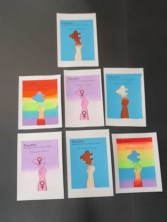
After finishing screen print I had to clean everything while waiting for my last designs to dry. I had trouble of removing the rest of the brown tape from the screen board but it has been stuck there since the beginning. I had to use brown tape to remove the remains of the tapes and I did what I could to clean the board. Jo said that I would not have to worry about it as long I have tried my best. She also mentioned that the others were planning clean it after I have finished. I took Jo's advice, then left as my designs were finally dried on time and took them into class. I kept the rest of my tests in my hidden desk after using the printmaking room. I had a look through the rest to see which was the perfect picture to publicly display for the final crit on Friday the 13th of May, therefore I did need more than one poster. I selected seven posters: three for race equality, two for women's gender equality and the last two were the LGBT Pride community. Despite of having very small white gap bits onto two posters about race I thought it was not so bad as the text goes well with the background to blend in. The last task was to trim off the edges neatly and took a picture on my phone.
They came out strong and beautiful. But incredibly amazing and I was so proud of my work.
Overall, it was fun and I enjoyed making my posters about acceptance and respect for people who are different in certain ways. The second one I enjoyed for Contextual Studies was one of the topics of artist research because of the artist I have chosen, amongst his work. Andy Ivanov's May Mermaid of the Lily Lake due to his inspiration of the postponed remake live-action of the original Disney’s animation The Little Mermaid (1989), involving new cast members, Halle Bailey to star as Ariel and to be the first black African- American songwriter, singer and actress to take the role of a Disney Princess character on live-action. She has been faced a lot of discrimination but it does not stop her from taking the role and Jodi Benson, originally voiced as Ariel from the original Disney’s animation The Little Mermaid, came to her defense. Especially, my fascination of mermaids.
The reading presentation was fine but slow to keep up pace with referencing which involves the struggles of writing specifically, depending on what to write about as I have referenced as lot of information. For what I enjoyed was bringing up theories and questioning the difference between fantasy and reality, involving prejudice views throughout my research.
0 notes
Text
Em Nagy Interview
Could you tell me a little about yourself?
I’m in my final year of Visual Communication at Arts University Bournemouth, and after that I’m planning to become a teacher. I’m going to be teaching at an art summer school over summer. After that I’ll be going onto doing my postgraduate’s qualification for PCG teacher training.
How did you get started in Visual Communications?
So, I did art GCSE and through that I really found my feet, it became very clear art was my most enjoyable subject. After that I went on to doing Graphic A-level and a BTEC in Art Communication. While I was doing that, I wasn’t quite sure as to what I wanted to do next, I knew I wanted to do some kind of creative degree, but I didn’t know in what specific subject.
Instead of going to Uni right away, I did an Art Foundation course which helped me to figure everything out. On the course one of the tutors recommended looking at Visual Communication because it’s very open, it’s really great for the freedom of doing creative work without doing something specific.
Did you face any obstacles while doing art in school?
Well at College, when I was doing Graphic Design AS, I really enjoyed doing the subject but there was an issue, and they basically wouldn’t let us do it for the rest of our A-Level. So, me and some of the other students had to fight to actually let us to do the course. The way it worked out, there was three of us who were merged with a Fine Art A-Level course and just got given Graphic Design briefs instead. So, it was kind of giving us the opportunities still to do Graphic Design without having a proper teacher. I felt like a lot of it was still self-taught and self-directed, and to be honest, I think helped me become a bit more of an independent learner.
If you’d of had a proper teacher in Graphics, do you think it would have helped you?
Definitely. Things like using Adobe software, which in our current climate, is very important to know how to use. I feel like we had a small taste of how to use these software’s before the teacher left but looking back I would of really benefited from being taught that from an early stage. Because then when I went to my foundation course a lot of people already knew how to use those programs and I didn’t, it knocked my confidence a bit because I had to catch up.
How would you describe what you do?
Craft making, I’d say. Everything I do is with a very hands-on approach. Throughout first year of my degree, I worked very digital and very technical, which is what I thought I was interested in, but throughout lockdown I really missed access to the studio and tools that I don’t necessarily have at home. So, for my Final Project in Second year, I based it all around craftmanship and using your hands to make artwork rather than digital. Then through that I rediscovered how much I really enjoyed book binding and Calligraphy. I use the computer to finalise my ideas, but for the actual making, I’m very hands on.
Where do you find influence?
To be honest I feel like a lot of it is social media. I don’t have one artist that I look up to or one artist that I follow, Instead I follow a lot of craft, artist book, calligraphy, handwritten, handmade hashtags. I think when I’m just scrolling through social media, I see a lot of inspiration from there, makes me feel like ‘ooo, I want to try’ that. I mostly look for inspiration on Instagram. There are some bits on Facebook, but I feel like Facebook- in that sense, is a bit more amateur.
How would you say your style has changed over time?
My styles become more sophisticated. Which I think that comes with practice, especially in craft- it’s all about skill. I think while studying for my degree, the tutors have really taught me how to reflect critically, and actually, make me think “well how does my design influence other people?”, considering about how it would fit in the real world.
Has there been a favourite project that you’ve worked on?
Probably ISTD, which that was a typographic brief. Because we did that for Uni, although it was a typographic brief, we had the freedom to adapt it and change it to how we wanted it to work on it. I did a lot of screen printing, print making, book binding. So, lots of hands-on approaches which I really enjoyed.
Has teaching always been your dream?
Teaching has always been my dream. I’ve always been very bossy (laughs). I’ve always known what I like and how to get that done – that very much comes from my mother. When I was younger, I always wanted to be a dancer, and then I got told that “if you’re a professional dancer then your career ends by your mid 20s”. From that I thought “well I could be a dance teacher”, so when I was dancing, I always stayed late in the studio, or I helped teach the younger classes. Then as I started doing more art and less dance, I thought “well actually maybe art teaching was the way forward”. I’ve never actually considered anything else, I’ve just always known I wanted to teach (laughs).
What would you say is the biggest thing that motivates you to create? Do you have a motivation for it?
I find it quite productive when I’m making things, it feels like it’s a good use of my time. With a lot of things in life, I think very creatively about it- which I think is because of my education. Although, my mums a pharmacist, but she thinks quite creatively, I think I also get that creativity from my mum. Very often when I’m at home, I like to sit on the couch and watch tv and do nothing. But I always feel a lot better when I’m sat down at my desk and making something, or working out how things work- learning through making.
Could you tell me a little bit about your creative process? If you follow one, or have one?
Whenever I get a brief, I read it through about two or three times, to give myself time to digest it. I start with mind-mapping, noting down any ideas that come to me. I find that later in my process, when I get a little bit lost it does help me go back to my initial thoughts.
I do lots of research, both contemporary and contextual, so looking at how other people have approached similar subjects but also reading around the subject as well. Then I just make, I don’t have to know what my outcome is going to be but as long as I’m making, I’m in a good place to work that out. Making also gives you good time to think about a project, Its good therapy.
Would you say you enjoy sharing your work with others, or do you prefer to go a bit unnoticed?
I do like sharing my work, it’s almost like sharing that enthusiasm for it. Not to do it for that pat on the back, but it is a nice feeling when other people look at your work and say “hey that’s really cool”.
Would you say you are quite critical of your own work?
Yes, I’m very critical of my work, I think I’m quite hard on myself as well. So, when things don’t quite go to plan or I’m struggling to find my feet with a project, I do beat myself up about it quite a lot. I’m definitely very critical of my own work, probably more so of my own work than of other peoples.
Is there anything that helps you overcome that?
I think talking about it with other people, especially close friends, or family. When I talk to my boyfriend about it, he’s very reassuring that I will find my feet, and that I am doing well. It’s easy to lose sight of that and I think talking to other people is the best way to overcome that.
Going back to your creative process, how would you describe it in one word?
Rollercoaster. If I’m honest, it’s so backwards, up and down. You have good days and you have really rubbish days when you are questioning why you are doing anything. It’s a roller coaster- 100%. But I think all creative processes should be like that, it’s never a straight linear path, is it?
Could you tell me about a project or work that you feel especially proud of?
Well, I don’t know if, skill wise, it’s my best work. But going back to ISTD, it was the first project where I’ve actually made all of the components for my work. I made all the content for my book, I printed my book, I bound my book, and now I have a physical object that I can show people and say ‘hey, this is my book’.
And did you face any obstacles with ISTD?
My biggest obstacle was my narrative, that seems to be a reoccurring theme throughout all my work. I kind of get a bit caught up in making, I would just make books all day with no intention if it was up to me. But in hindsight, I did get a little bit carried away with the craft and didn’t think so much about my narrative- what I’m trying to visually communicate.
If you did move out of Weymouth, would you miss anything from the town?
Weymouth is very much a holiday destination, seaside, very much a British seaside town. I do think that when the sun is out and the weather is nice, it is one of the nicest places to be. But on the flip side, when the weather is grey and dull, there isn’t too much to do.
What would you say is one of the biggest issues in the town?
Kids get bored, adults get bored as well. When the weather is a little bit rubbish and there isn’t a whole lot to do, you go down to the pub for a pint, which ends up in day drinking, or drinking all night. There just really is not much to do, at all. The High Street is dead and there is nothing to drive you out of your house to go somewhere. There are a lot of coffee shops, but then how much coffee is appropriate to drink in one day?
Do you have anything exciting in the works now?
Well, my Final Major Project is the biggest one currently. But I’m also going to be teaching my own Saturday art school classes next year. Just today I got send out some templates for my lesson plans. It’s not due for a couple months but I’m already thinking how I can plan my lessons to inspire young creatives, to eventually end up doing what I’m doing now.
Do you have any words of wisdom for anyone starting out?
It doesn’t always work. It’s a lot of ups and downs and like I said before- it’s a rollercoaster. Some days are easier, some weeks or months are harder. It’s frustrating and but the best thing I think you can do is just perceiver. Keep at it. But remember to take breaks, it’s still part of your process. Don’t be too hard on yourself, and that it will all figure itself out.
0 notes
Text
Supporting Statement
How I have interpreted the theme of light.
My interpretation of light, is that it can be referred to everything and anything that you feel is necessary and it also depends on how you perceive it. The most used way of light, is through a light source such as light that illuminates a room and too bring light into a situation of concern or confusion.
Research:
One of the artists that I have looked at is Antony Gormley. Antony Gormley is is a British
sculptor. His best-known works include the Angel of the North, a public sculpture in Gateshead in the North of England, commissioned in 1994 and erected in February 1998. The reason I was influenced by Gormly’s work is due to his sketches and the way he creates physical models of his work. He draws more sketchy and rough – he adds in detail to help you understand how he works and what it is he’s created. I was also inspired by the fact that since the 1980’s Antony Gormley has used the dominate theme of the human figure, which I felt helped me considerably since I was looking at mental health and feel as though looking at the human figure would work extremely well and also helped me look at different techniques. With his work being physical figures it helps to build and create the environment and atmosphere and really helps you to connect with his work as you get a sense of emotions that he has portrayed throughout his work.
During the mid 1980s Gormley was using a range of materials such as concrete, iron and clay.
The second artist that I looked at is Kim Noble. Kim Noble is a woman who, from the age of 14 years, spent 20 years in and out of hospital. In 1995, she began therapy and was diagnosed with Dissociative Identity Disorder (originally named multiple personality disorder).D.I.D is a creative way to cope with unbearable pain.
Kim has 20 main personalities. 14 of the main personalities are artists. I was influenced by her work, because she suffers from mental health, which I felt as though it would be intriguing to explore as she creates work throughout different personalities. After looking at her work I felt as though it very simple and she uses a lot of bold colours throughout her work which also look like silhouettes. Even though I found her
work interesting, I did also find her work quite disturbing, as it shows violence and messages written backwards on the walls and people being chained up, which create a quite dark atmosphere. I think her work is unique, I’ve never seen work like her which is why she stood out to me.
Since she has no formal art training, 14 of the main alters became interested in painting in 2004 after spending a short time with an art therapist. These 14 artists each have their own distinctive style, colours and themes, ranging from solitary deserts, sea scenes and abstracts to collages and paintings with traumatic content.
The third artist that I have looked at is Daniele Buetti. Daniele Buetti is a contemporary Swiss artist whose multi-media practice incorporates light installations, performance, photography, and sculpture in exposing the fragility of popular culture. In his series Looking for Love (1997-2000), he modified pictures of supermodels from journals and magazine, drawing tattoos, and scratching adhesions on their printed skin. “Light, no doubt, is the most seductive and the most magical of all the media,” he has reflected. “Flashing, colorfully sparkling spots enthrall us like moths drawn to the light.
I was influenced by his work as I liked the way he modified pictures of supermodels and I felt that he brought light to the idea of the perfect Image by choosing supermodel and underlined the idea of the perfect image and perfect mental state isn’t necessarily 100%
perfect all the time and that nobody should stand to surreal expectations. I was intrigued by Daniele Buetti’s work as I had never seen anything like this before and I felt that it was really inspiring and informative. I experimented with his technique and found it really challenging to create something that worked as well as a supermodel or magazine cover and also, I wanted to create something that incorporated his style of work.
The fourth artist that I looked at was Francis Bacon. Francis Bacon is one of the most important and celebrated painters of the last century, best known for his idiosyncratic approach to the human figure. Artist Francis Bacon is best known for his post-World War II paintings, in which he represented the human face and figure in an expressive, often grotesque style. Francis Bacon later dated the true beginning of his artistic career as 1944. It was around this time that he devoted himself to painting and began creating the works for which he is still remembered, with “Three Studies for Figures at the Base of a Crucifixion” seen as a major turning point. His large canvases depicted human figures— most often a single figure isolated in an empty room, in a cage or against a black background
I was influenced by Francis bacon as I liked the surrealistic art he created using the human body, I felt as though it was creative and unique. It captures a variety of different emotions and helps to create the surreal atmosphere.
For one series of paintings, Bacon was inspired by Diego Velázquez’s portrait of Pope Innocent X (circa 1650), but he painted the subject in his own style, using dark colors and rough brushwork and distorting the sitter’s face. These works came to be known as Bacon’s “screaming pope” paintings.
I also looked at a series of mental health such as: Schizophrenia, depression, anxiety and more. I did this as I wanted a better understanding of what I was working on and how I could incorporate the emotions and atmosphere into my work. I also took the chance to look at body art and also body image artist as I felt that it would be appropriate to see how I could incorporate into my experiments.
Outline of my brief
The objective of my brief was to create a graphical illustration that would be made into a
poster or a booklet. The illustration had to be tied into mental health and had to portray the atmosphere and emotions of how living with these disorders can affect your everyday life. It had to tie in with the project light. The outcomes that I produced feel as though I hit
the criteria of portraying emotions of living with the daily struggle of mental health. I decided to leave it open to how the outcomes would be presented further. I feel as though they would be disputed among social media and poster as I felt that is where they would work best, the social media would help to show the full I potential of the digitalized illustration as you’d be able to see the brightness of the pinholes better, but also a poster as it works really well on its own, and portrays the atmosphere and environment that I wanted to incorporate with in.
I was inspired by a variety of different artists throughout experimentation, but mostly Antony Gormley and Daniele Buetti.
Daniele Buetti inspired.
I liked how Daniele Buetti used existing photos and added over the top of them, I was also
really inspired by the pin hole effect and letting the light shine through the back as it attracts attention to the image itself and the surrounding.
Inpired by Antony Gormley
Inspired by Antony Gormley’s sketches, I wanted to make the spirals around her to seem as though they consume her and she's stuck with in herself, through thoughts, body image and mental state. I really like how he used a range of materials to create his work such as concrete, iron and clay, however I felt as though I would incorporate his work though digital context and make it so it shows the same impact but visual instead of physical.
Inspired by Mona Turnbull - The Prosthetics Event I was influenced by Mona Turnbull’s the prosthetic event as I really liked how she used the
human figure as a canvas through body painting. I coloured in one of the figures I created throughout Photoshop and then added illuminous colours. I focused the bright vibrant colours onto parts of the body that people don’t particularly like or would flaunt.
These are a few developments that I have created. I wanted to use the mirror as a place people could reflect and look at themselves and not feel as though they need to use the mirror to judge themselves and you should use it to flaunt your beauty and imperfections that make you unique, may they be visible or internal. I felt as though it worked well throughout the development, however I started to realise that it wasn’t sending the message that I wanted it too and started to look more like a Tumblr meme, rather than a positive poster towards mental health.
I feel like I started to make the poster too easy to guess what the subject it was about, it also started to take away the idea of having to challenge the poster towards your own mental state, imperfections and challenges throughout. It also doesn’t relate to other nationalities.
Final Project!
For the final design, I decided to go back to one of my previous developments, that beforehand I felt didn’t really work, after realising that it was more appropriate to the subject I was doing – mental health. I felt as though this one worked really well, the way the two-figure merge together makes them feel lost. Which then helps to bring out that idea of them being trapped in a body they don’t love or can’t accept, the spirals around the figure, acts as though it’s like a kind of force field its keeping them in, isolated from the rest of the world. Trapped within their own thoughts, unable to break through. Also without colour it helps to create the idea that its multicultural and it’s not just targeted towards one specific nationality. It also relates to more than one mental health as it about you, which makes you think about how you feel and whether this relates to you. Helps to bring light to the situation. The dots start to represent you becoming lost within yourself, being consumed by your own thoughts, body and state of mind, but also because they have the light shining behind them it brings the sense of relief and that there is light at the end of the tunnel.
One of the reasons I also chose this one as it felt like It channels the idea of having a permanent aura surrounding you, but instead of it channeling good energy, it surrounds you with negativity and isolation. The idea behind it, is if you could see your aura, would it be bright and colour full or would it be negative and dark.
I felt as though this design worked best as the figures are becoming consumed within each other and the spirals.
The idea was to make you think about yours and others metal state. It also helps to give you a better understanding around mental health and how becoming lost and not being able to find yourself any longer and/ or the idea of being subjected to the perfect body image, or even everyone else’s judgment can affect you, also around body defects that you were born with can then make you feel isolated and trapped as society struggles to accept you for you + mental health such as Schizophrenia, DID and many more also tied in with the same effects.
Light? I didn’t want to make it too obvious and that was the reason behind the spirals and dots as it brings your attention towards the figures inside and starts to make you think about others, with disabilities and defects that they can’t change or feel as though they have to fit into society. The project is based on light, so I thought it would be appropriate to bring light to the situation and that would be the connection to light.
I thought this idea was unique and less Tumblr idea than the other one and its more of a challenge.
I want to develop it further, if i have enough time, place it into a box, giving the idea of being trapped and isolated. Inspired by Antony Gormely’s Boxes and Francis bacons cube. it could also look really unique as a light/ lamp shade and the illustration could then be casted onto the walls as it then projects the feelings though silhouettes and light. This would help to create a more focused atmosphere. I removed the typography as I felt that it didn’t need it and it feels more challenging to think about what it means and how it could affect you and others. Also, the idea of pin hole in the illustration help bring beams of light through the illustration- inspired by Daniele Buetti. Not targeted at specific person/ nationalities or even mental health disorders as it completely neutral and which leaves the door open to your own thoughts and ideas.
7 notes
·
View notes