#someone teach me typography
Explore tagged Tumblr posts
Text
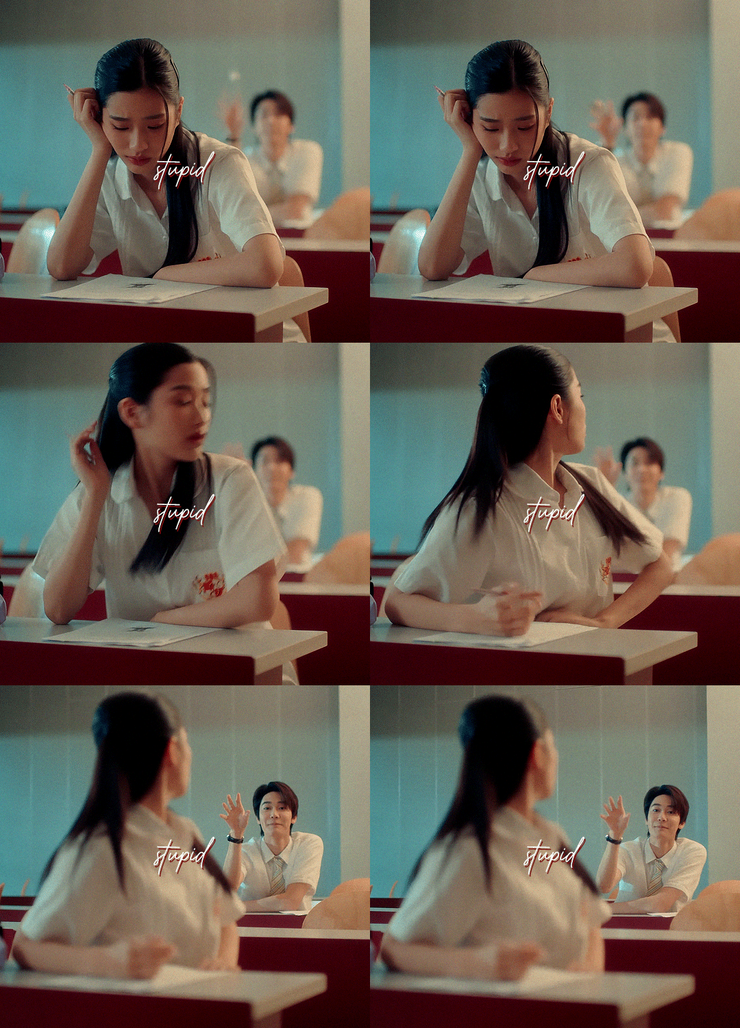


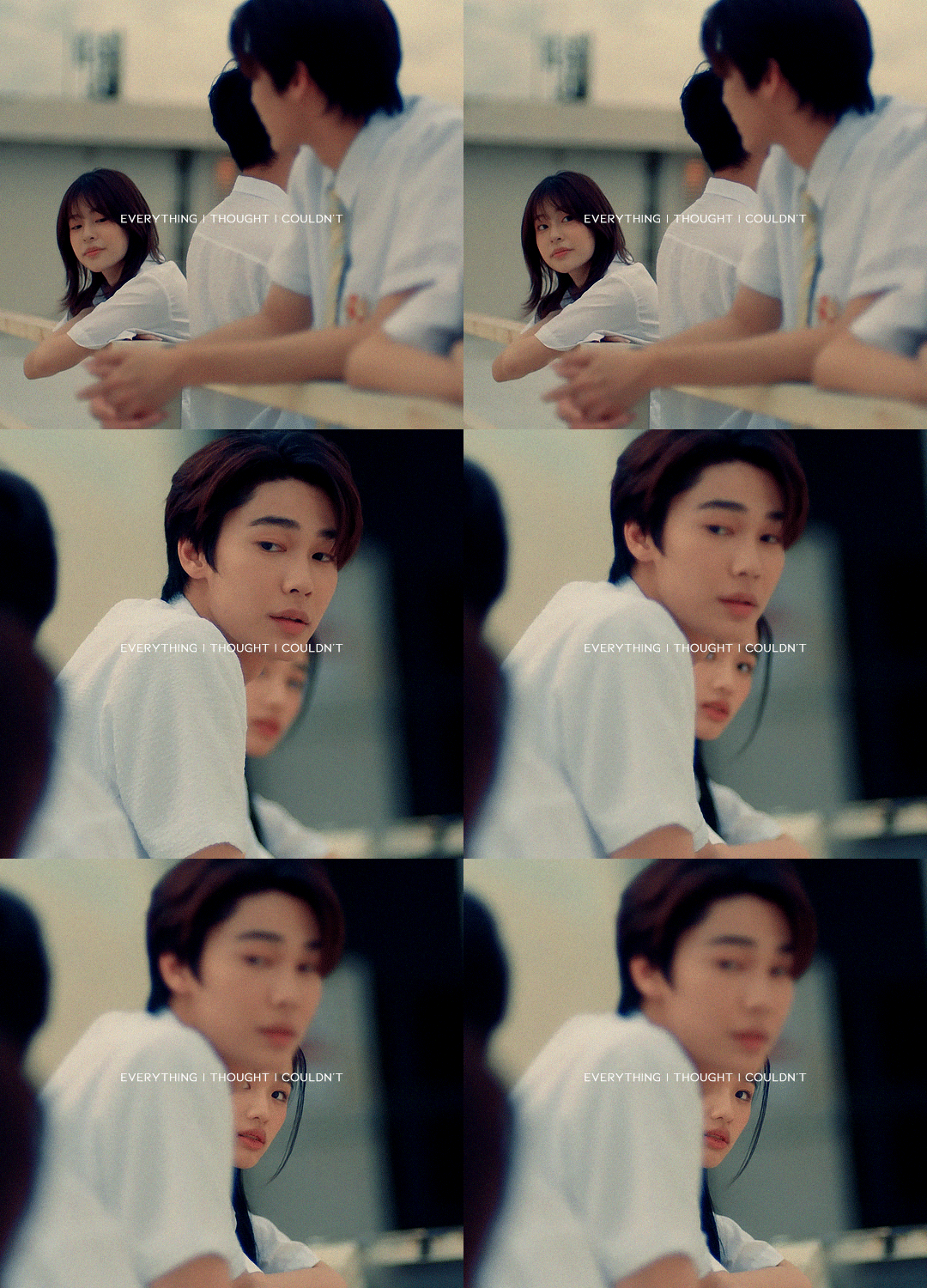
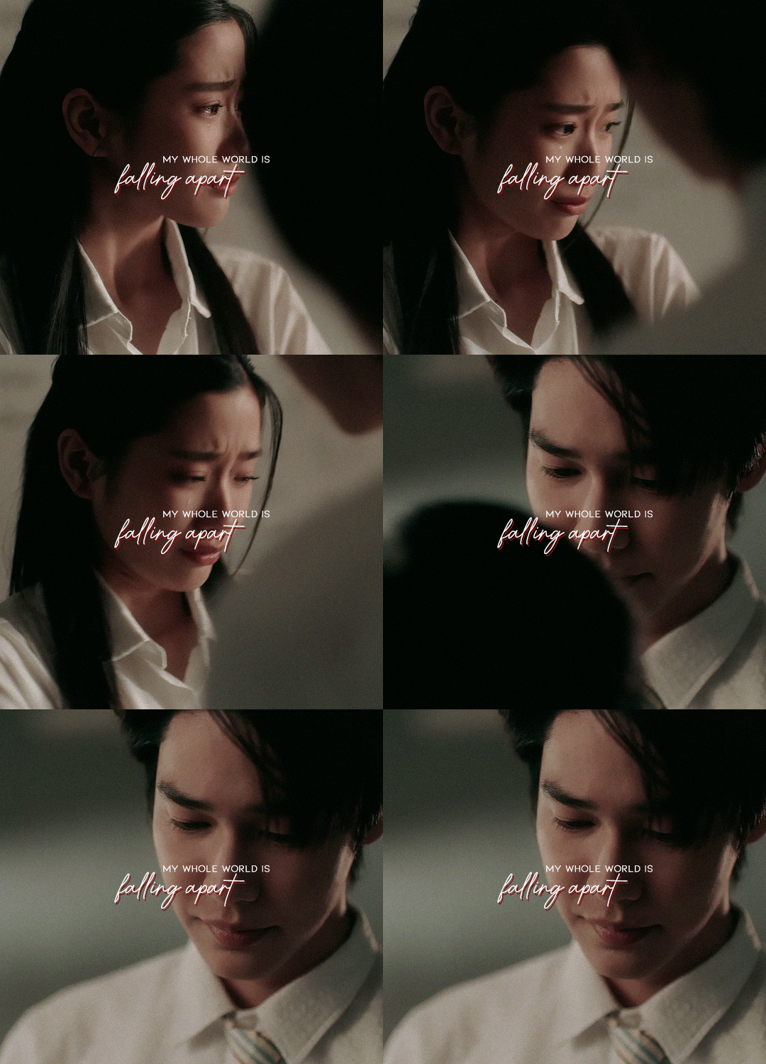
userdramas event 10: emotions — g-idle - i do: a love story in bangkok •
#userdramas#usergif#lakornladies#asiandramasource#asiancentral#tu tontawan#dew jirawat#once again i'm asking someone to come to my house and teach me typography#things have been so busy but i couldn't not make something for team lotus#ANYWAY#the gmmtv2024 event is happening mid october#idk if tu is coming back to acting next year#but if she is i'm hoping wishing praying for dewtu
92 notes
·
View notes
Text
Ethics and GenAI, the Justification parade.
Here are some of the top current hits from the pro-GenAI people.
It's not evil as long as it's not done to me.
It's a I'm fine with Gen AI stealing from other people, en masse, but as long as it doesn't steal from ME, it's ethically fine for me to use it.
Uhhhh....
2. It's stealing from other people anyway, so I may as well steal from them too.
Imperialism. So imperialism was A-OK. You see, everyone else was doing it at the time, so I may as well too. This makes you Thomas Jefferson. He was like, I know slavery is wrong, bro, but you know, I gotta have my slaves and my Sally Hemmings.
3. But I'm poor. Like really poor.
So stealing from other poor people makes it A-OK? You don't want to steal from the rich and punch upwards, you want HG Wells vision of the future to be true.
You can get editing for free, if you're patient, kind and generous yourself.
You can get art for 10 sometimes 20 bucks. Or you can simply spend the time to learn. The hardest part of any cover is the typography. You can have a really beautiful cover with well-set type. I posted tutorials. For. Free. Artists share their knowledge. It's only the time you take to learn. And when you learn, you'll create a cover that's far more unique and stands out in the market than if you steal.
4. It's not going to stop anyway...
Other evil deeds in the world are probably not going to stop either, does that mean one should do them. People steal all of the time. People steal my packages in my building. Does that mean I should do it too? Or should I do kind things like make sure my neighbors get the packages they are owed? Should I take action against it.
5. But it's like really mean and shit to harass people who are using genAI.
If someone is being a broker for an art thief, yes, you should let them know if they are doing it wittingly or unwittingly.
The AI bubble was going to break (https://www.youtube.com/watch?v=M3U5UVyGTuQ), but then they fucking forced it back into computers. So no. I, who know technology, can program (a bit shittily), have every right to tell you that using AI is bad for your book, bad for creativity, and bad for you.
Conclusion
I've solidly mocked the hell out AI before. Because it is a law of averages, and the average humanity is not amazing. It is boring, often wrong, and never unique like creativity demands we are. But individual and the collective of humanity can be extraordinary, if we put our minds to it.
If you use the crutch of AI to give you all of your writing advice, all of your research, to never really think how to do things DIFFERENTLY, how to CHANGE what is in front of you, How ANALYZE your information, you give into the humdrum of complacency, and instead of AI being the robot, you becomes the nice conforming drone.
Creativity is the antithesis of averages, or complacency, which is why I love my fellow artist. I refuse to use crutches. I love my fellow human more than the GenAI. I love the individuality, the uniqueness, and I think humanity is better than the mean it spits at us, be it racism, sexism, violence, conflict, or simply a load of wrong. I want to celebrate the right thing in my art: The craft and the ingenuity of humanity in the right way.
BTW, I gave Deepseek a quick and brief go around to see if it knew anything, and it was also very wrong. Like multitudes of wrong. (I expected as much since I gave it a niche question I know the answer to, but the public doesn't)
I ended up finding the answer myself with a lot of elbow grease (and I found a not average way to find the answer), but GenAI would teach you to give up and have no tenacity. And I can't abide by that. Why rob yourself of the plot bunnies to come? That's why you are getting stuck. Enjoy the journey to the answer. Your brain is 38 trillion times stronger than our current computers. Enjoy that, because it also burns less energy than a GenAI machine. https://www.crucial.com/blog/technology/how-does-the-human-brain-compare-to-a-computer
The human brain likes novelty. https://www.ciis.edu/news/novelty-keeps-your-brain-healthy
So keep your brain healthy and make your novel, well, novel, not human average. Find a solution to the problem you posed to yourself in a not average way. Because I guarantee you, that will be far more engaging to read, to enjoy, to see, to experience than anything that the average of humanity has ever come up with. Be not normal. And in that, you are creative.
35 notes
·
View notes
Text
CREATOR TAG GAME
thank you for tagging me erika @padme-amidala! 🥰
pick your 5 favorite gif sets of 2023 that got less than 1k notes and then pick 10 gifsets of someone else's that got less than 1k notes.
my sets:
this jake set (theyre all probably gonna be jake sets) cause that's when i started using those coloring settings that i always use now!
this other jake set cause it's my favorite combo of colors which is evident akshsd. it also was my first comission 🤍
this set and guess who's featuring it. jakey. not a fan of the 1st and 3rd gif but i love the rest
this set of leslie knope. jk it's jake peralta. and the set definitely deserved 1k notes 😤
and this set of not jake peralta! but it's andy samberg. it was easy to gif but one of my faves cause it's him
sets from awesome talented people: (ngl i had to scroll down some of their gif tags cause i'm not in all of their fandoms askjdhskdf)
merlin set by @ughmerlin i love her style so much, i even wanted to do a set inspired by it but i dont have the talent AKJSHDKS it's a really creative concept and the colors are so gorgeous and perfect for it!
sab set by @yenvengerberg she's a legend and this set is hilarious and i love the green! it's a crime that not all her sets get at least 1k notes cause they all deserve it
arthur set by @usershelby cause it has a quote from succession and also it's BEAUTIFUL. it was kinda hard to find a set of hers that didnt have 1k and i love that for her. also shoutout to this set cause why the hell not. and also this set. they're freaking mindblowing
jake set by @kitconnor it has a special place in my heart and ilysm mwah
got set by @padme-amidala it was so hard to pick one but this one is just... wow. those two colors go so well together and the typography is out of this world. also here's her gif page cause youre gonna wanna see it all
steve harrington set by @robin-buckleys i always recognize her gifs and i'm obsessed with her style! like the sharpening and vibrant coloring are so pretty always. i love this set cause of the color and also the no no no gif i love how each little "no" is arranged aksjhksd
bridgerton set by @cal-kestis i'm in love with the blue and the typography is so perfect. also their blending is always amazing and so smooth
sab set by @saws2004 this gifset is INSANE. like excuse me who allowed you to be this talented. blows my mind and it's one of the only things i've ever saved in fave to go back and look at it
percy set by @edwards-teach the blending on this set are you kidding me?? that second gif is straight up breathtaking i love it
heartstopper set by @lespanaye this set is hilarious and the coloring is *chefs kiss*
i'm also tagging the people mentioned above, no pressure :)
17 notes
·
View notes
Note
Your creations are so unique, creative and inspiring, do you have any tips for new gifmakers?
Oh hello there!!! This means so much to me and whenever people compliment my gifs it fills my heart with joy and pride so thank you so so much!!!
As for your question, my tips would be:
try your hands at different tutorials from the basics to more complex stuff, if you don't get it right in your first time don't worry you can always try again, try another day, try it with another scene/media
take your time and be kind to yourself, not every learning curve is the same, it's different from one person to another and we fortunatelly have SO many people willing to help and teach cool stuff
practice may not lead to perfection as perfect does not exist, but it does help you to improve your skills
try to follow other creators, even if they are not from your main fandoms, it is always nice to see what other people are creation, I always check diffent tags just to see whats up
I've been around tumblr since the early 2010's, so basically I was a tennager at high school while now I'm a grown ass adult!!!Took me a long time to find and develop my own style, there are things I really wanted to try back then that I couldn't achieve or I wasn't please with the result because I was simply trying to replicate other people's creations and now I undestand that maturing is also part of the process, looking for inspiration, references is okay as long as you add your touches to it because that helps you to improve, to polish your skills.
It's really nice when my edits gets like tons of likes and reblogs but when someone leaves nice tags or send me nice asks (just like yours) praising my gifs or how I did somethings like a colouring, a typography, a tiny detail or even the scene selection then THAT is what makes me emotional and super proud
2 notes
·
View notes
Text
CREATOR TAG GAME
bringing this back bc i think it's fun 🤭
pick your 5 favorite gif sets of 2023 that got less than 1k notes and then pick 10 gifsets of someone else's that got less than 1k notes.
mine:
this alicent hightower set bc i love the guts album for her and the cassette tape effects along with the ripped paper effects were super fun to play with
my beloved ladies (phoebe, rachel, & monica)!!! i just love them sm
natasha romanoff's tinder page was a random thought that came to my head and v proud of how it turned out :D
this yennefer set is one of my most prized possessions. the blending alone took me so long and i'm happy w the way it looks
the blending of this anidala set nearly killed me...and this is one of the only times i've ever done a quadruple blend
others:
i am OBSESSED with this star wars set by @edwards-teach...the coloring is just so stunning and i love the simplicity of the quotes in a box!
this star wars set by @padme-amidala is probably the best thing i have ever seen. the amount of blends and transitions and coloring is just mind blowing! seriously a piece of art work. still can't get over that erika made this set for me <3
becca's (@yenvengerberg) gifs always leave me speechless but this yen and tissaia set just has a special place in my heart..the quote, the colors, the blending, the transitions are all just perfection and capture the relationship so well 🥹
this alicent set by @saws2004 lives in my mind rent free. i absolutely ADORE the way the quote flows through the layout, so well done. the blending and the use of b&w is just superb. honestly one of my fav sets ever i could just stare at it all day
i LOVE the typography in this anidala set by @cal-kestis...nik is just a photoshop wizard and her creativity always blows me away. the blue and orange go so well together and nik's ability to combine multiple fonts is perfection.
this yennefer set by @ughmerlin is so so pretty!! the colors are so soft and the song matches yennefer perfectly. i also love the transition from b&w to color chefs kiss. & the font choice is just lovely.
umm hello??? this shang chi set by @simoneashley is gorgeous. the amount of time this must have taken was so worth it bc the colors are so so vibrant. i always love a good rainbow set esp when the coloring is this amazing!!
this house of the dragon set by @lady-arryn is so beautiful. the coloring and sharpening is just so soft and ethereal. and this particular blue/orange combo is wonderful. i am particularly obsessed with the blending of second gif..its just SO pretty.
my beloved triss!! this triss merigold set by @genyazafin is amazing i love it sm. i love the blue and orange and the way the coloring captures the darkness of the show. also the blending of the last gif is just so satisfying
screeeeeaaaaam this natasha and yelena set by @rosamndpike is just pURE pAin and is also rly rly pretty. the blending is flawless and i love the song + scene pairing choices. the typography alignment and placement is also super unique and satisfying
+ one more because i can – this regina set by bestie @morgana-pendragon is just teehee amazing. i love the trio of term idea and those three words fit regina perfectly (esp the 1st and 3rd lol).. the purple coloring is so her and is so well done
no pressure tagging all the people above & @singularities @moirainesedai @rebecca-weltons & anyone else who wants to do this !
19 notes
·
View notes
Text
From Sketch to Screen: My Journey from Traditional to Digital Art
Creativity has always been at the core of who I am. From childhood sketches to exploring the worlds of photography, graphic design and animation, my artistic journey will take me through a very dynamic blend of discovery and growth. With each medium, I will learn new techniques, adapt my skills and always find new ways to tell stories through visuals. This post is simply the beginning of my journey as a multimedia artist and how I will learn to integrate different art forms into my creative process.
In my early days I fell in love with the idea of drawing, the thought of turning my thoughts into visuals into a sheet of paper always intrigued me as a child, and like many artists, my journey began with a pencil and paper. Drawing was really my first love—it was my way of expressing ideas and bringing characters to life, and as someone who is interested in not only illustration but also photography, graphic design, and, eventually, animation, learning digital art feels like a natural progression. Graphic design, for example, depends heavily on software such as Photoshop and Illustrator. Animation necessitates knowledge of digital drawing tools. Photographs frequently include digital retouching. By honing my digital illustration skills, I can bridge the gap between these creative disciplines and broaden my artistic horizons.
Well, of course, moving from traditional to digital isn't easy. Unlike a pencil and paper, where I can feel the texture and control every stroke with precision, drawing on a tablet feels completely different. There's a learning curve—getting used to the pen sensitivity, understanding layers, and figuring out how to blend colors digitally.. At times, it's frustrating. But I remind myself that every great artist started somewhere. One of the most difficult challenges is getting past the comparison mindset. I see digital artists who have mastered their craft and wonder if I will ever reach that level. But instead of allowing doubt to hold me back, I remind myself that this journey is about progress, not perfection. My traditional art skills will serve me well in digital illustration; all I need to do now is figure out how to apply them.
However.. There is another of my interests that I want to share.
Illustration isn't my only creative outlet; I also enjoy photography and graphic design. These fields work better together than most people realize. Photography helps me understand lighting, composition, and color, all of which are useful in digital illustration. Graphic design teaches me about layout, typography, and how to produce visually appealing images.
By combining these abilities, I hope to create one-of-a-kind artwork that blends illustration, design, and photography. Eventually, I'd like to experiment with animation, bringing my drawings to life through movement.
Finally, this blog will serve as a personal journal of my journey—documenting my struggles, achievements, and everything I learn along the way. I want to show that transitioning form traditional to digital art isn't an overnight process, but a rewarding one. I've always wanted to become an amazing illustrator or an amazing animator, so I am willing to take this journey to achieve my goals.
To any other artists out there feeling intimidated by digital art: I get it. It's challenging, but it's also exciting, there is something incredible about thinking about how much potential you can unlock by putting in the time and effort to patiently learn a skill. Every new skill starts with a first step, and I'm ready to take mine. Let's grow and prosper together!
So for now, I'll show some drafts that I worked on in my design classes in school! The whole idea is to combine cats and an animation/illustration vibe..
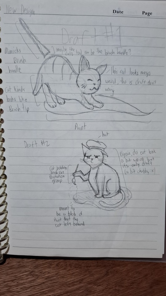
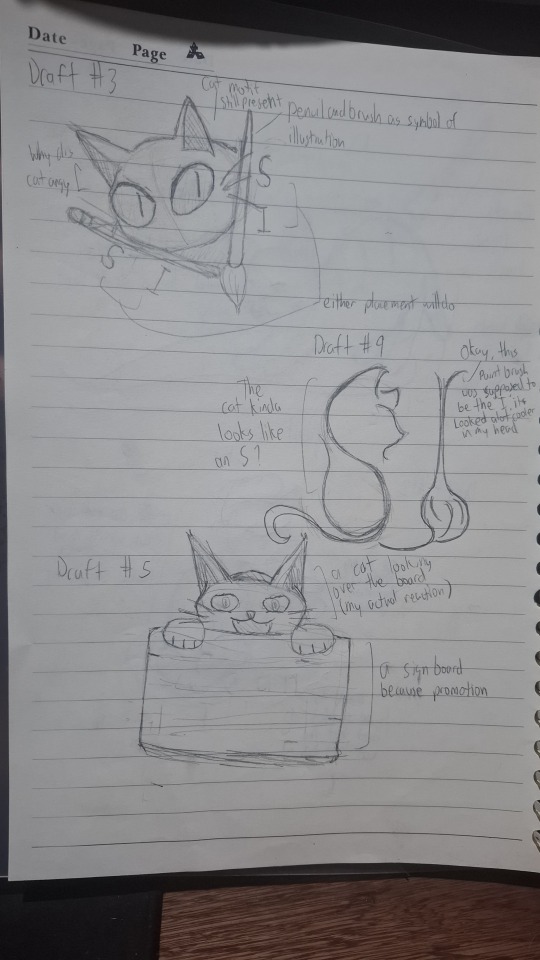
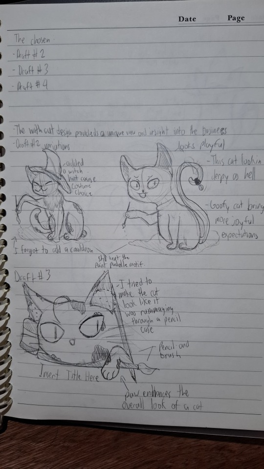
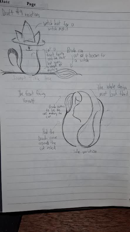
With all that said, if you're also learning digital art or just have any tips to share, feel free to comment below! Let's support one another on this journey!
1 note
·
View note
Text
What is Basic to Advance Social Media Graphic Design Course?
For Quick Enquiry: Click Here
Introduction: Why Social Media Design Courses Are Essential Today
Social media graphic design isn’t just about pretty pictures and trendy aesthetics. It’s a combination of art, psychology, and marketing that drives engagement and creates meaningful connections online. In India, where social media platforms are thriving like roadside chai stalls, businesses and individuals alike need skilled designers who can stand out in this saturated digital space. Whether you’re an aspiring creative or a working professional, joining a Graphic Design Institute in Noida is your first step toward mastering this craft and turning your ideas into visually stunning realities.
Think about it: every scroll, double-tap, or share is influenced by visuals. From eye-catching Instagram posts to engaging YouTube thumbnails, social media graphic design has become the backbone of digital communication. But how do you go from basic to advanced skills? A structured course designed specifically for social media graphics can help you understand the nuances of color theory, typography, layout, and branding — all tailored to the needs of digital platforms.
For someone considering joining a Graphic Design Institute in Noida, these courses are not just about learning tools like Photoshop or Illustrator. They teach you how to think like a designer — to strategize, plan, and execute your creative ideas with precision. The demand for professional graphic designers is soaring, and social media graphics are at the forefront of this demand. So, let’s dive into the key components of a basic-to-advanced social media graphic design course and see what makes it a game-changer for your career.
Mastering the Basics of Social Media Graphic Design
Before you can create jaw-dropping designs, you need to grasp the fundamentals. Every great designer starts with a solid foundation, and the basics of social media graphic design are no exception.
1. Learning The Fundamentals Of Design Principles And Elements
Design isn’t just about making things look “pretty.” It’s about balance, harmony, and conveying a message effectively. When you enroll in a professional course, you’ll start by learning the principles of design: alignment, contrast, repetition, proximity, and hierarchy. These are the building blocks that determine whether your design looks polished or amateurish.
For example, knowing how to align text properly can make your Instagram post look professional, while random placement can make it look like a school project. Courses at a Graphic Design Institute in Noida often emphasize these principles through hands-on exercises. From choosing the right font to pairing colors that complement each other, these basics are essential for creating designs that resonate with your audience.
Moreover, understanding design elements like lines, shapes, textures, and white space allows you to craft visuals that are not only aesthetically pleasing but also functional. This combination of creativity and logic is what separates a graphic design enthusiast from a professional.
2. Exploring Popular Social Media Platforms And Their Design Needs
Each social media platform has its unique quirks and design requirements. Instagram is all about aesthetics and storytelling, while Twitter demands concise, impactful visuals. Facebook leans towards community engagement, and LinkedIn prioritizes professionalism. A good course teaches you how to tailor your designs to fit the platform’s personality.
For instance, an Instagram carousel post requires a seamless flow of images, whereas a LinkedIn infographic should focus on delivering maximum information in minimal space. By understanding these differences, you can create platform-specific designs that truly connect with your target audience. This knowledge is crucial for students studying at a Graphic Design Coaching Near Me, as it prepares them to handle real-world design challenges.
By mastering the needs of each platform, you also enhance your versatility as a designer. This ability to adapt is what makes you a valuable asset to businesses, who often juggle multiple platforms simultaneously.
3. Familiarizing Yourself With Essential Tools And Software
Every graphic designer’s journey involves mastering tools like Adobe Photoshop, Illustrator, and Canva. These are the digital equivalents of a painter’s brush and palette. A good course ensures that you don’t just learn these tools but also understand when and how to use them effectively.
For example, Photoshop is great for editing images and creating detailed graphics, while Illustrator is ideal for vector-based designs like logos. Canva, on the other hand, is perfect for quick, professional-looking designs without requiring advanced skills. At a Graphic Design Coaching Near Me, you’ll get hands-on experience with these tools, making you confident in handling any design project.
Knowing your tools inside out also allows you to experiment and innovate. You’ll find yourself creating designs that are not only visually stunning but also optimized for different screen sizes and resolutions, ensuring your work looks flawless everywhere.
Advancing to Professional-Level Social Media Graphic Design
Once you’ve mastered the basics, it’s time to level up. Advanced social media graphic design isn’t just about creating pretty visuals; it’s about strategy, branding, and driving results.
1. Developing A Strong Visual Brand Identity
Branding is the soul of any business, and as a graphic designer, your job is to give that soul a visual form. Advanced courses focus on teaching you how to create a cohesive brand identity that aligns with a company’s values and goals.
Think of McDonald’s golden arches or Apple’s minimalist designs. These iconic visuals aren’t accidental; they’re the result of meticulous planning and execution. At a Graphic Design Coaching Near Me, you’ll learn how to create logos, color palettes, and typography styles that reflect a brand’s essence. This skill is invaluable for businesses looking to stand out in a crowded market.
By understanding branding, you also learn to think strategically. You’ll start designing with a purpose, ensuring that every element in your graphic contributes to the overall message.
2. Using Data And Analytics To Create Impactful Designs
In the world of social media, numbers matter as much as creativity. Advanced courses teach you how to use analytics tools to understand what works and what doesn’t. For example, if a particular color scheme gets more engagement, you can incorporate it into future designs.
This data-driven approach ensures that your designs aren’t just aesthetically pleasing but also effective. For students at Graphic Design Courses in Gurgaon, learning to interpret analytics is a game-changer, as it prepares them to work in environments where results are as important as creativity.
Moreover, using analytics allows you to refine your designs continuously, ensuring that your work remains relevant and impactful in an ever-changing digital landscape.
3. Creating Designs Optimized For Social Media Advertising
Social media advertising is a whole different ball game. Unlike organic posts, ads need to grab attention instantly and drive specific actions, whether it’s a click, share, or purchase. Advanced courses teach you how to create ad designs that not only look good but also convert.
From understanding audience psychology to crafting compelling call-to-action buttons, designing for ads requires a unique set of skills. At Graphic Design Courses in Gurgaon, students are trained to create high-performing ad visuals that align with marketing goals, ensuring their designs deliver tangible results.
This expertise in advertising also opens up new career opportunities, as businesses are constantly looking for designers who can enhance their online presence through effective ad campaigns.
Conclusion: Why a Social Media Graphic Design Course is Worth It
A basic-to-advanced social media graphic design course isn’t just about learning tools or following trends. It’s about becoming a visual storyteller who can craft designs that inspire, engage, and convert. For students in India, especially those enrolling in Graphic Design Courses in Gurgaon, these courses offer the perfect blend of creativity and strategy to succeed in a competitive market.
Social media is evolving, and so are its design demands. By mastering both the basics and advanced techniques, you position yourself as a versatile designer who can adapt to changing trends while delivering consistent results. Whether you’re designing for Instagram, Facebook, or LinkedIn, the skills you gain from these courses will serve as the foundation of your success.
So, if you’ve been contemplating whether to take the plunge, remember this: in a world where visuals speak louder than words, being a skilled graphic designer is like holding the key to a treasure chest of opportunities. Don’t just scroll through social media — design for it, and let your creativity shine!
Also Read This:-
How Important Is Social Media For Graphic Designers?
#kvch#GraphicDesignCourses#GraphicDesignTraining#LearnGraphicDesign#PhotoshopCourses#IllustratorCourses#AdobeCreativeSuite#MotionGraphicsCourses#3DDesignCourses#OnlineCourses#OnlineLearning#LinkedInLearning#SkillDevelopment#CreativeProfession#DesignCareer
0 notes
Text
best web development courses for beginners | classes for graphic design near me
Best Web Development Courses for Beginners | Classes for Graphic Design Near Me
Are you looking to kick-start your career in tech with the best web development courses for beginners? Or perhaps you have a creative flair and want to explore classes for graphic design near me? At ASDC, we have the perfect blend of courses tailored to both beginners and enthusiasts, making sure you receive quality education and practical skills in the growing fields of web development and graphic design.
Why Choose Web Development as a Career?
Web development is one of the most in-demand skills today. As more businesses go online, the need for skilled developers is skyrocketing. But why should beginners consider a web development course?
High Demand: Companies of all sizes need websites, apps, and online platforms.
Great Earning Potential: Developers are some of the highest-paid professionals in the tech world.
Creative Freedom: Web development allows you to bring ideas to life and create functional, user-friendly websites.
Career Flexibility: Whether you want to work for a top company or freelance, web development offers multiple career paths.
At ASDC, our best web development courses for beginners are designed with you in mind. From learning basic HTML and CSS to mastering complex frameworks like JavaScript and Python, we cover everything needed to launch your career as a web developer.
What You Will Learn in Our Web Development Course:
HTML & CSS Basics: The foundation of all websites, essential for structuring and styling web pages.
JavaScript: Bring your websites to life with interactive features and dynamic content.
Responsive Design: Learn how to create websites that work seamlessly on mobile devices, tablets, and desktops.
Backend Development: Dive into databases and server-side scripting with popular languages like Python and PHP.
Project-Based Learning: Build real-world projects, adding to your portfolio and showcasing your skills to potential employers.
Explore Graphic Design: The Art of Communication
In today’s digital era, good design can make or break a brand. Our classes for graphic design near me are ideal for anyone interested in visual storytelling, brand design, or simply wanting to create beautiful graphics.
Whether you’re a beginner or looking to upgrade your skills, ASDC offers comprehensive graphic design training that covers:
Design Fundamentals: Understanding color theory, typography, layout, and composition.
Adobe Suite Mastery: Learn industry-standard tools like Photoshop, Illustrator, and InDesign.
Brand Identity: Discover how to create compelling logos, brochures, and marketing materials.
UI/UX Design: Specialize in designing intuitive, user-friendly websites and apps.
Why Choose ASDC?
Expert Instructors: Our courses are taught by professionals who have years of experience in the tech and design industries.
Hands-On Learning: We believe in a project-based approach, ensuring you gain real-world experience and practical skills.
Flexible Timings: Whether you're a student, a working professional, or someone looking to switch careers, we have flexible class schedules that fit your lifestyle.
Placement Assistance: Our goal is to not just teach you but also help you land your dream job. We offer career counseling, interview prep, and job placement assistance.
Conclusion
If you're searching for the best web development courses for beginners or graphic design classes near me, look no further than ASDC. We are committed to providing high-quality, industry-relevant education that opens doors to exciting career opportunities. Visit our website www.asdckanpur.com to learn more and enroll today.
Take the first step toward a bright and successful career in tech and design. Let ASDC be your partner in this journey!
ASDC: Shaping Future Innovators & Creatives!
0 notes
Note
Hi Christina! I have an interested on graphic media like branding and logos. I really want to start getting into graphic design and I was wondering if you have any advice yourself for someone who is wanting to learn the basics such as typography, procreate, adobe, canva etc. My boyfriend bought me a MacBook Air and I have an Ipad w/ a pen. Do you mind sharing any knowledge you have? Also provide links of artists on yt and fun beginner projects to work on for fun? Thank you so much in advance!
The first thing I would start with is checking out classes on Coursera or edX. These are free classes from actual universities that can help you understand the basics of graphic design. There are lots of options, but I would consider starting with the CalArts Specialization in Graphic Design on Coursera. It's a beginner level set of classes that cover fundamentals of graphic design, typography, imagemaking, graphic design history, and branding. These classes will give you projects to work on that you can add to your portfolio later on.
There are also some books you might want to check out to get a better idea of graphic design theory. A few I've seen recommended are The Non-Designer's Design Book by Robin Williams, Graphic Design: The New Basics and Thinking with Type by Ellen Lupton, The New Designer's Handbook by Alastair Campbell, No Logo by Naomi Klein, Helvetica and Objectified by Gary Hustwit, and Graphic Means by Briar Levit. You can also see if you can find the reading lists for university graphic design classes- sometimes they're publicly available online.
Once you understand the theory behind graphic design, then you can start learning how to use software. InDesign, Illustrator, and Photoshop are the biggest ones in the industry, and so those are what I would start with if you have access to them. I would do these one at a time, since they can get kind of confusing if you're trying to learn them all at once. Again, there are lots of free online courses that will teach you how to use them. Adobe has their own free online tutorials for their software, so that's where I would start.
Once you have a handle on the principles of graphic design and the tools you need to be a successful designer, then you can start working on creating mockup designs for a portfolio. There are a few sites you can visit to see actual design briefs that you can use to practice: 99designs, Daily UI, Fake Clients, Minted.com, and Theydrawandcook are a few that I've seen recommended.
Once you have enough mockup designs, you can create an online portfolio for other people to see. Having a portfolio ready to go can help you get clients, apply for jobs, or apply for graphic design programs that can help you sharpen your skills.
1 note
·
View note
Text
Website Designing and Development: Your Path to Online Success

In today's digital age, having a strong online presence is essential for businesses and professionals alike. Whether you’re a small business owner, a freelancer, or just someone looking to showcase your skills or hobbies, having a well-designed and functional website can be your ticket to online success. In this blog, we’ll explore the world of web design and development, and how it can benefit you in the digital world.
Understanding Web Design and Web Development:
Before diving into the importance of web design and web development, let’s clarify what these terms actually mean:
- Web Design: This primarily focuses on the visual aesthetics of a website. It involves creating an attractive and user-friendly layout, choosing color schemes, typography, fonts, graphics, and overall look and feel. A web designer's goal is to make your website visually appealing and easy to navigate.
- Web Development: Web development, on the other hand, is the process of turning the design into a functional website. Web developers use various programming languages and technologies to build the backend of your website, making it work seamlessly. They create interactive features, like contact forms, online catalogs, and applications, that enhance the user experience.
The Importance of Website Designing and Development
Now that we have a basic understanding, let's explore why web design and development are crucial for your online success:
1. Professionalism: A well-designed website gives your business or personal brand a professional image. Visitors are more likely to trust and engage with a website that looks polished and well-maintained.
2. User Experience: An easy-to-navigate website ensures that visitors can find the information they're looking for quickly. A positive user experience can lead to longer visit durations and higher conversion rates.
3. Digital Marketing: Your website is the hub of your online presence. With the right design and development, it becomes a powerful tool for digital marketing. You can integrate SEO (Search Engine Optimization) techniques to rank higher in search results and use your website to promote your business or services through various online marketing strategies.
4. Accessibility: A well-designed website is accessible to a wide range of users, including those with disabilities. This not only expands your audience but also demonstrates your commitment to inclusivity.
5. Mobile-Friendly: In today's mobile-driven world, it's crucial to have a website that's responsive on different devices. Responsive design ensures your site looks great and functions well on smartphones, tablets, and desktop computers.
6. Competitive Advantage: Your competitors are likely investing in web design and development. To stay competitive, you need a website that stands out and offers unique features or content.
Choosing the Right Course, Company, or Agency
If you're considering website designing and development but don't know where to start, you have several options:
1. Courses: Many online courses and tutorials can teach you the basics of web design and development. These are great for those who want to learn and build their websites from scratch.
2. Professional Web Designers and Developers: If you prefer to focus on your business or profession, hiring a professional web designer and developer is a wise choice. They have the expertise to create a custom website tailored to your needs.
3. Web Design and Development Agencies: If your project is more extensive or requires ongoing maintenance, consider hiring a web design and development agency. They have a team of experts who can handle all aspects of your website project.
4. "Near Me" Solutions: You can search for web design and development services near your location for convenience. Many agencies offer local services, making it easier to communicate and collaborate.
In conclusion, website designing and development are your pathways to online success. Whether you're running a business, promoting your professional skills, or pursuing a personal project, a well-crafted website can help you achieve your goals. Take the time to explore your options, choose the right approach, and watch as your online presence flourishes. Don't underestimate the power of a well-designed and developed website in today's digital world.
#web design and development company#website design company#digital marketing company#web development company#web design company#website designing services#digital marketing services#digital marketing agency#website development company#website development agency
0 notes
Text
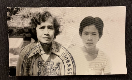
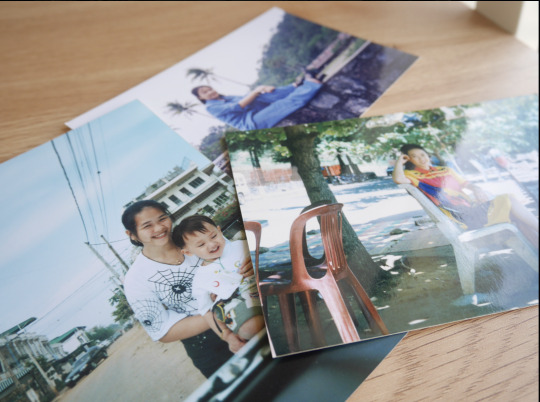
Object #1: Family Photographs Significance: Photograph of my Grandmother and Uncle on my Dad's side of the family. Between 1975 and 1992, many refugees escaped the murderous regime of the Khmer Rouge. Immigrated to Aotearoa to start their new life with the New Zealand Embassy emblem stamped. More photographs of the family of their lives in Cambodia. New thinking/Connections: Using collages using a variety of mixed mediums (photographs, illustrations etc.) has been a technique I’ve been wanting to work on and tend to gravitate towards. P.O.V: Exploration of my family background and their cultural upbringing and heritage. Visual Elements: Vintage photographs. Creases. Low saturated and grey scaled colours. Qualities: Glossy paper and matte paper. Technical Components + Processes: Context: Socio-cultural and Historical. Primary sources of what Cambodia was like at the time. Relationships to Work: Concertina. I wanted to investigate my cultural heritage.
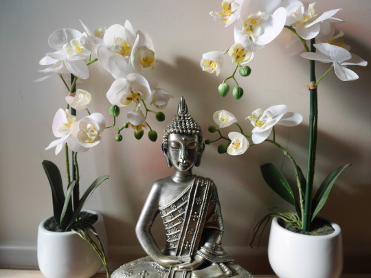
Object #2: Buddha Statue Significance: A Buddha statue is located in our dining room that is placed on top of our bookshelves. New thinking/Connections: Buddhism is the way of living. I could potentially showcase this idea in my poster to cherish it’s way of living. P.O.V: The values and beliefs of the religion teach how to be resilient, learn how to let go, mindfulness and acceptance. This was where my beliefs and values stem from – although I may not identify as religious but has helped me to better understand who I am. Visual Elements: Buddha can be seen as a peaceful figure. Qualities: Made out of some kind of material. Technical Components + Processes: Buddha’s position helps the viewer to understand what kind of figure he is. Context: Socio-cultural and Historical. The history of the religion and its significant impact on communities. Relationships to Work: Folktales. Given the opportunity to explore my heritage’s religion, Buddhism is a predominant religion in Southeast Asian countries.
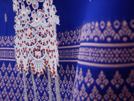
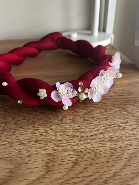
Object #3: Buddha Statue Significance: Close-up shot of Sampot, a traditional garment worn by men and women in Cambodia. Ao Dai is a Vietnamese traditional garment worn by women. New thinking/Connections: Take inspiration from the style of the clothing. How it’s presented, taking inspiration from it’s patterns. P.O.V: Cultural clothing is a reflection of the community's history, identity and values. Visual Elements: Elegant, Extragent. Qualities: Different kinds of fabric. Context: Socio-cultural and Historical. Someone's cultural background contributes to how an individual sees themselves and is also to be shared and celebrated with others. Relationships to Work: Concertina. Where I explored different aspects of my cultural heritage.
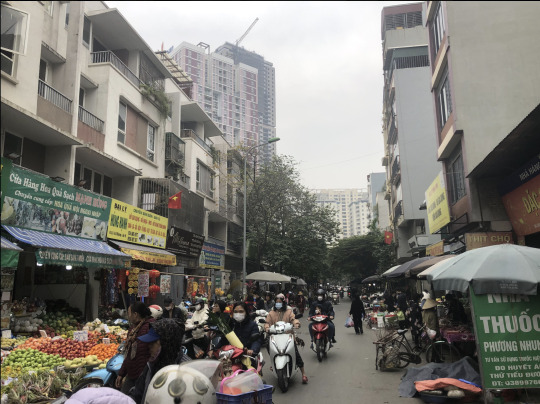
Object #4: Food Markets Significance: My solo trip to Vietnam. Although I haven't had a chance to visit my ethnic country, however, the environment itself is very similar. New thinking/Connections: The differences between my life in New Zealand in comparison to a third-world country. P.O.V: This trip has helped me to gain insight into the environment my parents grew up in. Visual Elements: Overcast, Cloudy, Quiet. Context: Socio-Cultural. Life in a third-world country. Relationships to Work: Taking photographs of the places I’ve been to and being able to look back on them.
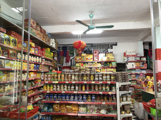
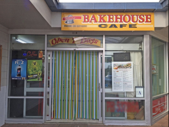
Object #5: Family Owned Businesses Significance: Being a daughter who is a part of a family-owned business. My parents owned a bakery, where I had spent the majority of my childhood. New thinking/Connections: The impact of being a part of a family business has its moments and hardships. P.O.V: What I miss about this place, was the community and the relationships I've developed while working there. Visual Elements: The designs of collaterals (signs, menus etc.) are in-cohesive. Technical Components + Processes: Typography. Relationships to Work: Brand identity for a cafe.
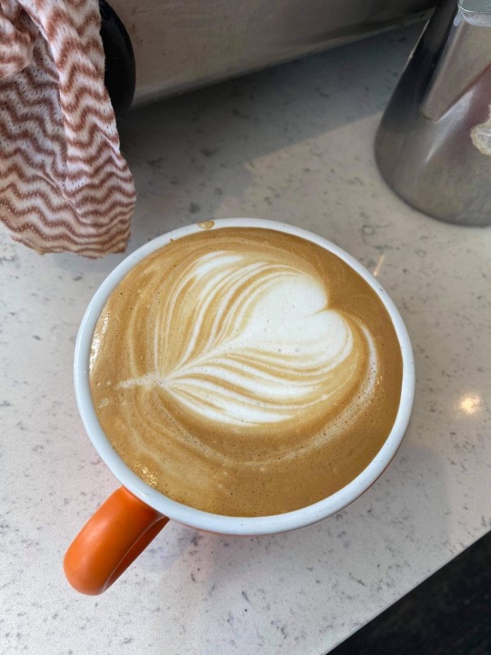
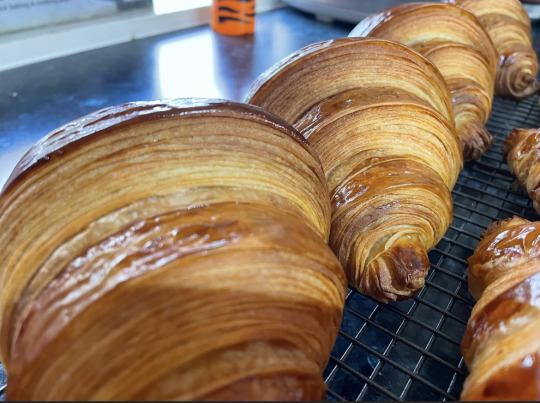
Object #6: The Kiwi Classics Significance: Kiwi culture - Mince and Cheese Pie, Cream Donut, and a bottle of coke is a staple in New Zealand Culture. New thinking/Connections: Growing up in the Bakery - loved the atmosphere and how food can connect people. Qualities: Savoury, Sweet, Bitterness. Technical Components + Processes: Commercial machines (pastry roller, coffee machine) that are used to ensure the quality and quantity of a product. Relationships to Work: Brand identity for a cafe.
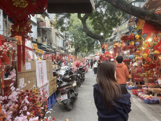
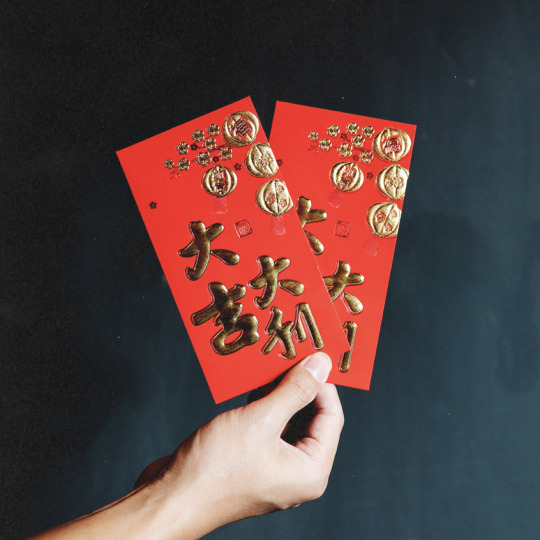
Object #7: Chinese New Year (Red Envelop) Significance: Growing up, celebrating cultural traditions such as Chinese New Year allowed me to feel a sense of community. Now that I haven't celebrated it since my grandparents moved out; it has made me realise how much I missed it. New thinking/Connections: The importance of learning about cultural heritage. It plays a crucial role in shaping how we view the world and feel connected to those who hold the wisdom and insights of those who came before us. P.O.V: Chinese New Year is centred around removing the bad and the old, and welcoming the new and the good. It is a time when it's worshipping ancestors, exorcising evil spirits and praying for a good harvest; to start off the new year. Coming together and celebrating with others. Visual Elements: Red and gold. Technical Components + Processes: A lot of activities and rituals for prep before the New Year. Typically, during this time of year stores will be closed. Context: Historical Context.
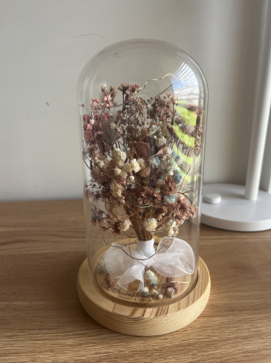
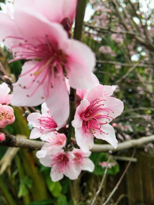
Object #8: Flower Dome Significance: I have a lot of fake plants in my room. This one in particular was given to me as a gift. New thinking/Connections: Helps to keep me grounded when things get stressful. Visual Elements: Different kinds of dried flowers Qualities: Rustic, Vintage, Delicate Technical Components + Processes: Dried flowers, fairy lights, Floral Arrangements. Relationships to Work: Floral designs.
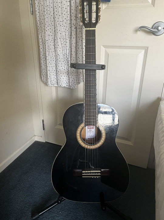
Object #9: Acoustic Guitar Significance: I enjoy listening to music, especially listening to an acoustic cover. This led to a new hobby that I cherish in my spare time. New thinking/Connections: Learning new chords, plucking and strumming patterns. Learning how to read sheet music. P.O.V: A part from acoustic, I enjoy listening to instrumental songs in general. Visual Elements: Not your typical wooden guitar. I liked the design of it overall. Repetitive pattern Qualities: Wood Technical Components + Processes: Tuning the guitar Contextual: Being a part of a community and contributing sheet music. I use Guitar Tab, where it's a website where people can contribute their chord or tab version of a song, YouTube is a great source as well.
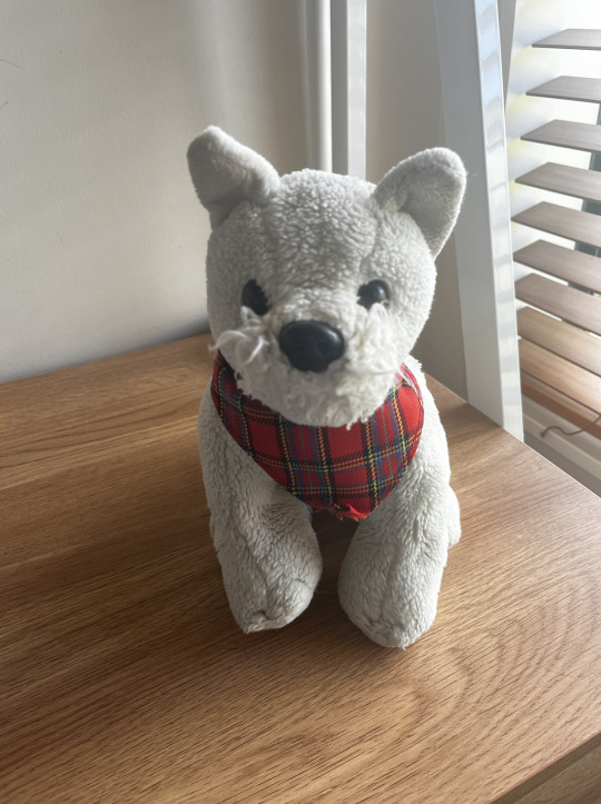
Object #10: Snowy (Stuffed Animal) Significance: When I was a kid. My Stepdad, Mum and I visited Martha's Backyard. Martha's Backyard is an American Store and at the end of that trip, I brought a plush toy home with me. A Scottish Terrier named Snowy; to this day, it holds sentimental values from my childhood and my love for dogs. New thinking/Connections: I've collected a lot of dog plushes growing up. I've learned the names of each breed and had to name them. I've always wanted a dog but wasn't able to get one until I got to own a Labrador retriever. P.O.V: My love for dogs. Qualities: Some kind of fabric material. Soft material Context: All animals deserve a home.
1 note
·
View note
Text
W5. Formative Script/notes for presentation
I wrote up a little script to figure out how long I was taking to talk - with this script it was around the 5minute mark or less.
The creative
My name is jasmine.. Some of my creative work in the past involves photography, campaign and multimedia work. A lot of my influences as a designer come from the media I consume as such artists like rene Ferrari stand out to me as their material’ also use entertainment as the building blocks to their work. Thematically I draw a lot of inspiration from people like lise sarfati who document girlhood or psychogeography through travel photography - a lot of these show up in the work I have done such as the cyanotype I did documenting objects of sentiment in my life.
The community
I explored this in more detail through my mindmpa linking my research to date with my work. Here you can see themes of sentimentalism, music, feminine identify that link my work to that of other creatives a lot of the artists i look into were women who explore what being a women in the modern world intails - it then looked into academic sources exploring this. a lot of the culutral or social infleunce coming through my work is that of the people around me and how they choose to bring meaning to things - something kija lucas looks into specfically. environemtnal influences would be the art of traveling - and how diffefrent environements impact peoples memories/emotions. I do feel a lot of my work is largely visual and I would want to look into typography going forward alongside screenprinting - possibly how the two can mar together.
Creative communities
Lise sarfati, is a french photography who still practises today, I would love to work for her or she be my mentor. I didn’t know the name psychogeography before i started researching her, and I think it applies to the sort of photogrsphy ice always been interested in - as such shes a big current inspiration. Denis dulude is a practising canadian type, motion, and graphic design is someone who’s work excites me, I think its interesting how he mixes silk screenrpitning with typography - how he layers them, Hes someone I would want to learn more about technique from. Kris Sowersby A nz type designer is someone I’ve found through this class and made me look at typography in another way - since i feel im not that versed with ty[ograhy learning from someone like him who uses a range of typogrhy would be interesting. Jim allen is a deceased NZ visual artist, i particularly likes how he valued all 5 senses when it came to his work - often setting up exhibitions that i imagine would make me feel like i was in cyantoype. I rarelt think of senses like touch or hear since a lot of the work ive done doesnt rely on those two things - it could be interesing to explore. Kija Lucas is someone I found while looking for inventory examples, she is an practising american photography whose work is that of collections. a lot of her work is around sentamentalsim and as someone who collects my memories it was interesting to see why others do the same - yet how different teach persons stories are. Leading from that , ive started collecting some objects its not complete yet but ive collected objects such as pendants, keepsakes, letters, photography, media with themes of sentamentalism, psychogeography and girlhood and is what im looking into going forward.
1 note
·
View note
Text
How I became a graphic designer with no experience?
Breaking into graphic designing course with no formal education or experience might seem impossible. When I first considered becoming a graphic designer, I had no design degree, no portfolio, and zero experience in the field. But today, I work as a freelance graphic designer with a steady flow of clients and a portfolio I’m proud of.
If you’re wondering how to start a graphic design career from scratch, this is my story — the steps I took, the tools I used, and the lessons I learned along the way. Whether you're a student, career-switcher, or simply exploring a new passion, I hope this story helps you take the leap.
Step 1: Realizing That Design Is Everywhere
My journey started not in an art class or a tech company, but on Instagram. I was running a small handmade jewelry page and needed to design simple posts and promotional banners. I started using Canva, a free and beginner-friendly design tool, to make graphics. At the time, I had no clue about color theory, typography, or layout principles. But what I lacked in experience, I made up for in curiosity.
That’s when it clicked — design is everywhere, and someone creates it all. The logos, packaging, ads, social media graphics — they’re not random. Someone thoughtfully designed them. And I wanted to be that person.
Step 2: Teaching Myself the Basics
I didn’t enroll in a fancy course or go back to school. Instead, I relied on free resources online. Here's how I taught myself:
YouTube & Free Courses
I subscribed to channels like The Futur, Yes I'm a Designer, and Flux Academy.
I watched tutorials on how to use Adobe Illustrator and Photoshop, even though I started with free tools like GIMP and Photopea.
I took beginner-friendly courses on platforms like Coursera, Skillshare, and LinkedIn Learning (many offer free trials).
Books and Blogs
I read “Thinking With Type” by Ellen Lupton and “Logo Design Love” by David Airey.
I followed blogs like Creative Bloq, Smashing Magazine, and 99designs to stay updated with trends.
Design Principles I Learned Early On:
Typography and font pairing
Color harmony and contrast
Composition and layout using the grid system
Visual hierarchy
Branding and storytelling through design
These weren’t just theory — I practiced every concept by applying it to small projects.
Step 3: Practicing Through Real Projects
I didn’t wait until I was “good enough” to start designing. I learned by doing:
Personal Projects:
I redesigned my jewelry brand’s logo and Instagram posts.
I created fake projects — like branding for a coffee shop or a book cover for a fictional novel.
I entered free design challenges (like the Daily Logo Challenge) to build momentum.
Helping Friends and Small Businesses:
I offered free design services to friends, local shops, and non-profits in my area.
I designed flyers for a friend’s yoga studio and a logo for a neighborhood bakery.
These “unpaid” projects were crucial. They gave me real-world experience, helped me learn how to work with clients, and added actual work to my portfolio.
Step 4: Building My Portfolio
Even with a handful of projects, I needed a way to showcase my work. I created a basic online portfolio using Behance and a simple Wix site.
My Portfolio Included:
A clean homepage with my name, intro, and design specialties
A gallery of 5–6 case studies with images, descriptions, and mockups
A contact page and links to my social profiles
I didn’t have fancy clients yet, but I made each case study look professional and explained the design thinking behind every project.
Step 5: Getting My First Paid Gig
My first paid job came through a Facebook group for freelancers. I responded to a small business looking for someone to design a menu. I charged ₹1000 (roughly $12), which was very low, but it gave me confidence and led to other referrals.
I started applying to more freelance platforms:
Fiverr – I created a profile offering logo design and social media graphics.
Upwork – I wrote custom proposals for small gigs.
Instagram & LinkedIn – I shared my work and followed potential clients.
Little by little, I built a client base. And every project, no matter how small, helped me improve.
Step 6: Leveling Up My Skills and Tools
As I earned more, I reinvested in myself:
I purchased an Adobe Creative Cloud subscription to access Illustrator and Photoshop.
I bought a used drawing tablet to experiment with digital illustration.
I enrolled in a paid UI/UX design course because I wanted to expand my services.
With better tools and skills, I started taking on bigger projects — brand identity packages, website graphics, and infographics.
Step 7: Finding My Style and Niche
Over time, I noticed that I was drawn to minimalist design and branding. I loved crafting logos, business cards, and brand guidelines. So I leaned into it.
Focusing on a niche made it easier to market myself, attract ideal clients, and improve in a specific area rather than trying to do everything.
What I Learned Along the Way
You don’t need a degree to be a designer. You need practice, curiosity, and discipline.
Start with what you have. Free tools like Canva, GIMP, and Photopea can take you far.
Real projects matter more than perfect ones. Don’t wait to build a polished portfolio. Just start.
Design is a problem-solving process. It’s not just about making things pretty — it's about making them functional and effective.
Never stop learning. Trends change, tools evolve, and there’s always something new to master.
Where I Am Now
Today, I work as a freelance graphic designer, and I’ve worked with clients in India, the U.S., and Europe. I’ve built brand kits, designed websites, and created pitch decks for startups. I still consider myself a learner, but I’m no longer a beginner.
And it all started with zero experience.
Conclusion: Your Turn to Start
If you're standing at the edge of this creative field, wondering if you can break in without experience, the answer is yes, you can.
You don't need a design degree. You don’t need fancy software. You need a willingness to start, make mistakes, learn, and grow.
My story isn’t unique — anyone can learn graphic design with consistent effort and the right mindset. You could be the next one to turn your passion into a profession.
So what are you waiting for? Open Canva, watch a YouTube tutorial, or take on your first project — and take that first step.
0 notes
Text
I transcribed it cuz the typography is tiny
Leigh Keily: Where are you from?
Sam Reid: I’m from south of Sydney, I grew up on a cattle farm an hour south of Canberra Near the Australian ski fields, which actually exist, which most people don’t know. But I went to school in Sydney which is usually an easier answer!
Stephen Conway: Were you a farmer?
Sam: In school holidays I was, yeah…
Stephen: We had a farm issue…
Sam: Did you?
Leigh: Yeah…
Sam: Oh issue as in a magazine issue… I thought you meant you had like an ‘issue’ (raises eyebrow).
Leigh: Yeah… Most magazines don’t have farm issues. It was actually in my editor’s letter last month that we had to do the Outward Bound survival camp.
Sam: I was an Outward Bound instructor! Did you enjoy it.
Leigh: Only in retrospect. It was horrible at the time.
Sam: Very good life experience I think. Good for character building.
Leigh: It was really good to see people crack under the pressure, of course.
Sam: It was always the guys that cracked! I loved it, having to get massive spiders out of the tents and teaching people how to make tents out of plastic and bits of rope. I always think I’m the worst advertiser for Australia because I always bring up the spiders…
Leigh: I once went to get to bed and there was a snake in my bed.
Sam: Really? My mom once put her foot in a shoe and there was a funnel-web spider in it, and they’re the spiders that are so deadly you have like twenty minutes to get to a hospital if you’re bitten, or you die. And that was living at home in Sydney.
Leigh: Yeah, that’s kind of scary.
Sam: It’s cool though.
Leigh: It’s kind of cool coming from a country where you know spiders are deadly. English people get so freaked out by the smallest creatures here.
Sam: Well it’s kind of like a playground here where you can run around in the grass bare foot and not even worry about it.
Leigh and Stephen gesture arms flapping, running through a field.
Leigh: So what have you been doing lately?
Sam: Well, I’ve had a few films out this year so I’ve had kind of a mad year flying all over the place promoting these films. The Railway Man came out this year and Belle, which we had this incredible journey around America. We opened the film in America and Oprah Winfrey liked the movie and invited me, Gugu and the director to her house. She threw this big lunch - it was nuts! I remember driving up to her house and being like “holy fuck this is actually happening” and there was Oprah standing at the door in her orange poncho. I mean it was incredible having someone
Never getting over the fact that our favourite farmboy Samanthyne Reid also used to be a survival instructor who liked to build tents out of scraps and go hunting for cool spiders in the Australian outback.
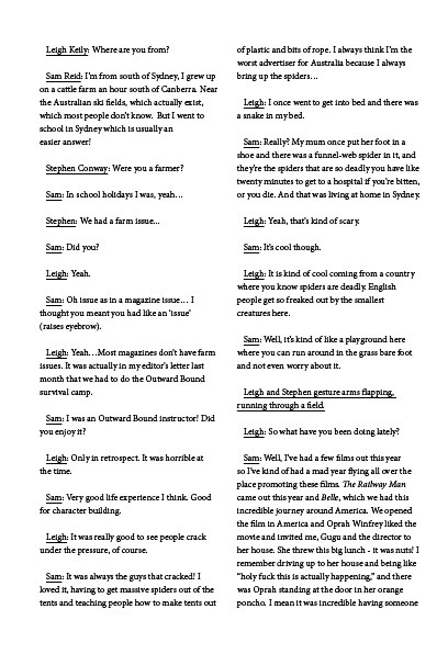
From JON Magazine issue 6.
136 notes
·
View notes
Photo
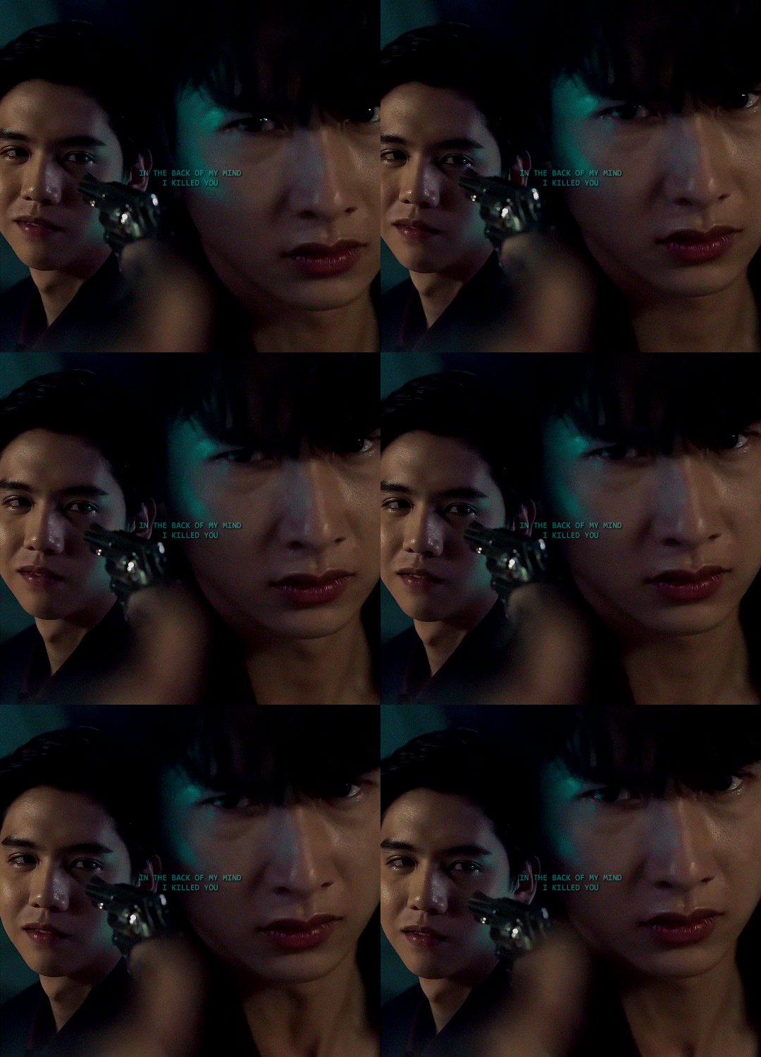
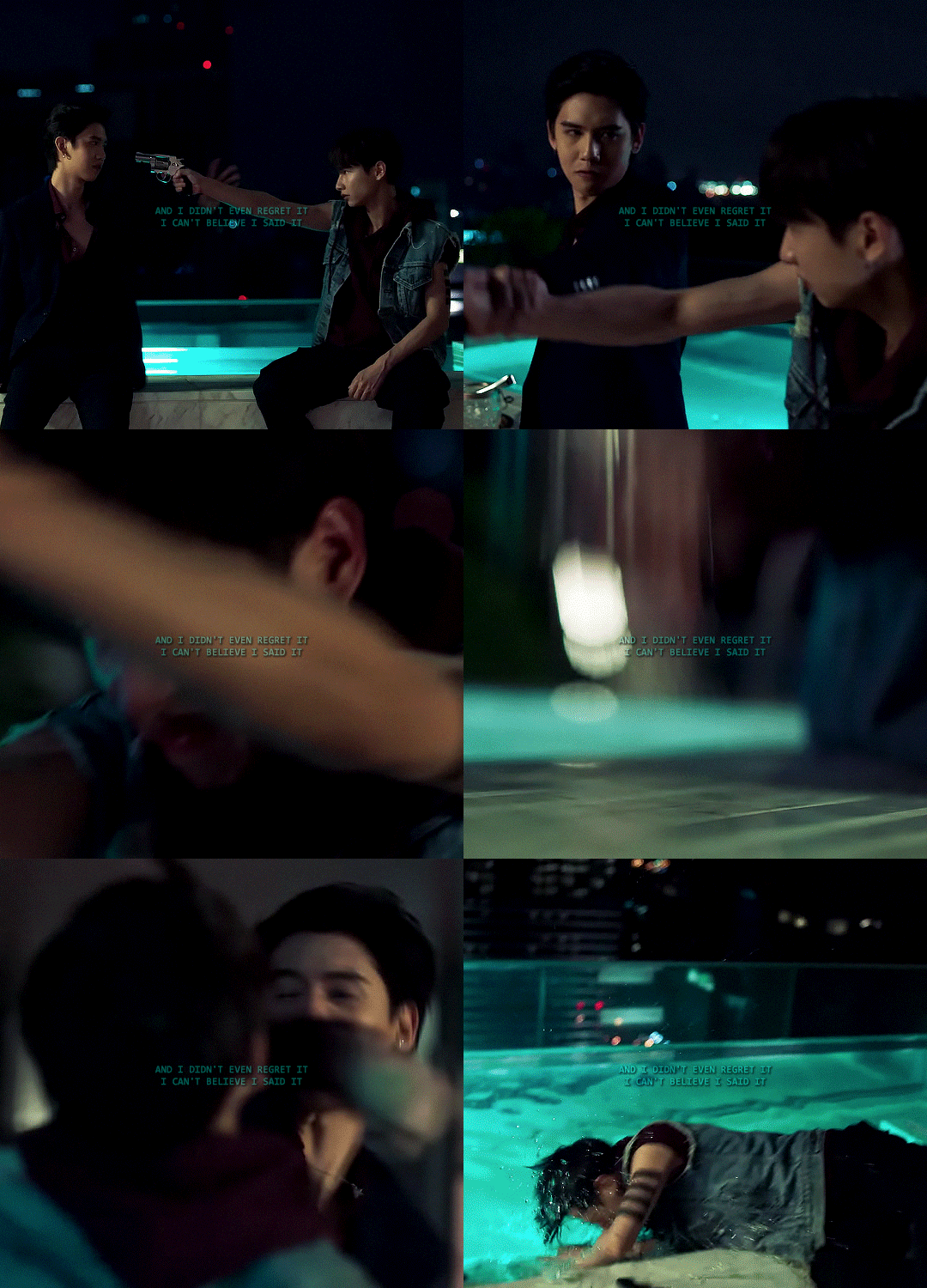

userdramas event 06: second time to shine — black & todd, not me (2021) | romantic homicide, d4vd
#userdramas#asianlgbtqdrama#bldramaedit#not me the series#gun atthaphan#sing harit#😭😭😭#sing played todd like he was in love with black#that scene in episode 13 where they are trying to kill each other#todd with tears in his eyes urging black to just do it#knowing he can't#neither of them can#anyway this is their song!!!#this has been in my head for a year#lets not talk about how i can't do typography#once again i'm asking for someone to come to my house and teach me#also i wanted more grain but tumblr size limit said no 💔
184 notes
·
View notes
Photo
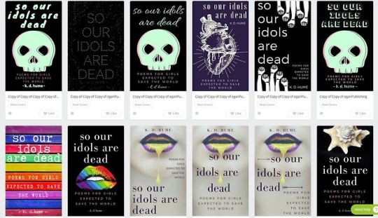
Welcome to my “designing a book cover for little to no money” process. I’ve just begun to think about this cover. It’s quite likely I won’t use any of these, and may still end up completely changing the title and/or tagline.
8 notes
·
View notes