#seriously this makes me so sad and mad I'm smad
Explore tagged Tumblr posts
Text
Apo and Colorism-a rant
So, I am on Twitter, but I'm not in BL/KPop stan twitter, so I didn't see a lot of this, but I saw a couple of BL tiktokers speak about it and it makes me mad and I want to rant about it. I also brought examples. The gist I was hearing is that a lot of garbage people on Twitter were making negative comments about Apo's darker complexion. I'm well aware that colorism exists everywhere, but I know that it is also especially prevalent in Asia as a whole. Thinking about this and feeling so sad that anyone would even think of being mean to sweet gorgeous bean, Apo...well it made me mad, but it also made me realize that most of my fave pics of him have been candid. So then came a Google rabbit hole and 2 days of research, and y'all, I think the evidence is clear. I'm gonna try and give this some flow, but it may not work out that way.
I'm gonna start with magazine covers, because from what I saw they are the most frequent culprits of this type of photo editing. Like this is clearly not the Apo we know and love. The Men's Health is from 2015, but the other two are fairly recent.

Vogue Thailand released their cover and interior photos very recently. On the cover Apo, is clearly much paler than in the inside photo. Honestly, even Mile looks much paler on the cover vs. the inside photo.
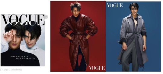
I also have this comparison, which is the Vogue Thailand cover and an inside shot from Unique magazine. Since it's a similar-ish pose with Mile's hand partially in front of Apo's face. There is the difference between studio light vs natural light, but I feel like you can definitely see the difference. Also consider that Apo in the Vogue cover is lit to cause deeper shadows around his jaw, were he evenly lit he would look even paler.

We also have these covers from Kazz magazine, which are especially odd to me, because both Apo and Mile are made paler on their shared cover, which is a bit of an odd choice. this is also the cover that made me realize that Apo is edited paler more often when he's in a photo with Mile, which just gives me some weird vibes.

Their interior shots are a mixed bag, based on what Kazz posted on Instagram.
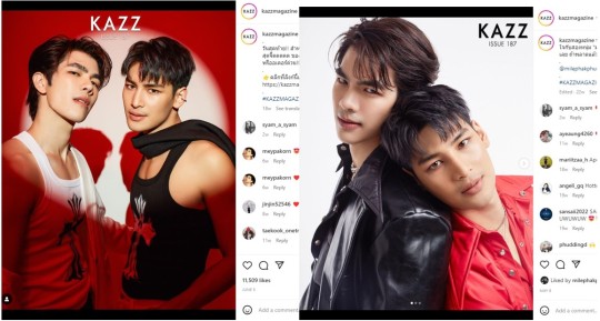
Kazz also posted a video from the shoot, which I think helps some to put things into context, because most people's complexion will change depending on the season and sun exposure. Just because a cover is released in October, those pictures could have been taken in June, etc. But we do have live footage of the day of the shoot.
But I like I said, I did notice a lot of more complexion editing on covers vs interior photos, but there was one magazine that just said nope, all of them will be edited so pale...and that was Madan. Seriously, that pastel should bring out Apo's warm complexion, but he's as pale as Apo here.

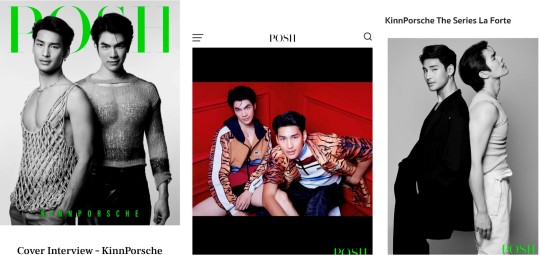
the next magazine I have is Posh, which is kind of a mix. The cover and some of the inside shots are black and white, so that does change how easily you can see complexion differences, and I don't think it egregious here in the black and white photos. However, the color photo is lit to make Apo's face as pale as possible, and then possibly edited further. Look at the difference between his face and his arm...it's massive.
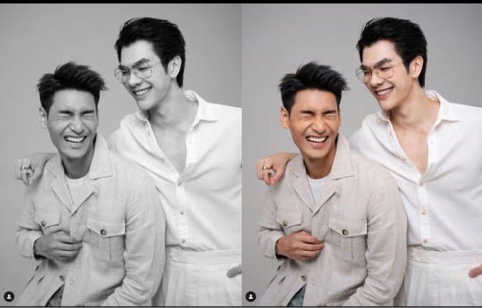
Here is a studio pic, though candid that I pulled from Apo's Instagram, and I just took down all the color saturation. You can still tell that Apo has a darker complexion that Mile.
So now let's talk about some magazines that did a little better. We have Unique, which is guilty of paling Apo down on the cover, but the interior photos are MUCH better.

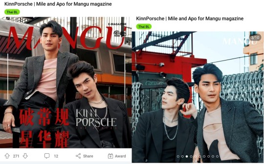
And the one of the best that I found was Mangu. Now these are shot outside on location, meaning that you're not blowing out everyone with studio lighting, but photo shop still exists and they could have easily done more tweaking to his complexion.
Best magazine shoot is L'Officiel. They really captured the gorgeous warmth of Apo's skin here. Like just *chef's kiss*.

Now, magazine are bad, but advertisements were so much worse. Here's just a couple pulled from Apo's Instagram, I've matched them with various candid photos from his Instagram as well, to show the difference. It does not escape me that two of these examples are a for a beauty brand/product. This first set is done with studio shots for comparison, since lighting will affect the overall color/tone accuracy of a picture.
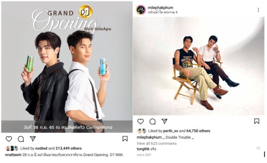
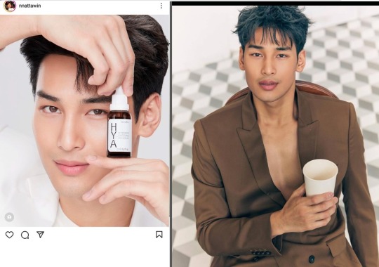
And then we have a comparison between ad and exterior candid photo, in good daytime light, so pretty accurate as far as color/tone accuracy.

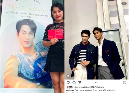
Now...I am American, and to be honest the majority of my experience with colorism comes from conversations specifically around and with black women, so there's going to be differences. I did try to find a shot/ad/magazine that was specifically American (or even western-media) based, but the best I found was an interview with Teen Vogue, which used pics that were provided by BeOnCloud, they didn't take any of their own photos. But they also did not edit them in a way that altered Mile's or Apo's skin tone.

I just want to end this to say, that I love Apo, I think he's adorable and beautiful and he seems very kind. It hurts my heart to see him given any negative feedback that's based around his darker complexion. So, if you see this shit, especially in local to you media, whether it's Apo or anyone else, call it out. Question it, be vocal about it. Because these 'creative decisions' are going to keep being made.
So....
#apo nattawin#kinnporsche#colorism#colorism in media#colorism in advertising#mile phakphum#vogue thailand#mens health thailand#madan magazine#kazz magazine#mangu magazine#unique magazine#l'offciel magazine#kinnporsche the series#seriously this makes me so sad and mad I'm smad#Apo is gorgeous#duh#He doesn't deserve this negativity
62 notes
·
View notes