#looking at the artist's other works and looking for inconsistencies between art quality and mistakes are the best ways to tell AI art apart
Explore tagged Tumblr posts
Text

@babycharmander I agree those sites are not reliable, but looking at the artists' other posts makes it very obvious they are using AI (one even admitted it, so...)
Every artist makes mistakes, even professionals, but there’s a correlation between one’s skill and the kind of mistakes they make. Someone with that level of rendering skills and face anatomy would not make hands with very glaring and weird articulations (which is also one of the few things AI can’t get right, so make your own conclusions about that). This doesn’t mean that any artist who can’t draw hands correctly uses AI, but you can’t make flawless art in every aspect and then have those wonky fingers that are however rendered correctly. Anatomy is the base of rendering: if you know anatomy you can render correctly - the opposite is rarely true. It’s really hard to explain this without a ton of examples, but if you’ve seen enough drawings from artists of all kinds of skills it becomes obvious what kind of mistakes they make.
Then there’s the matter of consistency. Some people improve faster than others, and some people are more proficient in having many very different styles than others. But these things also become very obvious if you look at an artist’s previous works. There’s absolutely no way the first person went from this to this in the span of two days, especially considering their previous works all look like the first link and nothing like the second. You can't excuse this as "it's an experiment " either because the level of skill between both drawings is immense – even if you tried a different, more realistic style, your lack of skill would show up in many aspects. I don’t mean this as an insult, but I was a beginner once and I know very well that the portrait above would not have been made by the kind of person who still overuses the airbrush to do the shading.
This is without taking into account that the first portrait has elements characteristic of AI (weird/blurry/vague lines in small details for example). This is not an “artist who can’t get every detail right” situation, this is very much someone using AI art and passing it as their own.
And while I agree you shouldn’t harass people who use AI, you should definitely call them out, which are two different things. Don’t send them death threats or insults but do make other people aware they are using AI, because otherwise they might fall for scams. The first artist made that portrait in exchange for a coffee – someone paid real money for a drawing that was made using AI without them knowing. This can have really bad ramifications and could even pose legal problems. Besides the basic "if you are paying for a man-made drawing, it should be man-made, not AI-made", AI art can’t be copyrighted, so imagine if someone paid $100 for a character design just to find out it was made by an AI and thus can’t hold the copyright for that design. Not to mention the moral question of AI being trained with real artists’ art without their consent, often to copy and profit from their personal styles.
Also, if you’re caught using AI, that’s obviously going to affect your reputation, there’s no denying that, but that doesn’t mean you can't apologize and just… stop using AI. Some people will be distrustful of you, of course, but others will value your honesty and stick to you and support you (in fact, I believe you *should* support artists who apologize for plagiarizing/using AI and change for the better after that). However, if you double down and deny using AI when it’s so obvious, then don’t complain when people unfollow you, write (polite) posts calling you out, etc. We already do this when someone is caught tracing or stealing other people’s artworks, so we shouldn’t make an exception for AI users.
And yes, it sucks that we have to play detective and over-examine every artist's work to make sure they aren’t plagiarizing or using AI – I’ve seen some actual artists get accused of using AI and I completely understand why they would feel offended. But it sucks even more to see people who use AI get thousands of notes, earn money through commissions/donations/etc from people who believe they are making their own art, and even win art contests or take artists' jobs.
AI art has already become a huge issue, with large companies threatening to replace artists and writers with AI, and this will only become worse from this point forward. Posts like this are, unfortunately, necessary, especially given how normalized AI is becoming in online spaces and how indifferent non-artists are about it. If we don’t take care of ourselves, no one will.
Update! A kind soul over on twitter let me know that there are pretty reliable AI art checkers online, that have been developed by people specialising in AI and machine learning!
An NYT article also talks about the pros and cons of a number of them.
I tested all the 3 free open access sites (Illuminarty, Optic AI or Not, Umm-Maybe) and only Illuminarty and Optic AI or Not gave consistent results on both art and photographs.
I'll put the links below so anyone can go and check for whichever art they want to (download the original images from tumblr posts, and upload them)
https://www.aiornot.com/#home
https://app.illuminarty.ai/
These are the results :

Optic flagged it as AI immediately.
But Illuminarty had very interesting aspect : when I uploaded the full image, AI probability was 10%. but, on cropping out the bottom of the image (jacket) the probability jumped to 73.9%
This is consistent with my original comment on the art here
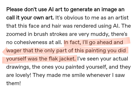
My limited understanding of these programs indicate that they scan the entire image including all the individual pixels. AI programs like Stable Diffusion, Mid Journey, DallE all leave signal artifacts when they process an image, which is then left on the final pic generated!
Compare these two @/skykashi original arts, that are immediately flagged as human made.

And now I get to my favourite AI art bro in the fandom @madasama! I commend you for admitting that you not only use AI, but are proud of producing a large number of "real" arts in such a short time!
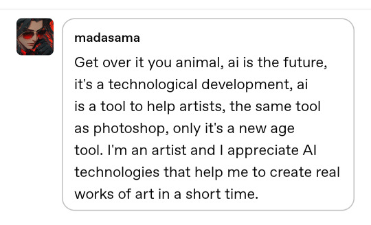
Here's your "art"s results!!

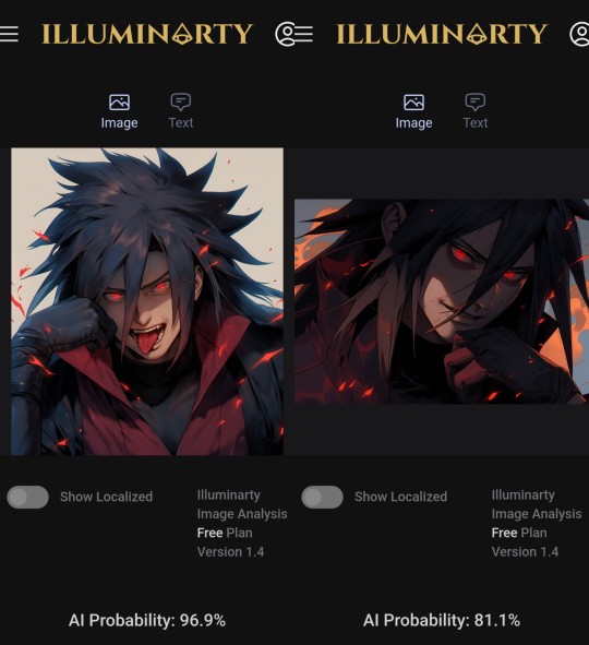
@elhnrt made a far more detailed and organised post about this specific weirdo, feel free to check it out!
I will be using fandom tags on this particular post so that it has a broader reach. Especially for genuine digital artists and art lovers. Save the links, and always keep an eye out for AI, it's everywhere these days.
#art stuff#then again i dont think op's use of those sites is a good argument because they are not reliable#but with the first artist doubling down on the “i didnt use ai art” and the second one just outright admitting you have no other option but#to make a post like this#and as i said above this is the standard procedure when someone is caught stealing drawings#you politely talk to them in private and if they refuse to take down the post you call them out publicly so people can block/report them#ai artists should absolutely get the same treatment#also a small addendum but i dont think showing layers/drawing process is enough of a proof#nor should people demand artists to show them#besides the fact that they can be faked some artists don't record the process or use one layer for the entire drawing (like me)#looking at the artist's other works and looking for inconsistencies between art quality and mistakes are the best ways to tell AI art apart#not perfect ofc but it is what it is
379 notes
·
View notes
Text
5 Steps to Promote Your Remix on Digital Stores and Keep All Royalties
The Independent Artist’s Dream In today’s music industry, independent artists have more tools than ever to share their creations with the world. Among these, the ability to promote remixes across digital stores while keeping 100% royalties stands out as a revolutionary development. For remix artists, this means not only achieving creative freedom but also ensuring they benefit fully from their hard work. But how can you navigate this process effectively? In this guide, we’ll walk you through five essential steps to get your remix on digital platforms and maximize its reach—all while retaining every cent of your royalties.
Step 1: Choosing the Right Digital Distributor Digital distributors are the bridge between your music and digital stores. Selecting the right distributor is crucial for a successful launch.
Understanding Digital Distribution Digital distributors like DistroKid, TuneCore, CD Baby, and others help artists upload their music to platforms such as Spotify, Apple Music, and Amazon. They handle technicalities like file formatting, metadata, and licensing, ensuring your remix is available to millions of listeners.
Key Factors to Consider When choosing a distributor, look for platforms that prioritize artist-friendly policies. Ensure they offer 100% royalties, a simple upload process, and access to comprehensive analytics. Many distributors charge an annual fee, while others take a cut of your earnings—so compare pricing structures to find the best fit for your goals.
Popular Distributors for Remix Artists If remixes form the core of your music, consider distributors with strong copyright support to avoid takedown issues. Check reviews and user feedback to ensure reliability.
Step 2: Creating Eye-Catching Cover Art Your cover art is often the first impression potential listeners get of your remix. It’s your visual branding and can significantly influence how your track is perceived.
Why Cover Art Matters Great cover art grabs attention, conveys your remix’s vibe, and helps it stand out among thousands of other releases. A professional, compelling design signals quality and can entice listeners to hit play.
Tips for Designing Effective Cover Art Ensure your cover art aligns with the tone and genre of your remix. Use bold, clear imagery that reflects your track's mood and avoid cluttered designs. Tools like Canva, Adobe Photoshop, or even hiring a freelance graphic designer can elevate your visual presentation.
Best Practices for Digital Stores Digital platforms have strict requirements for cover art resolution and dimensions. Typically, a 3000x3000 pixel image in JPEG format works best. Include your artist name and remix title clearly to make it identifiable at a glance.
Step 3: Optimizing Metadata for Discoverability Metadata is the technical information attached to your remix, including the title, artist name, genre, and release date. Getting this right is essential for searchability and ensuring your remix appears in the right playlists and recommendations.
Understanding Metadata Metadata plays a vital role in how your music is cataloged and discovered on digital platforms. Correctly formatted metadata ensures that your remix is correctly attributed and easily found by listeners.
Common Metadata Mistakes to Avoid Misspellings, incorrect genre tags, or inconsistent information can reduce your remix’s visibility. Double-check all entries before submitting.
Enhancing Discoverability Through Keywords Incorporate keywords like "remix," "genre," and mood-related terms in your metadata to make your track easier to find. For example, if your remix is an energetic dance track, include terms like "upbeat," "party," or "EDM."
Step 4: Building a Buzz with Social Media Campaigns Social media is an indispensable tool for promoting your remix. With billions of active users on platforms like Instagram, TikTok, and Twitter, your music can reach listeners across the globe.
Planning Your Campaign Start promoting your remix weeks before its release. Share teasers, behind-the-scenes clips, or snippets of the track to build anticipation. Create a content calendar to ensure consistent posting.
Leveraging Platform-Specific Strategies Each social platform has its strengths. Use TikTok for viral challenges, Instagram for visually appealing content, and Twitter for engaging directly with fans. Collaborate with influencers or DJs to amplify your reach.
Engaging Your Audience Ask fans to share your remix, create user-generated content like dance videos, or participate in contests. Engagement drives algorithmic boosts, helping your remix appear in more feeds.
Step 5: Engaging with Listeners Post-Release The promotion doesn’t stop once your remix is live. Maintaining momentum post-release is essential for sustained success.
Responding to Feedback Interact with listeners through comments, DMs, and social media posts. Acknowledging their support fosters loyalty and encourages them to share your remix with others.
Using Analytics to Guide Future Promotions Most digital distributors provide detailed analytics, showing where your remix is being streamed, who’s listening, and what’s resonating. Use this data to refine your marketing strategy and identify potential new audiences.
Keeping the Buzz Alive Post-release content ideas include sharing milestones (e.g., “10,000 streams!”), creating remix-specific merchandise, or offering exclusive content to your most loyal fans.
Conclusion: Take Control of Your Music’s Future Promoting your remix on digital stores while keeping 100% royalties isn’t just a possibility; it’s an opportunity to redefine your music career. By following these five steps—choosing the right distributor, creating standout cover art, optimizing metadata, building a social media campaign, and engaging with fans—you can take full control of your music’s success.
As an independent artist, the ability to retain all your earnings allows you to reinvest in your art and sustain your passion. So, why wait? Start your journey today and unleash your remix on the world. The stage is set, and the spotlight is yours.
What strategies have you used to promote your music? Share your tips or experiences in the comments below!
Related Articles:
For further reading, explore these related articles:
Promote Your Remix on All Digital Stores Without Paying Fees
How to Promote Your Remix on All Digital Stores and Multiple Platforms Effectively
Promote Your Remix on All Digital Stores to Get Paid
How to Promote Your Remix on All Digital Stores for Maximum Exposure
For additional resources on music marketing and distribution, visit DMT Records Private Limited.
0 notes
Note
Annon-Guy: Animation - In terms of artstyle's, do you prefer Hand-Drawn Sprites or 3D Rendered Models in regards to fighting games?
There's actually... three factors that can help make or break a game's appeal:
1. The Art style and rendering of the characters (in other words, how these characters are initially designed, which is sometimes inconsistent depending on the artists involved).
2. How accurately that art style(s) is converted in to either models or sprites. (Physics and animation quality are also a factor, including how big or small the sprites/models are.)
3. Whether or not the overall style/presentation/environment of the game appeals to the player. (Just as with Guilty Gear, things like Lifebars/User Interface, Music, Story, game mechanics, extra features, etc all help define the appeal.)
Factors 1 and 3 typically go hand in hand as far as how a game is presented, game difficulty and its adjustment can also be factor as well.
But, more importantly, Factor 1 is usually set by the developers and how they want to present the game to make it appealing.
Like, for example, comparing games like BlazBlue and Melty Blood.
At its peak, BlazBlue has very well-defined artistic visuals and large colorful sprites which are very expressive and complex, not to mention decently animated.
On the other hand, Melty Blood has very small sprites, very simplistic animations, and while the game is still very fluid in animation, still has limitations in how the game plays out (when a character gets hit for example, they do not have multiple reaction animations).
Rather than saying BlazBlue is "better", it's more accurate to say Melty Blood has its own "appeal" to certain players.
This could be said of other games, like Akatsuki, Arcana Heart, Skullgirls, and many others. Each has their own method of animation, sprite rendering, and overall presentation.
What determines how they rank in appeal is up to the players themselves, not so much what they actually LOOK like.
If you were to compare Melty Blood with similar art styles in anime like Fate/Stay-Night, obviously the latter would be a superior presentation, but at the same time consider what Melty Blood itself would look like if rendered in the same style as a film series like Garden of Sinners?
This is what I mean by "accurate portrayal".
It's one thing to create a sprite based on a particular artist's nuances and have it not be "all that accurate"... but it's another thing entirely when you can render it right down to the smallest details that the artist is known for.
If, for example, you compared such a work (Melty Blood but with higher quality sprites/animations) with BlazBlue... I'm almost certain fans would be split down the middle over which they liked more.
In some regard, this was the end result of a game like Under Night In-Birth. While still a game made by French Bread as Melty Blood was, their goal was to compete and surpass the sprite quality of BlazBlue.
Now, consider how hype-inducing a game like BlazBlue Crosstag Battle actually is?
Players get to COMPARE the sprites of characters. Even characters from older games get to join in on the fun, and even had their animations updated, like Heart Aino from Arcana Heart and even Blitztank.
Well, "updated" is also fairly vague. Depending on whom you ask, you might say "would Heart Aino look better if animated/drawn by someone else besides BBTeam?"
Some might argue that BlazBlue sprites are TOO detailed, or they don't detail the accuracy of certain animations. There's lots of nitpicking to go around.
Now, let's shift gears a bit and discuss 3D rendering, animation, and presentation.
Depending on whom you ask, 3-D is either easier or harder to render in terms of "accurate portrayal" based on how an artist intends to present their characters.
A good way of understanding this hurdle is to look at some of the oldest 3-D fighting games in existence: Virtua Fighter, Battle Arena Toshinden, Fighting Vipers, Ehrgeiz, Power Stone, Dead or Alive, Tekken 1 and 2.
One of my favorites as an example is Battle Arena Toshinden. The 3-D models themselves don't really do the artwork presentation any favors, and yet this game did have something of a fanbase.
You could also compare it with the classic game Soul Edge, which had a lot of anime-based artwork which looked almost nothing like the 3-D models it presented.
Soul Edge later became the Soul Calibur series, and went for more "semi-realistic visuals" with its design, deciding to abandon its initial "anime" look. This was also true of the Tekken games, though in the case of Tekken 7 the lines are somewhat blurred because of how much they increased the quality of the game's design.
While Tekken 7 isn't exactly "anime", it does certain things that give it anime elements, like throwing fireballs (Geese/Gouki), and even some level of airdashing (Noctis/Kunimitsu). Contrast with Soul Calibur VI, which adds a lot of visual effects to clashing in the form or Reversal Edge clashes, Break Attacks, and other visuals.
Still, you have some level of grey area when it comes to comparing how accurately characters are presented.
Say you were to compare Mortal Kombat 9, Mortal Kombat 10, and Ultimate Mortal Kombat 11. There's quite a lot, in terms of details and features, that could be discussed between these three games.
All three of them still have their appeal, but the same is also true of older Mortal Kombat titles as well.
In terms of my own personal tastes, if I were to compare Guilty Gear Strive with a classic game like Guilty Gear X, while GGX doesn't "accurately portray" how characters looked in Daisuke Ishiwatari's artwork, the same could also be said of the renders from Guilty Gear Xrd.
Rather, in terms of significance, in terms of what people seek to enjoy, and the "limitations" people can endure (otherwise known as "suspension of belief"), or even just the hope that "my favorite character will be rendered in this amount of details"... again, oftentimes it boils down to personal appeal and expectations.
There are things Ishiwatari can do that no amount of 3-D rendering in Guilty Gear Strive (or later games) could ever accomplish. That is the undeniable truth about Art and presentation in videogames.
But part of the ambition in Game Design is to seek "how accurately" these characters can ultimately be portrayed (regardless of 2-D or 3-D platform) and ultimately how appealing such a game can become.
However, even if such games reach the Zenith of character appeal and presentation... how much of that can be made "fun" and "appealing" to gamers, remains to be seen.
As for myself, I acknowledge the source. No matter what mistakes Ishiwatari has made or will make... it's the fact that he continues to experiment, the fact he continues to make these games... that in and of itself is what I find "appealing".
2 notes
·
View notes
Text
LGBTQ Game Review - Lingua Fleur: Lily
A significant part of my job is knowing the details of the goings-on in the world of yuri. It, therefore, shames me to admit that I almost missed out on the visual novel Lingua Fleur: Lily as I was completely unaware of it until Taiwanese studios Narrator and Storia, the game’s developers and publishers, messaged me. Thank the great goddess of yuri that they did, because I would have regretted missing this experience.

Lingua Fleur: Lily is a short kinetic visual novel set in a university told from the perspective of student Yuyi, the protagonist. Yuyi is a quiet and introverted student, hardly interacting with her classmates and having no close friends. Her isolated circumstances change when she is paired with the outgoing Yile, the deuteragonist of the story, during physical education. Slowly Yile beings to befriend Yuyi, helping her to come out of her shell and be truthful about her identity and difficult past.
As previously stated, Yuyi is extremely reserved and often anxious. However, she is also quick to anger, often getting short during Yile’s antics. This can make her seems stern and unlikable at moments but overall she is very realistically written. As the story progresses these moments mostly fade out and she becomes more likable and friendly while maintaining to her quiet and anxious demeanor. Her narration is the most enjoyable part of her character, as it gives insight into her feelings and her discomfort with certain situations, helping her to feel human.

In every way, Yile is the opposite of Yuyi. While the ladder is restrained and apprehensive, Yile has no such inhibitions. She is excitable and bubbly, often eagerly blurting out the first thought that comes into her mind without regard for how it makes others (specifically Yuyi) feel. This is never really treated for laughs, as this game is not in any way a comedy, but rather used to contrast Yuyi, helping develop her character by reflecting and responding to Yile’s actions. Unfortunately, most of the time Yile too easily falls into the stereotype of the naive and energetic girl.
There are however some lovely moments when Yile breaks out of this stereotype, particularly when she or Yuyi is more emotionally vulnerable. For example, at the beginning of the game, Yuyi gets slightly during physical education and runs away. Yile chases after her to comfort and care for the reluctant Yuyi. It is a touching moment that really serves to establish the dynamics between the characters.
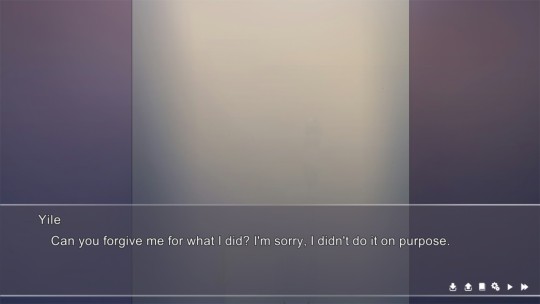
The game is complete with full Chinese voice acting. Both lead actresses do a decent enough job, shining especially during the quieter and more somber moments (which are plentiful). The louder moments of joy or anger are a struggle for them, the actress behind Yuyi does not carry enough vocal power for the scenes in which she yells (usually at Yile) and Yile’s tends to ascend into a grating shriek. I will give credit to the game for voicing even minor character that speaks only a few lines as well as the girls though. Overall, the voice acting added more to the game than it detracted but there is definite room for improvement.
Lingua Fleur is not a story of romance or attraction but rather of self-growth and healing. For me, this is a welcome change. It is not a happy story nor an overly sad cry-fest, but rather a very grounded and bittersweet narrative. Yuyi struggles to admit her identity (as a lesbian) and the ways in which this affects here are clearly shown and communicated in all scenes effectively.
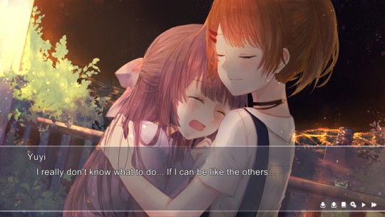
The more emotional scenes are powerful and my favorite parts of the game. Thanks to not only a solid script but because they are so realistic and relatable. Yuyi’s struggles to articulate her identity to Yile will easily resonate with experiences of queer readers. I will not spoil the ending but it appropriately matches the somber tone of the story and is simultaneously hopeful and saddening.
I did have a few issues with the game. Some of these complaints are small, a few typos, a few places where the word choice could have been a bit better (is my English teacher side showing?). I also found what I can only assume to have been a mistake due to negligence where name cards such as “female student” and “male student” were still written in Chinese rather than being translated like the others. Additionally, while the English translation is mostly excellent there were a few terms that did not work as a direct translation into the language, such as “Sis Tutor.”
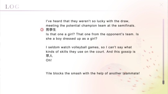
This character, Sis Tutor, is actually part of my biggest complaint. She and Yuyi share a difficult past together which is hinted at but not explicitly stated and explained until the final act of the game. This trope would be fine if it was not for the fact the story is told through Yuyi’s perspective and we hear her thoughts! This made the hints about her past unbearable and annoying. When you show the thoughts of the character with a hidden pass it does not work! It breaks immersion, as one can clearly see the writers’ attempt to contort the narrative of human thoughts as they clumsily build suspense to the big reveal. And it is a good (if obvious) reveal too, giving context to the actions of Yuyi, there is no need for it to be so hamfistedly teased.
Lingua Fleur: Lily’s CG artwork has a nice soft pastel look to it, with a serene hand-drawn quality to them. The artist was easily able to transfer the personality of the characters and the emotion of the script into the CG artwork, making them add to the experience. There is even one simple but stylistic animation. However, the CGs are inconsistent, with some being of clearly higher quality than others. Additionally, some of the choices for the CGs placement are questionable. Parts of the story were crying out for a nice piece of accompanying art but resources were put into other scenes which frankly did not need them.
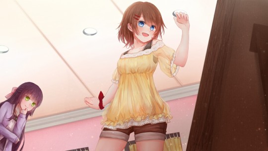
The character sprite’s share soft design of the CGs but often, unfortunately, have an unpolished look to them. They also clash horribly against some of the backgrounds, leading to a clear cutout effect that regularly took me out of the experience. Their design, however, is quite nice, especially Yile, who is downright adorable. There is also some great employment of lateral movement and strategic zooming on characters, some of the best I have ever seen, and certainly, the most fluid, helping to illustrate the story.
The soundtrack of Lingua Fleur proves that a score does not have to be bombastic and overly complex to be successful. Indeed, the music was one of the highlights of my experience. Oli Jan and Sorane created twelve original tracks for the visual novel each of which I adored as I played through. Often they employ just a simple melody and maybe a few delicate strings or woodwinds, creating an excellent somber and soft backdrop that perfectly complimented the game. I was greatly enjoying it right up until the finale when I fell in love.
During the game’s climax the track ‘La Robe’ plays and MY GOD!! I was struck dumb by how perfect the track was, I was at a loss for words (a rare occurrence I can assure you). It keeps the same simple style as the rest of the soundtrack but was just… stupendous. The song is triumphant, delicate, intricate, and hopeful. The victorious crescendo reached its peak at the perfect point in the story I swear I applauded. I could easily extend this review another few paragraphs filled with nothing but adjectives about this song. If you do not get the game for the love of all things gay in this world at least give the soundtrack a listen! It is a whirlwind of emotions that perfectly encapsulates the relief and sorrow felt by Yuyi in the bittersweet conclusion. It is a special thing for a piece to convey so much.
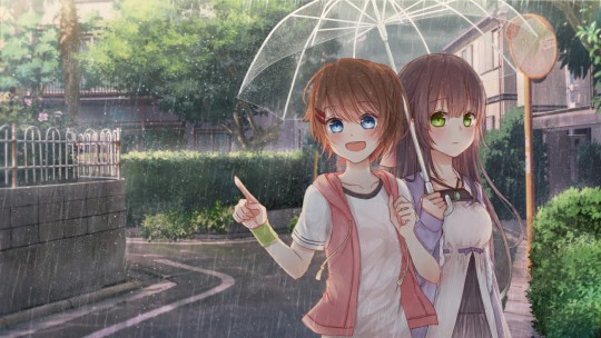
Lingua Fleur: Lily is an imperfect but meaningful journey. It does not conform to the genre standers of destined lovers and soulmates but is rather a gentle and ordinary story of healing, grief, and friendship. While it lacks artistic polish and jaw-dropping prose the emotion and humanism of the game reverberate within me. Lingua Fleur is a lovely, simple, and bittersweet experience.
I also appreciate that Narrator and Storia have promised new content for the game in the form of DLC. Lingua Fleur: Lily is available now on Steam in English and Chinese.
Ratings: Story – 7 Characters – 6 Art – 4 Voice – 6 Music – 10 LGBTQ – 5 Lewdness – 0 Final – 6
Review copy provided by Narrator and STORIA
Help create yuri and LGBTQ+ content, news, and reviews by supporting on the YuriMother Patreon
#yuri#visual novel#vn#lgbtq#lgbtq+#reviews#queer#gay#video game#game#lgbt#lesbian#lingua Fleur lily#girls love#gl#wlw#gaming
871 notes
·
View notes
Text
228. Sonic the Hedgehog #160

Birthday Bash! (Part One): Giving and Receiving
Writer: Ian Flynn Pencils: Tracy Yardley! Colors: Jason Jensen
Welcome to the beginning of Ian Flynn's reign, everyone! As many of you will know, Ian is a fan favorite amongst readers of the comics, and for good reason. Objectively, I'd say he has a much better sense than any previous writer of how to construct dynamic and interesting stories, as well as a great head for writing dialogue. Every character has their own unique voice when speaking, and as someone who takes a particular interest in dialogue in her own writing, it's something I admire a lot, especially given how stilted and unnaturally formal a lot of dialogue by Karl and especially Kenders often sounded, regardless of who was speaking. That said, I think that it took a good year or so for him to fully come into his own as head writer for the series, so some earlier issues are a bit strange and not up to par with a lot of his later work. Some of this, to be fair, is due to him essentially playing clean-up for this first year, untangling a lot of the bizarre leftover plot threads that Karl and Kenders left behind, and generally trying to make the world of the comics conform a little better to that of the games. All that aside, anyone reading the comics will likely notice an immediate and apparent improvement in the overall quality of the work starting with this issue. This is helped along, in addition, by none other than the very talented artist Tracy Yardley! who always (well, almost always) introduces himself in the story credits with an exclamation mark. It's kind of his calling card. Tracy took a while to really improve his art as well, so while his earliest issues sometimes have some strange proportions and poses, later on his style became easily one of the most visually attractive and recognizable ones in the series, simplifying a lot of the inconsistencies that many character designs had as well as doing away with the strange pseudo-human proportions that some artists tended to favor, particularly with the female characters. All this said, I will say that Ian isn't going to be immune to my criticism, as while I do recognize his skill as a writer and the good things he brought to the table, there are definitely some problems I have with the way he handled certain things. We'll cross those bridges when we come to them, however, so for now, let's dive into the new world he's creating and see how he does!
Elias and Sonic are walking on the outskirts of Knothole as Elias explains why his father approved the Metal Sonic troopers from last issue. We don't even really get to hear the explanation, but to be fair, we hardly need one, as the idea was so insane to begin with that the only true explanation is that Kenders needed a plot device. Sonic tries to make Elias promise that "you royals" won't hit him with any more weird surprises, and Elias says they only have one more, leading him to a building next to where the Great Oak Slide into the village ends.

I mean, canonically he's supposed to be turning seventeen here, even though realistically he should be turning eighteen, because remember, for him to have turned sixteen in StH#68, had the Robians be deroboticized in early June in StH#123, and still have managed to spend close to a year in space before turning seventeen, literally everything in between the two aforementioned issues would have had to take place in the span of a few weeks - yes, that's counting the month-and-a-half time span that Sonic was confined to Knothole, as well as major events like Eggman's return and the entire Green Knuckles saga. You can see why this huge discrepancy still bothers me, right? Hmph. Anyway, no sooner has the party begun than an explosion destroys the door, and two new players enter the scene - Bean the Dynamite and Bark the Polar Bear from Sonic the Fighters! Nack's been part of the comic for long enough now, so it's cool to see these two make their first appearance. Bark is totally silent - as far as I remember, he never says a single word during the entirety of the comic - but Bean, in the absence of an obvious personality to draw from in the game, has subsequently been given the personality trait of "criminally insane" in the comics.. He's erratic, he talks to himself, he cracks jokes where jokes really shouldn't be cracked, and most importantly of all, he loves his goddamn bombs. Bean starts chucking said bombs left and right at the various Freedom Fighters in the base, while Sonic tangles with Bark. He seems to think these guys are only after him due to something Evil Sonic did in his place, something which he has by now apparently finally explained to all the women of Knothole, and manages to break away from Bark to stop Bean's bombing spree by pinning him to a wall and asking about Evil Sonic. However, Bean happily insists there's been no mistake and he wasn't even aware of Sonic having an evil twin, nor does he particularly care. Oh, speaking of Evil Sonic…
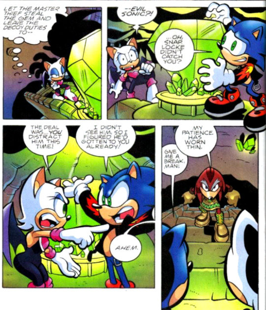
Huh, it seems that Evil Sonic has actually explained his true identity to Rouge in between their previous failed attempt and now. I'm surprised she hasn't outright abandoned him by now due to Rouge not exactly being evil-aligned to begin with, but I guess the pull of the shiny is just too strong for her to resist. And as it turns out, Bean suffers from a similar insatiable need! Fiona pulls out a ring of keys and shakes them around, completely distracting Bean from his current activity of bashing Sonic's head in, and throws them out the hole he made in the wall, prompting him to immediately abandon everything to chase after them. Fiona then advances on Bark, who by now has gotten himself cornered by every Freedom Fighter in the room, and convinces him to stand down as he's outnumbered. Outside, Bean plays with the keys and talks to them, seemingly convinced that they're a beautiful woman with an "adorable accent" who wants his number, when a suspiciously-Shadow-shaped shadow converges on him, prompting him to try to invite him into smashing Sonic as well. Good luck there, buddy, I don't think Shadow usually runs with crazy…
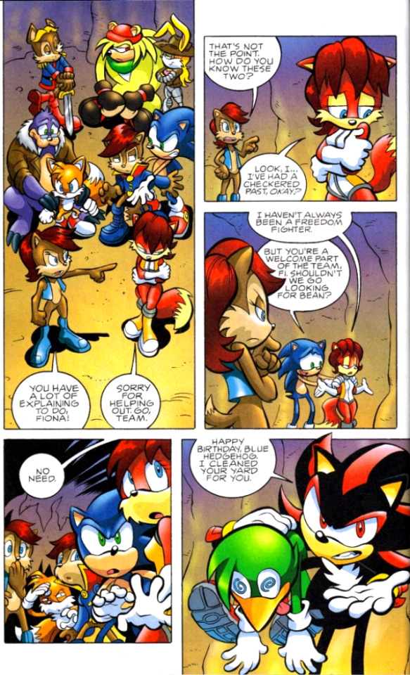
Geez, Sally, cut Fiona some slack. Not everyone had a squeaky-clean record - hell, just look at Shadow! Back in the Chaos Chamber, Rouge and Evil Sonic begin to battle Locke, who tosses Evil Sonic to the side as he perceives Rouge to be the bigger threat. However, that turns out to be a bit of a bad idea, as with Rouge tied up in the fight, Evil Sonic takes his chance to go after the Master Emerald without her, obviously recognizing it as more than just a shiny trinket.

Back in Knothole, Shadow explains that he's only here to thank Sonic for saving Hope, as he knows he wouldn't have been able to do it on his own, and reminds him that as soon as he leaves this building they're back to being enemies, as Shadow's still aligned with Eggman for now. Sonic, to his credit, seems to recognize that Shadow is only allied with Eggman because he doesn't yet know better, and cheerfully invites him to come back here whenever he cuts out on that deal in the future. It's at this point that everyone realizes Bean has quietly snuck into the brain trust's comms room to casually let Eggman know that he and Bark failed to take Sonic down, and when Fiona ushers him back out of the room, Eggman is only too happy to let Sonic know personally that he wishes him a happy birthday and he's sending him a new, more metallic present. Within seconds a thud outside alerts them to the arrival of this present, and everyone rushes out to see a strange figure emerging from an egg pod - a figure which resolves itself into the combined forms of Crocbot and Octobot, now merged into the singular entity of… Croctobot! (Don't worry, Ian knows just how silly this is and even acknowledges it next issue.) But what of Evil Sonic and Rouge? How is their fight faring against Locke after the former got knocked aside? Well, Evil Sonic takes his chance to dramatically emerge from behind the emerald as the other two get ready to continue their fight…

Plot twist! How many people actually didn't know by now that Evil Sonic and Scourge were the same person? I'm guessing there had to be at least a few of you. You can actually already see Ian's new plans being put into action - it's very telling of his intentions when the very first issue he ever pens immediately makes a point of distinguishing a rather tired and boring character into a new and improved version of himself, with a unique name and new, visually distinct look. Apparently Kenders, who if you recall is the original creator of Evil Sonic, never liked this and continued to insist on referring to him as Evil Sonic, but screw that, Scourge is a much more interesting character and this was a change that sorely needed to be made.
Sonic Rush (Part One of Two)
Writer/Pencils: Tania Del Rio Colors: Ben Hunzeker
So unfortunately, Sonic Adventure 2 isn't the only case in the preboot of a partial adaption of a game being included without any actual ending. Sonic Rush, the game, introduces Blaze, a cat from an alternate dimension that is controlled by the Sol Emeralds rather than the Chaos Emeralds, and most of the plot revolves around the Sol Emeralds ending up in Sonic's dimension and her trying to recollect them to bring back to her own world. However, things are a bit different in the comics universe. In this story, Blaze comes to Sonic's dimension because, apparently, she's been having nonstop dreams about him, dreams which show her visions of Eggman threatening the Sol Emeralds and Sonic helping her protect them. She's frustrated that she would have to rely on anyone else to help her protect the emeralds at all, believing them to be her sole responsibility, but nonetheless she's tracked Sonic to Knothole. However, while deliberating her next move, a squad of swatbots - yes, ordinary ones, it's been a while since we've seen them rather than shadow-bots - happen upon her and decide that they should take her in for interrogation.
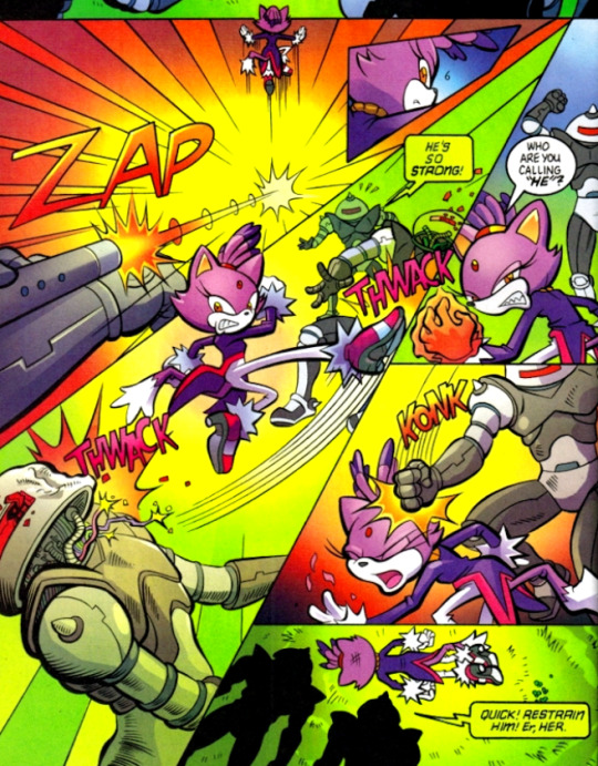
Yeah, I guess Blaze doesn't understand the dangers present in this universe yet, does she? An hour or so later, Rotor sends for Sonic, informing him that they caught the aftermath of Blaze's capture on their video surveillance. Neither of them know who she is, but they decide she can't be from their village, since she left several disabled swatbots behind, while most people in Knothole are noncombatants and those that aren't are accounted for elsewhere. Sonic rushes out to find their trail and tracks them to a nearby facility set up amidst the trees, and while he begins fighting his way in, the scientific robots in the building go about studying their new specimen.
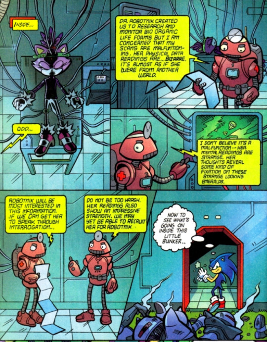
Sorry, but why the hell would Eggman be looking to add some random Mobian to his team? He only likes robots anyway, and tends to either betray or enslave every living being that comes to him. Blaze suddenly awakens and becomes furious - not that she's been captured, mind you, but that they took off her coat while studying her. She must be really goddamn attached to her coat, because she starts absolutely trashing the place, exploding into flames and screaming so loudly that Sonic becomes genuinely worried about her wellbeing, rushing to where he last heard her. The door of the lab she's in is completely blasted off its hinges by the force of Blaze's explosions, but thankfully after this she seems to have found her coat, because the blasts subside and she appears in the doorway wearing it once again, staring down at an utterly shocked Sonic with a look of fiery fury (the literal flames coating her entire body probably help with the "fiery" bit). Uh… good luck dealing with that, buddy boy!
#nala reads archie sonic preboot#archie sonic#archie sonic preboot#writer: ian flynn#writer: tania del rio#pencils: tracy yardley#pencils: tania del rio#colors: jason jensen#colors: ben hunzeker
9 notes
·
View notes
Text
Grace Hartigan’s “Barbie”
This essay was written in 2012
Opinion alert — Jackson Pollock is the most famous Abstract Expressionist painter. Fact alert — it was in New York City that Pollock and the other artists associated with this new movement blossomed. The “Irascibles,’ as they were dubbed, began to shake up the art world with their new philosophy and aesthetic. The novelty of Abstract Expressionism was powerful enough from the beginning to draw in a younger group of artists. Helen Frankenthaler, Joan Mitchell, Sam Francis, and Grace Hartigan are a few of the artists known as the second generation New York School. Despite her young age, Hartigan was deep in the Cedar Tavern circle and was considered a friend by Pollock, de Kooning, Rothko, Kline, etc. Curious and observant, Hartigan looked outward at her surrounding physical, social, and political world for inspiration. She began to paint a combination of what she saw and what she felt. Her commentary on daily life is the leading characteristic of her work. Her paintings such as Barbie have been interpreted as feminist precursors to pop art, but in reality, Hartigan did not ally herself with either feminism or pop art. For Barbie the output is a statement about the contemporary ‘60’s society. This painting and the great majority of her other works are musings on life and should be viewed the same way one reads poetry. A complete interpretation can only be accurately made by considering her own words as well as clues from her life’s story.
Hartigan was born on March 28, 1922 in New Jersey. She was greatly influenced by her aunt, an english schoolteacher who piqued her interest in writing and theatre which lasted all through high school. She married at age 18 and ended up in California after she and her husband ran out of money on their way to Alaska. They lived there several years with their newborn son until World War II broke out. They decided to move back east where he was then drafted. She began to take night classes to learn drawing and painting and got a job as a draftsman. She fell in love with Matisse after being introduced to book of his work and immediately began seeking out a way to paint like him. She then began to study under Ike Muse and moved to New York with him after she and her husband split. Not much time passed before she and Muse split also and she began to support herself with a “life of total poverty but meeting all marvelous, exciting people.”1 This is a reference to the collection of artists and writers who patronized the Cedar Tavern in the 40’s and 50’s. She visited Pollock’s and de Kooning’s studios and began the journey headfirst into pure Abstract Expressionism which solidified her status in the group as well as Clement Greenberg’s approval. Her first few works in ’49 and ’50 were very gestural and resembled the flat, all over composition of Pollock’s work. This only lasted a couple years before she began to slowly introduce representational elements that are very similar to the figures in de Kooning’s Woman paintings. A key factor in this change was her growing relationship with the poet Frank O’Hara. Hartigan’s childhood love for literature re-blossomed vicariously through O’Hara who dedicated several poems to her. In 1952 O’Hara gave a series of twelve poems called Oranges, Sweet, a Dozen to Hartigan who then turned them into her Orange paintings. This rebellion against Greenberg allowed her to extend her boundaries and begin to develop her own identity as a painter. Her first step was to look back at the Masters like Velasquez, Goya, and Rubens all the while keeping Matisse and the Abstract Expressionist aesthetic in mind. She then began to look outward in the exploration of her world, New York City. For several decades she painted shopping malls, billboards, vendors, shop windows, and anything else that caught her eye and stimulated her mind. Hartigan was overflowing with material that she felt compelled to paint. Throughout the ‘60’s she pulled out all the stops and painted everything from mythical creatures and gods, Marilyn Monroe, lily ponds, human emotions, and Barbie dolls. The only reoccurring visual elements are the gestural forms that came from her Abstract Expressionist background and the bold use of color drawn from her love for Fauvism. This inconsistency of subject matter is the first clue as to Hartigan’s thought processes.
The mistake that critics and historians too often make is the lack of attention paid to Hartigan’s body of work as a whole. When they step back and get the big picture view, they consider it for a couple of minutes and quickly conclude that, “She has reached for new ideas so often that she has no signature style.”2 Naturally at this conclusion, they are forced to focus on individual paintings or small series of them. Unsurprisingly, the interpretations of Hartigan’s Barbie paintings are straightforward and superficial.
The Barbie doll made her debut in 1959 and it was not long before Mattel, Inc. began receiving criticism for the doll’s negative body image. The doll has often been used as a symbol for the unacceptable image of women portrayed in pop-culture. When Hartigan painted Barbie in the heat of the controversy, many people, both feminists and non-feminists, assumed that she was making a feminist statement. The well-informed researcher might also argue his/her point with evidence that Hartigan originally signed her paintings as “George Hartigan” for her first few shows. This has been taken as a statement of the difficulty for women artists to succeed in the world of Abstract Expressionism. However, both of these arguments can be easily refuted by Hartigan’s own words. She has repeatedly denied having any feminist sentiments and even supported Pollock by saying, “The myth I find most infuriating is the one of Jackson Pollock as brawling, woman-hating, drunk and macho. The man was tender, suffering- an inarticulate, shy genius, but people don’t want to hear that about Jackson.”3 When asked why she signed her work “George Hartigan” she replied, “Because I identified with George Sand and George Eliot — they were my heroes. The real story is I had gay friends who all had female names amongst themselves and I thought it would be fun to have a man’s name.”4
The argument that Hartigan’s work is a precursor to Pop art has greater merit, but still doesn’t go much deeper than the paint on the canvas. Nevertheless, Hartigan did paint an abstract work titled, Billboard which can be compared to James Rosenquist’s work, and a couple of paintings of Marilyn Monroe which invariably conjures Warhol’s ghost. These images in addition to the Barbie doll are unquestionable pop culture icons. One can easily imagine Barbie as the subject of a Warhol painting and should not be surprised that he did indeed use the child’s toy in a series of prints. Warhol’s Barbie is very different from Hartigan’s however. In her essay, which analyzes Hartigan’s work, Melody Davis points out that, “Pop art is typically hard-edged, cool, acrylic-painted, repetitive and de-personalized.”5 This is the antithesis to Hartigan’s work. In response to this new aesthetic, she made an unapologetic statement in the 60’s saying, “Pop art is not painting, because painting must have content and emotion.”6 Similar to the contrast between the quality of a hand crafted table that exudes warmth from the carpenter’s personal touch and the mass-produced particle board piece made by machines and sold in an IKEA store, so is the unfriendly relationship of Hartigan and Pop art. It is not uncommon to see the subject of Barbie in everyday life, but just as Dutch genre painting is not Pop art, neither is Hartigan’s work.
Instead, the individual work is one of social commentary. Referring to the Barbie doll, Hartigan made this statement, “I’m very interested in dolls of all cultures, because a doll is an essence, really, of what society thinks you should present to your little girls, about what they’re supposed to plan for, how they’re supposed to think about themselves. And if you’re supposed to think about yourself as a bride that deserves a $100 dress and you only cost $15 and your husband is a castrated man, boy, that tells you something about American morals!”7 Hartigan painted what she saw around her. When she walked throughout New York City she painted vendors and shop windows. When she studied the masters at the MET she painted the scenes and figures that excited her. When she noticed a changing country she painted a doll that symbolized a part of it. Hartigan was not supporting or criticizing mass production, mass marketing, or mass media. She was taking input, processing it, and then giving output. Hartigan explains, “I try to declaw the terribleness of popular culture and turn it into beauty or meaning.”8 Now a motive fueling her creative machine becomes apparent. By zooming out and viewing the entirety of her life and work, we see that Hartigan takes both the ugly and mundane as well as the beautiful and exciting and gives them a poetic quality. This should not be a surprise, given her love for literature as a child, her very close relationships with the poets who patronized the Cedar Tavern (O’Hara in particular), and her “heroes,” the novelists Eliot and Sand. For the final piece of evidence let’s again consider Hartigan’s own words, “As most painting moves closer to sculpture and architecture, my own work moves nearer poetry…It increasingly must be ‘read’ in terms of meaning and metaphor.”9 Hartigan’s bold colors, gestural brushwork, and expression through abstraction are some of the tools she employs to give emotional life to the content that she chooses to paint. The successful viewer is the one who does indeed “read” her paintings. Poetry and Hartigan’s work are musings on life.
With a creative career that lasted over half a century, Hartigan produced a large body of paintings and prints. She did not stray far from her aesthetic, yet changes throughout the decades are visible and tell her life’s story like rings in a tree. Her experiences at the Cedar Tavern were truly invaluable and would cause envy in any historian. Unfortunately, she has been misunderstood a great deal too much. Barbie should be read as a poem, and not as Pop art or feminist art. Only then can one fully appreciate the creative mind of Grace Hartigan.
Bibliography
Diggory, Terence. “Questions of identity in Oranges by Frank O’Hara and Grace Hartigan.” Art Journal 52, no. 4 (Winter93 1993): 41.Academic Search Premier, EBSCOhost (accessed November 9, 2012).
Gibson, Ann Eden. Abstract expressionism: other politics. New Haven, CT: Yale University Press, 1997.
Hartigan, Grace, interview by Julie Haifley. May 10, 1979.
Hartigan, Grace, interview by Jonathan VanDyke. February 12, 2000.
Hobbs, Robert. 1995. “Grace Hartigan: A Painter’s World by Robert Saltonstall Mattison: Reviewed by Robert Hobbs.” Woman’s Art Journal , Vol. 16, №2 (Autumn, 1995 — Winter, 1996), pp. 42–44. JSTOR (accessed October 18, 2012).
Jachec, Nancy. The Philosophy and Politics of Abstract Expressionism: 1940–1960. Cambridge [u.a.: Cambridge Univ., 2000.
Kunitz, Daniel. “Gallery chronicle.” New Criterion 20, no. 3 (November 2001): 51–54. Art Full Text (H.W. Wilson), EBSCOhost (accessed October 19, 2012).
Landau, Ellen G… Reading abstract expressionism. New Haven: Yale, 2005.
Lavazzi, Thomas. 2000. “Lucky Pierre Gets into Finger Paint: Grace Hartigan and Frank O’Hara’s Oranges.” Aurora: The Journal Of The History Of Art 1, 122–137. Art Full Text (H.W. Wilson), EBSCOhost (accessed October 18, 2012).
Lord, M. G.. Forever Barbie: the unauthorized biography of a real doll. New York: Morrow and Co., 1994.
Princenthal, Nancy. 2009. “Grace Hartigan 1922–2008.” Art In America 97, no. 10: 142. Art Full Text (H.W. Wilson), EBSCOhost (accessed October 18, 2012).
Robert Saltonstall Mattison. “Hartigan, Grace.” Grove Art Online. Oxford Art Online. Oxford University Press, accessed October 18, 2012,http://www.oxfordartonline.com/subscriber/article/grove/art/T036782.
Shapiro, David, and Cecile Shapiro.Abstract expressionism: a critical record. Cambridge [England: Cambridge University Press, 1990.
1 note
·
View note
Text
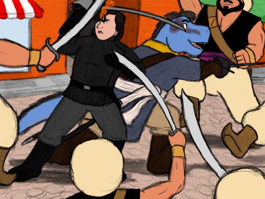
The clash of steel rang on the streets of the Magic Kingdom as a furious duel erupted in New Orleans Square. In the midst of a band of soldiers all the way from Agrabah, lead by Captain Razoul, two swordsman stood their ground, slashing and thrusting back-to-back against superior odds—in other words, it was a fairly average Friday afternoon for Christopher “Chris” Carnovo and André Caron, the Swashbucklers of the Magic Kingdom.
A stranger duo couldn’t be found from the Frozen lands of Arendelle to the Primeval World. Chris was a young, greyish-blue tyrannosaur, dressed in a blue pirate’s coat belted with a white sash, wielding a rapier with lightning-fast thrusts. André was a young man with shaggy brown hair and a black padded jacket, slashing violently at his foes with a sabre. The soldiers of Agrabah pressed hard on every side, but the odd pair had two things in their favor—they were both masters in the art of swordsmanship, and they had been fighting together since childhood.
Chris and André had a long and colorful career—starting as privateers in their youth, the two had almost single-handedly cleared the seas of pirates such as the notorious Captains Nathaniel Flint, Henry Morgan and “Black Bart” Roberts, before taking up service as fight choreographers in their young adult years. The two friends had choreographed almost every fight scene in almost every movie made in the Magic Kingdom, a land of princes and princesses, wizards and witches, pirates and knights, talking animals and other motley characters. Under the leadership of Mickey Mouse, the protégé of the late Good King Walt, the Magic Kingdom was a land of art, culture, and storytelling, producing some of the finest movies in the world. But while some made their names on the silver screen as actors or served the Kingdom as statesmen and captains of industry (often all three), others made their names behind the scenes. Chris and André belonged to the latter category, but their work had made them many friends all over the Magic Kingdom—friends that sometimes had need of their special set of skills.
“Just once, I’d like to be called in for a favor that doesn’t involve the risk of getting stabbed!” André Caron snapped at the tyrannosaur as he slashed up, knocking a sword out of a soldier’s hand.
“We’re professional swordsmen, André,” Chris shot back as he spiraled his rapier, sending another scimitar flying out of a soldier’s grip. “What kinds of favors do you expect people need from us?” He lunged to the side just as a soldier was trying to flank his friend, arresting the attack. The two shifted positions effortlessly, their efforts coordinated like a dance. “Besides,” he smirked, parrying a wild cut from another soldier, “Where’s your sense of adventure?”
“I left it at home with the good book I was reading!” André shouted. A soldier rushed him and he grabbed the soldier’s wrist, wrenching his arm back before kicking him into his comrades.
“So, you don’t think we should be out here rescuing our friend?” Chris asked, spiraling his blade to intercept a cut and slashing at a second swordsman before thrusting over his shoulder at the first.
“I never said we shouldn’t be here,” André said, smashing his guard into a soldier’s forehead before parrying another incoming strike. “Just don’t expect me to be happy about it!” He swiped wide, left and right, whirling his sword in a dangerous dance of steel. He plowed through the soldiers, knocking them this way and that, clearing a way for the tyrannosaur. “Alright, Chris, I’m holding off as many as I can. Find Razoul and work your magic.”
This is the opening scene of a Disney fan-fiction story I’m rewriting. I started writing it for a couple reasons:
1) Chris needed a home. I’ve been drawing this swashbuckling tyrannosaur and his human companion (yes, André is named after me—there aren’t enough characters with my name, and that needs to be fixed) for just about 20 years now, and figured he needed a proper story. But what kind? Well, as I looked back, I realized that he was always sort of inserting himself into whatever I was interested in or reading at the time—piracy, Disney movies, books, etc. He was always a fan-fic character. So he needed to be in a fanfiction story. And as I tend to prefer a Disney-esque/traditional Western cartoon style, I decided he needed to be a Disney character—just one who works off-screen.
2) I really want to write original stories. I have at least 3 or 4 solid concepts, but when I decided in college that I wanted to write, I figured out I SUCKED at dialogue. And pretty much everything else. I had some raw talent, but of course that’s never enough—and being a perfectionist, I wasn’t going to waste an original story as my first attempt at learning the craft of writing. So I started exploring blogs about writing fantasy and credible, published authors all said the same thing: they started by writing fan-fiction. The reason they gave was that it was motivating because you already love the characters, and the world building and character creation is done for you (you can learn those skills later), leaving you free to focus on more fundamental aspects of writing craft—things like dialogue, pacing, plotting, planning, description, active vs. passive voice, all that jazz. So I decided to follow their advice.
I said earlier I was rewriting it—well, I got a little more than halfway through and the story just ran out of gas. The characters, I realized, would never and could never do the things necessary to advance the plot without breaking character, getting themselves killed, or using a dues ex machina. There were too many dangling plot threads, too many unnecessary characters, and after five years of intermittent drafting (I was in college, then I’ve had a day job or been job hunting ever since—I’m busy) I had gotten to know my characters (or my interpretations of several preexisting Disney characters) well enough that I could see major inconsistencies across the 200+ pages I had written. So I decided to go back to the beginning and rework the plot, making it a lot more consistent and focusing on a tighter core of characters. This scene was not in the original draft, and I think it establishes my characters far better than what I’d written before (which was essentially an info-dump of exposition—classic mistake).
Artist Behind the Scenes
Illustrating the picture presented several difficulties—one, I absolutely loathe myself for constantly choosing ground like grass or—in this case—cobblestones, which require a lot of repetitive, regular shapes. But that’s what the picture required, so I decided to make the cobblestones a little scribbled and blurry, and made the background lines thicker and fuzzier too. The biggest challenge was drawing multiple opponents—each guardsman is a unique person and requires individual attention to meet my minimum visual quality standards, and I can’t get away with vaguely soldier-looking blobs (as I’ve done in other pictures) since they are an integral part of the action that is the main focus of the piece.
The solution was to remember the adage, “the essence of the picture is the frame.” By positioning Chris and André just right in the frame and filling up as much space as I could using them, I could get away with only drawing parts of most of the guardsmen to give the effect of an outnumbered, chaotic street duel. I ended up framing the two characters with a ring of enemies, with Razoul appearing in the back to round out the impression of being surrounded on all sides.
The scimitar sabres (“scimitar” is a European butchering of the Persian shamshir) were a compromise between the way the Agrabah guards’ weapons appear in the movie Aladdin (where they are comically short and fat and have a clipped point) and real weapons. No actual Middle Eastern sword, to my knowledge, ever had a clipped point, which was actually a common feature of European single-edged swords like falchions and messers (which probably were the real inspiration behind Western artwork’s depictions of Eastern sabres); few sabres were ever as fat as the cartoons make them out to be; and most Middle Eastern sabres have straight, not recurved quillons. Most real sabres were relatively narrow, light swords meant for slashing/draw-cutting from horseback, not percussive chopping, and instead of a clipped point Turkish sabres often had a flared, double-edged tip called a yelman. I was thus faced with an artistic dilemma: integrity to reality or integrity to the source I was emulating. These are supposed to be the same guards as appeared in the “One Jump Ahead of the Breadline” musical number in Aladdin, armed with the same weapons; yet the action is taking place in “real life,” off-camera. I ultimately decided on a compromise: the scimitars would retain the same shape and features as in the movie, but I edited the dimensions to look a little more like real swords instead of meat cleavers.
(Disclaimer: Chris and André belong to me—everything else belongs to Disney).
#sketch#cartoon#cartoon characters#cartoon tyrannosaur#chris#chris carnovo#André#andre caron#swashbuckler#sabre#rapier#scimitar#disney#disney fanfiction#swashbucklers of the Magic Kingdom#new orleans square#Razoul#agrabah#duel#fencing#sword#swords#swordfighting#sword fighting#sword fight#fanfic#anthropomorphic tyrannosaur#tyrannosaur#anthro tyrannosaur
1 note
·
View note
Text
Critcal Reflection
In this critical reflection of my work I will be focusing on Heterotopias as a concept, and where my research into them lead me with my final illustration. Throughout the second semester of this year-long topic, I have explored places, artists, storyboarding and my own ideas using a vague and interesting stimulus.
Heterotopias are locations which are embedded in aspects and stages of our lives and which in some way mirror and at the same time distort or unsettle or invert other spaces. Put simply a normal location rooted in reality which can be seen as a distortion of reality. This usually involves typical and atypical characteristics clashing within a single space. For example, my first heterotopia used for this module was a space station. Despite being surrounded by human technologies, the unknown environment of space changes the context of everything and shows a distortion of the indoor setting. Heterotopias can be sorted into different types, summarised into six different principles by the philosophical researcher Michel Foucault. The concept my heterotopia of this semester encapsulates most however, is that it ‘Encapsulates spatio-temporal discontinuities or intensities’. This is due to the structure of the overall city and how it functioned. Many things which should have been separate such as businesses, homes and advertisements where forced into the same location due to lack of space. That or aspects such as streets, signs and homes where packed beyond the normal limit within the typical amount of space. A normal seeming city was distorted to accommodate its huge population, giving it heterotopic features.
The heterotopia I chose to research and re-create was the now demolished but well documented walled city in Kowloon Hong Kong. The city stood for around 50 years before being demolished in 1994 by the Chinese government. Before then it stood as a safe haven for dangerous gangs and hosted many unlicensed medical practices, especially dentistry. The city despite having a police force was dangerous and fairly lawless, as the poor squatters which continuously moved in made makeshift homes on the roofs of other homes, which continuously stacked up creating dangerously high buildings. Most citizens however enjoyed living within the walled city, as those who could not normally practice medically with their licences in Hong Kong due to certain restrictions, were able to work. I believe the walled city of Kowloon is a heterotopia as it’s a city disconnected from everything around it operating using its rules and regulations, which distorted a highly urbanised city into an almost dystopian context.
The mood board I created for the city is a collection of images mainly demonstrating the dense population and structure of the building in the city. I used mainly real photographs with few drawings to illustrate the aesthetic and tone of the city. The mood board is oversaturated with images closing the text in-between to help conveys the hectic, overwhelming and oppressive feeling of the city. Collecting the images I needed made me realise how well documented the city was. Various photographers kept extensive portfolios depicting the city, and even multiple accounts of video footage showing locations and citizens exist.
The main idea for using the city as a heterotopia was to depict the city in a mostly negative light, highlighting the problems of an inconsistently modernised city which retains slum like aspects. My original storyboard ideas showed various shots a people, from various places in the city. I wanted to show how the city was perceived by different types of people from regular citizens to children, business owners and more. After I received feedback from presenting my ideas, I realised I needed to keep my focus on the location and focus less on the people and use them as more like accessories to the city environments which can help tell the story. I decide that instead of creating one image in aftereffects going horizontally across the city, I should change the image so that it pans vertically. By doing this I could emphasise the height of the city buildings, and still conveying the feeling of being small I wanted to get across with the characters with other shots. Working vertically at for example, street level for the whole animation would limit the scope in which the city would be perceived by the audience. I chose to pan downward starting at a clear sky before showing how the screen eventually becomes more and more filled and hectic. Starting with a few wires coming across the shot from the roofs until eventually its filled with advertisements and crowds.
I planned on making my final illustration of what the finished scene would look like, on paper with pencil instead of any other format. I have software that I’d likely be able to create this image in however I feel this was the more suitable choice. As I’ve had less experience drawing digitally overall, as well as more experience drawing characters over background art, I feel I’d be able to make an overall higher quality image using pencil and paper. Using paper however provides it own difficulties. Using colour is a lot more difficulty and complicated. Erasing mistakes with colour also may not be possible, so instead I used greyscale shading. I’d also have to use high quality drawing paper in a format where I could create a lengthy image. The final image turned out well as I started discovering how to use shading and outlines more effectively as I worked. I had the idea in retrospect to draw the initial image on paper, and transfer it over to a digital software to use a base, where I could then use colour and the other advantages or digital art.
One thing I struggled with was the perspective and angle of the shot. I wanted to be able warp the image and give a perspective of looking upwards, as that was one of my original ideas. I used references to try and create this and inadvertently found the two games in development which used the city as either inspiration or as a setting. I thought having a 3D representation of the city could help with this. I had to settle for a normal angle in the end however, as the overall composition and look of the image felt distorted and out of place in my trials. I also first envisioned creating character sheets for the people in the animation, but after feedback and realising that I’d have to make a crowd shot, I settled with making featureless silhouettes. Using silhouettes is simpler and also adds to the mysterious atmosphere of the city I’m trying to depict.
The sound design of the animation would also be fairly simple. I would start at the top of the image with quiet diegetic background noises such as wind. As the screen travels downwards, the noise would slowly get louder as voices of muffled crowds and domestic arguments will be heard as the screen travels down from the apartment windows, into the streets below. I likely would have found royalty free noises online instead of making these myself as it would be quite difficult to emulate this myself. Collecting these noises in the streets could also pose problems, as recording individuals without consent violates some ethics.
During this module I did some research into some ethical issues when it comes to animation. These being IP (Intellectual property) and Image Content. Once my work starts being used in a professional context, I need to be aware of not infringing upon any copyright with my animations and artwork. Along with the basic need to respect others work and IP rights, I need to make sure I never directly use other materials in my work. In this context, not using and publishing any photographers’ images and calling it my own. This is in exception to works in the public domain, in which I feel I should still provide credit. Another more difficult issue is that of Image Content. There are times where if work is too similar to other people’s there could be problems. It can be up to interpretation where materials are to similar, but I still have to be careful to avoid this kind of conflict.
Overall, I am content with the ideas I came up with for this module as the research into Kowloon City was extremely engaging and interesting. The abundance of materials available about my chosen topic area was incredibly useful in my research of the design and aesthetic of the city. Despite struggling to accurately depict the scene how I wanted, I found solutions and am happy with the overall product. In the near future I plan on improve my illustration skills both traditionally and digitally so I can properly express my ideas and concepts in the most appropriate format, as I feel a strong visual style and identity will greatly benefit my work.
0 notes
Text
The 6 Most Common Mistakes With Creature Animation Demo Reels
More and more animation development studio are hungry for animators who have experience working with animals and creatures in a more realistic style. Many recruiters at visual effects studios, video game studios, and commercials studios have a really hard time finding quality animator candidates as demo reels with strong creature animation are few and far between.
If you are interested in this type of animation, here are some of the most common mistakes I see on demo reels. Avoid these at all costs in order to create more believable and memorable creature animation and improve your chances of landing one of those jobs!
The animation is too “clean”
Working in a realistic style (or, ideally, a slightly exaggerated “hyper-reality” in order to make your animation more exciting, dynamic, and memorable) means that you will need to have a higher level of detail and complexity in the movements.
This style of animation is an art in and of itself, and requires a slightly different mindset as you approach the work. You will still be using all of the principles of animation that you are used to, but in a more integrated and, often, a more “messy” way.
Adding some dirt to specific curves in just the right way, overlapping the actions while making sure they affect (and are affected by) each other, and being willing to have a slightly less perfect pose or arc at carefully chosen moments can make a huge difference in making your creature work feel real.
Keep in mind that this “messiness” needs to be very subtle. Readable silhouettes are just as important (if not more so) than ever and your arcs still need to feel organic, etc. Subtlety is key with creature work. In the Creature Animation classes, we work with the students to strive for “simplified complexity,” which I know sounds like words that shouldn’t go together, but mastering this concept is a huge part of bringing to life a realistic creature.
Look for opportunities on your creature to add small little details, secondary actions, tiny overlapping actions, muscles firing and relaxing, etc – as long as these are all kept extremely subtle, they can all work together to create the feeling of one large thinking, feeling, breathing complex creature.
Once you identify areas that you can add complexity (this can be as simple as toes spreading as the weight presses onto the foot, or how that toe move affects the claw, etc), then it’s time to simplify these actions in such a way that no individual “little” action draws attention to itself.
A nice dragon sequence from Harry Potter and the Deathly Hallows Part 2 – done by Double Negative
If someone’s first reaction to your epic shot of a dragon roaring is to say “wow, that claw pressing on the ground during the footplant was awesome!” then you are doing something wrong. Those types of movements, intended to add tiny bits of complexity and realism, are not meant to be the stars of the show. They should be felt rather than seen, at least on a first viewing of the shot. The goal is that they will all come together to make that dragon feel huge and real, but the key to pulling that off is to keep them all a bit simplified and unnoticed.
Action, pause, action, pause, action
Creature rigs tend to be more complicated and detailed than the average animation rig. Whether it’s a cat or an ogre or a giant robot covered in moving parts or a dragon with complex wing controls, you can bet your bottom dollar that at first glance, the rig will probably look intimidating.
There’s a reason for this, and it’s because we need to achieve that high level of “simplified complexity” mentioned above, and you just can’t do that with limited controls.
Unfortunately, that means that we often see animation on demo reels that have some interesting animal behavior or creature ideas, but those movements tend to be too broken up.
Instead of a gorilla running into frame and picking up a ball and throwing it, we see a gorilla run into frame and come to a stop. Then pick up the ball and stop. Then lift the ball and stop. Then he throws the ball.
Worse, often even those actions themselves can be full of discrete body movements that feel disconnected. Arms moving that aren’t driven by the shoulders, shoulders that don’t react to arms pounding onto the ground, big chest movements that have no effect on the hips, etc.
References of gorillas running
A careful study of live-action reference and a focus on overlapping actions can make a huge difference. Beware the feeling of disembodied limbs or discrete actions that don’t flow through one another. It completely kills the illusion of an organic creature.
The speed doesn’t match the size.
Few things can kill a shot quicker than having something that is meant to be large zipping around the screen too fast. Often, animators are more used to animating humans, and we get into a routine of timings that we are used to. When you’re thrown into a situation where it’s time to animate a gorilla or a huge dragon, it can be difficult to wrap our brains around the timing and spacing that this character will need to be using in its movements.
This stands out especially in moments where a character is changing direction, starting an action, or coming to a stop. Often, I will see a large creature doing some cool action and then he comes to a stop that is far too abrupt to accommodate for his weight or to give time for his momentum to naturally dissipate. This kills the feeling of weight and ruins the illusion of size.
Remember – there is no single “correct timing that will work for all characters.” They are all unique. They have different sizes, emotions, shapes, and actions – all of which will radically affect the speed that they will move.
Look At My Imagination!
Imagination IS one of the most important aspects of animation. I don’t want to belittle it or downplay the importance of actively working to cultivate and strengthen your imagination.
However, there are times to rely on your imagination and there are times to at least partly set it aside.
Even when working with a fantastic creature design, we need to carefully ground the movements of that character in the real world. Animating some alien quadruped? Look at its anatomy and figure out what quadruped(s) it most resembles. If you don’t base the animation at least somewhat on those real-life animals, people are going to have a hard time buying the performance.
At the 6:50 mark in the video above, ILM Animation Supervisor, Hal Hickel, reviews creature design for the film, Pacific Rim, in this presentation at the Bloomberg Businessweek Design Conference in 2014. A nice reference on how the creature animator thought process works when animating alien creatures.
Sometimes on reels, we see creatures who resemble the anatomy of animals we are familiar with and yet move nothing at all like them. There are probably times to do that, but I would argue that a demo reel is the wrong place, as your work has no context and very limited time to impress. If you have a lion running around like a lizard, we likely aren’t going to marvel at your imaginative choices, we are going to think it looks bonkers and move on to the next reel.
Rotoscoping
A direct copy of live action reference is going to give you some movement that will feel pretty good. It’ll be solid, it will likely have a decent amount of that “simplified complexity” if you have really studied the reference carefully. It will be good animation.
But will it be great?
Probably not. Reference is a hugely important step to successful creature animation, but being a frame-by-frame slave to it is a mistake. Here’s a couple more words that seem to not go together but are just as important as simplified complexity: subtle exaggeration.
You are the artist. Your job is to look at the reference and to make artistic choices. That’s what makes your animation worth watching. As a creature animator or visual effects animator, your goal is realism, but that doesn’t mean we aren’t using the principle of exaggeration.
You need to filter your reference(s) through your artistic eye and carefully choose what to exaggerate. We make this pose a little more dynamic or that movement a bit snappier or this fall a bit heavier through the use of small (sometimes extremely small) amounts of exaggeration.
It’s this carefully planned “subtle exaggeration” that will take your work out of the realm of feeling “rotoscoped” (which can easily start to feel dead or robotic) and give it that spark of life that makes it memorable and exciting to watch.
Your goal should be to make your work slightly larger than life. That’s what makes it special, but of course the tricky part is keeping those exaggerations within the realm of believability and not “over-animating” the character to the point that it no longer feels real.
Inconsistent style
A plague of many an animation test (creature-specific or not) is an inconsistent style. There is nothing wrong with stylized animation. All animation styles (from the cartooniest to the most photoreal) are valid and beautiful and none are more artistic or special than the others. What’s important on a demo reel is that the style of the animation, at least within that specific shot, feels consistent.
Very often we will see a nice heavy creature walking along and then do something that feels far cartoonier than the previous few seconds felt and then revert back to Big-Heavy-Creature-mode. The middle of the shot will have quicker movements or overly stylized poses in comparison to the rest of the scene. It’s common that part of a shot will suddenly feel “animated” rather than real.
Any time you are animating anything, it is important to know the style you are working in and keeping that consistent is a big part of an animator’s job. Learn how to do that and show it off on your reel
0 notes
Text
Intro to blog & Nishika N9000 camera review
Hello everyone! Welcome to my very first blog post. I have big plans for this far-flung little corner of the internet: camera reviews, photo techniques, experiments in visual storytelling and more! Art, design, filmmaking, photography - all here. Let’s roll! (no pun or reference to 35mm film intended)

Intro
Today it’s all about photography - I’ll be taking a look at a rather obscure little imaging device - the Nishika N9000. A unique, highly specialized stereo camera that that takes 4 images at the same time from slightly different angles, which, when combined into an animation, create a miniature Matrix-like effect of the objects in the shot appearing three-dimensional. It’s a specialized camera and the only reason you use it is for its GIF-making capability. It is also a complete pain to use, totally unreliable and makes pictures of horrendous quality. Despite all this, it is a total blast and very fun. Read on to find out why.
This camera, along with the original Nimslo and the direct predecessor Nishika N8000 are responsible for the influx of countless animated GIFs on Tumblr, FFFFOUND! and other image blogs alike. I always found them a gleefully enjoyable exercise in lowbrow picture-making fun, something that could add real depth to the mood of a BTS, a casual project or just plain fun while hanging out. I denied these inner callings for a while until I stumbled upon @tkbmedia and finally bothered to look at the tags being used. “Nishika” it said. And here we are. Now, part of the reason I want to write about it is because its a genuinely fun little camera and the other part is because there is next to zero easily-digestible info online about this little plastic wonder, or even how it relates in quality and specs to its progenitor, the Nishika N8000.
History
The first quad-lens stereo camera was the Nimslo. Designed in the US, the camera was made overseas has solid metal construction, electronically controlled shutter, high quality glass lens and is pretty compact as well. If you read between the lines, you figured $$$. Then came along the N8000, made by a different US company called Nishika, which some claim blatantly knocked off the design idea, made it much cheaper and marketed the living daylights out of it, promising the next big thing in photography. There is much history written about both these companies and why they fell from grace, but that’s not the goal of this review. Both these cameras were originally designed for lenticular mail-order printing where you would take the photos and send the roll in, getting back lenticular prints. In its waning days, Nishika learned on their design mistakes and made the N9000 camera, hoping to renew interest in the franchise, but by that time the infrastructure was starting to fall apart along with the public interest for these items. Nishika went out of business and the overstock was silently decaying in warehouses around the country for decades. Prices went down to near-free and, with the advent of the digital revolution, the camera started seeing a resurgence when experiment-happy photogs figured that these can be used for great artistic effect.

Unboxing & tech specs
Prices bordering in the $10-$20 made this novelty a no-brainer, so I splurged and received a sealed, new-in-box N9000 in the mail not long after. Was a lot of fun opening the package - the whole process resembled an unearthing of a time capsule from a prehistoric age. Best I could tell by the chintzy design and fonts used (I’m an art director by day, I pay attention to these things), my particular specimen was from the early 90’s. The N9000 is made, save from the hotshoe, entirely out of cheap, ready-to-break plastic. Even the lens are plastic. Relatively compact, looks and feels like a beefy, cheeseburger-binging point and shoot. Weighs next to nothing. Small size and weight is a plus for anyone that wants to travel and take multiple cameras for multiple shot types. This one doesn’t take up much space. Each press of the shutter creates 4 tiny half-frame images spread across two regular frames of 35mm film. A 36-exposure roll gets you around 18 shots give or take. A 24-exposure roll probably takes around 12, haven't tried. Has a closable lens cover. Aperture selector between F8 and F16. Button. Rewind button and knob. And winding gear, yes, the winding gear. Reason I want to focus on it is because I genuinely hate it so very much, from the bottom of my usually very accommodating and forgiving heart. They cheaped out and replaced the lever from the N8000 with a finely-sharpened flesh-shearing winding gear to advance each frame and wind the shutter. I can live with it, but I dread every time I have to advance frames. The shutter speed is a fixed 1/60 sec. Has a tripod socket, an unremovable strap, and, well, that’s pretty much it. No batteries. Surprisingly small amount of foam in the back door, so even with vintage, less likelihood of light leaks. Has a little sticker inside recommending 200 film outdoors and 1600 film indoors. I'd personally load it with 400-800 film and tweak exposure with aperture.

Comparing to the N8000
The main reason I went out on whim and got the N9000 instead of the N8000 is size and weight. As soon as I saw pictures of the N8000 in hand AND read that they put a large chunk of metal inside just to make it feel more expensive and reliable than it is I knew it wasn’t for me, as my photo bags are always packed and space is at a premium. The N8000 is a very, very large camera, I’d say roughly twice the size and weight of the N9000. But, at the same time the picture quality looked to be the same (identical lens) and features are largely identical. The N8000 is also the very definition of gimmicky, with the fake LCD screen on top showing recommended settings for exposure. The "meter" built into it is just there to remind you when to use flash. And with today's film exposure latitude the f/11 is totally redundant. That's a whole lotta strikes out against the N8000. The only feature that I miss from the N8000 is the wind lever instead of gear, the rest of the playing field belongs to the sleeker, more modern and compact N9000. The best camera is the one you have with you, remember?

In use
Load film. Wind to 1. Set aperture. Point. Shoot. That's it. When you get to the end, hit the rewind button and crank that knob. Live life and be happy. They have a rather complicated set of recommendations for ideal positioning of foreground/mid/background elements, but in use I found that they correlate pretty neatly into my shooting style anyway so I just base a shot on instinct and click away. Just frame the subject either medium shot (waist up) to long shot (full figure) and try to compose stuff into the foreground and background for perfect harmony. Even when the rules are totally broken I still notice a 3D effect (works better for objects closer rather than further). When it gets even a little big (very, very little bit) dark - use flash. Theoretically, any type of flash should work, but my Canon 600EX-RT wouldn't trigger because the firing pin is a fraction of an inch off. Go figure. Had to MacGuyver a workaround with a coiled hot shoe extension to make it click. Even then, the flash wouldn't fire every 3-4 frames, killing the shots. Also, some films with a softer base (looking at you, Fuji Superia) tend to be torn at the sprockets when advancing the frame, renderings the entire roll useless. Reason for that is that there is only one film advance cog in the top of the body and winding pressure is applied unfavorably to the top sprocket holes only. Be very, very gently, or bye-bye roll.

Image processing
After taking the shots, what's next? Everybody has different procedures from here on out but the general goal is to develop the film, get scans and then combine those scans into an animated GIF. If I'm shooting B&W, I develop in my trusty D-76 concoction and after drying, proceed to scan on the Epson V800. Negs are converted in ColorNeg and the final images assembled in Photoshop. Obviously, there are lots of other substeps involved in each respective step, but they are outside the scope of this review. A bit later I am planning to write about my experience with developing your own film, scanning film and using ColorNeg and Lightroom/Photoshop to get the most out of your film shots, but for right now PM me if you would like advice/tips/tricks. Last step is to export an animated GIF or an MP4 video if you're planning on uploading to Instagram. Sounds like a whole lot of steps, huh? No fear, after doing this a couple of times it becomes second nature and many processes can be automated with Actions in photoshop.

Conclussions
So why do it all? Funny thing, I almost filmed a mock camera review where I smash the camera into moon dust against a brick wall. That's how frustrating it sometimes gets with all these inconsistencies and deficiencies in build quality. Would I bring something like this to an even remotely professional shooting environment? Absolutely not. The only camera capable of pulling that off is the Nimslo. Forget anything with a Nishika badge on it. But, if you are looking for a novel (and cheap) way of taking pictures and impressing friends, family and followers, as well as having the technical chops necessary to use film and assemble the GIFs, it's hard to beat the Nishika. The resulting images are what make all of the hassles worth it. It's like I sometimes describe the allure of film in general to people. Film is grainy, soft, full of imperfections and lacks the punch and pizzazz of digital. But oddly enough, that's exactly the way most of our memories work. Warm, somewhat vague,fuzzy. The Nishika just takes it to a new level by introducing depth. It's like a good old memory, animated.
Sample pics

#nishika#film photography#n9000#n8000#camera review#analog#black and white#bw#gif#ilford#hp5 plus#film#35mm#half frame#3d photo#stereo photo#kodak#tri-x#animated memories
1 note
·
View note
Text
Aesthetics - The Legend of Zelda: Skyward Sword analyzed, Part Five
(This is part of my ongoing series analyzing The Legend of Zelda: Skyward Sword, part of a bigger series where I play through and then talk excessively about every game in the Zelda series. If you want to catch up, earlier installments discussed the use of patterns, the story and how it fits into the chronology, the controls, and the flow and friction)
Video games are composite art. They combine dozens of artistic (and non-artistic) disciplines. You have game designers, writers, musicians, and an entire array of visual artists, specializing in textures, models, animation, lighting, and all kinds of other things. I've been focusing a lot on the game design, since that's an understudied field, but all the other elements deserve analysis too. We've already examined the story, so today, we'll take a look at the look of Skyward Sword.
Good: Overall art direction, graphics
When I review games, I make a distinction between "art" and "graphics". The former, as I use the term, is the timeless quality of the art direction, divorced from that specific implementation in the game; the latter is the technical work of making the software turn the artistic vision into reality, judged by what the hardware can theoretically handle. "Art" is that which shows up even in the manual and advertising, that which is unchanged in remakes and ports. Skyward Sword, on the whole, does an excellent job on both fronts.
The graphics are nothing to write home about by 2017 standards, but for a Wii game, it looks excellent. It's important to remember just how weak the Wii was, even compared to the Xbox 360 or Playstation 3. It also has some real limitations on what you can do with it, beyond just strength - since the processor design was identical to the Gamecube, it had very little flexibility, requiring a lot of trickery from programmers to get many special effects.
I'm not really equipped to dig into the technical functioning of it, but just from playing, it seems to hold a mostly-stable 30fps, rendering the game at 360p and upscaling to 480p before rendering UI elements. This is a common trick for console games - this hides the jaggies you get with no antialiasing, and fonts benefit far more from the increased resolution than the 3D environment does, while not costing nearly so much processing time to render. There was some consistent framerate drops during certain cutscenes - most scenes of a Timeshift Stone have some really nasty reduction in framerate - but during gameplay, it seems to be solid, which is when it really matters.
Some very interesting effect is done to create a depth-of-field-like effect, blurring the far background in a painting-like way. Again, I don't have the tools (or, quite frankly, the skills and time) to dig into exactly how this is done, but the effect is really well-done. This serves a gameplay purpose too, by making foreground objects (like enemies or items) stand out more from the background.
The design of most of the characters is also spot-on. Everything is stylized, anatomy is often exaggerated, and colors are bright and vibrant. There's visual depth to everything, lots of layers, which balances out the flatter colors. Faces are expressive. Costumes are iconic without being overly simple.
Even lots of the fully background characters look pretty good. Wander through Skyloft, and you'll see lots of interesting characters. There are very few background characters with a bland or boring design.
Okay: The Heroes
Which makes it so weird that the two central characters of the game are so dull. Skyward Sword's Link and Zelda aren't bad, really. They're just... completely unremarkable.

Link is bland. He doesn't have any of that exaggerated styling that made other characters fun. He just looks like the Link from Twilight Princess with new textures. There's very little depth or layering - the dominant feature is just that blank green tunic. Given how much green there is in the environment, Link often fades into the background. This never reached the level of a gameplay issue, at least for me, but it's still not great when the player character isn't visually distinct from the game world, especially when the story is about him entering a strange new world.
Link also just doesn't fit in. His proportions are far more realistic than the rest, making him look out of place next to caricatures like Beedle or Strich or Gondo. It's not consistent - he looks fine beside Pipit or Kina or Peatrice - but that inconsistency is itself a minor problem.

Zelda's first design in the game is fine. It's got contrast, it's got depth, it's not the best thing ever but it's pretty good. And she's very well animated - I won't call it Pixar quality but it's leagues ahead of where they were even a few years prior. She's emotionally expressive and responsive. But then she has a costume change, and it's just... nothing.
It's a white dress. No other color. No layers. No depth. No frills or poofs or anything, besides a bit of lace designs that you can only see in the concept art. They still have her moving well but it's just... so... wasted. Could they really think of nothing more visually interesting than a featureless white dress to symbolize the purification stuff? You don't see her in this outfit all that much, but it's the outfit she's in for the majority of the game, so it's still very important. It wouldn't have taken much to make her design better. Give her any splash of color - a red rope belt (red string has a suitable symbolic meaning in east-asian culture), a purple feather from her Loftwing in her hair, anything really that isn't plain featureless white. Even making that lace rendition of the Hyrulian Royal Crest more visible would have worked. Even if you absolutely insisted on flat white, you could layer the clothing to give depth instead of a featureless white void. Or give her more to wear - a wimple or veil over her head even adds to that "purification" intent (and it's not like Zelda games haven't borrowed religious imagery before). I can't really point to anything that was actually done wrong with Link or Zelda. They just aren't nearly as good as many of the other characters.
Bad: The Villains
Some stuff was just outright bad, though.

Tentalus, the boss of the Sandship dungeon, is a bizarrely cartoonish enemy design. If its battle was intentionally funny, that could have worked - but the fight is framed as one of the most dramatic in the game. The ship shudders under its attack from the moment it appears, twisting in a section reminiscent of the Call of Duty 4 level "Crew Expendable", of all things. The skies are dark under the pouring rain, lit by distant lightning... the music builds to an ominous tension... as this Baby's First Lovecraftian Horror shows up. It's purple Cthulhu with tentacle dreadlocks. As more than one fan artist has noted, Tentalus looks like it came from a Monsters Inc. knockoff, not a Zelda game with a French Impressionist aesthetic.
And the single eye as a weak point, in this late stage of the game, is frankly unnecessary. Any player who's made it this far knows how boss weak points work. Absent a gameplay justification, it just further serves to make the boss look child-like.

For a boss that features so prominently in the game, The Imprisoned is also quite poorly designed. His core problem is his lack of features, and how the "gameplay-oriented" features look so out of place.
On the face of it, a dark behemoth, featureless except for a gaping maw, seems like a perfectly fine idea. The early concept art certainly looks good. But now add some white blobs as "toes" that serve as weak points - first, it distracts from that singular focus on the mouth, and second it undercuts the intimidating look of the boss, because seriously, you kill the boss by stabbing its toes? The same thing happens when, in the second and third forms, they added some ungainly long arms, tipped with white blobs as "fingers". They were certainly necessary to make the boss fight playable, but there had to have been another way to do it. It just reeks of a boss that was designed by an artist, and then had to have gameplay elements tacked on.
The Imprisoned also fits very poorly with the painterly aesthetic of the rest of the game. It, almost alone in the game, is harshly geometric, with his hundreds of identical scales. The concept art is quite a bit more abstract, so maybe it's a matter of the Wii not having the horsepower for all those particle effects. But I have to judge the game they released, not the game they wanted to make, and this game has a central villain that doesn't fit.
Had that felt more deliberate, it could have worked. The Twili had that sort of effect in Twilight Princess, with a techno-ish sound and harsh digital effects to play up their alien-ness to Hyrule. But in every way except its appearance, The Imprisoned fits the game normally - normal music, normal gameplay, normal sound effects.
Overall, the game's aesthetic sensibilities are on point. It really is a lovely game. But those few mistakes are all the more glaring when they're surrounded by excellence.
Next time: the greatest flaw of Skyward Sword
1 note
·
View note
Text
Colour/ Light/ Space- Emma Moser
The concepts and exercises I completed in the past four weeks are clearly an important element to the development of my skills as a visual artist. Considering I’m interested in further exploring the practise of portraiture painting, extending my knowledge and understanding of colour, light and space has allowed me to develop my skills and learn new methods of creating quality work.
Week One- Day One: Johannes Itten’s Colour Wheel
This basic exercise allowed me to warm up to using paint and mixing colours. Once I started mixing the secondary colours, I instantly started experiencing the issue of not mixing an adequate volume of paint to be able to effectively fill the needed space with the appropriate colour. Completing the colour wheel helped me understand the concept of complementary colours as well as the difference between warm and cool colours.

Week One- Day Two: Chromatic Greys
Applying my knowledge of the colour wheel and adding white to create three more complex colour charts further challenged my mixing and colour observation skills. My method involved choosing one primary and its complementary secondary colour and creating a scale of the transition between the two colours. I then extended the chart by incrementally adding white to each colour on the scale. Problems I faced in this exercise all branched from palette organisation, mainly not mixing enough of a certain colour to have enough to mix white into it. This created issues when I would run out of paint and have to remix the colour, which I sometimes struggled to do due to having to match the colour exactly in order for the chart to remain accurate.


Week Two- Day One: Tertiary Colour Mixing
Finding organic matter and using the methods learnt through understanding the colour wheel and working with chromatic greys gave me an effective insight into how I can apply the skills learnt into real life artistic practice. After finding a leaf to use as my colour matching objective I observed that the leaf had an underlying red tone to it, so I decided to use red and its complementary colour green to use to mix. After mixing yellow and blue to create a suitable green I begun adding red, the leaf’s colour obviously had a large amount of white in it so I incrementally added white. I was able to match the tone a lot quicker than the colour so I continued working with the green and red to try and make a match however I noticed I was able to get a more accurate match by mixing an orange and adding that into the colour. A mistake I made in this process was not annotating each colour I mixed as I went as I sometimes found myself creating colours less similar to my goal and forgetting what I added in order to reverse my mistakes.
Week Two- Day Two: Albers Interaction of Colour
Creating colour paper compositions was a fascinating change moving away from the technical side of colour mixing, allowing me to further focus on how colours interact with each other. When being instructed to create an image using complementary colours I immediately wanted to work with blue and orange as they have such an intense effect on my eyes together, especially considering I had such bright, block paper to use. I decided that using two different shades of each colour would ease the intensity of the image and make it slightly easier to look at. I was originally going to create cross/ “x” type patterns but realised this looked too mathematical, so I used uneven, but still neat line compositions in order for it to look minimalistic yet organic.
For the circle image I decided to use a ying-yang type formation in order to add an additional dimension of roundness to the image.
I used spiral shapes in my yellow monochrome image to add a higher level of challenge to my shape making and placing darker yellow circles underneath to add more depth to the image.

Week Three- Day One: Black and White Tonal Scale
Moving away from colour and working with exclusively black and white helped me develop a greater understanding of tone and light. Painting a scale of greys from 0-100% black took me a few attempts due to me not starting by mixing the 50% black/white square first. My first scale got too black too soon, with the greys marked 50% onwards looking all too familiar. I reattempted, adding less black each interval and ended up with a more accurate scale.

Creating the grey scale in collage form had the same challenge as it was a lot easier sourcing darker shades of grey from the sources provided, this meant the shades 50% black onwards were harder to categorise within percentage groups as opposed to the lighter shades.

Week Three- Day Two: Black and White Collage Drawing
When creating my black and white collage I used a mix of both block tones and shaded, indefinite shapes. This meant I had to apply various drawing techniques in order to replicate my collage. I started filling in the lightest areas of the drawing first and finishing with the darkest/ black areas, this meant that I could go back and adjust the tone of the lighter areas without overdoing it and having to restart. A challenge I faced filling in the block/ single tone areas of the drawing was my colouring technique as I had to commit to one pencil direction in order to avoid some areas being filled in twice as dark, resulting in an inconsistent tone.

Week Four- Day One: Paper Sculptures and Observational Drawing
The process of creating the observational drawing of my paper sculptures was similar to the black and white collage drawing as I started with the lightest parts of the drawing and gradually worked on the darker parts. This method allowed me to go back to the lighter sections and further work into the shading, creating a more accurate match of tone.

Week Four- Day Two: Observational Painting
The observational painting of the paper sculptures was a nice wrap-up to the course and allowed me to put all my skills and knowledge to use. Once I drew an accurate enough scaled image of my sculptures and then filling in the positive area with a white paint base I used my colour wheels to decide on whether I should use warm or cool primary colours. I decided on mixing a warm orange and a cool green and red. Once I mixed the appropriate colour I lightened the tone by adding white and darkened the tone using the complementary colour. I finished off the painting by adding the shadows using black and mixing in white to make appropriate greys. I found that the green’s tone was accurate, however the colour was slightly off, so I went over the shape again after mixing a new green, adding more blue.

This four-week course helped me develop my understanding of colour and tone. I found myself more aware of the way I observe colour and tones in everyday life and felt like I better understood how I could replicate what I see. I’m confident that the skills and methods I learnt I will continue to use for the rest of my creative life.
Melinda Harper is known as one of Australia’s most significant contemporary abstract artists. Her abstract artworks feature incredibly bright colours arranged in eye-catching, almost optical illusion appearing compositions. Her main interest in her artmaking is “what one colour does to another colour, the weight of a colour and the feeling of a colour.” She finds inspiration from long drives and walks where she constantly finds herself looking and responding to colour, which results in her creating very personal work, based off her unique experiences of vision. Harper doesn’t plan her paintings and instead allows a compostion to develop as she applies each layer. The result is usually an array of geometic shapes which engage the viewer and result in audience anticipation and interest. Due to the abstract form of art Harper produces, this opens up her works to be more subjective to the audience, allowing unique viewing from person-to-person, each feeling different emotions and responses to the work.

Melinda Harper, Untitled XIII oil on canvas, 122 x 183 cm, 2008
Lara Merrett is a painter who has studied her art all over the world, including India, where the daily exposure to the colours of the markets, festivals, clothes and textiles inspired and fuelled her colourful art practice. Merrett describes her work as “intuitive, large, unlikely and not shy” and this is demonstrated through her use of huge canvases and an array of inks, acrylics, vinyl and metallics. Similar to Melinda Harpers’ practice, Merretts’ artworks are never pre-planned as she explains that it is “magic when the unexpected happens”. Her use of strictly water-based medium results in an extremely organic arrangement in her works as the materials are poured directly onto the canvas, she elaborated on her practice explaining: “I often use the phrase ‘to catch a painting’ in describing the process in the studio. I like to think of the paintings being ephemeral and intangible. The light and colour change constantly and can never be repeated.”

Lara Merrett, My wayward
2012, synthetic polymer paint and ink on linen, 186 cm x 170 cm
Sydney Ball is known as being one of Australia’s leading colour abstract painters, as he was also credited for bringing this form of expressionist painting style to Austrlaia. Ball had a strong faith in the power of colour. As his works varied from straight lines, waves or splashes, his colour use remained bold and consistent. The variation of different lines, splashes, splatters and squeezes of the paint in his artworks create a strong performance-like feel of colour motion that can be described as “at once chaotic yet controlled.” His less frantic works, however, are bold structured forms of unmodulating colour with precise surfaces that looked too perfect to be painted created a large statement of the primacy of colour expression.

Sydney Ball, Great Falls
synthetic polymer paint and enamel on cotton duck, 1975-1976, 273 x 585 cm

Sydney Ball, Infinex #15
2012, acrylic on canvas, 175 x 200cm
0 notes
Text
Is It a Fake? FAEI’s Dr. Anheuser Explains Art Forgeries
Have you ever wondered about fake art and the authenticators who can tell the difference between real and fake? In this article, world-renowned art authenticator Dr Kilian Anheuser of Geneva’s Fine Arts Expert Institute (FAEI) explains the problem of art fakes in the $60bn yearly art market, what types of paintings are more often forged or faked, the fate of paintings that cannot be authenticated, the ongoing duel between art faker and art authenticator, and the means and methods by which authenticators discover whether a painting is real or not. Some of this information may surprise you–the questions are not as simple as they might at first seem.
Fakes are certainly a major problem for the art market today, but the real issues cannot be reduced to a simple question like “Is it a fake or not?” Most paintings have undergone considerable changes during successive cleaning and conservation campaigns which are perfectly normal even for late 19th/early 20th century “modern” art, now already more than a hundred years old.
Any earlier paintings, such as the old masters with extremely high market values, you will never ever find in their original state. Some of these, discovered in very poor condition, would effectively be re-painted by a skilled conservator on their original support, with just traces of the original paint layer remaining. Should this be called a fake or an example of outstanding restoration? Anyway, we feel a potential buyer ought to know what exactly he will get for his money. With the old masters there is also the issue of historic copies–often of high quality and by skilled period artists–or multiple workshop copies. Pre-modern workshops were enterprises with apprentices and employees, not studios where an inspired artist worked on his own. Art historians know about these issues, many investors in art do not. There are of course outright fakes. We get to see many of them, and we are certainly more aware of the situation than many others. Money always attracts shady characters, and there is plenty of money in the art market. It is difficult to set a starting point. Ten years ago or twenty, whatever, but the trend is clear and will continue for as long as there is money to be made. At present, only a small minority of collectors, art dealers and investors protect themselves through a proper scientific expertise before a purchase. All too often in the past, and often enough still at present, a painting on which doubts have been cast will simply be sold on to someone unaware or willing to take a gamble. Otherwise, if the authenticity of a work of art is never questioned because for all parties concerned it is convenient not to know, the painting will retain its market value, be it fake or genuine. Such are the economics of the art market. Money is the incentive for most art forgeries. Other motivations such as personal revenge are relatively rare. This means that for a forger or an unscrupulous restorer the ratio between effort and prospective gain must remain interesting. Old masters with their sophisticated painting techniques and historic materials difficult to obtain are relatively rarely outright fakes. In this sector you’d rather find concealed restorations to “improve” the looks of a painting, or to get a prestigious attribution accepted. Modern art is more likely to be faked outright. Yes, forgers do know about scientific techniques and historic working practices. Never underestimate your opponents. Most (exept for those who simply cannot be bothered as someone is always likely to buy their painting eyes shut because they cannot resist a tempting bargain) do try to avoid beginner’s mistakes as far as pigments are concerned, and they would also focus for example on lesser known artists who still sell for good money but where a potential buyer is less likely to demand a sound scientific expertise than for a premium painting. A serious scientific authentification laboratory does not simply carry out isolated tests. What we and also our colleagues in museum laboratories and elsewhere do is to look for inconsistencies between materials, techniques and known workshop practices. Even if physico-chemical analysis brings up no anachronistic elements as such, meaning that in principle all the materials and techniques were available and in use at the time in question, the painting techniques and materals may still not match what is known about a painter’s working habits, known from historic sources or other technological studies. To make the most of the analytical results, these cannot therefore be interpreted in isolation but must always be discussed in their historic and art historical context. Herein lies the difference between a typical university scientist competent in the use of his analytical methods who may come up with a correct analytical result but will be unable to tell you more, and a specialized paintings authentication laboratory who will know the crucial questions to be asked, and who will be able to interpret the results to work out the answers. These laboratories bring together different competences such as conservation scientists, technical art historians and conservators, each of whom is able to contribute complementing observations from their own specialty background. At FAEI, for example, we are a scientific team of two chemists-cum-art historians, each with some 20 years experience in the scientific analysis of works of art, an imaging specialist and a qualified paintings conservator. Similar competences can be found in museum laboratories (most countries have at least one major museum equipped with a scientific laboratory, in the UK for paintings this would be for example the National Gallery in London, in the US there are several such as the Chicago Institute of Art, the National Gallery in Washington DC, or the Getty Conservation Institute in L.A.). However, these would not normally take on work for private clients, which is where laboratories like ours come in, providing services to collectors, art dealers, investors, and also to public institutions. By Dr Kilian Anheuser Photos: Dr Kilian Anheuser from Blogger http://ift.tt/2pqFZqr
0 notes
Text
An academic piece inspired by an exhibition held at Victoria & Albert Museum Shoes:Pain and Pleasure
The Powerful Mistress
by Stephanie Houghton
Fashion. Let us dwell on this fleeting phenomenon full of ambiguities, impermanence,and mockery. Some argue that fashion is the product and the source of social inequality and elitism, the other, on the contrary, that it is the result and a factor of social equality and democracy. Some insist that its existence is detrimental to art, others proclaim it being a form of art itself. These and many more existing judgments about fashion often not only differ amongst themselves but also directly contradict each other forming a dialectical relationship. Fashion seems to take both sides of the evil and the good, thus remaining a cultural vector of status, spectacle, and beauty. In order for us to understand why does this term exist as a contradiction, we should turn our attention to German Romanticist and a Marxist interpreter and a philosopher, Walter Benjamin. He actuates the concept of the dialectical image in his collection of thoughts in the‘’Arcades Project’’, where we meet with the binaries of fashion and their modus operandi1 in cultural and political spheres.Thoughts devoted to fashion are scattered throughout the volume, hidden away in complex notes on other thinkers, fragmented and inconsistent, reciprocally to fashion itself.Perhaps this deliberate abyss which was created by the absence of concreteness in his writing only achieves a surrealistic effect on the unfinished concept of fashion. In the light of Benjamin, this paper will draw attention to the figure of Madame de Pompadour and the triumph of her seemingly petite, nevertheless revolutionary pair of shoes.
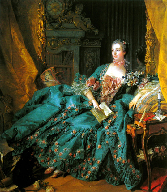
Figure 1. François Boucher, Madame de Pompadour, 1756, Munich, Alte Pinakophek, (photo: Kunstdia- Archive ARTOTHEK, D-Peissenberg), oil on canvas.
Figure 2. Close up of Boucher’s portrait of Madame de Pompadour heels
François Boucher, the father of decorative allegories and pastoral paintings, was an artist whom Jeanne-Antoinette Poisson admired and was inspired by. This particular portrait of her displaying the prosperity of her social position acts as what Benjamin defines as ‘’dialectics of a standstill’’. In his Convolute N: On the Theory of Knowledge, Theory of Progress, he writes: ‘’It's not what is past casts its light on what is present or what is present casts its light on what is past; rather, image is that wherein what has been come together in a flash with the now to form a constellation’’. This painting can be seen as an example of subject and object merging together. Similarly to the function of a photographic image, it preserves the past for the present. In Benjamin’s terms, the image has a role. It acts as a tool of confrontation and its source is history, which crystallizes force that is originally embedded in this painting. For Benjamin, time was a mysterious phenomenon which enclosed the dialectical relationship between the past and present. Walter Benjamin’s concept of time is gifted with autonomy and transitory power. This painting exists as a testimony of past, and its aim is to remind us of it. Fashion operates in the same sphere. Fashion, as we know it, has an ability to enter into any historical epoch and dictate its presence, so is the image. This painting as a historical object in which this act of knowledge, in particular, Pompadour’s shoes, which seem to enter our visionary field deliberately, demonstrates this presence of the past performed in the now. By looking at this painting of the past, Pompadour’s petite feet peek out from her exuberantly decorated dress almost breaking the bindings of time to signal their legibility in the present. This work of art operates as a ‘‘tiger’s leap into the past’’, seemingly bestowed with tranquillity, but at the same time dangerous in action. The tilt of her shoe exists as an open conversation of fashion in the eighteenth century.
The mood and the lighting of the painting appear dimmed, and most importantly of all, private. It seems that in this certain moment Pompadour is having the time away from the formal rituals of the court where she is constantly on display. Her dress and surroundings demonstrate her taste and status. From her writing feather and ink, sketches on paper to a wide collection of books from the ones stored in the cupboard behind and the one in her hand, every detail is considered to indicate her intellectual and artistic achievement. One can say that the appearance of flowers remind us of her fragile femininity which she possesses as a woman. Portraits of Madame de Pompadour by Boucher tend to achieve a celebratory effect on her prestige education and knowledge, proclaiming her as a ‘‘femme savante’’, a woman of Enlightenment era. From the moment she appeared at court, Madame de Pompadour used her wit, intelligence and diplomacy to seduce and captivate King XV.6 From 1756 to this day, this portrait displays women’s capability of knowledge in political and economic spheres, which back in those days were governed by patriarchal male groups. The way Madame de Pompadour positions herself in this portrait signals for her personal achievements as a powerful mistress of King Louis XV. Perhaps her importance in the history of female heel formation begins with this painting.
The act of wearing heels in eighteenth-century France came to signify wealth and status as the term ‘well-heeled’7 indicates. Historically, heels as a formal invention came to reign with King Louis XIV in early 1700’s. It was recorded in historical papers that ‘’rigid court protocol established that only the King and his court could wear red heels in France’’.In this historical light, heels were representatives of status and power of the French Court. The fact that the height of the heel was always changing in order to meet the whims of royal representative’s shows that fashion back in those times was drastically fluctuating and was following the means of economy. In this sense, the operation of eighteenth-century fashion circulates within the ‘’arena where the ruling class gives the commands’’. In Benjamin’s theory, fashion in the leading classes operates by the means of dominating the lower classes. For instance, the upper class will increase the height of their heel once the lower class has adapted it. However, Pompadour did not come from a privileged background, and the possibility of her dictating fashion entirely depended on her gaining a socially respectable position. In this certain moment and year to which this portrait brings us back to, Pompadour possesses a high value in French society. She uses her achievements to manipulate her lover King XV and the laws of fashion. In this light of defining the attitude of fashion, one can see that it operates within the frame of certain class and gender. In Pompadour’s case, it operates within this picture frame, but at the same time within the gulf of time, in which this painting can flash up and disappear without rules.
Relying on the functions of the social classes based on the Marxist theory, Benjamin shows a great concern with Capitalism and its influences on fashion. With the rise of Capitalism and commodity fetishism, ‘’fashion has opened the business of dialectical exchange between woman and ware-between carnal pleasure and the corpse’’.Capitalism kills, robs, impoverishes and creates colossal richness and beauty. It settles in the people that feeling of longing for that form of life and the opportunities that will forever remain unavailable. It produces not only the objects but the images and dreams of fashion. Within the capitalist world, the victory is achieved by the inorganic over organic. The transformational energy of fashion and its constant craving for recycling of old styles and the rapidity with which fashion comes and goes resembles with death. Fashion changes with such speed that objects lose their significance and forever remain as historical corpses of fashion. They are gifted with life once they are fashionable and when they are devoid of style and no longer fashionable, they remain as reminders of the past. Benjamin’s thought on fashion having a dialectical relationship with the organic and the inorganic, opens up a different perspective on Pompadour’s heels. This particular pair with enhanced oriental decoration raised tips and fastened buckles, has lost its relevance in modern fashion. However, the concept of the heel remains unchanged. Certain heel styles come and go, but the heel is still a heel with an evocative function. It continues to be a tool of height enhancement, professionalism, confidence, sexuality and power.
If wearing Pompadour’s heels today equates to wearing a phantasmagorical dream, what does it mean to be a fashion collector? Eighteen years ago with the rise of Sex and the City series, the New York inhabitants, and perhaps all women representatives in general, began to regard shoes as something holy. Sex and the City series larger contributed to Manolo Blahnik shoes became an iconic phenomenon. Sarah Jessica Parker slumbers in every woman of today. Indeed, there are events in a woman’s life that cannot be possible without heels. It is inconceivable to get married without Manolo Blahnik and walk down the red carpet without wearing Jimmy Choo. It is no mistake that on the shoe Olympus sits Madame de Pompadour’s heels. The act of collecting wearable objects as commodities, in particular, heels, turn shoes into the objects of fetish and desire. Madame de Pompadour’s little shoes have a certain charm to them. Their miniature quality appears desirous for a fashion collector. Only recently, Victoria and Albert Museum has included Madame de Pompadour’s shoes in the exhibition Shoes: Pain and Pleasure as a collectable object. Does heels have a true function or are they bestowed with something more than a desire to own? What is this true fascination with collecting commodities? If we are to turn to Benjamin, he regarded the act of collecting as a wish of the exhibitionist to possess value and at the same time taking away that value from the object as it becomes objectified. He writes: ‘’ And for the true collector, every single thing in this system becomes an encyclopaedia of all knowledge of the epoch, the landscape, the industry, and the owner from which it comes. It is the deepest enchantment of the collector to enclose the particular item within a magic circle, where, as the last shudder runs through it (the shudder of being acquires), it turns to stone.''The more rare and expensive the fashionable object appears, the more collectable and desired it is. This fascination with ownership can be compared to sexual desire, which also demands immediate possession and seeks pleasure in owning the object. To collect is to complete the object’s purpose. But can it be complete if the wearer does not give life to it by wearing? The dialectical tension in collecting commodities is seen in objects becoming the objects of display, but at the same time hidden with a fetish. Collecting Pompadour's shoes as a material thing carry more than the wish to have. It is no accident, that her feet, as the most modest and least favoured part of the human body, are bestowed with a revolutionary spirit. The feet as the opposite pole of the figure evolved much slower than the upper body. Pompadour, back in her days, was breaking the rules of modesty and morality by showing off her feet. As Philippe Perrot wrote: ‘’here we are at the heart of all male fixations, the spark that inflamed their desires, the anchor of all their fantasies: the foot. Ever since it was completely hidden by dresses, it became the object of a universal, ardent, and fanatical cult.’’By performing such immoral act for a woman of good behavior, Pompadour is reaching out to other women who follow fashion. Her provocativeness achieves the power of seduction. She appears dangerous, forbidden and desirous. As a court lady, she has the power to dictate her rules. Regardless of Madame de Pompadour being addressed as a mistress of King Louis XV, she has owned her place in the history of Western dress. And her shoes can claim to be a part of her revolutionary character.
Heel, beside their feminine character, have been adopted by both genders. Even today, they continue to be seen as unisex. However, heels tend to represent femininity more than masculinity, even though historically, heels were a male invention. This dialectical concept between gender specificity in fashion echoes Elizabeth Wilson text on transgender fashion,where she states that: ‘’fashion permits us to flirt with transvestitism, precisely to divest it of all its danger and power.’’In Benjamin’s sense, the so known cross-dressing is a result of modernity. Modern fashion, for Benjamin, ‘’consists only in extremes’’. It perverts nature and morality, it cannot remain neutral, as it to commit to a particular tempo in order to be modern to meet those extremes. Heels, no longer gender-specific, have lost their ‘aura’.Walter Benjamin’s description of the aura surrounding a photograph in his inspirational essay on ‘’The Work of Art in the Age of Mechanical Reproduction’’, notes that aura stands for the particular, ‘’the one-of-a-kind value of the ‘genuine’ work of art has its underpinnings in theritual in which it had its original, initial and utility value’’. And Benjamin would agree, that the aura surrounding Pompadour’s shoes in this picture makes this pair of shoes very unique and authentic. However, in the modern world this authenticity in fashion gives way to fleeting tendencies. A modernist has to commit to the ephemeral, to the progressive. In other words, the stiletto heels which we know today would not exist in fashion if they were tied up to a certain historical time, space or the figure of Pompadour. Fashion continues to make copies and reproductions, and their functioning in society makes the existence of the original optional. The dialectical image, thereby, can be described as the image of the past, which translates the desires of the past generations into the present. Can we consider Madame de Pompadour’s heels as the origin of the history of the heel or is it just another replica of the famous heel that we know today?
References:
Christopher Breward and Caroline Evans, Fashion and Modernity, (Oxford: Berg, 2005).
Elise Goodman, The Portraits of Madame de Pompadour: Celebrating the Femme Savante, (California: University of California Press, 2000).
Elizabeth Wilson, “Gender and Identity.” In Adorned in Dreams: Fashion and Modernity, revised and updated edition, (London: I.B. Tauris, 2003),
Katherine Lester and Bess Viola Oerke, Accessories of Dress: An Illustrated Encyclopaedia, (New York: Dover Publications, 2004).
Madeleine Delpierre, Dress in France in the Eighteenth Century, trans., Caroline Beamish, (New Heaven & London: Yale University, 1997).
Margo DeMello, Feet and Footwear: A Cultural Encyclopaedia, (United States of America: Greenwood Press, 2009).
Nancy Milford, Madame de Pompadour, (London: Vintage, 2011). Philippe Perrot, Fashioning the Bourgeoisie: A History of Clothing in the Nineteenth
Century, (Princeton: Princeton University Press, 1994). Ulrich Lechmann, Tigersprung: Fashion in Modernity, (United States of America:
Massachusetts Institute of Technology, 2000).
Walter Benjamin, The Arcades Project, (United States: President and Fellows of Harvard College, 1999).
Walter Benjamin, trans. Edmund Jephcott, Selected Writings: 1938-1940, (Cambridge and London: The Belknap Press of Harvard University, 2003).
Academic Papers and Dissertations:
Alexia Bretas, “Eternal Return of the New-The Aesthetics of Fashion in Walter Benjamin’’ (PhD diss., Universidade Estadual de Compinas, Proceedings of the European Society for Aesthetics,vol.5, 2013).
Journal Articles: Ewa Lajer-Burcharth, "A Woman’s Worth. Madame de Pompadour and the Arts," In Art in
America, No. 4, )April 2003),100-107. Georg Simmel, ‘’Fashion’’, American Journal of Sociology No. 62 (May, 1957), p. 541-558.
Peter Wollen, ‘’The Concept of Fashion in The Arcades Project’’ In boundary 2, 30, no. 1 (Spring 2003): 131-42.
13
Online Journals:
Elise Goodman-Soellner, ‘’Madame de Pompadour at Her Toilette’’, Simiolus: Netherlands Quarterly for the History of Art, Vol. 17, No. 1 (1987), 41-58, accessed December,2015, doi: 10.2307/3780687.
Online Source: ‘’Why did men stop wearing high heels?’’, last modified 25 January 2013,
http://www.bbc.co.uk/news/magazine-21151350. Film: Jeanne Poisson, Marquise de Pompadour, film, Directed by Robin Davis: (France, 2006).
0 notes