#like... my life changed... i used to be stuck in cutesy childlike things. i did not expect this. at all
Explore tagged Tumblr posts
Text
On Thundercats Roar, the Calarts Style, and ‘Toxic Masculinity’
Okey, I know I rarely, rarely make blog posts. If I have something to say about cartoons or the animation sphere I would probably make a video on my channel. But I believe that this matter is not a suitable topic for a potential video, and also I’m still kind of on my Youtube hiatus. Anyways...
There is a reason why Thundercats is hated so much, and it’s because of the plight of the ‘Calarts style’. A lot of people, especially those who grew up with cartoons from the 80′s and 90′s, criticised the show for repeating the art style repeated in modern 2010′s cartoons such as Steven Universe and Gravity Falls, and that the Thundercats reboot is no more than an epiphany for the ‘lazy’ style in all contemporary cartoons.
But is this true?
The modern ‘calarts’ style is constructed from drawing a circle, and drawing a bracket, representing the lower jaw, that protrudes out, as seen in this image:
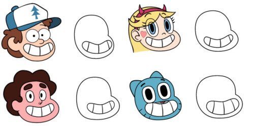
As an artist who has emulated and utilised this style, I can say that this is perfectly true. But now let’s look at the other side, the 80′s- The 80′s style is primarily based on realistic human anatomy and proportions, with accurately depicted muscles.
But here’s the catch. The education process of an animator within an art school is rigourous- students are required to attend mandatory figure drawing classes, where their skills when it comes to anatomy and perspective are drilled to perfection. The artists who animate with the calarts style, and the artists who made the original Thundercats have no doubt gone through this process- with all that intense training, one could probably regurgitate a human figure as easy as...well, drawing a circle with a jaw below it.
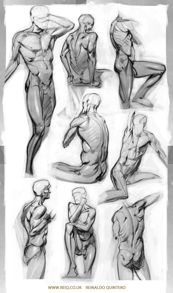
Image credits: Reiq from Deviantart
I do agree that there is more effort that is placed into defining emotions and muscular features in the original Thundercats and many 80′s cartoons. However, the fact that they regurgitated the real life anatomy does not make them any more, or less, creative than contemporary cartoons.
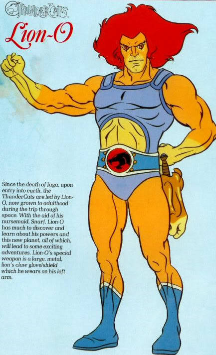
Look at Lion-O for a start, he is supposed to be a human-cat-alien. However, all the character designers did is illustrate a normal, muscular person, change the eye size to match a cat, and made the skin orange. It’s practically one or two cat features stuck to a perfectly standard rendition of a male figure that the artist could have drawn a million times during anatomy class in animation school.
And hence, like how the ‘Calarts’ style is based off a regurgitated circle and a bracket, the 80′s cartoon style is based of a regurgitation of standard human anatomy that is commonly understood by all artists- including modern animators in Calarts. Anime uses a regurgitated style, so as comic books. But how about this image?
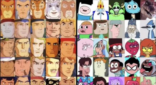
So are 80′s cartoons a pile of shit too?
No, the creator of this image has obviously nitpicked the characters from contemporary animation. But it does tell the point that the ‘repetitious, lazy style’ argument could work both ways, and it could be true with exceptions at the same time. The point is- each era of animation have a stylistic/anatomical thing that is repeated, and that’s fine! Because in the cartoon industry a lot of artists work between shows, and this result in their style being intertwined between many dominating shows within the industry. Both style has their beauty- the 80′s, muscly, realistic style is a celebration of how life-like and realistic you could make a series of moving pictures to be. And the Calart style looks fluid, lively, and well, cute.
Though the design from Thundercats Roar might have been too much of a generic copycat (ba dum tss) of the Calarts style, let’s remember there are many amazing cartoons that are animated in the same style, but are beloved and are appreciated for their artistic beauty. For a start- Wonder Over Yonder, created by Craig McCracken, who surprise, came from Calarts himself. We should appreciate each era of cartoons- past, present or future, and of course, be free to criticise it too. And we should not allow one bad fruit in the basket to ruin it all for everyone.
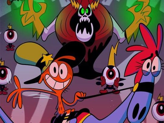
But there is one last thing about this whole Thundercats thing I want to address. I think this comment left by a fellow on Youtube highlights this problem I want to talk about best.

‘When I see this style (Calarts), I don’t think ‘cutesy’. I think racist bigoted, vindictive, far left authoritarian. This drawing style is a huge warning sign that you’re dealing with the someone who’s really into violence and revenge, but deluded enough to think they’re childlike and fun.’ -anon
This is one of the biggest problem with the whole issue- people politicising the Thundercats reboot and the Calarts style.
Basically the consensus is- the Calarts style and the Thundercats reboot itself is an attempt from leftists and SJW’s to stifle ‘toxic masculinity’, otherwise known as ‘the war on boys’. As we have all noticed- the original Thundercats is very masculine, while the reboot looks cutesy and non-threatening. Many people believe that this reboot is a small part of the agenda from the liberals imposing feminine standards on young boys at school, in the media they consume and in society, instead of allowing them to have rough and tumble play.
Let me get this straight first- I do believe that this is an issue with the western education system in many western countries, especially Sweden. But I’m not here to talk about politics, I’m here for animation.
The modern cartoon style portraying their characters as more cutesy instead of more masculine is not a large social engineering project, but it’s instead a mix of the change in writing style and economics.
First of all, large corporations like Cartoon Network has no intention on manipulating kids to be more feminine. They just market, greenlight, and promote what sells. It’s called business. The cutesy style is trendy nowadays- so networks today promote it. The muscle-man, masculine style is trendy back in the 80′s, so networks promoted it before. Welcome to the free market.
Second of all- the writing style. The entire Calarts style started with the ‘cartoon renaissance’ of the 2010′s- catalysed by shows like Adventure Time and Gravity Falls. These shows not only brought a new art style, but they also brought something back that has been mostly eroded in the previous decade- story and character development. The imperative part of character development is relatability, and this would mean the rejection of ‘Mary Sues’, or perfect flawless characters.
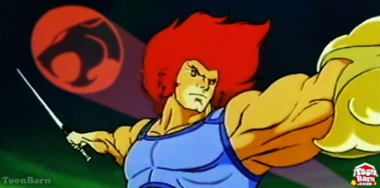
It lies in the visual narrative- a worked up person with large muscles- as portrayed in Thundercats, does not seem as ‘relatable’ as maybe a more bubbly, cutesy, character, because the fact is that the majority of us do not look, and more importantly, feel like that. But unlike the Thundercats reboot, this bubbly Calarts character design in many good contemporary cartoons juxtaposes with the character’s surrounding world, which is often illustrated to be much darker, and included more physical and emotional challenges they have to face. They are more appealing because the audience, whether they are kids are adults, realise that someone meek and not very insignificant like themselves, represented by the ‘cutesy’ style, could fight and fare along in a world that’s dark, complex, and that they can overcome the hurdles in their personal life like family relationships etc (classic examples being Gravity Falls, Steven Universe, Adventure Time, even Gumball, OK KO and Star Vs to some extent) and that they could do so too. They are not more appealing to the audience because the audience is being brainwashed into being more feminine.
A lot of the people supporting the notion that the Calarts style is representative of the feminisation of society will point out that cartoons today do not show and encourage people to take action on their own flaws, and that the audience is shielded from reality and are replaced with rainbows and sunshine to ‘feminise’ the children, and some of them end up calling artists and animators that utilise the Calarts style as ‘cucks’, ‘soyboys’ (lol) and ‘betas’ and are obsessed with their ideologies and social engineering. When in fact, cartoons today have been promoting the idea of overcoming one’s own flaws all the time, (Maybe not in Thundercats Roar or TTG but in Adventure Time, Steven Universe, Star vs. etc) and are in fact building stronger people in real life, all thanks to the fact that the audience could actually relate increasingly to more modestly, cutely designed characters.
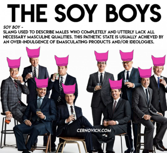
Img cred: Know Your Meme
And I have to say, I personally think a lot of them are completely new to the modern cartoon/animation sphere and they just popped in because they saw this Thundercats reboot, and just because of that one reboot they came up with the notion that the Calarts style and the entire cartoon industry is stifling masculinity. No offence to them at all. But like I said earlier, the cutesy style actually creates a sense of reliability and juxtaposition for the audience that a more masculine and strong illustration style like the original Thundercats might not be able to offer. It’s only that Thundercats Roar failed to create this sense of juxtaposition, but it doesn’t mean the rest of the bunch- OK KO, Steven Universe, fail to do so too.
If you are a big fan of cartoons, may I ask you, will the show lose it’s appeal, at least slightly, because...
- Star from Star vs looks more like Wonderwoman
- Dipper from Gravity Falls is an alpha with gains.
I’m well aware that this is could be different between person to person.
The point is, the fact that we are politicising a fucking art style and calling everyone who uses and endorses it as your political opponent, shows how emotionally driven this whole debate is. Fans of the former Thundercats have every right to be mad at the reboot- it is a bastardisation of the original and a disrespect towards the original creator. However, turning this nostalgic rage into political stigmatisation and blanket generalisation of the many hardworking artists and animators that just get along is childish in itself. Sure, some artists might actually believe that masculinity is toxic, whoever designed the characters in the Thundercats reboot might be lazy- but the majority of those people who use the Calarts style, or come from Calarts, want to pursue their passion, make the best animations they could, and put food on the table.
The political issues implied are very real, but using them to emotionally justify one’s rage against these artists is not right.
It takes some balls for you to voice out against social change (despite doing it in the wrong place), but it takes a real man to pursue the gruelling yet rewarding art form of animation.
#thundercats#toxic masculinity#soyboy#thundercats roar#thundercats reboot#calarts style#80's cartoons#i'm sorry
84 notes
·
View notes