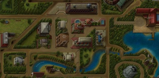
#like. there's literally an entire expanse of empty mountains outside the map boundaries to the north + west. free real estate
Explore tagged Tumblr posts
Visit Tumblr Blog
Explore Tumblr blogs with no restrictions, modern design and the best experience.
Last Seen Tumblr Blogs


Fun Fact
The total number of visits Tumblr.com received during January 2021 is 327 million.
Text
mannnn I'm forever going to be disappointed they reused hyrule from botw instead of doing somewhere/something new
#dip speaks#dip plays totk#totk spoilers#it really takes out the fun of exploring and im rlly having trouble staying interested in it#like. there's literally an entire expanse of empty mountains outside the map boundaries to the north + west. free real estate#plus before the game came out i thought a whole bunch of hyrule was gonna be lifted into the sky because thats what happened to the#castle right? and that's how the sky islands would be formed?#like it'd still be hyrule but a cool new twist. really lean into the whole sky islands thing#instead we get. caves. a couple floating islands not rlly worth visiting outside of storyline stuff. and the depths exists ig#im still wondering why this all took 6ish years to make and is priced 70$#i like the game and i like all the little mechanics stuff they added. esp the fuse ability. and there have been revelations that Shook Me#but man.
0 notes
Text
Part 3: Nancy Drew & The Vanishing Set Designer
The Importance of Cohesive, Believable Game Worlds
A wall of text series on how Nancy Drew games largely lost their charm--this time with pictures!
Boasting more than 30 titles released over the course of nearly 20 years, it’s obvious why the Nancy Drew series has experienced changes in graphics. Thanks to never-ending advancements in PCs and artists who continue to hone their craft, the games moved ever closer to an ultra-realistic ideal.
Improved textures and dynamic character animations were some of the most noticeable and appreciated changes that helped to further immerse the player and create a beautiful game world. That said, a convincing game world does not require the latest and greatest graphics--it only requires cohesion. The most realistic graphics in the world are nothing without a skillful designer behind the scenes, setting the stage and making everything feel “right.” Unfortunately, that designer seemed to vanish with increasing regularity as time went on.
Empty Spaces
HER has never had a AAA budget, and that comes with certain limitations. One of the most obvious is the amount of characters that Nancy is able to interact with in each game. Since creating, animating, and voicing characters takes quite a bit of time, there are rarely more than five. This can create some challenges when it comes to creating a game world which feels lively and believable.
Some locations, like the abandoned Thornton Hall or the soon-to-be B&B in Message in a Haunted Mansion need no excuse for their limited cast, but others require a bit of explaining.
Sometimes, a story-driven explanation is given for how sparsely populated a location is. For example, in Secret of the Scarlet Hand, the museum is currently closed to visitors, just like the park in The Haunted Carousel. But other times, a few tricks are needed to seal the deal--and not every game had some up its sleeve.
The Good:
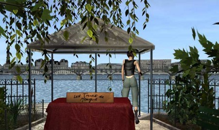
Danger on Deception Island did a good job of making the Hot Kettle Cafe, an otherwise sparsely occupied establishment, feel as if a group of bustling customers were just out of view through the use of sound effects.

Dishes are clinking, people are chatting and laughing, but only Holt and Jenna are ever seen. Yet, the simple addition of those sound effects and a little sign saying the other part of the cafe was occupied helped the player suspend their disbelief.
Perhaps even more impressive, Danger by Design managed to make a public park feel fairly believable through the use of cleverly obscured vendors, street and nature noises, a pesky squirrel, and a suspect visiting at one point.
This location, coupled with the choice to have Nancy immediately appear behind the parfait counter at Cafe Kiki against the sound of chatting customers, allows the game developers to avoid making Paris feel underpopulated even though there are only a handful of NPCs.
The Bad:
Unfortunately, The Phantom of Venice did not succeed in presenting Venice as well as DAN presented Paris. Though the Ca’ itself was beautiful and the musical score was, as usual, wonderful, the vast majority of the locations felt completely and utterly dead.

No amount of heels clicking on the pavement, people occasionally shouting Italian phrases, or flocks of pigeons landing briefly was going to make these locations--which are visited many times throughout the game--feel real.
The game designers chose to set many of the clickable buildings further back, revealing large swathes of empty streets and public squares, rather than having Nancy appear at the front door like she does in many other games.
While I can see they were clearly trying to showcase the unique architecture of Venice, it simply results in a mostly “off” feeling game world since one would expect lots of people to be roaming around.
The Silent Spy--with its basically empty train station--and Shadow at the Water’s Edge--with its barren urban environments--suffer from this problem as well, along with the game I love to hate: The Shattered Medallion.
Even though MED makes a ridiculous attempt at explaining why Sonny Joon is the only member of staff present and conveniently gets rid of the vast majority of the competitors within the first act of the game, it still utterly fails at making the player feel as if they are participating in a game show. Frankly, with the constraints put upon HER by their budget and game engine, I simply cannot imagine how they could have successfully pulled off an authentic game show experience, but the lack of competing teams was far from the only issue with MED.
The Great Outdoors
The trouble with any game world is that there almost always must be a boundary--a limit to where the player can go. Except for games that feature randomly generated locations, players can expect to--sometimes literally--hit a wall at some point. The trick is to make it seem as if there is no wall.
Outdoor locations can make pulling off such a feat difficult, because as the depth of field is increases, more and more objects are required to fill all that space. However, it is by no means impossible, and HER has marvelously pulled it off many times.
The Good:
Ghost Dogs of Moon Lake was the first game to truly offer an outdoor experience. While previous games like Treasure in the Royal Tower and Secret of the Scarlet Hand had walled gardens, DOG gave the player an expansive forest to explore during the day and night.

This game succeeds at giving the player a sense of actually being deep within a dense forest by using layers upon layers of 3D trees. No matter where you look inside the thicket, you never seem to see a “wall.”
Not only that, but allowing the player to wander in the woods rather than having every location be accessible by a jump map--like the motor boat map--makes the game world feel very large, though some players may find backtracking to be annoying over time.
Another contribution to that sense of realism, much like the Hot Kettle trick, is the use of environmental sounds and critters. Songbirds singing in the trees, the famous chirping worms of Pennsylvania, and other woodland noises play almost constantly in the background as Nancy’s feet crunch upon earth and fallen leaves.
The DOG designers also used a limited, cohesive color palette of muted, earthy tones not only in the forest but also throughout the cabin, speakeasy, and ranger station.
The result? A game which, though it may not rival the likes of Skyrim in detail or variety, feels thoroughly cohesive and drips with atmosphere.
Similar success--though on a smaller scale--was achieved by the forest in The Captive Curse, which was full of sounds, had misty depth of field and gave the player a true sense of being lost in a dark, potentially sinister place.

The Bad:
The Shattered Medallion, on the other hand, is one of the worst offenders of a poorly designed outdoor world. Given that this game was almost entirely set outside, HER certainly had a challenge on their hands, but they failed miserably.
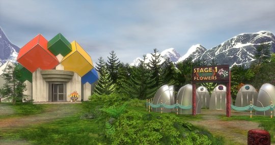
Contrast this forest scene with the one from DOG or CAP. Those trees are almost definitely 2D photographs pasted in a row, allowing for almost no depth of field, and it’s the same story for the mountains.
Using 2D assets is not necessarily a no-no, but here they make the actual 3D models--the silver flower stations and the puzzle palace--look wildly out of place.

The same thing is happening in this other half-ass location from MED. A strange collage of photographs with a few oddly lit 3D models pasted on top makes for a very “wrong” feeling scene.
Indeed, almost every outdoor location in MED has this very weird feeling of being on a Hollywood set--like the backdrops could fall down at any moment and reveal the whole thing to be a farce--and it’s made only worse by the almost complete lack of background noise. Admittedly, I have never been to New Zealand--perhaps it really is deathly quiet--but this game could have greatly benefited from some consistent sounds of nature to liven-up its otherwise lifeless locations.
On top of all that, this game seems to have no color scheme of which to speak nor does it feel expansive. A jump map is used extensively for traversing the landscape, with many outdoor locations only allowing the player to take a mere handful of steps in any given direction.
The result? A game which simply feels “wrong” in nearly every conceivable way.
By no means is MED the only offender, though. Similar depth of field issues--though not as egregious--were present in Secret of the Old Clock, and as far as cohesion goes, I think we should all take a moment of silence for this travesty:
All I can say is, whoever approved that design was just...wrong.
The Jump Map
Jump maps can be great time-savers when going back and forth is a key gameplay element, and the Nancy Drew games certainly involve a lot of back and forth. Sometimes they save a player a lot of headache, but sometimes they break immersion--particularly when they attempt to stand in as a cheap substitute for an expansive, believable game world.
The Good:
Danger on Deception Island is one of many games which features a jump map for key locations.
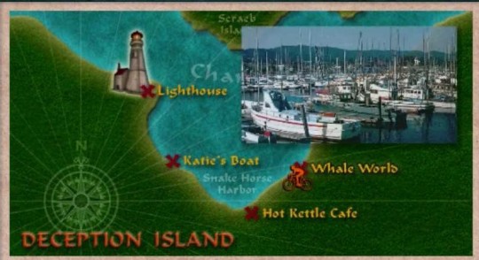
What makes this map work is simple: each location is fairly large and immersive in its own right, and there is presumably little to be gained by forcing the player to click one million times down the actual road to each place.
That said, while the player may jump from the lighthouse to the Hot Kettle with the click of a button, copious amounts of kayaking, exploring beaches and the enormous tunnel system keep the game from seeming too constrained. The player feels as if they really have explored Deception Island, rather than feeling as if they have simply visited a few buildings.
The jump map in DOG, SSH, STFD and various other titles work for the same reasons--the forest, Beech Hill museum, and WWB studio respectively seem so large that jumping around to smaller, more limited locations doesn’t actually feel very limiting at all. Plus, the art style used for the map can often add to the immersion, like the subway and train maps.
The Bad:
Though its map certainly looks plausibly like an amusement park flyer, The Haunted Carousel was the first game with a jump map that truly felt like a limitation.

Though there are double the “clickable” locations on CAR’s map in comparison to DDI’s, there simply isn’t much to explore in CAR’s locations. Indeed, the park feels very tiny, and I can’t say I truly felt like I “saw” Captain’s Cove. Perhaps if even one location had allowed for more open exploration, the game wouldn’t have felt so limited.
In the same way that mini-games and repetitive tasks can serve to artificially lengthen or beef up a game, jump maps can attempt to artificially expand a game world. Sadly, there are even more cheap tricks deployed in service of this goal.
Third Person Perspective
Secret of the Old Clock was the first game to transform the jump map into a driving simulator, and this mechanic was met with mixed reception--it seemed like players either loved it or hated it for various reasons. Regardless of opinion, this game mechanic always introduces a risk: the style of the game changes.
No longer is the player immersed in a first-person, beautifully rendered 3D world--they are now dropped into third-person on a stylized, top-down map. The effect is simple: the player is very aware they are playing a video game.
The Creature of Kapu Cave, The White Wolf of Icicle Creek, The Phantom of Venice, and The Haunting of Castle Malloy all featured variations of this third-person mechanic, and many games afterwards incorporated some form of the driving simulator to varying degrees of success, but Ransom of the Seven Ships went absolutely wild with it all.

From sailing around, to scuba diving, to rock climbing, to digging holes, to driving the golf cart around the island--the player was constantly yanked from the first-person, 3D-rendered game world and thrust into what were essentially 2D mini-games. While the color scheme was consistent, the art style varied greatly, making the game feel much less cohesive than many of its counterparts.
While RAN certainly felt like a very large game in terms of terrain--complete with copious amounts of agonizing back-tracking--it really lacked immersion. Indeed, there is no real sense of urgency like that in The Final Scene--despite it being Bess who has been kidnapped--and the focus is constantly taken off of the mystery at hand and onto figuring out how to drive correctly or sail that godforsaken boat.
A Matter of Preference
Ultimately, I think the Nancy Drew games evolved along something of a sliding scale. In the beginning, the aim was to put the player into Nancy Drew’s shoes, but this aim slowly and steadily shifted towards that of simply creating a game. And the truth is, there is nothing wrong with either aim; it’s all about what experience you’re looking to have.
When I first started playing the Nancy Drew series, I was looking for a mystery-solving simulator and I couldn’t get enough. I’ve played a lot of other detective games, but the ND games were really something special, so when they stopped delivering the same type of product, I really felt like something great had been lost.
Again, there is nothing wrong with game-y games, but there is something to be said about games that try to provide an authentic experience. It’s not every day that an ordinary person gets to solve a mystery--a mystery that seems so plausible that you feel a real sense of accomplishment when you unravel all its threads.
I missed that in so many of the later games, and I think that’s a shame.
Read Part 1: Nancy Drew & The Curse of the Pointless Task & Part 2: Nancy Drew & The Case of the Missing Realism
68 notes
·
View notes