#like idk. something very neat about how at first glance it seems like they're doing gender and race blind casting in the same way a lot of
Explore tagged Tumblr posts
Text
some thoughts about Chuck and Texas (character analysis?)
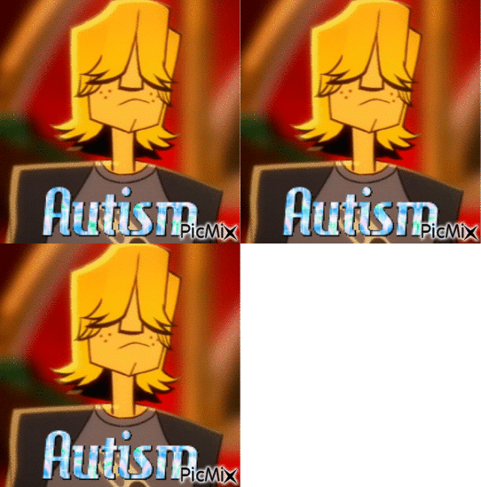
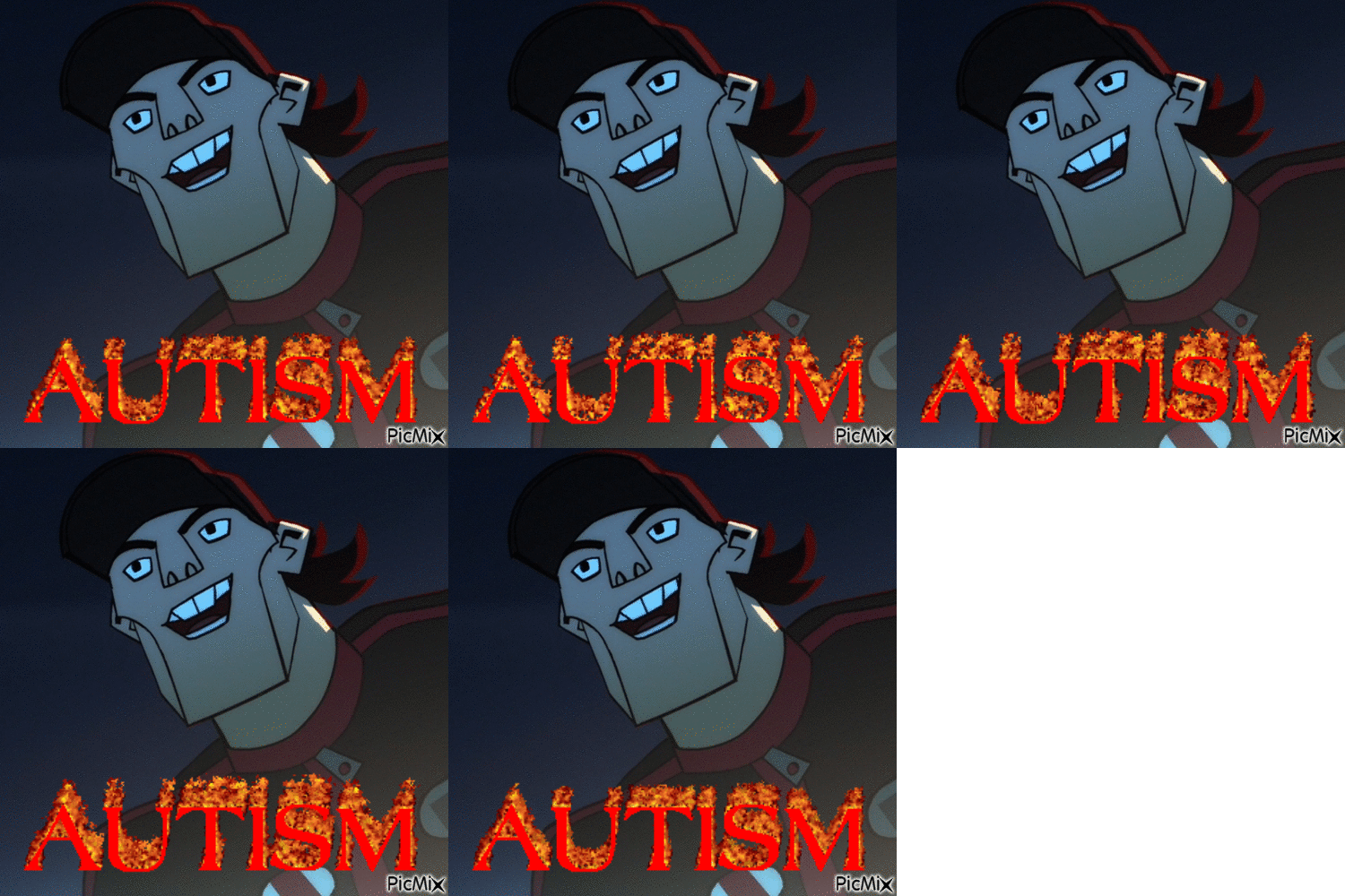
thinking bout they're actually very similar, at least in my perception
and it's not visible at first glance, they seem like polar opposites, actually - Chuck, anxious, withdrawn, kinda insecure; Texas, loud, confident, certified bragger and bullshitter
but that's not entirely true, when you get into it
from Texasify, I think it's safe to say that Texas does all that - constant boasting, coming up with a million ideas that no one really asked for - cause he feels like the team, or specifically Mike doesn't appreciate him enough and take him seriously. and honestly, isn't that what Fearless and Blonde Thunder tackle, but from Chuck's perspective? He takes the booster cause he feels like, because of his fear, he isn't on the same level as the other Burners, and in Blond Thunder it's even more obvious. He even pulls a Texas move at the beginning of the episode and starts bragging about how good of a driver he is, even though he's never been behind the wheel. He's scared the Burners will think he's a joke if they knew he wasn't as good at driving as them. These episodes (Texasify, Thunder and Fearless to an extent) are literally about the same thing except in relation to two different characters.
And the thing is, both Tex and Chuck ARE right - the Burners DON'T take them seriously. In Amazons we see that the Burners dismiss Texas's idea to infiltrate the other gangs from the get-go and only humor him because they think it's funny. Even Mike is very opposed to Texas's ideas (which I thought was kinda out of character honestly but let's not get into that), basically treating him like an annoyance, or even a hindrance to his own plan.
Chuck ALSO doesn't get treated seriously by the gang. In Fantasy Vans, they start out making fun of his hobby, cracking jokes and basically laughing at him instantly. And yeah, okay, guess you can say it doesn't rly matter cause it's just a hobby (even though it's clearly important to him), but in Fearless we see them sat around a table and laughing at him screaming in fear for his life, very obviously making him the butt of the joke.
What I think is especially interesting is that Texas is probably most guilty of this (making fun of Chuck), with him laughing at Chuck the loudest and even making snide comments. And then what makes that even MORE interesting is that Texas very clearly recognizes Chuck's intelligence while not thinking he himself is smart (very evident in the texasified intro where "Texas is intelligent" is the only claim he backtracks on)
I think it's safe to say that Texas feels a kind of insecurity cause of not being as academically gifted as the others, ESPECIALLY Chuck. Idk if I'd go as far as to say he feels resentment, but it's definitely a neat idea to explore.
What is ALSO important to point out that the show itself doesn't take them seriously. Both Texas and Chuck are often made to be the comic relief character - Chuck with his screaming and clumsiness and Texas with his outlandish ideas and lack of understanding of situations he finds himself in.
BUT that's not where the similarities end. I like how both of these characters don't seem to have problems with... let's say departing from the truth. Obviously, Texas just makes up stories that never happened to make himself look more heroic, or overexaggerates his abilities, but Chuck does that too, to an extent. Like I said before, he lies in Blond Thunder, he also has no problem with taking the booster and not telling anyone about it, or not admitting that his first LARPing win was due to him tripping, essentially taking credit for something he didn't really do (a thing that Texas also does, most visibly in Threat level)
Another thing, which is maybe less important but present nonetheless, is that both of them have negative rizz. Texas, thanks to his over-confidence comes off as douchy and, dare I say, misogynystic, whereas Chuck is so insecure he basically forgets how to speak around Claire.
They both also care very deeply about Mike's opinion. Texas clearly feels inferior to Mike and feels like they're in a constant competition, resulting in him trying very hard to impress him. With Chuck, it's a little different - his need of Mike's validation pushes him to try to be better. He comes clean to Mike about the LARPing thing (even though he didn't need to) and takes the booster mostly because of Mike also, then, of course it's Mike who gets him to take it out. It makes sense, of course, since Mike is the leader of the Burners, placing him directly above Tex hierarchically, and Chuck's best friend, but neither Dutch nor Julie feel that need to prove themselves to Mike constantly (Julie feels the need to prove herself in Off the rack, but I think it's mostly targeted towards the team as a whole and not Mike specifically)
Also also, little thing, but it's funny how they both don't have canon last names
Overall, Texas and Chuck are actually two sides of the same coin and I really REALLY wish we'd gotten more interactions between them. Also they both have super ultra autism. You see it, right? You totally do
62 notes
·
View notes
Note
alec alec i found a scrap bit from mt old projecr, explaining a plague in the story qnd now i am subjecting u to reading it 💗
there used to be a plague (Amanita yersinia) going around, one that was so severe it wiped off nearly half of the Volokean population. at first, the infected would feel a few symptoms, such as:
toad skin: slight, barely noticeable bumps across their skin, one that neither the infected themselves or anyone else knew where it came from paired with slight change in hue across their arms; the tips of their fingers would turn a soft greenish hue, one that's barely noticeable at first glance. day by day, it only grew. the greenish colour crawling up the infected's arm, and paired with the bumps on their body, it makes it look like as if there's moss under their skin.
vomiting pure black, whether it's liquid or something solid– resembling food the infected had eaten prior to vomiting it out.
there would be much severe symptoms, however, such as:
the infected would begin to vomit out moss, the colour of it black from the previous "vomiting black liquid and/or solid"
the infected's eyes would have moss growing in place of them right when they're about to die. once they passed, the moss starts to grow and eventually turns into mushroom.
think of the severe symptoms as stages of decomposition, like the moss/mushroom is eating them up from the inside. these symptoms might be less noticeable on older people. if not treated properly (*cough cough* the government limiting the cure only for the rich), the elderly would slowly begin to rot. on surface level, it would seem as if the infected elder died out of no where, but once you've gotten a closer look– oh, is it not obvious! their rotting body would still look like any other person, sick with a simole fever, but they're actually nearly dead!!
ya lol, i think i named the plague after some sort of plant that i can't remember (i think it was a mushroom of some sort). this plague doesn't have that much effect on the timeline of the ACTUAL story, so it's just a side information because it's the cause of the main character's mother's death.
this has NOTHING to do with the florian & milanko project so uh :3
-🧼 (I'M SO SORRY FOR THE SPAM I DON'T HAVE ANYONE ELSE TO TALK TO ABOUT THESE BECAUSE ALL OF MY FRIENDS ALREADY KNOW) (HAVE A GREAT DAY ALEC, STAY SAFE!!)
Sugar how do yall manage to think of this kind of lore like where do you gain inspo how does a process like this look like bc i genuinely could never see myself conjuring up a whole plague and creating symptoms and timelines and how it would work in society yall genuinely amaze me!!
Also a very creepy/ neat plague concept! I don’t know why but I feel like the bumps on the skin would look like when one scrunches their chin and maybe even feel like such and for some reason that freaks me out but in a good way!! Idk if you’ve seen chin muscles under a microscope but they look terrifying 😭
Also although the process is very dark I think it would produce such cool art, for example I think it would look super cool seeing a person at the finale stage of the plague especially the details with the moss for eyes!!

3 notes
·
View notes
Text
been chewing over my helen k wint cord thoughts for the past 24 hours (my actual serious thoughts. not just my "lesbian cord elam hot please please please wife me" thoughts) and I can't stop thinking about how different a female cord elam hits. particularly when it comes to the trial scene I was feeling a very different vibe watching her trying to take a stand against this miscarriage of justice and getting told essentially that she doesn't know what she's talking about and should shut the fuck up. like don't get me wrong it's always been an uncomfortable moment especially bc cord in this revival has already always been played by actors of colour (and i'm pretty sure specifically black actors) but having the actor also be a woman is definitely a notable additional layer to that. pretty much every version of revival cord has had a rough deal but with helen k wint it feels like there's now even more that she'd have had to overcome to be in a position of authority in this community and even more excuse for the other characters to dismiss her as soon as it's convenient for them
#the casting in this revival is so interesting to me#like idk. something very neat about how at first glance it seems like they're doing gender and race blind casting in the same way a lot of#shows do#but when you actually start thinking about it it becomes pretty clear they've put a lot more thought into it than that. idk#oklahoma!#oklahoma 2019#oklahoma west end#musicals#ifer rambles
12 notes
·
View notes
Note
First off, I love your Butch Hartman video I can never stop using it as background noise when I'm in the middle of drawing anything and it's why I followed your tumblr. Second, I wanted to ask about detailed character designs cause I want to to do more mechanical/robotic kinds of characters but it seems to clash hard with basic character design philosophy. How do I figure out what to and what not to include when it comes to designing robotic characters somewhere between cartoony and detailed?
omg for real? that's actually pretty weird to think about LOL someone putting my video on in the background. Not weird in a bad way at all, just not something I’ve ever thought about! I'm flattered gjgjhgjh and glad you like it
as for the question, I'm honestly not SUPER sure? I honestly don't think I'm that great of a character designer lol, like I'm much better at catching what does and doesn't work in other pre-existing designs, but my own character designs are pretty boring and milquetoast imo lol
I'm especially bad with detailed character designs, but I do think a couple things can be helpful here:
1) look at other mech/robot designs and see what they do! When I'm designing characters I almost ALWAYS look up references for inspiration (especially bc I'm unimaginative and bad at designing characters lmao, so the jumpstart is needed); a couple months ago I was playing around with designing a centaur girl, and I know I want to use her for a world that's post-apocalyptic, semi-fantastical/magical in nature (she's, y'know, a centaur, and characters can use magic channeled through staves, so her weapon has to double as one), and takes place in the desert. I also had like..... sad goth cowboy brainrot because I'd been listening to a lot of Lord Huron's Long Lost album lmao
So I googled a shitload of those words, alone and in combination, to see what other folks had done for similar ideas! I also had to look up images of horses bc I'd never drawn horse anatomy before, and also had to look up how saddles worked, bc my centaur girl is saddled up for her non-centaur girlfriend to hitch a ride lol. And then I stole borrowed all those ideas, and this is what popped out:
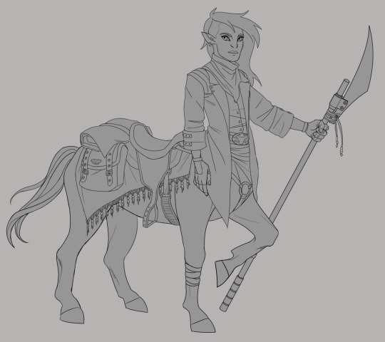
Is she, yknow, the BEST?????? Idk probably not. But I like how she turned out, and she wouldn't have turned out nearly as okay-looking if I hadn't looked up shitloads of references for what other people did and used that as inspiration!
Anyway. uh. not to just like shove my art and personal anecdotes in your face, but I'm not very coherent right now lol, I apologize. I hope I'm at least illustrating my point okay
BASICALLY UH, look at a shitload of other folks' art and see what they did. There is no shame as an artist in stealing like, aspects and little pieces of other designs and ideas, so long as you're not like, plagiarizing an entire fuckin character and/or idea and passing it off as your own. Take inspiration and details and ideas, and then put your own imagination to work
2) I think even in detailed character designs, more fundamental elements of character design can still apply! Even if a character is heavily detailed, you can still use value, color, and other elements to pull attention to areas of a character you want the eye to focus on (usually things like face and hands). I think a really neat example of this is the Vex from Destiny
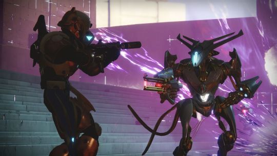
The Vex (on the right lol) are mechanical enemies, so, a little confusing to parse at first glance even though they're humanoid. Their weakpoint is also NOT their head, as you might expect from a humanoid enemy, but rather (usually) their stomach. Thus, they're designed so that their stomach glows a very eye-catching and easy-to-aim-at warm white color, while the rest of their glowy bits are more subdued (usually moreso than in this picture) and cooler in color. The rest of their design, while very detailed and VERY neat, is pretty monochrome and dark so as not to distract from the Big Glowy Weakpoint
ofc, not every character design is going to want to emphasize a weakpoint lmao, but I think the idea is still sound and easily transferable. If your entire character is detailed, and especially if you're going with more of an alien/nonhumanoid shape, value and color are really useful ways of pulling attention to areas that you want to bring attention to
Not to pick on Butch Hartman again lmao, but since it was my BH video that brought you here, and it's SO easy to use him as an example..........
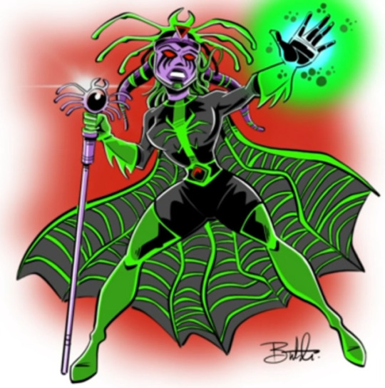
Look at her again........ Misery Vex (I just realized we have a theme going with this word) really isn't a detailed character design. She has...... a lot going on? But she's not.... SUPER detailed. Even simple character designs can be dumpster fires when the person designing them doesn't know what the fuck they're doing lol
The problem with Misery Vex isn't that she's highly detailed, it's that Butch doesn't understand how to lead the eye. Everything is the same value, some of the details that she DOES have don't add anything to the design (functionally, artistically, or to tell us anything about her as a character), the other details are extremely on-the-nose (like, we get it, she's a spider). Hyper-limited color pallets CAN work, but it doesn't work here at all because of all the other problems
And again, like I said in my video, the only place he DIDN'T add any sort of detail of any kind, in an otherwise highly-detailed piece, is her crotch, so the eye kind of automatically defaults to resting there. It’s a problem of not understanding how to use design principles to lead the eye
And the problem is that this isn't easily fixable lol. like, the ENTIRE design has to be reimagined to make it work. Trying to fix one aspect, like the overly obvious spider imagery, just makes the bad color pallet stand out more. Trying to fix the values just makes the extraneous details look weird and makes the colors muddy
So it’s not that the problem is Misery Vex being highly detailed, it's that her design is flawed in a VERY fundamental way. In many, many fundamental ways
To uhhhhhhhhhh... get back on point lol......... I think, again, looking at what other artists/shows/games/etc have done for mechs/robotic characters and asking whether you think they're effective designs, and whether you think they're aesthetically pleasant, and why or why not. What is your eye drawn to when you look at it? Do they do anything neat or interesting to draw your eye? Are they easy to parse despite their detail, or are they just a jumbled mess that your eye jumps all over, and if the latter, what would you have done differently to focus the design?
TL;DR I think that fundamental character design principles (shape, silhouette, color, value, probably others that I'm forgetting) can still be SUPER useful to keep in mind even when creating heavily detailed characters, you just might have to shift how you think about them, if that makes sense!
(Also again, thank u sm for the kind words and I'm glad you enjoyed the video)
(also also if anyone better at character design than me wants to chime in in the notes or reblogs, absolutely feel free to go buckwild)
#I hope this makes sense lol I'm so sorry#this is about the best ur gonna get out of me rn#skella answers#long post#anonymous#sorry everyone for making u look at misery vex again
15 notes
·
View notes