#it's too poofy for my taste otherwise it's such a cute skirt but i have another dusty pink one so I don't reach for it anymore
Explore tagged Tumblr posts
Visit Tumblr Blog
Explore Tumblr blogs with no restrictions, modern design and the best experience.
Last Seen Tumblr Blogs


Fun Fact
In 2020, 44% of users from Denmark used Tumblr daily.
Text

if anyone is interested in trading for this AP three tiered skirt (2005) w me feel free to msg me ^_^ it has a couple of pin sized stains & the bottom right bow is slightly heat damaged (not noticeable besides the wrinkles which i will iron down (carefully lol) as u can see). iso muted colors, brown, ivory, black, bxw, or florals. dm for my lacemarket feedback !
#i have non moot dms off so you'll have to send an ask so i can follow u back first#i can send closer photos of the stains etc but I'm gonna attempt to get them out before trading#it's too poofy for my taste otherwise it's such a cute skirt but i have another dusty pink one so I don't reach for it anymore#egl#oldschool lolita
53 notes
·
View notes
Text
ranking the sdr2 cast by how much their formal wear hits
this is just my opinion, but my opinions are great and i know what i’m talking about! this will be long so it’s under a cut
S TIER:
s tier is reserved for only the best of them all, the cream of the crop, the fit that i would gladly lay down my life for. s tier is the crown jewel. s tier is what everyone else should strive to be... but only one can take the prize.
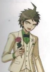
#1: AKANE OWARI
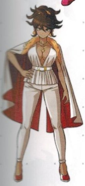
the undisputed champion. this look is everything to me. EVERYTHING. the red-trim cape with the fur. the contrast of the airy, gathered blouse with those skin-tight shiny (leather? vinyl??) pants. the pumps. the belt that screams disco style. the necklace accentuating the tasteful titty window. the red white and gold color scheme are you FUCKING WITH ME miss owari this look could bring ARMIES to their KNEES in an INSTANT. whoever drew this deserves full creative control of the danganronpa franchise and i’m not kidding
A TIER:
a tier is for the fits that frankly own bones. they’re not as jaw-dropping and legendary as owari, but they’re still razor as hell and deserve to be met with riotous applause.
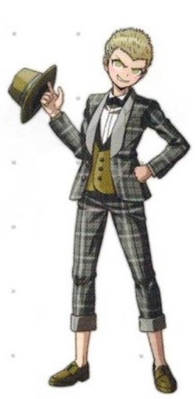
#2: KAZUICHI SOUDA
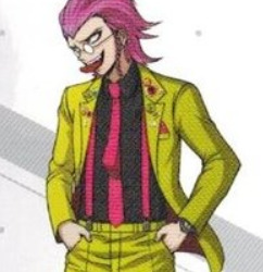
kazuichi, i didn’t know you had it in you, but this FUCKS. the character of the pins on the lapels, the sneakers, and the mispinned tie. the absolute CLASS of the suspenders, watch, and tiny round glasses. the handsome slick in the hair now that the greasy beanie is gone. the tasteful highwater. he looks like the host of the larry king show if the larry king show was exclusively about ska bands and he has never looked better
#3: HIYOKO SAIONJI
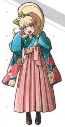
tell me this isn’t the cutest shit. the colors here are EXQUISITE. the bright notes from the blue on top, the way the soft pink is a perfect middle ground of the pink + white flowers on her sleeves, the subtle way the green in her bow matches the green in her collar, the white petals breaking up the sky blue that might otherwise look out of place? remarkable. stunning.
#4: PEKO PEKOYAMA
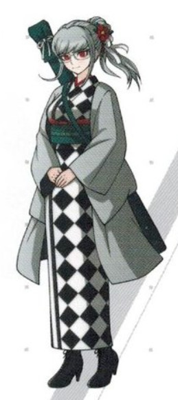
the ELEGANCE is EVERYTHING here. the monochrome is offset by just a splash of red that ties everything together with her eyes and the flower in her hair, the checkerboard pattern is visually interesting but not distracting, and her hair in that loose ponytail with the little white ribbon? ugh. ADORABLE! but most of all, look at those BOOTS. those CUTE LITTLE HEELS on those SICK LACE-UP BOOTS..... QUEEN shit!!!
#5: CHIAKI NANAMI
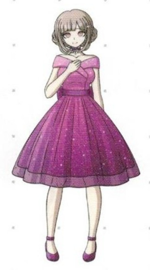
rounding out our a tier is chiaki in this adorable little dress just LOOK at her!!! she looks like a little rose, a perfect flouncy skirt with a glittery mesh overlay, a fun and fresh over-the-shoulder collar, a fucking big old bow tied in the back?? i can literally feel the way this dress would feel in my hands. it’s simple and perfect and frankly a GORGEOUS color on her this is flawless
B TIER:
b tier is a perfectly respectable place to be. these fits lack the lustre and flavor of the a tier entries, but they’re still dressed to impress and they still look fine as hell.
#6: TERUTERU HANAMURA
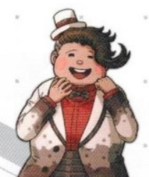
say what you will about teruteru (and i do) but this suit is ADORABLE and it fits in with his theme + talent better than any other mfer on this list. the tasteful white/brown/red palette gives it a flashy chocolate cookie look, which is amplified in the fun pattern on the jacket. the chef’s hat switching out for a little top hat and the way the cumberbund looks a lil bit like a chocolate bar is also VERY cute
#7: THE IMPOSTOR
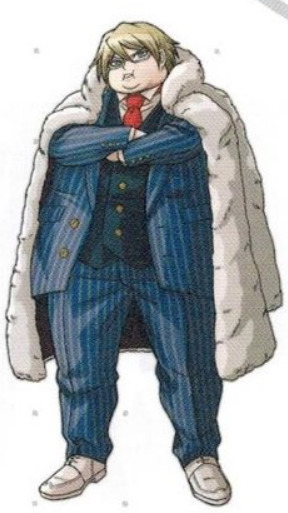
now on its own, the suit is just alright. a vibrant pinstripe blue three-piece with the classic red tie wouldn’t land the impostor in b tier on its own... but that FUR COAT, LUXURIOUSLY DRAPED OVER THE SHOULDERS does WONDERS to pull this look together. not only is it worn with “yeah, it’s real mink, no, you can’t touch it” confidence, but it also ties the otherwise arbitrary white loafers into the structure of the look. it’s subtle and class as hell.
C TIER
c tier is full of looks that are... fine, but ultimately either are boring, lack cohesion, or have a confusing design choice or two that make it hard to get all that amped about. c tier is a passing grade, but nothing more.
#8: NAGITO KOMAEDA
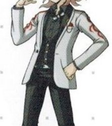
there’s a lot that’s good about this outfit, but there’s also a lot that doesn’t really work. let’s start with the good: the slutty loose bowtie and collar, the tight-fitting vest that ends before the hipbones so you can see the belt, the cute little ponytail? (chefs kiss) exquisite, all of it. but the suit itself is boring as sing, and who the hell decided to put the t-shirt symbol on the sleeves??? was it to add visual flavor to an otherwise bland suit? this does NOT have the black/white/red elegance that peko had.
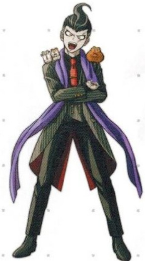
#9: FUYUHIKO KUZURYUU
the silver and gold mob-boss look, complete with matching shoes vest and fedora, are a nice nod to fuyuhiko’s talent! the plaid is teetering on the edge between fun and garish to me, but the fact that it’s consistent and the only pattern means it isn’t too offensive. quick question though: why are his pant legs rolled up like that?? this isn’t a cute “cuffed at the ankle” look, dude looks like he had to wade across a pond to get to the venue. what gives
#10: GUNDAM TANAKA
out of everyone here, gundam’s suit might be the most boring of all. the scarf is just his normal scarf. the red tie and trim don’t do anything to tie the look together. the only mild point of interest is the asymmetrical vest, and i can’t even tell if that’s intentional. simply put, this “““fancy”““ outfit isn’t even in the same ZIP CODE as the level of ostentatious chuuni that gundam serves us every single day in his casual wear. maybe even worse than being ugly... it’s disappointing.
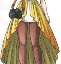
#11: IBUKI MIODA
now, look. is this dress buckwild and ugly as hell? yes. but you know what else it is? it is IBUKI MIODA’S DRESS. there might not be a single cohesive thing about this dress aside from its color scheme. the huge poofy ruffles of the skirt and arm things with the spiked bow and corset are baffling. the artist somehow managed to draw the awkward, clumping shape of the skirt to make it look exactly like an emergency cosplay sewn four hours before a convention. frankly, i can’t justify ranking it as a c! but i’m doing it anyway, because the sheer level of craftsmanship demands it, and in this house we respect diy queens that are totally off the shits.
D TIER:
d tier is for outfits that aren’t offensive, exactly... but like, they sure don’t look good! d tier is not a respectable place to be. those in d tier won’t be laughed out of the ceremony in shame, but they should really run their outfit by someone else first next time.
#12: NEKOMARU NIDAI
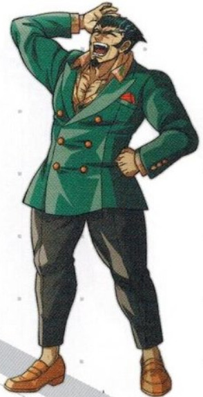
now don’t get me wrong: i have nothing but respect for the titties-out look. keeping the shirt unbuttoned all the way down to where the lapels of the jacket end? that’s sexy as hell. however, this flawless idea has a confusing execution. why emerald green and orange? what’s with the... long-sleeved printed (hawaiian?) shirt? why the red pocket square? and the jacket itself, while fitted perfectly along the chest and midsection, has a weird, unflattering scallop shape flaring out at the bottom. i want to like this fit, but there are just too many bad choices.
#13: HAJIME HINATA
oh, hajime... literally nothing about this ensemble is it. the creamy manila suit might have had potential if there were literally any color variation in the vest (or potentially shoes) to give it a little more shape, or even if you just went with a white shirt underneath it! i could get behind a light, off-monochrome look! but that leprechaun-green shirt is downright perplexing to me. it looks like a mistake! did you get dressed in the dark? did you spill something on your other shirt? this is a mess.
F TIER:
f tier is inexcusable. f tier should never have happened. how does it get this bad. who did this? who’s responsible for this?
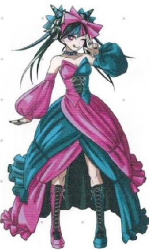
#14: SONIA NEVERMIND
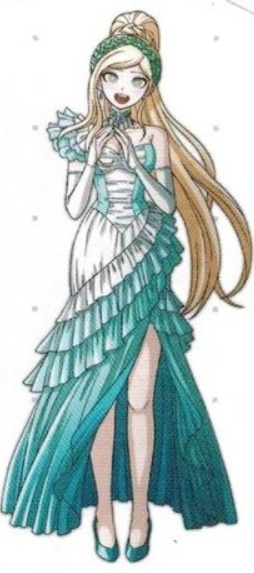
y’know, the colors are pretty! i dig the white and teal! but... girl... what the fuck is this construction. the ruffles are all over the place. the bodice looks like it has less fabric than space it needs to cover. the bottom half of the skirt looks like it was sewn on as an afterthought because the top half was too short for dress code. what’s with the weird choker collar detached from everything else. why is the hairband a slightly different shade of green. so many decisions were made here and none of them are flattering
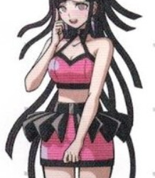
#15: MAHIRU KOIZUMI
yknow, i like the idea behind this. i can see what you were going for! the dress on its own might have worked, even! but everything else about it is just... so ugly. what the fuck is happening with those shoes??? the sheer black tights aren’t the sexy OL look you think they are. the collar of the dress looks like it’s... braided for some reason??? those earrings are so huge for no payoff, statement jewelry with nothing to say, and worst of all... that headband. GIRL. that headband and that belt...... there’s nothing here. also i love orange but it’s not her color.
and finally... the worst.
#16: MIKAN TSUMIKI
what the fuck. what the fuck is this. this is straight up cheap rubber fetish gear. why is the HAT rubber? that skirt ruffle makes this look like fucking polly pocket clothes. why the fuck is she wearing that. the clothes are so bad that it makes her hair look like rubber too. was she dared to wear this? is this some cruel punishment? i don’t even know what to say. this is the worst possible outfit. there is not even one redeeming quality about it.
19 notes
·
View notes
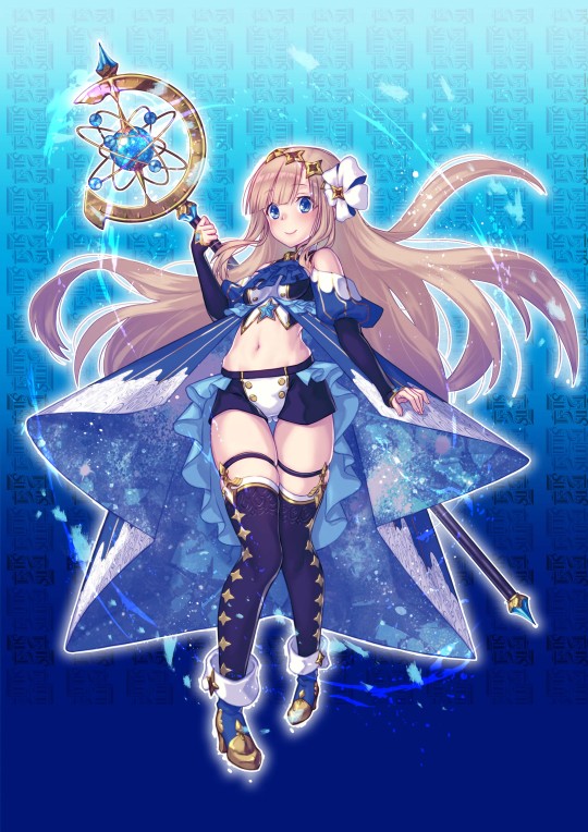
Text
The Caster Chronicles character design ranking (Aqua)
(source)
Remember when I did these? Only one more set left!
Other rankings:
Ignus - Terra - Aes - Silva - Luna
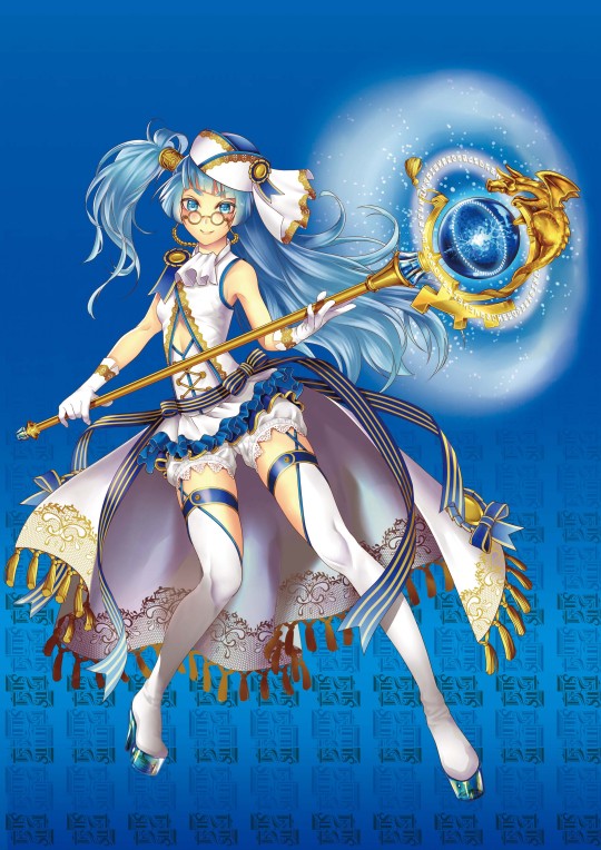
Ema Ashiya Chakoru Senti
I’ve never been a fan of tiny glasses like these, on an anime character they give me a stuck-up know-it-all vibe, but apart from them I like this one quite a lot. The gold embroided train with tassels looks majestic (and without it the character would look much less formidable), and with the militaristic vibe she looks like the reliable senpai who knows her stuff. The see-through heels that appear to have water inside are a nice touch. Hair’s kinda dumb though, I don’t think the carefree half-ponytail fits the otherwise more sophisticated look, and the fact that her hair seems shorter on the other side adds to the careless effect. 9/10.

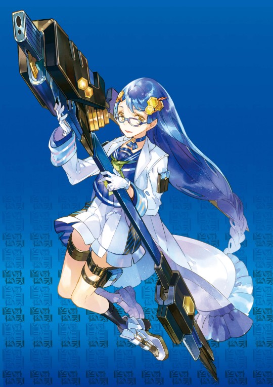
Mahiru Inuzuka Canal
Girl you have already outgrown that top, please get a bigger one.
The shoes that have a sailor collar is a fun touch and fits well with a water-themed character and a syringe is a unique weapon. However I find the design of the hat uncute, though with the belt tail it does create a fun sporty vibe for the character. Scarf is a little odd choice here, like otherwise she’s in a bikini top and hot pants so she shouldn’t need more warmth... but it’s a fantasy design so who cares. So overall mostly an alright design I guess but the top is just awful and ruins everything for me. 3/10.
Rui Saotome Deshi Lion
Now here is the smart quiet character who will absolutely destroy you in a battle if you anger her, but she will be very polite about it. I like the skirt that is actually pants. And there’s stripes on the inside, that is attention to detail! The shirt hem is also fun, with the way it looks like it has pleats. In general I like this design in that it has really basic elements (sailor uniform & lab coat), but there are enough little details to make it interesting. Honeycombs are a bit odd choice here, but at least the shape repeats in her hair accessories and weapon, and gold looks great with the white-blue colour scheme. Weapon is too mecha for my tastes but otherwise a really solid design. 9/10.
Akira Nakaya Saira Treverse
She looks like a magical girl police officer, like I could imagine her as a side character who is first introduced showing up at the end of an episode after the heroes have done their thing and now it’s the authorities’ turn to get involved. Maybe the design is a bit on the busy side but I always love some stripes and sailor collars, and the metallic parts give it a nice official and formal vibe. 7/10

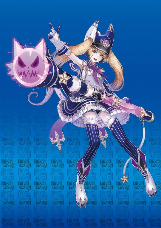
Kotoko Mizusaku Zoi Russel
A nice sporty sea witch design if we ignore the wardrobe malfunction. I like how it gives off this sinister seaweedy octopus vibe without having any actual tentacles or seaweed. Cogs are a bit odd design choice here, like nothing else in the look is steampunk, but at least they aren't too distracting and fit the colour palette. Also the weapon looks really cool. So ultimately I really like the idea of a young and energetic dark sea witch, but the top is just stupid, at least give her a bikini top under it or something. 6/10.
Shizuku Mizumoto Hilde Willow
Again a great weapon, let's start with that. But overall... The cut of the dress is kind of generic, so it's on the little details to make this design interesting. I always like the scalloped edges and jewelry dangling from bead strings is often a good idea as well. But other than that I can't think of much to say; the design is consistent, doesn't look overdesigned or completely forgettable, but I'm not particularly interested in it either. 6/10.
Karen Kashima Karen Urania
Not a fan of the cape thingy, it looks like it’s been starched and in general doesn’t seem like something that’s nice to move around in. Also is it just me or is there something wonky with the perspective? The head ribbon and her boobs just look like they’re at a weird angle for me. And not a fan of the pants either. Weapon is cool and the off-the-shoulder poofy sleeves are cute (though they give a royalty vibe which has nothing to do with the rest of the look), but apart from them I don’t really care for this one. 4/10.

Tomoka Nakamura Broom Spica
I like the fresh cool colour palette even if the design otherwise doesn't appear to have anything to do with ice. But it makes me think of refreshing cool water on a hot summer day so that's already a plus. Otherwise there's not much to say about this one, sailor collars are always nice I guess (and it appears she has two of them), the floral pattern is nice, hair looks cute and soft, and a fun weapon again, but overall not a very memorable look. 5/10.

Hakari Shikimori Lineal
From this angle at least that almost looks more like a belt than a skirt. Apart from that, that is some dedication to collars, in addition to the normal collar she also has a collar on her hat, skirt and shoes. And the green diamond thingy also repeats in many places. What I don't like is that the diamonds look too heavy and bulky on her hair, and also the skirt is too short, but overall... I guess I appreciate how consistent the look is. 8/10.

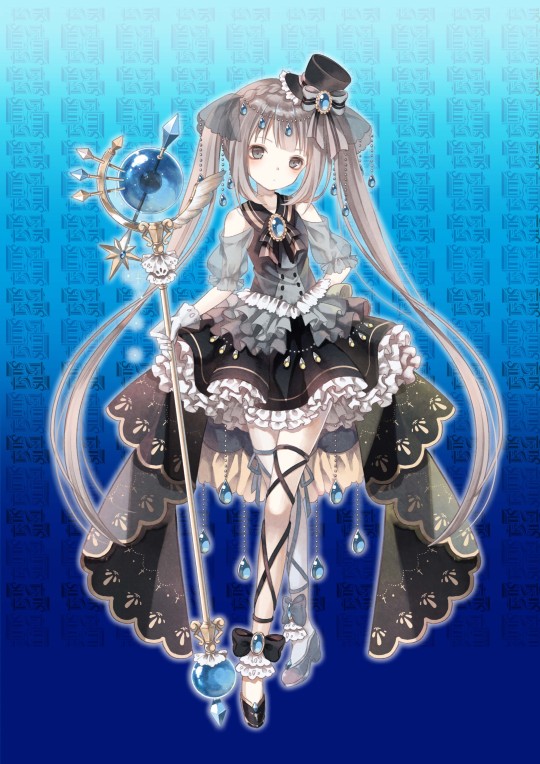
Kaede Himuro Lady Lupinus
The outfit itself doesn’t interest me at all, but there’s other things to talk about this one. The posture, expression and the droopy hair ribbon gives the impression that she really couldn’t care less. Relatable at times. But what does she measure? The only interesting detail here is the measurement tape theme, and I really want to know more about her powers. Thanks to this one detail I kinda like this design since it makes me think. 6/10.
--
Aqua average: 6.3
6 notes
·
View notes