#it's like a minimalist beige instagram interior
Explore tagged Tumblr posts
Text
Do you ever do a uquiz and the creator is trying so hard to be profound with the piss puddle deep takes and you just feel it seeping out from the screen that they consider donna tartt peak literature, and you can't take it anymore and close the uquiz before finishing and check their blog and it's like taylor swift and grishaverse and yeah, donna tartt every other post.
#i must say i admire those people somewhat for having the absolute balls to make questions like 'pick a line of my writing'#and it's nothing special at best#bad and pretentious at worst#but the self confidence is almost admirable#one question was also worded like 'choose a thought they will find when they inavitable dissect my brain for studying'#and i was like#miss you post taylor swift lyrics#there's literally nothing interesting up there#it's like a minimalist beige instagram interior#pumpkin spice latte is more avant guarde than your thoughts
3 notes
·
View notes
Text
earth (mainly virgo) placement aesthetics starter pack:
(capricorns & taureans can likely relate to this too; unless they’re one of those goth aes capricorns or bubbly pink taureans - i find it varies. virgos will relate the most)
has one of these emojis in their bio/display name/etc: 🕊🏹🌿🍵☕☁
rose gold, gold, browns, super soft pinks & beige x100000000
always uses those soft grainy and slightly sparkly filters on everything
lace tank tops/bralettes and silk shorts. the go to spicy look
immense amounts of highlighter and clear lip gloss
always reblogs pictures of beds with white bedsheets.. probably HAS a bed with white bedsheets
dreams of having a minimalist decluttered apartment with way too many plants and lots of big windows
probably reblogs a lot of architecture & interior pictures
gold jewelry
secretly follows 894832 studyblrs/studygrams.. probably runs one
ig feed full of cafe pics; ig stories full of friends & study pics
overly tags & organizes everything on their social media (mainly virgos)
probably has multiple tumblrs/twitters/instagrams for their different aesthetics/content/etc (i find virgo placements are always most likely to have ridiculously organized social medias, to the point where they’ll have individual outlets for each specific interest) (this isn’t an aesthetic but i feel like it fits in this post)
pretty blog theme & about page & navigation page. no basic default themes for them almost ever
probably has a creative and cheesy name for their queue
probably ran a blog about a book (maybe show) they were obsessed with at one point in their life....................might still be doing that..book-nerd virgo aesthetic is real
sun, venus, rising, second house & midheaven will apply the most.
#mine#virgo#earth#capricorn#taurus#this was kind of a self roast#i change my aesthetic constantly but this is my timeless aesthetic tbfh#and EVERY virgo i meet is like this#esp the suns & ascendants & venusians#this is very short sorry#i kind of was thinking about making moodboards#for the signs.. but idk if yall are into that??#i used to be super into photoshop and colouring and such tho so moodboards..giffing.. its kinda right up my alley
146 notes
·
View notes
Link
What is Japandi? the new minimalism looks like this
Did yo heard about his new trend? Japandi is the new minimalism and it seems it's here to stay.
As minimalist myself, I like to stay updated and to keep my living space as much minimalist as possible as keeping it welcoming to my friends and family.
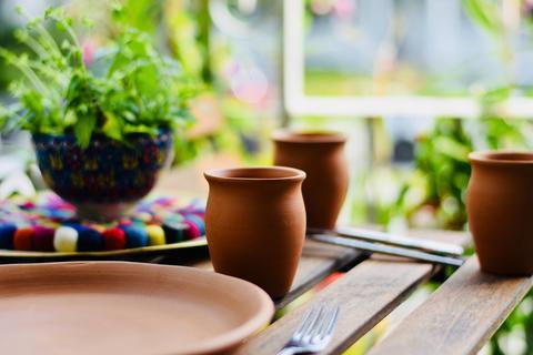
I already added more natural color palette earth tones to create this modern minimalist style. And I did not invest that much, simply adding layers on sofa, some details on furniture and decluttered my wall floating shelves.
Even I extended the feeling from the living area to the kitchen decor. Highlighting terracotta tones to create the earthy texture to get this so called Japandi aesthetic.
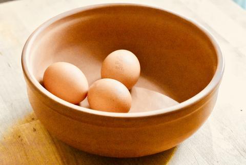
So if as me, you feel intrigued about Japandi, let me put together some of the basics here.
First of all, I want to be clear, I'm not a professional blogger or interior designer, I'm a home and garden decor enthusiast and I practice minimalism in my life and in mu small on-line store. I created Pottery Sol y Tierra to promote the well-being through Feng Shui inspired potteries and decorations.
So you are wondering what Japandi means?
Japandi is a home decoration style.
The Japandi style is a style of furnishing and interior decoration resulting from a mixture between the styles of Scandinavian and Japanese decoration.
If as me you appreciate Scandinavian decor and Japanese eclectic style, you will adopt this Japandi as soon as now.
Every decor lover just swooned. Japanese design meets Scandinavian minimalism in this rising home decor trend. Sleek lines, neutral color schemes and calming setups will be on the radars of pinners everywhere.
Natural color palette earth tones
Modern minimalist kitchen
Minimalist bathroom designs
The result of searching Japandi on Pinterest is so beautiful, just click here to discover the lasts Pïns about it
Pinterest is a great way to stay updated about any trend. It helping home decor enthusiasts create their dream Japandi aesthetic. Home retail brands promote a new bedding or bath collection in neutral shades, but how to integrate pottery to Jacandi ?
Would you like to discover my Pins? Find them here
Japandi is the new minimalism and is inspired by both , Japanese
and Scandinavian interior styles.
The basics about this new trend, Japandi : between Scandinavian and Japanese style
Scandinavian style reigns supreme in our interiors. In particular, it makes them more refined by forcing us to abandon the frills and put too flashy colors in the closet.
At the same time, the Japanese style, more discreet in terms of notoriety, offers us simple interiors that are conducive to contemplation.
Discover these japanese inspired stoneware dinner sets here
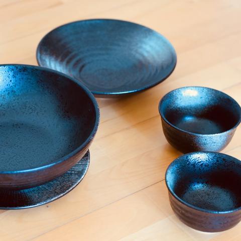
These two movements therefore have one strong point in common: minimalism. And both invite us to refocus on the essential in our decoration, and more broadly in our lives. The japandi trend therefore brings them together in order to get the best out of each one!
Read about how to create Feng Shui style in your garden here
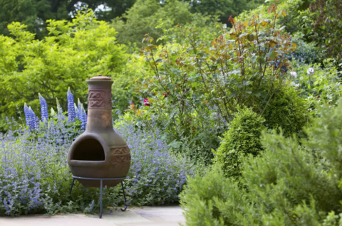
When you look at a Scandinavian bedroom and another japandi trend, you immediately notice the similarities between the two styles. So, as on our plate we appreciate the Asian fusion (especially when the chef Pierre Sang is in charge), we say to ourselves that it is only a matter of time before imagining a style of decoration on the border between these two cultures.
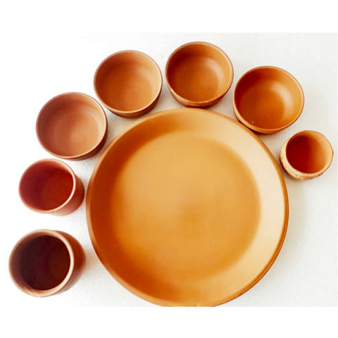
Find nice Japandi clay dinner sets here
But ultimately, the countdown is no longer necessary. Because the japandi is already there, around us. And personally, I will take it again a second time!
The Japandi trend, a delicate blend of Wabi-sabi and Scandi
Do you remember the Wabi-Sabi ?
The Wabi Sabi indeed offers us to turn to simplicity and appreciate the effects of time on nature and objects.
In interior design all goes fast. We passed from eclectic, to Hygge to Wabi-Sabi.
Do you remember Hygge?
Find my thoughts about it here

And going back to Wabi-Sabi, It is about this style of decoration, or rather this art, which consists in seeing the beauty in the evolution of things as time passes. It is the rust which invites itself on the metal, the parquet which lives and the door which creaks.
Do you feel entering into observation mode when staying in front of a piece of art?
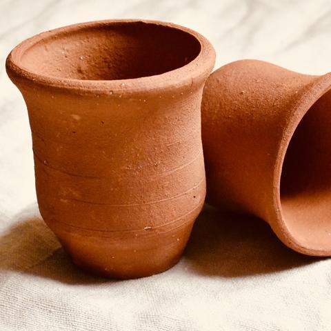
It happens to be even drinking my morning coffee with these beautiful handcrafted coffee mugs
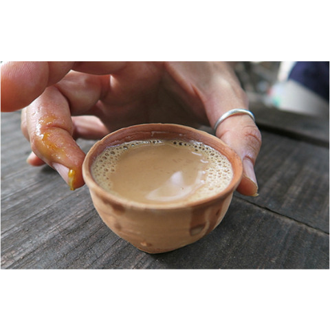
What we see is that this way of appreciating all the small details that contribute to the shaping of the history of an object.
This is basically the essence found in the japandi trend.
But this approach is tempered by the Scandinavian side of this style of decoration. Light wood, white, simple and natural materials reinforce the softness and luminosity of Japandi.
Have you ever been at Ikea? This is so unique, even knowing that they mass produce.
In both cases, one thing is certain: simplicity is the watchword.
We then limit its consumption to what is strictly necessary. It is therefore sustainable materials that we recommend. Both for their environmentally friendly character. But also, for their aesthetic appearance today which we will also benefit in 20 years.
So how to get the Japandi look in 3 easy steps?
Eliminate the clutter
Let natural light flood the room
Swap the ornaments for a few designer pieces
The goal is to make the decor simple but also functional and aesthetic.
Does this sounds like Feng Shui to you? fair enough
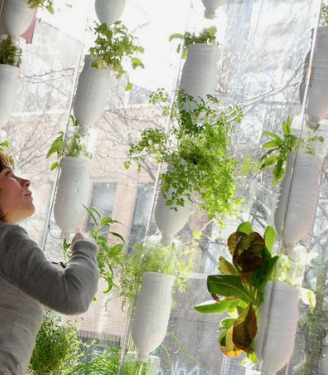
Thus the minimalism of Japanese design and the simplicity of Scandinavian lines have come together to reinvent a clean, timeless style of elegant subtlety. Personally, I have only one desire: to adopt it!
The clean color palette for a home with Scandinavian Japanese decor
A Scandinavian decoration banished black unless it was exclusively accompanied by white. In the japandi home, it's the opposite. It is used a lot and it comes with neutral tones and natural colors.
For classic colors, there are of course white, different shades of cream as well as beige. Everything then turns to more earthy tones such as brown or chestnut. But these hues, instead of turning to warmer tones, tend to join green. Adding new tones was also described on my last blog post, find it on number 10.
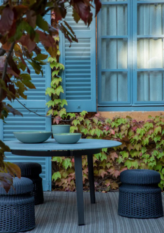
Finally, we can clearly see the dominance of natural colors. Indeed, all the colors finally resume those found on the outside.
You can sprinkle blush pink over everything to add some color if the style seems too austere. Also, to bring a little life, it is possible to add green plants in every corner.
Sprinkle blush pink will be great to match it with earthen terra-cotta home essentials. Find some ideas on my Home & Decor Pinterest board here
Japandi at home, what does it give?
Like that, it may seem simple.
But in reality, adopting the Japandi trend at home is not that simple. This is mainly due to the fact that it is often difficult to get rid of the superfluous. This could be easy if you are minimalist minded, as I am.
And this even though these things are sometimes toxic. By the way, if you have trouble sorting, I strongly advise you to follow the advice given in Marie Kondo's storage method.
For that, I let you refer to his book The Power of Less.
In the meantime, here is a small shopping list to inspire you and get you on the way to a Japandi decoration at home!
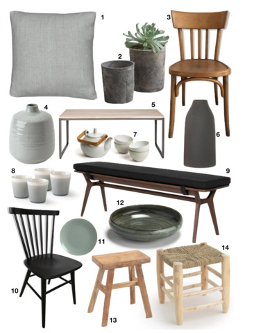
1 - Washed linen cushion cover, Onéga // 2 - Concrete planter // 3 - Vintage bistro chair // 4 - Minimalist vase // 5 - Woood solid oak dining table // 6 // 7 - Teapot porcelain and bamboo // 8 - crackled coffee cup // 9 - Jenson bench // 10 - Black wooden chair // 11 - La Redoute Intérieurs plate // 12 - deep enamelled stoneware plate AM.PM // 13 - Teak stool solid // 14 - Moroccan style stool
Thanks for reading so far.
Please stay tuned for more blogs to come by visiting my blog
You can also find me on Instagram here
and on Pinterest here
#Art#blog#earthen vessels#Feng Shui#Garden decor#Garden healing#Handmade#Healing#hygge#Interior design#Japandi#Post#Terracotta
1 note
·
View note
Text
The reason I in particular get upset about it is that Aggressively Minimalist Decor being Incredibly Fashionable makes it extremely difficult to find housewares in styles that I like. In the same way, and for the same reasons, that, like, Aggressively Low-Rise Jeans being Incredibly Fashionable in the 2000s made it difficult for anyone with any amount of belly fat to find jeans that they liked.
Some people may genuinely like wearing jeans with waists that hit their pubic bone. They may genuinely find that comfortable and feel sexy. And if that's right for them, they deserve to be able to wear those jeans! But if every pair of jeans is like that, then a lot of people are not going to be able to wear jeans and feel comfortable. You're going to have to buy older pants, wear things that are not jeans, or wear jeans that make you feel uncomfortable.
Aggressive Minimalism in Interior Design was the same way for a while, and it trickling down to the mid-and-low-end home decor is still having Aftereffects. It was difficult to find any nice quality bed sets that weren't Pale White or Pale Beige. (I had to shop in the kids' section to get anything colourful.) It was difficult to find nice dishes ditto, or nice tableware ditto. It's still difficult and outrageously expensive to find furniture that doesn't have that minimalist-blocky-industrial look to it. I've been complaining for years that I want a bigger desk, but it's flat-out impossible to find a bigger desk in the style I'd like without buying an older piece of furniture (with the price markup to match). I have to either compromise and get a desk I find ugly, or make do with what I've got.
I joke around that I can only shop for housewares during Halloween, but realistically? I'm lucky that I like gothy shit and that Target stocks vaguely gothy shit that will last year-round during Halloween. Because it means I do have houseware options once a year. If you don't like holiday tat and you don't like minimalism? You were in trouble until the start of the pandemic, and if you can't afford really fashion-forward home decor, you're gonna be SOL for a couple more years.
It's easy to blame instagram and house flippers for it, because they were the face and driving force of the Aggressively Minimalist style. And if you like minimalism, I can see why you'd be upset at the blame and anger. It can honestly get a little too harsh, in the same way that the pushback on Britney and Christina Aguilera for the low-rise jean trend could get a little too harsh.
But if you didn't like The White Room With A Single Pop Of Colour from like, 2012-2019, you were SOL for finding nice housewares that you liked. You could not hit the back button, in the same way (and for the same reasons!) that you could not hit the back button on low-rise jeans in 2004.
Fashion is not like fic, where if you don't like it you can just ignore it or write your own. If you don't like the prevailing fashion in home decor, "making your own" requires a significant time and financial investment. If you can't make your own, you have to pay someone else the big bucks to custom-make something for you.
It is not any one person's style decisions I'm mad at. It is the fact that I could not (and in some ways still can't) opt out of this particular trend without extreme difficulty and expense. And it's not fair to take it out on any one individual person, but I'm still mad. You get me?
When I really think about it, I suspect the reason I feel so confused by people loudly hating minimalism is just.. mm.
This is maybe a weird connection to make, but think about how we all respon$ to antis who hate content on ao3: then don’t look, you gav3 a back button, etc.
But yet the minute Makayleighlugh posts a photo of a white room with a single yellow flower in it, we all… yell about how ugly that is and start performatively praising Marie Kondo (who yeah, doesn’t require you to have Rooms like that but surely wouldn’t… intensely object to them)
Rather than just. Clicking back.
Why are we all acting like we forget that button’s there if we happen to be on Instagram rather than ao3?
34 notes
·
View notes
Photo

The Perfect Tiles for Farmhouse Decor
We love staying on top of the hottest and newest interior design trends, but there are some home aesthetics that will never go out of style! One of our personal favorites has to be farmhouse decor! When it comes to creating a cozy country home or envisioning a cottage aesthetic, this is one decorating style that will always adapt with the times. Recent years have seen updates to this trend as it spread from rural areas into the suburbs and cities, absorbing other design styles into its homey and welcoming feel. From the recent modern farmhouse decor craze that combines white barn-inspired houses with galvanized steel accents, black trim, and rustic wood details, to elegant French country homes that embrace luxurious styling and organic details. A lot more goes into modern farmhouse decor than a fireclay farm sink, neutral paint for your shaker cabinets and a Skinny Chevron Calacatta Gold Mosaic Tile backsplash! We’re diving into the different ways to style farmhouse style interiors and how to create these stunning looks in your own home! Pairing Tiles with Farmhouse Kitchen Decor Ideas Rustic Farmhouse Design with Wood Look Tiles Although there are many different design elements that you can add to a country-inspired home, a rustic farmhouse kitchen is usually the first one that comes to our minds! Natural elements keep the true heart of a farmhouse or country home, and can be incorporated into any interior style! Rustic home decor can still be sophisticated, as this beautiful earth-toned kitchen shows. The backsplash with Nova Hex Wooden Beige Marble Tile ties in with the floating shelves and wood tones of the cabinetry to keep the kitchen design natural. The subtle geometric detail in the hexagon marble tile backsplash is picked up in the Granada rombus pendant light that adds a warm glow with a brass finish. DIY Shiplap Walls Made Easy We have Chip and Joanna Gaines and the Magnolia Farms/Fixer Upper craze to thank for popularizing shiplap walls in kitchens, living rooms, and bathrooms! This rustic design element was used primarily as siding for barns and other rustic outbuildings, and was frequently used on turn of the century farmhouse exteriors as well. Many renovated houses incorporated it into the design, restoring wooden boards or repurposing them into other rooms in the house. Whitewashed shiplap has become a trending wall treatment, and thanks to wood-look porcelain planks are easier to achieve than ever if you want to recreate this HGTV-approved look at home! Our Tribeca Mixed Planks for Wall are an easy way to install your own DIY shiplap with a lot less effort than installing wood planks - the durable porcelain and weathered wood look are a great way to combine rustic farmhouse home decor elements with a long-lasting building material! This kitchen combines them with Tribeca Blanco wood-look porcelain floor planks, butcher block counters, and oil-rubbed bronze drawer pulls on the white cabinets to create a sophisticated cottage design. Add a Glamorous Finish to your Farmhouse Kitchen If you prefer a luxurious element to your home decor, you can still create a cozy cottage style kitchen! It’s no secret that we love Mother of Pearl tiles for their glamorous shine - Geometric Pearl White Thassos Shell Tile is a stunning white backsplash tile for a modern farmhouse kitchen thanks to a tone-on-tone combination of shell and Thassos marble. It will add luminous light to even the darkest kitchen, creating a welcoming ambiance that’s perfect for the hearth and center of the home. Pairing it with a Classic Blue paint color for the cabinets and a fireclay farm sink was the perfect way to tie in an elevated wall tile with more down-to-earth decor and create a harmonious kitchen that is part welcoming and part grand! The elegant brushed nickel fixtures and drawer pulls are the perfect finishing touch for the traditional kitchen style. Farmhouse Bathroom Design Ideas Sweet Southern Homestead is a master of farmhouse decor, as her stunning Instagram feed of her Kentucky house can attest! She did every room from top to bottom in a modern farmhouse style, and the master bathroom is no exception! She sourced antique doors from Antiques & Vintage Texas to add the perfect aged patina to this stunning airy white farmhouse bathroom! She wanted to go new for the flooring, however; making Retro Blanco Hex porcelain tiles the perfect choice. Similar to the faux shiplap above, these floor tiles are designed to resemble antique wood, but with a porcelain finish that is scratch and slip-resistant. Along with the vintage doors, they added the perfect accent to the freestanding cast iron pedestal tub and old world wrought iron chandelier from Antique Farmhouse! Classic White and Blue Farmhouse Bathroom with a Twist Airy white and splashes of blue have cemented themselves as the traditional color palette for classic farmhouse interior design. It’s not hard to see why when you factor in a white vanity with a porcelain vessel sink and brushed nickel faucet and hardware - it’s a classic for good reason! The white wicker laundry baskets are a great addition to keep the country charm feeling even when it comes to storage necessities, but there’s no reason that tradition has to feel boring! To give this white and blue traditional farmhouse bathroom a fresh finish, the team installed White Striped Diamonds Marble Mosaic Tile to add a sense of movement and creative design to the space! A Powder Room with Farmhouse Charm A powder room or half-bath can be a great way to give guests a glimpse of your home decor taste! Smaller bathrooms can easily feel cluttered, so keeping the details on the wall is a great way to maximize space and style all at once! The Tribeca Mixed Planks showcase their range in this cozy aqua and champagne bronze half-bathroom, with an antiqued vanity and vessel sink. In keeping with the minimalist decor, a ladder bathroom shelf provides over the toilet storage options without taking up too much space! The simple and rustic etagere and woven baskets are the perfect way to finish off this bathroom with elegant country style! Other ways to style Farmhouse Decor Industrial farmhouse style - Rustic meets modern in industrial farmhouse style! This design aesthetic draws inspiration from farm equipment and machinery mixed in with rustic wood and classic white elements. The blend works especially well when tying farmhouse decor ideas into an urban setting - we’ve seen it used to great effect in downtown lofts as well as charming suburban houses. Darker elements like wrought iron, espresso stained wood, and charcoal gray grout accenting white subway tiles create a contrast with classic shaker cabinets that makes this style especially popular today. French country - The French Country aesthetic, or campagne style, is frequently blended with traditional American heartland home ideas. This style tends to steer towards whitewashed wood over a natural finish, keeping the overall look bright and airy. It has been increasingly popular in recent years, as it combines a homey and welcoming feel with a more upscale and elevated interior experience. Light colors, frequently Provence-inspired gray, blue, and purple, are combined with neutral linen accents and pastoral artwork to create this elegant style. Think flourishes on the details, like leaded glass cabinet facing, vintage drawer pulls, and hanging copper pans to create that South of France feel! We could see Azul Cielo Thassos And Carrara Striped Chevron Mosaic Tile finishing off this charming white, gray, and silvery green kitchen by Sanctuary Home Decor to create movement on the backsplash! The exposed wooden beams and vintage bronze lantern are the perfect details to add French country style to this kitchen! We hope you’ve found the perfect primer to style farmhouse decor at home or to take your rustic country retreat to the next level! Looking for the perfect tile to pair with your industrial farmhouse kitchen or elegant French country powder room? Let us know in the comments or message our team for a styling session!
1 note
·
View note
Text
7 simple ways to create a Scandi-style retreat in your outdoor space
Whether it’s secrets to living a happier life or how to create a cosy, minimalist aesthetic in our homes, our love affair with all things Scandinavian has certainly picked up momentum in recent years.
Looking to refresh your garden or balcony? Why not consider tapping into a pared-back Scandinavian style. Our outdoor spaces have become much-needed places of refuge as of late, so now is the perfect time to transform yours.
You're reading: 7 simple ways to create a Scandi-style retreat in your outdoor space
‘In Sweden, we spend a lot of time outdoors. Especially in summer, when daylight hours are longer, and evenings are warmer,’ says Catharina Björkman, lifestyle expert at Contura. ‘There are numerous benefits to being out in the fresh air, and by creating a secluded outside retreat you can immerse yourself in nature whilst still enjoying the comfort of your own private space.’
But there are some key considerations to make. ‘Treat your secluded spot as a digital-free zone and as somewhere to relax and de-stress away from gadgets and screens; this is crucial to boost happiness and wellbeing,’ Catharina explains. ‘For the design, look to Scandi interior inspiration and embrace the principles of lagom for a sense of balance. Think minimalist furniture, plants, faux-fur throws, bunting and soft lighting.’
Get some inspiration below…
1. Choose your spot outside
Scandinavian design is one that’s celebrated by many, thanks to its inviting, calm and simplistic feel. To get started on transforming your space, choose which area outside you want to work on (if you can, opt for a spot that catches the sun). Next, define the space using seating, flooring, cushions and large outdoor plant pots.

Catharina adds: ‘If you are using a wall or garden fence, you could add artwork (metal or stone is best to withstand the elements) to further enhance the feeling of an extra room. Don’t forget to add some form of shade for hot days; a canvas awning or sail shade are inexpensive, yet stylish options.’
2. Patio or paved areas
If you are lucky enough to have a patio or raised decking area, make the most of it. Choose a corner to place cosy cushions, warm throws, fairy lights, garden hammocks or lanterns to easily transform it into a charming seating area.
Remember, with Scandinavian design, minimalism is key; don’t go overboard with accessories but also don’t be afraid to experiment with textures and neutral colours.
Alternatively, if you have a smaller garden without a patio, you can create your own seating area using cost-effective pallets or wooden crates. These can be purchased from hardware stores and some online garden retailers.

KatarzynaBialasiewiczGetty Images
3. Transform your shed
Got a shed in need of some TLC? ‘The humble garden shed can be easily updated to create a Scandi retreat, but this does mean you can’t use the shed for storage,’ says Catharina.
If you want to transform yours, first give it a good deep clean to get rid of dirt, dust and cobwebs. Next, paint the walls in a light natural colour, then hang bunting (this can be purchased online or easily made yourself using excess fabric). Fairy lights, cushions, blankets and throws will create a cosy atmosphere, too. The only problem would be having to come back inside at the end of the day…
4. Upcycle old furniture
If you’re on the hunt for a creative project then why not upcycle second-hand or tired-looking furniture? You don’t have to spend money on new items to achieve the shabby-chic Scandi look in your garden.
‘Wooden crates make excellent coffee tables, sand down and repaint any old garden furniture, and look for second-hand decorative items such as lanterns or rugs,’ suggests Catharina. ‘You could make your own bunting and soft furnishings (such as cushions and throws) and design your own artwork if you’re a keen crafter.’
This content is imported from Instagram. You may be able to find the same content in another format, or you may be able to find more information, at their web site.
5. Lighting
Hang fairy lights or festoon lighting around your seating area to create a welcoming atmosphere. Instead of harsh bright lights, opt for a softer, warmer hue (such as yellow lighting).
Catharina adds: ‘Add candles to the table and choose an array of candle sizes and styles, avoiding anything too matchy-matchy. You can also get outdoor solar-powered fairy lights, which come on automatically when it gets dark and will glow for several hours.’

Shop decorative outdoor lights at Lights4Fun
Lights4Fun.co.uk
6. Incorporating natural textures
Much of Scandinavian design is inspired by nature, Nordic forests and the sprawling green spaces they have around them. When creating your own Scandi retreat, incorporate natural textures such as rattan, wicker furniture, cotton, stone, leather, linen and faux-fur throws. Keep the colour palette cool and calm: white, greys and soft hues of beige will tick all the right Scandi boxes.

7. Update your balcony
If you’re a city-dweller with a balcony then why not transform your space with fairy lights, a small bistro table, plants and delightfully soft cushions.
Catharina suggests: ‘Get creative with how you style your plants; an old step ladder can provide great shelving to display plants in a stylish way, for example. You can also grow culinary herbs (rosemary, mint and sage) on a sunny balcony in zinc pots, which look decorative and are useful for cooking.’
Grab a book and while away a lazy Sunday afternoon…
Read more: How to Build a Raised Garden Bed
Like this article? Sign up to our newsletter to get more articles like this delivered straight to your inbox.
SIGN UP
20 garden bistro sets perfect for alfresco dining (and a spot of relaxing)
Best wooden bistro set
Roma bistro set
Best compact outdoor bistro set
Tice Garden Compact Bistro Set, Green
Perfect for urban spaces, we love the soft, rounded design of this garden bistro set, and the chairs tuck perfectly underneath the table when it’s not in use. It’s perfect for compact spaces, especially a balcony or small patio, and is available in several colours including green, chartreuse, grey and teal.
Best contemporary bistro set
Outdoor Bistro Set – White
Crafted from FSC certified teak, the chairs are topped with a plastic seat and back rest, while the table boasts a timeless slatted design. The white colourway makes it ideal for a contemporary garden.
Best sustainable bistro set
Duraocean Bistro Set
This hard-wearing, fully recyclable and stylish garden bistro set is perfect for the eco-conscious shopper, and it’s a great sustainable buy. The chairs are made with 100% recycled plastics from marine debris, and the table is made from FSC approved Eucalyptus.
Most relaxing garden bistro set
Aruba 3 Piece Bistro Rocker Set
This is a bistro set with a difference! These rocking chairs are made for relaxing, and sipping on a drink or two. The set includes two rockers and a matching table, with tempered glass top.
Best mosaic bistro set
Morocco Garden Bistro Table & Chairs Set
Enjoy alfresco dining with this Moroccan-inspired bistro set. With an intricate tile detailing, soft padded cushions and powder-coated steel frames, this weather-resistant style is great for adding some character to your garden.
Best holiday-inspired bistro set
Garden Gear Leon String Bistro Set
thompson & morgan
£169.99
Relax in style with Thompson and Morgan’s modern bistro set. The chairs have been inspired by 1950s Mexican furniture and aims to be as comfortable as possible.
Best bar bistro set
vidaXL 3 Piece Bistro Set Solid Acacia Wood
This outdoor bar bistro set is perfect for enjoying drinks and a quick bite to eat. With a high-quality acacia wood construction and a natural oil finish, this durable bar set is weatherproof and easy to clean. The tabletop even has a parasol hole if you want some shade when the sun’s out.
Best bistro set for a balcony
2 Seater Balcony Bistro Set
We love this space-saving bistro set for a balconies, which is perfect for those of us who live in the city. Both the table and the chairs fold away easily, so you won’t have to worry about it taking up too much space.
Rustic garden bistro set
Cabo bistro set
Gardens are a place of refuge, so it’s important we make them as inviting as we can. We love this rustic-style bistro set from Cox & Cox which has been hand-woven with a unique synthetic roped weave. It has also been made from rust and weather-resistant materials, so it’s suitable for the outdoors all year around.
Best bistro set for the family
4-Seater Bistro Set
Easy to clean bistro set
Read more: History of Gnomes | LoveToKnow
vidaXL 3 Piece Folding Bistro Set Plastic Green
Made of durable plastic, this bistro set is weather resistant and easy to clean too. The table and the chairs can be folded and stored when not in use.
Best budget bistro set
Helsinki Bronze Bistro Set
Keep it simple with this stylish bronze bistro set, perfect for any size garden. The chairs are foldable too.
Best foldable bistro set
Eve 2 Seater Bar Bistro Set – Sage
Looking for a bar style bistro set? This 2-seater from Argos is a great budget buy. Slimline and made from durable metal, the high table and chairs fold down easily and simply for storage.
Most stylish garden bistro set
Faro Bistro Set in Grey
On the hunt for a more modern style? This smart grey set from Cox & Cox features two comfortable chairs and a small round table for for drinks. It’s also available in blue, too.
Indoor/outdoor bistro set
Pack of New Acapulco Chairs (x2) & Table (x1)
Available in a range of bright colours and with a metallic iron structure, this bistro set combines design and comfort and can be used outdoors. Store away safely during winter.
Best rattan bistro set
Tara Natural rattan side table and two chairs set
If you’re looking for a modern rattan style, then this bistro set is worth the investment. Both the table and chairs are made from synthetic rattan, which means they can be left outside all year round. We love the unique Insta-worthy round table, too.
Slimline outdoor bistro set
Georgia FSC Eucalyptus Wooden Bistro Set
Slender bistro set
Cote Bistro Set
With slender, hand painted grey frames and a decorative curled finish at each arm, this garden bistro set is rather charming. The granite topped table adds an elegant touch, while the chairs are topped with grey water repellent cushions.
Best metal bistro set
Folding Metal Bistro Set Orange
This foldaway bistro set in vibrant orange is brilliant if you want to add a pop of colour to your garden. Best of all, it’s lightweight and is easy to store away when not in use.
Like this article? Sign up to our newsletter to get more articles like this delivered straight to your inbox.
SIGN UP
This content is created and maintained by a third party, and imported onto this page to help users provide their email addresses. You may be able to find more information about this and similar content at piano.io
Source: https://livingcorner.com.au Category: Garden
source https://livingcorner.com.au/7-simple-ways-to-create-a-scandi-style-retreat-in-your-outdoor-space/
0 notes
Text
Sweet Living Under The Stars In Germany
I’ve happily followed Laura Wolter on Instagram for years over at @oursweetliving because I adore her smart DIY ideas and her kind and friendly Insta Stories, and of course her eye for style and color. Laura works primarily with warm, earthly colors - terra cotta, green, creamy white, beige, and peach tones combined with tons of textured, natural materials like wool, ceramic, linen, rattan, sessel, wicker, and wood. Combining these colors and materials with her large potted plants, two fluffy cats, and her boyfriend Victor - her house feels like a very loving and caring space.
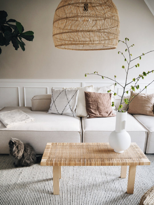
I’ve met Laura in person a few times at the Garden + Home Blog Awards each year, she is as open and warm as you’d imagine, which is directly reflected in her interior world. It’s wonderful to see such a wide-eyed enthusiastic person enter the digital space with a fresh approach to decor that doesn’t feel heavily sponsored, extremely “on trend”, or overly staged. Laura is the real deal, which is why I wanted to introduce you to her today and share a glimpse of her new attic apartment in the very charming city of Münster, located in western Germany nearby to the Dutch border.

On Laura’s Insta, I enjoy how expressive she is in her daily videos (Insta Stories) and how much she shares with her followers, from her morning coffee to her frequent trips to IKEA and garden shops. I’m most impressed by her overall excitement for mundane home projects - she is motivated to get to work on things that most people whine and procrastinate about like laying a deck floor, adding molding to walls, and having to repaint because the color wasn’t quite right the first time around. Laura and her boyfriend Victor jump right in with contagious laughter and lots of smiles and kisses. Laura’s approach to everything she does is centered around staying positive, making small moments count, and doing everything with a complete heart.
Laura’s interiors are very tidy and well-edited. Together, they share a 140m2 space spread across two floors in the attic with a generous outdoor terrace, but even a large city apartment like this could easily become too full - yet she takes the lead in keeping it simple and relatively minimal. It can often be a challenge to share a space with pets, which I asked her about. She confessed to never being a “cat type”, but her two cats, Yoko Ono and John Lennon, moved in with her on a whim and now she can't imagine living without them. She expressed that it’s, “incredibly nice to come home to them” (especially when she lived alone in her former apartment), that, “they greet me at the door and they love to cuddle up in bed in the evening… They’ve been there for me throughout many difficult situations and have helped me with their cuteness.” :)
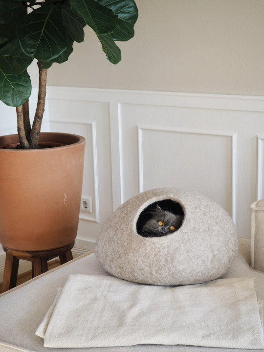
Her words made me think back to my childhood when I grew up with dogs and cats at home. Pets can certainly make a home feel so much warmer and loving, don’t you think?
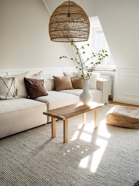
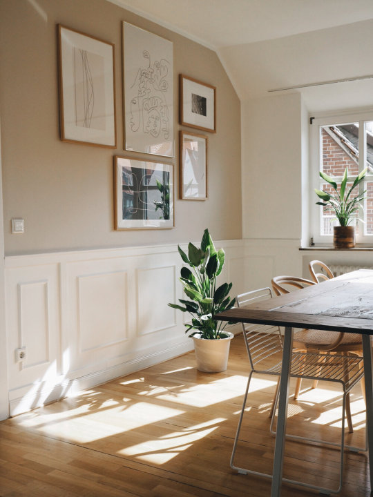
One of the projects that I love the most from Laura and Viktor is shown below - how they changed their walls to look and feel more charming through the use of panel molding. Panel molding is raised wood trim used to accentuate flat walls to add character and mostly run the full height of the wall but many people are doing it 1/2 or 3/4 up the wall now to mimic wainscoting. Panel molding (and wainscoting) is a real trend for interiors, especially used in neutral, relatively minimalist spaces, in cream or white, in spaces where this type of paneling was not included originally. Laura appreciates the charm of her old building which is why they decided to apply this idea to their living room, dining room, and hallway - because it creates even more charm in the apartment. I have to agree - you can see the BEFORE and AFTER in both her hallway and dining room below. Gorgeous!
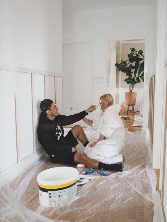
BEFORE - Adding wood molding and paint to their hallway
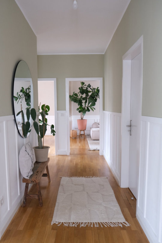
After!
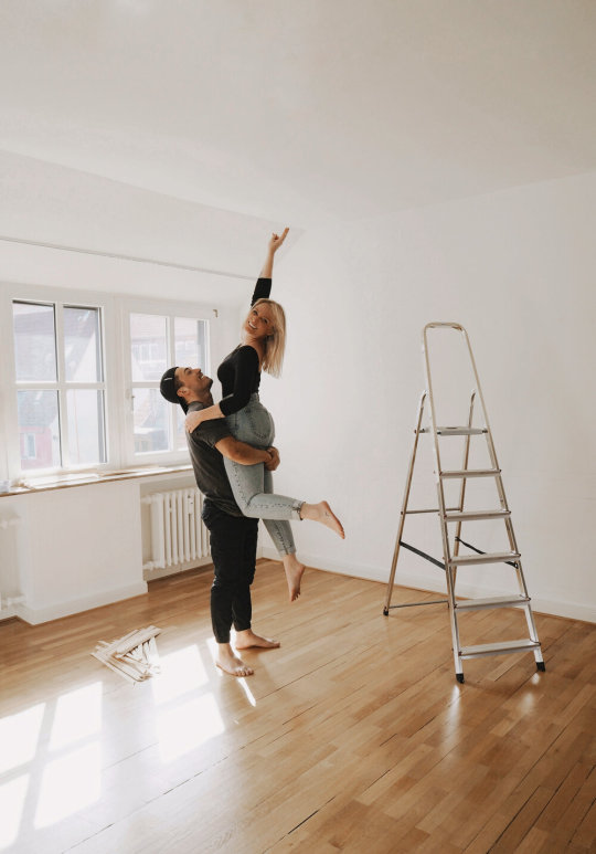
BEFORE - Happy to get started!

Adding paneling to wall, and paint, and still HAPPY!
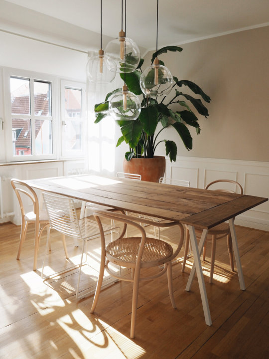
AFTER - and next they will add a cabinet to the wall… IN PROCESS….
This talented couple is currently working behind the scenes to build an online store for home decor - OUR SWEET LIVING SHOP. They’ve teamed up to design and make everything themselves because their backgrounds and talents match perfectly - she studied fashion with a major in tailoring, design, and management, so she is responsible for the textiles and Victor is a carpenter so he handles the building and woodwork. After her fashion management studies, she also studied communication science in Münster. Victor is from Chile and relocated to Germany six years ago and like Laura, he has a great passion for traveling, getting to know other cultures, and meeting different people. He did his training as a carpenter here in Germany and has been working in this field ever since, so they are a great match. Laura calls him her lucky charm because since he came into her life, so many beautiful things have happened to her. Their biggest dream is to someday buy an old apartment and refurbish and renovate everything together. It’s so inspiring to watch this young couple organically build their interiors world together now with their new apartment, next with their online shop, and later - well, let’s wait and see!
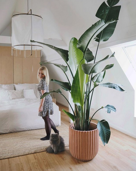
Lovely plants!
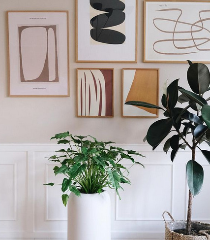
And more plants!
0 notes
Text
Ten Small But Important Things To Observe In Black Kitchen Wall Art | Black Kitchen Wall Art
If you adulation adequate affable spaces abounding with rustic elements, you’re not alone. According to a 2019 trend address from the National Kitchen and Bath Association (NKBA), farmhouse is one of the four best requested kitchen styles, and experts ahead it to abide growing in acceptance over the abutting few years. Although farmhouse kitchen acrylic colors about angular neutral, these blush schemes aren’t all about whites and copse tones. Alike bolder hues such as fleet blue, terra-cotta, or blooming can be advised farmhouse kitchen colors in the appropriate context. The key to creating a bright, affable amplitude is a aloof abject that lets you add personality with attenuate hues and accustomed textures. Follow these tips to accept the best farmhouse kitchen colors and add an agreeable vibe to the affection of your home.
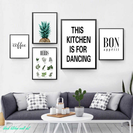
SURELIFE Herbs Poster Botanical Kitchen Wall Art Canvas Prints Paintings Black and White Letters Pictures Gift Home Decorations – black kitchen wall art | black kitchen wall art
James Nathan Schroder
Whites, grays, and beiges are the foundation of farmhouse kitchen colors. Acrimonious the appropriate aloof acrylic color is an important aboriginal footfall to accomplishing the absolute farmhouse style. This aloof will act as the abject blush in your space, accoutrement either the cabinetry, walls, or both. Although air-conditioned whites and grays accept bedeviled recently, abounding homeowners and designers are now alive against an earthier palette, says Stephanie Pierce, administrator of architecture and trends at MasterBrand Cabinets. “Stark whites are abatement into biscuit creams, woodsy tones that are ablaze to medium, and nature-based colors,” she says.
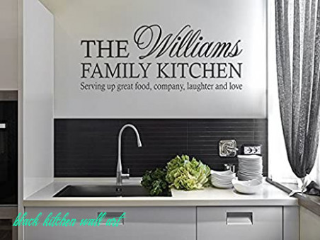
Personalised Family Kitchen Wall Art Quote Sticker Vinyl Decal PVC Black Large 11cm wide x 11cm high 11 – black kitchen wall art | black kitchen wall art
Suggested gray chiffonier acrylic color: Silver Cloud 2129-70, Benjamin Moore
James Nathan Schroder
Kitchen Wall Decor Set of 11 • Vintage Crates in Black and White .. | black kitchen wall art
If you’re planning a farmhouse kitchen makeover, aboriginal accede if you accept any absolute elements (like countertops or flooring) to assignment with. Be abiding to argue those surfaces afore acrimonious a aloof acrylic color. Your new acrylic blush should accompaniment the tones of your kitchen’s surfaces, so attending for hues of the aforementioned temperature. For example, a air-conditioned biscuit will accord with a abysmal gray countertop, while a chrism acrylic will draw amore from copse flooring. Blush temperature is appropriately important if you’re starting from blemish because the abject aloof will access the added colors you accompany into the space.
Story continues
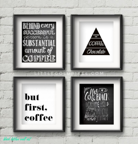
11 Kitchen Free Printables • Wall Art Roundup | Printables .. | black kitchen wall art
To amount out if your neutrals are balmy or cool, argue the darkest adumbration on the acrylic sample strip. Typically, warmer hues embrace reds, yellows, oranges, while acknowledgment shades tend against blues, greens, and purples. Alternatively, analyze the aloof with added colors, such as dejected and red swatches: What undertones do you ascertain in the neutral? Does it about-face added appear one blush back placed abutting to anniversary other?
Suggested white acrylic color: White Veil OR-W14, Behr
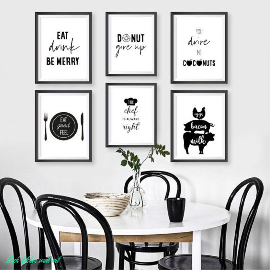
Fun Food Black & White Typography Gallery Kitchen Wall Art Prints – black kitchen wall art | black kitchen wall art
Marie Flanigan Interiors LLC
Traditionally, corrective cabinets are one of the best style-defining elements of farmhouse kitchens, behindhand of
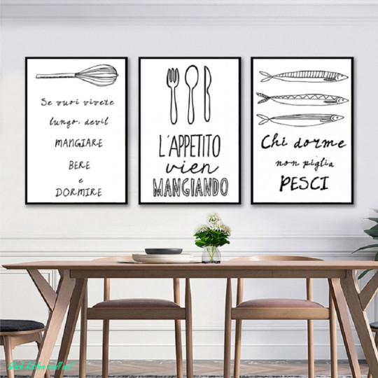
US $11.111 11% OFF|Nordic Minimalist Canvas Prints Posters Black and White Kitchen Wall Art Canvas Paintings Pictures Dining Room Home .. | black kitchen wall art
Ten Small But Important Things To Observe In Black Kitchen Wall Art | Black Kitchen Wall Art – black kitchen wall art | Pleasant to be able to our blog, within this period I am going to explain to you concerning keyword. And after this, this is the very first image:
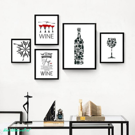
Abstract Kitchen Art For Wine Lovers Minimalist Cafe Wall Art Canvas Prints Black White Red Wine Art For Modern Kitchen Restaurant Home Decor – black kitchen wall art | black kitchen wall art
Think about image previously mentioned? can be in which awesome???. if you’re more dedicated therefore, I’l l demonstrate several image yet again underneath:
So, if you like to receive these wonderful pictures regarding (Ten Small But Important Things To Observe In Black Kitchen Wall Art | Black Kitchen Wall Art), simply click save icon to save the pics to your laptop. They’re available for obtain, if you appreciate and wish to get it, click save symbol on the page, and it’ll be directly downloaded to your pc.} Finally if you like to grab unique and the recent photo related to (Ten Small But Important Things To Observe In Black Kitchen Wall Art | Black Kitchen Wall Art), please follow us on google plus or save this page, we attempt our best to present you daily up grade with all new and fresh photos. We do hope you love staying right here. For most upgrades and latest information about (Ten Small But Important Things To Observe In Black Kitchen Wall Art | Black Kitchen Wall Art) photos, please kindly follow us on tweets, path, Instagram and google plus, or you mark this page on book mark section, We attempt to offer you up-date periodically with all new and fresh photos, love your searching, and find the perfect for you.
Thanks for visiting our website, articleabove (Ten Small But Important Things To Observe In Black Kitchen Wall Art | Black Kitchen Wall Art) published . Nowadays we are pleased to declare we have discovered an incrediblyinteresting topicto be reviewed, that is (Ten Small But Important Things To Observe In Black Kitchen Wall Art | Black Kitchen Wall Art) Lots of people attempting to find details about(Ten Small But Important Things To Observe In Black Kitchen Wall Art | Black Kitchen Wall Art) and of course one of these is you, is not it?
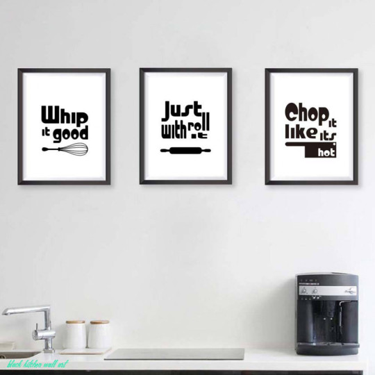
Modern Black White Kitchen Quotes A11 Posters Nordic Living Room Wall Art Picture Home Canvas Painting – black kitchen wall art | black kitchen wall art

black and white kitchen art – Free printables | Decoración de unas .. | black kitchen wall art
Black Kitchen decor, Kitchen wall art, Kitchen prints, Set of 11 prints, Kitchen poster, Black and White, Kitchen Prints, Kitchen decor art – black kitchen wall art | black kitchen wall art
US $11.11 110% OFF|Black White Minimalist kitchen wall art Canvas Painting picture Food Wine Kitchen Decor cooking Posters Prints for Living .. | black kitchen wall art
The post Ten Small But Important Things To Observe In Black Kitchen Wall Art | Black Kitchen Wall Art appeared first on Painter Legend.
Painter Legend https://www.painterlegend.com/wp-content/uploads/2020/05/surelife-herbs-poster-botanical-kitchen-wall-art-canvas-prints-paintings-black-and-white-letters-pictures-gift-home-decorations-black-kitchen-wall-art.jpg
0 notes
Text
10 Important Life Lessons White Dining Room Wall Decor Taught Us | White Dining Room Wall Decor
As we ataxia beneath grey, COVID cloud-covered skies, I am appetite certainty.

US $10.10 10% OFF|Botanical Print Green Plant Poster Modern Wall Art Minimalist Canvas Painting Decoration Pictures Dining Room Wall Decor|Painting & .. | white dining room wall decor
More questions than answers pepper my days: Back will this end? Will the apple anytime be safe? Will hospitals accept abundant beds? Does any abundance accept toilet paper? I continued for absolute answers.
So back an email landed in my inbox aftermost anniversary featuring a dozen images of crisp, black-and-white home interiors and accessories, my acknowledgment was relief. This unambiguous, unequivocating bond of definitively adverse colors is absolutely what I charge appropriate now.
While trends appear and go, this chichi bond is consistently in style, conceivably today added than ever.

traditional dining room ideas – ruraluniversity-chitrakoot | white dining room wall decor
In the apple of color, atramentous and white beggarly all or annihilation – literally. In light, white combines all blush (think how a prism fractures white light), and atramentous is the absence of blush (think abysmal space). In pigment, atramentous is all blush (think about all the crayons melting together) and white is no blush (the bare canvas).
So move over gray and beige, and accomplish way for a blush aggregate that takes a stand, that isn’t wishy washy, that brings … certainty!
Now, afore you allege me of accepting too agitated away, I looked up “creative license,” and it says appropriate actuality in my AP Stylebook, “Crises and added boxy times accomplish abstract outbursts permissible in alike the finest journalism.”

Fresh White Dining Room Sconces Rethink Design Studio Ways Dress .. | white dining room wall decor
So I alleged a few designers to ask: What is it about atramentous and white that’s aloof so reassuring?
“People accept atramentous and white because its clean, bright and bold,” said Joanne LaFauci, an autogenous artist who works for Ethan Allen. “Because it uses two ends of the spectrum, it creates ball through contrast. Aloof as in fashion, in interiors the aggregate feels abiding and sophisticated.”
“When I anticipate about atramentous and white, I anticipate about Old Paris, Chanel appearance and a archetypal access in a Georgian home,” said Beverly Hills autogenous artist Christopher Grubb. “While added blush combinations appear and go, atramentous and white is timeless. Today, we feel pulled adjoin it because it’s article to angular on.”

Small Formal Living Room Ideas Dining Wall Decor Amazing White .. | white dining room wall decor
“Every artist has done a black-and-white room,” New York autogenous artist Gideon Mendelson added. “It’s allotment of our artist DNA. Altered designers – Ralph Lauren, Dorothy Draper, Billy Baldwin — accept anniversary brought it to the beginning of architecture in altered ways. Atramentous and white apartment feel dramatic, confident, graphic, avant-garde and cornball all at once.”
I’m not absolutely accessible to redecorate a allowance in my abode in the colors of a chess board, but I asked our experts what we should accede in case we feel so compelled:
Why accept atramentous and white? “For the actuality that it’s not blah or beige,” Grubb said. “The aggregate works, and it’s consistently worked. This

10 Inspirational Ideas For White And Wood Dining Rooms – white dining room wall decor | white dining room wall decor
10 Important Life Lessons White Dining Room Wall Decor Taught Us | White Dining Room Wall Decor – white dining room wall decor | Pleasant in order to my personal weblog, on this time period I am going to teach you in relation to keyword. And from now on, this is the 1st graphic:

Decor For Dining Room – HOMIFIND – white dining room wall decor | white dining room wall decor
Why don’t you consider impression over? is usually which awesome???. if you feel and so, I’l l show you many image once again under:
So, if you desire to receive the great pics about (10 Important Life Lessons White Dining Room Wall Decor Taught Us | White Dining Room Wall Decor), simply click save icon to download these photos for your pc. They’re available for obtain, if you want and want to take it, just click save badge in the web page, and it will be directly down loaded in your notebook computer.} Finally if you’d like to find new and recent graphic related to (10 Important Life Lessons White Dining Room Wall Decor Taught Us | White Dining Room Wall Decor), please follow us on google plus or book mark the site, we attempt our best to provide daily up grade with all new and fresh images. We do hope you like keeping here. For some up-dates and recent news about (10 Important Life Lessons White Dining Room Wall Decor Taught Us | White Dining Room Wall Decor) graphics, please kindly follow us on tweets, path, Instagram and google plus, or you mark this page on book mark section, We try to provide you with up-date periodically with all new and fresh pictures, like your searching, and find the perfect for you.
Here you are at our site, contentabove (10 Important Life Lessons White Dining Room Wall Decor Taught Us | White Dining Room Wall Decor) published . At this time we are pleased to declare that we have discovered an incrediblyinteresting contentto be reviewed, namely (10 Important Life Lessons White Dining Room Wall Decor Taught Us | White Dining Room Wall Decor) Many people searching for details about(10 Important Life Lessons White Dining Room Wall Decor Taught Us | White Dining Room Wall Decor) and of course one of them is you, is not it?

Kitchen Wall Decor Ideas (DIY and Unique Wall Decoration) | Dining .. | white dining room wall decor

White Dining Room Ideas: 10+ Simply Astonshing Decor You’ll Adore – white dining room wall decor | white dining room wall decor

10 Creative Ideas for Dining Room Walls | Freshome | white dining room wall decor

Éste me encanta! … | Dining room small, Dining room walls, Grey .. | white dining room wall decor
The post 10 Important Life Lessons White Dining Room Wall Decor Taught Us | White Dining Room Wall Decor appeared first on Wallpaper Nifty.
from Wallpaper Nifty https://www.flowernifty.com/10-important-life-lessons-white-dining-room-wall-decor-taught-us-white-dining-room-wall-decor/
0 notes
Text
Buying a Chair

Sales Person: Welcome to Furniture Store, may I help you find anything?
James Bond Villain: Yes, I would like to buy a chair an evil chair.
SP: Well I don’t know if we have evil chairs.
JBV: Menacing yet stylish, lime my villainous countenance.
SP: Do you have a look you’re going for?
JBV: Well I was thinking about going for steampunk post-modern Pier One, but then I remembered that I had taste, I’ve really been into sleek, minimalist, a lot of metal, shiny- but not blingy 50s-60s feel.
SP: Like what people back then thought-
JBV: Yes that’s, I just love that all white room at the end of “2001: A Space Oddesy”.
SP: Well whatever your lair looks like-
JBV: It’s an old soviet bunker/missile silo that I purchased from the Russian mafia.
SP: Sounds like it’s cozy and insulated.
JBV: It is, one day I just decided to scream and all my minions could hear was me screaming reverberating off the walls- they were completely terrified, but at least they knew they were safe.
SP: I think we have what you’re looking for, it’s kind of in the corner over here. No one else really-
JBV: Do you think Andy Warhol would bang someone in it?
SP: Yes?
JBV: That’s exactly what I’m looking, it’s one of those spherical, circle shaped, you have earned your commission! Does it come in white?
SP: Or silver.
JBV: No white, and what about the interior fabric? I was thinking of a pop of color, like orange. Not that there’s nothing wrong with beige but a bright blood orange just screams “I have been captured by a menacing menace with excellent taste- and didn’t gauchly go full red.
SP: You want to stand out?
JBV: Yes, that’s what I want in prole speak. What features does it have, I have special villainous needs that your organization might not be able to meet.
SP: That costs extra, but it can be done.
JBV: Oh Goodie, don’t worry, I’m not one of those poor shabby terrorist chic villains. Look at me we have one chair, a dark room, rope, a blindfold, and one lightbulb, wow I’d be scared of me. Goateed Spock, you can get all of that at Menards. Our cafeteria is amazing, if you’re thinking about changing careers.
SP: No thank you, I appreciate it but I’ve been with Furniture Store for 2 years, I think they’re promoting me to manager. What specific villainous needs do you have?
JBV: A cup holder, and a tray table. Sometimes I get peckish waiting for my captives to come to, and I swear I’ve told them I can only scroll through Instagram so many times.
SP: Oh, I hear you, are there any more features you’d require?
JBV: Spinning, with speed options. Slow, but not too slow for when I need to demand millions of dollars from Paula White, or fast for when one of the minions makes an oopsy.
SP: Can’t you just wait, facing them, looking at them?
JBV: Yes, I’m currently doing that now, and honestly we’re getting kind of tired of each other, is that feature that I requested not available?
SP: No, it will just take some finagling and engineering, anything is possible at Furniture Store.
JBV: Good, and delivery.
SP: What’s your address?
JBV: I’m afraid I can’t tell you that, or my name, or my, I’m paying in cash.
SP: So pick up?
JBV: Yes, and if it requires special installation who should I kidnap? I will compensate them handsomely.
SP: Do you compensate everyone you-
JBV: Not unless they have especially useful skills. One morning I just woke up really craving an omelette, and one of my minions used to be a dishwasher for Emeril Lagassi-
SP: You kidnapped someone for an omelette?
JBV: Yes, the invisible hover car needed to be tested anyway, does your girlfriend have an Etsy store or something?
SP: No, but my cousin does.
JBV: What does she make?
SP: Cat stuff, she sells a lot because the internet.
JBV: Does she, thank you, did she just give you-
SP: Yes.
JBV: That whore, you should tell her who’s boss.
SP: She’s her own boss.
JBV: That being impressive and quite the accomplishment aside, when should I expect my chair to be ready?
SP: Since this is a special request for-
JBV: Jared from Subway.
SP: Jared from Subway, I’ll have to talk with the owner, and then-
JBV: If you give me that ottoman on wheels over there no questions asked I will agree to your terms.
SP: This vase is also on sale.
JBV: Hmmm, the sex worked for one of my minions, maybe she’ll like it.
SP: I’ll just also throw that in no questions asked-
JBV: Do babies like home décor? It can strike its baby enemies with it.
SP: Or home invaders.
JBV: No, their condo is super secure, it was her birthday last year and she has been with me for a long time. I was forced to vaporize most of her coworkers, but she really…kittens. The baby daddy also promised to make an honest woman out of her.
SP: So I’ll be in touch with you within the week.
JBV: Yes, here’s my burner cell phone number.
SP: I thought you’d have a top-secret secure channel or something.
JBV: Oh no, the NSA and Israel have f’ed that all up, the Jews. I’m sorry, I don’t. The Jewish people are not indicative of their governing authorities but, some shady stuff- arms deals.
SP: Were you ever a part of-
JBV: I’ve already told you too much, here is money, goodbye!
SP: Is this a down payment for the chair?
JBV: I also like this throw pillow, it’s for that!
SP: That was part of the, you forgot the ottoman.
#interiors#interior design#home decor#james bond#furniture#furnishing#homesgoods#supervillian#evil lair
1 note
·
View note
Text
Extraordinary Assortment Of Sizes Of Customized Made to Measure Home curtains Dubai Supply and Installation in Dubai and Abu Dhabi?
An Introduction To Home Curtains In UAE
furnishings gives a animated seem to our home and it comprises so many features that entire the internal of any dwelling. Home Curtains Abu dhabi are are also one of the most important facets for the decoration of a house. they provide your area an imperial design and make you think as in case you’re in a throne room. Impeccable and tasteful, residence curtains in Dubai have now taken over a variety of the houses and indoor spaces.

They spiked in status seeing that of their aesthetic affect on any indoor space, as they utterly reform the look of a location completely. Home Curtains Dubai tend to head along well with most types of furniture.
Less Expensive To Buy Home Curtains In Dubai And Abu Dhabi
Residence Curtains tend to combine in line with your furnishings, furnish a 2d look at your rooms. Mahogany furnishings with beige curtains, or hardwood ground with evergreen curtains? which you could on no account go home curtains suppliers in abu dhabi with curtains as each color, texture, fabric, and type of curtains have their own perks and appear best of their own manner! in fact, curtains simply furnish a sort of remedy no other furniture can. they are a thoughtful accessory together with being elegant and giving your house a lavish and unique makeover.
dwelling curtains in Dubai furnish royalty, without being too boring. which you can by no means go incorrect with curtains– they're a favorite of nearly everyone at the moment, from small children to young adults to adults. where to buy home curtains in abu dhabi also go good with any furniture you own. Be it mahogany, or hardwood, or oak, and even metal or aluminium frames appear effective with house curtains.
Kinds To Home Curtains In Dubai And Abu Dhabi
1) however how have you learnt which is the perfect curtain for you? how you can fit nice with cost and convenience with perfection? most importantly where to purchase dwelling curtains in Abu Dhabi? fortunately this record of home curtain suppliers in Abu Dhabi will aid you decide simply that.
2) Interiors Dubai is the excellent recognized and must-consult with retailer for interior décors like carpets, hardwood ground, and curtains. Dubai inside has services all across UAE and is one of the greatest residence Curtain Suppliers in Abu Dhabi.
3) it's also well known for exporting its products to a few cities in the Gulf and internationally.
Conclusion
Dubai furniture is another well-known brand of curtains that's famous all over the place UAE. What differentiates it from most curtain brands is the potent range of type they have got. they have got the most important range of curtains, blinds and drapes everywhere UAE! From complexly designed curtains to simple and minimalistic but sophisticated curtains, this retailer has a curtain for everyone!
Dubaifurniture.co
Call Now 056-600-9626
Facebook : https://www.facebook.com/dubaifurniture.co/
Googlee + : https://plus.google.com/+DubaiFurnitureLLC
Twitter : https://twitter.com/DubaiFurniture1/
Pinterest : https://in.pinterest.com/dubaifurnitureco/
Instagram : https://www.instagram.com/dubaifurniture1183/
YouTube: https://www.youtube.com/watch?v=ddpZLnVZLq8&feature=youtu.be
Google Map links For Dubai https://www.google.com/maps/place/25%C2%B008'50.7%22N+55%C2%B014'39.0%22E/@25.1474204,55.2419879,17z/data=!3m1!4b1!4m5!3m4!1s0x0:0x0!8m2!3d25.1474204!4d55.2441766?hl=en Read More : http://carpet-and-rugs.over-blog.com/2019/09/how-to-choose-the-best-customized-made-to-measure-blackout-curtains-in-dubai-and-abu-dhabi.html
0 notes
Text
What Is Organic Modern Style? Minimalism Meets Mother Nature
NelleG/iStock
Move over, modern farmhouse. Back up, boho chic. The rising star in the world of home style mashups is organic modern decor. This au courant concept channels a light, airy aesthetic while combining the best of modern design, natural craftsmanship, and a dash of Scandinavian flair. Think cozy, comfortable neutral spaces with well-crafted fixtures such as hand-hewn wooden beams, clean lines, and natural textures and fibers.
Even Justin Bieber has taken to the trend—his new home is filled with these touches.
View this post on Instagram
A post shared by Hilton & Hyland (@hiltonhyland) on Nov 13, 2018 at 1:18pm PST
“While organic modern style is a nod to Scandinavian minimalism, it also borrows from midcentury modern and bohemian design to create inviting spaces that are warm, natural, and effortlessly sophisticated,” says Stephanie Thornton Plymale, president and CEO of the Heritage School of Interior Design.
Has this style piqued your interest? Read on for the simplest ways to incorporate the look into your home.
What is organic modern style?
Photo by MAS Design
Organic modern style is an evolution of the most popular elements of minimalist design that have been personalized and given individual character, explains Beverly Solomon of the eponymous design firm.
“The general idea goes back to Frank Lloyd Wright and his concept of continuity,” she says. Wright felt that great design should feel like part of the landscape, stressing livability, natural materials, and craftsmanship.
The organic modern look also has roots in design from the turn of the 20th century, especially the influence of the Finnish designer and architect Alvar Aalto and designers such as Charles Eames.
Look to the Danes
Photo by Mint House Interiors
Design experts say the Danish home lifestyle craze hygge is giving way to the popularity of organic modern. Chunky knits, sheepskin, faux fur throws, and candles all work beautifully in this style.
“Hygge describes a quality of warm coziness, which was brought in to complement and soften the modern aesthetic in nordic countries,” says Glenn Rush, visual design manager at Build.com.
Lean on a neutral color palette
Photo by studiocuvier.se
Organic modern style features clean open rooms with natural elements, texture, and very little clutter, says Karen Gray-Plaisted of Design Solutions KGP. One of the key hallmarks is a subdued color palette, which is typically shades of white, gray, or beige with very few vibrant colors. If brighter tones are used—say on a pillow or in a rug—they’re used to juxtapose all the white.
Looking for a neutral paint shade as a starting point? Consider the ever popular greige family like Ashwood by Benjamin Moore (OC-47) or the quieter, more feminine Pink Ground (No. 202) by Farrow & Ball.
Choose clean lines
The clean lines of a leather sofa go perfectly with a modern organic decor scheme.
West Elm
Gray-Plaisted says you should stash all thoughts of tufted sofa in favor of simple geometric shapes. A leather option like the Hamilton sofa (seen above) fits the bill ($2,400, West Elm).
Lay down natural rugs
Photo by bySHnordic
The best way to curate an organic modern aesthetic is to choose a rug made from natural materials like sheepskin, cowhide, wool, or sisal. One to consider: the Gracie Oaks tribal handwoven area rug ($130, Wayfair).
Other materials can include wood or natural stone flooring, bamboo, and, of course, live plants.
Sustainable textiles are a must
Photo by MAS Design
“Look for natural, sustainably produced fibers like linen, cotton, bamboo, seagrass, and jute, coupled with reclaimed wood and recycled glass and metal,” Plymale says.
The simple, sharp lines of furniture in this style can be broken up by organic textiles that are begging to be touched.
We love the color-block designs of these Bainbridge Pillow covers ($68–$88, Serena & Lily) to accent chairs and beds.
Mix big-box with Etsy finds
Photo by West Elm
Make it easy on yourself, and hit up the bigger retailers for larger items (Design Within Reach, Anthropologie, Restoration Hardware, World Market) and then accessorize with handmade, one-of-a-kind pieces from Etsy. Plymale loves the idea of a Danish teak or natural hide slingback chair with a native woven blanket from a local vintage shop.
The post What Is Organic Modern Style? Minimalism Meets Mother Nature appeared first on Real Estate News & Insights | realtor.com®.
0 notes
Text
I can’t believe it’s not clutter: maximalism hits our homes
After decades of bland minimalism, people are decorating their homes to the max. Is it a response to our troubled times or individual expressionism?

Outside, Tania Jamess home looks fairly average, a flat in a Victorian conversion on a north London street lined with trees and speed bumps. Inside, its a riot of colour.
Neon pink, yellow and orange zap across the walls, while dozens of 60s and 70s tea trays line the stairs, each a different pattern. In the living room are green and pink sofas with leopard-print cushions. A pink plastic light-up pigeon and a toy plastic horse sit on a shelf alongside a big yellow plastic bird she found in a charity shop. I was like, oh my God, 4 thatll go with the pigeon! she says. On another shelf sits her brightly coloured glass-bottle collection, which she has been adding to for the past 20 years its a one-in, oneout policy now. There is a fireplace painted highlighter yellow, pink and purple, with a baby-sized blue plastic bear standing to attention in the grate. In the bay window, a jungle of house plants spreads its fronds. I dont want to say Im attached to stuff, says James. Im not materialistic but its important to me to have how I feel inside, out.
She understands that the home she shares with her family is Marmite someone once told her: Its like 10 cups of coffee with a migraine. But she loves it. I work from home and I literally need it, she says. And while it may sound chaotic, on a sunny Monday morning it feels surprisingly serene.

Tania AKA Ms Pink who runs and online store called Quirk and Rescue. Photograph: Jill Mead for the Guardian
In 2018, Jamess maximalism has found its moment. After decades in which the idea of a stylish home tended towards a minimalist aesthetic of pale walls and bare wood, the past few years have seen a decisive turn, with everywhere from Gucci to John Lewis to River Island bringing out flamboyant homeware ranges. Ikea once urged people to chuck out your chintz, but last month it launched an accessories collection by artist Per B Sundberg, who describes his work as lush, rough and burlesque; it includes skull-shaped vases and candlesticks in the shape of poodles.
On Instagram, maximalist interiors abound. James is known as Ms Pink on the site (she and her partner run a company called Quirk and Rescue, selling cushions and prints) and she points out the democratic nature of social media; you would have had to buy specialist magazines in the past to access anything approaching this range of ideas. But the move towards maximalism also seems to be about other shifts: a reaction to grim political times, and a rejection of the idea of a house as, primarily, a commodity.
In the 00s, as house prices rose swiftly, cultural forces, including TV property shows, encouraged home-owners to keep their house beige and bland, the idea being that this would increase its appeal should they ever need to sell or let it. Now there seems to be a move towards making our living space big or small, rented or owned into an expression of our personality. In other words, a home.
Maximalism can be read as an escape from a world and culture that at times seems bleak. James sees it in part as a backlash against austerity: People are like, right, what can we do to make ourselves feel good? The American interior designer Jonathan Adler suggests its because minimalism is a bummer. When youre about to kick the bucket, you dont want to look back and see an endless haze of beige. He says maximalism is about surrounding yourself with things that make you feel a little bit more glamorous than you think you are. Rather than more-is-more, he describes this as glamour-upon-glamour.
Pati Robins, a full-time carer whose maximalist rented home on the outskirts of Cardiff has attracted more than 50,000 Instagram followers, says maximalism for her is about a collection of things that I love I have to feel something for them. If something gives me a great joy or any reaction, I pick it up.
When she and her husband first started renting their home from a housing association in 2006, she says it was a nicotine-stained, magnolia hell, all Scandi and Ikea, all white and empty. She had moved from Poland with one suitcase and her husband was a homeless veteran, so he didnt have many belongings. When you live like someone else is living because you dont want to stick out too much, she says, you end up feeling like a guest in your own home it was just awful.

Luke Edward Halls living room. Photograph: Jill Mead for the Guardian
Tomris Tangaz, the course director in interior design at Chelsea College of Arts, University of the Arts London, says that during eras when things get tough, people find ways of negotiating those climates and I think private spaces in particular your four walls are the only spaces that are not loaded, that are free of authority and rules. (There are, of course, often a lot of rules that come with renting a property, which can impinge on tenants ability to express themselves, so its interesting to see how Robins and many other people on Instagram are finding ways to negotiate that.)
Tangaz says there is a sense that our homes represent a rest from the world outside, and while Robins doesnt want to ascribe too much of her homes decor to turbulent political times I didnt start maximalism after Brexit, she says she does think of it as her own personal sanctuary. I close the door and I escape the world. Its a feeling she says her husband, who suffers from mental health problems, shares. When the house was still empty, he felt more on edge it reminded him of hospitals. Now it is filled with their objects, hes a bit calmer, she says.
Her version of the aesthetic feels very different from Jamess her walls are painted dark colours, for instance. In her living room, the head of a donkey juts from a neon pink frame.
Maximalism is all about expressing individuality and personality, and so the cultural reference points are hugely varied. Ben Spriggs, executive editor of Elle Decoration magazine, mentions the colour-saturated worlds of Wes Anderson and the Italian palazzo look of Call Me By Your Name. Both he and James namecheck the 1980s Memphis design movement, with its squiggly patterns and bold colours, especially the aesthetic of its founder, Ettore Sottsass, whose fans included David Bowie and Elio Fiorucci Sottsass co-designed the latters flagship New York store.

It is a way of expressing yourself Hall in his flat. Photograph: Jill Mead for the Guardian
In Luke Edward Halls one-bedroom flat, there are shell-shaped wall lamps, merman candlesticks and so many books that his shelves sag under their weight. He is one of the artists and interior designers most associated with todays maximalism, and says that at a time when the world can be quite grim, it is about escaping into a fantastical universe.
For him, that involves being surrounded by objects that have a story. It is a way of expressing yourself, he says, sitting on a mustard yellow sofa. In the same way I have scrapbooks, its a way of having these memories surrounding you. On a nearby table are small glass anchovies picked up on a trip to the Amalfi coast with his partner; on another there are glass chicory and asparagus picked up in Venice. He and his partner love anything shaped like a fish, vegetable or animal, he says. His fridge is adorned with magnets of crustaceans, Campari and Botticellis The Birth of Venus. In the bedroom, there are palm-print bedsheets and a leopard-print carpet, green wallpaper and pink curtains.

Halls bedroom. Photograph: Jill Mead for the Guardian
For James, one of the most appealing aspects of maximalism is its DIY quality her living room includes fake cheese plant leaves bought for less than 2 from Ikea and spray-painted neon orange and pink, as well as a customised Mothercare clock from when her children were young. This customisation reminds her of the punk scene she was part of in the 70s: People are realising that you dont have to be rich and able to employ an interior designer you can just get stuff you love and make it look good.
With minimalism there was a clear aesthetic, while maximalism embraces everything from Robinss dark walls, Jamess neon birds, and Halls shrimp magnets. Its much more personal, says Tangaz, much more about what you want to create. Robins believes people are getting sick and tired of living like everybody else. I think we just want to be seen as individuals. If that means pink walls, orange floors and lamps in the shape of artichokes, so be it.
Original Article : HERE ; This post was curated & posted using : RealSpecific
=> *********************************************** Original Post Here: I can’t believe it’s not clutter: maximalism hits our homes ************************************ =>
I can’t believe it’s not clutter: maximalism hits our homes was originally posted by 16 MP Just news
0 notes
Text
20 Top Risks Of Attending Small Bathroom Colors | Small Bathroom Colors
Hexagon or penny, marble or caked concrete. There are so abounding means to accomplish blah bath attic tiles interesting. In Michelle Gage’s Philadelphia home, the attenuate adumbration elevates all-embracing wallpaper. Jenni Li acclimated simple grayscale squares to breach up an all-white palette in her Brooklyn townhouse. Equally as able as archetypal white, the bendable blush offers a addition of amore and depth. Plus back you put it in a allowance that’s meant to action as a adequate escape (like a bathroom), it’s the absolute bout for a abatement environment.
Do you appetite a zen bathhouse or a hotel-like vibe? Choose the activity you achievement to challenge and again alpha accession afflatus for your abutting renovation. We can advice in that department: These seven spaces are affidavit that blah is annihilation but boring.
With its alpine angled ceilings and mive tub, this Emily Henderson–designed allowance feels like the ultimate comfortable escape. This is due in no baby allotment to the aphotic blah tiles: With blotchy detailing, they attending added opulent.
Try: Clé’s slate-hued accustomed bean option—a abiding actual that appearance an amoebic arrangement and about looks like affective water.
Rustic amphibian shelves, alms tile, and apparent plumbing: Nadine and Matt Abramcyk expertly styled their space, opting for pared-back hex tiling on the arena for article added able than accurate slabs.
Try: Porcelanosa has a absolute dupe, which akin comes with the aforementioned accustomed acclivity so no two shapes are absolutely alike.
20 Top Risks Of Attending Small Bathroom Colors | Small Bathroom Colors – small bathroom colors | Encouraged to my own blog, within this time I am going to provide you with about keyword. And today, this can be a first impression:
paint colors for small bathroom – stepinlife | small bathroom colors
Think about photograph earlier mentioned? is that amazing???. if you believe and so, I’l d teach you many photograph once more under:
So, if you’d like to get these incredible images related to (20 Top Risks Of Attending Small Bathroom Colors | Small Bathroom Colors), simply click save button to store these images in your laptop. They’re all set for obtain, if you love and wish to own it, just click save symbol in the post, and it’ll be immediately saved to your laptop computer.} Lastly in order to gain unique and the latest image related to (20 Top Risks Of Attending Small Bathroom Colors | Small Bathroom Colors), please follow us on google plus or book mark this blog, we attempt our best to provide regular up grade with fresh and new photos. Hope you love staying right here. For most updates and recent news about (20 Top Risks Of Attending Small Bathroom Colors | Small Bathroom Colors) pictures, please kindly follow us on twitter, path, Instagram and google plus, or you mark this page on bookmark area, We try to present you update regularly with all new and fresh pictures, like your searching, and find the ideal for you.
Thanks for visiting our site, contentabove (20 Top Risks Of Attending Small Bathroom Colors | Small Bathroom Colors) published . Today we are excited to announce that we have discovered an extremelyinteresting contentto be reviewed, namely (20 Top Risks Of Attending Small Bathroom Colors | Small Bathroom Colors) Some people searching for information about(20 Top Risks Of Attending Small Bathroom Colors | Small Bathroom Colors) and of course one of these is you, is not it?
20 Best Paint Colors For Small Bathroom With No Windows (With .. | small bathroom colors
The 20 Best Small Bathroom Paint Colors – small bathroom colors | small bathroom colors
The 20 Best Small Bathroom Paint Colors – small bathroom colors | small bathroom colors
The 7 Best Small Bathroom Paint Colors – small bathroom colors | small bathroom colors
Smart Placement Colors For Bathrooms Ideas – Gabe & Jenny Homes – small bathroom colors | small bathroom colors
20 Best Paint Colors for Small Bathrooms , Your Bathroom look .. | small bathroom colors
Marvelous Bathrooms Small Bathroom Color Ideas Pictures Grey .. | small bathroom colors
131 best images about Paint Colors for Bathrooms on .. | small bathroom colors
Top Paint Colors for a Small Bathroom – Picone Home Painting .. | small bathroom colors
small bathroom color schemes – breakpointer | small bathroom colors
Top 20 Best Paint Colors For Small Bathrooms | Brush and Roll Painting – small bathroom colors | small bathroom colors
5 Decorating Ideas for Small Bathrooms | Home Decor Ideas – small bathroom colors | small bathroom colors
paint color for small bathroom – juliahomedecor | small bathroom colors
20 Beautiful Farmhouse Bathroom Designs | Bathroom makeovers on a .. | small bathroom colors
41 Refined Minimalist Bathroom Design Ideas | Interior God – small bathroom colors | small bathroom colors
Small Bathroom Design Trends 20, Modern Bathroom Colors – small bathroom colors | small bathroom colors
Accessible Beige Color Review by Laura Rugh | Rugh Design – small bathroom colors | small bathroom colors
Best Colors to Use in a Small Bathroom – Home Decorating .. | small bathroom colors
Hometalk | Old library table beat up to kitchen island – small bathroom colors | small bathroom colors
from Wallpaper Painting https://www.bleumultimedia.com/20-top-risks-of-attending-small-bathroom-colors-small-bathroom-colors/
0 notes
Text
Mario Buatta Auction Shatters Estimates for Chintz
After 22 hours of bidding on 922 lots, the auction of the late decorator Mario Buatta’s belongings — a giddy assortment of dog paintings, porcelain fruits and vegetables, needlepoint pillows, gilded door knockers, Chinese jardinieres and a thousand other pieces delivered in 19 trucks — fetched $7.6 million, more than two and a half times its estimate.
The last item was a festive water color sketch of Mr. Buatta in bed, in a typical swirl of fabric, newspapers, magazines and books, along with two rotary phones, made by Konstantin Kakanias for The New York Times in 1988. Within minutes, the cost of the illustration, which had an estimate of $2,000 to $3,000, rose to $11,250.
While the highest purchase was $212,500 for a spare and lovely Russian painting of two houses (an atypical object for the very maximalist Mr. Buatta), perhaps the most startling to observers was the sale of 107 pieces of porcelain lettuce ware. It went for $60,000. (A chipped tureen shaped like a bunch of asparagus that went for $17,500 raised some eyebrows, too.) Final sale prices include a buyer’s premium of 25 percent.
“You would think everybody who wanted a Dodie Thayer head of lettuce would have one by now,” said Stephen Drucker, a former editor of House Beautiful and Town & Country.
The two-day sale attracted more than 1,200 people, though most of the lots were sold online or by phone. “It was blood sport,” said Christopher Spitzmiller, the lamp designer, who spent all day Thursday at Sotheby’s, one of the few who showed up in person to bid. He was joined by old friends and clients like Hilary Geary Ross and Blaine Trump.
“It was like being with Mario again,” Ms. Trump said later. “So much for minimalism.”
Ms. Ross, who collects Dodie Thayer Lettuce ware, as Mr. Buatta did, said by text that she was not the purchaser of the 107 piece set. “I am still scratching my head over how much he secretly had. When he saw my stash of Dodie, he called me a hoarder.”
Mr. Buatta, a voracious shopper who liked to describe himself as “the original hoarder,” was also known for his collection of dog paintings (there were more than 50 in the sale). Mr. Spitzmiller bought a spaniel portrait for $12,500, a happy outcome, he said, though he went over his top by a few thousand dollars and in the bidding process watched his heart rate reach 116 beats per minute on his Apple watch. “I did expect Mario to appear like a zombie and bid against us all.”
Anne Newgarden, a cousin of Mr. Buatta’s, was in the sparsely attended room both days. “Mario is dancing somewhere,” she said.
The aggressive bidding and intense interest caught many observers by surprise. “I think if we were back in the 80s or early 90s, nobody would bat an eye at these prices,” said Todd Romano, a former assistant to Mr. Buatta who is now a designer in San Antonio, Tex. He was bidding by phone both days and bought two dog paintings, among other things. When a tiered black-and-gold table chest that Mr. Buatta had bought at Brooke Astor’s estate sale went for $52,500, he was taken aback.
“It’s basically just a large box,” Mr. Romano said. “The enthusiasm for pretty cannot be understated. In these times, people are so happy to be amused. We’ve forgotten what pretty looks like.”
“I’m completely shattered,” said Dennis Harrington, the head of Sotheby’s English and European furniture department in New York. “I’m absolutely gobsmacked that people from all over the globe stayed up all day and all night to bid. And I’m amazed at how many buyers were private individuals. Clearly there’s a lot of people fed up with monochromatic interiors, with all this emphasis on hotel-like environments, and newly excited by Mario’s maximalist style.”
Mr. Harrington added that he didn’t think the prices were particularly inflated. “The estimates were very low, meant to be tempting, and we expected a bit of Mario bounce,” he said. “But I know of several disappointed decorators who were generally unsuccessful. They have been used to getting what they want, and it was like, ‘Where are all these people coming from?’”
Mr. Harrington was not the only one who thought the auction might signal a pendulum shift in interior design. “This sort of moment could change the direction of decorating after 20 years of relentless modernism,” said Mr. Drucker, the former editor.
Andrea Kavanagh, 42, was bidding from her home in Palm Beach, and won herself a dog painting. Her design blog, the Glam Pad, features traditional, whimsical interiors of the sort championed by Mr. Buatta. “For years the design magazines have been pushing modern, minimalistic style and the latest trends du jour,” she said. “Those of us who love traditional, classic style have felt unheard, but I feel like Instagram is changing that by bringing ‘old souls’ together from across the globe.”
She noted how the term “grandmillennial,” a neologism coined by Emma Bazilion, a features editor at House Beautiful, was gaining traction among Ms. Kavanagh and her like-minded peers.
Kirill Istomin, 43, a Russian designer with offices in Moscow and New York, bought eight dog paintings and two gilded wall brackets for a new client, a 29-year-old European woman who had found him on Instagram. Mr. Istomin, an exuberant colorist like Mr. Buatta, hoped to recreate much of Mr. Buatta’s living room wall in his new client’s home.
In Los Angeles, Luzanne Otte, 39, a philanthropist and friend of Patricia Altschul, a reality show star and longtime client of Mr. Buatta’s, was bidding steadily both days, having been goaded by Ms. Alstchul. “Pat is so offended by my grisaille aesthetic and my beige wardrobe,” Ms. Otte said. “She’s been trying to punctuate my life with color. I’m in a transition period, trying to find my grown up look.”
She had already purchased a set of dessert plates when she found herself in a furious bidding war Thursday for Mr. Buatta’s red secretary, winning it, finally, for $52,500, even though she had given herself a top of $25,000. “I’m a volleyball player,” she said. “I’m very competitive.”
By Friday, she had also bought a porcelain box in the shape of a sunflower; five blue and white Delft vases; an 18th century Dutch butter tub with a snail-shaped knob; three Staffordshire pieces shaped like cottages; a gilded, neo-Gothic overmantel mirror; a black and white Regency cabinet; and five hand-painted silk pillows for $16,250.
“My transition to neo-traditionalist is now complete,” she said.
By 11 p.m. Friday, the auction room was empty, except for Emily Evans Eerdmans, the fine arts historian who has been hired by Mr. Buatta’s estate to clean out his apartment and many storage facilities. After the final lot sold, Ms. Eerdmans and the auction house’s specialists stood up and began to clap. Assembling the more than 1,000 objects in this sale had taken nearly ten months, and the group was both elated and exhausted. They gathered for a class photo, calling out a chorus of “Chintz!” instead of “Cheese!”
In the taxi going home, Ms. Eerdmans’ phone pinged with a text from Ms. Otte, the Los Angeles collector. It turned out that it was Ms. Otte who had bought the water color portrait, and though they only met once, she planned to give it as a present to Ms. Eerdmans.
“It’s only fitting,” Ms. Otte wrote, “that the final piece goes to his best friend.”
from WordPress https://mastcomm.com/mario-buatta-auction-shatters-estimates-for-chintz/
0 notes
Text
Mario Buatta Auction Shatters Estimates for Chintz
After 22 hours of bidding on 922 lots, the auction of the late decorator Mario Buatta’s belongings — a giddy assortment of dog paintings, porcelain fruits and vegetables, needlepoint pillows, gilded door knockers, Chinese jardinieres and a thousand other pieces delivered in 19 trucks — fetched $7.6 million, more than two and a half times its estimate.
The last item was a festive water color sketch of Mr. Buatta in bed, in a typical swirl of fabric, newspapers, magazines and books, along with two rotary phones, made by Konstantin Kakanias for The New York Times in 1988. Within minutes, the cost of the illustration, which had an estimate of $2,000 to $3,000, rose to $11,250.
While the highest purchase was $212,500 for a spare and lovely Russian painting of two houses (an atypical object for the very maximalist Mr. Buatta), perhaps the most startling to observers was the sale of 107 pieces of porcelain lettuce ware. It went for $60,000. (A chipped tureen shaped like a bunch of asparagus that went for $17,500 raised some eyebrows, too.) Final sale prices include a buyer’s premium of 25 percent.
“You would think everybody who wanted a Dodie Thayer head of lettuce would have one by now,” said Stephen Drucker, a former editor of House Beautiful and Town & Country.
The two-day sale attracted more than 1,200 people, though most of the lots were sold online or by phone. “It was blood sport,” said Christopher Spitzmiller, the lamp designer, who spent all day Thursday at Sotheby’s, one of the few who showed up in person to bid. He was joined by old friends and clients like Hilary Geary Ross and Blaine Trump.
“It was like being with Mario again,” Ms. Trump said later. “So much for minimalism.”
Ms. Ross, who collects Dodie Thayer Lettuce ware, as Mr. Buatta did, said by text that she was not the purchaser of the 107 piece set. “I am still scratching my head over how much he secretly had. When he saw my stash of Dodie, he called me a hoarder.”
Mr. Buatta, a voracious shopper who liked to describe himself as “the original hoarder,” was also known for his collection of dog paintings (there were more than 50 in the sale). Mr. Spitzmiller bought a spaniel portrait for $12,500, a happy outcome, he said, though he went over his top by a few thousand dollars and in the bidding process watched his heart rate reach 116 beats per minute on his Apple watch. “I did expect Mario to appear like a zombie and bid against us all.”
Anne Newgarden, a cousin of Mr. Buatta’s, was in the sparsely attended room both days. “Mario is dancing somewhere,” she said.
The aggressive bidding and intense interest caught many observers by surprise. “I think if we were back in the 80s or early 90s, nobody would bat an eye at these prices,” said Todd Romano, a former assistant to Mr. Buatta who is now a designer in San Antonio, Tex. He was bidding by phone both days and bought two dog paintings, among other things. When a tiered black-and-gold table chest that Mr. Buatta had bought at Brooke Astor’s estate sale went for $52,500, he was taken aback.
“It’s basically just a large box,” Mr. Romano said. “The enthusiasm for pretty cannot be understated. In these times, people are so happy to be amused. We’ve forgotten what pretty looks like.”
“I’m completely shattered,” said Dennis Harrington, the head of Sotheby’s English and European furniture department in New York. “I’m absolutely gobsmacked that people from all over the globe stayed up all day and all night to bid. And I’m amazed at how many buyers were private individuals. Clearly there’s a lot of people fed up with monochromatic interiors, with all this emphasis on hotel-like environments, and newly excited by Mario’s maximalist style.”
Mr. Harrington added that he didn’t think the prices were particularly inflated. “The estimates were very low, meant to be tempting, and we expected a bit of Mario bounce,” he said. “But I know of several disappointed decorators who were generally unsuccessful. They have been used to getting what they want, and it was like, ‘Where are all these people coming from?’”
Mr. Harrington was not the only one who thought the auction might signal a pendulum shift in interior design. “This sort of moment could change the direction of decorating after 20 years of relentless modernism,” said Mr. Drucker, the former editor.
Andrea Kavanagh, 42, was bidding from her home in Palm Beach, and won herself a dog painting. Her design blog, the Glam Pad, champions the sort of highly-festooned interiors favored by Mr. Buatta. “For years the design magazines have been pushing modern, minimalistic style and the latest trends du jour,” she said. “Those of us who love traditional, classic style have felt unheard, but I feel like Instagram is changing that by bringing ‘old souls’ together from across the globe.”
She noted how the term “grandmillennial,” a neologism coined by Emma Bazilion, a features editor at House Beautiful, was gaining traction among Ms. Kavanagh and her like-minded peers.
Kirill Istomin, 43, a Russian designer with offices in Moscow and New York, bought eight dog paintings and two gilded wall brackets for a new client, a 29-year-old European woman who had found him on Instagram. Mr. Istomin, an exuberant colorist like Mr. Buatta, hoped to recreate much of Mr. Buatta’s living room wall in his new client’s home.
In Los Angeles, Luzanne Otte, 39, a philanthropist and friend of Patricia Altschul, a reality show star and longtime client of Mr. Buatta’s, was bidding steadily both days, having been goaded by Ms. Altschul. “Pat is so offended by my grisaille aesthetic and my beige wardrobe,” Ms. Otte said. “She’s been trying to punctuate my life with color. I’m in a transition period, trying to find my grown up look.”
She had already purchased a set of dessert plates when she found herself in a furious bidding war Thursday for Mr. Buatta’s red secretary, winning it, finally, for $52,500, even though she had given herself a top of $25,000. “I’m a volleyball player,” she said. “I’m very competitive.”
By Friday, she had also bought a porcelain box in the shape of a sunflower; five blue and white Delft vases; an 18th century Dutch butter tub with a snail-shaped knob; three Staffordshire pieces shaped like cottages; a gilded, neo-Gothic overmantel mirror; a black and white Regency cabinet; and five hand-painted silk pillows for $16,250.
“My transition to neo-traditionalist is now complete,” she said.
By 11 p.m. Friday, the auction room was empty, except for Emily Evans Eerdmans, the fine arts historian who has been hired by Mr. Buatta’s estate to clean out his apartment and many storage facilities. After the final lot sold, Ms. Eerdmans and the auction house’s specialists stood up and began to clap. Assembling the more than 1,000 objects in this sale had taken nearly ten months, and the group was both elated and exhausted. They gathered for a class photo, calling out a chorus of “Chintz!” instead of “Cheese!”
In the taxi going home, Ms. Eerdmans’ phone pinged with a text from Ms. Otte, the Los Angeles collector. It turned out that it was Ms. Otte who had bought the water color portrait, and though they only met once, she planned to give it as a present to Ms. Eerdmans.
“It’s only fitting,” Ms. Otte wrote, “that the final piece goes to his best friend.”
Sahred From Source link Fashion and Style
from WordPress http://bit.ly/2Ucvxmj via IFTTT
0 notes