#it's been a while since they've toured iirc
Explore tagged Tumblr posts
Visit Tumblr Blog
Explore Tumblr blogs with no restrictions, modern design and the best experience.
Last Seen Tumblr Blogs


Fun Fact
The Tumblr app for Google Glass was released on May 16, 2013.
Note
what to think of motogp and wta's new logos
what to think indeed


I don't know anything about graphic design, so these are all extremely uninformed opinions. I thought this piece on the race was really helpful (to me, who again doesn't know shit) in explaining some of the practical reasons for the motogp rebrand - and I imagine some of the reasons are broadly applicable for the wta too. like, yeah this does make sense

which I don't feel like was. as much a problem with the old wta logo

idk man. I get the player adds a more cluttered visual element, but the atp logo also still as one of those. iirc this logo has also only been a thing since 2020, so it's not like in the motogp case where it's literally been around forever. you can detach both the text and the symbol and use them on their own. I kinda get why motogp needed a new one more than I do with the wta,, like okay, the wta is defo in a worse state than motogp but I'm not sure the REBRAND is gonna fix anything
setting aside the actual justification for the rebrand... I don't really like either of them. it just looks extremely generic! again, I think the piece from the race was good for explaining WHY this happens --


-- but the thing is, right, I am not a shareholder in motogp and don't actually need to care how commercially smart this change is. I think sometimes there's this thing where you dislike somebody and you then get told 'well you just don't know that there's industry-specific reasons for why it's Like That!!' and it's kinda. okay, that's good information to have, but I have taken in that information and I still don't like it. logos in general have been getting more generic and, sure, maybe that makes sense for commercial reasons, but sometimes you've got to free your mind from your inner capitalist and just. dislike stuff. I don't want all my sports to look like they're trying to sell me vegan soup
also, while I can claim no real nostalgia for either the wta or the motogp logos, to me this is still like. the intro I will always associate with motogp
youtube
the champions tower is one of the cooler branding things motogp has going for it, and the link with the chequered flag just makes it neat and distinctive and on-topic. idk, SURELY there was a way to just integrate this one visible design element into the new logo in a way that still makes it work for the internet age etc etc? I'm not a graphic designer (clearly) so I don't have any great suggestions, but even if you're just making the 'o' have a chequered flag or whatever idk. I don't like this trend
coming back to the wta, we do obviously have to address the elephant in the room - they've changed colours. idk man, the problem with the wta rebrand is I associate that logo with the wta even more than I did the old motogp one with motogp. and I do associate purple with the wta. idk WHY they've made the switch.... I do kindaaaa have time for the argument that 'men's tennis blue women's tennis purple' is maybe kinda dated colour coding. I'm a big fan of the colour purple in isolation, but also I don't necessarily hate moving away from that. that being said.... don't go GREEN, the atp challenger tour is GREEN. now I know they have also recently had a rebrand --


-- but in everybody's heads, that shit is still green!! I watch challenger events, plenty of tennis fans do and even if you don't you do still have a sort of... vague awareness of them. why green?? okay so you can't take blue because the atp's got that, no purple, I'm guessing no red on similar gender coding grounds. I personally would have gone for orange. and in general, obviously the larger issue is that announcing you're going to do a big change a RADICAL new step a huge overhaul and then it's a fucking COLOUR change is like. my brother we are in crisis mode here I think you're gonna have to do better than that
anyway. why does everything just need to look more boring nowadays


can we not at least keep the triangle 'a' with the tennis ball!! could we not have kept the 'a'!!
misc complaints:
what does 'rally the world' even mean

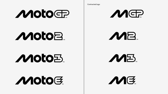
nobody is calling it 'mgp'
don't like that that's in the social media pfp's now... with the wta I do need a bit longer to see about how I feel about the graphics in practise. but also, at the end of the day, I don't care THAT strongly. I have zero real investment in motogp's long-term health, I DO have a lot of investment in women's tennis' future but also it's not going to live or die by this logo change. I will miss both of the old logos and broadly preferred them to what we have now
anyway.


#i can't really remember the current motogp theme tune off the top of my head either but#i do feel in general that motogp just feels more like a generic sport these days#like this is also obviously the valentino effect but noughties motogp in my head is kinda this funhouse mirror situation#that's kinda detached from 'normal sports'. possibly even reality. i do sometimes forget those guys were actual 'athletes'#whereas current motogp i do just follow. as a sport. that does normal sports things. and then i remember it's a continuous thing#do think more generic branding probably contributes around the edges to that. it's just more slick now innit#idt that's a good thing or a bad thing it's just a thing in my head#//#brr brr#racquet tag#batsplat responds#something about '10... casey could no longer drag an unrideable bike to title contention and vale could no longer be spared by the gods#lost receipts i fear. stuff used to just kind of Happen for narrative convenience#//brr brr
2 notes
·
View notes
Text
man or astroman are touring again adsdfcgvbnm i want them to come to my city SO BADLY
#man or astro man?#man or astroman#music#words#it's been a while since they've toured iirc#i have to see them live like i really am desperate#i love their music so much#if you've seen moam live i'm jealous of you
0 notes