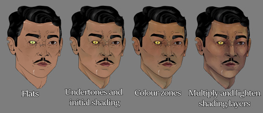
#i've gotta tweak that eye a bit more and render the ear. then on to the chest and arm and hand and a flower. all to this level of detail!
Explore tagged Tumblr posts
Text

👀 fourth sitting. i don't know if my skill level will allow me to go more detailed than this but i am going to try
#wip#solas#i've gotta tweak that eye a bit more and render the ear. then on to the chest and arm and hand and a flower. all to this level of detail!#because i make good decisions
95 notes
·
View notes
Note
Art tips I beg of you share your wisdom
Oh god oh fuck I'll try, a lot of my art process is vibes only, i kind of just zone out and Draw and a picture appears
I have to stress that practice is the most important part of art, even if said art looks shit and you feel like the world is ending because you're not doing well/making tangible process/it's not turning out how you want. Gotta push through that by accepting that hey, sometimes your art turns out looking Janky, so what? You still took the time and effort to make art, and you're more of an artist than you were before starting the piece. You can sit back and figure out how to constructively criticise yourself without destroying your own self confidence for the sake of a viewer who isn't there. Practice being neutral about noting the parts you dislike - 'this anatomy is awful and I'm shit at it, why do i bother' isn't going to help as much as sitting back, going 'damn that looks weird, lol' and then looking up reference photos similar to what you'd been hoping to draw and figuring out where things went wrong.
When starting with a drawing, person or animal, I find myself focusing on the silhouette initially. Sometimes i might play around with a solid colour, or focus on the outline with a thin-ish pen. It helps to be aware of certain curves on a form and how it relates to other features of the body proportionally. Look at the empty spaces on the piece and look back to those in the reference, or your own intuition, flip the canvas etc, and see if it looks 'right'. Get funky with it when in the draft stage
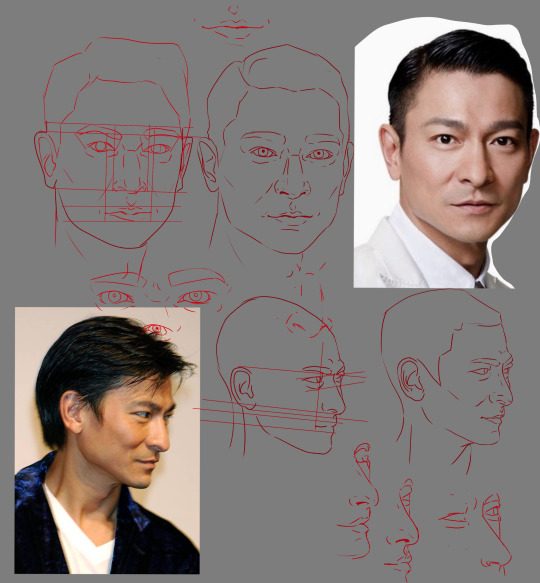
Tracing for practice and reference also helps - but don't trace blindly, instead use it as a chance to figure out how the lines of a person/animal/construct move, and how can you replicate that in art. Make guidelines and notes on how things are proportionate to each other, isolate singular lines and practice them over and over to build up the muscle memory.

kind of like the above, where I used photos of an oc's faceclaim (Andy Lau) and traced over them, isolated certain features, made guidelines, and so on
When figuring out how to draw faces, I use a couple little anatomy tricks to keep things in line before tweaking some of the features to make things more unique:
Corners of the mouth tend to align with the top of the jaw. The corners of the mouth also align with the pupils if a front-facing figure is looking straight on. The inner corners of both eyes align with the outer nostrils. Top of the ears align with the top of the eyelid and earlobes align with the bottom of the nose.
This can change depending on feature size etc, some people have bigger or smaller eye or theyre close together or further apart, or they have large earlobes or none at all, or their nose is small or big. I just use it as a guideline to make sure features are in order because. Uh. I keep forgetting to draw in the guides during the draft stage.
Variability of the human face lends well to avoiding same face syndrome as you can stretch the features quite a bit. It may feel weird or wrong drawing a face with different features to how you're used to, but that's the point of practice and progress.
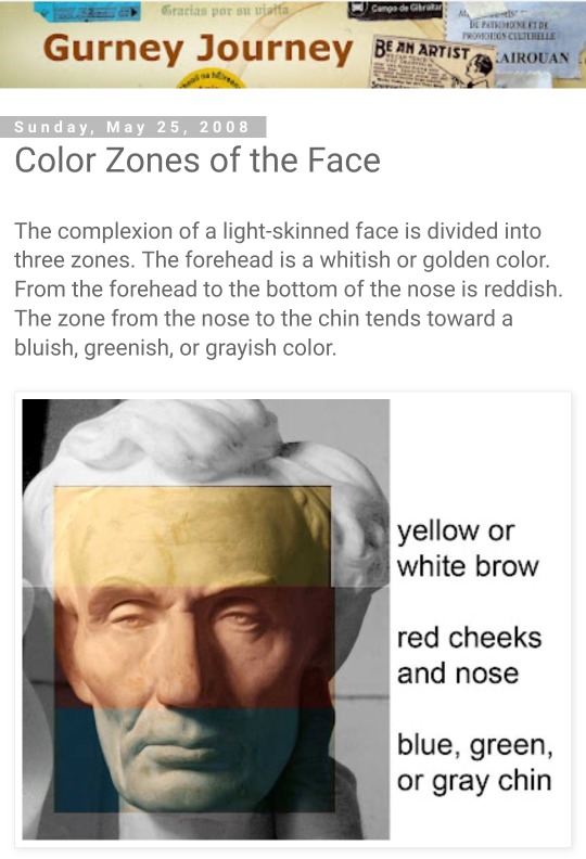
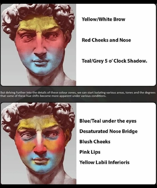
For rendering I found using the colour zones of the face (shown below) adds a lot of oomph and depth after finding my own rendering attempts falling a bit flat.

(above, from Gurney Journey describing the colour zones of the face)
(below, by ArtofYorugami on twitter)

I make the three colour bands, blend them to the contours of the face, then set the layer to multiply and lower the opacity to around 10-20%, and make further tweaks there to where it best suits the face being drawn.

Other little things
Eyes aren't totally white, make them a touch grayer and also add a little bit of blue to give it some depth. Same with teeth but I've yet to figure those freaks out
Hands are the devil but draw them enough times and you can flub your way through them until they feel normal. Would recommend having at least one finger in a different position to the rest, as our hands naturally rest with the index finger away from the rest. Again, use a reference, trace for research and building muscle memory, be cognizant of the muscles and bones at play in the hand and wrist. There are reference compilations on pinterest I've found in the past that have been helpful, and taking a photo of your own hand is an option as well.
A hand's palm width across is also the height of your lower face. That sentence doesn't make a lot of sense - but if you put your hand over your mouth, the top will be touching the bottom of your nose, and the bottom of your hand will align with your chin, more or less. Again, this can change from person to person but is helpful when eyeballing proportions.
Reference sites like x6ud is very helpful for angles of people and animals. Apps like Handy are helpful with figuring out how certain angles of light interact with the face. Videos like this one and this one are also good lighting references. Just looking up 'face under different light angles' on a search engine or pinterest will also be fruitful. Books like Michel Lauricella 's Morpho - Fat and Skin Folds is also very useful and you can find free pdfs online with enough safe digging. And there are a number of tutorials by tumblr artists on a number of desired topics
For expressions, it can be difficult to word the search right to find the specific look and angle you want as a reference. If you're willing, I'd recommend taking a photo of yourself making the expression at the intended angle. No one but you has to see the photo lmao
Uhhh. Multiply, overlay, add (glow) are your friends if you use CSP, play around with pens and layer effects until you get ones you like. I'm partial to the CSP textured pen for lineart and the watercolour pen for rendering
I think that's all i have ahjfjdks 😭 sorry, hope this helped a little bit!
14 notes
·
View notes