#i've been wanting to post more digital art too
Explore tagged Tumblr posts
Visit Tumblr Blog
Explore Tumblr blogs with no restrictions, modern design and the best experience.
Last Seen Tumblr Blogs


Fun Fact
1,644 Tumblr posts in 1 second.
Text
Broke all my tablet pen nibs. Booooooooo
#i've been wanting to post more digital art too#the funniest thing is I went through 6 in 2 months because I bought the wrong ones and jerryrigged them into working on my s pen pro
0 notes
Text

January 28 . Feast day of St. Thomas Aquinas
Here we see the greatest mind of the church in his natural habit-at.
I decided to make a younger look for him since some of his notable events also happened when he was young.
Happy feast day to the greatest theologian!
#I'm late in posting this because I've been going through some stuff#But I couldn't let the days past without acknowledging the life of the great Doctor Angelicus#Grrrr need to get motivated making character designs again for these saints#🤪#St. Thomas Aquinas#Saints#Christianity#catholic art#my art#my faith#Saint Thomas Aquinas#digital art#want to make more pieces with his life events too
298 notes
·
View notes
Text

I've been very busy with a game and might've stumbled into a favorite guy, as you might know from the "hear me out" tag game
#my art stuff#digital art#gta v#trevor philips#Made this a few days ago but forgot to post#I really like this - first time in a long while I've stylized a more realistic character/person and been happy with it immediately#Wanted to try and draw all his tattoos - If I missed any please lmk!!!#I should let myself draw in my own style more#I just always worry it looks too sharp or something? I really like it though#Posting this now cus my friend needed it for a thing and I'd forgotten to#so I might as well post it now so the people have it#tattoos#tattoo#trevor philips tattoos#trevor philips tattoo#also yes - I prefer him in his younger style.#I'm weak for a mullet OTL
70 notes
·
View notes
Text

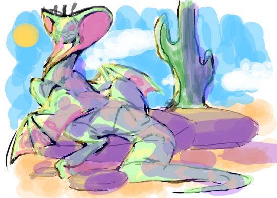
Just pretend I posted this like a month ago lol
I just really wanted to do the "it's pride month" meme with Conan and Tiaan because I think it fits them too well😂 I expecting that someone else must've drawn this with them before, but I was surprised that at least here on Tumblr I didn't find anything despite spending some time in their ship tag. I think it's been a good while that I've started getting more invested in a canon x canon ship, but they are cute and hilarious at the same time💕
Also my first time drawing the boys! Not entirely happy with both of them but it's a learning curve :') Conan gave me a surprisingly easy time for whatever reason, I expected him to be much harder to draw but it's mainly his hair that's still confusing me (and I have to figure out his proportions but that's something I need to work on on all characters I draw). Tiaan felt quite a bit trickier in comparison, why do pretty people have to be so hard to draw😔 I feel bad for the small Tiaan in the second panel though because he was super rushed since I just wanted to get this finished at least roughly on time, sorry dear😭 But I hope that this won't be the last time I draw them :D
#bro I procrastinated so much on this and I don't even know why😭 I want to art but the art is hard :(#I've been feeling so dead after my semester project that even my hobbies are exhausting#I kinda wanted to draw this in a more simple art style too but somehow I forgot how to draw in that one#but I don't want to wait like a year now until I can post it heh#star wars#star wars imperials#tiaan jerjerrod#conan antonio motti#moff jerjerrod#admiral motti#motti x jerjerrod#meme redraw#it's pride month#it's pride month meme#pride month meme#pride month#fanart#digital art#selniasart
31 notes
·
View notes
Text
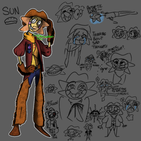
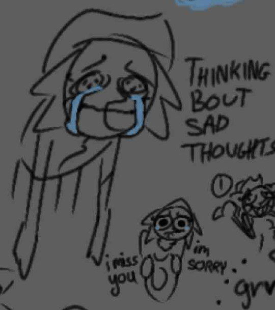
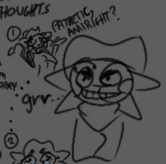
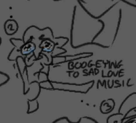
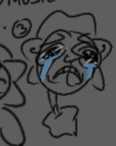
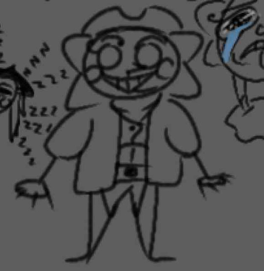
Toony Cowboy. Design is still work in progress, but loony toony cowboy here.
Dump Description and Up-Close of some Doodles under cut.
I'd draw comics but that takes a lot of energy. So that's a maybe...
The Doodles
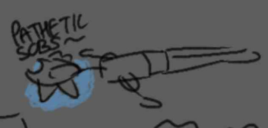

Bonus out of context comic on the original comic.
Description
This Sun is a comic-relief character after undergoing a lot of traumatic events within a short-period of time back when he still worked for a FazCircus with his Brothers (he calls them Brodners) Moon and Eclipse as a trapeze artist. He is an abandoned animatronic alongside Moon (Eclipse mysteriously disappeared like the cryptid he is). After abandonment, he became an outlaw.
He's a hopeless romantic who struggles with verbally expressing his thoughts and emotions. So majority of the time he settles with stumbling around life as a super dumb dude because thinking takes too much processing power.
He's also enchanted with loony toon powers, so he can now consume food, cry, utilize a hammer-space, and make facial expressions. Plus other rubberhose animations and toony effects.
Due to his trauma, he is unable to handle high emotional situations (angst and tension). He needs to isolate himself to process it, but sometimes that makes it worse. Coping Strat: Run away from the stress either normally or by ragdoll flinging himself. Attempting to stay will make him ramble incoherently and make the situation worse, from his POV anyways.
He likes pies and bakes different flavors based on situations. Pumpkin Pies means he's sorry.

Btw, the character next to Sun here is Eclipse. Eclipse is an anomaly. I'll talk about him later.
#my art#going to reblog it onto my art acc#fnaf dca#dca fandom#dca fanart#the daycare attendant#sun fnaf#sundrop#sun dca#ToonyDCA AU#digital art#I've been listening to too many sad love songs for this guy hahaha#I'm not okay lmao#Feeling mentally exhausted even though I want to draw more :[#long post#sorry it's so long#Moon himself in this AU actually belongs to someone else#it's sort of a shared AU but I wanted to show Sun#he's such a blorbo
8 notes
·
View notes
Text
omg
#the newest episode of what we do in the shadows is SO good bro omfg#this is up there with the mass hypnosis episode when they try to get colin robinson into a private school#i stopped making personal posts a while ago because i always felt like my content has to reflect my healing journey#but it can just be fun! it should be fun#that said lol personal posts are baaaack#what we do in the shadows is SO GOOD#also i've been watching next level chef lately and its so intense lol i can only do 1 episode a day or night#otherwise the adrenaline is too much lmfao#oh! and i got into PEN15 recently and i like it a lot. its giving grungey 90s middle school broad city#and i love broad city too#i just felt like talking about some fun stuff i've been doing :•)#i also finished jurassic park (book) and it was so great. so ready to read lost world#i also wanna re-read the perks of being a wallflower again i haven't read it in years and i feel like i'll connect with it deeply with this#new understanding. but yeah i think thats all the fun hobby stuff i've been doing lately#i want to draw in my sketchbook more but digital art is just so convenient & you can do so much more#other than that same old stuff like marathoning shows i love. bob's burgers and king of the hill and family guy and robot chicken#the office superfan show is really cool too#i like talking about my interests!
0 notes
Text
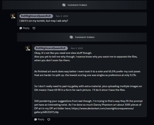
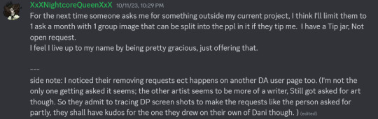
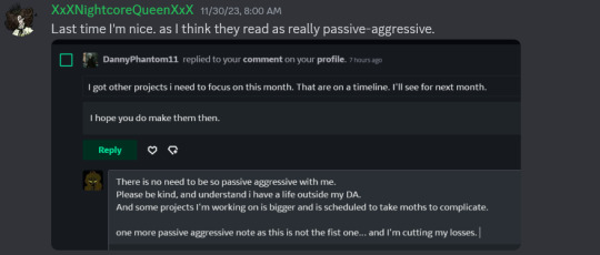
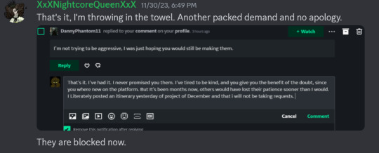
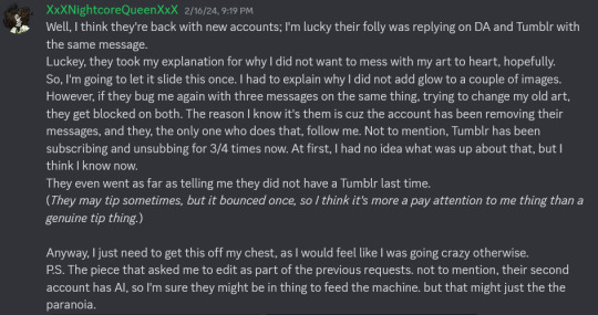
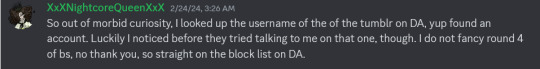
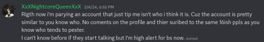
PSA To the Phantom, we have a Troll/Stalker!
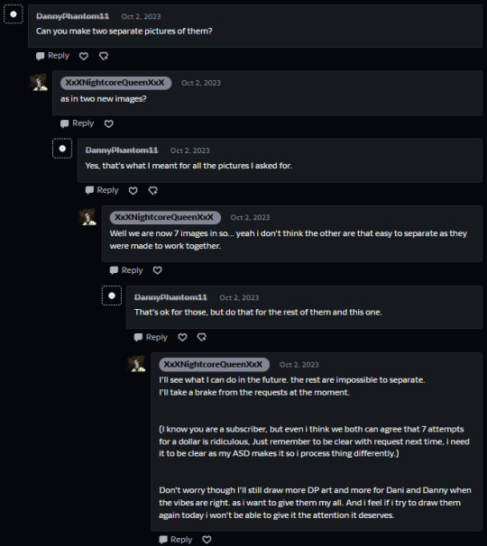
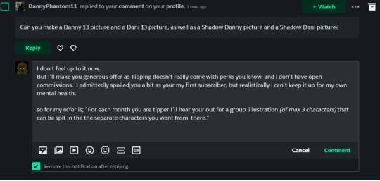
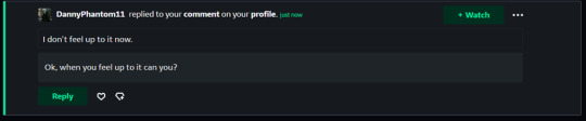
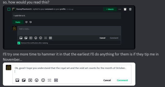
Those who know me know this is somthing I won't typically resort to this, but today, I've reached the end of my long patience. ( one and half a year of patience) There is a Stalker/ Troll whose whole stick is trying to get people to draw Dani and Danny fan art. Thir asks will look like this. They will delete them as soon as you answer. I mod on a few Discord servers, so when I informed people on Discord that I had a digital stalker, someone reached out to me to ask me if this was them, as they didn't want to deal with what I had to put up with. That's how I got a hold of this:
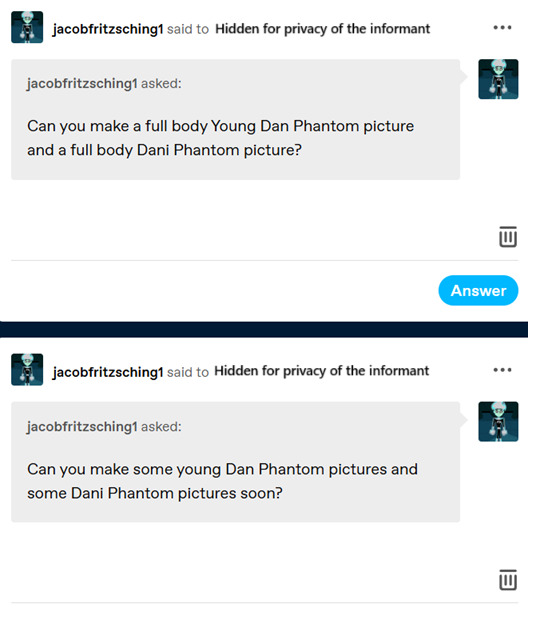
On Deviantart, they try to get into people's good graces by subscribing and donating a dollar. (it's a tip you can do on DA, not required) They ask you to do art, and if you bite, They won't stop pestering you about it. Like you didn't do it fast enough, or you didn't do it. And if you do, they have a new request lined up the minute you post the last. So it's never good enough. They will try to monopolize your time, and you never get time to draw what you want to if you try being kind at first. One telltale sign that it's them is that if you reply to them, they will delete all their messages with you after your reply to avoid detection by moderators.
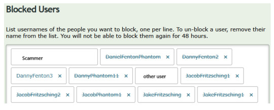
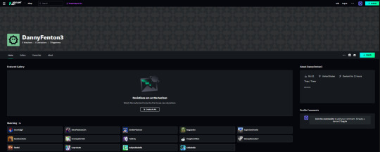
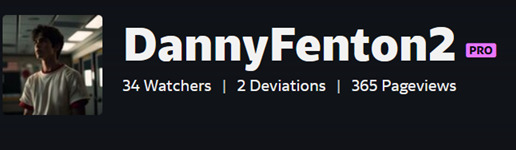
So here are the usernames I know them by; Usernames of them on DA; DanielFentonPhantom DannyFenton2 DannyFenton3 DannyPhantom11 JacobFritzsching1 JacobFritzsching2 JacobPhantom1 JakeFritzsching JakeFritzsching1 The username of the stalker on Tumblr: JacobFritzsching1 & JacobPhantom
I've tried to block them multiple times, And I suspect DA staff have banned some of their accounts.
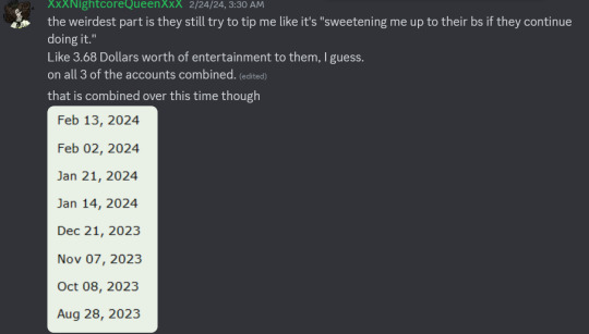
They don't understand no and stay away or that people have boundaries. I've reported them multiple times. They have been suspended multiple times (I was lucky enough to get this screenshot for a suspended account)
They have been bothering me since Aug 28, 2023 and the latest block for this person was today.
This is me reaching out to others in my discord communities over time for help, showing what it did to me mentally and why I no longer take art requests. (For the privacy of the other users, I've only included what needed to go in there with their usernames hidden.) The only other user by name than me is the stalker.
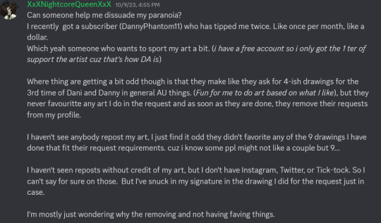
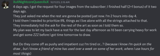
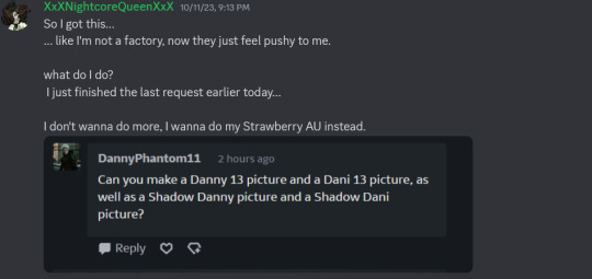
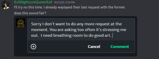
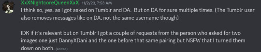
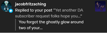

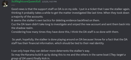
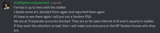
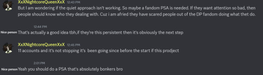
I lay myself bare to you phandom community so that you may not suffer silently by JacobFritzsching1 hand. I know I'm not his only target. I've stayed quiet and done what I could for a year and a half. They have not let up, and I fear they are driving good people out of the community through their behavior. I will confess to thoughts of wanting to permanently delete my stuff just to escape this stalker. But I'm not letting them win. I am a Phandom elder, I have been a phan since the show since it aired back in the day; some of you may know me by my old username Jeanette9a, some of you will know I'm sited as one of the earlier ones to keep DP ship names list that now exisits on Ao3, and I have to use my every connection and pull to see this troll/stalker not mess with more of my fellow Phandom community. That so be it. I will pull out my megaphone and scram their misdeeds to heaves, so they may never walk anywhere without people knowing who JacobFritzsching1 is in regards to the phandom. You wanted attention well, here you go may I hope you enjoy what you have sown.
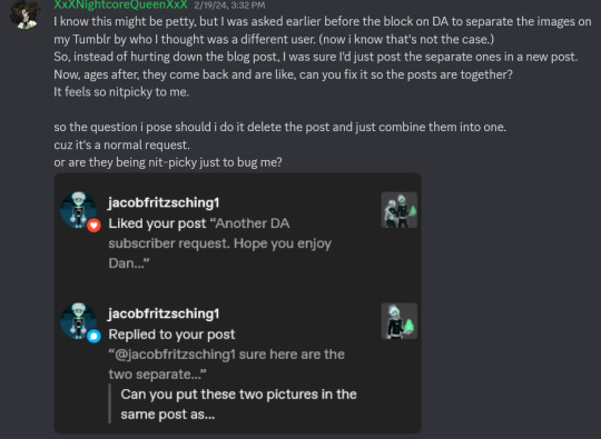
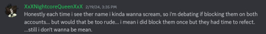
---- If anyone else has more receipts about this person feel free to reblog with a me too and show the phandom just who JacobFritzsching1 / JacobPhantom is. Because I'm just one person finally speaking up. I don't expect people to believe me outright. Not without more people who can attest to their character. Here is another post about the same user that is by someone other than me:
269 notes
·
View notes
Text
AN ARTIST'S GUIDE TO HANDS
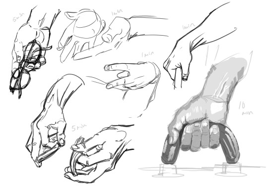
No, sorry it's actually not an artist's guide to drawing hands. Those are just warmup studies (which I'll talk about in this post.)
This is a guide to Your Hands and how to take care of them when making art.
No one ever sits down and teaches artists how to take care of their hands. They didn’t even teach me this while I was in art college. This is just what I've learned myself through years of pain and scouring the internet for advice.
This is going to be a long one and geared towards illustrative traditional/digital/pen/pencil artists specifically, but artists of other mediums and crafts should take care of their hands too! Well, we all should take care of our bodies in general, but this is about hands.
(advice is below the read more)
First off I'm not a professional or anyone with actual medical advice. I'm just some guy with chronic hand pain who makes art. This advice is free for you to use or discard.
WARMUPS!
Ever sit down in the morning to draw and wonder why your art is so stiff and looks so much worse than what you were drawing last night? It's because you didn't warm up!
You know how for physical sports they all warmup and do stretches before getting into the actual sport. To prevent injuries and all that? Yeah, it's good to do that for art too.
One way to warmup is to just draw lines. Try to keep them as straight as you can. Going up and down and diagonal. Draw squares. Big squares. Small squares. Circles! You are warming up, keep it loose and relaxed! Basically just scribble away.

(examples. I usually keep going until there is no paper white left. This can double as practice for drawing straight lines without a ruler, which is a great skill to have when freehand city drawing.)
Before hopping right into drawing people you can try doing some quick gesture drawings. Line of Action has timed sessions with a large variety of clothed or nude models. I usually do the 30 min class as it has a nice balance of short and long timed poses. The point isn't to draw nice art, but to warm up. Try to get the basic form down, not the details. I find that doing a full class session can really help my drawings feel more loose and grounded in reality for the rest of the day.
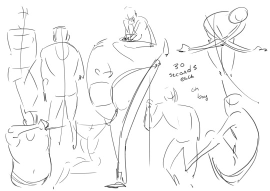
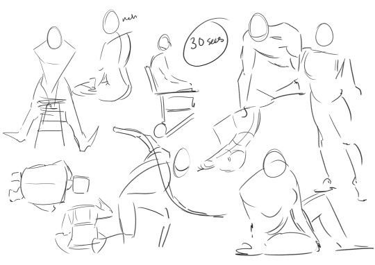
Some examples I found in my folders. I suggest looking into what a line of action (not the site) is and giving it a try with some of the studies!
COOLDOWNS!
For sports it's to return your body back to your everyday baseline after a workout.
Example; you are working on a big project! A masterpiece! It's detailed and cool! You have been focusing on this for hours and drawing so intensely. But you need to stop working for the day.
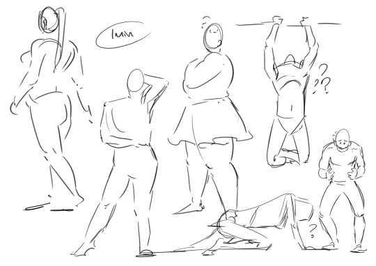
A cooldown is for winding down out of the go go go mindset. Put away the big project and do a couple small doodles and sketches. You are relaxing your hand and letting it stretch out. Keep the sketches loose. Let the art happen slowly. Don't polish anything, that can happen another day. Just ease yourself out of drawing.
...
Cool! Now we get into the meat of this thing.
HAND PAIN
How to avoid it and how to manage it if you already have it.
I love you artists and creatives, I am begging you to please take care of your most important creative tools. I really don't want this to sound like scare tactics like "oooh you better do this or blah blah!" Nope. I just had to learn all this the hard way and I'm extremely passionate about it.
Take this advice or don’t ╮(゚~゚;)╭ I can't tell you what to do, I'm not your dad
Adjustments and Small Solutions
If you are feeling physical discomfort while drawing there are many different solutions to try! Here are some suggestions that may or may not work for you.
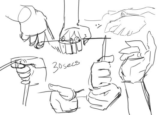
Hold your pencil more loosely. Stop gripping that thang so tightly!!! Relax that hand! They make these… squishy pen grip things... I think they are called Adaptive Pencil Grips or Adaptive Writing/Drawing Aids? They stop your hand from being all cramped up by making your drawing tool wider. It's going to take a bit of time to adjust to drawing with it, but it's worth it for those who hold pencils too tightly.
Don't press as heavily. For traditional art, if you find yourself pressing really hard to get darker lines try moving to a softer pencil. Most standard pencils are HB, the B pencils have softer graphite. Experiment until you find the right one for you. For Digital, adjust your pressure settings so you don't have to press as hard to get thicker lines. You should not be pressing so hard all the time, it wears out both your hand and your tablet! It takes a bit of time to adapt to pencil or pressure changes. Try doing some unimportant sketches, they don't have to be good. You are just training your hand and mind to adjust using less pressure.
Draw with your arm and not your wrist! It's small repetitive motions that cause the most strain. You probably hear this one a lot, what does it even mean? It means moving your arm with the motions of your line, and trying not to make too many tiny movements with your just your fingers or wrist. This one is hard! It takes time and conscious thought to change the habit. Tips? Work bigger. Zoom in more. Use bigger sheets of paper.


(Motions exaggerated for a clearer example)
Change the angle of your drawing surface. They make angled tablet holders, angled desks, angled desktop raisers. Experiment, find and angle that is comfortable and the one that causes the least pain. (It's also good to make sure you don't have to hold your head at an uncomfortable angle when drawing. Staring straight down or hunching over a paper flat on the table can cause pain!)
Compression Glove? Wrist brace/tensioners? Some folks use them and I've been thinking of getting one for years now. I can't give advice on this one, because I don't have experience with it. Look into it if you want!
Managing Pain
First things first.
IF YOUR HANDS START TO HURT WHILE YOU ARE DRAWING. STOP! Put the pencil/pen/paintbrush/whatever down. The art will still be there for you to continue tomorrow.
I know from experience that it's extremely hard to pull away when you are hyper focused on an art piece. It's hard to remember all sorts of basic needs like food or bathroom when hyper focused. But you Need to stop when you feel that pain. (Preferably even before the pain…)
Take Breaks! Let your hands rest when you can. Just like a machine, if you don't schedule maintenance, the machine will schedule maintenance for you. Often that means having to wait a few days for it to return to functional. Best to take a day off from heavy usage or take an occasional 30 min break throughout the day to let your hands rest.
Stretching is important! Full body stretches are good; your arms, shoulders, neck, and spine are all connected, but I'm specifically talking about HAND and wrist stretching. There are a lot of stretches and massages for carpal tunnel and arthritis out there. I find they work for hand pain in general. Move into and out of each stretch slowly. Do not push a stretch if it hurts!! Be gentle!!
I am not a qualified professional and I will not be giving out specific stretches (that is beyond my personal comfort level). There are other artists out there who have made helpful stretching info-graphics which are cool, but I will not be because i don't want to be responsible for someone accidentally hurting themself. Ask your doctor for stretches & advice or look some up on your own.
Don't feel bad about forgetting to stretch frequently! Of course it is good to do it regularly and frequently, but I would be a hypocrite if I said that I remember to stretch daily. Setting timers for stop and stretch sessions can work for some people, but also doing stretches whenever you remember is fine! If you are sitting on the toilet you can idly do some hand stretches. On the bus? Laying in bed? At the beach? Do a couple stretches! Even just once a week is better than… nonce a week.
Using Cold or Heat to treat pain. If you really overdid it, put your hands in some cold water or wrap a cloth around an ice pack and apply it to your hand. Cold works best for me, but warmth works for others. This is just pain reduction and reducing inflammation from overuse! This is not a permanent solution.
If your hand hurts a lot! Frequently! Talk to your doctor? Idk mine has never given real advice. Just gently poked my hand and told me there isn't much to be done about it :/ but there are really good doctors out there who will care and give helpful advice!
Again. IF IT HURTS TO CONTINUE DRAWING. STOP DRAWING! This is not a "no pain no gain" type situation. Drawing so much that you hurt yourself isn't noble, it's just… limiting yourself. You only get one set of hands. These things are very handy to have.
Other Advice
Things I couldn't figure out how to fit into the earlier sections.
Your other hand can't handle the strain! Lets say you hurt your drawing hand... the other hand is right there free to use for art. Right? Wrong. Your other hand can't keep up with the demand, it hasn't been trained to the same extent as your dominant hand, it does not have the built up muscle. If you want to use that hand for drawing you are going to have to use it s l o w l y and train it bit by bit over a long period of time. When I tore a tendon in my right hand I decided to just keep drawing with my left and I got Really Good at it. It only took like two months before my left hand hurt too much to move. Then I had 0 functioning hands to pull up my pants. Not fun!!
People who draw on phones. That is extremely impressive! I'm amazed by the things people can create on such a small space. But phone artists are the ones I see most frequently mentioning hand pain. please please please make sure you are taking breaks. Would a stylus work instead of using a finger?
Outside of Drawing. Sometimes it's things outside of drawing that are causing the pain. For me there are multiple sources, but I also have tiny baby hands. Holding a phone too long causes pain. The handheld mode for my Switch causes A Lot of pain. The way my hand rests while typing on my laptop hurts! Playing tense videogames for too long hurts! Find the source of your pain and make some changes. The same things will apply to most; take regular breaks, do some stretches, and find soft things to prop up or rest your arms on.
Change your Artstyle. This one is more of a last resort. You might have to change your art style if you are getting sharp pains every time you draw. I loved drawing tight clean lines and many small fancy details, but drawing like that left me in so much pain at the end of the day. In 2023 I had to take the better part of year off from illustrations just to learn how to sketch and draw more loosely. I had to learn how to be gentle. To stop gripping my pencil so tightly. Learn! Adapt! You might discover a new style that you love even more!
A lot of this stuff gets more complicated in a work setting where you have to draw fast and long in order to get paid. Things like reducing your workload can help, but that can be... financially rough. But outside of that, it’s ok to be a slow artist. Going full steam and hurting yourself is not worth it.
Aaaaaanyway, thats all folks. Today's rant brought to you by me! The guy with chronic hand pain who always forgets to stretch! The guy who got frustrated with a sketch yesterday and decided to push to keep drawing for just one more hour! The guy who woke up this morning and had to spend 2 hours massaging and stretching their hands. The guy who probably shouldn't have typed all of this out because ooww ow ouch

If your hands do hurt, it's going to be ok! You don't need to be a speed demon who draws all the time. It's ok to take your time and take frequent breaks. You are going to do great things! Just be gentle with yourself...
#art advice#carpal tunnel#hand pain#last tips!#don't punch people... use your elbows or smthn. your hands are too precious to wreck punching a jerk#if you are an artist and enjoy longboarding wear wrist guards. lifesaver fr#i hope this thing is readable. it's long and my eyes are tired#also i am an artist not a writer... forgive my grammar
1K notes
·
View notes
Text

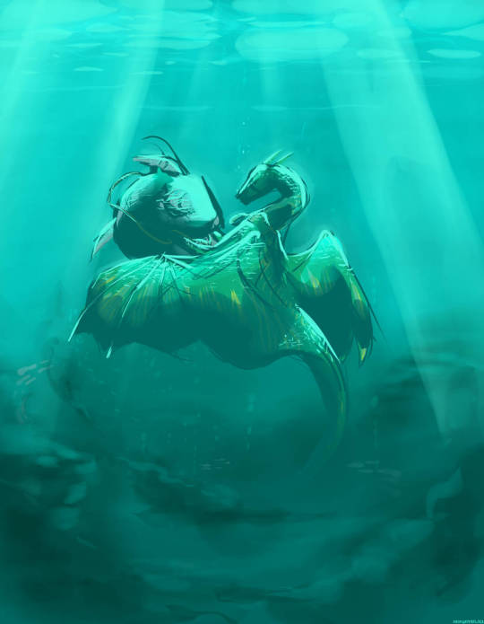
"He's far away. But I know we'll see him again."
Haven't posted in a bit haha I was busy with a commission that took quite a lot of effort to finish
I've also been quite unhappy with my art. I really liked my Aqua drawing, and wanted to make something just as good. I guess i put too much presure on myself and ended up not doing anything out of fear of drawing something bad, or that wouldn't consider good enough.
Honestly, theres some things in this drawing that I'm unhappy with, but It's one of the first time while looking at my digital art that I realised:
Does it really matter if my art is not perfect?
Nope. Not at all. What matters most is the process and the intent behind art, not if it's pretty or not. And that's something I need to keep in mind more, I think.
340 notes
·
View notes
Note
How did you find your art style?? I'm literally in love with it
I stopped doing the parts that weren't fun
I've never been aiming for anything in particular, and it's varied over time + between works. it's where it is now because it's the meeting point of my ability to make art and what I want to show in it. I had cartoon simplicity for a while, and then detailed clean line art for a while, painted for a while, had lineless geometry for a while. dabbled in clay when school allowed and digital 3d when it didn't. took up photography. looked at a lot of other people's art, peers, posted online, formally published.
there are things I know directly inspired me - early 2000's animation that relied on bulky, limited models and a strong character shapes; packaging design; graffiti of all calibers; the vivid, realistic illustrations of fantasy field guides; animation and dance; comics, many times over - but those can make any person draw anything, depending on what they choose to keep. I learned I liked the part of a painting that was roughing in big chunks of color, and liked hatching more than smooth blending, so I stopped blending. i liked dramatic shading and easy to read framing / shapes, so i limited my color palettes and used a lot of solid black. i liked how a bright light source could obscure something as much as darkness could, so i used it a lot as well.
my advice for finding a style will always be to just... let yourself do the parts of the art that you love doing, and experiment with the rest until you find things you like there, too. if a part of it is boring or takes too long or you never like the result, just don't do it. there's other ways. it's not a hobby worth doing just to be miserable about.
here's some art from when I first started digital painting. as a treat
244 notes
·
View notes
Text


🧡 Save the date: 06/29/25 🧡
HAPPY JASVER SIX MONTHS AND HAPPY ENGAGEMENT!!!! I can call her my fiancee now!! <333 I'm posting it today for two reasons: one, I'm too damn excited NOT to announce it, and two, I'm going to social media detox entirely during the actual anniversary this weekend (12/29) and try to celebrate the day with her 🧡🧡 I felt like it'd be proper for us to get married on our 1 year anniversary, and the early announcement means I can plan some fun stuff for anyone who wants to join in celebrating with me!!
This piece is actually a bit of a redraw from my first ever jasver, which I have under the cut + some more notes!

I am SO emotional over the improvement I've made since I've started self shipping. Drawing self ship was actually some of the first completed digital art I've done in a long time, and not to get personal on main, but I rarely made anything creative when I lived with my ex for three years. Our one-year breakupaversary (LMAOO) aligns pretty closely with the 6 month anni, which really has gotten me thinking. Self shipping has been the most empowering, emotionally satisfying, and fulfilling journey I've ever been on, and I'm so so excited to spend many many more years with her. This Gem who stands up for herself, who is strong, who isn't afraid to fight, but still cares so so deeply about me.
Jasper has been my love, my light, my absolute everything since I started self shipping with her, and I'm so so grateful for what she, and the entire self ship community, has given me. Thank you everyone who has supported me the past six months, given this ship so much love and affection, and for all the friends I've made thanks to the selfship/yumeship communities! After so many years feeling aimless, disconnected from all my creative strengths, alone. . . I finally have her.
Jasper, vi estas mia ĉio, mia trezoro, mia brilo kaj mia plej belega knabino, kaj mi estas tiel dankema por ĉiujn, ke vi donis al mi. Dankon, dankon, dankon. Por la resto de mia vivo, mi batalos por vi, kuras kun vi, amos vin kaj amos vin kaj amos vin. Mia sunbrileto, miaj koloroj, mia alia duono. Kaj ooooj mi tre ĝojas, ke ni geedziĝos. Mia plej belega knabino. . .
heart border
tag list! (please let me know if you would like to be added or removed!)
@the-bluebirds @starshakez @quinni-shippi @self-shipping-crow
@viridian-artist @botwild-track1
207 notes
·
View notes
Text
YOU DO NOT HAVE TO PAY ANY MONEY TO SEE SPACE BABY.
YOU HAVE TO PAY MONEY IF YOU WANT TO SEE IT EARLY, ALL AT ONCE, WITH THE CREATOR TALKBACK. THIS IS A STARKID BUSINESS MODEL THAT HAS EXISTED SINCE 2014, IT IS NOT "BEHIND A SECOND PAYWALL", IT IS A WAY TO GIVE A LITTLE EXTRA MONEY TO THE ARTISTS WHO WORKED ON THE SHOW KNOWING FULL WELL THAT IT IS AN EXPERIMENTAL PILOT AND COULD FLOP.
anyways. hi this is my rant blog so here's the rant
tldr: starkid needs a social media manager, they don't make the youtube residuals or ticket sales profit you think they do, chicago and la are great places to do theatre due to the audiences they draw but they are SO FUCKING EXPENSIVE, capitalism is rotting this country from the inside out and starkid knows this better than anyone
first and foremost:
curt mega is not a legal representative of starkid and he is entirely within his rights to defend misconceptions about the art he makes. he is so respectful to the fandom on here, even apologizing to the confessions blog after accidentally following them because he wants fans to have a safe space where they don't feel like they're being monitored by someone from the company. there is nothing wrong with him trying to assuage people's fears about the show. debunk whatever you want my dude (including if i say anything wrong in this post!)
i am not, under any circumstances, a blind defender of starkid. they've made choices that i do not enjoy in the 15 years that i've been watching them. like i say in this post, i think fans need more notice than a week if there is going to be a livestream we have* to pay money for. i would like a musical that is composed by someone other than jeff or clark. i wish the black friday deluxe download had the digital ticket in it. i wish jangle ball could've come to the actual southeast rather than claiming to be coming to the east coast then hanging out in new york (but as you'll see, that would've cost MONEYYYY). you will notice that these are nitpicky personal grievances. that's the point. im not gonna shell out completely for a group of white guys in LA, no matter how autistic i am about the musicals they make.
as someone who also donated to starkid returns and has also been disappointed to see how long it's taken for this stuff to get off the ground (I absolutely loved cinderella's castle but i would not have minded waiting for it if it meant we got space baby sooner or sissy/ttip. i want to see/read Sissy SO FUCKING BAD)
but think about it. starkid returns made $386,000. a weeklong rental of the El Portal Theatre costs $12,000. so for two weeks of tech thats $24,000. the two weekends of performances were $6,000-7,500 each. it's $7500 per shoot day for a film production. already, that's almost $50,000. Now think about renting film equipment, making costumes, sets, props, paying the cast, crew, theatre technicians, house management, REHEARSAL SPACE RENTAL, we don't know if any of the actors had to be housed in LA while they were working on the show, not to mention getting merch made (FUCKING EXPENSIVE). And that's just on Nerdy Prudes. They also had an entire fucking national tour to fund. i ain't doin the math on every theatre they rented for that tho.
while the 10iversary kickstarter made about $547,000, considerably more than SK Returns, that money went into funding the travel and stay of the fuck ton of people who came to LA for the show, renting the Ace Hotel Theatre, funding Black Friday, and of course the unfathomably expensive Wiggly plushes, which were very kindly restocked what, three or four times? because the FANS kept begging for them. and then after all of that was said and done, the company took a huge hit with the pandemic. Some of the SK returns money probably went into making Workin' Boys too! That's what happens when a global pandemic shuts down all your plans for two years!
i was also surprised to hear that space baby wasn't going straight to youtube. I had it in my mind that it was going to be something similar to Movies, Musicals, and Me. I see now that I was incorrect. It's experimental. It involves SO MANY ACTORS. and not to mention starkid has been doing the digital ticket prior to youtube release thing for YEARS. my main thing is that i would be totally totally fine with having to buy another ticket for space baby (which is only $10 by the way, less than all of their other digital tickets. not to mention it includes the talkback afterwards) if they had only clarified it just a little bit earlier. Nightmare Time 2 was announced on October 8th, 2021 and the first ticketed livestream wasn't until the 23rd. that's two weeks, a whole week longer than we got for space baby. however, im willing to understand that there probably wasn't as much time to announce things/people have been a little bit scrambled lately due to, i dunno, having to evacuate due to the raging wildfire.
unfortunately, people aren't always going to understand that making art is fucking expensive in this day and age. i hate that starkid has to keep reiterating that but it might be smoother if they had a media trained person running the socials who had a prewritten explanation of "making stuff costs money" for the people who don't get it. and then when starkid DOES do stuff for cheap they get taken advantage of. i'm still not over those fuckwads who bought meredith's beautiful handmade coasters at VHSCC and upsold them for three times as much money. the people who bootlegged the black friday digital ticket and posted it online just cause they didn't want to wait the measly 3 months it took for the show to get posted online.
being angry when the person who made the show is looking at the tumblr tag for the show because he wants to see what people are saying about the show he made comes thru to clarify some misconceptions when the tumblr tag is full of people not understanding the starkid business model that's been around since 2014 is not the move. not the move!!!
171 notes
·
View notes
Text
Beyond Memory Lane // [ PROJECT SEKAI ART PROJECT ]

[ EVENT SUMMARY ] - One day, after cleaning out the attic of his home with Emu, Rui discovers an old box hidden away in the corner by chance. Opening up the box, he finds several things from his childhood, spurring a trip down memory lane.
…
[ hii, i felt inspired and wanted to try and make a project sekai event set for an au I have, known as the "DECORA AU", that I've been working on for the past few days! and this is the collection of those efforts... yippee? yippee!! ]
DECORATED FLIPSIDE ♪ GACHA

4 ✩ Rui Kamishiro - [ The Space Left In-Between ]
"I've found yet another wonderful and special treasure."


**comes with the “Leading Director” costume. Card Skill: My First Light Show [ life recovery ]
..
4 ✩ Emu Otori - [ Watching Digital Stars ♪ ]
"Emu wonders what else this can do?"


**comes with the “Gummy Bear” costume. Card Skill: So Sparkly ♪ [ perfect tap score increase ]
..
4 ✩ Akito Shinonome - [ Captured On Film ]
"What are you doing now?"


**comes with the “Husk” costume. Card Skill: What Are You Doing...? [ score increase ]
..
4 ✩ Ena Shinonome - [ Old School Photography ]
"Never used one of these before... they're interesting."


**comes with the “Narcissus” costume. Card Skill: I Need A Good Filter. [ turns taps to perfect ]
..
4 ✩ Airi Momoi - [ Rewatching Movies Together! ]
"It's been so long since we've gotten to watch something together!"


**comes with the “Poppy Flower” costume. Card Skill: Want Some Snacks? [ life recovery ]
..
4 ✩ Kanade Yoisaki - [ A Trip To The Gas Station ]
"I made it... Now to buy some snacks... maybe dinner too?"


**comes with the “Koi Fish” costume. Card Skill: What's For Dinner...? [ score increase ]
…
[ EVENT STORYLINE BASIS ] - An event storyline that surrounds the recorded past and the recorded present of the characters involved in the story. The first half of the story primarily focuses on Rui, Emu, and the story of the old light projector found among the junk in the attic, while the second half focuses on Kanade and the others, running into one another while outside.
[ TRAINED CARD BASIS ] - The trained cards are all based on characters within the DECORA AU, their titles being the names of the associated characters they're "playing", which are The Leading Director (depicted with Rui Kamishiro) of the Decorum Hosptial, and the 5 different protagonists of the AU, Gummy Bear, Husk, Narcissus, Poppy Flower, and Koi Fish (depicted with Emu Otori, Akito Shinonome, Ena Shinonome, Airi Momoi, and Kanade Yoisaki). Everyone (hypothetically) gets the associated outfit and hairstyle depicted on the card.
[ ART AND CHARACTER DESIGN BY ] - All art shown is by yours truly! I also designed all the trained character designs and additional casual outfits. Yeah, even the patterns and the backgrounds, drew all those myself... godspeed if I say so myself /silly
...
[ FINAL WORDS? ] - hii! if you're seeing this, you got through everything, wow. i always wanted to do one of these custom sets but I was never really sure where to start and... figured I could do it with these goobers first, and so I did!! it was a very fun project.... i got to draw some people I've never drawn before, so i'd say it was an overall fun experience!! if you guys like what you saw, want to know more, or want to see a part two with the hospital staff and the vocaloids (I did NOT forget about them, promise!), maybe you could reblog the post or send in an ask? even a comment would make my day!
okay, I'm gonna go now, have a good day or night (wherever you are!), make sure to drink some water, the small things!! okay, bye!
#ringmaster doodles#pjsk#pjsk art#project sekai art#pjsk fanart#project sekai fanart#pjsk rui#pjsk emu#pjsk akito#pjsk ena#pjsk kohane#pjsk ichika#pjsk airi#pjsk kanade#rui kamishiro#emu otori#akito shinonome#ena shinonome#kohane azusawa#ichika hoshino#airi momoi#kanade yoisaki#pjsk/original au crossover
116 notes
·
View notes
Text
HAPPY ONE YEAR SINCE I BECAME OBSESSED WITH THE AMAZING DIGITAL CIRCUS AND FELL IN LOVE WITH JAX!! 💘 ₊˚⊹♡
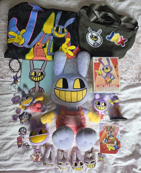
When The Amazing Digital Circus first came out, I took one look at Jax and intentionally avoided watching the series since I had a feeling I was going to become obsessed with it. When Episode 2 came out in May of 2024, an edit of Jax popped up on my TikTok For You and I heard him speak for the first time and that edit alone made me decide I couldn't resist anymore. That night I watched Episode 1, fell in love with Jax, composed myself enough to brush my teeth and then immediately after watched Episode 2 and the rest was history. I love this series so so so much and over the past year it has brought me so much joy, comfort, love and excitement. I love all of the characters so much, especially Ragatha and Pomni but Jax is my absolute favourite and I knew he would be. His mannerisms and attitude drive me crazy and I get so overwhelmingly excited everytime I see him on screen or see any new promotional material with him, and over the past year I've spent so much time seeking out fan-art, reading fics and engaging with the community about him and my favourite ships. I collect other characters too but I wanted Jax to be the focus of this post since most of my other characters I'm in love with I have been in love with since I was younger so I couldn't pinpoint the exact day I fell in love with them, but I know that date with Jax so I can celebrate it! I'm so blessed to have built up my collection of him, with a combination of officially licensed items and fan-made merch. Many of the items were made for me by one of my best friends Jo and I am so grateful she took the time to design and make them for me, and I will forever treasure them (A huge thank you Jo if you're reading this for supporting my obsession!!). I also have to thank my sister Sarah for getting me the official Jax keychain plush for Christmas!! I love and adore all of the items in my collection, but my absolute favourite is the official Jax plush in the middle who I have slept with almost every night since I got him. I'm so excited to learn even more about him as the show progresses!! 💜
#the amazing digital circus#tadc#tadc jax#jax#jax plush#tadc plush#tadc collection#glitch productions#animatez
90 notes
·
View notes
Note
Hi, I found your work on Twitter last year and I really love and look up to your art. If you have the time, I wanted to as if there are there any study topics, artists or techniques that have significantly influenced you :')
I'm at a bit of a complete loss on what to study presently so I thought I'd ask my favorite artists, thank you for reading and I completely understand if this is too open ended a question
Thank you!
This isn't the first time I have been asked this question and I suspect this won't be the last so I'll just lay everything out here. Go to a cafe or get a blanket or something because this will not be a short read:
Foundational:
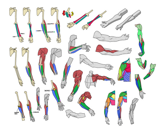
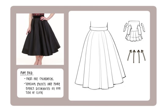
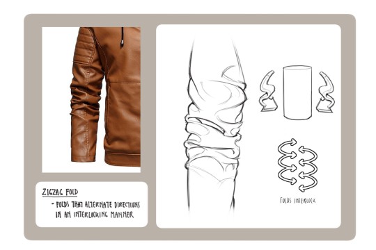
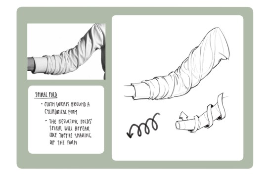
Anatomy: A lot of my foundational anatomy and clothing illustration knowledge was gained from taking classes and doing observational drawing. Because of this, I'm not going to have the best book recommendations but top 2 books I can recommend for getting Started started are Andrew Loomis or RockHe Kim's books on anatomy (huge asterisk here: they're good at teaching you Basics basics like muscle groups and turning forms and extremely general proportions but will not help that much with making your figure drawings less stiff or how to draw fat or especially in the latter's case how to draw women not built like stick bug anime girls but uh I heard the Morpho books are pretty good. genuinely everything I know about drawing fat is from observational drawing/studies because at some point I got sick of my school for only hiring skinny models in their 20s-30s). I have some diagrams drawn by my friend who studied the hell out of these guys below:


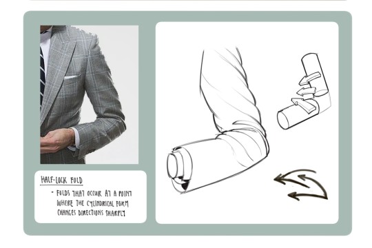
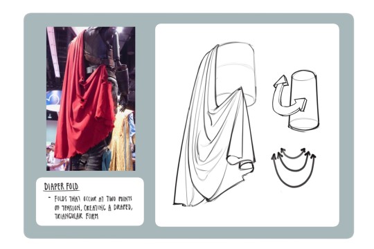
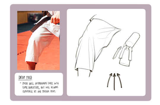
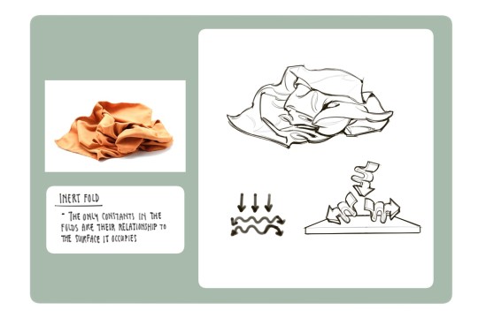
Clothing: I don't know any books that can really help on this front I apologize if I find any I'll update this post but pretty much all of my knowledge on drawing clothes boils down to the following rules: Where are the tension points, how stiff or soft is the textile, how is the form underneath the section of clothing behaving, and don't make even spaces between fold groups
All of this is kind of moot though if it isn't applied through study or observational drawing though
Design:
I have to be really careful here because I don't want to deal in absolutes, the only absolute I'm confident espousing is that anyone who tells you there is only a small selection of methods you should follow to execute a specific type of design are objectively incorrect and just haven't figured out alternative if not more effective design solutions to a common problem. The only real Worst Thing I think you could do as a designer is create a pinterest mannequin devoid of a story, disconnected from its context in the world, and lacking in a clear purpose/personality but this too could be easily be disputed if maximising a character’s aesthetic appeal serves a purpose in its context, and my opposition to this design approach is my personal bias as a character designer for entertainment where emphasizing a character’s function and their relationship to said function is usually the goal
I think the 5 best pieces of advice I've ever received when it comes to designing characters are the following:
Try and follow the rule of thirds/general gestalt design principles of contrast
Always consider what it is you're trying to communicate with the character
Create believable transitions and reinforcements between points of interest
(Entertainment related) KISS principle/Keep It Simple, Stupid is your friend, the way a character wears or wields what they wear or wield will communicate their role in the world (who are they?), their relationship to their role (do they like their job? are they good at it? are they a part of an organization with the means to provide them things to perform their role more effectively?) effectively enough. Excessive information that bloats and conflicts with the communication objective weakens design (example: My favourite childhood toy for years was a pokemon plushie. Would I as a stay at home digital artist be wearing it as a keychain on my crusty paint stained polyester pajama pants when I'm at my desk working my job? is wearing it relevant to my character as a person who both no longer is invested in pokemon and is in this context focused entirely on comfort and doing my job? (no)). I think Elden Ring is an excellent example of a game that has visually complex designs but pretty expedient storytelling with its characters for worldbuilding
Study things that aren't just character design, to borrow from Lynn Yaeger borrowing from Sally Singer "If you're interested in fashion learn everything except fashion... Politics, art, painting- anything except fashion". Because people in different disciplines who work with different mediums or fields of study approach problems in different angles you may not have considered which can help give new ideas + often times the stuff you like was inspired by stuff that isn't at all what you would expect or enjoy yourself (To pull from a very popular example, Arcane is a League of Legends joint which was highly influenced by Warcraft which was highly influenced by Warhammer which was basically a giant response to western pop culture of the 1960s and the history of European warfare something something coconut tree).
Character design is kind of a hard thing to Get Good at considering how much of the actual process is super psychological/not bound by a *ton* of absolutes and has to account for medium and function (you kind of just have to have The Sauce) so I don't recommend Just studying independently only (possible, just very difficult). If you can and are interested in learning more about the specifics take some classes taught by people whose styles you fw who both know what they're doing and are good at explaining their process. For design for entertainment you can always check out Concept Design Academy or The Workshop Academy and see who's teaching there
As far as artist inspirations are concerned I think looking up the artists who worked on projects you like are a good starting point to figure out how you want to stylize. Going off of that at least currently my favourite designers/illustrators for entertainment with The Sauce are probably Evening Monteiro, Sergey Kolesov, Mindy Lee, Tonci Zonjic, Sasha Tudvaseva, Claire Hummel, and Yoshitaka Amano
My favourite book currently for tackling character design at least from a narrative consideration is probably Talking Threads: Costume Design for Entertainment Art (one of the authors is my friend and an excellent teacher!) and a lot of the stuff they espouse really helps to take into consideration individual and external factors when designing a character/how they can be used as vehicles for both individual storytelling and worldbuilding, gigantic reference point for my most recent casual project
Besides that the only other way I can really recommend studying character design is to just look at art, history, architecture, nature (pretty much Everything) and think about how ideas and concepts from those things can be applied to or communicated through a design or figure out what it was about a design or designs you like made it appealing
uhh tldr this is just how i as one among millions of artists got to where i am today as of January 16th 2025 my word is not gospel the advice I espoused here may very well spell my downfall tomorrow
166 notes
·
View notes
Text
Phil Lester, the romantic you are. (or, some of my favorite "Phil loving Dan" moments in the last few years ft. actual timestamps, since i'm not artsy enough for web-weaves yet)
❧ "Thanks Dan-" "Thank you... for tolerating my presence." "-for treating us with your presence." (What Dan and Phil Text Each Other 2, 20:50)
❧ The cooing at Dan's outfit at The International Academy of Digital Arts and Sciences Award event, including putting a hand over his heart. (ROASTING DAN'S 'FASHION', 11:11)
❧ The edited segment at the end of this video in which Phil does an additional promotion of Dan's book; "I've just seen how happy he's been since he's found all this stuff out..." (I TRY TO GIVE DAN A HAIRCUT!!, 19:10)
❧ "Oh look, we're together!" (Dan and Phil Chained Together, 12:40) -- volume warning for this one.
❧ Every time during this video in which Phil expresses excitement that his character is with Dan's again, or stress that him and Dan will be separated (Dan and Phil are Getting Divorced - It Takes Two #1, non-exhaustive list of timestamps 17:50, 22:20)
❧ “Here’s where that’s fine. I would shape-shift into you, you would shape-shift into me… no, we know each other so well, it wouldn’t be that different." (Phil Pushes Dan's Button for 18 Minutes, 10:47)
"op you forgot-" a lot of these are just recent clips i've mentioned in the past since i was asked to give time-stamps, but please add more in notes! i know most folks know these but in case anyone doesn't :3 (honorary mention both mukbangs & every baking video)
BONUS: my personal "roman empire", AKA a selection of pictures Phil's taken of Dan that I think are particularly loud -- warning in advance these do not have IDs but when i get a chance i can add them into an RB! all under cut <3
EXTRA BONUS: i made a post compiling some of my favorite pictures of Phil wearing the "We're All Doomed" merch hat because this is something i think about a lot too. these have IDs! my actual post isn't important i just didn't want to recopy over the pictures.
phil lester loving via photography in a very non-exhaustive list because it's not like this has been his birthday tradition or anything... i hate romance. <3
292 notes
·
View notes