#i'm so scared to tag this with barry steakfries in case some poor unknowing soul finds this
Explore tagged Tumblr posts
Visit Tumblr Blog
Explore Tumblr blogs with no restrictions, modern design and the best experience.
Last Seen Tumblr Blogs


Fun Fact
BuzzFeed published a report claiming that Tumblr was utilized as a distribution channel for Russian agents to influence American voting habits during the 2016 presidential election in Feb 2018.
Text
every kitty maid barry sprite i have worked on so far
this post will be long
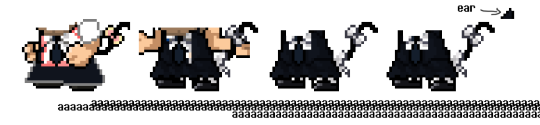
fig 1: tiny little sprite sheet (not to actual sprite scale)

thoughts:
Barry's dress was decently easy to sprite as it is essentially a palette swap with a skirt and a few other details. the skirt was a bit tricky to figure out, i originally wanted it to be a more straight/flat kind of dress, but it didn't turn out too well so i decided to give him a more frilly and detailed skirt. i loosely referenced the princess' dress in episode 1 of the DTM series. i was thinking about keeping his sleeves ripped but the little short white sleeves were too cute to pass up ^w^
also wanted to remove the tie but i thought it looked nice and fit really well with the colours, so i kept it
this is lifted from one of KoolTimYT's sprite edits, like the tail and ears and the blush colour, though the dress and bows are completely original art
those shrugging sprite were actually really tricky to edit, the first two were fine as the only real difference was Barry's head perspective and it being a singular pixel down in position, but the other two were kinda hard as i not only needed to sprite an unseen area of Barry's dress, but i realised the arms had a singular pixel difference so i needed to go back and fix that. also spriting a slightly different sleeve and trying to figure out the other positionings in general
spriting Barry's kitty nyah gesture hands was also a little tricky but i got a hang of it and i think i did a pretty decent job at it :)
those separate sprites with just his arms and the bows up in the corner was mainly for me to have extra assets to use in case i fuck up but i think they could be useful for anyone else to use
the pink bows were for the first kitty Barry edit i did where i was gonna give him a super colourful pink dress/suit
by the way i make all of these sprites in MS Paint and add transparency in Paint.net by magic-wanding away the unnecessary white spaces (why is unnecessary spelled like that i have had the hardest time trying to spell that stupid word for as long as i can remember what the fuck) (i guess you could say the stupid extra letters are unnecessary why is there a C???)
fig 2: the first sprites

thoughts:
so the one on the right was made as a complete joke when i saw KoolTim's sprite and i internally went "haha but what if he like being a cat" and gave him the bows because i thought they looked cute
as mentioned before i was gonna make him a pink dress, but the black one looked better. so i was gonna give him pink and yellow socks but they looked out of place and just made 'em white.
just realised..... spamton socks..............
the early "nyah!!" sprite kinda looks like those lucky cats that wave their paw you know the ones
really glad i gave Barry the dress because the look really pulls everything together real nicely
yeah not much to say about these ones moving on
fig 3: beta unused do not research
thoughts:
so the first one on the left is me trying to figure out which skirt type to use when i realised i wanted to use black instead of pink. obviously it didn't look very good. also just a sidenote the reason the outline is grey is because i often use a grey colour when spriting or "sketching" over a sprite, basically it's not finalised
the second one is me trying to get a look at how the dress fits on the shrugging sprite which is why it looks messed up
the other two are the same i think i don't know why there's 2
floating cat ear my beloved
these are a bit unsettling
fig 4: colour palette guide feat. my grapheme-colour synesthesia

thoughts:
self explanatory. sometimes colour picking directly from a sprite over and over can be tricky so it's good to have a neat little colour guide on hand for any spriter
the white had black around it because i drew this is MS Paint where the base colour is, you guessed it, white
yes i know the little coloured letters are ugly, blame my brain for going "but what if we colour these in the way you see letters" and me for agreeing with my brain ignore that pretend it's not there
speaking of synesthesia: R is green. you cannot argue with me on this. R is a green letter and i will die on that hill it's just so,,, green looking
may update this in the futore thankyou for looking at these
#spriting#my aart.#tag urself who's your favourite maid kitty barry sprite#letting the impulsive thoughts win: a rope of sand#spriting is actually pretty fun and MS Paint is a pretty nice program for it#a lot of undertale and deltarune's sprites were made in it anyway#i'm so scared to tag this with barry steakfries in case some poor unknowing soul finds this#wait is dan the man a tag on here#dan the man#OH NO WHAT HAVE I DONE#FUCK#FUCK SHIT SHIT SHIT SHIT SHIT SHITHSIT SHIT SHIT#UHHH#GOD#FUCKSHIT#welp#hi dan the man fans <3 please ignore this
3 notes
·
View notes