#i'll have to start infodumping here drawing is fan but i want to talk about these guys also!!!
Explore tagged Tumblr posts
Text
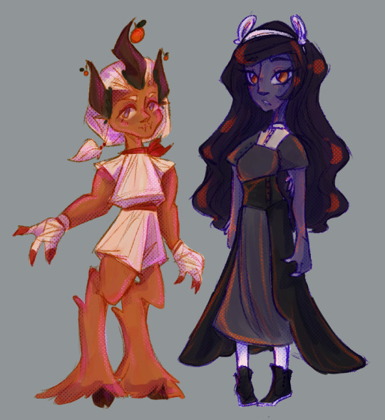
ik i said i'd upload the designs for opal+ame+rosa next but eh. v quick sketch of the girlfriends for now :thumbsup:
#personal projects#my art#oc: calamondin#oc: pearl#these two are... hmm#i'll have to draw the fucking uhhhh. leaders. pillars. whatever the hell i'm calling them#b/c both ame and cala are kinda hard to 100% explain without them#they're like. disciples. understudies... backups? calling them disciples officially but the role is a little... complicated. maybe.#haven't really put it into words so yeah#i'll have to start infodumping here drawing is fan but i want to talk about these guys also!!!#+ yeah i love screentones now. wish i could understand how they work.#but it's fiiiiine#ALSO I JUST HAVE TO SAY pearl's little feather thingies are actual feathers they're not a part of the headband#these design are still in the working things out stage esp pearl but to be completely fair if i only released 100% completed ones#this blog would be empty as hell
5 notes
·
View notes
Text
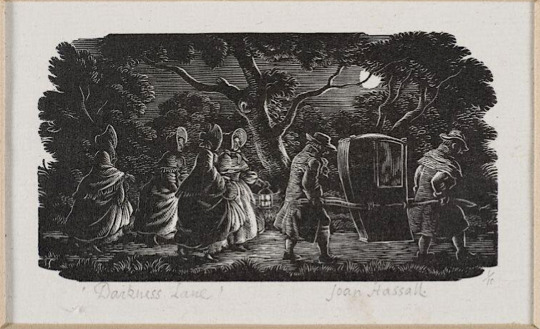
Darkness Lane by Joan Hassall [ x ] - the piece that most inspired my recent woodcut-style piece.
When I found out I was drawing for @gorgeousundertow's regency AU fic, Half Agony, Half Hope, as part of the @ineffableidiotsbigbang, I started looking up Jane Austen novel illustrations for inspiration and ended up finding some really cool art and websites! I'm posting about some of the images and resources I found because I think it may be interesting to others too (and even if it isn't, I'll have gotten the infodump out of my system haha).


Illustrations from Mansfield Park by Joan Hassall [ x ]
The link above points to a gallery on pemberley.com which has deliciously old-school DIY website HTML and a wealth of Jane Austen illustrations, as well as references for regency clothing. This was where I discovered Joan Hassall's work and decided I wanted to do a woodcut style piece (and then subsequently regretted it many times during the process of making it because I had no idea what I was doing). The detail, visual texture and dramatic lighting in her work is so cool and I just got more obsessed the more I saw.
See more Joan Hassall on tumblr via @uwmspeccoll (a very cool account!) here, here, and here.
The gallery on pemberley.com also had a bunch of Charles Edmund Brock illustrations, which I could not get enough of and so returned to the searchpage and found Molland's Circulating-Library. SO COOL! Jane Austen fans have bought illustrated editions of her novels and uploaded scans of them and oh my gosh they are all so beautiful.
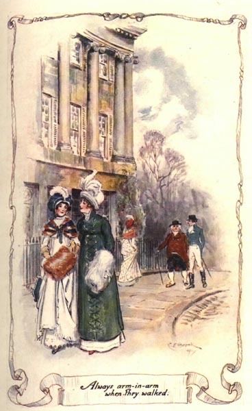
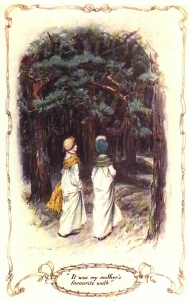
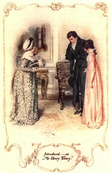
Northanger Abbey watercolour illustrations by C.E. Brock [ x ]
Side note about Henry Tilney (Catherines' love interest in NA), I also came across this old fan page for him from a mostly-broken-links-now site called THE CULT OF DA MAN and um it's great haha, check it out. (reviews of artists representations of him, more delicious HTML, and pixel art (!) of da aforementioned man)
There's also an article on Molland's about Charles and Henry Brock and their Jane Austen works that I found interesting. Charles is better known and did far more JA illustrations, but I do really enjoy Henry's tinted line pieces! (the article also dunks on some bad reproductions of them haha)


Pride & Prejudice tinted line illustrations by H.M. Brock [ x ]
C.E. Brock also did really cool title pages and when I found out that fic banners were a thing I knew what I wanted to do! (with the help of the symmetry tool and undo haha, so much respect for traditional art)


Title pages illustrated by C.E. Brock [ x ] and my banner - the banner design uses elements of both of the Brock images.
So, research in hand/bookmarks folder and banner completed, I decided on a scene from Chapter 10 where our beloveds are standing beside the Thames in the moonlight after walking around London for hours together and talking (CUTE). I wasn't sure what buildings to include in the background, so @gorgeousundertow gave me a few suggestions: Old Southwark Bridge, London Bridge, Southwark Cathedral, and Clink Prison. I realized after a bit of sketching that bridges would be hard to show with the straight-on view I wanted to do, so I decided on the Cathedral, partially because I had also considered drawing a scene that takes place in Salisbury Cathedral in Ch. 7.
OK BUT HOW? I struggled finding reference images for a while until I realized this was LONDON and would be very Google Earth-able. Big ups to Frank Cosgrove, whoever they are, for uploading this haha. This was also where I found out that all the suggestions were from a very small area!


View of Borough High Street, London, 1830, by George Scharf [ x ]
The building in front of the cathedral looked too new, so I went searching for an older image and found the second image. It's a completely different angle but it was enough to get me past the 'oh no idk what do'.
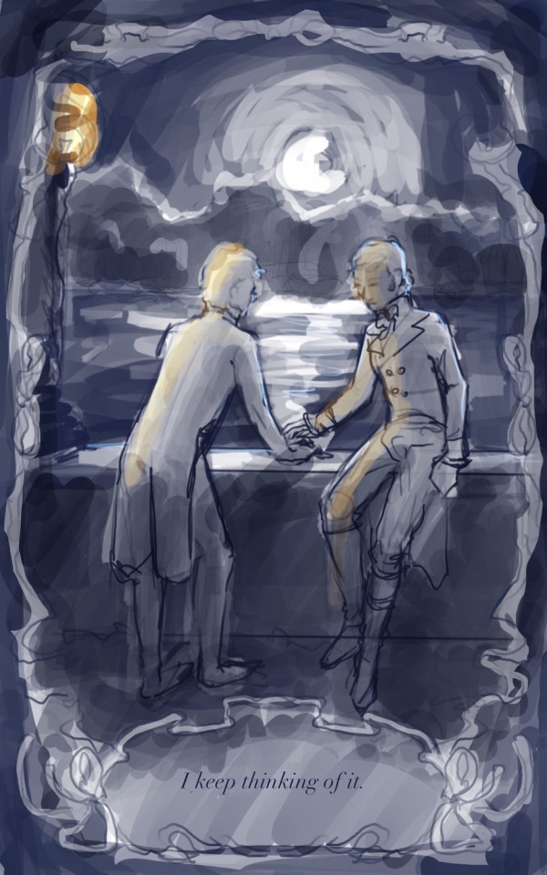

the much brighter concept vs the much darker finished product, featuring a barely-visible Southwark Cathedral
While looking for images of the Thames pre-Google Earth, I also found this website called Dictionary Of Victorian London which has a whole bunch of old images and excerpts from newspapers, etc on a variety of topics. One of the categories, Sex > 'unnatural offences', had this excerpt from The Times (1863), which reads:
Thomas Lane, a coffeehouse keeper, No.9, Love-lane, Eastcheap, city, and James Mortimer, a seaman, were charged with unlawfully meeting each other to commit an unnatural offence. ... The Magistrate committed both prisoners for trial.
Ugh. I hate that so much. Some sexy stuff happens right after the moment I'd chosen, and reading that reminded me that such things would be much more comfortable and safe in darkness (or if ppl just stopped being homophobic, but barring that). I wanted them to feel alone, like the whole world was asleep and it was just them, outside of time.
With that in mind, the iconic Thames Walk Lamp had to go bye bye, and when rendering the background I tried to minimize any light - it's just the suggestion of buildings. I also added tree cover! I tried to imitate how Joan Hassall does trees in some of her artwork, but when she rendered trees like this they were usually farther away/smaller, so my version looks more stylized with how prominent they are.
The ribbon border and book quote presentation is of course more Brock, but by making it black and having the interior image use it as a border instead of a fade-out inside it, I made it a bit of a reference to the very cool foliage edges you see in the very first Hassall image at the top.
I used the procreate brushes from this post on the Procreate Folio forums if anyone wants to try them!
Also fun fact! The font for the quote is called Chanson D'Amour <3 (I initially downloaded it when making the banner before changing the banner font to one called Dark & Black)
------
That's all I have to say about the process for the piece, but here's a comic from Dictionary Of Victorian London, Thames > Sanitary condition that I thought was cute (and gross ig? but also cute):
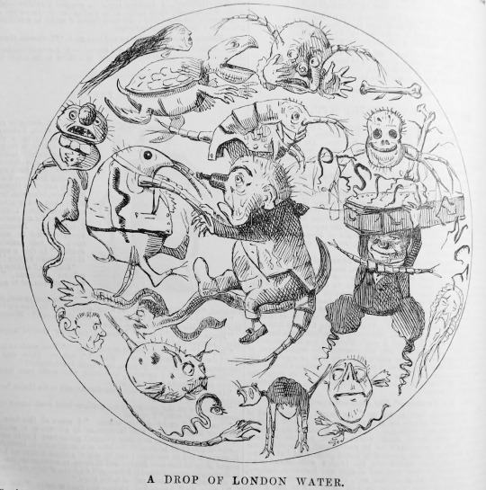
a Punch comic from 1850, I can't link the page due to how the website URL system works but it's from the Thames > Sanitary condition page
#lol anyway back to reading fanfiction from the bang!#joan hassall#charles edmund brock#henry matthew brock#art process#eccles makes#ineffable idiots big bang#jane austen#illustration
19 notes
·
View notes