#i'll do a little writeup on my experiences too!
Explore tagged Tumblr posts
Text
oops, all rpgs! hades has been eliminated because i already did that one
54 notes
·
View notes
Text
My Favorite Cheap Art Trick: Gradient Maps and Blending Modes
i get questions on occasion regarding my coloring process, so i thought i would do a bit of a write up on my "secret technique." i don't think it really is that much of a secret, but i hope it can be helpful to someone. to that end:

this is one of my favorite tags ive ever gotten on my art. i think of it often. the pieces in question are all monochrome - sort of.
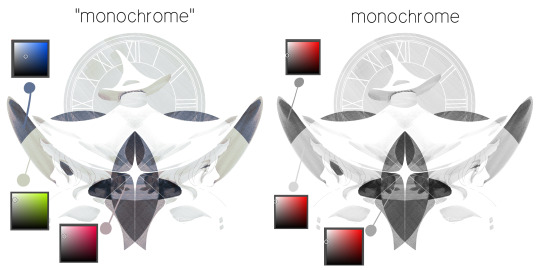
the left version is the final version, the right version is technically the original. in the final version, to me, the blues are pretty stark, while the greens and magentas are less so. there is some color theory thing going on here that i dont have a good cerebral understanding of and i wont pretend otherwise. i think i watched a youtube video on it once but it went in one ear and out the other. i just pick whatever colors look nicest based on whatever vibe im going for.

this one is more subtle, i think. can you tell the difference? there's nothing wrong with 100% greyscale art, but i like the depth that adding just a hint of color can bring.
i'll note that the examples i'll be using in this post all began as purely greyscale, but this is a process i use for just about every piece of art i make, including the full color ones. i'll use the recent mithrun art i made to demonstrate. additionally, i use clip studio paint, but the general concept should be transferable to other art programs.

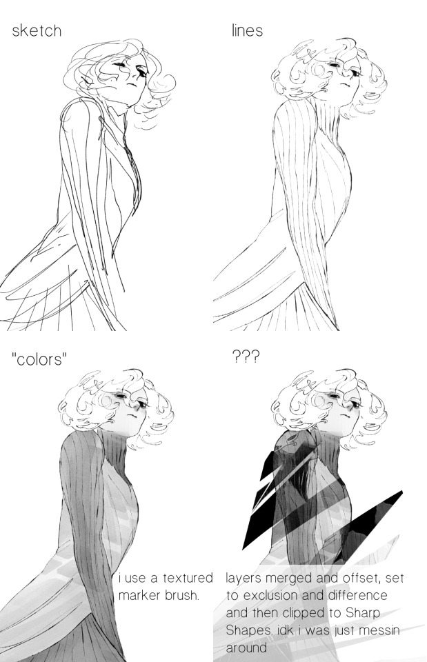
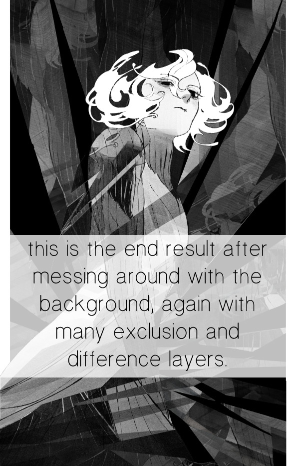
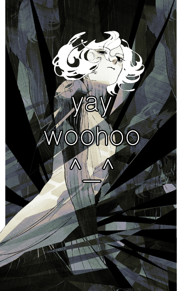
for fun let's just start with Making The Picture. i've been thinking of making this writeup for a while and had it in mind while drawing this piece. beyond that, i didn't really have much of a plan for this outside of "mithrun looks down and hair goes woosh." i also really like all of the vertical lines in the canary uniform so i wanted to include those too but like. gone a little hog wild. that is the extent of my "concept." i do not remember why i had the thought of integrating a shattered mirror type of theme. i think i wanted to distract a bit from the awkward pose and cover it up some LOL but anyway. this lack of planning or thought will come into play later.
note 1: the textured marker brush i specifically use is the "bordered light marker" from daub. it is one of my favorite brushes in the history of forever and the daub mega brush pack is one of the best purchases ive ever made. highly recommend!!!
note 2: "what do you mean by exclusion and difference?" they are layer blending modes and not important to the overall lesson of this post but for transparency i wanted to say how i got these "effects." anyway!
with the background figured out, this is the point at which i generally merge all of my layers, duplicate said merged layer, and Then i begin experimenting with gradient maps. what are gradient maps?
the basic gist is that gradient maps replace the colors of an image based on their value.

so, with this particular gradient map, black will be replaced with that orangey red tone, white will be replaced with the seafoamy green tone, etc. this particular gradient map i'm using as an example is very bright and saturated, but the colors can be literally anything.
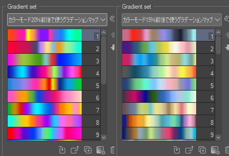
these two sets are the ones i use most. they can be downloaded for free here and here if you have csp. there are many gradient map sets out there. and you can make your own!
you can apply a gradient map directly onto a specific layer in csp by going to edit>tonal correction>gradient map. to apply one indirectly, you can use a correction layer through layer>new correction layer>gradient map. honestly, correction layers are probably the better way to go, because you can adjust your gradient map whenever you want after creating the layer, whereas if you directly apply a gradient map to a layer thats like. it. it's done. if you want to make changes to the applied gradient map, you have to undo it and then reapply it. i don't use correction layers because i am old and stuck in my ways, but it's good to know what your options are.

this is what a correction layer looks like. it sits on top and applies the gradient map to the layers underneath it, so you can also change the layers beneath however and whenever you want. you can adjust the gradient map by double clicking the layer. there are also correction layers for tone curves, brightness/contrast, etc. many such useful things in this program.
let's see how mithrun looks when we apply that first gradient map we looked at.

gadzooks. apologies for eyestrain. we have turned mithrun into a neon hellscape, which might work for some pieces, but not this one. we can fix that by changing the layer blending mode, aka this laundry list of words:

some of them are self explanatory, like darken and lighten, while some of them i genuinely don't understand how they are meant to work and couldn't explain them to you, even if i do use them. i'm sure someone out there has written out an explanation for each and every one of them, but i've learned primarily by clicking on them to see what they do.
for the topic of this post, the blending mode of interest is soft light. so let's take hotline miamithrun and change the layer blending mode to soft light.

here it is at 100% opacity. this is the point at which i'd like to explain why i like using textured brushes so much - it makes it very easy to get subtle color variation when i use this Secret Technique. look at the striation in the upper right background! so tasty. however, to me, these colors are still a bit "much." so let's lower the opacity.
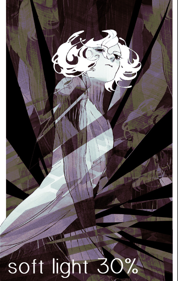
i think thats a lot nicer to look at, personally, but i dont really like these colors together. how about we try some other ones?
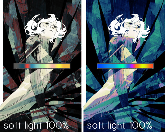
i like both of these a lot more. the palettes give the piece different vibes, at which point i have to ask myself: What Are The Vibes, Actually? well, to be honest i didn't really have a great answer because again, i didn't plan this out very much at all. however. i knew in my heart that there was too much color contrast going on and it was detracting from the two other contrasts in here: the light and dark values and the sharp and soft shapes. i wanted mithrun's head to be the main focal point. for a different illustration, colors like this might work great, but this is not that hypothetical illustration, so let's bring the opacity down again.
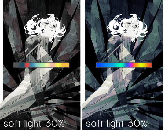
yippee!! that's getting closer to what my heart wants. for fun, let's see what this looks like if we change the blending mode to color.
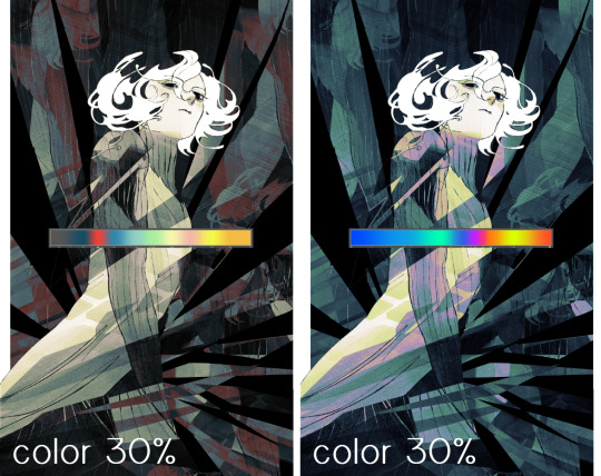
i do like how these look but in the end they do not align with my heart. oh well. fun to experiment with though! good to keep in mind for a different piece, maybe! i often change blending modes just to see what happens, and sometimes it works, sometimes it doesn't. i very much cannot stress enough that much of my artistic process is clicking buttons i only sort of understand. for fun.
i ended up choosing the gradient map on the right because i liked that it was close to the actual canary uniform colors (sorta). it's at an even lower opacity though because there was Still too much color for my dear heart.
the actual process for this looks like me setting my merged layer to soft light at around 20% opacity and then clicking every single gradient map in my collection and seeing which one Works. sometimes i will do this multiple times and have multiple soft light and/or color layers combined.
typically at this point i merge everything again and do minor contrast adjustments using tone curves, which is another tool i find very fun to play around with. then for this piece in particular i did some finishing touches and decided that the white border was distracting so i cropped it. and then it's done!!! yay!!!!!
this process is a very simple and "fast" way to add more depth and visual interest to a piece without being overbearing. well, it's fast if you aren't indecisive like me, or if you are better at planning.

let's do another comparison. personally i feel that the hint of color on the left version makes mithrun look just a bit more unwell (this is a positive thing) and it makes the contrast on his arm a lot more pleasing to look at. someone who understands color theory better than i do might have more to say on the specifics, but that's honestly all i got.
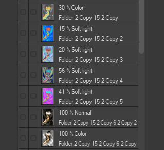
just dont look at my layers too hard. ok?
2K notes
·
View notes
Text
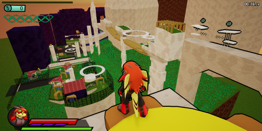
Recent (very helpful) feedback has me questioning what sort of game I am trying to make here, exactly. Sure, it's a story-focused combat platformer, but what sort of user experience do I want? What level of difficulty? Which aspects of gameplay do I prioritize?
Test Build 01 had a problematic difficulty due to its lack of clarity and proper teaching elements to the player, leading things to feel cluttered and confusing. The still-unreleased Test Build 02, meanwhile, was on the course of over-correction. It was streamlining the environment design and making things more clear to players, along with a dedicated tutorial environment to gradually learn character abilities by example. Which are all good things to be clear, but I think I was going a bit far with it.
Thanks to the aforementioned recent feedback, I realized that enemies just letting players run up and destroy them before they can attack wasn't great - even if it was an extremely early level in the game's story. I realized that Atien's movement was way too overpowered and allowed players to easily skip past entire setups and large expanses of terrain unchallenged. Both things I was suspecting and questioning now and then in the back of my mind, but brought more to my immediate attention. This is something I'd like to fix.
Now, I have a lot of big ideas. Revamping more of Atien's abilities further, completely starting the levels over yet again to go more all out with hazards and setpieces, and to be more conscious of things like teaching elements and challenges that escalate in complexity, but I don't want to delay Test Build 02 any further (it's already been a full year since the release of Test Build 01, after all).
Instead, these grand ideas will be noted for future versions, and I will continue to prioritize getting Test Build 02 in a presentable and playable state. However, I did decide to make smaller and quicker tweaks to various mechanics and enemy behaviors to make things a bit less "spineless."
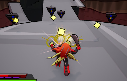
Changes include nerfing Atien's Spiral Dash speed and distance, removing the increase in movement speed gained from sprinting down slopes, and making pretty much every enemy more actively aggressive and interesting to engage with. I believe the changes done so far have already made things much more engaging and fun, even though I am aware there's still a long way to go to make the game truly up to the quality I wish it to be.
Instead of detailing every little change to every enemy in one post, I'm going to leave it at this for now. Maybe in the future I'll do more detailed writeups on a per-enemy basis. Either way, I hope you all enjoy Test Build 02 once it's eventually out!
9 notes
·
View notes
Text
Heya, not sure if you'll read this. But for what it's worth...I totally support those who do write those fics. I tried to state that in my original post, but perhaps it wasn't clear. This post was more me yelling at myself than anything else--in other words, it was my public acknowledgement that my fandom experience today is MY fault for not curating enough and NOT the writer's.
Why did I read a fic in a category I wasn't feeling good enough to read? Because the premise sounded good and by the time I hit the part I wasn't a fan of, I was too invested. I should have stopped reading at that point, and that's exactly what my post talks about me regretting: the fact that I had to finish the fic.
I went back and reread my original post and yes, I could see how it could be read as possibly anti-D/J without context. Sorry about that. Um, for context, I wrote D/J about an hour ago, so I don't think it makes sense to say that I'm against the ship when I jumped into creating content for them just today.
On your other points: I'm well aware I have had more than a few rants about various Stargate-centered topics. I do my very best to make it clear that my rants aren't aimed at anyone who writes or reads that type of fic/enjoys that type of content/etc. However, I also don't think I should muzzle myself just because what I have to say doesn't align with the "100% positive" viewpoint. Giving no space for dislike doesn't align with the concept of fandom inclusivity either. As we say about fic, the most important thing is to clearly tag and signpost, and that's always what I focus on before posting a longer Tumblr writeup, especially one I know isn't for everyone. If there's a better way to do that signposting, I'm open to suggestions.
On the "passive-aggresive bitching": I'll be honest. There was an incident several weeks back that may have pushed me to post passive-aggressive stuff. Had nothing to do with fic, actually--it was the Tumblr gif side of things and had to do with some not-so-nice tags that came across my dash. However, all but one of the things I wrote in response to that incident are still buried in my drafts, so very little of the hurt I felt (and the possible resulting passive aggressiveness) ever saw the light of day.
Hope that clears some things up. At the end of the day, fandom is my fun hobby thing, and I interact with it in a way that is probably not everyone's cup of tea. Pretty sure it comes from being a sports fan--analyzing why things go poorly and break our heart is in our blood. Anyway, I do my best to engage in the "good" fandom practices, but of course that's not always clear and I don't bat 1.000. Again, I'm sorry.
Whoa, you know how some stories just make you fucking HATE Pete?
Yeah.
Stories where Sam stays in an emotionally abusive relationship with Pete and there's a lot of detail paid to what happens between them creep the fuck outta me, personally. Not sure exactly why, but I suppose it's based in the fact that Sam was always my hero in terms of how to be a woman growing up. I hate it.
I have no qualms about a Sam who dates Pete and breaks up with him as soon as he starts trying to change her. And when I'm feeling in a better mood I'll enjoy some of the ones where she sticks around a bit longer too. But today it was very much NOT what I needed.
To be clear, I'm not saying these stories shouldn't exist. They're all good in their own way for different people and different reasons.
I'm just saying that I started one, immediately knew it was not for me today, but also knew the story would keep haunting me until I knew what happened. So I read it and now it's super late and it's still creeping me the fuck out and I didn't even enjoy it, I felt sick the whole time.
Add that to the weird one off D/J S/J fic I wrote 1000 words of by accident and my night is not going well.
Ugh.
Oh and I still can't sleep. Comfort fic, here I come...*prays* please work please work please work
34 notes
·
View notes