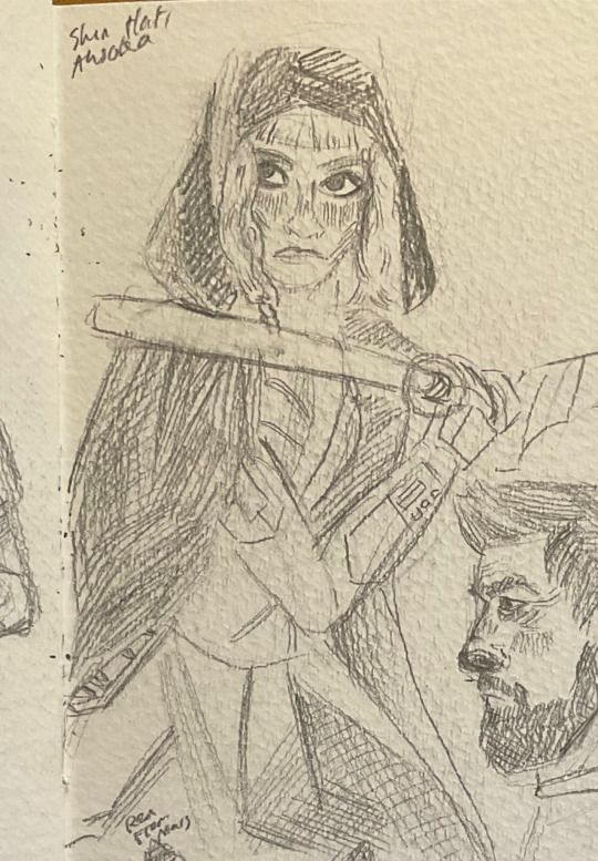
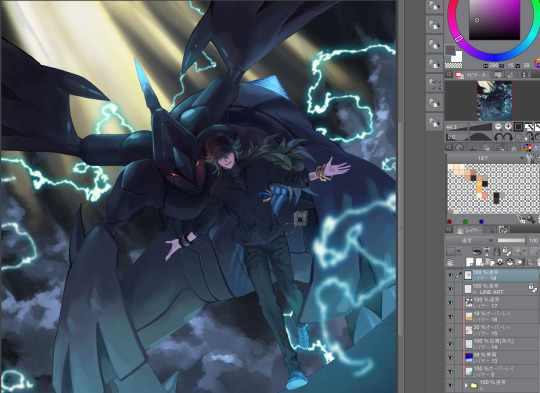
#i was going to colour this but I don't know how so here's the greyscale while I figure it out
Explore tagged Tumblr posts
Visit Tumblr Blog
Explore Tumblr blogs with no restrictions, modern design and the best experience.
Last Seen Tumblr Blogs


Fun Fact
Tumblr has been providing a Korean-language service since 2013.
Text
venus in my eyes..

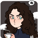
#ensemble stars#enstars#illustration#enstars fanart#takamine midori#Venus in my eyes is crazy#i was going to colour this but I don't know how so here's the greyscale while I figure it out#midori.....#0:44 midori solo changed my life
13 notes
·
View notes
Text
Colours and ISAT (spoilers ahead!)
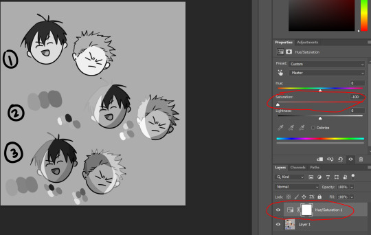
I wanted to talk about colours and In Stars and Time today- I wanted to talk about specifically how colours work in isat and how silly goofy things could look if they could suddenly see colours. Because colour disappearing is something that happened a long time ago, there is a chance that the dye techniques have cahnged. While some things wouldn't change- such as being able to identify snow as white, who's to say the way they make fabrics and threads grey has changed slightly- because if a flower that was previously yellow and a flower that was previously blue separately make the same colour grey thread- who's to say that eventually they're used together to weave a fabric that looks like it's one shade of grey that in fact is patches of blue and yellow together? :)
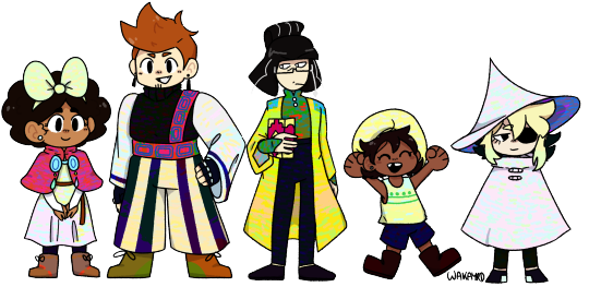
So... I did a little experimenting. lol. Pardon the way everyone is drawn I was rushing so I could get to the fun part (the colouring of the clothes).
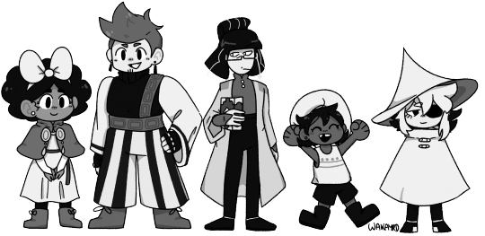
The greyscale version of the drawing is actually just the saturation turned down to 0! I took some liberties (I removed pure black and pure white from the drawing so i could play with the colours more)
If you wanna see more about how I did it (and how you could too) please read more below! teehee :)
So what I did was make a little program. teehee
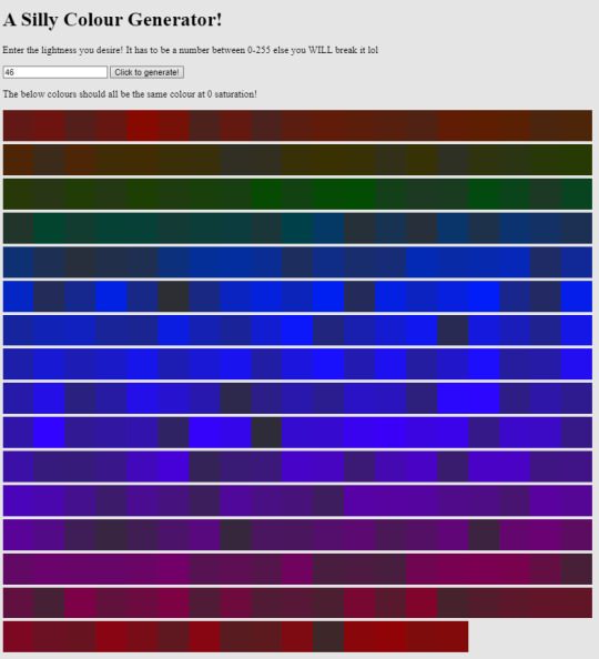
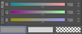
Please don't mind the stylization of it, but basically you put in a number of lightness (0-255) and it creates a bunch of colours that when put at 0 saturation, produces the same grey! basically you just need to know the lightness of the grey you're going for and it should spit out a bunch of colours! You can find this out by changing to RGB and there should be one value in all three lines that are the same: in this case it's 150 and that's what you'd enter into the program!
if you want to see it, it's here! password is: stardust
I had a lot of fun talking about this; it's something that I talked about while i was streaming because I was so excited by the idea. I wonder if anyone else has thought of this!!! teehee :) If you do fiddle with this please let me know it's so fun I'd love to see what you do!
#in stars and time#isat#isat fanart#isat spoilers#in stars and time spoilers#isat siffrin#isat mirabelle#isat isabeau#isat bonnie#isat odile#look im so normal about colours#please i love this topic#siffrin is unintentionally easter coded and I love it#waka art
231 notes
·
View notes
Text

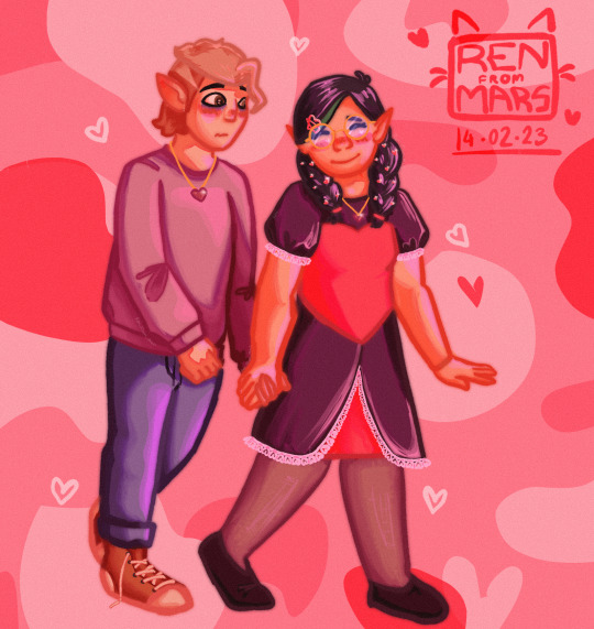
Day 1 — Soulmates ₊˚✧ ゚
Submission for @goldengroovy's @olnfweek2024
MC: Micha
Long ass ramble under the cut 😂
Okayokayokay SO-
I love soulmate au's. I cannot tell you how many fics I've read or how many prompts I've played with or media I've consumed or how many bullshit ideas I've come up with in my own head for them, I CANNOT.
It's just - hhhhhhhhhhhh- Soulmate au's and Time Travel au's are just the shit that gets me out of bed some days 😩💖my world weary soul drinks that shit like medicine, okay?
That all being said, it's probably a little ambiguous which au I picked to some, so let me explain: There are two au's I'm mashing up here really, both are from fics I've read back in the day. One being a Clack fic and the other a Thilbo one 🤷♂️kind of calling myself out here but w/e, they were good fics.

The Thilbo one is easier to explain - the concept is "Heartsong" which is, literally what it says on the tin. You find out who your soulmate is the first time you hear them sing (and no, that does not mean everyone is just a naturally good singer - they can be ass at music but, the point is, when you hear them their song is the perfect song for you and your heart knows that). There's a lot of little nuances to this one - things like you hearing your heartsong when you dream so you always know the moment you find them. Also people who have quiet dreams because their heartsong died, sometimes before ever even meeting them. etc etc. The heartsong also seems to expand, in some respect, to instruments (as Thorin plays his harp one night and Bilbo starts to hum without thinking about it because it sounds wonderful to him and that's how Thorin finds out).
Overall, it's a very soft and sweet concept to me and as someone who has a deep love of music, it's also one of my very favourites.
The Clack one is a little less easy to explain? I think. Maybe because it's nuances are so round about but I'll do my best. The concept for this one is "I Only See Colour When I'm With You" - anyone who knows how Clack fics usually go knows where this is probably headed 😂 and I am sorry to have hurt you but, overall, the idea is: You live in a noir-esqu world where everything is black and white. This only changes when you find your soulmate, of course, who brings the world into full saturation and lets you see colour for - possibly - the first time in your life (I say possibly because I genuinely can't remember if you start out colourblind or if it's an age cap thing).
Unfortunately, for as much as I adore this concept, it's been a long damn time since I read the fic and I don't even know if it still exists somewhere. So I can't actually recall if it was a 'you have to touch them' or 'you have to hear them' thing but the fic takes place with Zack on the cliff right before Midgar where he holds Cloud and looks at the sky - so I'm willing to bet it's a touch thing.
I also really loved this fic because it was the first one I'd read that brought in the concept of multiple soulmates to me - As Cloud later sits with Aerith and sees the colour he couldn't see with Zack, meanwhile Aerith only sees black and white, because she was only able to see colour with Zack (who was never able to see colour with her, because he needed Cloud for that).
Essentially, they all needed each other to see the world in colour. As a polyam person who didn't quite realise I was poly back then, it was a very comforting (and now dearly cherished) fic.
Anyways! Now that you have the background on the two concepts, you can kind of get what I'm going for with this piece.
Tamarack, Micha and Qiu are all soulmates in a fuzzy, desaturated world (I'm sorry, I'm not cruel enough to but them in complete greyscale LOL) and the way you find your soulmate is by hearing them sing and, when they do, your world is suddenly vivid and bright and beautiful. Suddenly, you can see things as they were meant to be seen and it's a permanent change (unlike the Clack fic) but things are always clearest and brightest when your soulmate speaks or sings 💖
I get a real kick out of the idea that Micha's known for fucking months that Tamarack is his soulmate (if not years) because he's always listening to her play but never says jack shit about it because he's emotionally constipated that way 😂Though genuinely, it's probably because he just doesn't think he's her soulmate and he's a bit against finding out he's right honestly.
Joke is on him, he's Qiu's and Tamaracks soulmate! And he couldn't have picked a better moment to grow a pair an take the risk 🥰
#OLNF Week#OLNF Week 2024#olnf#our life now and forever#mc michael#our life#qiu lin#tamarack baumann#olnf qiu#olnf tamarack#soulmate au#au#iwrite art#iwrite rambles
361 notes
·
View notes
Note
Hey there, I adore your art, thank you for sharing it and joining us on tumblr. Your Ghoap art makes me feel so soft.
I am curious about your rendering process. I like how your pieces are textured and coloured and the 3 dimensionality of it, is there a chance you'd be open to sharing some of the steps you take to get from sketch to the finished product? For example what methods (if greyscale, selection tool, etc.) and brushes you use? How you pick your colours?
No pressure in answering this of course, I am just glad to see what you'll be up to in the future.
Hellooooo thank you so much for your kind words!! I've actually been getting so many nice notes from people, I'm so sorry that I haven't responded to them much, I promise I read every single one and shed a little tear of joy at how nice you all are!
Now to the question!!
I made a little step by step image of one of the portraits I posted here for you with a bit of commentary underneath! I'm sorry if it's the ramblings of a mad-woman I'm a bit all over the place sometimes haha (I'm so sorry if there's typos, please ignore them)
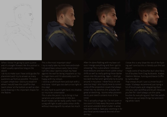
I'll also answer the direct questions here since I don't think I addressed them TOO directly in the image.
Methods: I work with soft brushes and the lasso tool for 90% of my process! I introduce textures as well obviously but I try to let my soft brushes do most of the work. A lot of that 'soft' look people tell me my art has just comes from subtle colour shifts and general softness achieved that way over working with harsher textures. I generally like to limit my layers somewhat, especially with simple pieces like the one above. That image is actually just a single layer after step 2! It helps me not get too stuck on one area but I also just... draw on the wrong layer very frequently even if I name them so I don't use them unless I'm working on pieces with different layers of depth (fore-/mid-/background etc.) I do check my values *constantly* (I use the colour-proof setup in photoshop) but I don't work directly from greyscale. I go straight into colours from the sketch.
How I pick colours: I do try to keep my colour palette cohesive and a bit more neutral to start with. I try to avoid extremes at the start so I'm not locked into that too early since it makes that 'subtlety' harder to achieve otherwise. For those colour shifts I talk about I just pick whatever base colour I put down and then shift the colours accordingly! Brush modes/layer modes can also help but I definitely recommend looking a bit into colour theory before relying on them TOO much! Otherwise using them will also end in strange results. There's no direct 'formula' I use when choosing colours since every light scenario is unique and will affect colours differently. I would definitely recommend James Gurney's book on Colour and Light!
Last but not least! If you're more of a visual learner and my rambling is a bit much in written form (I'm so sorry, I'm very chatty I know) I also have a few painting processes up on YouTube c: So if you want me to shut up and just watch me struggle instead then here's a link to the painting that started it all, the OG ghost soap piece I did over a year and a half ago: https://www.youtube.com/watch?v=D76X0MT4W5U
I hope that all makes sense!! I'm still super new to Tumblr but I'm always happy to ramble on about art so! Thanks for reading my rant haha
#sorry this is long#but#art advice#i guess?#but you do whatever you want#I'm not your dad#answered asks
144 notes
·
View notes
Note
Hi!! I just wanted to say that the way you draw characters/use colors in your art is an absolute dream, I've never seen anything prettier. Do you have a specific way you pick/use colors, or any advice for coloring? You inspire my art so much, and I'd love to learn how to color like you someday :)

@braventheninth gonna reply to both of you here hope that's cool!
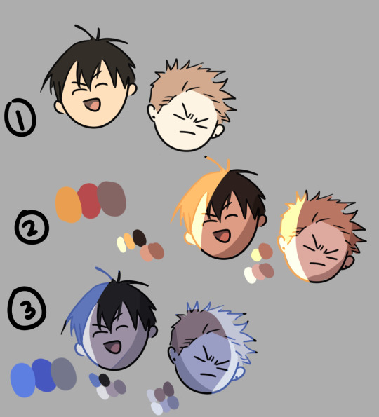
aaaah thank you so much I'm really honoured to hear you both like it and that it inspires you anon !! ;v; I don't actually know much about art theory-wise, aside from very basic colour theory that I always forget so most of my choices are pretty instinctual and based on my own preferences!
i can do my best to explain my thought process though! uuh it is. lots of text though just as a warning.
one thing I tend to do with almost everything is pick what kind of colour mood I'm going for! usually, since I love orange and also warm feelings, I'll aim for some kind of warm tone and when doing that I try to slide every colour I pick towards the warm end of the colour wheel. Blacks and whites are especially good for this! As a general thing I almost fully avoid picking any colours along those edges of the colour picker

instead I'll move all my colour choices a nudge into the square for the colours towards the tone I want (in this case warm) (the white is there be warm too I just forgor to type it).

and since I wanted warm colours for this drawing I desaturated the blue of Brain's pants so it would fit in better. I once heard someone say you should always pick one main colour and saturate fully and the further away from it on the colour wheel you got, the more desaturated your colours should be. I don't really do that bc I like my colours to stay bright but I do keep it in mind to mess around with sometimes.
I'm not always great at keeping this consistent, but I think it usually makes for pretty decent results... Other things I keep in mind are that when I pick the colour for my shadows I always make a little slide on the colour wheel towards the opposite tone of what I based my main colours on. oh and picking the right base colours ?? no clue tbh I always put every colour on it's own layer and then I spend a couple minutes adjusting them all seperately until I feel like they go well enough together. I usually avoid the bottom to right section of the square fully, bc I find they often get oversaturated and muddy, but that's just a personal preference I guess.
also since I enjoy the way coloured lineart works for my stuff I tend to mess around with layer settings for my lineart! usually the end results will look something like this:

where the clipped layer is clipped on to my colours folder. lineart is the only place where I just use plain black since I'm gonna change it with these layer settings later. it often still shows up as black for darker colours (and especially blues?) but it keeps a slightly coloured edge that I enjoy. if the blacks of the end result don't look good, messing around with the layer opacity usually changes stuff up. sometimes I'll also erase part of the lineart from one of the layers as a way to adjust.
I think what might be more relevant though, is the way I've been picking my colours for most of my recent posts though, which is. very differently. and also quite dependant on the fact I've been drawing on Tegaki! Tegaki has a limited colour palette that looks like this

only the 6 colour slots next to the bottom greyscale can be replaced by your own colours. As shown here I only bothered to add something to half of them; mainly the beige-ish colour I like to use for whites, a brown that I never use bc it's ugly with everything else here and a purple? that I only Think I added. both the brown and purple suffer from being too desaturated for the rest of the palette, which makes them stand out in a pretty bad way when used tbh.
I have. absolutely no idea what I'm doing with colours on this site though ngl. I think it just automatically pushes you to be a little more chaotic with the choices? a simple example is the green I picked for Link's tunic here doesn't really have any good, easy choice for shading imo. most of the "darker" green tones just feel more saturated, and it sticks out pretty bad as a shading colour for the more muted green I picked for the tunic. Removing those, the choice was either a mossy green or a blue.

and while the mossy green is still green, it feels far too dark a shading colour compared to what I picked as shading for the rest of the drawing. The blue has the added bonus of being closer to the purple I used for the black-ish parts.
I think my point is that it's really easy to push yourself to make some fun new choices when the tools you're using limit you a bit in a way? Looking at it now, I'm also seeing that the hands were lined with very different colours. I remember just thinking that I couldn't be bothered to find the exact same purple I used for the first hand so I just went with the first thing I landed on, that being a pink. But now I think it works pretty well since the one hand is lifted a bit more into the light and that goes well for a bright colour like pink. happy accidents and all that right ?
I am fully just yapping at this point 🧍 but the point still goes for most things drawn on this site.

like there was no reason to add the blues or reds or pinks to the heather here but I only had so many purple shades to work with. it might be less realistic but I don't think it would've come out as well if I had stuck to only the purple shades from my reference photo.
This ended up way way too long and I have no idea if any of it made sense or was helpful at all, but it was surprisingly fun to reflect on my own choices a bit more! especially since I often just do whatever I feel like I think it's helpful to sit back and consider what instinct actually tells me it's the right thing to do.
in an attempt to do something actually helpful uuh I recommend messing around with 2 specific things and switching around with them a bit; namely limited colour palettes (like 1 or 2 main tones imo) and then just going absolutely ham and just using whatever colour for everything (make them orange! put some blue and purple on the bark! leaves can be blue if they want to! (go more ham than I did tbh))

I think just messing around does so much for making some kind of sense of colours even without Knowing how they work. it's easy to say we should all study, but personally I'm pretty bad at it and it's more fun to just trial and error it... errors do happen a lot though omg do they happen, but that's helpful for figuring stuff out too!
#ask#when I called myself Yappinator 2000 on bsky this is exactly what I meant shfdiuhsdf#feeling a little sick and should've probably slept early instead of figuring this out but it was rly fun and relaxing actully!#considering how bad I've slept recently ending the day with lots of quiet pondering might be just what I need haha#I should probably get the triangle colour wheel so I can lessen all those colours I don't like to use but I'm too used to it being like thi#too tired to have imposter syndrome too tired to overthink whether I make sense. it's quite nice actually#I hope at least some of it will be helpful or fun :)#almost started overthinking anyway I am pulling myself back by the scruff and off to bed#sleep well everyone whenever you do <3#also. totally no secret tegaki agenda here totally 👀 it's totally not like I think everyone should at least try that site haha no waay#it's only full of cool and nice people just like here and you can draw silly comments to each other#and also runs better on chrome than firefox wink wink......... spleepy time..........
26 notes
·
View notes
Note
Not ship chart related but I think your art is so pretty!! Do you have any tips? Especially with coloring if it’s okay <] (/nf)
waah thank you very much! i'll try and explain but here’s my colouring-specific tips, or at least how i choose my colours !! <3
unless for stylistic reasons (e.g. greyscale drawing), i personally avoid pure black, greys and white for colouring. go and choose off-colours instead! for lineart, black is okay but i always go for an actual colour anyways heheh. for the background colour of your canvas, sometimes an actual colour (rather than white or grey) may help you pick your palette to be more harmonised!
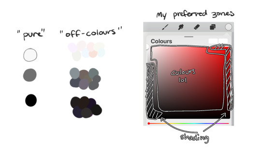
following this, i also don't like using pure/neon for colours (aka the top right corner), unless it's for a certain aesthetic or artstyle (e.g. the character has a "toxic/radioactive" aesthetic; the character is a scenedog (or similiar); or highlights). see below for examples! they may be subtle but sometimes the subtly can make the difference you are looking for, especially if you're looking for a natural look. if you're aiming for the bright/old 2000's artstyle, then pure/neons may be your friend!
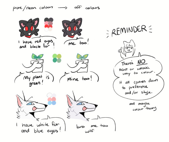
when i'm casually drawing characters (oc or not), i rarely colour-pick from the reference image. i find that when you're "forced to make the palette", it can come out more pleasing to your style/atmosphere of the drawing! it’s more personalised that way... like yea, that’s my favourite versions of those colours! i'm not saying that my colours are better though, only that "hey that's me! in those colours!!" you can have the reference image on the side or go by memory. here’s me doing this with pride flags:
nowadays, when drawing the spooky month characters—who have simple designs god bless—i can just imagine their reference and adjust the colours in my head lol example: if i know that Lila's colour palette is purple, and that her winter sweater is coloured lighter than her hair, then i can just go ahead and pick whatever shade i want following that rule!
(of course, always double check with the actual reference for physical design inaccuracies and skin tone if it applies. my advice above is just for general hair/clothing colours! …because yknow you don't want to accidentally whitewash a character's skin in the name of aesthetics lol. if you’re unsure and want to be on the careful side, please do colour pick the skin at least !!)
moving on... gradient maps and certain blending modes (like exclusion, luminosity and darken) can be a game changer too. for normal drawings (e.g. drawings with no environment), i use darken the most because it changes a few colours rather than the entire piece... (the percentages are opacity levels!)

oh and as a really basic shading tip without using blending modes: sometimes, you just gotta go for grey. shading a warmer colour? use grey to make a cool tone. shading a cool colour? use grey to make a warm tone. not all the time (because you don’t wanna make your shading seem muddy), just sometimes…
and that's that! there's always exceptions to rules and often times, your headshot doodle ends up as one big experimental mess (in a fun way, hopefully)!
this is how i choose my colours though most of the time, it is just me going “good enough”
i think we're pretty similar on how we like warm colours! i enjoy going the simple/lazy route and avoid blend modes but then again, shading is a whole different thing…
hope this helps in any way !! <:3 !!! <3
#if anyone wants to ask for specific tips i’m happy to share!#if i have any lol#[ the askbox mourns ]#[ the art of mourning ]#[ mourn's mourns ]#anyways yea i kinda do just imagine the spooky month characters with a light orange multiply layer and then try to replicate it irl#my personal/lazy rule is that if it looks good faraway its good enough AHAHA#spooky month lila#spooky month jaune#spooky month rick#spooky month aaron#spooky month#“actuallyyy the 'black cat' is actually dark grey—” SHHHHHH SHUT SHUT IT. SHUTUT !!!!! i need u to see the lineart /silly#[ mourn's resources ]
96 notes
·
View notes
Note
I hope I'm not taking too much creative liberty here by only vaguely relating this question back to the DnD characters, but I am perpetually amazed by your character design abilities and when I was watching your recent DnD-related video I wondered what your process for picking colours was? I struggle to find good colors within a palette, and what shade to assign to each part of the design etc. Usually I end up improvising and it doesn't look very good, but you seem able to do it very well and I was wondering if you had any pointers?
On a slightly more relevant note, I was also wondering if you ever further develop the one-off characters you create just in your own free time?
I'm a fan of monochrome/simplified color palettes so I usually start with a main color and work from there, adding stuff as I go. I don't know how much that helps but that's what I got. Checking values by making your colors all greyscale can help if it feels off.
And I generally haven't really gotten too deep into any of the characters I come up with for videos, but Zephyr's a good character I just kinda came up with and spun an entire narrative out of just because I liked him so much. I gotta use him in something someday, he's my special little guyyyyy
28 notes
·
View notes
Text


I don't really go here (don't have a computer or console to play the game on), but I got curious about this man after seeing him on my dash, and now I can't stop thinking about him. So here's some art I've made of him in-between scrambling to find gameplay videos featuring him and reading everything I can find about him online. (Feat what I imagine my builder would look like if I had the game. Her name is Frida and she's so far only wearing the basic clothes, bcs I'm not sure if I can properly figure out how she would dress unless I played the game. Also, I projected a little of my own trepidations with marriage on her, mostly because I imagine that even with Pen not wanting to be married it might hurt his ego a little for someone to be so happy that marriage with him isn’t on the table.) The text in the first panel in the comic is taken directly from the wiki, (apparently it’s his response when accepting a romantic confession?), but I apologise if he’s ooc in the rest of the comic, I'm still getting a feel for him.
(ID in alt and under cut!)
[ID:
A digital drawing of Pen from My time at Sandrock. It’s shows him shoulder up, from a profile view, a serious expression of his face. He’d shaded in a warm orange with light blue highlights. The background is a greyish green. In the lower right corner is a doodle of a person with long hair, grasping the air infront of them with a comically feral expression and text reading “I’m so normal about him” ending with a smiley face above her head. In the corner is aslo a signature reading “Cookieek”.
The second image is a digitally coloured sketch of Pen from My time at Sandrock. He’s vivible from the hips and up, and from a 3/4 perspective, standing against a gradient background, and smiling at something off screen. He has one hand on his hip and his cape is flowing beside him. He’s cast in warm orange light, with blue shadows. In the bottom of the picture is a signature reading “Cookieek”.
A comic in greyscale, featuring Pen and my builder Frida, a skinny woman with a round face, a scar on the left side of her chin, and light hair pulled up into a messy high ponytail. She’s dressed in the default builder outfit.
The first panel shows Pen looking down at Frida, smiling smugly with his hand under his chin, two stars around his head, and saying: “Very well! I promise you I will not only be the Protector of Sandrock, but the protector of you. Though you must know, I am in strong opposition to this strange concept called "marriage."”. Frida is looking up at him, her back to the viewer.
The second panel shows Frida beaming up at Pen who’s now the one with his back towards the viewer, she’s giving him a thumbs up, while exclaiming: “Then we are on the same page!” with a smiley face at the end. Beside her head is a small “yay!” written above another smiley, but with an open mouth smile. Pen appears to almost freeze up.
The third panel shows Frida walking away from pen with a pep in her step, a big happy smile on her face alongside a blush. “Terrified of marriage” is written above her head, with an arrow pointing to her. Pen is still standing in the same pose as before, but with a baffled expression on his face, and question marks around his head.
The fourth panel focuses in on Pens face, as he lowers his hand, appearing now to be both confused and slightly miffed, question marks still around his head.
The final panel shows Pen striking another confident pose, looking to the side with his fingers grazing his forehead, sparkles around his head. He smiles, and says “Ha! Poor Skinny! So upset, but trying to have good humor about it! I can see through it easily! But good play, good play.” He’s sweating slightly.
In the right lower corner is a signature reading “Cookieek”.
End of ID]
#mtas pen#mtas#fanart#sketches#sketch#this man and Arthur are duking it out in my mindscape for attention rn#not even kidding#I’m still working on the superhero au fic though!
37 notes
·
View notes
Text

"You know, there's more to this than I thought. I was just thinking about the psychological applications of colour, but there's a real science to all this, too." "They used to teach it in art class, when it still existed." "Hm!" "Actually, go back a page? I have a new idea. They have all these wonderful hues on them now, I think that's enough for phase two." "I absolutely agree~ I'll meet you back at the lab."
And as the two Stars continue to make life difficult for the island residents pursue their creativity, Tageta continued to wheel alongside the museum curator.
. . . . .
It's hard enough to navigate a grey city with all your feelings (and even your core beings) all scrambled and assigned to all these different colours.
Let's make it harder!
In an effort to test the limit of how people see themselves in these wonderful new hues, Mimosa and Solaris have decided to duplicate some of you in a different colour palette. So you may find a duplicate of yourself walking around the city, leaving paint splatters just like you! But there's something different about your new double...
...It's entirely made of paint!
Unlike your current selves, these doubles aren't greyscaled or monochromatic. They follow a specific property, both visually and fundamentally, as listed below:
Tint
A tint of a colour means white was added to it to make it lighter. If your double is a Tint of you, it retains your personality, albeit in a lighter tone that isn't as intense as you are. (Pink is a tint of Red)
Shade
A shade of a colour means black was added to make it darker. If your double is a Shade of you, it retains your personality, albeit in a darker tone that makes your double more moody. (Maroon is a shade of Red)
Analogue
Analogous colours are next to each other on the colour wheel. If your double is an Analogue, it will act mostly like you, but as if something in your story changed and you took a bit of a different path. Maybe your Analogue succeeded in a crucial part of your story where you failed, and act a little different for it. Typically, analogous colours create harmony with one another--how you interpret that is up to you. (Orange and Yellow are analogous colours to Red)
Compliment
Complimentary colours are on opposite sides of the colour wheel. If your double is a Compliment, it will act completely different from you in every aspect it can. Complimentary colours typically clash with one another, and your Compliment will oppose you--how you interpret that is up to you. (Green is a complimentary colour to Red)
Here are some guidelines to this new colour challenge:
It is not mandatory to have a double. This is just a fun little extra--you don't have to have one if you don't want to!
Each muse gets only one double, and it cannot be changed once you make a decision. So you won't be able to use a compliment AND a shade in different threads--you'll have to be consistent!
Every double is made entirely of paint, including their clothes and weapons. They are semi-solid and keep their shape, but are fluid enough to stretch and melt into different areas. They cannot outright transform, but can fit into tight spaces or containers if need be.
Your muse is still under the effect of the Colour Theory, meaning if your double splashes a certain colour paint on you, your personality will change accordingly! You might want to bring an umbrella.
Your double cannot actually use your powers and abilities. Any powers or abilities that have a visual or physical effect will instead be... made of paint. So if you can throw a fireball, your double will also throw a paintball that looks like your fireball. It's very messy, but harmless. If your muse has an ability that has no physical component, like mind control, your double cannot use it--it simply won't have any effect.
If you feel that it's necessary, you can destroy your double by using any technique that would get rid of paint--soap, water, turpentine, etc. You could also burn or freeze them, or find something to absorb them with. Needless to say, stabbing a paint blob wouldn't be very effective... but a garden hose would.
Your double might think it's the real thing. Or it might be aware it's a fake. It depends on how you want to play.
If you have any questions, please feel free to ask the Masterlist!
10 notes
·
View notes
Note
Question, how are you so good at art? I mean, it’s all subjective really but your specific art and colour combinations really tickle that itch in my autistic brain.
I've been drawing since I have memory. One of my earliest memory was at maybe 5, drawing Spyro. I started drawing gems at 15 maybe? A lot of the gemsonas from that era are lost to time, but I do remember they were requests (wow, me doing free art? Unheard of!).
Started taking art more seriously when I started this blog, at 2019. I have no job and by the time I was dealing with some serious depresssion shit so when I was sad I took drawing as a therapy. I drew a lot. So I still draw a lot since it's what I'm used to do or else it feels weird haha. I can guarantee your skills will improve on a speed demon level if you have no job and aren't the type of person that likes going outside.
Now more seriously, between 2019 and 2024 a lot of time happens. Art takes a while and one can get mentally burn, so while my hands rest, I can take my time to improve and get stronger. Mindlessly drawing can make lineart and coloring faster but designing can get weirder in the sense of not knowing what to do and just overcomplicating things. Here's my favourite example, good 'ol Blizzard! And I'm still not happy with the damn thing! Art can be personal, art can be a challenge, art can be fun, depends on how you take it. All you have to do is not to give up.


Art feels like a beast to dominate, you need to understand it to break it (I say this as a self-taught artist). No one, and I repeat, NO ONE, starts drawing good. If you don't draw good at the first time, don't give up. You don't like it? Too bad! Art is subjective and just because you don't like it, it doesn't mean someone else won't either. You don't like it because you saw the full progress, of course it doesn't surprise you. But it can surprise someone else!


This drawing right here is the FIRST digital drawing I made (I already drew a lot of paper, I'm sure you can tell haha). I used no layers because I had no idea they existed. Same gang ages later. And they still need to be updated!
Art is constant practice. A commission? Oops, it's actually practice regardless of how serious it is because in the future you will get better, you just have to not give up.
About the whole colouring part, I usually don't overthink it much. If it fits, it sits. BUT I do put it to a test. Does it have a lot of neon colours? Does it look cool? Then I have a problem because if I put that to greyscale and I can't see any difference because it all becomes a grey mass that's an issue. That and limiting the palette, depending on the character's complexity.
Per example when I draw on my art-style (hiii new followers who don't know my art style), I have to play with greyscales a lot to make sure all details can be seen.

I'm sure you get the point by now. I really want to do a video someday reacting to my pile of sketchbooks full of old drawings and do more lessons and all that stuff haha. It's not just about "drawing a lot since old age", that's boogus. It's more about "drawing a lot, having patience, learning from mistakes, research about art and keep drawing".
I'm sure I missed a bunch of things to say, hope that helps anyway! ^^
8 notes
·
View notes
Text
gif tutorial: selective colouring
turning this gif
into this gif

(requested by @oogelyboogely)
quick disclaimer: i'm mostly self taught, so a lot of the methods i use might not be the most efficient or the ones that other people use, so apologies about that!!
with this tutorial, i'm assuming you know the basics of how to make a gif (loading in frames, turning them into animation frames, etc), but if need be, i would be more than happy to make a tutorial on that too
i use photopea, a browser-based photoshop replica that's free to use and i highly recommend it!
first step is loading in all the frames, which should look like this:

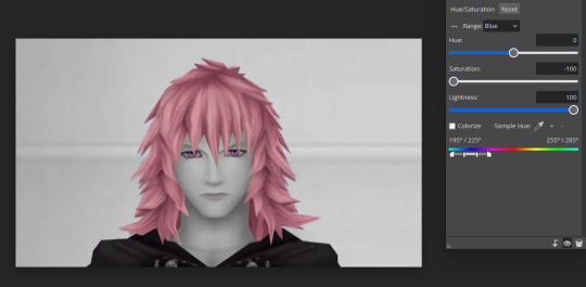
the main thing i want to be in colour is his hair (and the petals that fly around him when he unhoods, same colour so it shouldn't be too much of an issue to deal with). however! for this particular gif, i want his eyes to also be the same/similar shade of pink so they're also in colour.
for this i'm gonna go to the top bar and go to layer > new adjustment layer > hue/saturation > blue, which should give you an adjustment layer that looks like this

if i move this around, this is also gonna change the background very slightly, which we don't want, and it won't change the colour of his eyes very much.

in order to change just the blue of his eyes, i need to adjust the slider at the very bottom. this shows the spectrum of the colours selected and the colours it's changing. if you're testing this, i would say change the hue to 180, then mess around with the adjustments until you've found a setting that only changes the selected hue

this seems to work well for this, so im gonna keep this adjustment layer specifically for changing the eye colour and move onto another
everything i want to be in a specific colour is now in that colour, so i'm gonna move onto working on making everything else in greyscale. it's exactly the same process (using a hue/saturation adjustment layer), but you're altering saturation to -100 (making other colours grey), and changing lightness (which colours you want to be a lighter shade of grey in the greyscale)
this gif in particular shows a specific problem i have with doing this: red and red-adjacent tones with selective colouring. many skintones fall under red hues when altering them, so when trying to isolate a red colour, it can get a bit finnicky. the spectrum slider tends to get very precise with the hue/saturation adjustment layer.

shown here, i'm using a new adjustment layer and going for the red to try and desaturate the skin tone, and you can see it's desaturated the hair too, so i need to adjust the spectrum so it only gets the skin tone (while i'm doing this, i'm also going back to check on the first frames where the petals are to make sure they're not affected by this since i want them in colour too!)


next up is the back wall which is a blue tint (as exampled with changing the blue setting with the first adjustment layer, we can now use the blue adjustment on the second adjustment layer freely since it won't affect the eye colour anymore)
while doing this, it's important to go over all the frames occassionally, especially with scenes that have a lot of varied colours, because a lot of the time, some layers may have stray areas of colour that fit into what is still allowed to be in colour, in which case a 'replace colour' adjustment layer (layer > new adjustment layer > replace colour) should be used to try and get out specific shades you don't want to be in colour. it's not an issue in this gif, but in cases where it is, those adjustment layers can pile up, but that's natural! (it can also be used in cases where you're close to greyscale but not quite there, just eyedrop the colour and set saturation all the way down)
after this, i'm just gonna do some adjustment layers to alter lighting to make sure the colours are balanced well (curves, levels, brightness/contrast, etc), and it should be done from there!
remember to save psd files regularly so you have backups of your work in case anything happens! hope this was helpful and if you'd like me to elaborate on anything, please ask!
examples of some of my gifs with this effect include: this, this, and this
#gif tutorial#i have no idea what else to tag so i'm just gonna tag that#alt text has been added to each photo for clarity as well#to the person tagged/who requested the tutorial: i hope this was helpful!!#i've never really done a tutorial before but this was fun!!#also sorry for the shit compression on the gifs they were a bit rushed fdkhdfkjh
19 notes
·
View notes
Text
Kingohger ep15
starting this one early coz ritamoru ig live after this
eh we still don't get a film preview yet
i'm so nervous lol
from the preview images it looks like the team will split in two with the Colours rescuing Suzume and the Greyscales on negotiations
even their fortune stick is bee theme
woah the expressions change!!
guess i shouldn't be surprised by Kuroda dropping in to hand him his phone but this does nothing to clear up that fanart of Kaguragi making a "old man squint at phone" face when Yanma tried to teach him how to use a smartphone
Kaguragi ringtone !
you kings like to talk hand free so much lol
WAIT that's a video call Racles can't use smartphones booooooo
ehh throne shot?! (bet it's before they got dragged into whatever the colours are up to)
lol Jeremy in takuan land
Shutup prima you know how hard your sausages are to find
Soy rice ah soy rice ah Kagu 😏
"his only sister"… so no more dybowskii siblings :(((((
he overthrew the last king because he was taking all the food for himself?????! 🤩
YOOOOOOO practically going as everyone thought
is Rita a screenshot again
sickling! I was right... or am I?
(waiting for "2m Suzume" if even tv asahi made fun of it)
alright i get it Gira is basically living with Yanma for now huh
Jeremy outright told them!! Good boy!!
BETROTHED BETHROTHED BETROTHED!!
Yanma 'translating' Gira's evil plans 👌 one of us Himeno
"let's steal the bride!!!" Gira… (tired kogane voice)
Rita's here to provide illegal advice 👌
I feel like Rita would gladly ignore their illegal activities if they hadn't heard anything but they DID and it's WRONG to lie so now they have to be there to hold the brain cell
i'm so here for Suzume outplotting those two
one second makeup on
omg
(sound of Tools and Farming Tools shattering)
okay 16 rita is rising if Suzume is not leaving
PLS give us more political intrigue 🙏
ah Her Majesty's new earrings
Gorokke nei dou yau gum yat lah 😏
(rewind) hmm Suzume's performance really has that naivete… makes speculating her age even harder
I'm so here for Kaugracles fic after this developlment
or see how canon goes if Racles was 竹馬 with Betaria
Kaguragi's speech and determined look… So-san's acting 🙇
Gira making sentai history again transforming fetal position
yeah 16 is definitely Rita + team esp. director changes at 17
King Kong reference?
Moffun Ep 2 TODAY??!??
ugh heartbreaks at Kaguragia's face
YES HIMESAMA PLEASE KICK RACLES' ASS thank you for sticking to the Suzume hachi motif of taking over others' territory!
禍國殃民嘅女人…ありがたい…
<LIVEBLOG SIGNAL LOST>
production notes: Director purposefully look for designs from students + wait five weeks for Gokkan lah (more later)
cast blog: ahh a wild yuzuki appears! Team Wings... my team wings...

+ Morphonia is a pro in helping me close the zipper before filming. Somehow that's not easy so thank you for always helping!
Ritamoru real
SPOILER
Gokkan had a royal family???!!? Everything Rita is RITA and not GOKKAN KING??!!(😍😍)Morphonia is the last princess!! Rita as Morphonia's Knight😭😭 Ritahime next ep Himeno bringing Rita a Moffun gift😭😭 Ritamoru Ritahime can be so real
---
tangent: seeing the Tools actually broke Toei's servers trying to order Racles's acrylic stand, very admirable
9 notes
·
View notes
Text
I’ve been doing some reflecting on this past year, and I really truly think it is the most artistic improvement I have made in any span of time. Of course, I’m going to be completely insufferable about it and have collected my best piece from each month with a few personal notes, so why don’t we go on a sprint down memory highway together?
January
At the start of the year, I was both adrift between fandoms and art styles. I was mostly aiming to find which style I could keep using, finish pieces quickly yet still feel proud of. It certainly worked in the moment, but as I pushed my boundaries more it didn't stick. Still, I look back on this style fondly! also proper throwback to my old username that i had for far too long
February
This was the start of me working on colour palettes. I lay down my main colour in the background and fit the rest of my colours around that. It was a good way to start experimenting!
March
Then the shift back to finding my style- I particularly like how the hair turned out in this piece! I also started trying more interesting poses here, and actually properly attempting hands.
April
I didn't finish any pieces in april as I had started working more hours and didn't quite know how to balance myself creatively at that point. I did lean into this style of sketch much more, which was good fun while it stuck around but ive leant away from it in more recent times.
May
Not much to say about may in particular, lots of the same things as the past few months with improvements here and there! just some steady progress :)
June
Cue the crunch of getting character refs done before artfight, and then only actually finishing one (which isn't actually complete, even to this day). But hey, more solid reference for My Guy ! I also leaned into drawing furries a lot more and have improved heaps in the difference of proportions!
July
artfight baybee!! no artistic differences, but it was a lot of fun scouting out other peoples character designs! I do hope to participate more this year :3
August
back to colours, though this month felt like a bit of a backtrack. Don't get me wrong, I do quite like this piece, but contrast-wise it doesn't have as much visual clarity as I would like. Regardless, a good learning opportunity!
September
Fun fact, I rendered this one entirely in greyscale! This was the start of me getting back into hatchetfield after being reminded of NPMDs release, and lets be real this part of black friday was chilling so I had to do something about it! I consider this piece a landmark in terms of my art journey.
October
Once again no real finished pieces, I was too busy watching nightmare time while waiting for the group watch of npmd. I did do a lot of studies of star wars characters from their live-action shows though, which was a fun learning experience!
November
This was the piece where I applied pretty much everything I had learnt throughout the year. contrast, colour themes, interactive environments and poses, the lot! and also. its them. how could i not
December
A perfect piece to wrap up the year with! Another step up from november, this applied lots of what I had learnt and pushed my boundaries even more. I have been aiming for more realism to actor's faces and body types, not out of it-has-to-be-canon-sake, but rather learning how to accurately depict someone's likeness from a few photo references. good practice for both live-action and animated characters!
Overall last year was absolutely wild. I can't wait to share my journey with you all as we go into 2024 strong!
#art#my art#art journey#art progress#the owl house#nerdy prudes must die#black friday#hatchetfield#artfight#fnaf sb#furry#oc art
6 notes
·
View notes
Text
Creative Idea of the Day - June 2024
Every day on my Idealog account on Bluesky, I share a quick creative idea - unlike the more lengthy ones I share here. And because I like to archive things all in one place, here's June 2024's collection.
06 - Lists are the easiest thing there is, so get you a new (or old) notebook or do it digitally, and make a list (and keep it going) of things to be happy about - things, people, movies, quotations, a moment of peace, a good sneeze. All of it!
Here's mine:

07 - Watch the first TED talk you find on ted.com that starts with the first letter of your first name. Apparently, mine's going to be "Let your garden grow wild". I note that I don't have a garden.
08 - Experiment with calligraphy or hand lettering.
09 - Sculpt a small object using clay, play dough, or plasticine. There are multiple recipes online to make your own, which means you get to decide your own colours. My grandmother used to make me pastel colours.
10 - Fill a page with small circles and colour them in. You could even use dice, or another counting method, to gamify how - and with what colours - you colour them.
11 - Create a piece using only primary colours. RGB or CMY.
12 - Write a short story exactly as many words long as how old you are in years.
13 - Create a photo essay or photo scavenger hunt.
14 - Create some puppets or paper dolls.
15 - Go outside and photograph the first thing you see that's your favourite colour.
If you can't go out, try to spot something from your window that's that colour.
If you can't spot anything, write the silliest thing involving that colour that you know.
16 - Using any means you like - still life, words, photographic, music - illustrate something from a dream.
17 - Draw a continuous line without lifting your pen.
18 - Make a list of words to look up in other languages.
19 - Monochrome study - black and white, greyscale, sepia, or any monochrome you like, in any medium you like. Even text.
20 - Make an apocalist (or bucket list).
21 - Create a portrait using only words and text.
22 - Write song lyrics or poems based on a set of randomly generated words. Any LLM or AI can do that, or you could ask some folks to pitch in words, or you could hit up random pages in a dictionary or other book.
23 - Each Saturday I post a longer or more detailed creative idea on my blog - most under the tag inkspiration, some under adventures, and some under per diem.
24 - Get a stack of books, any books you have, and stack them such that the titles on the spines create a verse from the top down. Any kind of verse you like.
Here's one from my comfy chair-side TBR pile:

25 - Try a sensory experience.
26 - Make a list (and find or create the images if you want) of things that would be great album/book covers.
27 - Find a way to gamify your movie-watching experience to help you choose a new movie to watch each week. If it's a foreign (to you) film, try a food from that country for your movie snack.
28 - Make a list of rainy day ideas.
29 - Create a map of your neighbourhood.
30 - Turn old fabric scraps into stuffed animals, pillows, or patchwork quilts. If you can't, put the scraps into frames to make some wall art, or to use as backgrounds for framed photographs.
0 notes
Text
Crime O'clock - Demo Review
After a lovely day, I was having a terrible evening thanks to a letter from my local city council. I decided to sit down and play the Crime O'clock demo cause it seemed like it would lift my spirits. I think this game was a recommendation from Payton's Corner?? I'd have to go through my youtube and check. I'm pretty sure it was a rec though, as this is not the kind of game I would usually demo. It's marked as a hidden object and time travel game and I would not have looked twice at it if it wasn't recommended. But oh my goodness, I had so much fun and I absolutely adored it.

So the premise of the game is that there exist a True Timeline and occasionally, people try to disrupt this timeline through crime. As a time detective, your job is to solve these crimes in order to preserve the True Timeline. In the game, some mysterious force seems to be trying to disrupt the timeline by doing a lot of little crimes over a spread of time as opposed to one big crime. You have to figure out who they are, foil their plans and save the time as we know it. The demo only scratched the surface of the plot but it explained it very well in the short time and leaves you excited for more. Now, onto my thoughts.
First of all, I want to point out that this is a genuinely unique premise, like I've heard of nothing else like it. I feel like sometimes in gaming (in everything really), things are starting to feel more and more like a rift off an existing idea as opposed to something new and fresh. Crime O'clock is a true one of a kind story that feels like it's breathing a breath of fresh air into my gaming catalogue(or more realistically, my wishlist).
On the technical side, the music was fun and upbeat and matched the mood of the game well. The graphics were very pretty, despite being mostly in greyscale, and the points that used colour were so distinct that it almost feels like each colour palette is distinctly for a certain part of the game. Mechanically, it was a point and click game, so not much there to mess up I don't think.
The actual game is excellent. In the game, you work with your AI, EVE, who helps you, provides guidance, tools, and if you ask, hints. The dialogue from EVE is funny (in my opinion at least) and is a perfect balance of informative and entertaining. The plot is fun and makes you think but it isn't overwhelming. The setting is so out there, and combined with the cute art, animal characters, and combination of past & present with outrageous technology like teleportation portals (yes it sounds wild, but it fits so well), it all makes it just silly enough that you don't take it too serious and use too many braincells.
The puzzles aren't easy but they aren't overly complex. I only had to use the hint system once and there's no punishment for using a hint. Despite it technically being a hidden object game, it didn't feel like one as I was playing, mostly because it's so unlike any hidden object game I've played before.
I feel like, the length of this review tells you how much I loved this game and this was only the demo. I will definitely get this game once my employment status has been sorted. I feel like the last couple of demo reviews I posted have been "will buy when I have money" like Another Code and Wylde Flowers but that's mainly cause they've been the ones that excite me enough that I have the energy to write a review. I am working on a post called "Games I demoed and did not like" that's currently 6 games and counting, so it's not all 5 stars over here, that's just what excited me right now.
Overall, I definitely recommend this game to anyone who likes puzzle-ly or detective cosy games and is looking for something new.
Final Rating: ⭐⭐⭐⭐⭐
~Eli
Ace of All Trades, Pro at None😆
#ace of all trades#hobby blog#hobbies#pc games#video game#video games#games#gaming#puzzle games#videogame#cosy gaming#cozy gaming#crime oclock#paytonscorner recs#paytons corner rec#rec#highly recommend#game reccs#game recommendations#game review#game recs#demo review#game demo#demo#detective game#hidden object game
0 notes
Note
Hello! I hope you're having a great day! If its not too much trouble to ask you, would you be able to explain how you choose your colours? I always choose too vibrant colours or the tones don't mix well, I'm not too great at picking colours and was hoping you could explain how you usually do it so I could take inspiration if that's alright? :) <3
Thank you for your time
Here's an easy way you can choose colors! All have the same base color as #1.
You can clip layers on top of your base colors and adjust colors there based on the scenery you're going for with layer properties (Multiply, Overlay, Addition, Difference, etc.)

You can color pick from above the layers and get your color palette from there~ When I'm painting 1 picture I flatten the base or group them as above, then put the "editing"/adjustment layers as clipping layer to adjust the colors then paint over the top in 1 layer (for me it's easier than having to look for what layer is what). I paint below the line art first then later I'll paint above the layer to adjust some things than editing the line art haha (^^;;; ). I don't know if it's the best way but that's how I do it for single arts.
(More under the cut with pictures)


The "N" layer is just the layer with the base color of the person and the Pokemon and the Pokemon's line art.

I was looking for 19 Days arts to use as an example but a lot of them have already been flattened so I can't show you anymore so forgive me for the old Pokemon art m(_ _)m I wanna adjust some colors here but o<-< it’s just an example please forgive me o<-<
This way the color palette is already made so you can go ham on the shading via color picking in the layer above all the adjustment layers.
If you’re having troubles with choosing “too vibrant” colors, it is helpful to look at your picture in greyscale so you can adjust the level accordingly. If it’s in greyscale, you’ll be able to see which areas are too bright, too dark, too dull etc.
You can easily do it in Photoshop, but if you’re using Clip Studio like me, you can try to do this in Layer Properties to turn the base color greyscale. Then you can easily select if off after you’re done checking. I don’t really do it (I should and I might in the future - I just saw the effects recently), but you can try to see if it helps!! (If you have Photoshop then it’s way easier to check)
Clip Studio Paint:

Photoshop:
I hope I made sense Anon (;-; )
When you observe the colors you pick with this, you’ll be able to pick the colors yourself once you decide the background. Once you let go of the general idea of what certain parts should look like, like for example the one with the blue hue. You generally don’t use that blue color on human skin unless you’re going for an alien sort of aesthetic; but if you use it with other colors relative to that hue then it will look natural as a skin color, based on how the other colors translate with that same lighting.
I did it for this one because I did the background first.
455 notes
·
View notes