#i wanna take the fattest bite out of the victorian era mizu fanart so bad it's not even funny
Explore tagged Tumblr posts
Text
What would your art taste like?
Inspired by @solisflowersblog because she asked what her art would taste like and I got to cooking >:)


Explanation under the cut!
Sweet explanation:
Solisflower's art would taste like a raspberry compote custard tart with a dark chocolate crumble on top (couldn't find an image of just a crumble topping so imagine the crumble on the right is on top of the tart on the left)
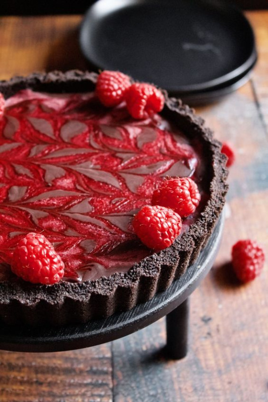
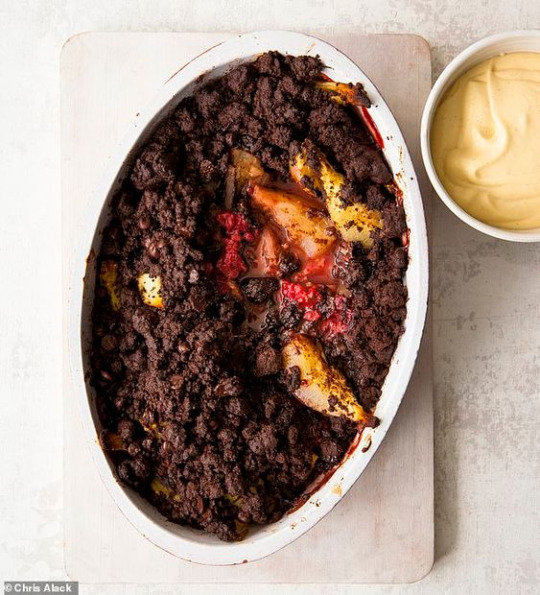
(raspberry tart, chocolate crumble)
Her choice in brush colour influenced the reason why i chose raspberries. It's both sweet and sour, and has a gritty texture from the seeds. Personally, i actually don't like raspberries (texture issues), but i can appreciate the flavour when combined with other fruits or ingredients. Dark chocolate pairs extremely well with raspberries. Its rich and smooth texture beautifully balances out the tart flavours of raspberries, giving the perfect blend of flavours. Dark chocolate also represents Mizu in her artworks. Mizu has rich lore that goes deep, we've barely scratched the surface about her origin story so it felt fitting to include chocolate to describe Mizu.

A custard based tart perfectly describes Solisflower's art with the way she intentionally blocks out certain areas of her pieces with minimal details and colour. The smooth and silky texture of custard best represents this. Though you're not drawn to the custard due to it's simplicity, it holds a lot of weight as it helps deliver the other striking ingredients. This is best shown in the Akemi artwork where she intentionally uses minimal details on the hair and clothes to better direct your attention to her face and hands.
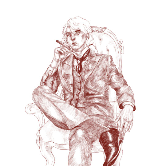
The dark chocolate crumble i mentioned best describes the crosshatching shading style she uses in majority of her art. The sketchy look adds a lot of texture and variation while also making her pieces look visually interesting and crumchy (been snacking on crackers lately and i imagine eating victorian era mizu, as seen above). I really enjoy her use of insane details and basic blocking of shapes to best enhance the subject (mizu) in her pieces.
In conclusion, Solisflower's artworks has a perfect balance of striking and rich flavours, the sourness of raspberries and richness of dark chocolate. The added texture of silky custard and gritty dark chocolate crumble greatly enhances her pieces, with the consistent use of shading and blocking that gives an interesting variation in all her artworks.
Savoury explanation:
On the other hand, her art would taste like a nut (pecan, walnut or pistachios) and herb panko crusted salmon with a creamy lemon sauce. It took me a while to think about what kind of protein best fit Mizu since she's the main subject matter in almost all of Solisflower's artwork. Her art doesn't give off beef vibes, and chicken didn't feel right either. Her art is more delicate, though you could argue that with her style of shading it gives poultry energy, a quail maybe, but i personally think fish best describes the delicate nature of each brushstroke that is laid onto the canvas.
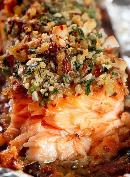
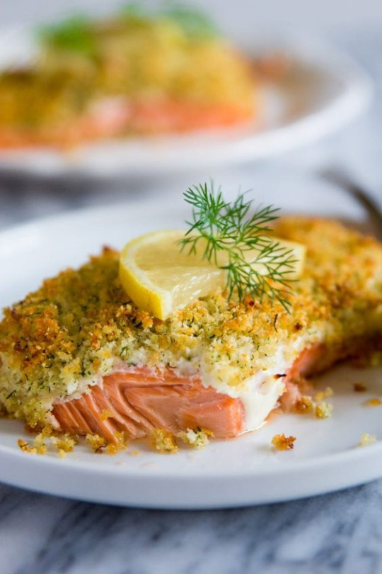
(pecan panko crusted salmon, panko crusted salmon)
Her use of crosshatching for shading greatly reminded me of the flaky layers of fish. The layers and delicate nature of fish represents each singular brushstroke that makes up majority of her pieces which adds lots of texture and variation in her art. The addition of a panko crust is because of the type of brush she uses which adds a lot of grain and a sketchy, almost rustic look. Fish dishes aren't complete without a sauce and a creamy lemon sauce best describes the solid areas of her pieces. It gives the perfect balance and enhances her art in a way that uplifts the important details of her artworks.
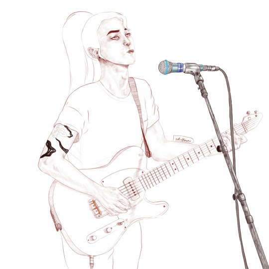
I chose simple flavours to represent Solisflower's artwork. This is because i'm more drawn to her use of texture and minimal colour that she uses in her pieces. Herb and lemon flavour combinations are a good pair that best describes her art as it enhances the flavour of fish (MIzu). In the example of the art above, her subtle use of blue adds a small but striking variation in her piece but it doesn't draw away from the subject itself, but enhances it.
In conclusion, Solisflower's art has the perfect balance of texture that i love so much. I'm such a sucker for sketchy, clean lineart art styles because the variation of line thickness and the grain of the brushes used tickles the right part of my brain. I'd eat her art up like i've been starved for several days. If her art were a restaurant i'd give her 3 Michelin stars <3.
If any artist would like me to compare their art to food, please let me know! I need to do something with my culinary degree once i get it lmfao.
#solisflowerblog#mizu#blue eye samurai#blue eye samurai fanart#what would art taste like#i like comparing art to food#i wish all fanart was edible#i wanna take the fattest bite out of the victorian era mizu fanart so bad it's not even funny
42 notes
·
View notes