#i wanna go with the early 2000's look with her design but i don't have the time to color her xd
Explore tagged Tumblr posts
Note
Ooo we need more fem Lust :33
We need to know each other anyway ;)

"you sure you wanna know me? i can be a little too wild to keep up with sometimes~"
#ask#my art#fem!lust#lust sans#i wanna go with the early 2000's look with her design but i don't have the time to color her xd#one day i'll make a full ref sheet of my girls...one day!!!#glad you guys liked her!! she's so fun and bubbly waaa she'd be so cool as a best friend!!! >:'0 <3333
29 notes
·
View notes
Text
Hi OP, sorry to use your (very very good) artwork as a means to vent, but this is something I've been wanting to get off my chest for a good while.
For those who either need a reminder, don't know, or have genuinely forgotten, here's what Sally's redesign looked like:

A character design featuring the most generic mullet ever, smooth as the brain of the executive that greenlighted this. (Assuming (s)he was even available when the brains were being handed out, of course.) And it's not like "oh, it's just a promo render, the art department probably had more leeway—"


…nah fam, they kept that traincar going to the very end of the run. Which if you're going for a basic, prim and proper, regal-type princess for the hero to go "well, excuuUUuuse me" to, that's fine, I suppose, if a bit insulting, even to the very thing I'm referencing, but for tomboy bisexual disaster Sally Acorn? One of the main characters, no less, originally made to basically outsnark Sonic "I'm so sorry you have nothing better to do in your life" the Hedgehog?
NO. nnNO.
nnnnnnNO!
She looks like a background incidental character that got promoted to the main cast, and even then, that is an outright slur to the formerly incidental characters this franchise gave us. Lemme remind ya'll: Lanolin started out as an incidental character. LANOLIN.
Unironically, post-SGW Sally just feels like what you get off Wish or Temu than the character I remember from the cartoons and comics, and it really does just boil down to that fricking 60s-ahh hairdo. Again, if you wanna do that vibe elsewhere? Cool! Great! Awesome! Amazing! Spectacular! Go for it! But for a main character in a Sonic the Hedgehog spin-off, it makes her feel more like a yet-to-be-revealed twist villain to me than when she was an actual villain.
AND EVEN. THEN.

HOW DOES THIS FEEL MORE FAITHFUL THAN THE ACTUAL NON-ROBOTICIZED VILLAIN VERSION OF HER THAT CAME AFTER THIS?!?!
Tbh, that's why I believe fanart like OP's above has done a much better job presenting post-SGW Sally than the actual comics did. Comics which, mind you at the time, were made largely by passionate fans of the franchise. The writer made a two-dozen chapter fancomic in the early 2000s. One artist did another, arguably more well-known and beloved, fancomic. One artist did artwork for the first mentioned fancomic at one point.
I'm not gonna pretend like this inconsequential thing that happened well over a decade ago in response to a lawsuit is actionable to the creative team behind it (or the heads behind them at the time) in Anno Domini Current Year. I'm stupid, stubborn, emotionally broken, and prone to rants like the one you're reading, but I'm not petty. And that's why I'm honestly glad most of the fandom retroactively decided to make Sally's redesign more in line with her original look, keeping the distinctness that made that original work as well as it did.
But yeah, this rant's been almost a decade in the making. Maybe I am petty. Or maybe I don't want to be anymore.
Up to you. And by a lesser extent, to me.

Both designs are good and valid
772 notes
·
View notes
Note
On the subject of Turning Red
I think the style fits the movie well! I don't give a shit if it has the "bean" mouth, and yeah finding out the director was inspired by the Yamadas like you said I can see it now, but anyway I think the style perfectly encapsulates that feeling of childhood/girlhood and growing up in the early 2000s(which I learned is the time period its set in!!) It's bright and bouncy and while it still has that "detail" Pixars movies have I feel the movie was right to go in that direction
I really wish people would stop parroting that old cal arts argument already, first off John K has no leg to stand on Mr. I wanna take forever and a day to make ONE episode of a cartoon that hasn't even been relevant in 30 years and secondly the guy hasn't had real work in ages, doesn't play well with other professionals and his last endeavor, that short he funded on Kickstarter was full of way to many amateur mistakes a supposed "professional" should know to avoid and was nothing more than a scam
Anonymous asked:
Personally I don't like the "floppy soft" look of "Turning red" and "Luca", because it's just too soft. But I agree, just flipping out because it has that style is just kinda immature? I think they remind me a bit too much of claymation too? Just weird to me.
Let me preface this with the following: if the person who started the current batch of discourse on Twitter surrounding this movie had just said 'this looks ugly' or 'lol, GrubHub', no one would have given a shit.
It's the fact that they also had to toss in 'everyone who worked on this should feel ashamed of themselves' on a platform where animators, indie, corporate, and those trying to get into the industry, are already feeling irritable, belittled, and exhausted that was a case of 'my dude, you are going to end up with a scorched front yard and it is no one's fault but your own.
That being said though? The people who tried to edit tweets to make the OP of the ground-zero tweet look like a pedophile really need to step back and think about what the hell kind of people they are.
Now, as for these asks:
1. I think another thing that people who bring up the CalArts argument, in addition to how much it belittles whatever legitimate points they may be speaking on, is that a lot of John K.'s ire with founding that argument also went towards studios that expected 1-to-1 toyetic character-design/animation (i.e.: Filmation). So it's just a bad take overall; if you want to talk about corporations and studios favoring simplified designs, talk about it!
2. Personally? Me? The core thing that has me going 'Mm... I don't know' isn't even the art style but the way that they're going to present this coming-of-age/girl gets her first period story. Because I'm more than fine with a mainstream animated film doing so, I just can't stand the thought of sitting through 90 minutes of 'these are the worst kind of teenagers and I hope they all get run over by a bus' writing that a lot of coming-of-age stories produced in recent years fall into.
23 notes
·
View notes
Text
Review: Tamayomi
[will contain spoilers]
Lately I have been pretty bored with the recent developments in Daiya no A and Oofuri. New Shonen anime stuff just don't appeal to me, so I bit the bullet and watched Tamayomi for at least one episode a day.

Like me, people would normally think "HOW TF ARE THEY GOING TO PLAY BASEBALL? AREN'T THEY WEARING SHORTS??? IS THIS JUST FANSERVICE?? OMYGOD"
But I did it. I watched the whole thing. 12 episodes.
And I enjoyed it.
THE SETUP/PLOT
pretty standard fare
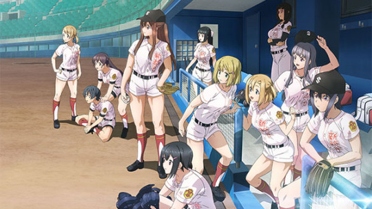
Pitcher Yomi Takeda accidentally reunites with her childhood friend who's actually a nationals-level in middle school catcher when they both end up in the same highschool.
School: former powerhouse located in Saitama, now baseball club is almost non-existent. Yomi and a few other will try to revive the team from scratch.
Basically Shin Koshigaya is a brand new team where they struggle to look for new members and majority are first years.
They have to face other stronger teams even when they have a few members and some decent players.
Demographic is SEINEN (like oofuri, last inning, one outs, etc.)
CHARACTERS

Yomi Takeda as Main character and pitcher- skilled, resilient, funny, hardworking, does a lot of research which enabled her to perfect her form and hone her breaking ball. She keeps improving in a good pace too.
Tamaki Yamazaki former childhood friend of Yomi. Is a decent catcher in middle school. A bit well known. Good communicator.
Yoshino - team manager and coach. srsly she is a boss. She's not infallible but she tries her best.
and other decent players with adequate skill
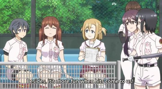
For a sports anime they have decent cast. This is probably the closest we can currently get of a story where the girls are just focused on the sport, do their own strategizing/planning/training. All of them are cute but also serious about what they do.
There's no boys here so there's no talk about het-crushes and other distractions. It's a clamfest babyyyy.
I've seen a little of Major 2 (the one abt the son and his coed team) and I couldn't stand it because it was just slice of life in sportsy undertones.
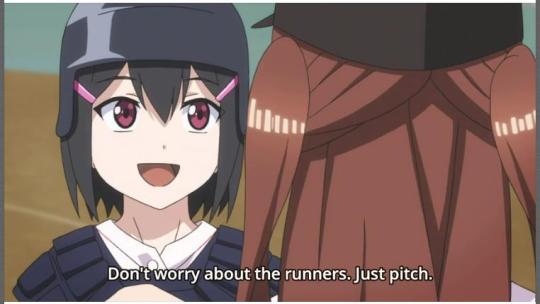
There is also decent communication among all the players. It's pretty refreshing to watch. The catcher is well rounded and the pitcher is good. Everyone talk things out and there is not a lot of drama.
FANSERVICE
Wearing shorts to a sport that involves a lot of making contact with the ground is just illogical lmao.
Their school uniform skirt is pretty short
A little bit of their manager prodding the thighs of each person she meets but with good reason (she can tell how much muscle/exercise a person does just by a little prodding). It's a trope thing.
That's all. There are no panty shots, unnecessary locker room nudity, boob action, see through sweaty shirts. Most of the cringy things I've seen in other girls sports anime aren't present.
Eventually I even forget that they're wearing shorts or that it impedes their performance. It seems like it doesn't matter much to the characters so ¯\_(ツ)_/¯
I don't know if like the hugging or holding hands is considered fanservice. In my experiece we ladies just act like that irl. What they do is nothing out of the ordinary.
REALISM
3/5. They wear shorts and dont tie their hair up. The baseball part seem pretty decent though. The pacing of the story and matches was like watching IRL Koshien. It's all very clinical and straightforward.
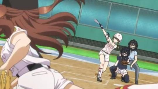
Plus they include a lot of interesting baseball stuff which I haven't seen happen in early stages of other shonen anime like: specifically training the pitcher in other positions, showing what fielders yell to each other, letting other relievers start to reserve their ace (ppl can yell DnA did this but remember Tanba was injury boy throughout Act 1).
COMPARISON TO OTHER BASEBALL MANGA
based on technicality Tamayomi is prolly one of the top among baseball anime/manga I have seen.
Last Inning
Oofuri
Tamayomi
Daiya no A
Now don't chase me with pitchforks because of this ranking just yet. The fact that Shin Koshigaya coach's decisions and reasonings for plays and lineups are discussed makes the show at par with Last Inning and Oofuri. (we dont see DnA kataoka talk abt this sht like..ever)
Moreover Tamayomi has similar vibes to Oofuri/Big Windup but less dramatic. I do not think it's good for beginners too (especially with just 12 episodes). You need to have prior baseball knowledge to understand what the characters were doing.
However, this show is probably the most no-fuss baseball anime/manga I have watched. It does not rely on hype like DnA and it also don't have heavy topics like Oofuri and Last Inning. It's not wacky like One Outs and it's not uber slice of life like Cross Game. It's just baseball.
My minor complaint is that they don't give numbers when talking about things like pitching speed tho. It would've been more realistic if actual numbers were dropped XD
ART/ DESIGN/ANIMATION
A.k.a the thing most viewers complain about.
Character design is subpar. Everyone's faces are almost the same. You can tell who's the character not by face but by hair and height. Personally I don't mind this. I don't really look for realism in most things I watch. And I think the hair designs are cool.

Lots of people drop this show because of bad animation. There are shots/scenes where it's like I'm watching fanmade AMV's in nicovideo/youtube from the early 2000's. Pitching motions and Batting motions look like character movements in rpg games.
It's not really a problem for me though. I think it's charming for some reason. I don't mind it. A lot of people do but I'm not them.
CONCLUSION
NGL I wanted more. 12 episodes is too short. I hope a better animation company picks this up. I'm rewatching the whole thing because I enjoyed it a lot. I'll even check out the manga if I have time.
If anyone's interested here's my tamayomi livetweet thread
This is one of the closest thing I could get to what a decent girl sports anime looks like. If the character designs, art, animation and the uniforms were just better this show would have gone pretty far.
Compared to Shonen types of manga this was relaxing to watch, especially before bed. I'd honestly recommend it you wanna watch smth that doesnt involve a lot of feelings and drama but still feel like watching an actual sport.
Girls are fun. Finally.

[personal notes under the cut]
I get that people reading this would think I'm being too optimistic about a show they considered shtty but I kid you not, I dropped Bakuten (boys gymnastic's anime) coz even with it's wonderful animation i thought it was boring af.
I have dropped so many prettily animated shows coz i just cant get into the characters nor the story.
I've also said before in my Two Car review that I am actively avoiding shows with popular VA's. Idk much abt female VA's in anime, therefore watching Tamayomi was the perfect solution for me.
The reason I like tamayomi so much is that it gave me the same feeling of watching Summer Koshien 2021. I just think an anime that made me remember that kind of feeling was cool.
I'll rewatch hanebado next. wish me luck.
#tamayomi#sports anime#baseball anime#girls sports anime#this is prolly the only positive review abt this anime
45 notes
·
View notes