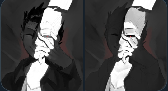
#i usually don't paint in the skin when it's just lineart but i felt like it today.. i personally think it looks good
Explore tagged Tumblr posts
Note
character of your choice from beloved web novel the process of elimination ...?

sara and care.. if there's any character descriptions that negate these designs let's pretend they don't exist for now . because my memory is really bad man
#the process of elimination#tpoe#i usually don't paint in the skin when it's just lineart but i felt like it today.. i personally think it looks good#practice needed but i think i can start risking it with the drawliner#sara morgan#caroline reyes
13 notes
·
View notes
Text
Okay, I don't know what's going on with Tumblr and everything has been absolute chaos with my life the past few months, so y'know what, screw it. I think I'm actually brave enough to share some of my art. At least it won't just be sitting on my tablet that way.
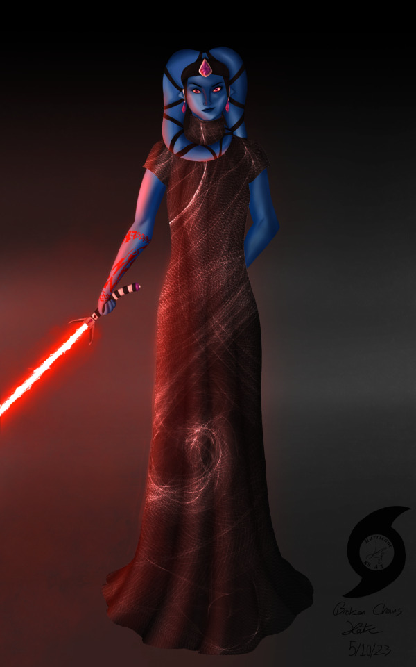
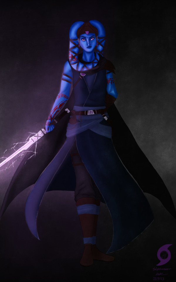
This is my Sith Inquisitor turned Force-sensitive Outcast from SWTOR, Roodaka Greatstorm-Kallig. I haven't really plotted everything out with her regarding her story, but she's not my Outlander. She leaves the Empire right after Ziost, after losing all of the family she'd used her Dark Council connections to find and save from slavery, and Lana recruits her to help Sana-Rae run the Enclave about two years before the Outlander (my Knight Aja Verdona) is rescued. She's prickly and petty and spiteful but I love her dearly. And because I've never posted art before, art process and a little bit of character lore ramble under the cut, I guess?
I usually work with lined art/sketches that are admittedly very messy, but when I did the first one back in May I was experimenting with actually rendering/painting, and I saw a fashion post thing that looked like something Roo would wear, so I was mostly just playing around, it's not a solid outfit design for her. It's janky and wonky and oh Lord please don't look closely at the anatomy or face it is not up to my usual standards, but I was so proud of myself for the lighting on this one, as well as how I managed to render the muscle. Like, the lighting! I have no idea what I'm doing but I think it looks so flipping good! And I was happy with how the crackly lightsaber blade turned out—it is supposed to be Aloysius Kallig's lightsaber, meaning it's at least over a thousand years old, right? It should be a little janky with age!
The second one is supposed to be post Fallen Empire, after she's left the Sith and become sort of a wandering Force-user—think Ahsoka as of, well... Ahsoka, but more on the side of Ventress if she'd survived TCW (don't get me started on that choice 🙄🙄🙄). I came into it knowing a little more of what I was doing, but I kinda got in over my head and gave up on the 100% lineless thing, you can definitely tell with the sword/clothes. 🥴 The second piece has been sitting unfinished in my WIP folder for months, so I just said screw it, finished up some details and called it because I am SO PROUD of her face and hands (I DREW A GOOD HAND WITHOUT LINEART WHO AM I?!?!) and how I rendered her skin, I don't want it to live in WIP purgatory forever. You can actually tell that's muscle! And a neck!
I'm proud of how her tattoos turned out, too. I played around with Cham Syndulla's tattoo pattern, turning it at different angles. It felt like a good way to root her in Twi'lek culture despite the Kallig bloodline having been separated from it for so long. She gets the first one to cover up a slave tattoo, and the rest after Ziost to further reclaim her identity and culture, leaving the Sith behind.
I have no idea how to close this post. Um... thanks for reading all this, if you have? I've never posted art before, I'm kinda terrified. 🤣🤣🤣🤣🤣
#K8's Art#(never thought i'd have the guts to make that tag!)#K8 Rambles about SWTOR#swtor#swtor sith inquisitor#swtor fanart#star wars the old republic#SWTOR OC: Roodaka Greatstorm-Kallig#i am utterly terrified of posting this but if i don't do it i dunno if i ever will#so here we go! deep breaths kate 🤣🤣🤣#edit: i'm gonna pin this at the top rather than that meet the artist because if i look at that self portrait anymore i'm gonna combust 🤣
55 notes
·
View notes
Note
Do you have any tips on how you do shading ?? Your art really inspires me and I literally suck at shading lmao.
hello anon!!! im honoured i can inspire you sdfhkjh it's crazy to me that i can inspire literally anyone :,DDD <33
tbh i do all my shading purely based on vibes/what makes me happy so im not sure im a good advice person but ill show you a breakdown of how i go about shading and hopefully that might help a bit? :o i've left it below the cut because i have too much to say and it ended up being really long LOL
of course if there's anything you want more details on i'm always happy to explain, just let me know!
okay SO ill use this asmo as my example, i think there's enough to talk about here that it should be helpful hopefully
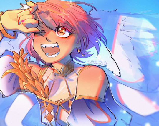
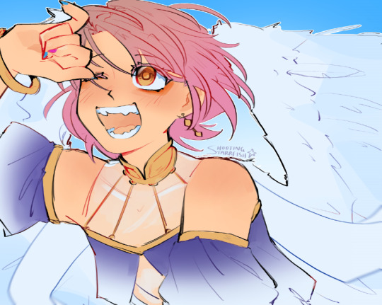
so here's my lineart and flats! i do all my flat colours in one layer because i find it easier to make everything look more cohesive when the pieces arent separated (i usually like it when the colours bleed into each other a lil), but i also just dont like the process of having to switch between layers for everything too LOL flats are unfortunately my least favourite part :,D probably because my lineart is so messy hahah
as you can see, the shading is very minimal here, just some subtle stuff in the wings/sheer parts of the fabric and some blushing on the skin, i also stole the orange under eye/liner thing from TBHK because <3
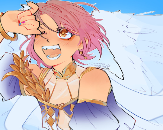
and then i clean up any messy stuff by just painting over top of everything on a new layer, i also rendered the metal at this stage because i felt like it i guess???
i dont think i did a suuper good job at rendering the metal here (because i was lazy), it looks fine but something to note about metal is that usually you want to push the highlights and the shadows a lot more, as well as the reflections because it is so shiny and smooth this is why you'll see a lot of pink and blue in the metal, to show the reflections of his hair and the sky
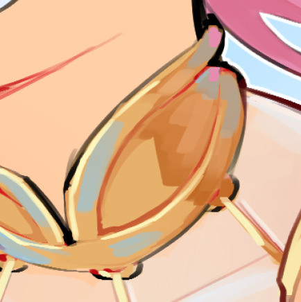
i would recommend using reference to get a better idea of how metal ACTUALLY works but again, i was lazy lol so that's a simple explanation based on what little i know/have observed
the jump here is a bit drastic and you might be like woah starr where'd all this come from?? but this is all in one layer-
('hard light' - 62% opacity)

this is how that layer looks as a normal full opacity layer, for reference:
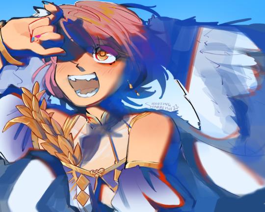
lately i've been using hard light layers to shade! they're very versatile because unlike multiply layers i can do my shading and my highlights within one layer (do you sense a theme of me disliking having too many layers lmao)
SO this is where i have a bit more to say about shading you'll notice the prominent shading colour here is blue, this is because the main environment here (the sky) is blue. i dont know if that's how things work in the real world but it works for me LMAO i usually prefer to have my shading lean cooler purely for aesthetic reasons, i like how it looks more
you might also notice some areas where the blue is a bit brighter, this is to imitate reflected light, again because the environment is blue light tends to bounce around on things and reflect back even into the shadows so this is the effect im trying to get, i like to typically go with a brighter blue cause it gives things a sort of shinier? quality that i enjoy aesthetically, idk if its very accurate to real life tho it also helps me to give depth to the shading since shading isnt usually just one flat blob, and this is a bit of a shortcut to having more dynamic (?) looking shadows

i also want to point out my use of bright reds on the edge of the shadows:
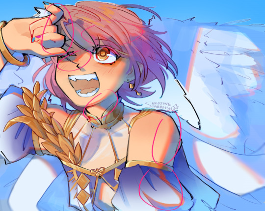
i believe this is called diffraction- there's a real legit scientific reason why it happens but i... dont know what that is i just know it happens in real life (maybe not to this extent?) and it looks cool so i do it SFHJKSFH i usually blend it into the shadows though as opposed to into the lighter parts, i find that tends to look better
some miscellaneous things-
don't be afraid to throw random colours around!! who cares about realism, it's fun lmao
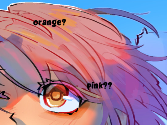
this artwork is a spoiler for asmo's bday so shhhhh but i did want to quickly show that you can also use hard light layers to create a glowy effect, i literally just painted the pink/orange directly on the shadows layer and it helped to make his eyes more glowy
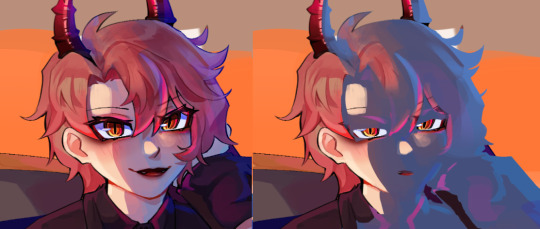
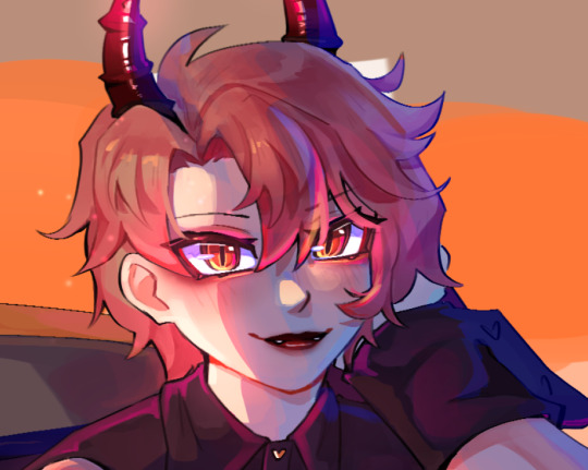
of course i do go in and paint over a little after and add some layer effects but it helps to have that base there
now that you've learnt that i dont know what i'm doing, i wanted to highlight a couple of resources that have helped me! i hope they help you as well <3
this video gives some really interesting insights into this artist's process and some problems they had throughout, as well as how they overcame them! it looks a lil clickbaity but i promise it's good!!

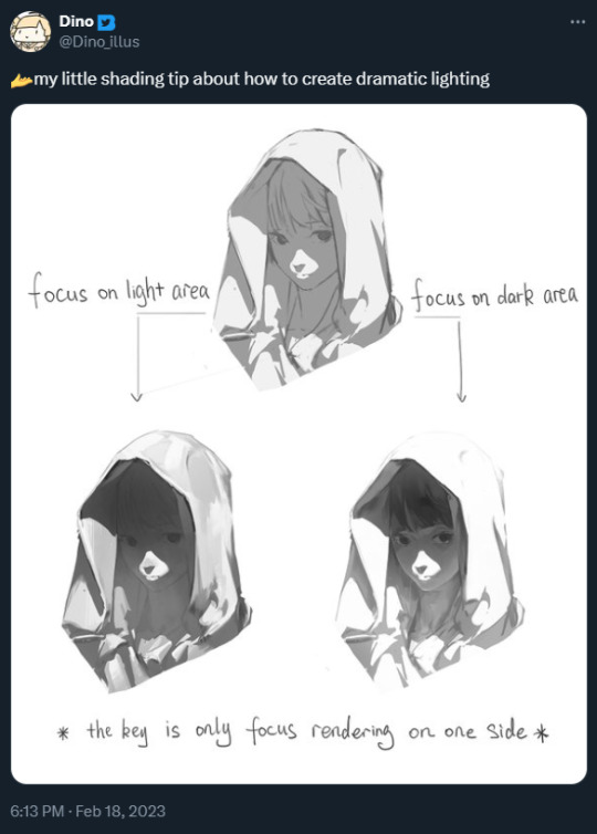
this tweet also shifted how i think about rendering when i want to do something with dramatic lighting!
+ an attempt i made to replicate this (i wanna try this again lmao it was fun)
i hope that helps even a little bit, i did my best to explain but sorry if it was mostly nonsense though :,DDD best of luck with your art, anon!! <3333
19 notes
·
View notes