#i have never done a tutorial before so i'm sorry if this makes zero sense
Explore tagged Tumblr posts
Note
I'd love to learn about some of your favourite colouring techniques!
I’m sorry this took me so long to get to! I realized after I made the offer that the gifs that best exemplify my favorite tricks were lost when my hard drive broke, so I had to make some new examples. Since I gif Star Trek a lot, this is going to focus on primary colors (gotta love those Starfleet uniforms) as well as neutrals and blacks.
My single guiding principle when coloring is to find the complementary colors and make the warm colors warmer and the cool colors cooler. As fate or kismet or happenstance would have it, this works especially well with Spirk edits because of their blue and gold uniforms. Unfortunately, none of my Spirk psds survived the purge, so here are some other examples.
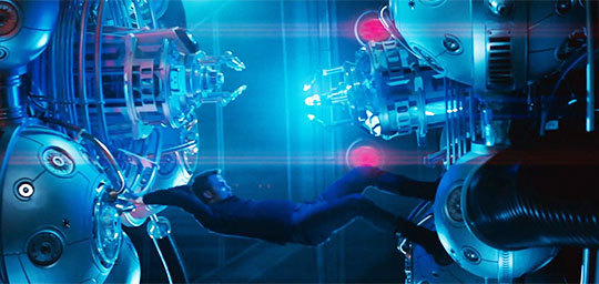
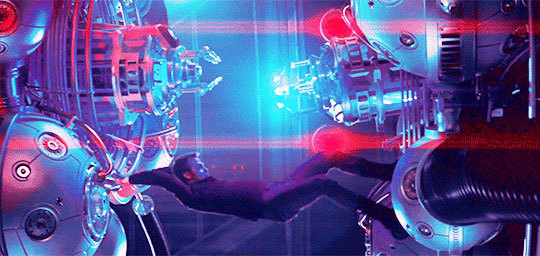
It took a couple of color balance layers to get that red as bright as I wanted it, but this shot needed a warm color to contrast with the blue and purple.


I brought out the blue of the planet and tried to restore the yellow of Kirk and Sulu’s uniforms.
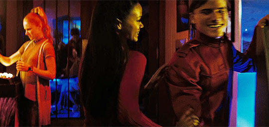
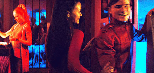
I lightened the blues, got rid of the green in the yellows, brightened the reds, and made the blacks and neutrals cooler. Like I said: the warm colors are warmer ad the cool colors are cooler. (My gifs aren’t usually that purple, but I’ve been in a purple mood lately. 🌈🌈🌈)
So if I wanted to gif this scene the first thing I’d do after sharpening and lightening it is create a selective color layer and go into the yellows.
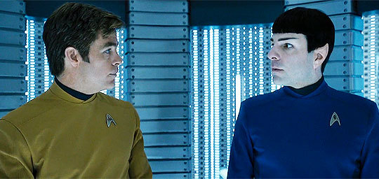
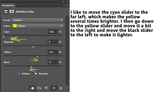
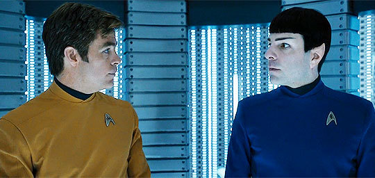
It usually takes two or three selective color layers to get the yellow where I want it. (In the case below, all those layers led to Kirk’s uniform becoming pixelated, which is a price I’m willing to pay to get rid of the scene’s drab monochromism.)
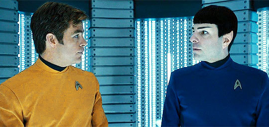
Because there’s no red in this scene other than in their faces, I’m going to do something similar with the reds.
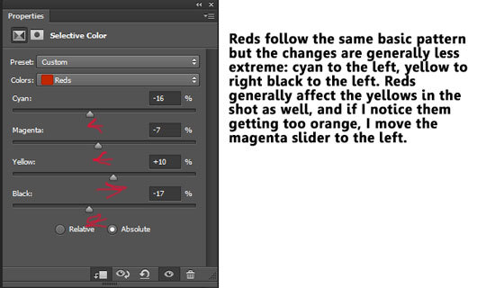
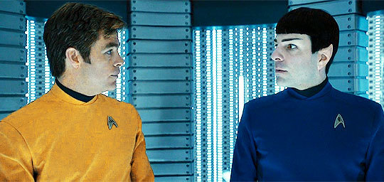
Not a huge difference, but if the gif were moving, you’d notice that it added some color to their faces. Note: the above approach to yellow and red work best on white characters. I use the same basic technique when coloring characters of color, but moving the black sliders to the left might result in whitewashing, so be wary!
On to blues! I like them light and bright.
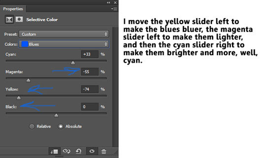
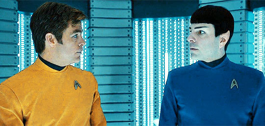
I do something similar with the cyans:
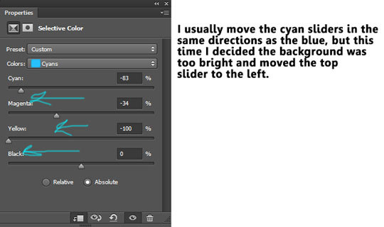
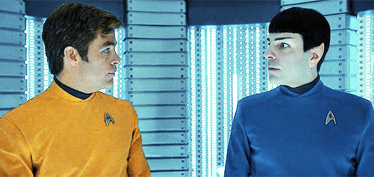
This still looks drab and monochrome to me, so I’m going to go into the neutral colors.
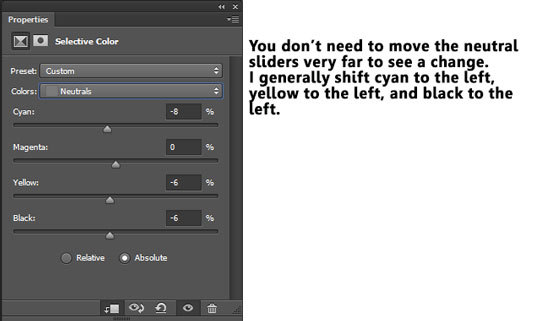
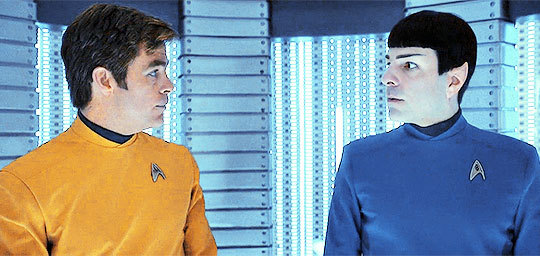
You can see the different in their faces and in Jim’s hair. It also affected the blues, so I might tweak them later. But first, I’m going to alter the blacks.
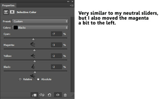
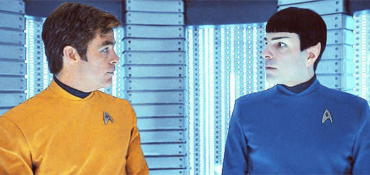
The most important coloring lesson I can impart is that not all blacks are equal. A lot of movies give their blacks a green hue, which I find pretty ugly, so I tried to restore the dirty blonde of Chris Pine’s hair and add a little bit of blue (not cyan, not green, but blue).
Another tip that might be obvious but took me a while to figure out: Take advantage of the masks on your coloring layers! That’s what I did the last time I gifed this scene because I had added one too many selective color layers to brighten the yellow and Chris Pine started to look like he had jaundice. The unnatural yellow in his skin in the above example? I hit the vector mask and colored it away with the paint brush tool! This can also help prevent whitewashing. It allows you to alter Uhura’s uniform without changing her skin tone!

Please let me know if I was unclear or if you have any questions!
46 notes
·
View notes