#i gave him back some of his original ref's design elements
Explore tagged Tumblr posts
Text
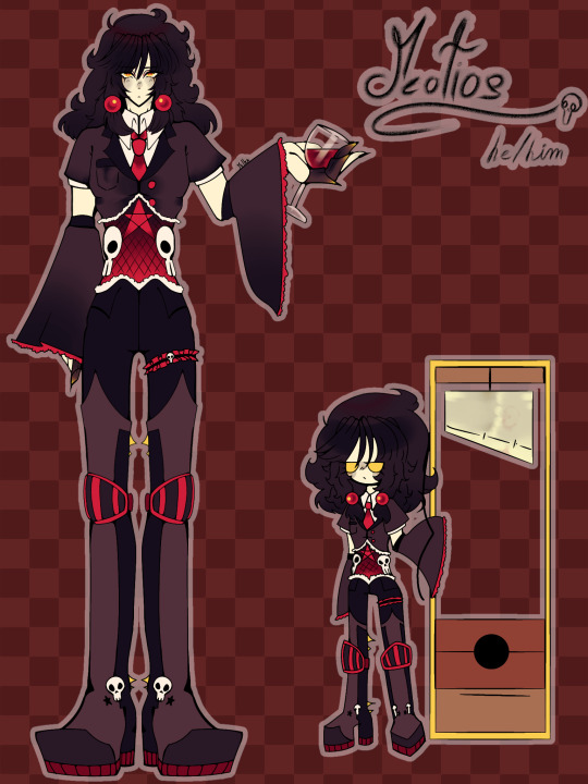
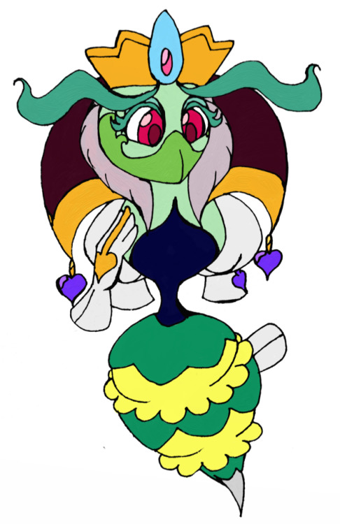
I remade my Oc Meotios!!!!
Hell's manager, working for hades and managing the 3 judges.
He looks way better now tbh-
#saint seiya oc#oc#ocs#art#original character#original art#oc art#oc artwork#oc artist#i think i improved a lot tbh#i gave him back some of his original ref's design elements#like the yellow eyes and gray blush
25 notes
·
View notes
Text
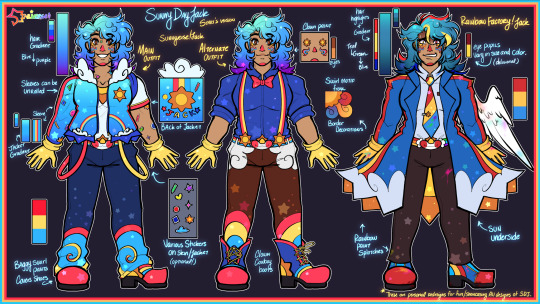
Sunny Day Jack ★ Stari’s Versions
—
★ DO NOT USE/REPOST WITHOUT MY PERMISSION. NO MINORS.
—
Apologies for the tumblr inactivity, space crew! I’m much more active over on Twitter!
Here’s a simple lineup of Jack designs that I’ll be personally using for myself! I love when artists take a character and add their own personal twists on them, so I’ve done the same to my favorite technicolor clown.
I’ve also seen a few people be interested in two other designs that I’ve done, so I’ve added them to the lineup as well for others to use or to see their full outfits!
—
Here’s a explanation of each design element if you all are interested in that:
Sunnyverse Jack(Left):
Sunnyverse!Jack is my personal interpretation, artistic recolor, and story with him. He is basically a spin-off of the Sunny Time Town AU by JambeeBot.
I wanted his jacket to reflect looking up at a vibrant summer sky, with clouds, rainbow pockets, swirls, and stickers to add to the childlike wonder. His different color suspenders replaces the stripes on his shirt, which is now a sun on the collar!
I’ve personally always liked the idea of Jack’s hair cascading into purple tips, it’s been referenced in many other drawings of mine. Considering Papa Rise also has purple-ish hair, I think it fits!
This design went through a couple sketch phases and some reworks with the most recent showcase being the birthday drawing of Artemis, where this design can be seen in now outdated-concept!
Alternate Outfit (Middle):
Over a year ago, I made a drawing about Jack and bowties, spreading my bowtie propaganda…. And I still am HAHA. Listen, Jack with a bowtie is so cute, So I’m bringing that design back as well as a full ref!
I’d like to say that this is his work or side outfit, but this is not the teacher AU. I did not create that AU, so don’t refer to this design as the teacher AU!
Even though I don’t consider Jack as a rodeo clown, I gave him clown cowboy boots to reference [Redacted] and his southern residence somewhere.
Rainbow Factory Jack(Right):
RainbowFactory!Jack or RF!Jack is an AU I made last year as well, and finally got around to giving you all a full standing ref for him!
He got more attention than I thought, I know a couple of you like delusional men. I get it.
For his hair, aside from the primary highlights, I also changed the coloring to be a bit more muddled and darker on the teal spectrum, as I like to do that when I draw Jack in a not so-friendly manner. His hair is also more spiked, compared to the others who have more of a fluffy round curl.
His coat is very simple, red and yellow stripes down to a cloud border, and the inside of the coat shows a giant sun on the underside. He also has different color rainbow splotches in different places on him!
His eyes can vary in size or be consistent, and the colors of them can change or spiral too! Usually though, the right eye is lighter than the other. His colors are more saturated and darker than the other designs.
Cotton Candy Cupid Jack:
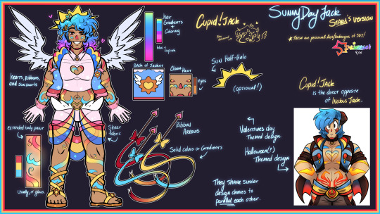
Finally, the last design I have in the lineup is Cupid!Jack!
This is the first custom design I’ve made of Jack. Shared in this post, this was meant to be the Valentine’s Day design I had for him! Though this drawings is extremely old and outdated now for both my MC and art, I decided to carry it on to a proper Cupid AU design for everyone!
He was originally labeled as Cotton Candy Jack in a wip post that keeps getting shared around from time to time, but I’m unsure if I should keep that name for this lover boy now! There was a community cotton candy Jack trend a month or two ago, so maybe I should change the name? What do you all think?
Design wise he parallels the classic Incubus Jack, which I believe was originally a Halloween costume. His design shares similarities on purpose, being the extended body paint gradient and the sheer fabric overlay on the pants.
Almost like an angel/devil duo, Cupid Jack is more pastel, softer/brighter primary hues, has fluffy wings! My goal was to have them be similar enough side by side, but also different enough to tell that they are different themes/holidays.
He has a motif of hearts, ribbons, and sun swirls. His hair gradient is also the most vibrant one, going from cyan to a vibrant pink at the tips.
He has sandals because I thought it fit the whole Cupid vibe, but drawing his dogs out every-time might actually be the end of me.
—
While I will use these personal redesigns, I want to make it clearly stated and obvious that Jack is not my original character, nor are these redesigns an attempt to change his character or completely detach him from his media. There are simply my fun artistic portrayals of him, as I admire his original design, media, and game as well.
The Rainbow Factory and Cupid AUs are technically my AUs. Ship art, written stories, headcanons, etc. of RF or Cupid Jack are completely okay to create! I just ask that you tag me so that I can see what you all do with him!
However, I ask that if Sunnyverse Jack is used, please ask for permission before using his custom design, as it is my own design of him that I use personally.
…and also, I wanna see more MV Jacks! Artists! Show me how you would draw him in your trademark! I love creative expression!
#sunny day jack#swwsdj#sunny day jack au#sdjsunnyverse#sunny time town#sdj#rainbowfactoryjack#cupidjack#cotton candy jack#Sunny Day Jack but in my eyes#colorful clown man gets more colorful
130 notes
·
View notes
Text

Next up in the Sabzerus designs: Tighnari and Cyno!
I know this is unrendered, but I already committed to not rendering these two until I finish Haitham and Kaveh's designs which, in hindsight, is difficult atm because I have more ideas about Collei's design over them. With the recent release of Sethos, it seems that it would have to wait until I finish his and Collei's designs when I get to them. I'm writing a fic now lol so it the wait is probably quite long.
Tighnari's is relatively easy and I'm so pleased with the results! He finally looks put together and not... odd, palette-wise (to put it mildly). His clothing is based on the traditional dress of the Kabyle people, an Amazigh ethnic group from northern Algeria, with some modernized touches (I used references from modern-day photos of Kabyle dress!). The highlight is the burnous (hooded cloak), originally a symbol of resistance in the Algerian War of Independence and now a garment worn in special occasions such as religious festivals. I think it would be appropriate of Tighnari to wear one for his Sabzerus dress.
Cyno is so far the most difficult one to design. I have 0 references outside of speculative fashion plates and museum pictures of jewelry. I struggled so much with the outfit components, but I persevered and this is the result. His clothing is based on what Ancient Egyptian high priests of the New Kingdom wear. The long shendyt (kilt) and shawl are made from linen, which in higher social classes are woven so finely they appear as though transparent. Not just luxurious, but also airy for comfort against the desert heat.
Previously on: Nahida + Wanderer | Nilou
As usual, close-ups and some more thoughts under the cut:


Tighnari's canon design is incredibly confusing to me, because unlike some other Sumeru characters I have absolutely no idea which part of Algerian (or Arab, but that's a very wide ballpark) dress it's supposed to be based on. Where is that white fabric wrap even from? However, when I looked at his hoodie, I realized that it's probably supposed to be a "modernized equivalent" of a burnous. Probably.
The belt accessory is actually an article I always see on women's robe kabyle, but never men's. I think they look neat and Tighnari wears belt accessories, so I incorporated them. (If any of you seeing this are Kabyle or Amazigh, do tell me more of the nuances. Are they exclusively feminine accessories? I also read that Kabyle women tie their sashes differently depending on marital status, but does this only apply to sashes or does it also apply to these cord belts?)
It's not very obvious, but the burnous has a split back, so Tighnari's tail can poke out comfortably. It's also pretty fun to try and incorporate elements of his official design, such as the paw-print gloves, the boots, and the turtleneck. To me, Tighnari without a turtleneck is unimaginable for some reason.
I've been tentatively calling Cyno's design "the one time Cyno puts some effort into doing his hair". The little braids aside, his hair is actually in a half-up bun. I really should draw these refs from more angles... and this is unimportant in the grand scope of things, but I gave him some beef. My guy deserves more beef (and I apologize for covering his chest regardless).
The wesekh (wide collar) is made from gold and various precious gems/minerals. This one has gold, carnelian, and turquoise. The narrow golden beads on the outermost layer represents beetles, which in turn symbolize resurrection (i.e. Hermanubis' indwelling within Cyno).
I've always been baffled at the fact that Cyno wears mostly black, but would prefer for my design to contain elements from his actual design, so I kept the sash and helmet black. However, I do know that too much dyed linen (and animal fibers) are inappropriate to wear in temples. Unless you are a funeral priest, where you wear a leopard skin as a part of the rites. Then again, Cyno's biggest inspiration is Anubis, so perhaps he could get some leeway here...
To continue with the flower theming, I chose the Sumeru Rose for Cyno and Tighnari wears the yellow flower on his canon clothes once again. It's never mentioned in game, but I'd like to think the Sumeru Rose is among the national flowers of Sumeru along with the Padisarah, so it's appropriate for the General Mahamatra to wear it.
Lastly, I gave them matching double piercings. Tighnari wears them on his right ear (as per his canon design), and Cyno on his left. Another matching set :)
#ksadraws#genshin impact#genshin fanart#tighnari#genshin tighnari#cyno#genshin cyno#am i allowed to tag this cynari? i feel like i should tag this cynari bc i sure implied it
98 notes
·
View notes
Text
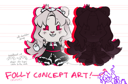
Sketches and commentary on the Folly ref sheet for RAT's newest plush! (info below the cut vvv)
(note: RAT commissioned me to make the character ref sheet, which is NOT the plushie schematic that Makeship actually uses as reference to produce the plushie)
This is the first sketch we sent to Makeship!
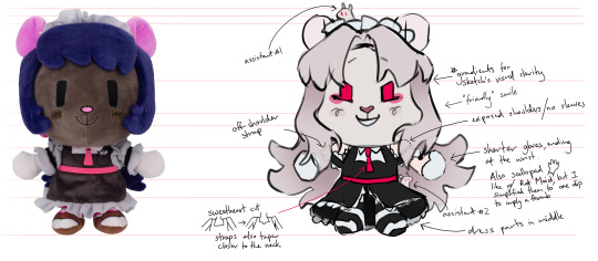
I'm starting to add details to push Folly's identity a bit more and differentiate her more from RM (Rat Maid), i.e. neckline, nose, gloves, blush. Lots of curves! (And I also added two rats instead of one <3O~ <3O~)
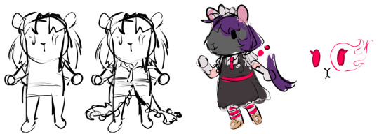
At one point we considered giving her the eye design shown on the right (red thread embroidered around her eye) as a reference to her MC skin's glowing eyes, but we decided eye shadow was a better look. also it looks like sans undertale
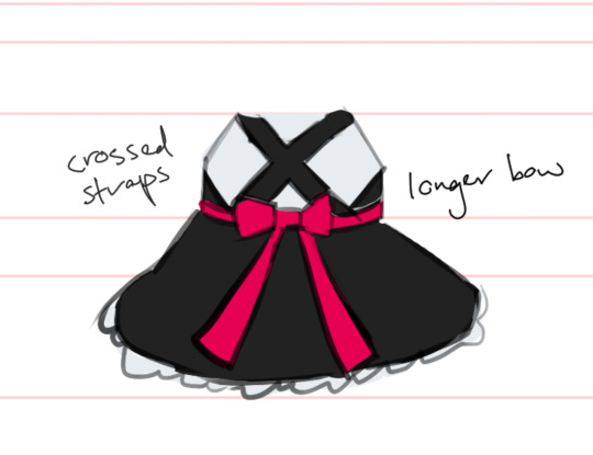
This is the back! The Folly skin has a long pretty bow, but it's scrapped by the end because A. her hair obscures everything on her back and B. as we went along we increasingly afraid of the sheer mass of fabric building on this plushie.
Most of her palette is colorpicked from the original minecraft skin by Arathain (who also made RM!) but iirc we made the ears pinker and lighter. You can see their OG tweet featuring the Folly skin here!
Onto the dress design!
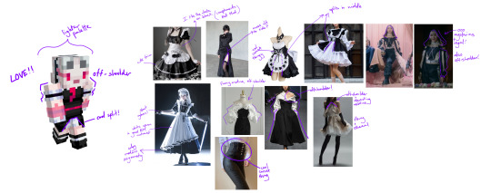
RAT wanted the Folly plush to feel like more than just a recolor, so he had me redesign her dress. I started off with an inspo board focused on elements we wanted to keep-- Folly's lighter palette, the middle slit of her dress, the off-shoulder straps, and the overall maid theme.
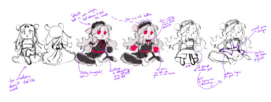
You'll notice that Folly's expressions here are kind of all over the place (I don't think she's ever looked that sympathetic in her life). I think I made these sketches before I finalized her face, where RAT requested some mixture of murderous intent with mischief, but in a subtle way. Later down the line the specific smirk Folly has actually gave the physical plushie a lot of trouble (faces do not scale easily on cone shaped snouts).
The first alternate dress designs!


RED: RAT (paraphrased), PURPLE: me ofc More refined sketches! As you can see here RAT's working me to the bone with all of his requests. It's okay though, b/c after I sent him the completed ref sheet I got to watch him turn on Makeship. (KIDDING, KIDDING)
Overall, I was looking for a dress that felt regal, beautiful, and unconventional, while still feeling like a maid dress. Wow, after physically typing that out I feel like face palming. "I need a dress for a GODDESS also a uniform good for housekeeping please" (???)
After feedback, I focused more on variations of the 2nd option.

You'll see at the last Folly, I combined the 2nd variation with the tie ribbon, the layered dress design, and long puffy sleeves. I decided to bring over the long puffy sleeves specifically because I hoped that they would give Folly a more interesting silhouette that of course contrasts with RM.
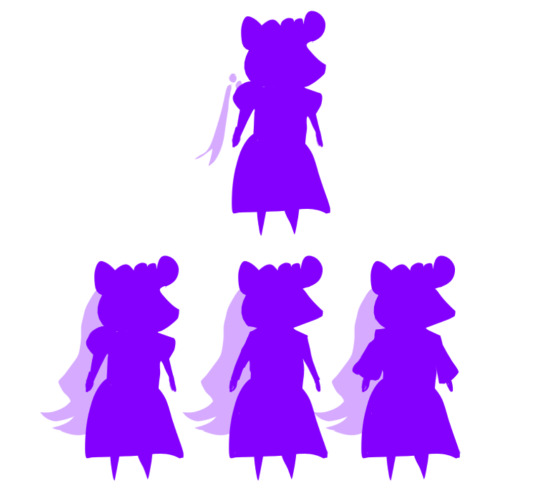
(To be fair, this contrast isn't very visible on the plushie itself but it is fun to draw.)
And finally, the second and last ref we sent to Makeship!

imo Makeship did an INCREDIBLE job translating the design to plushie!! I'm sure there's plenty of challenges Makeship's plushie makers have to deal with that we don't see, so I always specify that I'm only responsible for the initial drawing when people ask me if I "made" the plush.
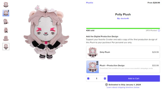
One really delightful surprise were the 3d rats; we didn't think they were possible but they were (ilu makeship)!! You'll probably also notice that Folly's eyes look pretty different--- they were changed slightly in each step and ultimately ended up softer, which is interesting because I feel that it kind of mirrored how RAT's approach to Folly as a character changed in the months of the plushie's development (and up to her release!).
And that's all I have for my part of the plushie! I always love working with RAT on projects and plushies are a highlight. They're especially surreal to think about when we all used to joke about them before RAT really blew up.

ofc, the shill if you want to get her: Makeship Folly plush and RM's ref sheet if you're curious: Rat Maid plushie ref
i think the campaign ends about October 7th, 2023, but you and i are very likely to be in different time zones so if you're interested doublecheck with the site. if the date has long past then ig this is just a fun little time capsule for you, which can also be pretty cool :)
76 notes
·
View notes
Text
Heyoo!! I've been hard at work and I have a couple drawings of my Monkie Kid Au's characters'll look like! I won't give spoilers yet cause I need to figure out the overall story for the comic(cause some bits are still a work in progress), so yeh! I'll give a short explination for each drawing tho if it helps.(also, Sorry if this is super long 😅)
Anyways, to start off with, we have MK!
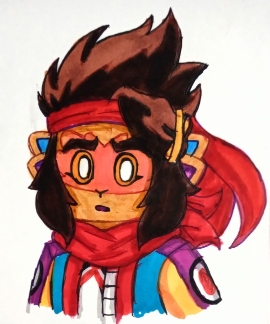
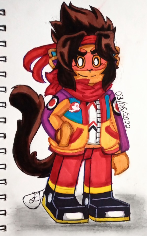
To start off with, since I'm making him the son of Macaque and Sun Wukong, he's gotta have a monkey form! Soo I gave him the tail but for the ears, since Sun has 2 and Macaque has 6, I thought I'd just meet in the middle with 4. Soo you bet he'll have sensitive hearing now with this, next is the outfit, I kinda kept it simple,changing a few bits but I tried combining the S1 and S3 jackets together, buut I thought 'why not add some purple to him?'. Oh and the bandana! I wanted it to be Sorta reminiscent of Macaque's scarf, and yeh, that's basically it for now.
Now Onto Mei.
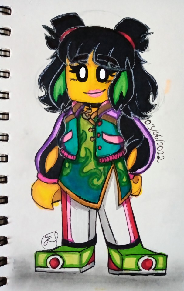
I wanted to give her a type of bomber jacket just the middle part being shorter than the previous jacket she wore. Annddd the dress shirt she has underneath, I wanted to keep it her style soo I watched the last 4 episodes of season 3 again and came up with making a green flame design on it. Though i thought adding some pastel purple and pastel pink details would work with her as well, plus some red as a reference to the samadhi fire. Also, Can't go wrong with a choker that has a flame charm on it can you?
Next up, our resident fire demon, Red Son!
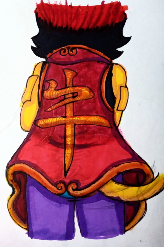
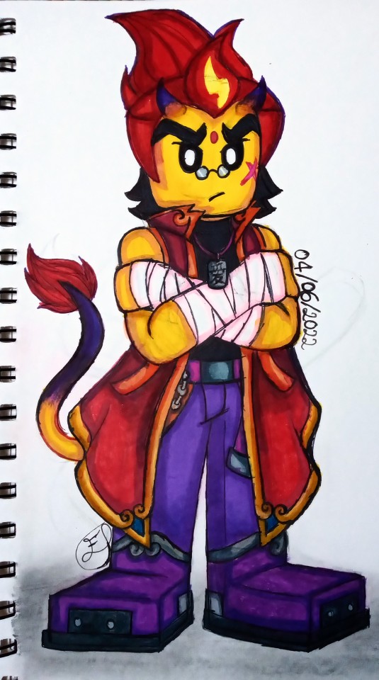
I wanted to add some Demon Bull king elements to him as a start, sooo, the tail came in and I added a set of horns that'll be growing in. I kept most of his old outfit just adding extra details to the shoes andd adding a dog tag that has the Chinese symbol for "Family" on it. Ohhh but the jacket was the most fun to draw, I wanted to keep it both fancy but pretty exaggerated. Sooo I used the Yu-Gi-Oh Character Seto Kaiba as a reference. Now this is only one version of the jacket since he'll have a separate one with his original logo on the back. Buuut this sleeveless version has the symbol of the Ox from the Chinese zodiac on the back of it, though I wonder, where did he get it from? 🤔
And lastly, We have Sun Wukong and Macaque themselves!
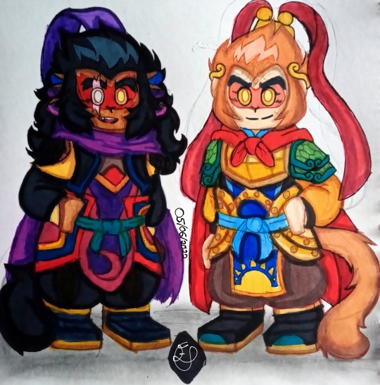
Now, I thought about keeping a sort of Sun and Moon motif to them whilst looking at their previous outfits for ideas.
For Macaque, the first thing I did, was to make sure I kept Macaque's blind eye(which he may hide from time), I switched up his scarf colour since he got rid of his old one and gave it to someone else. The rest sort of fell into place after that.
For Sun Wukong on the other hand, I used refs of his outfits and armour from the show, but also looked at the Monkey king:Reborn 2021 movie's version of Sun anndd the 2015 Monkey king:The Hero is Back movie's version of him for help with keeping his outfit traditional but adding my own ideas to it. For the pauldrons on his shoulders, I came up with the idea that he may have been given a couple scales from his friend the White Horse Dragon before he passed away, used those to make his armour. Oh and I tried making it so each colour represents a past friend of his, So Tang Sanzeng, Zhu Bājiè, White Horse Dragon, Nezha and a bit of Macaque too.
But, the MAIN part I wanted to keep, was the Golden Fillet he wore during his journey to the west with his master and allies. Granted he got rid of it but a headcanon of mine is that he kept it, after he was able to take it off, as a memory of his master, Tang Sanzeng. So I stretched it out a bit wider and made it a sort of crown(Idk what that type of crown is called).
So yeah! That's it for now and I'm so sorry if anything sounds like I blabbered on or didn't explain some parts enough, I'm not the best with explaining things, I just draw to have fun tbh. Anyways! I hope you like them! And please, go ahead and suggest below who you think I should redesign next and whatever ideas you have for them.
Also thank you so much @djmurphy and my friends on twitter for helping me with my Au, I may not have a name for it yet but again, thanks so much for helping me with it! I couldn't have done it without you guys 🥰
#lego monkie kid#monkie kid#monkie kid fanart#qi xiaotian#lmk red son#lmk mei#macaque lmk#six eared macaque#monkie king#sun wukong lmk#red son monkie kid#my artwork#traditional drawing
179 notes
·
View notes
Text

some updated designs!! lots to say about these!!
Emilia and Mateo’s “Imaginary” Designs
I have a plot update for them ;w; I thought, since their whole motif is arts and performance, that it would be cute to write in a playground roleplay element to their story! Besically as kids, they make up a fantasy world that they play in together whenever they get a free second! In off-time, Mateo writes stories and makes art of their characters, and Emilia starts learning to play music so that she can compose theme songs for them. Emilia’s character is a fire witch who’s able to comfortably use her powers bc they live in a more magical world. Mateo’s character is a healer who follows Emilia on her quests to save the places she defends. I thought it would be a nice place to kick off their obsessions with creativity, and also that it would be kinda fun to do a plot within a plot and kinda try to make up a story that two kids would.
These outfts are the designs they thought up in their game. Mateo later drew up the designs, this being most obvious from the rose on Emilia’s belt. Her gloves keep her magic in when she doesn’t need it, and the cloak is fireproof. Mateo’s outfit is based on a plague doctor’s, but for ease, the mask is just a piece of thick fabric that can be lifted up over his nose when he needs it. The rest of his body is covered to prevent him from contracting infections from fluids.
Holly and Masei
Nothing too new about these designs, their original designs were just way too simplistic bc i didn’t have much of an idea. Holly is a warrior, so his outfit is very lacking in layers and fabric. On the other hand, Masei is a prince, so his clothes are dumb layered and the little translucent piece is supposed to drive home just how extravagant he is.
Khauai, Haven, and Hakeem
I wanted their outfits to be more like their animal motifs! Cevon didn’t get a redesign because his current outfit is civilian clothes which. suits the fact that he gets his power taken away. Khauai is an owl, so his cloak is meant to reflect his wings and the puffy pants + slim boots mimic the legs of an owl. Haven is a selkie, so I gave him his seal coat to wear over his human form. I left the sweater, though, since it kinda melds both worlds for him as opposed to him only wearing his seal coat and Yearning for the Sea. Hakeem’s outfit is supposed to be lionlike, so I gave him the furry collar to be the mane and the furry boots to be his paws. It’s also a little more form-fitting bc he steals Cevon’s powers and as such becomes an incubus. I think he’d embrace that fully.
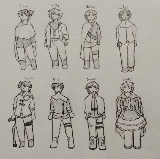
The Major Arcana
These characters have 3 things each that are part of their designs: an album, a Tarot card, and their name. I decided that the Tarot card would be more involved witht heir demeanour and how they present themselves, so the outfits are based on their album and their name.
Crow, obviously, is named for a crow. His clothing is layered to represent the feathers of a bird’s wing, and his cloak is ruffled to be shaped like the wings themselves. His album is After Hours. His heavy layers also represent him often blocking people out because he feels like he’ll just let them all down (a la Save Your Tears). At the same time, his outer cloak is open, because what he really wants is to be better, but it’s hard to make that go to the inner layers of himself (a la Faith). His clothes are all black.
Harley’s name means “meadow of hares.” His spikey hair is meant to represent windswept grass, while his inner vest is meant to be a little white bunny tumby and his boots are white at the toes to represent paws. His album is Beauty Behind the Madness. BBTM is a little sluttier than AH, so I had to kinda work around that, since Major Arcana generally wear old-fashioned clothing and lots of layers. Underneath his jacket, Harley’s arms are bare and his jeans are high-waisted so that when he’s free to do so, he can shift into hotboy mode. BBTM’s narration is also more smug and more detached, so I felt like that it made sense to give Harley a more modern outfit than everyone else, because he couldn’t care less about the customs of Major Arcana dress or how anyone feels about it. His clothes are brown and white.
Nakoa’s name means “warrior.” I gave him the harnesses on his back and leg to look like he’d be carrying weapons around, even though he never would. His album is Transmissions. The ablum gives off a very aching, yearning vibe, with the narrator sounding alone throughout the whole thing. His mission seems to be to find and protect someone else, while sticking staunchly to one’s ideals and values throughout the quest. Nakoa dresses like Major Arcana should, with his clothes being the most traditional of anyone’s. The lock necklace represents his loyalty to the Major Arcana (as in, he’s locked in) and the heart necklace (while in canon it represents his card: The Lovers), represents the person that the album’s narrator is talking about. I wanted to make him look very “tied up” in his clothes, so everything runs across him. This represents the loneliness at the album’s core; Nakoa is tied up in himself and effectively has no one but the cause to be loyal to. His clothes are purple and blue.
Sunday’s outfit is supposed to contrast Nakoa’s heavily. They don’t wear all of the ties and layers he does. Their design is meant to be open and welcoming, because their album is Dreamland. The narrator of Dreamland describes a troubled past in an expressive and upbeat way, and I thought I’d reflect that in the fact that Sunday is the eldest and effectively the most responsible for the whole group, yet they remain open and their layers stripped despite all that. Their name obviously reflects the sun, so the main colours of their outfit along w the sun at their collar represent the sunrise. Their outfit is iridescent (another ref to Dreamland’s aes), with bases of pale pink and yellow.
Arwen’s name means “royal maiden.” Her outfit is based on the most practical layer of mediaeval royal clothing, with her hood able to pull up to look like a victorian maiden’s bonnet. Her album is Hozier, but I’m going to be hinest and say most of her outfit was designed before this, so I couldn’t find a place to mix in the album..? So the colours of her clothing are the album cover’s colours: orange, blue, and brown.
Elio means sun. I have enough characters designed after the sun, so I went entirely album-based with him. His album is DIVISIONS, a rebellious, anticapitalist love letter to no one. The album is about adventure, love, and the future, so I wanted to give Elio a v futuristic and punky outfit. His outfit is my favourite out of all of them, but I don’t actually have much to say about it? I think it looks exactly how I envisioned, like Elio’s a punk from the future. His clothes are black, white, and silver.
Dawn’s name meaning is obvious, and again w the sun. I went all-album with him too. His album is Meteora, an album that’s essentially about hating yourself, your past, and everyone around you. I wanted to go more emo with Dawn’s design bc of that, but emo style actually doesn’t... appeal to me, plus it’s not very Major Arcana. I gave him some gay little boots to be his choice piece of emo clothing, and then emo’d up a regular outfit instead. His clothes are layered, again representing him building up walls. He has lots of elements that are tied around him, this time to look like he’s sealed himself in, hence them all being horizontal. He burned the edges of his cloak himself and also sliced into his pants so that he looked imperfect and everyone around him would know that he’s imperfect. His clothes are, in contrast, pink, yellow, and blue.
Dovey’s name obviously means dove. Her cloak, like Crow’s is ruffled at the edge to represent bird wings. Doves are much fluffier than crows, though, so in her outfit, feathers are represented by the ruffles in her dress. Now, uh, her album is Wasteland, Baby! and the outfit very much misses the vibe. Dovey is another character whose outfit I had planned before hand, and it wasn’t desidned with music in mind. The one song I did think of while designing her was As It Was, which reminds me of Red Riding Hood bc of the way it opens?? I feel like even though I can’t pinpoint any one vibe that matches her look, I can see her as the narrator slash star of all the songs in this outfit. So IDK, it vibes w me, fjkdshdsfd. Her outfit is grey and brown, like a mourning dove.
#i will never draw them in colour#that is a PROMISE#ough i’ve had these ideas in my head for *checks watch* since last night#they were burning holes in me so i finally sat myself down#im REALLY proud of these outfits even if i dont love how some of the doodles themselves came out hfjkdsf#character design is my fucking PASSION#ill do the minor arcana and everyone’s battle outfits another time. for now i sleep#alex art#my ocs#the hibiscus flower#the little rose#the glass oracle#the golden prince#the spirit of justice#the son of the sea#the consumer of lies#the solitude of stars#the silence of snow#the voice of love#the colour of sunset#the spellbound archer#the spirit of revolution#the fury in judgement#the dream of serenity
4 notes
·
View notes
Photo
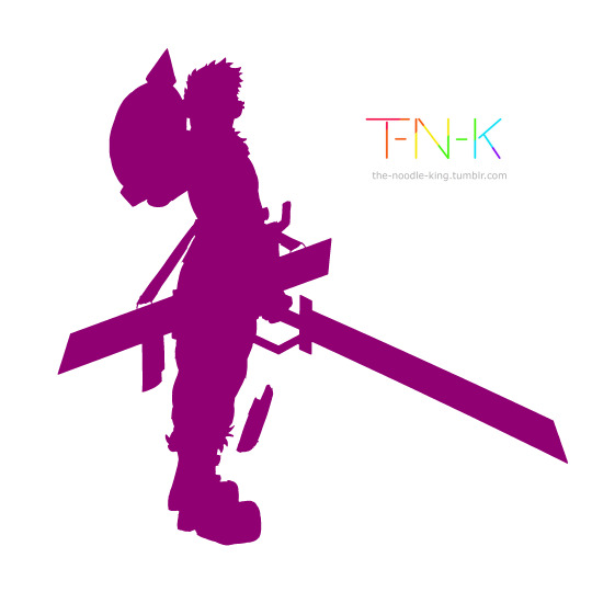
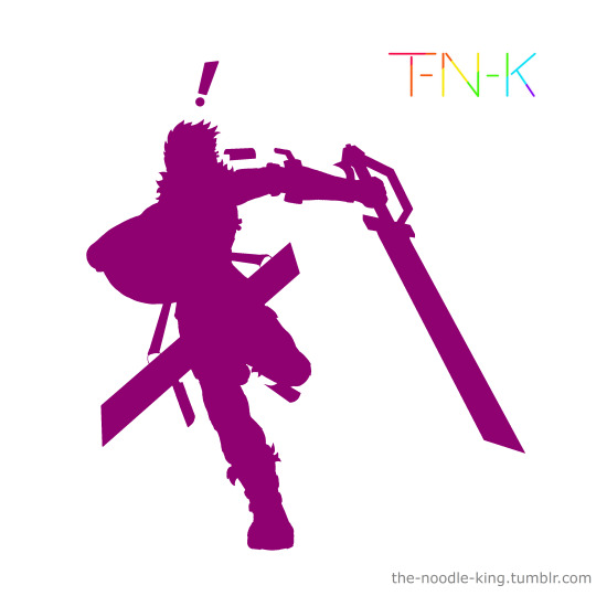
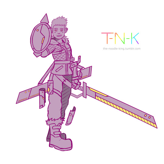
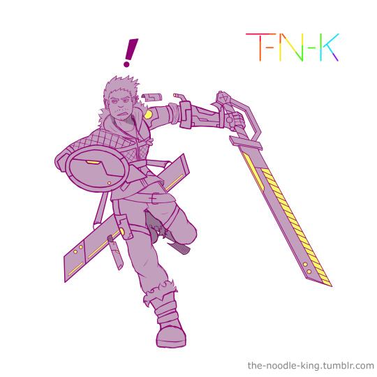

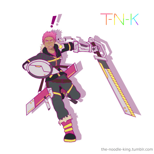
I’ve drawn a lot this month, relatively! just yesterday I did these two drawings back to back of my OC Reggie (also called RJ).
Since I’ve never actually written anything about him anywhere before, I figure this post is a good chance to do that, so I’m gonna write about his character design and how I developed it, his characterisation and whether or not he’s actually part of any kind of story or universe (Spoiler Alert, the answer is Maybe)
Okay so, first things first, his character design.
Reggie’s design came primarily from one idea, but also from two smaller ideas. The instigating idea for his design was a couple articles of clothing I found in a local shop, a pair of pink and black boots, and a black and yellow jacket.

I grabbed pics of them and filed them away as inspiration for a future drawing. When I set about making said drawing I was really just throwing ideas at the page to see what stuck. Now a jacket and a pair of boots might be enough for some people to make a full character design, but I need a little more to grease the wheels as it were.
Enter the other two smaller ideas.
I had some other images saved for inspiration (which I won’t add to the post as standalone images because they’re someone else’s art) and I had a very old OC with no story and only half of a poorly drawn design to his name - RJ.
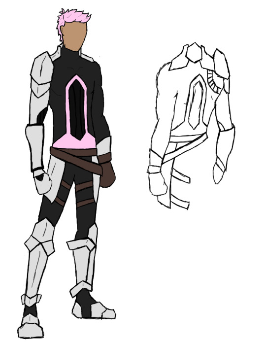
^ this dude was not only one of my first attempts to make an overwatch OC, but was straight up one of my first digital drawings, ever. I always kind of wanted to come back to his design and make it... Good, but I never had the motivation. Then when I was figuring out how I wanted to combine the pink and black fur trimmed boots with the black, grey and yellow jacket, I decided I’d take some of the tiny grains of RJ here that I had wanted to salvage into a decent design, and do just that.

^ this here is the original mood board of refs I used to make the original drawing of Reggie.
I took the boots more or less verbatim, but brought the yellow from the jacket down into them, the jacket I embellished with asymmetrical padding and added a hood with fur lining to tie it in with the boots, then I brought the pink of the boots up through the design into the sword’s scabbard, his glove, shirt and hair.
The hair style was based on RJ’s original do, a shorter back and sides then spiked and swooshed on top; from RJ’s original design I also took the base colour for his metal plating and the general idea of his various belts, as seen in Reggie’s diagonal belt and thigh straps (made yellow to tie the grey trousers into the colour scheme) and his thigh plating. Reggie’s skin tone was also based on RJ’s, though tweaks were made to it both at the time of designing Reggie and one making these new drawings.
Finally the impractically large sword and matching metal glove, as well as his floating, cyber-mystical metal plates were added using inspiration from the other images.
In the brand new drawings I did, I made some tweaks to his design, small ones to his metal glove and floating metal plates, of which I added another to his lower left leg. I also made the glowing... port? on his left shoulder have a metal surround so it’s not just a big cyberpunk light right in the fabric of the jacket.
I gave him a shield to complement his sword (sadly hiding his pink fingerless glove from the drawings, meaning one of the few pink elements isn’t shown) and gave his sword a design outside of the scabbard, which I hadn’t done previously.
And that was the whole process of his character design. It was an interesting process to attempt certainly, and one I enjoyed a lot at the time, which I also used as an excuse to try a different colouring method than what I did before, and liked so much I still do it now.
-
Now, about his characterisation and story design/concepts.
The short version of it is, Reggie is a standalone OC who was created without a story, but who I would like to develop one for, and intend to design other characters in the same vein as him in the future to do so. But since he was created without a setting and I’ve not done anything with him since creating him (before now), he doesn’t really have any characterisation to speak of, just vague ideas that I have for what he might be like which could change depending on what kind of story I try to build him into.
The long version is... Well a lot longer.
When I first designed him, some of the kinds of ideas I used involved the thought processes I use when making my overwatch OC’s, and the original RJ was an OW OC, so I could have made him into one as well if I had wanted. The “Design Ideas” I mean are things like, a limited colour pallet, cyber punk elements like the metal plates and lights in clothing, and things that enhance the silhouette and make the character stand out like the huge sword and the way it hangs from his waist, the floating metal plates, the big, blocky metal gauntlet on an otherwise innocuous body and the bright pink hair.
But I also used another set of design ethos’; those that I used for my RWBY oc’s back in the day. The big sword and the way it’s carried was also inspired by the bold weaponry from RWBY, and was even originally meant to be able to transform between being a sword and being a scythe, as well as a gun, in true RWBY fashion. The limited colour pallet and brightly coloured hair were other things which doubled up for these design ideas, and the overall look of Reggie’s outfit, the asymmetrical quilting, black and grey base with bright pops of colour to break it up, the fur trims, all inspire more of a RWBY look to me than an Overwatch one. But in the end he wasn’t either, because I didn’t want him to be either. In the new drawings I refined certain elements for the sake of visual clarity, like removing the runes from his floating metal plates and simplifying their shapes, but I also made changes which, for me, shifted him away from the feel of belonging to either franchise, slightly. I forwent the transforming nature of the sword and added a small personal shield to give him more of a cyber-punk knight vibe, as well as accentuating the glowing yellow lights in the design by adding more of them through the unsheathed sword and the shield, as well as the redesigned floating plates. He’s still undeniably a fusion of the two styles, they’re both franchises that I’ve created a lot of original characters for specifically because of enjoying the way their characters are designed, regardless of my intent, a vaguely cyber-punk character with an oversized weapon and bright pink hair is going to look like they belong to one or the other, if not both. And I’m okay with that.
But back to the matter at hand- He’s 100% not an OC from anything preexisting, and when I made him I didn’t make him for a story idea I already had, and I didn’t create a story idea for him to slot into during or after creating him... So does he have one now, as I’m writing this, after having drawn him again, twice, back to back, out of the blue? No, not exactly. I am working on something, as I always am; the gears are grinding and I’m piecing together little thoughts here and there of some ‘maybe’s’ and ‘what if’s’, and I fully intend to design some more characters like Reggie to all exist in the same universe and to be part of a story. I’m just not there yet.
As for his present characterisation, I originally conceived him as being unnaturally happy go lucky and a tad hyperactive, but I’ve now got him in my mind as being just generally passionate across the board, not just happy go lucky and hyperactive, but also very positive, optimistic, comedic, capable of reacting tearfully to just about anything and likely being just a little ditzy. Real Anime Protagonist energy.
#Original Character#Reggie / RJ#art#Paint Tool SAI#character design#For the sake of my OCD I need to tag this with /something/ to designate fandom or Original Story even though he doesn't /have/ one#so for the time being let's call this#Metal Hands Are The Devil's Workshop#MHatDW
4 notes
·
View notes
Photo
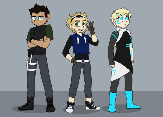
this is called: I only use one (1) pose for outfit references because it’s the easiest pose for me to draw and it’s only outfit refs they don’t have to be special
just me rambling about the characters a bit under the cut rip mobile users sorry
anyway I finally got around to redoing the main 3 from my scifi comic! good news is I finally figured out how to draw hairlines/foreheads so I can finally draw Jarek and Meri the way I always envisioned them, aka with spiked up hair and using goggles as a headband
still not entirely satisfied with 82′s hair but that’s okay for now. I at least finally gave her a Good outfit and better colors that don’t hurt your eyes to look at
alright I added a read more to this so this is where I ramble alright
first. Jarek. not gonna lie when I did the Big Reboot of this story like 5 or 6 years ago (yikes) I highkey based his looks off a guy I rly liked at the time. and then made some changes based on my drawing ability but all u need to know is he literally has dark skin and blue eyes bc at the time I had a HUGE crush on a dude who had dark skin and blue eyes. also at that point aka the first time I ever drew these characters he still had basically that same outfit. since then I never rly made design changes except like. having a better design for the vest and the shoes and making his sleeves short instead of rolled up. but this time around I also changed his pants to make them darker and bluer so there’s not AS much gray cause there’s a lot of gray in this story but it felt like too much you know? and I made his shirt green instead of brown bc with his skin color, a brown shirt is hard to make look nice unless it’s a very dark color but if it’s dark then it starts to blend with the vest you see my problem? so clearly I needed a new color and I chose green bc his boyfriend’s eyes are green therefore Jarek’s favorite color is green okay next!
Meri! my son! my boy! I love him! fun fact of the day: a couple years ago when I did the original outfit refs as I was drawing him I was like “lol I headcanon this character is trans cause why not” and then I realized he’s my own character so at that point I decided he’s trans. cause. why not. also he likes kpop. cause. why not. tbh since the first time I drew these guys his design hasn’t changed much either. I think originally his hoodie was a little more..complete lol it was a full hoodie. and I used to put a lot more detail into his belt to make it like a utility belt but tbh it just got annoying to put that much detail in so I simplified it WAY down this time around. also I think when I did the first outfit refs I changed it so his hoodie’s sleeves were cut off and he had that 3/4 length sleeve shirt underneath, but this past time I also cut off the bottom cause it makes him look Cool. ALSO! for the first time I finally gave him gloves lol idk why I didn’t before. it’s cute! plus it’s practical considering he’s like the Engineer of the group and does machine stuff a lot. and last thing: goggles. I used to draw them hanging off his belt cause I rly wanted them to be an integral part of his Look and for a long time I didn’t know how to draw them as a headband. but now I can! so finally they’re a headband and they’re less of a pain to draw. pushing his bangs back also makes him look younger which is also what I wanted so bonus!
alright last one S-82. this is rly long lol. the first time I drew her was when I did the first outfit refs a few years ago actually! and then 2 years ago I redid her outfit refs cause I just wanted to update them, but I didn’t change much of her design that time around. mostly her outfit was like a super simple black dress with some highlights in that bright blue. and when I did THESE updates to design at first I was like “eh I like her outfit I’ll keep it” then when I looked at it for a reference I was like “JK I DO NOT LIKE IT” so I gathered new outfit refs which was a longer and harder process than I thought (don’t look up “scifi outfit women” bc it gives u sexualized alien costumes) and then mashed my fav elements together to get this! which is still simple enough to draw quickly and nicely and also Looks Good. also I redid some of her colors cause her hair was a rly gross shade of yellow? and it was so light that to get enough contrast her skin was PAINFULLY white so I just darkened those a bit and yay!
okay end ramble
oh also Jarek’s gun holster is white bc he got the blaster from a cyborg. and all their stuff is white. that’s why it looks so weird lol
#I'm just now noticing that jarek and meri have like the exact same color pants cause I updated jarek's colors#but I drew them on separate canvases originally so I didn't even notice until now#space boyfriends#s-82
24 notes
·
View notes
Photo

MLP Nextgen Doodle Dump
So, to preface this with bad/weird news, my dad's in the hospital right now. He's got an infection of some sort but he's doing okay. He's hoping to get out tomorrow/today for you guys, Monday for sure. So, as you could imagine I'm stressed out LMFAO. If I'm not around much that's why. Also I I hate to ask, but any donation would be helpful. I'd open commissions but I've got a lot of things I've got to get done beforehand. Any amount helps, and I'll probably try and do something for you in the future if you do donate. I've decided to doodle a bit over the past few days. I don't know how long it's going to be until I get motivation to draw something good/normal and I felt bad for that so I wanted to do this doodle page. Not only was it easier for me to do and was something I could post, but I could explore the relationships in my NGs a bit. I didn't sit there and fiddle with them for too long, so they aren't the best, especially anatomy wise and how faithful they are to the refs I have of said chars, but it was fun and mostly non stressful. I'm debating on doing more, but I was kinda struggling to fill this one out alll the way, lol. It was originally intended to just be a Valorverse dump but I ran out of ideas and I neglect my first NG too much anyways lol. It started out with Number 6 and the NSFW doodle I posted on my Furaffinity of Celly and Starswirl but I decided to take off with it a bit more lol. I will be writing this as if it was on DA so if some things come out looking weird that's why, lol. Also I can't remember the order I doodled them in so whoops lol. 1.This is Rosemary and Ajwain, my two Zecora x Saffron Masala nextgens in the Mediverse. Both of them take at least 1 day ouf of the week to have some drinks and talk to each other. Ajwain loves his quality time with his sister. Ajwain was designed by the lovely Scyllarus a while back! It's a shame I haven't gotten around to drawing them until now I REALLY LOVE THEIR DESIGN STILL THANK YOU!!! ;v; 2.These are my Two Discord x Celestia babs in the Mediverse. Blane and Maelstrom. Maelstrom is a lot bigger than Blane lol. One fateful day, when Discord was left to his devices for too long resting at the Royal castle, he informed Celestia that he was in fact pregnant despite lacking the proper genitalia to be so. After a few months, he layed an egg, that of which Maelstrom was hatched from. He very tactly laid said egg during a very previously nice and lovely dinner that She and the Mane 6+Spike and Starlight were having. No one was left un-traumatized. When I originally started doodling this it was intended to be a friendly banter/fight between these two siblings, but it seems like it's a little more serious than that LOL Blane's design was by the lovely chiickii, and Maelstrom's design was by the lovely 3. (Valorverse) Mahina, a Celestia x Mirror!Sombra bab, crying his eyes out. The original thought behind this was that he's upset because he doesn't have a close or even okay relationship with his older sister, who practically just kinda rejects his existance even though she's still nice to him. It hurts him so much though, as he loves her dearly and wants to be close with her but isn't. Another thought that popped up was just him being overwhelmed with his Princely duties, as well as not being able to get over his crush on Twi. 4. (Valorverse) A Pinkie x Skystar bab I designed! I love Pinkie's babies and this one's no different lol. She has no wings in her hippogryph form! She's got Limestone's eye color (and coat color kinda. its supposed to be a purple but it looks more pink lol.) I also just realized that Pinkie has babies with 2 royal families LMFAO. I don't have a name for her yet, so any suggesetions are appreciated if you have the time, lol. 5. (Mediverse) Barbell, a Dumbell x Hoops bab, and Sky High, a Rainbow x Soarin bab. These two are the closest of friends and Sky has a huge crush on him. I feel like they'll eventually get together lol. In this doodle she surprised and tackled him down, lol. Its really awkward at first for them to be friends, as Rainbow and Dumbell (and by extension Hoops) really don't get along all too well even after the apology they gave her. Rainbow often encourages Sky to not talk to Barbell indirectly, but Dumbell and Hoops are patient and are understanding of Rainbow's feelings. 6. (Valorverse) Ahh, the first one lol. This originally was intended to be Pippin "Lil' Mac" selling some of the apple cider the apples make, but the story kinda twisted in my brain into him being at his first prom and getting absolutely tossed LMFAO. I have no idea who his date would be or where he went, however I can tell you he has some seriously gay feelings right now LOL 7. (Valorverse) This is Viridian, a char I adopted from chiickii! Viridian is the adopted daughter of Twilight and Tempest. In horrible Irony, she is INCREDIBLY bad at channeling her magic through her horn. Simple levitation spells are a struggle for her, and she feels like she needs to get better for the sake of her mother, who is the element of Magic after all. She studies so hard and intensely she gets very easily frustrated and will even hurt herself in the process if she isn't paying attention. In this pic she bit her lip. 8. (Valorverse) A fullbody of another char I adopted from chiickii! She is Amalthia, a Starswirl x Celestia bab. She was born with a growth disorder where her left hind leg didn't develop properly and is a lot shorter than her others. Before her other leg got paralyzed she would still use her wheelchair, but could get around with it okay. Now with the other one not working it is a necessity, lol. 9. (Valorverse) A doodle of the recent Pinkie x Rutherford bab I designed. This is him in another outfit of his. Every now and then he wears shoes that make it look like he's hooved. He'll also occasionally cut the "hair" off his tail and just go with a short one. This is definitely a headcanon and not just because I forgOT TO DRAW THE TAIL 10. (Valorverse) I thought it'd be cute to have it canon that Pippin and Morning Glory (a fluttershy x treehugger bab) dated back in highschool before both of them realized they were gay lol. I guess that would be his date to the original prom lol. They're BFFs still even though they had a kinda nasty break up. WLW MLM Solidarity lol 11. A bit of a Crossover between the two Verses, lol. The left is Barbell, and the Right is Gusty Haze, a Vapor Trail x Short Fuse bab in the Valorverse. Gusty was the result of a weird one night stand Vapor had with Gusty is one of the fastest fliers in the Valorverse but still couldn't keep up very well with Barbell. He has the added benefit of being a great distance flyer as well, where Gusty is more of a "Fly fast in bursts" flyer. Barbell is a CRAZY good flyer. Gusty was adopted by Rainbow and Lightning Dust. He's a very fiesty thing that's full of vigor and sportyness. He's also is a bit hotheaded, however that was to no one's surprise. He got into an accident when he was younger, trying to preform an almost humorously dangerous trick that ended up with him getting burns on his rump and other parts of their body. I imagine the tape he wears over his arms covers more burns. Gusty Haze is a Nonbinary Female that uses He/him pronouns. 12. (Mediverse) Naughty Naughty things you can only find uncensored on my Furaffinty, lol. 13. (Valorverse) Not much backstory on this one. Just a doodle of Swan Song, a Stygian x Starlight bab, trying to be cute. 14. (Mediverse) Another drawing of Blane, I originally was going to flip the image but by the time I remembered it was a huge pain to, so his bits are out of order technically, lol. It wouldn't surprise me if they switched from time to time anyway. (Not to mention I drew it wrong on 12 anyway LOL) It kinda looks like he's laughing at Swan Song lol 15. (Mediverse) A techincal spoiler but that hasn't stopped me before LMFAO. At some point, Amaris, a "Nightmare Moon" x Sombra bab, ends up trying to rule equestria but gets defeated and redeemed. He meets a pony of the name Broken Heart, a Cadence x Shining Armor bab, while traveling and eventually helps him get out of the depressive rut he was in, get him help, and eventually fosters a relationship with him. The event of Amaris befriending him and helping him out of his misery was what triggered his Cutie mark, A balance Scale with a heart on top of it. You can find my writings/ramblings on both my Nextgen Verses here: https://www.deviantart.com/musical-medic/journal/MLP-Nextgen-Headcanon-Hub-764399763 I'm very tired at the time of writing this and there's no spell check on Postybirb so apologies for any typos and weirdness, lol. Please enjoy! If you like my work, please consider supporting me on Patreon and following me on the other websites I'm on! You can find them all here: Patreon: https://www.patreon.com/Musicalmedic DeviantArt: https://www.deviantart.com/musical-medic Instagram: @ musical_mediic or https://www.instagram.com/musical_mediic/ Furaffinity: https://furaffinity.net/user/musicalmedic/ Twitter: https://twitter.com/Musical_mediic Tumblr: https://Musical-mediic.tumblr.com Posted using PostyBirb
0 notes
Text
OC Recap-thingy???
hecc i put this off for too long
i dont really know what that anon meant when they requested this, but i hope this’ll do (readmore bc this is gonna be Long)
Crinoline Parisa
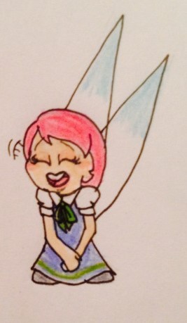
Ribbon’s mom
where’s her husband??? we just dont know
she’s doing her Best™ to be a good mom to Ribb
Lace Parisa

Mirror World!Ribbon
an edgy lil shit
very grumpy
why have i never posted a coloured pic of her
Shadeleine Walsh
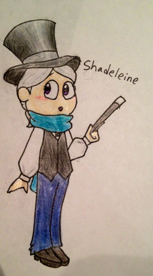
Mirror World!Adeleine
Probably the OC I fiddle the most with.
She has a really strong Texan accent for some reason??? I don't know why I gave her it
Takes magic lessons from Wiz( that magician guy that no one seems to remember/care about?). As it turns out, their brand of magic is not anything she can pull off.
Works as their assistant sometimes... Even if it can be slightly terrifying because of their methods (their magic lets them make the tricks a bit more than just illusions). Shaddy has gotten cut in half (or more parts) more times than she cares to count.
Actually more interested in drama, but she's taken what she got.
She's good friends with Shadow Kirby! They hang out a lot!

Her name used to be Shado. And yes, that IS pronounced the way it looks like it is. She hated it.
Owns an oversized magenta sweater and wears it at ever chance she gets. Wiz hates it.
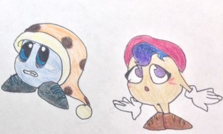
there wasn’t originally another character in this picture what are you talking about
Shadow Marx (left)
Mirror World!Marx (no duh)
Mild insomniac. He hates it.
Just wants to sleep, like any other noddy.
Dating Mirror Magolor
May or may not have kept him up with his late-night thoughts a few times.
Syzzle (right)
Mirror World!Gryll
Doesn't care about Star Stacker (or any similar game) in the slightest.
A complete NERD
Probably owns a library or something
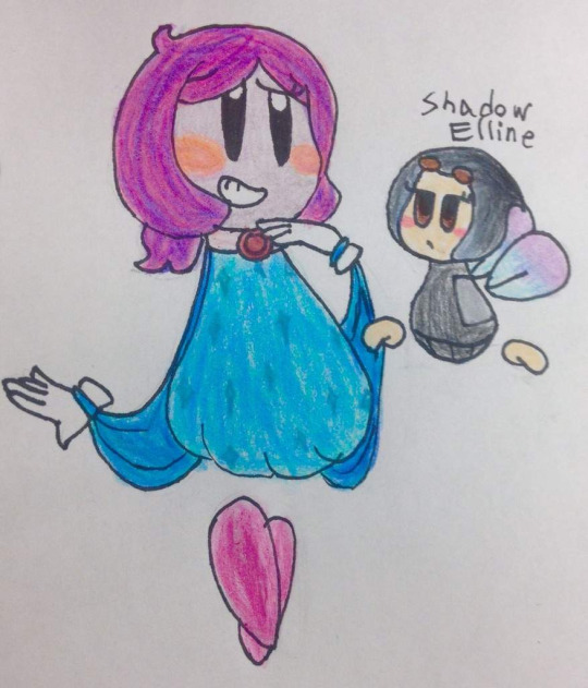
Theatra (left)
Mirror World!Claycia
Complete drama queen
Which is good, because she's an actress.
Gay as hell for Shadow Elline
she’s supposed to have horns like Claycia, but I forgot them in this picture
Shadow Elline (right)
Mirror World!Elline (what a shock)
An inkbrush fairy-thing
Writes most (if not all) of Theatra's stuff
Gay as hell for Theatra
the ‘straight man’ of the duo, despite being neither straight nor a man
Mirror Magolor
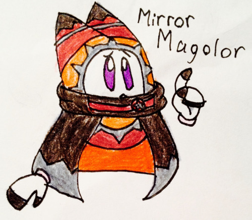
Mirror World!Magolor (obviously)
An anxious little negg (nerd egg)
A cinnamon roll (unlike his counterpart)
Protect him
Knows nothing about where he came from
Dating Shadow Marx
Slightly annoyed by how much he keeps him up. But he stops rambling... eventually.
More info on him can be found here
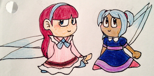
Rose Symyva (left) and Violet Larivi (right)
They're married
Rose is pretty chill, Vi's a bit more eccentric.
Don't insult Violet unless you want to face Rose's wrath (which you don't).
I don't know much about them yet, they're mostly just designs.
Typhiste Nirymsu
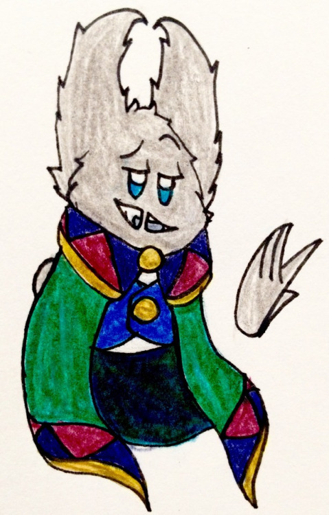
DEAD (GOOD RIDDANCE)
He was An Ass
Dated Magolor at one point.
Used to be a prince (now he's just dead)
LEMME SMASH
Echo

Also dead, but less so.
Died from electrocution.
Doesn't remember anything about her life, which distresses her.
When she was alive her name was Iris
Updated version of one of my first Kirby OCs
Niaviri Taysin
Also dead (for real this time)
A good little egg
Was a florist!
v gay with Odalania
Tislora Altryb

Mags’ mom
v sweet egg
maiden name is ‘Azaress’
was closer to her son than Aparctias was
idk what else to say about her
Aparctias Altryb
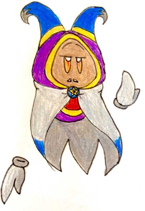
Mags’ dad
firm, but kind
taught the egg most of what he knows about magic out of family tradition
also got him started on learning English

Hynwari (left) and Sanfyria (right) Rimaddim
only exist in the Popa AU
super dead, even in the AU
both of them are Very Short (Sanfyria especially). they could make Meta Knight look like he’s average height
Popopo (the green half of Kirby)’s parents
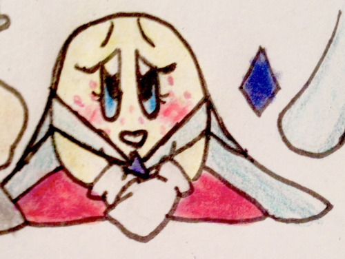
she’s supposed to have speckles i just forgot them in the original pic
they were specifically targeted to be killed just so their son could be taken from them by Nightmare

Hazel Pesyphomia (left) and Amelia Evitheth-Pesyphomia (right)
MARRIED
Adopted a certain artist as their child.They love that noodle-orb a lot
Amy would absolutely fight you if you were to insult her wife or her kid.
Were honestly really scared the first time one off their kid's drawings came to life
Twila

You know her. She's the one with all of those scarfies.
Spoils those little beasts
Was actually supposed to be trained as a Spynum, not a Simirror, but was more interested in magic than archery.
Lives mostly-alone in the woods.
Amicia Tyopt
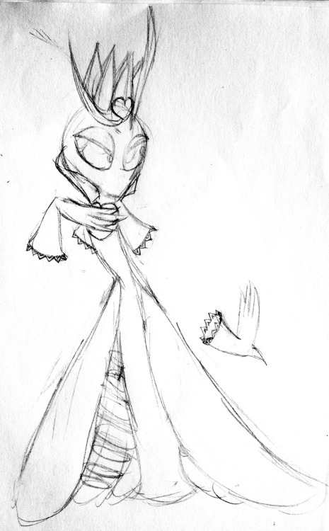
technically that’s not actually her in that picture but let’s look past that
as implied above, her body was stolen by sectonia (shown above)
idk anything about her personality yet tbh
Osgifu Amata

handmaiden moth, in more ways than one
worked for Sectonia Way Back When
deceased
Eglantine Cujoi
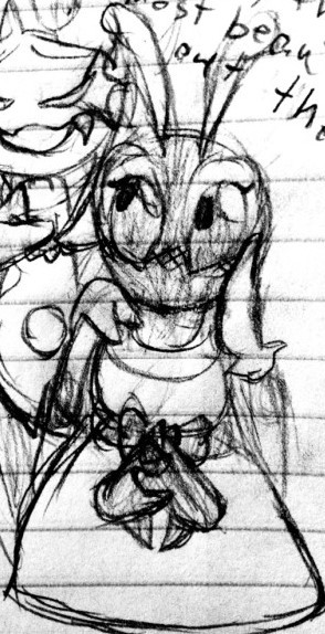
Into™ gals
first body stolen by Sectonia
deceased in both body and mind
Kimiko

anime-verse oc
demon beast
just read this it’s got all you’ll need to know about her
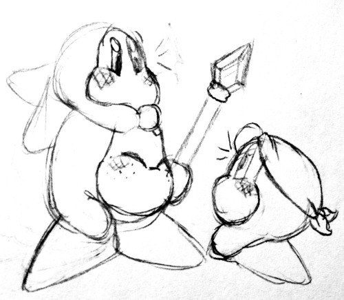
Jordan (the one with the spear) and Coral (on top of Jordan)
BWD's siblings
Jordan is their older brother, Coral their younger sister.
He works as one of Dedede's guards. She's too young to work.
Jordan's a little jealous about Taylor (BWD) outranking him, but he's proud of them at the same time.Coral is a little ball of energy.
They were the other Waddle Dees in Dream Collection's intro, and the sleeping Dees with the eye implants next to Bandanna Dee in Robobot( in the modern train level I think?).
Odalania
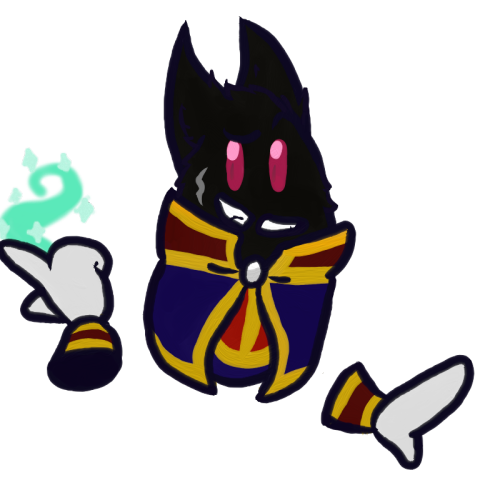
Dead
Really freaking good at magic
Lean Bean
Worked for Typhiste's family
Gay™ with Niaviri
also has a casual clothes ref
Magolor (not that one)

yes, every other time ‘Magolor’ has been mentioned I was referring to canon one. i call this one Old Magolor/Classic Magolor/etc. for simplicity
this is who canon mags named himself after
Old and Dead
one of the lor’s previous captains
lorlor
Cymboria Taysin

niaviri’s younger sister
she’s the bigger one
very sweet
good at magic
likes to travel
often brings foreign flowers back to nia!
Morastrum Altryb/Nirymsu
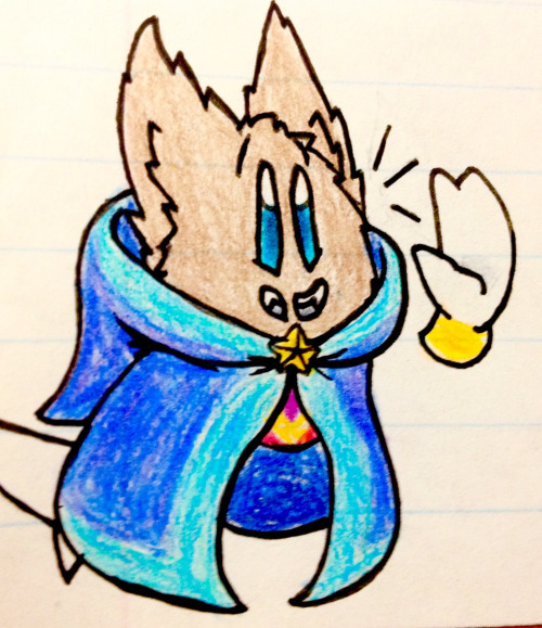
doesnt exist in the mainverse
a Good Lil Girl
... even if her dads (mags and ty) are both Asses
last name depends on if Typhiste is alive or not
likes sweet foods
Myrdinia
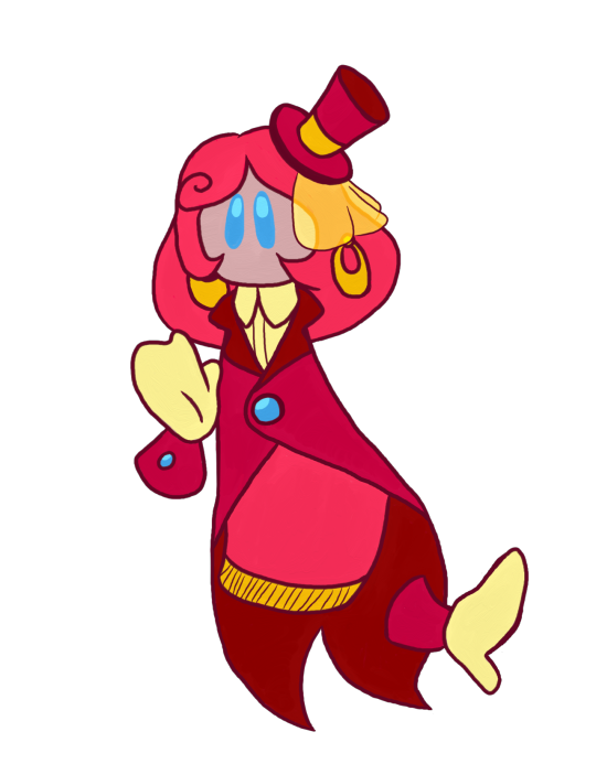
mirror world!drawcia
an automaton made by wiz
speech has a Low Quality Garble
incredibly bitter over the loss of her sister
always has at least 5 throwing knives on her
Glorious Nebula

really old
their language shows their age
how are they still functioning
no one’s really sure how they lost that quarter of their face
used to have one of those shooting star decorations, but it got broken off at some point i totally didnt just forget it
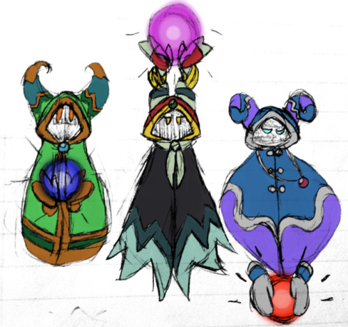
??? (left)
old and dead
one of the ancients
married to garulin, was very happy with her
probably worked a lot on the clockwork stars, but did help with other artifacts as well
pleasant guy, but not really anything special if you ignore his place in history
Drusorig (middle)
also old and dead
another one of the ancients
i don’t have a proper ref for him, but there is this
he has dark fur, for all that matters
i dont trust him
very strong magic
the master crown was his own personal project
he didn’t trust anyone else with it so i think you can imagine who the subject of his experiments with it was.
destroyed most of the evidence of his experiments before his death so no one would know about them
it worked
Volzavair (right)
also also old and dead
guess who’s also one of the ancients (it’s him)
actually has a proper ref
SHORT
gay, but ended up marrying a woman out of convenience and desire for offspring
relatively weak magic, specialized in technology
worked on the Lor Starcutter, but died before it was completed
his oldest kid probably finished it
Kyneriun Snekell
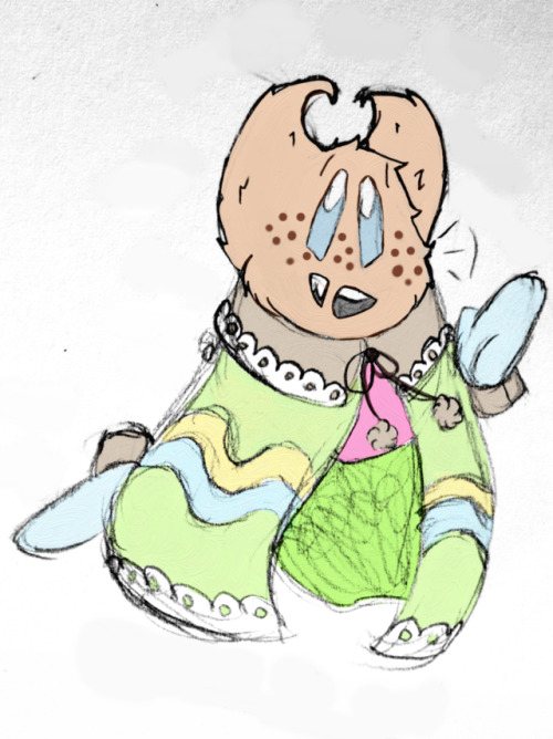
press ‘f’ to pay respects
sweet pastel boy
loves baking
a little younger than magolor
Dalindia Nirymsu

dead
was queen regnant
could be a pretty strict ruler, but tried to be a just ruler
her husband is dead(er?)
ty’s mom
tried to keep him in line
Tiltaii

i’m not even sure if that should be their name but i’ll just... roll with it
theyre nonbinary
a literal doodlebug (pillbug artist)
painted these portraits
doesnt have any magical abilities unless floating their hands counts
bought Paintra from Paint Roller, and was... pretty surprised, to say the least when she suddenly came to life
regardless of their surprise, they’re trying to take good care of her
???

a honey bee
runs a cafe
very polite, but not a pushover
more or less a design with a few ideas attached at this point
Garulin
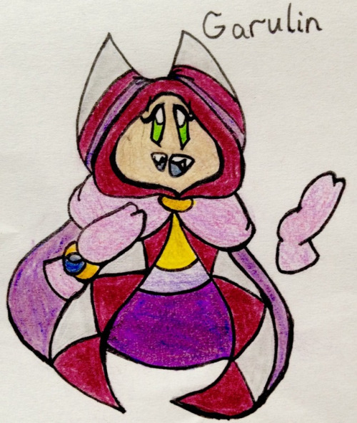
married to the unnamed green ancient
technically one of the ancients but not commonly acknowledged as one
pretty good at magic
mostly worked with the artifacts’ ‘mind’s, both through programming and magic
Shadow Sectonia
mirror world!sectonia (what a shock)
floralian jewel wasp
accidentally ended up corrupting other world!sectonia by having too much contact with her
naturally a wasp. hasn’t stolen anyone’s body
she’s too nice to do that
dead. actually got murdered around the same time her counterpart died
spoilery elements below (don’t worry he’s the last OC here)
Shadow Taranza

mirror world!taranza (who would’ve guessed)
overly-loyal
like, ‘would unhesitatingly die for someone he cares about’ kind of loyal
nervous mess, even before Sectonia died. that only worsened things
he’s not okay
#there's a lot of old art here so#youre welcome for that i guess??#idk i dont want to look at it either#Vesper's OCs#LONG POST#save#ref#maybe i'll update this one day#probably not#lmao theres actually a few that are missing because ive never posted anything about them here#or anywhere#i dont expect anyone to go through all of this because of how ridiculously long it is but Congrats if you do
7 notes
·
View notes
Text

I remade my Oc Meotios!!!!
Hell's manager, working for hades and managing the 3 judges.
He looks way better now tbh-
#saint seiya oc#oc#ocs#art#original character#original art#oc art#oc artwork#oc artist#i think i improved a lot tbh#i gave him back some of his original ref's design elements#like the yellow eyes and gray blush
1 note
·
View note
Photo
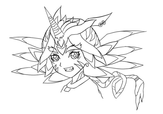
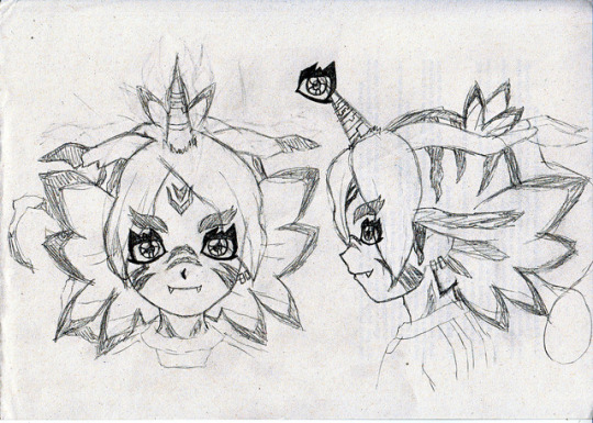
Happy birthday to me. /o/ And that’s the first and last time I mention it in this post. I don’t care and you shouldn’t either—I just want cake.
FubuGabu is back! Not by popular demand because, well, no one has asked for it, although the feedback I got was lovely. But, hey, I had this material ready, so might as well do something with it, lame as it might be.
These are some early and not-so-early doodles of FubuGabu. The latter was pretty much the base of the final design, but the former… that’s from 2014 or something wild like that. I actually had many more doodles and concepts, but I hated them all so much that I erased most of them. I’m surprised I could save that one. I might have kept it because it was a full lineart, I guess. In any case, I’m glad I could find that much.
Since it’s fitting to do, let’s talk about FubuGabu’s design today! There’s a lot to talk about, but my memory is awful, so I’m sure I’ll forget about some things. I hope it won’t betray me too much.
Anyway, as usual, more under the cut.
Well, well, well. Ain’t this boy one little shit. Fudou gave me nightmares. Kidou is still giving me nightmares (to the point where I’m considering changing the idea I’ve had for around a year now). Someoka was awful to draw and make sense of. Max’s tail was awful to work with. But Fubuki? Fubuki is on a whole different level.
Let’s start by talking about the final design, since that’s the better one. Not even good, just better. That’s an epic victory as it is, so who cares.
FubuGabu’s design, as the reference sheet and my last post states, is not based on Gabumon, but on Gabumon’s line. What this means is that it has elements from (almost) every single one of Gabumon’s evolutions. Just for the sake of satisfying people’s curiosity, namely @IshidoShuuji’s, I’ll list the different elements here, since that’s the easiest and most straightforward way to explain it:
Tsunomon: eyes, colour of the face.
Gabumon: horn, face stripes, teeth, hair ears.
Garurumon: eyebrows, pretty much all of the hair, hair tail, forehead marks.
WereGarurumon: nose stripes, pretty much all of the hair, earrings, eye scar.
So, no, MetalGarurumon, Punimon and Omnimon/Omegamon aren’t part of the design. …Or are they?
Just kidding. They are not. ww But you shouldn’t rule them out just because of that. Well, no—rule Omnimon out. There will be no Agumon miximax, so that isn’t going to happen. I don’t want to keep people’s hopes up for nothing. I made it pretty clear from the start that I wouldn’t use a franchise twice, but I bet most people don’t know that. So, yeah.
Now that I have broken down the elements, let’s look at them from up close. This is truly a difficult design to understand, so I’ll get the explaining done as I move along.
Let me start with Tsunomon’s part. I used the colour of Tsunomon’s skin because it looks human: I didn’t want to turn Fubuki into a furry—I mean, have him all covered in hair, because it just looks weird. It was either Tsunomon’s skin or Gabumon’s, and he’s BRIGHT YELLOW. So you’re welcome.
The eyes have changed very dramatically. Tsunomon’s aren’t all that complex compared to Gabumon’s, for example, so it was easier to pull off without screwing up too much. That’s in the early concept you can see above, Fubuki has eyes based on Gabumon’s instead and it looks like he’s using about 4kg of eyeliner, hah— You’re gonna run out of money if you wear so much of it every single day, pal.
They’re not exactly Tsunomon’s eyes, although it’s a rather radical change. As I mentioned when I talked about Creature miximaxes, eyes get rather distinctive shapes when animals (or monsters) are involved. I did something that goes against my analysis, though: I added light to FubuGabu’s eyes. Just because I hate myself and because it looked kinda weird without it.
While Tsunomon’s eyes are completely round, FubuGabu’s actually follow the shape of Fubuki’s eyes, although vaguely. The irises are Fubuki’s, period. I simply extended the lines to match the new shape of the eye. The lower eyelid creates a straight line based on the hypothetical line of Fubuki’s eyes, which is visible in coloured art. The outer part of the eyes also matches that of Fubuki, not to mention that I kept the fold over the upper eyelid and the little marks below the eyes. The main difference, therefore, is the thicker contour (which is linked to the spikes) and the curve that replaces the right angles on Fubuki’s usual eyes.
Let’s move on to Gabumon. His marks were probably the toughest to place, and it doesn’t help that Fubuki’s refs are so BAD. REALLY. Many, most characters have references that match. Maybe not perfectly, but almost. But Fubuki? Fubuki ain’t need none of that crap. When you are this FABULOUS, no one cares about your face changing size and shape in every screenshot or your hair going longer and shorter every 5 seconds. Everyone is blinded by your sparks, anyway, so who will notice?
I noticed. But anyway. ww
Since Gabumon only has markings on half of his body (since the rest is all yellow), I let FubuGabu borrow those on Gabumon’s nose. Actually, if you were to strip FubuGabu (please don’t do that), you’d see that his whole body is covered with markings. I like to think that those belong to Gabu, even if they could easily belong to Garuru or Were instead. Still, that means that the marks on his neck are Gabu’s.
As for the marks on his cheeks, they were very easy to place on the front view and frustrating to figure out elsewhere. I just gave up on them at some point and thought, “meh, Inazuma has pulled off weirder stuff!” They’re supposed to end somewhere behind the jaw, though, but before reaching the neck. Hence why I actually drew the jawline ww
The horn and the teeth are pretty self-explanatory, but I’ll point something out about the latter: I only added two teeth even though Gabumon has many because I wanted some kind of parallelism with Someoka. He, too, has two teeth, but they grow on the opposite direction. True teammates who complement each other!
Now, for the hair ears, aka those things growing from the sides of his head. Those are 100% hair—they don’t really serve a purpose. As such, using Gabumon’s seemed like the best idea. After all, what makes WereGarurumon’s ears interesting are the earrings, but how do you put an earring on hair? As for Garurumon, his ears are just more boring than Gabumon’s. Gabu’s ears are kind of quirky and worn out, which is a cool little thing that I felt like adding. Also, Garuru’s ears go upwards and I didn’t dig that.
Regardless, Garurumon is probably the star of this design. Most of the bigger elements are based on him, after all. You could argue that many of them also belong to Were, but I was looking at Garuru when I designed them. I guess that’s enough of a reason. I guess.
There was an element of Garuru’s design that I really, really wanted to add to Fubuki: the feather-shaped hair growing from his back. You know, these things:

After fiddling with that idea a whole lot, I eventually realised that it was best to keep it simple and shape Fubuki’s hair to look like those… however you wanna call them. I’ll just call them feathers. It may not be a perfect resemblance (and it may not make perfect sense either lmao), but I definitely thought it looked the best. These are actually not too hard to draw:
The first feather (from the top) follows the natural curve of Fubuki’s hair, but instead of curving down again, it creates an arrow-like shape.
The second feather starts and ends in the exact same spots as Fubuki’s, but instead of curving upwards, it’s completely horizontal.
The third one is the trickiest: it’s long and doesn’t match Fubuki’s normal hair. The part that touches the second feather starts where it should, but the part that touches the fourth one doesn’t. It’s tough to explain, so here’s a picture that will hopefully make it all clear:

The last feather is shorter and isn’t as diagonal as the third one, but it does start and end at odd places, too. The “trick” to draw it is keeping in mind that the third and the fourth feathers end at pretty much the same height:

The fifth feather isn’t even a feather; it’s just a simple spike. Nothing relevant there ww
Garurumon is also responsible for the marks next to the ears and the one on the forehead, not to mention the top of the head in general. The ones on the ears weren’t too bad, but the forehead was frustrating. As I mentioned, Fubuki’s references are a mess and I draw over them for the sake of keeping the original proportions, but it backfired in this case. Since they’re all so different from each other, Fubuki’s forehead grows bigger or smaller depending on the view, so the forehead mark is radically less visible sometimes, even though it technically shouldn’t be. Still, rather than repositioning it every time, I thought it made more sense to place it correctly to settle for a specific place, so that’s what I did.
Now, the top of the head is tricky. Let’s start by saying that it’s based on Garurumon’s back. Maybe WereGarurumon’s too, but I couldn’t find a single picture of Were’s back, so who knows. As you can see in the following image, Garuru’s back has a long, thin line that goes from his head to his tail, and that’s exactly what happens to FubuGabu too. You can’t quite see the end of the line because of the hair, but it’s still there… technically.
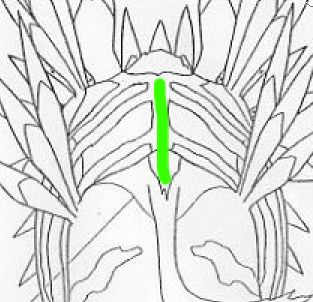
That thin line sprouts into a bunch of rugged lines, and that’s exactly what happens with FubuGabu too. The lines are rather random (and I didn’t spend much time figuring the size out, whoops), but they do follow some certain shapes. The closest line to the face might be rugged, but it goes straight down. The second one starts from way back, but it’s shaped like an arrow pointing at the face. The tips of both lines are fairly close, too. The third line is way smaller than the rest, and is also the last one you can see, but definitely not the last one in general.
Let’s talk about Fubuki’s little sprout as well. As you know, Fubuki’s sprout has two locks of hair, but FubuGabu’s has three. That’s because FubuGabu’s is also based on Garurumon: to be more specific, on this part:
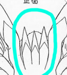
I tried adding that part just the way it is by sticking it to the forehead, but I didn’t like the result at all, so I figured it was best to do something funny with Fubuki’s sprout instead. Oh, well. Choices! And talk about choices, I added Garurumon’s tail simply so the hair would be a complete portrayal of his figure. As I mentioned in the post I linked to above, miximaxing with creatures often leads to that, so yeah.
The hair is obviously the biggest and most visible part of FubuGabu’s design, but Garuru hogs quite a few other spots. Not Gabumon, nor Tsunomon, nor WereGarurumon (nor Punimon) have eyebrows, so I was pretty much forced to use Garurumon’s. Not like I mind, because they’re pretty awesome. It’s kind of sad that they’re usually not visible, but, to be honest with you guys… they’re kind of a pain to draw because of their very specific shape. So I’m secretly glad. ww
And last, but not least, WereGarurumon. Ah, what a little shit. How come there are official linearts for MetalGarurumon, but not for WereGarurumon? Anyway. ww
Were’s contribution is pretty straightforward. Earrings, a scar and marks. There are a couple of things worth mentioning, though.
For the earrings, I noticed too late that Were has both white and red earrings. I was going to use the red earrings because they stand out more, but I noticed that the visible ear was on the side of the white ones… And it was too late to change the design completely, so I just went for the white. Too bad, but life is simply unfair. Especially when you don’t pay attention.
Now, the nose marks are funny. I struggled so much with those. As you can see on the second picture of this post, they were originally going to be shaped like triangles, but I didn’t dig that. And even after I changed the design, I couldn’t get them right, which was… frustrating.
(Also, it took me a long time to realise that the bridge of the nose would be hiding one half of the marks in every view except the front one. After I did, though, everything finally looked better. Thank goodness.)
Anyway, I think that pretty much covers the final design, but let’s also talk about the early designs real quick.
Nothing much to say about the second picture of the post. I just made sure to make some sense out of the markings and retouched the elements I mentioned above. Well, I tried to polish everything, really.
Now, the first picture of the post is easily over 2 years old. It was one of the first, if not the very first, concept of FubuGabu. And, man, what a mess.
It was like, “what does Garurumon have? Feather thingies! SO LET’S ADD THEM EVERYWHERE.” The feather thingies appear on his forehead, the locks of hair over his face, on his hair and even behind his head. I could never figure the latter out—but, man, did I spend hours trying to make those work. And all because Garurumon has feather on his face and on his back, so I felt like FubuGabu needed two layers of feathers too. Thankfully, I eventually realised many of these elements simply weren’t needed, like that second layer of feathers, the earrings on Garurumon’s ear (which, again, are made of hair, so wtf), and… the ring at the end of the tail? Where did that come from? This is Garurumon, not Gatomon! Geez, self!
Some of the early elements made it to the final design. The overall shape of his eyebrows, the markings on the head, the neck and the cheeks and even the horn, just to mention a few. The final feel to it is completely different, though.
This is probably because of how different the hair looks. FubuGabu’s original hair was full of feathers, but they didn’t fit Fubuki’s normal hair. They were randomly coming out of his head for whatever reason. Not to mention that the hair falling over his face looks like tentacles rather than anything else. It looks like a miximax with Squidward rather than with Gabumon. Ugh, I hate myself. XD
One last note: I don’t know where the forehead mark on that first design comes from. I guess it’s meant to be Gabumon’s, somehow? I forgot and I’m too tired to investigate it. It probably never made sense, anyway. XD
I think I covered everything! But, phew, that took long. Still, if anything isn’t clear or there’s something I forgot to mention, please let me know!
(Also, I’m too tired to re-read this post, so excuse the many typos that I probably made. I’ll check it out... eventually.)
25 notes
·
View notes
Text
The Long History of the Omega Seamaster
https://www.divewatchhq.com/?p=8145 It doesn’t seem to happen so much anymore, but back in the day luxury watch brands liked to celebrate their significant birthdays by releasing entirely new collections. That was certainly the case when Omega chalked up its centenary, commemorating 100 years in business way back in 1948. They marked the anniversary with the release of a line touted as the ideal watch for customers looking for something robust yet elegant, a model suitable for ‘town, sea and country’. Its name—the Seamaster.
The Omega Seamaster Planet Ocean 600M Coaxial
Over the last seven decades, the family has grown to become the most varied in Omega’s whole lineup, the name adorning everything from sophisticated dress pieces to gargantuan chunks of solid steel. In between, they have been the favored timepieces of underwater pioneers, royalty and military action men, both real and fictional. Below, we will take a look at the Omega Seamaster history and key references.
Omega Seamaster History: Let’s Start at The Beginning
The original Seamaster was a relatively simple affair, taking its inspiration from the models Omega had supplied to the British armed forces in the Second World War. Known as W.W.W watches, for ‘watch wristlet waterproof’, they were prized for their sturdy build quality and excellent legibility, two elements that formed the groundwork on which the Seamaster was, and still is, constructed.
Omega reissued their original Seamaster at Baselworld 2018
Although ostensibly meant as a more formal wear, there was an inherent toughness to the design, with the brand already having plenty of experience with waterproofing; the Omega Marine had come out in 1932, considered in some quarters as the father of the dive watch, although it bears little resemblance to the concept as we know it today. Even so, Omega had cultivated the reputation and when the Seamaster landed it only strengthened the company’s position. Key to much of the watch’s ability was the use of rubber O-ring gaskets, which were able to retain their shape, and therefore their imperviousness to water, over a vast range of temperatures far better than the shellac or lead seals used by rival manufactures. In 1955, the Swiss Laboratory for Watch Research tested 50 Seamaster cases to a depth of 60 meters, and the results from that successful study, and the subsequent experimentation with new materials, gave rise to a trio of tool watch collections among the most popular ever made.
The Professionals
1957 saw Omega roll out the first Seamaster 300, a true diver’s watch that made its debut alongside the consistently underrated Railmaster, a model for scientists and engineers that lined up against the Milgauss, and the inaugural Speedmaster, which needs no introduction.
The original Seamaster 300 is one of the most iconic dive watches ever made
The original reference, the CK2913, showcased the brand’s new Naiad winding crown, their answer to the screw down design, the patent for which was still held over at Rolex. Omega’s invention was mounted on a specific type of spring inside the winding tube that created an ever tighter seal under increasing water pressure. It meant the deeper the watch was taken, the more protected it became; the downside of which was a certain vulnerability at shallower depths. Nevertheless, as its name suggests, the Seamaster 300 was rated waterproof to exactly…200m! I know; the reason for the discrepancy is, depending on which story you prefer, the fact that the testing equipment of the time could only simulate pressures of 200m maximum, or it might equally be that Omega just thought 300 sounded better from a marketing standpoint. The choice is yours. Whichever is true, the watch was an instant hit, arriving at just the right time to capitalize on the craze for recreational Scuba diving as well as drawing the eye of one legendary name who explored the underwater world for a living. When, in 1963, Jacques Cousteau embarked on his Precontinent II expedition, the French oceanographer’s experiment to develop a permanent subaquatic habitat, the Seamaster 300 became the timepiece of choice for him and his team.
Continental Shelf Station Two was an experiment by Jacques Cousteau, where he first wore a Seamaster
The watch went through a redesign in 1964, with an enlarged bezel as well as the case increasing in size overall from 39mm to 42mm, and receiving the twisted bombe lugs still present on most models today. Military customers followed, particularly the British Special Boat Service (SBS), although the limitations of the Naiad crown made the association a relatively short one, giving way to the Rolex Milsub Submariners in the 1970s.
600 and Beyond
New technology gave rise to industrial saturation diving in the 60s and 70s, and with it, new challenges to overcome for watch manufacturers. The main hurdle concerned the gas mixtures being used at the enormous depths crews were now required to work at. A Trimix blend allowed divers to breathe far deeper than with a standard air mixture, but with the drawback of having to use helium. With one of the smallest molecules of any chemical element, the tiny helium bubbles easily penetrated the cases of watches, and then expanded as divers ascended to the surface and forced out the dial crystals.
The Rolex 5513 Submariner was retrofitted with a helium escape valve, courtesy of DOXA
Three manufacturers sought to address the problem. Rolex teamed up with Doxa and devised the Helium Escape Valve (HEV), a small, one-way regulator fitted into the side of the case to allow the gas to seep back out of the watch before it could cause any damage. It was first retrofitted onto a ref. 5513 Submariner, before becoming the defining feature of the all-conquering Sea-Dweller in 1967. Omega went a different way. Their solution was to stop the helium getting inside in the first place and so came up with the Ploprof (PLOngeur PROFessional—professional diver) Seamaster 600.
The Omega Seamaster 600 Ploprof was forged from a block of stainless steel, in case you couldn’t already tell (photo: toolwatch)
Forged from a single block of stainless steel, with a 4mm thick crystal, it was more barn door engineering than Rolex’s elegant response, albeit a highly effective one.
Hydrostatic tests rated it waterproof to 1370 meters, but with a lumpy 54mm case, it wasn’t much of a looker and was a commercial failure. Its even hardier follow-up, the Seamaster 1000, suffered much the same fate. Even so, the 600 accompanied divers on a record breaking expedition in the Ajaccio Gulf in France, spending four hours a day over eight days at depths of 253 meters, and coming up smiling. The public may have been indifferent, but professionals loved it.
Image Boost
The Seamaster range expanded into several distinct lines throughout the 70s and 80s. Chronographs emerged with styling a world away from the original but very much of their era. For the 300 however, the best was yet to come. After a six year absence from the screen, James Bond was back and in need of a new timepiece.
The Omega Seamaster got a new lease on life with their introduction into Bond films
In 1995 Omega scored a massive coup by replacing Rolex as watch supplier to the world’s favorite secret agent. In Goldeneye, Pierce Brosnan sported the Seamaster 300M, a new collection released a year before, complete with its own Helium Escape Valve. The quartz-powered model with a distinctive blue dial and bezel, the ref. 2541.80, catapulted the watch instantly into the category of ‘must-have’. So far, the franchise has used various references in a total of eight Bond films, with Omega surviving the leap from Brosnan’s super smooth portrayal to Daniel Craig’s far more gritty interpretation. In Casino Royale, Craig’s debut outing from 2006, he unveils the Seamaster Planet Ocean for the first time. A contemporary reimagining of that original CK2913, the Planet Oceans are even tougher, with thicker cases and waterproof to 600m. They are also the first Seamasters to be given Omega’s Master Chronometer Co-Axial movements, with their massive magnetic resistance.
James Bond switched things up a little bit in Casino Royale with a Planet Ocean from Omega
Bond has stayed loyal to Omega and the different models in the Seamaster family. In 2012’s Skyfall, we see him wear the so-called entry level piece, the Aqua Terra, aimed more at a life spent riding the ocean waves on a luxury yacht rather than exploring below. And in Spectre, the most recent adventure from 2015, he goes into battle with a special commemorative edition of the 300 created to observe the CK2913’s birthday.
Latest Models
The professional Omega range goes from strength to strength, with 2017’s release of a nostalgia drenched trio which were an almost mirror image of the original Railmaster, Speedmaster and Seamaster from 1957, updated with the very latest in the brand’s industry-leading calibers. This year they were at it again, diving even further back in time with the limited edition Seamaster 1948 duo (pictured above). A revival of the first watches to bear the name, launched some 70 years ago, they are a pair of 38mm dress pieces in either a central seconds version, or with a small seconds sub dial at the six o’clock. Reintroducing the same dauphine hands and elegant triangular indexes, they are about as faithful a likeness of the watches that started it all as you could wish for.
The Omega Seamaster history is full of lessons and key victories
The Omega Seamaster history is incredible – the longest continuously running model from a brand not short on heritage. Whether from the professional or dress lines, the watch has always been a fan favorite—and will continue to be so for many years to come. The post The History of the Omega Seamaster appeared first on Bob's Watches
0 notes