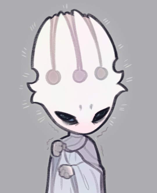
#don't mind that little white line around his lineart
Explore tagged Tumblr posts
Visit Tumblr Blog
Explore Tumblr blogs with no restrictions, modern design and the best experience.
Last Seen Tumblr Blogs


Fun Fact
In 2020, 27% of US Tumblr users had an annual household income of over $100,000.
Text

Here he is in all his traced, colour-dropped glory. As mentioned, I took liberty with anatomy here and there, as well with some colours, since the pixelation of the screenshot was really washing them out.
Feel free to use this for your own colour-reference purposes. Or don't. I'm not your dad. Whatever.
#Danny Phantom#Vlad Masters#render#don't mind that little white line around his lineart#that's just what happens when I crop out negative space for some strange fucking reason
33 notes
·
View notes
Note
Okay back for some more art related questions.
How did you make fpk so pink without actually making him pink? I feel like every time I try to draw a pale character with an undertone of color, it looks like that color even though on the color wheel I added like 3% of the color.
How long does it take you to do your art? For an example how long did the fpk reference sheet take you compared to The Cycle art piece with Grimm?
How do you eyeball man? Your art is literally the reference pictures I use to try and draw dark eyes but every time I try to draw them, it looks like Kawaii eyes. Like the eyes in this emoji:🥺. How do you do it?
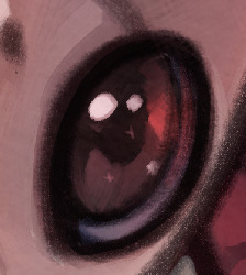
it all comes down to a very simple thing - it's about highlights that trick your mind into seeing a different color. i'll mainly talk about pink here cause that applies to fpk and i have examples, but i'm sure you could apply this to other colors
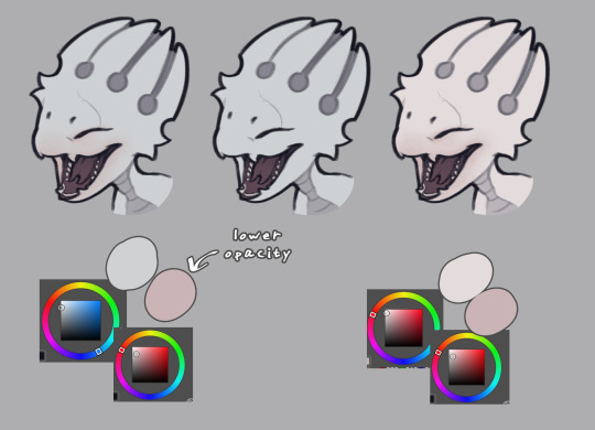
here he is with the pink highlights, without them, and what he would look like if he was actually pink. see the difference? he's still predominantly light gray, but the pink details make you see it as more pink-tinted than he actually is
it's not a 1:1 match since he's leucistic as opposed to fully albino, but i was heavily inspired by pictures like these:
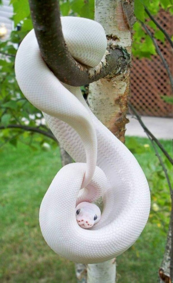
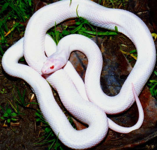
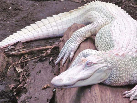
if you notice, they're not pink, all of them are white, but the pink areas around the mouths or in the shadows make them appear pink-ish
his pre-hibernation look is a lot closer to these pictures, since his soul glow made him more white than light gray (he also has very subtle iridescence)
the lineart also plays a big role in making a white/gray character appear to have a certain color
here's fpk as you see him on the ref with gray lines + pink highlights, with the highlights removed, and with pink lines (the shadow behind the horns was adjusted as well to match the lines)
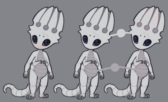
both 1 and 3 appear to look light pink. the third one especially affects how the body looks, so depending how subtle you want the effect you may choose between the two options. or mix them, whatever you like. and as you can see, the colors on the last two are identical, but the one on the right looks more pink
(and if i'm being honest, i may actually snatch those pink lines for future drawings, cause i really like how that looks hahah)
---
2. it's very difficult to say, i get distract easily so i never keep a proper count. but the unshaded drawings don't take very long, unless there's a pose or any other details that gives me trouble, and i focus all my attention on it, i'd finish the lineart and color phases in probably around 30 minutes? the sketch always influences the length of the process the most, so there's no single way to determine it
and in the case of references, it naturally adds up. the last updates aren't exactly the most reliable way to deduce that since a lot of them were just updates to existing drawings. but if i were to start from scratch, had clear poses in mind and didn't get distracted, i could probably get it done in like two hours
as for the more detailed drawings, they take a lot longer. again, i can't really say how long, the cycle drawing took me a few sittings, but if i had to guess it was probably a few hours in total? maybe around 5? just guessing
---
3. depends which style i go for. in the unshaded style i keep the eyes simple. one flat color and two lighter colors for the reflections. the more subtle ones play a big part, they make the eye look more 3d and wet. and that also carries over to the painted, shaded style, which includes additional lighting and some details. i particularly like the little star shaped reflections, i think they're adorable but they're subtle enough where they're not distracting
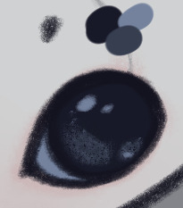
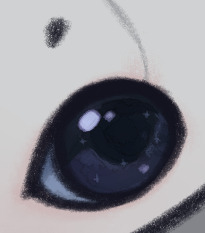
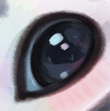
another big part of how i paint his big black pupils is their reflective nature. in a brown room, they'll look more brown than black and so on. it's very exaggerated, normally such eyes wouldn't change color to such a drastic extent, but i think it makes the drawings look more interesting
i can't really offer any specific tips other than that, since i kinda make it up as i go. but using photo references is always helpful, especially for different eye colors
41 notes
·
View notes
Note
Hi i follow ur mademoisemuder tumblr account and I really like how smooth your lineart is especially the black & white manga style and regular linework.would you be willing to share your brushes or brush settings? A photo works to. I use clip studio & I’ve been dying to draw smooth lineart like you do! And your knife girl oc, to die for! A friend said she uses a brush size of around 6-7 with no taper and adjusts her pen pressure settings, dunno how she does it, how is your brushes settings like? I’m a iPad person and I recently got a screen moniter but it’s a whole different experience switching from procreate iPad to PC. Please share your ways por favor , -art anon
THANK YOU SO MUCH!!!
I use Clip Studio too! I use it on PC with a tablet (regular, not screen), so idk how well my settings will translate for you but I'm happy to share regardless!!
First of all, and importantly: a lot of it is muscle memory and training that comes naturally as you continuously do lineart. With time, you'll notice that the bigger swoops and long lines/curves that form a smooth line will start to come more naturally to you simply because your hands get used to the motion and you don't have to actively think about it anymore. Hands are cool like that.
(but also sometimes a stroke just takes 15 attempts regardless. Strg+Z is your best friend.)
As for the brushes I use, I'll put them under a readmore (got a bit lengthy)
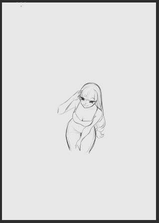
First, for a rough reference/guide regarding the brush sizes, I usually sketch on the base A4 layout with 300 dpi, but I sketch small and not page-filling. Here's a thumbnail so you get a rough feel for their size on an A4 page.
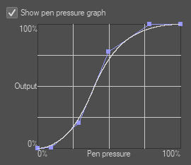
Also I recently adjusted my pen pressure settings a little (under File - Pen Pressure Settings) so it now looks like this, but it used to be the default until a little while ago though!
Onto the actual brushes:
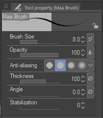
Most of the stuff on KG's blog is drawn with the Maa Brush from the CSP Asset store, so for example this, this and this were all done using the Maa Brush. I use it to sketch and line, usually on size 5-10, these are my settings:
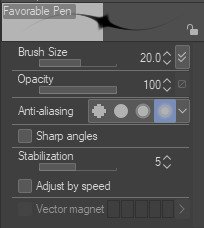
Next, for very thin delicate lineart I like to use the Favorable Pen from the Asset store, which I used here for example. I use around size 20 for it (I don't use a lot of pressure so the line comes out quite thin)
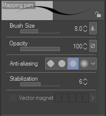
For a lot of my more rendered art I use the basic Mapping Pen in Clip. I used it for example for the recent story-arc update in asksds or for this. I generally use size 6-10.
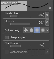
Back when I used SAI I had a brush called the Ballpoint Pen which I THINK I made myself in Clip (I at least couldn't find it again under that name in the asset store but I'm sure there are a dozen brushes like it) which is just a basic brush without pen pressure. I often use that one to get me out of a rut or to force me to focus on simpler shapes since it does kinda need you to be a little controlled to keep everything readable. I used it here and here for example. I use it at size 3 but keep in mind that I draw small.
I guess I could also mention that for most of the regular asks in asksds I use the Simple LineArt pen from the Asset store. There's no significant difference to the Mapping Pen, I just feel like the tips aren't quite as delicate as the Mapping Pen and I prefer that for sds...it might be an illusion though.
And we're done, those are the main brushes I use for lineart! Occasionally I try something different (like a G-Pen for a more textured look) but these ones are my regulars. I hope it helps!! (❁´◡`❁)
5 notes
·
View notes
Text
OK, but hear me out
Say Ride the Cyclone were to be adapted into a film; imagine how much fun it would be to see it animated.
Because for the main plot, like the intro song and the mostly dialogue scenes in limbo, you could easily do a stylistic, but still grounded in realism style that a lot of modern animated projects are doing right now (think Arcane or Into the Spider Verse). But once each of the kids go into their respective songs/fantasies for what their life could have been? What if those were done in completely different styles?? Imagine the additional, visual storytelling that would tell about who they are as characters?
Like say, for Ocean's number, WTWN, everything became more simplified, and the characters (especially Ocean herself) turned into a more rounded, chibi-like style to enhance just how cutesy and likeable she's trying to portray herself throughout that number.
Or for Noel's Lament, everything goes black and white, and the characters become even more 2D stylized, and the film scales down to a smaller millimeter frame, more reminiscent of cartoons from the early 20's, when animation was just starting out, to enhance his idealization of "the olden days" (as Ocean puts it).
Mischa's song, This Song is Awesome could be animated with a more choppy frame rate, and the character designs turn a little more jagged around the edges, kind of like animated music videos (I'm thinking a Gorillaz band vibe). But as he transitions into singing about Talia, the colors start to bleed out over their lineart, and become more paint-like and Talia herself moves like a rotoscoped character (think Loving, Vincent that came out a few years ago) to enhance the sense that she's somewhere between a real person and a fantasy Mischa's built in his mind.
Ricky's song would, of course, be stylized after those sci-fi cartoons from the 90's, like X-Men or Captain Planet.
For the Ballad of Jane Doe, I would love to see something like what Wolfwalkers did back in 2020, where most of the characters (in this case, the other kids) are for the most part, animated like traditional, 2D characters with very clean lines and neat movements, whereas Jane herself stands out for having messier, sketchy line art, and looks more and more unfinished in her animation as the song goes on, because she can feel more and more of her own identity being lost.
Constance's Sugar Cloud I could see done in the classic 2D Disney style (i.e., the Renaissance era of Disney, like the Lion King or Little Mermaid days) because not only is it really smooth and colorful and just all around nice to look at, but it reminds the average moviegoer of their childhood growing up with those movies (among others, obviously), which ties in nicely with Constance's preceding monologue about remembering her own life, and the good that came with the bad.
I'm even tempted to envision the first half of the finale song in a different style, when the stage production would show a quick projection of Jane/Penny's life after she returned to the world of the living. Imagine watching this animated film, and for that segment alone, it becomes that really hyper-realistic, almost uncanny valley CGI animation style, to show that she really has joined the world of the living, i.e. our world, among us, the living breathing movie goers watching this, and watching the other kids still in limbo fade back to that main art style for the final number.
I don't know; it just feels like something that would be so engaging to see from an already compelling storyline and characters. Especially with more experimental animation projects on the rise right now
#random rambling#Ride the Cyclone#Ocean O'Connell Rosenberg#Noel Gruber#Mischa Bachinski#Ricky Potts#Jane Doe#Penny Lamb#Constance Blackwood#idk I just really love animation you guys#so naturally I have to bring my latest hyperfixation into that world#might even sketch these different styles#for a better visual idea#but I haven't done any sketches in a hot minute#so who knows
1K notes
·
View notes
Text
Behind the scenes for this comic -
This is preeeetty long, so I'll put it under read more.
So as with all the other comics I have done, the process usually is: lay out panels - lineart - adding special effects (which really is just adding gradients, I haven't really figured out using proper comic tones and stuff -)
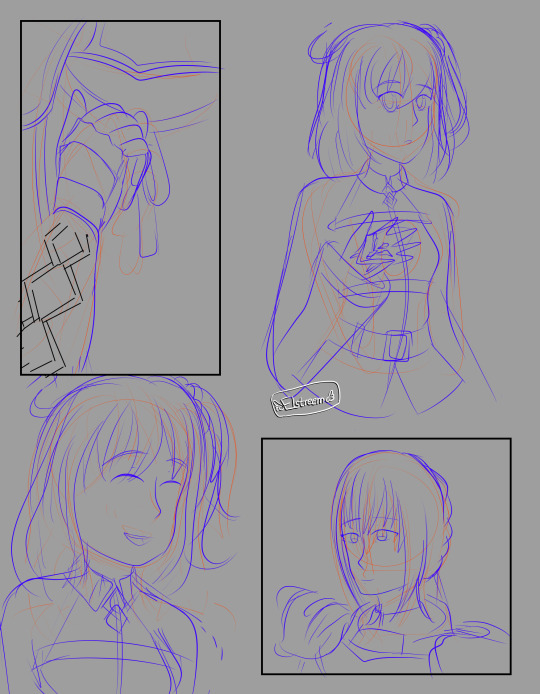

Sketches for pages 1 and 2! I often used red pencil for basic outlines, just to figure out what goes into which panel, and then a more polished blue sketch I can draw off.
Initially, dark Bedi (lol) had one eye showing but that just made him look like the angry mango Avenger so I decided to show only the mouth instead.
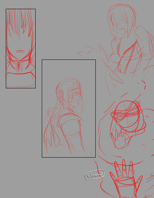
If I'm feeling confident enough, I go straight off my initial sketch, as was with page 3. Here's the comparison between the sketch and a finished lineart!
And it is not fun drawing the bby so distressed :'''<


Page 3 had a few things going for it, like the fact that it had a gradient background and character outlines were in white - which I kind of blunt-forced my way into doing by clipping another layer on top of my lineart and painting that white. So many layers lol. I had separate panels for the blood drip on Altria's chest because I honestly wasn't sure what I was doing lol.
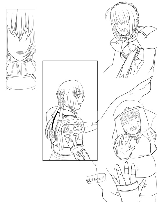
As for Princess Helena's design (again, she's the princess abducted in the story of the Saint Mont-Michel) there's nothing really deep about it. I don't think Fate will ever show what she looks like so I just thought to draw a princess-y outfit, but I ended up kind of liking it.
And man, the fact that Bedivere still remembers Princess Helena and feels guilty over it after all those years, enough to tell Ritsuka about it in his Interlude. I kind of wanted to explore that really, that he feels a lot of guilt for the people he thinks he failed, and naturally, that fear of losing another person he loves extends to Ritsuka. Which leads to imagined fears on the next page.

Page 4 is probably the most complicated page, it took me 3 hours working on the line art for this. The hands around Ritsuka are the Foreign God and Goetia...well, I tried, but Beast I has really detailed hands...
It's a bit confusing to me how much of Chapter 6 the summoned Bedivere actually remembers, because Mash says he probably didn't experience it, but he definitely is aware that he's a Bedivere from a different history - the profile even says he swore loyalty to Ritsuka because they helped him fulfill his wish. So...does he actually remember it or not? From some comments on character materials on the wiki, he acknowledges the Camelot allies, and he finds himself upset at seeing Altria Lancer (which she also comments on in her own materials and I realllllly wish we see this interaction in the game.) He also knows she isn't his King, so he seems to know that they were able to let Goddes Rhongomyiad to rest. On the other hand...Bedivere seems to avoid talking about Camelot in Tristan's Interlude and doesn't seem to acknowledge it in his My Room lines. Which could just be him not wanting to talk about it rather than having forgotten, but couldn't be Fate without some messy lore. Welp. This got long.
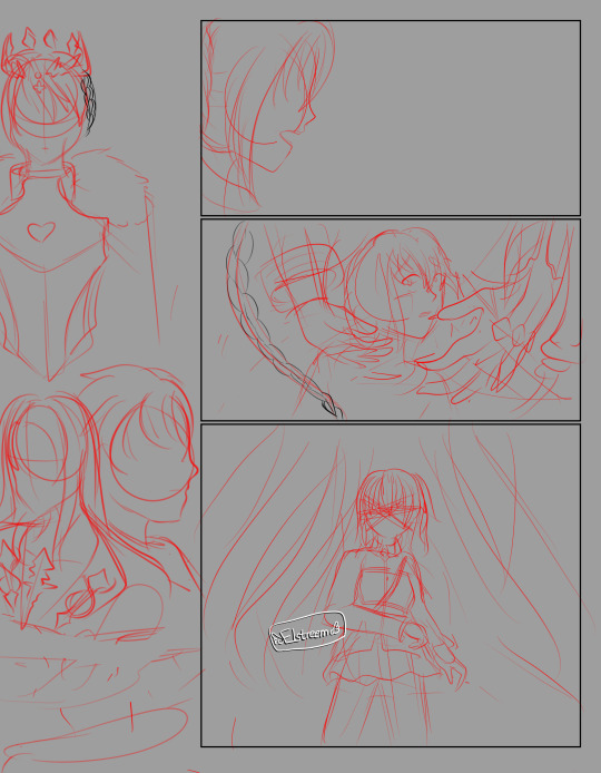
Anyway, these four pages are actually the only ones I initially laid out, and the rest is me going rogue and thinking, "Let me add one more page....hm, not concluding enough, one more - and one more -" so the rest of the comic is a bit plain in comparison.
It's a bit of a mind twister figuring out where Ritsuka's side ponytail is every time I draw her. I've drawn Bedi enough times to not be confused where his metal arm is lol.
I also realized midway that it's a little confusing as to what is really happening and half-assed it into Bedivere having his intrusive thoughts while walking with Ritsuka. The first four pages had something going for it which changed in the last six pages, that's me not planning ahead lol.
What else...oh yeah, I initially wrote all dialogue in by hand but my handwriting is atrocious and not really consistent, so I ended up using CSP to insert the text. If you're ever gonna make a comic, don't be like me who lays out all the visuals with only a vague idea of what the dialogue is gonna be and then end up with longer text than expected in place ^^;
0 notes