#custom fr dragon
Explore tagged Tumblr posts
Text


Orion
#fr art#flight rising#fr dragon share#flight rising art#fr veilspun#dragon: orion#i've been on a roll with personal customs lately
217 notes
·
View notes
Text
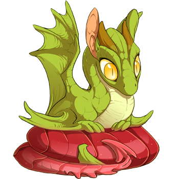
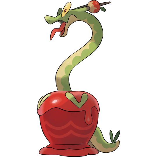
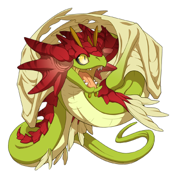

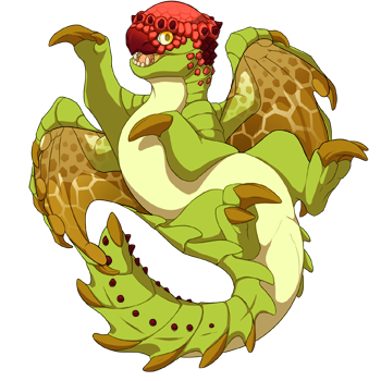
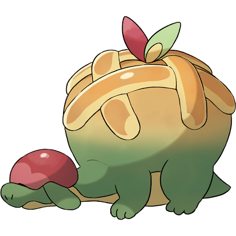
(1 2 3)
#i REALLY wanted to use a snapper for appletun but pachy was just too perfect of a gene#none of these are final but im SUPER tempted to make the hydrapple one real#and make a custom skin for the apple instead of using glowtail#fr#flight rising#pkmn#sassy speaks#tbh I can't believe it took me so think to scry these they came out WAY cuter than expected#i think itd be really cute to somehow use a PC skin to make the pearl Applin but idk how id incorporate the actual dragon into that LMAO
392 notes
·
View notes
Text
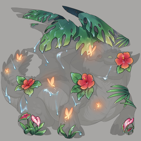
Tropic Sunshower
this is going to be my nature fest entry this year nwn if it doesnt win i'll definitely be printing it
365 notes
·
View notes
Text


Back in the Snappy mood! If interested in your own, check out my adopt thread! :D
https://www1.flightrising.com/forums/adopt/3377932
28 notes
·
View notes
Text

✧ the crone
#flight rising#fr#fr art#flight rising art#frfanart#my dragon#my art#wildclaw#fr wildclaw#she's my custom progen I love u u soggy cryptid girl
105 notes
·
View notes
Text
been thinking about this since my last post, I think it'd be fun to start up some stuff like worldbuilding wednesdays again! what do you guys think about having a little community lore 'event' where we all chime in this Wednesday July 3rd?
#kal rising#flight rising#flight rising lore#fr lore#fr dragon share#fr dragon showoff#flight rising dragons#wishing I could make a poll last a custom amount of time#one day will do#disclaimer: I wasn't around for fr tumblr peak so i DON'T know what I'm doing#I'm doing! my best
43 notes
·
View notes
Text
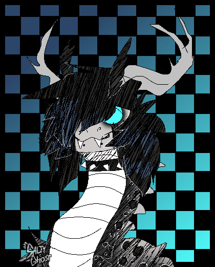
a left-handed conversesneakers sketch, because i injured my wrist and can't use it but i really wanted to draw
#fr#flight rising#frfanart#fr aether#aether#dragon#my art#sketch#conversesneakers#technically i did use my right hand for a few things#but i promise this was like. 90% left-handed#i should probably make a custom accent or smth for him tbh#once my wrist is healed obviously#aghhhhhhh i forgot an image description wails#it's fine. it's fine. there's one now.
110 notes
·
View notes
Text

Izan.
The forgotten founder. Cursed, to forever search the Forest. An aimless wander, to escape - but for why?
He doesn't remember anymore.
#flight rising#dragon share#fr pearlcatcher#pharaoh gene#foam gene#custom progen#dragon: izan#pronouns: he/they#collectors lore
13 notes
·
View notes
Text

Accent approved!!!


My ridiculously subtle accent for my sweet boy~
#i love him your honor#flight rising#flight rising accents#my first custom accent!#flight rising sandsurge#DRAGONS#fr sandsurge#flight rising dragons
7 notes
·
View notes
Text
maybe i like how aegon looks every bit of a targaryen but he's the one who rejects the customs and traditions of being one while jacaerys is his exact opposite. maybe i just like that!
#like man aegon does not want to be married to his sister fr#jace is the one who accepts the queer targaryen customs whole heartedly#house of the dragon#aegon ii targaryen#jacaerys targaryen#not team black not team green but a sinister third thing (team common folk who just wants lower taxes)
7 notes
·
View notes
Text


my progens.... i restored my custom in 2022, and yesterday i decided to restore and scatter my random. i'm very happy with them both!
#eye guy speaks#eye guy plays fr#flight rising#dragon share#my scries#it's a coincidence that they both looked great as obelisks :P#my custom is rust/maize/azure and my random is now cottoncandy/royal/lavender
8 notes
·
View notes
Text


been wanting to make new lore, revamp old dragons, and just... make my lair something i'm excited by. so. started off with my progens. this is my random (check read more to see his original form) Slate.
he's been a veil for a while but, today i changed his primary and found this incredible accent (Accent: Mistral Monarch) on the ah randomly.
also i haven't drawn a dragon in a while.. so sketched him since i'm inspired by his new look.

how he looked originally when i named him Slate (before i scattered him a bunch and turned him into a veilspun)
#flight rising#fr dragon share#flight rising dragons#veilspun#i'll post my custom progen after i sketch her#she finally got a makeover (after being a fae for almost 4 years)
38 notes
·
View notes
Text


my special boy Caius crocheted by @transtundras-fr !! ft. the shockingly luminescent pallor of my arm
Francis is offering these crochet doll commissions and I think the results are adorable! Caius is so sweet and has lots of tactile variation (fluffy hair, pointy horns, floppy cute feet!!). His scales were also crocheted onto his face giving him a really cool dimensionality. This is a perfect way to pay tribute to your favorite dragons, or get as a gift for a friend! I believe Francis does non-FR dragons as well, so go check out his work. He also makes them in multiple sizes, and this is on the smaller side!
#flight rising#fr dragons#fr imperial#crochet#textiles#textile crafts#textile art#dragon#dragon art#artists on tumblr#crafts#craft art#plushie#plushies#custom plush#custom artwork#art commissions#art for sale#art dragon#fr imp
12 notes
·
View notes
Text
Tutorial: How I Render Accents
PART 2: COLORS
I usually do not recommend 'pixel hunting' aka going over your work with a fine tooth comb and picking out stray pixels to erase. However, for setting up a proper base layer for accents it is imperative to do so.
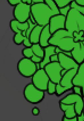
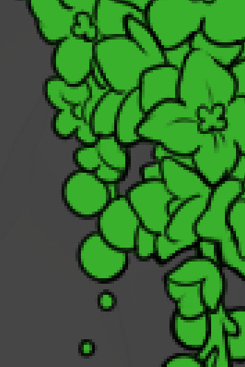
To explain my method of color blocking: I select everything outside of the lines, invert that selection, then fill in. This does a more accurate job than going into each and every section and filling them all in individually, and is also significantly faster. Only downside is small sections like above where you can see bits of the green (which I use bright green against a dark grey background to contrast the base color, lines, and background) poking out, as well as the inner section where it filled in a spot I did not want filled in. Getting all of this right in this stage will make your life easier as you go. (It's also the method I use to color block all my work, even beyond accents)
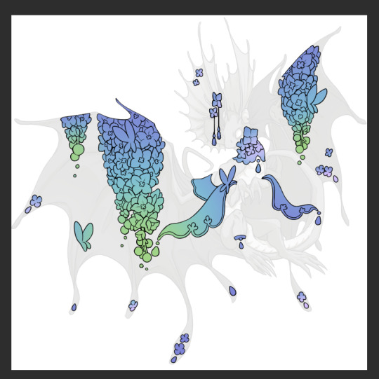
Now this where my style of rendering color may come off intimidating and, tbh it might be. I do gradients first and then I color over them with "normal" blend layers. I typically don't use multiply layers unless I'm shading something that has a lot of textures. If this scares you, it's okay I'll keep walking you through it. Here, my gradient goes from a pastel but deep periwinkle, to a soft more cyan blue, then to a lighter pastel green. Skipping steps and going from the periwinkle to green will give it a different look. There's also hints of a pinkish tone as an accent color.
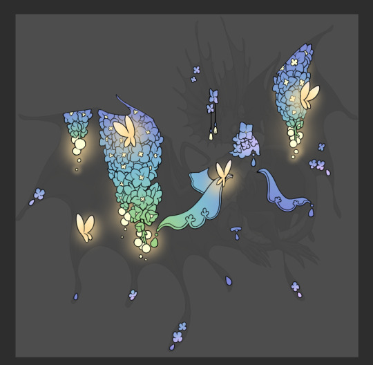
So as I said, these additional layers are done with regular "normal" blend mode layers. I've placed one in between the butterfly line art and the line art for the rest of the flowers, and then an additional layer under everything else. This allows me to create a glow effect specifically around the butterflies, and then specifically under the flowers. Going back and forth with the proper amount of opacity (by using the airbrush transparently) helps to make it glow but not be Too Loud. Also checking it against a dark background can help to check for spots where it spills past the borders, as well as really gauge how Bright it is. I've also color matched the butterflies with the flower pits and the bulbs. This adds extra cohesion and makes them all look uniform but different enough with the gradients.

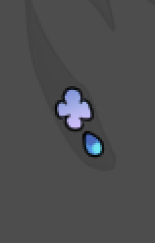

The stages of how I render gems/dew drops. Take the base color, make it a bit darker and less saturated (as well as changing the hue a bit depending on what the default color is. For yellows I go more orange/red, for blues I go more purple or even pink. It depends), add a small drop light at the bottom thats a fairly saturated version of the base color, and then a stark white/ near white highlight. That's it. Don't over complicate it, it will not matter when it gets shrunk down. Note that I do not use multiply/overlay/screen layers for these types of things as it adds too much bulk to the files and doing it manually helps to strengthen your color theory skills.
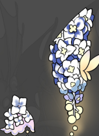
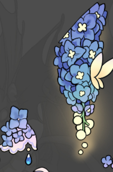
For shading and rendering, again, I create a "normal" layer and simply. Draw over what exists. Color picking and hand blending allow me to create the exact shades and effects that I want that multiply/screen/overlay layers may not be able to achieve. (which isn't to say I dont use them! i just don't use them for the main meat and potato part of my coloring) All of what is shown here is also achieved with the CSP asset SOIPEN (which can be found for free in the asset store)
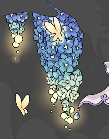

another example. The one on the right is showing how the layer looks without the gradient base layer under it. All of this is rendered by hand. I also specifically put a highlight color around where the butterfly is sitting to give a better illusion that it is properly sitting on the flowers rather than just in front of them.
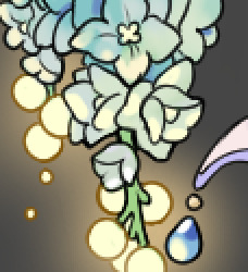
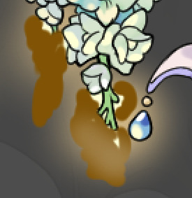
Next is changing the color of the lines, if needed. A method i'll use is I color just the sections I want (on a separate clipping layer) then lock that layer's alpha setting to them add in a gradient. It's a small and subtle effect that adds more depth without doing a lot of effort. (work smarter not harder)
Now we get to the Polish Layers!
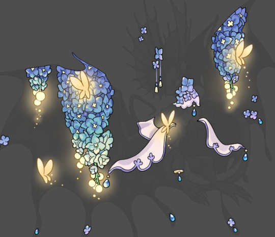
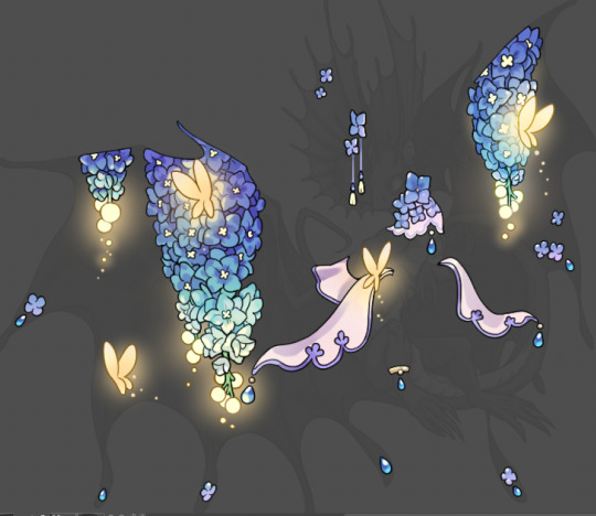
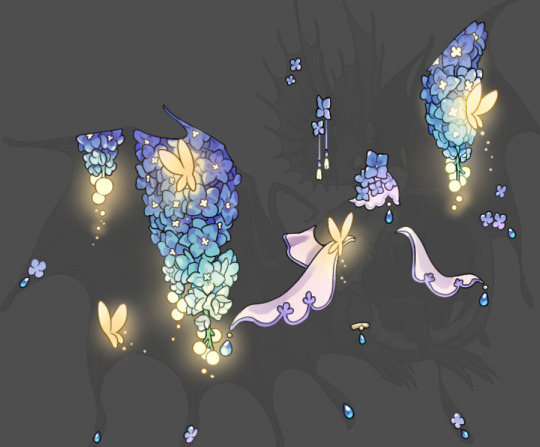
first image is how it looks as a base. second image is with an overlay layer applied. I've used some dark purples and mid tone desaturated greens to push the values a bit further (especially evident on the top left wing) Third image is with a screen layer applied, highlighting the inner most part of the flowers and adding some additional bounce light.
An important thing to note about making accents vs making full coverage skins: OPACITY AND LAYER TYPES MATTER OVER TRANSPARENT SPOTS. What I mean by this is that if you use a soft, light grey to shade with a multiply layer, don't clip it to anything, and have it go outside the lines - that will no longer appear as a 'shadow' when it comes to the final result. Instead you will have a section of soft light grey that is simply laid on top of whatever the image under it is. The same applies for overlay/screen/add layers and so on. If i use a very dark color on a screen layer (to give a soft highlight) and airbrush it over a bunch of stuff and don't clip it, it will end up with this horrible dark splotch over everything that isn't opaque. To this end, mastering normal layers is imperative to having well rendered and convincing accents.
Another thing of note: when it comes to sparkles/small details, note how 'large' the sparkles behind the butterflies are. They seem a bit chunky, yeah?
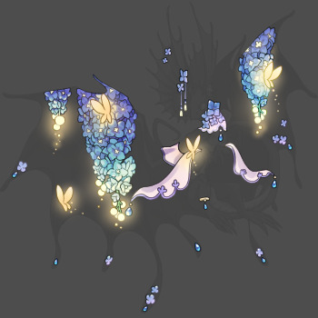
this is what they look like at proper size. If anything, I could have gone larger on the small metal beads connecting the dew drop jewels to the lace.
Another trick I also like to do is this:

a slight hint of transparency! It's just enough to let the dragon's lines underneath show through but not enough to be super noticable. I like to do this a lot when it comes to sparkly and magical effects.
Next is the worst part of all: destroying all that beautiful hard work with the shadow and line art layers! (sobbing)
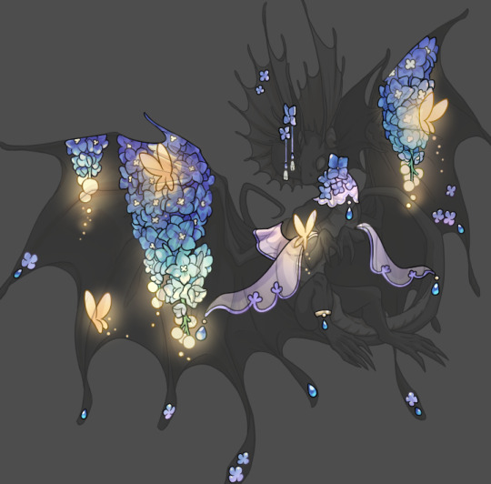
This stage always agonizes me. This is my first pass of the shadow/line layers and let's hope it's dark enough.
But yeah that's a start to finish look at how I create my accents. Unfortunately a lot it devolves into needing to know, yknow, line weight and silhouette importance, color theory and the ways that drawing applications actually apply color to a png vs how its rendered in app. All of these things impact the finesse of the accent, and are things you do have to learn gradually over time, but hopefully this has given yall some additional insight and perhaps some helpful tips.
And this should also explain why I get so mad when people go 'hey can I get this accent in another color' no! no you literally can't!
155 notes
·
View notes
Text

Custom 1/2 for TorrentialGoat on Flight Rising
Yaayyy! Doing more dragon-based customs, this one is based off of this dragon: www1.flightrising.com/dragon/… As well as a special image that the commissioner sent me!
If you want a custom commission just like this, and have flight rising account, you can find my thread here:
#furry#furry art#anthro#anthro art#furry oc#furries#furry anthro#pixel#pixel art#pixelated#fullbody#anthro dragon#furry dragon#dragon#flight rising#flight rising art#flight rising dragons#flight rising dragon#fr tundra#custom#commission#artists on tumblr#art#artwork#digital art#my art#art tag#illustration#art for others
24 notes
·
View notes
Text


New limited skins are up for preorders! Info in notes.
168 notes
·
View notes