#characters or change a marginalized identity to fit your 'aesthetic...' well that says a lot about how you view those identities IRL!
Explore tagged Tumblr posts
Photo


... because most witch scripts are a massive royal pain to write.
If the images are blurry: right click -> open image in new tab.
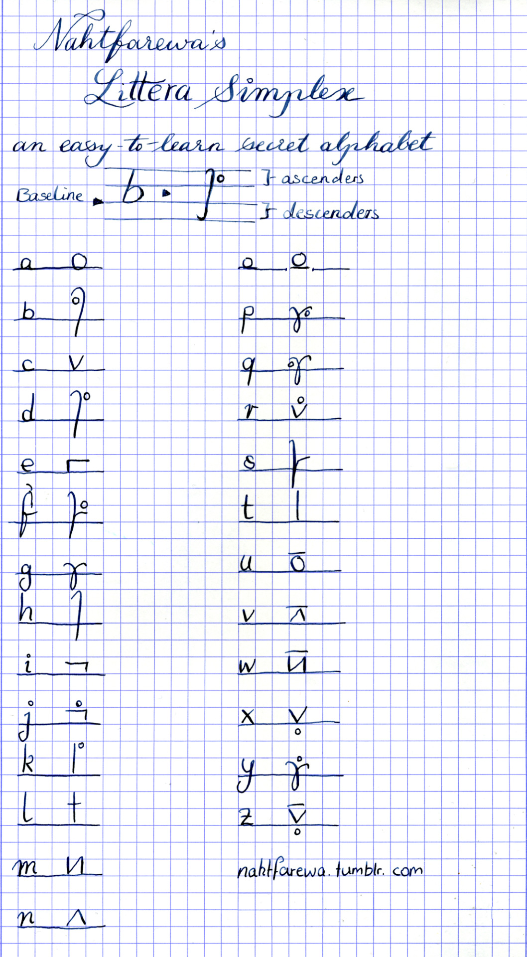
Littera Simplex (v 1.0) is a secret alphabet developed by me, with the intention of it being easy to read, write and learn, but also not completely obvious.
It was technically created as a witch’s alphabet, but it’s usable for pretty much everything. There is no symbolic or religious meaning tied to any of it.
Before you ask: the complete alphabet in chart form as well as the font may only be shared with attribution (a link to this blog is fine) and non-commercially, unless with written permission; however, you are free to do anything you want with texts you write with it... though I’d obviously appreciate a link back to my blog (and a small donation if you make more than just a marginal amount of money off of anything using this script, because I’m a broke-ass student and this took actual effort). Also: If you show me things you used this for, I’ll be a very happy nerd.
FONT: It’s a thing. [here]. Includes lower-case letters, a handful of capital letters for roman numerals, the short form for “and” instead of &, and that’s pretty much it.
Further notes and a loose translation of my horrid scrawl under the cut:
Golden Rule: See a detail you don’t like? Change it. Do whatever works for you.
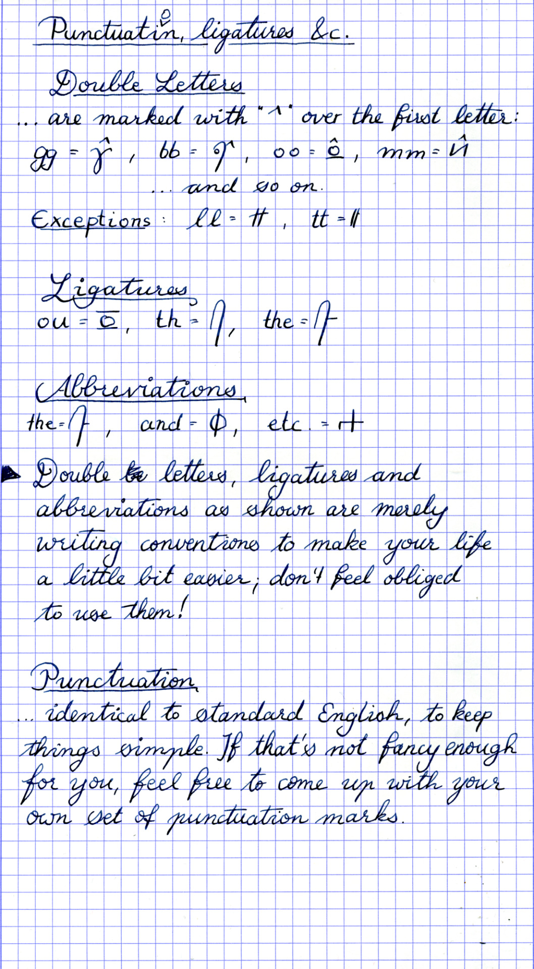
Double Letters are written as only one letter with a “^” above (or slightly to the right of) them. Except for ll and tt, because why would you do that.
Ligatures As shown. Feel free to come up with your own.
Abbreviations / word glyphs As of now, I’ve only got ones for “the” (which is really more of a ligature), “and”, and “etc”. There is also “for”, which I sometimes write as a circle with a horizontal bar, but idk how useful that is. Another one I forgot was “thi”, as in “this”, which looks like “the”, except with an i.
Punctuation As usual. If your periods usually look like circles, you might want to make sure to fill them out, in order to avoid confusing them with circles that are part of letters. If normal punctuation isn’t good enough for you, you can come up with your own.
Numbers Ran out of easy glyphs to use, so there are none; I’d recommend using standard Arabic or, more aesthetically pleasingly, Roman numerals.
Special Characters, Accents, etc I’d suggest modifying existing letter forms to fit those things - most letter-modifying marks can be used as they are, with the exception of ° and maybe one or two others. (for example, the German “ä” would look like “ö”)
Capital Letters ... are not a thing. You can simply write the normal letters a bit bigger, if you really have to, but I wouldn’t advise it.
Memorization Tips Every letter group has one base shape with some modifying marks. Common letters are usually faster to write and thus have less additions to the base shape. You’ll likely get the hang of it very quickly - it took me maybe two pages of writing until I knew all the letters by heart. By the way: S and f are grouped together because the old, long s and f look damn near identical and a lot of my inspiration came from medieval manuscripts. Also, it just fit really well, organisation-wise.
Inspired by... Medieval scribes and their manuscripts, Tironian notes, a 1947 documentary (and stealthy advertisement) on the history of writing by the Sheaffer pen co., an 8th grade maths textbook, and my lack of motivation and memory.
Font It’s a thing, but I wouldn’t necessarily advise it. Littera Simplex was developed specifically as a handwritten script - I may have sacrificed connected letters for the sake of readability, but it’s a cursive at heart, with the possibility for a personal handwriting and a lot of time-saving short forms, which doesn’t work with the font. Have fun with the font, but please don’t judge the script by it, is what I’m trying to say.
90 notes
·
View notes