#but you asked why! and the answer is 'my core game design philosophy' 🤷♂️
Explore tagged Tumblr posts
Note
I'm averse to including any customization options that either don't contribute to the overall experience of the story/worldbuilding or restrict the player's imagination unnecessarily. I consider colour options to be both of those, at least in this game. So no
not the same anon, but im genuinely really curious as to why you think this. I think it's a really interesting perspective. i was wondering if you could perhaps expand on this. 👀 /g
i hope it doesn't come off as rude, im genuinely interested to know more about your perspective on this,only if you feel comfortable doing so ofc, if not feel free to ignore this ask. 😅
I am always open to rambling about my game design philosophy anon 😌
I am of the opinion that every single choice you make in game design must serve the game in some specific, defensible way. If it isn't serving the game, it's bloat, and it needs to be excised. The number one thing that kills a project (especially in indie) is feature creep, so for me, being conservative with game design is extremely important. This is also going to probably be in my portfolio, meaning it's especially important to show a future employer that I know how to manage a project like this, since at the kind of indie studio I want to work at people tend to wear a lot of hats.
The number one example I can give you of feature creep to explain why it's so deadly is Yandere Simulator. Funny game concept, terrible execution. Why? Feature creep. Also the dev is a creep. But primarily feature creep. The game had a whole slew of clubs you could join, a full menu of dozens of easter eggs, a bunch of carefully crafted events with placeholder characters... He was so busy implementing random crap and then fixing all the bugs he introduced that he did not implement the first rival, the purpose of the game, for like 8 years.
What the fuck does that mean? It means if you let the project get bloated, you let it get fucking bad. There is no fixing Yandere Simulator now. Those decisions have doomed it.
Tight game design, on the other hand, feels great. This is why I love Apocalypse World so much. Everything is deeply intentional and extremely tight. That kind of tight, focused game design is what I'm trying to aim for here. Everything must serve the game.
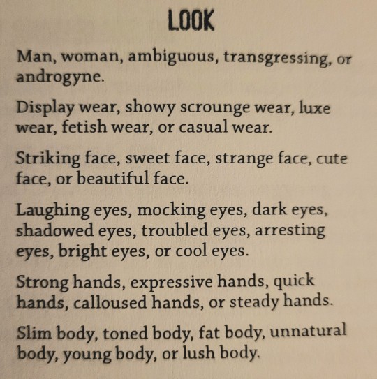
With that in mind, how about I show you how Apocalypse World handles character customization? Here's the Skinner playbook:

Mwah. Beautiful. They show you only enough to clue you in on who your character might be- showy, expressive, troubled, lush. These are playbook specific, meaning a different character will have a different array of options. It's minimalist, it's focused, and it has no fluff.
It's easy to think about character creation as "just what you need to do before the game starts," but that's a misunderstanding. Character creation is the first impression a player gets of your world and its rules. And just like you want to present yourself well in your job interview, you want to present your game well in the "am I going to bother playing this" interview.
The approach I've chosen is meant to mirror that anti-bloat philosophy. What I want to tell players is that this game is gonna be stylish, a little more mechanically involved than what they're used to, but importantly, tight as fuck. So choosing the options wisely and removing bloat means getting that message across. Colour is bloat. The game will never reference your character's skin or hair or eye colour, because that's just not really how I write. It doesn't contribute to the worldbuilding, and the player will naturally decide those things themselves regardless of whether I give them the option. So it's gotta be cut.
Does that mean this approach should apply to everything? No. You've gotta make sure it fits your game. For example, for another game technically inspired by Apocalypse World (twice removed haha), @zorlok-if does this incredibly well. It has an absolutely bonkers amount of customization, a real maximalist approach that makes a huge impact when you start up the game- it makes you feel like a kid in a candy store. And it works great, because it matches the feel of the game.
All of this is a long way of saying that you've got to be intentional with every aspect of your game design, even the ones that don't feel like they matter much.
#i know this is very overdramatic for a discussion about hair colour lol#but you asked why! and the answer is 'my core game design philosophy' 🤷♂️#thank you anon!!#ask#anonymous#(in case anybody's wondering what i mean when i say they're both inspired by AW- zorlok is inspired by MOTW#which itself was inspired by AW. so they're like... an uncle and nephew. but if the nephew was born before the uncle#cause zorlok came out first.... y'know this is a bad analogy. go play zorlok it's great)
32 notes
·
View notes