#but when it's unintentional things/small details especially ones that are a product of its time
Explore tagged Tumblr posts
Text
sorry for seeing one negative thing about a thing i like an then being annoyed about it for the rest of my life it's just like that sometimes
#and usually it's like. one thing.#and i see that one person doesn't like the thing i like and i am internally dying#like#if i could erase every memory of every post that was like ''actually here's how this kid show sucks and a few minor design elements make it#irredeemable despite the fact that quite a lot of it had good morals and decent storytelling''#like. usually they are not wrong about the flaws#but girl. just because the characters don't have that much variety doesn't actually mean that the show is like. the worst thing ever#it just means that the show has major/minor flaws and then you can choose to look past those. or you can not#but i mean. obviously there are egregious things like ''this is literally intended to be hateful towards a minority/plant such beliefs''#but when it's unintentional things/small details especially ones that are a product of its time#like maybe don't simplify it down to ''show horrible and irredeemable because they made a few jokes i didn't like''#(especially when like. the jokes are like. the kind of jokes in every single cartoon of that decade)#maybe just move on and don't do that i guess#idk i am vauging because i see things that are like ''sorry x is horrible and you can't like it. and also a few fans of this bothered me#so i'll just say something rude and overgeneralizing like 'oh man it's funny how every single fan of x media is like this and they all suck#'''#sorry for complaining but rrrgh#brain is filled with angry little worms that want to kill#vent maybe
3 notes
·
View notes
Text
Bully Sticks Exporter
What is a Bull Stick?
A bull stick, also known as a cattle prod, is a handheld device used by farmers and ranchers to move or direct livestock, such as cattle or sheep. It typically consists of a long pole with a pointed end that delivers an electric shock to the animal when pressed against its skin. The shock is meant to be mild and temporary and is used as a means of encouraging the animal to move in a certain direction or to discourage it from behaving in a dangerous or disruptive manner. The use of bull sticks is regulated in many places to ensure the humane treatment of animals.
Benefits of Bully Sticks
Bully sticks are a popular dog treat made from dried bull pizzle. They have several benefits for dogs, including being a natural source of protein, helping to promote dental health by reducing tartar and plaque build-up on teeth, and providing a long-lasting chew that can help keep dogs busy and mentally stimulated. Additionally, many dogs find the taste and texture of bull sticks to be highly satisfying, making them a great option for training or as a special treat. However, it's important to supervise your dog while they are chewing on bull sticks to prevent choking or ingestion of large pieces. Please visit here www.raiyantrade.com for more details.
How to Choose a Bull Stick
When choosing a bull stick, there are a few things to consider. First, you'll want to make sure that it is the appropriate size and weight for your dog. A good rule of thumb is to choose a bull stick that is at least as long as your dog's head and neck, and not too heavy for them to carry comfortably. Next, consider the ingredients. You'll want to choose a bull stick that is made from high-quality, natural ingredients and doesn't contain any artificial preservatives or additives. Look for a product that is made from grass-fed, free-range bulls, as these are typically the healthiest and most nutritious. Finally, consider the brand and reputation of the company that produces the bull stick. It's important to choose a company that is transparent about its sourcing and manufacturing processes, and that has a good reputation for producing high-quality, safe products. By following these guidelines, you can ensure that you choose a bull stick that is safe, healthy, and enjoyable for your furry friend.
How to Give a Bull Stick to Your Dog
Giving a bull stick to your dog can provide them with a tasty and long-lasting chew toy. To give your dog a bull stick, start by selecting a high-quality, all-natural one that is appropriate for your dog's size and chewing habits. Then, introduce the bull stick to your dog and let them sniff and inspect it. After that, hold the bull stick steady while your dog chews on it, monitoring them to make sure they are not biting off too large pieces. Finally, take away the bull stick once it becomes small enough to pose a choking hazard and discard it. Remember to always supervise your dog while they are chewing on a bull stick to ensure their safety.
Safety Precautions
It is always important to prioritize safety in any situation. Some general safety precautions that can help prevent accidents and injuries include wearing appropriate protective gear, following instructions carefully, and being aware of your surroundings at all times. Additionally, it's important to maintain a clean and organized workspace, avoid distractions, and take breaks as needed to avoid fatigue. Remember, safety should never be taken for granted and should always be a top priority.
Supervise your dog
It's important to always supervise your dog, especially when they are around children or other pets. Even if your dog is well-behaved, they can still get into trouble or cause unintentional harm. By keeping a watchful eye on your dog, you can prevent accidents and ensure everyone's safety. Additionally, you can use this time to bond with your furry friend and reinforce good behavior with positive reinforcement. So don't forget to supervise your dog and enjoy spending time with them!
Conclusion
I completely agree with you. Bully sticks are a fantastic and healthy chew for dogs. They last a long time, are incredibly durable, and are packed with flavor. It's important to consider your dog's size and chewing habits when choosing a bull stick for them. Always keep an eye on your dog while they're chewing on a bull stick, and avoid giving them to puppies or dogs with dental problems.
0 notes
Text
Thinking about Time Paradox Ghostwriter, how it showed so much promise yet turned out being a whole bunch of nothing, and how it might have been improved had Kenji Ichima's microwave was struck by lightning and spat out a copy of future manga critics discussing his work.
TL;DR (and boy howdy is it TL)
Plagiarism. This is a common angle of criticism, to the point that it makes people dismiss the series before applying any other criticism. And it's by far the easiest criticism to address; it just feels like the people behind TPGW didn't consider it until too late in production.
Why's White Knight good? A manga about manga needs to be good at explaining manga. A crucial plot point, and arguably the throughline tying all the story's events together, is the unsurpassed genius of Itsuki Aino's White Knight. The reasons why White Knight is good seem like they'd be
Itsuki Aino's death. It's a plot point that's introduced clumsily, resolved worsely, and just feels out of place. Part of that is just the fact that the series was clearly meant to have a bunch of chapters between the introduction and the death reveal, but given that this plot occupies eight out of fourteen TPGW chapters, I can't exactly ignore its problems. I probably should have made this #4, but I'm not restructuring everything now!
Emptiness. A series about manga should say something about manga, and TPGW absolutely says stuff about it. It's just not good, or consistent. And possibly unintentional, especially if we read a bit too much into the statement that stories don't need to have meaning to be good. A lot of people (myself included) read chapter 1 and assumed TPGW would have some interesting stuff to say about the creative process and what makes manga good, but all we got in the end was "Good manga doesn't have to be original or meaningful or have personality, it just needs to be written by a talented mangaka!" Barf.
And to fix as much as possible with as few changes as possible: Start by drastically changing Itsuki Aino's philosophy of "manga just needs to be good" and "personality only reduces a manga's potential audience". Keep her goal the same as Sasaki's—making manga everyone can enjoy—but change her beliefs on what makes manga enjoyable to be something different than Sasaki's.
Then change Aino's role in the story so that she's aware of the time plagiarism and actively brought into the creative process of Sasaki's White Knight, so their now distinct personalities and philosophies can play off each other. Have them actually discuss White Knight in a way that both illuminates their differences and hopefully why one manga is better than another.
Finally, change the hundreds of tiny details that contribute to the series's themes, because the big picture is a fairly small part of the problem.
Problem 1: The plagiarism thing
On one hand, if you overlook the fact that Sasaki basically plagiarizes his manga, TPGW has a lot of interesting things to say about the creative process. On the other hand, the series gives you very few reasons to overlook the fact that Sasaki basically plagiarizes his manga.
This is so bad that I wouldn't be surprised if nobody involved in the production of TPGW considered that its premise was kinda plagiarismy before they saw the response to chapter 1. This impression isn't helped by the way that Aino casually absolves Sasaki of wrongdoing after a brief conversation. It's like everyone involved just wanted to get it out of the way.
Sure, Sasaki assumes that the first chapter of White Knight is just something that came to him in a weird dream and not a literal copy of Shonen Jump from the future that he plagiarized. He's not crazy. But Sasaki never really considers whether he should keep drawing White Knight once he sees another copy of Jump manifest when he's wide awake, and doesn't give much focus on the reasons why he feels like he can't stop publishing his copied work.
Sasaki feels guilty about plagiarizing White Knight, which is good. However, it feels like shallow, unimportant angst, diluted by the angst he feels about realizing that he still doesn't have any good ideas of his own. That latter point is especially bad, because it makes it impossible to tell whether future angst about "not being his" comes from the plagiarism thing or the I-don't-deserve-this-praise thing, or even a pride thing.
The thing is, there are good arguments in favor of continuing to publish. Aside from a general feeling of obligation towards his employers (and the first series he's gotten published), there's the fact that Aino publishing her own White Knight idea would be perceived as plagiarizing Sasaki. But this never gets enough focus.
If I had to point to a solution, I'd have Aino believe Sasaki when he explains how he wrote White Knight. This would give her a good reason not to casually absolve him of a crime she has no reason to think he could commit, which in turn gives Sasaki a good chance to defend himself.
But above all, it lets Sasaki make amends to Aino. Something direct, like Sasaki actively offering to make Aino an assistant and promote her to coauthor as soon as he could get away with it. I get that him stopping Aino from working herself to death is supposed to be that, but it's so far removed from his initial plagiarism and meeting Aino and stuff that it feels less like a response to harm he caused her and more like an unrelated side quest he went on because nobody else could.
(Plus, I personally dislike stories built around big deceptions that nobody is allowed to find out about for fear of disrupting the status quo. Screw the status quo!)
Problem 2: Why is White Knight so good?
White Knight is a super basic but super popular manga series, in both the future where Itsuki Aino wrote it and the present where Teppei Sasaki did. It's so good that the editor-in-chief glances at the manuscript (when Sasaki didn't have an appointment with anyone) and immediately decides it should run in Weekly Shonen Jump, and it breaks all sorts of fan response records, and it inspires despairing wannabe-mangaka to give it another go, and editors cry at the storyboards and call it divine, and Sasaki almost literally isn't allowed to not make it a weekly series. But why?
We don't get much detail about White Knight. Each chapter is better than the last. It looks better when Sasaki stops just copying Aino's linework. We have a broad plot synopsis from chapter 1; endless night, ghost that needs to be killed, generic-sounding nice-guy-tragic-backstory hero. There's also a witch, and a teacher who might know who the ghost is, and a "hanged man of space-time ghost". Oh, and it's super good! People never say anything about it except to say how good its x is, and virtually every possible value of x shows up at least once.
Also the baffling implication in chapter 10 that Sasaki's plagiarized White Knight is Aino's ideal manga because it has no personality to speak of. But, um, let's unpack that later.
While we get a little more information about why Sasaki's original series are bad, but he talks at length about how his version of White Knight is worse than Aino's. Why? The art wasn't good enough?
Normally, this wouldn't matter. When reading Phantom of the Opera, we don't need to understand why Christine and Erik are such good singers; we can just accept that they're talented and had good teachers and move on. It's only a problem if they're played by a talented but inexperienced actress and a disharmonic actor.
But if the play started with Christine failing to land a job at the opera, then she started singing a different song and was immediately made prima donna, and also she spent a lot of page time discussing or pondering what makes a singer good, that would be a different story. Understanding why Christine's performance improved would be important to the plot, and absolutely critical to the themes.
All we're left with is Sasaki's stated belief that manga doesn't have to be original or something unique to the author's vision or anything like that; to be good, manga just has to be good. So I guess manga has an inherent goodness, something that makes them good, and if they don't have that they don't have it.
This is supported by how other characters talk about manga. The manga (plural) that Sasaki submits in chapter 1 mostly receive very vague, shallow criticisms. "Pedestrian premise. Flat characters. Boring. It's not like any one part of it is especially bad. The problem is that nothing about it is good." "This story is completely empty. There's nothing in it at all." The second manga gets a bit more detail, in that Sasaki took the "flat characters" thing to heart and tried to make them quirky, only to fall into new stereotypes.
This feels like it's setting up Sasaki as a competent but cripplingly ordinary mangaka. His manga is just written to appeal to a lot of people, without considering who "a lot of people" is, or what they might find appealing. And to contrast his boring failures, we have White Knight...which is also ordinary, but good instead of bad?
(I can't find a great place to slip this in, but: Sasaki makes a point out of the fact that, for all its popularity, his White Knight didn't have the same explosive success as Aino's. The only difference between the two that we know of is that one was written by Aino and one was written by Sasaki.)
White Knight didn't need to be explained in detail. We don't need half of the manga to just be White Knight panels and synopses. But if you're going to have a manga about a mangaka who ruminates on the creative process, who keeps failing with his own premises but succeeds when the inciting incident gives him a new start, the difference between the success and the failures is kind of important! We should have been given some idea why White Knight succeeded where everything else failed, why it was "good".
The only hints we're given are something about the art and Itsuki Aino just being a good mangaka. Characters praise every aspect of White Knight, not just the art, so I assume the manga isn't focusing on Sasaki's art because that's the only thing that matters for making good manga.
But what is? Why is Aino's manga so much better than Sasaki's? This is an important question that should be answered, as important as asking why Goku can beat up Frieza, because manga is as important to TPGW as martial arts is to Dragon Ball.
The answer should be clear in some difference between Aino and Sasaki. But there isn't one. They are the same, to the point that Aino thinks it's plausible that Sasaki would come up with the exact same idea. They have the same philosophy on creating manga (I'll get to it), the same goals, the same obsessive drive to perfection.
What differences are there? Aino works slightly harder, in that she works herself to death in her 20's while Sasaki only works himself to illness and fainting. Aino is more optimistic, but it seems like Sasaki was the same at age 17 and just had his optimism crushed by several years of failure. Which brings us to the one real difference between the two of them: Aino writes good manga.
I'll get back to that point after I wrap up this section.
The easiest way to solve this would be to have characters talk about White Knight, other than when they're praising it. Also to have Aino not just be the schoolgirl prodigy version of Sasaki, having two points of view is important.
Maybe Sasaki and Aino discuss White Knight when she becomes his assistant. They could disagree on why it's a good story, which would mean explaining the reasons each of them thinks it's a good story.
Having Aino help Sasaki with White Knight long-term, or at least having her do more than basic assistant work, would do a lot for the story. It would make White Knight less plagiarismy, since Sasaki is presumably getting credit. It would give Sasaki an insight into why the world and plot of White Knight work the way they do, which he'd find useful and which would characterize both the manga and the mangaka (plural). And it gives the two principal characters reasons to constantly discuss the most important object in the story with one another, especially the aspects most relevant to the series's core themes.
Problem 3: The whole Itsuki Aino dying thing
I don't think the idea of future!Aino dying is, in and of itself, a problem. I can see a version of TPGW which gets more than 14 chapters going through all potential stages of a mangaka's career through Sasaki, future!Aino, and present!Aino once she starts her own series. In the process, it would develop the characters of Sasaki and present!Aino, and maybe even future!Aino through an interview or something published in the magazine.
If that series climaxed with future!Aino karoshi'ing herself, it could be a sensible and powerful climax—especially if the supernatural aspects of its resolution were introduced over time and not rushed into existence because the manga was about to be canceled. Eight chapters would be a decent length for that kind of thing—if anything, a little quick.
But that's not the TPGW we have. In our TPGW, the eight chapters focused on future!Aino's death and preventing present!Aino's are 57% of the series. Everything else is little more than setup to the karoshi arc, yet very little has been done to establish its conflict. Why does future!Aino overwork herself? Well, present!Aino is clearly passionate about her work. Why would Sasaki making a series that's better than hers make Aino not overwork herself? I don't think this question ever gets answered, even though Sasaki asks it himself.
In the end, the time robot does something we had barely any idea it might be able to do, Sasaki spends decades making the perfect manga, and Aino just kinda gives up when she sees that Sasaki made that perfect manga. I'd have thought seeing a better manga than what she could draw would energize her, make her strive to surpass that limit.
You know, like how Goku has this drive to surpass anyone he sees that's stronger than him. Imagine if Goku saw how strong Beerus was and just gave up martial arts on the spot. Wouldn't that suck? It would feel out of character for someone who had been driven by a love of martial arts for the entire series, to the point of risking his own life for a good fight.
But no, Aino just likes drawing for fun, and she didn't realize it until Sasaki showed her how much better he could write manga. My first instinct is to call this sexist, but upon further consideration, there are many other ways to interpret this plot point. They're all bad, but they exist.
There are two solutions. First, you could make a much longer series which establishes all the time magic and character details that would make this turn of events make sense. Second, if your story gets canceled halfway through act 1, don't tack on the second half of act 3 if it relies on details that were supposed to come up in act 2.
Problem 4: What are you saying?
This is a manga about manga. It's one of the few manga that I'd say is more about manga than Bakuman is, mostly by virtue of not having distractingly blunt opinions about women. TPGW is pretty focused on manga. In fourteen chapters of manga about mangaka writing manga, sci-fi twist or no, there should be something about manga said, right?
A lot of people say manga needs to just appeal to people, and the people who disagree aren't given much consideration. Sasaki's editor talks about how manga characters "live off of paper and ink...and they breathe within our hearts!!", and Sasaki says he would have enthusiastically agreed if it wasn't for his "but it's not really mine" funk.
The biggest thing is probably Sasaki and Aino's feelings towards the idea of "something only you can draw". Neither Sasaki not Aino thinks there's anything only they can draw, or that manga needs a "message"; they both just want to make manga that people like—one that the whole world can enjoy. Not just people on every continent, every person in the world.
Considering that one of the characters who espouses this thesis is the protagonist, the thesis is supported by White Knight very obviously being something at least two people can draw, plenty of side characters support this thesis, it never receives any pushback that the narrative considers meaningful, and the other character espousing it wrote an almost supernaturally good manga series, it's probably safe to say that the narrative treats this sentiment as true. That the purpose of manga isn't to be unique or original or interesting, but to be enjoyable. To make people happy.
This ties back into what I said about White Knight being generically "good". Manga that have a lot of good things in them are good, because they make people happy. Why things in manga make people happy, or how they do, or why things might appeal to one person but not another, or even whether things that people find appealing could change between 2020 and 2030? Unimportant.
I don't want to try and divine the opinions of author Kenji Ichima from this, nor about illustrator Tsunehiro Date or the series editor (who is not named on Wikipedia), nor even about Jump's upper management. The world of corporate art is such that stories can, in principle, say things that every single person creating them disagrees with; the people making them are beholden to the bottom line, to shareholder opinions, not to artistic merit.
So when I say that TPGW has really shitty opinions about manga, that's not meant to reflect on any particular human involved in writing it.
Let's start by pointing out that "manga is supposed to make people happy" is just a fat nothingburger of an opinion and move on to all the other things that get dismissed to support that thesis.
Like, the idea that a series doesn't need to do anything new to be good. This is ridiculous! The rhetorical composite author of TPGW might have had manga like Dragon Ball in mind when saying that, but DB is only so generic because so many other series copied all the new things it did. A generic Shonen Jump series that doesn't do anything new won't look like Dragon Ball, it'll look like Neru: Way of the Martial Artist or Dororo Dororon.
The idea that manga (or art in general) should have a message is a bit less concrete, but personally, I'd argue less that a series must have a message to be good and more that any story is gonna have a message, which can affect series quality the same way that its plot, characters, or art can. But to TPGW, this message isn't even on the same level of unimportance as plot or characters, it's something to be actively dismissed.
All that a manga needs to be is "good". What does it mean to be good? It needs to make people happy, by being good. How do you make a good manga? Judging by the lack of difference between Sasaki and Aino...you need to be a good mangaka. That's it.
Sasaki and Aino do the exact same thing. They both work stupid hard on their manga, with the exact same methods and motive—the same disregard for anything except creating a "good" manga that makes people happy. Even their flaws are the same, most notably the way they rip any work they don't consider good enough to shreds. (Not that I'm confident TPGW thinks this is a flaw...)
One of them uses this method to succeed, one of them is trapped in a loop of failure until he gets a time machine. That's it.
Sasaki is a bad mangaka. Aino is a good mangaka. Aino is a good mangaka because the manga she writes is good, and the reason her manga is good is that it was written by a good mangaka.
This is even directly supported by the text. The time robot attributes Aino's success and doom as coming from being "born with too much talent". (And also her drive, but Sasaki has repeatedly failed to match Aino even when he's given exceptionally strong motivation.)
There are some side issues I have, too.
Chapters 4-5 are almost about how the perfect is the enemy of the good, how hitting deadlines is important and worth making small compromises for. Then the chief assistant finds a compromise, and then Sasaki rips up the compromise because it's still not good enough (wait, didn't they digitally combine the backgrounds and character art?), and then he gets one more chance to redraw everything and makes it better than before so there are no consequences.
The main characters make a big deal about how it's dumb to ask mangaka to make something only they can draw, and this is supported by the fact that White Knight is ultra-popular despite being something at least two people could draw. Yet Sasaki sees a big jump in his White Knight's quality when he stops trying to copy Aino's art, when he makes White Knight his own and draws it in a way only he can. This contradiction isn't really addressed.
A reasonably coherent position is argued in chapter 10. A writer's "personality" leaking in can make it appealing to some people, but can also "make it feel too eccentric". The more personality, the more people who will be turned off by this eccentricity. But the thought terminates there! Thus, personality makes a manga into a niche series, and a lack of personality gives something the potential to be a hit with everyone. The idea that "goodness" or "entertaining-ness" are somehow tied to personality, that a manga truly without personality won't be enjoyed by anyone, never comes up. Conclusion: Aino needs to suppress her personality to make her dream manga.
All of this aside, the core conception of "good manga," or "good storytelling" in general, is a bigger problem. Whatever the flesh authors of TPGW were trying to say, the story they made says that good manga is just good, it's pointless to try and figure out why, all the things people say about how to write good manga are bogus, and talent is all that matters. Bull fucking shit.
The manga doesn't fully commit to the bullshit. The idea of "manga anyone can enjoy," so important to almost every mangaka in the series, is questioned out of nowhere three pages from the end of the series. And the whole climax of the story is about Sasaki the deeply untalented mangaka making a better manga than uber-prodigy Aino. All he needed was (checks notes) roughly 8.7 years of stopped time to finish and polish the last ~150 chapters of White Knight, something like three times as much time per chapter as Aino needed. Plus the first quarter of the series written by the uber-prodigy. So with the tables tilted via supernatural interference, untalented mangaka can surpass talented ones!
But yeah, TPGW is pretty committed to its bullshit.
I could go on about how empty TPGW feels, but at this point I'm just gonna like a Replay Value video on the subject and try to wrap this up.
Right, solutions. Um...start by having Sasaki and present!Aino not have the exact same opinions about what makes manga good. Find some way to imply that both are wrong, and that future!Aino only made her future White Knight so good because her opinions were more nuanced and accurate than either of them. Beyond that...this is the kind of problem that comes from details, not plot points.
I don't think the idea of future!Aino dying is, in and of itself, a problem. I can see a version of TPGW which gets more than 14 chapters going through all potential stages of a mangaka's career through Sasaki, future!Aino, and present!Aino once she starts her own series. In the process, it would develop the characters of Sasaki and present!Aino, and maybe even future!Aino through an interview or something published in the magazine.
If that series climaxed with future!Aino karoshi'ing herself, it could be a sensible and powerful climax—especially if the supernatural aspects of its resolution were introduced over time and not rushed into existence because the manga was about to be canceled. Eight chapters would be a decent length for that kind of thing—if anything, a little quick.
But that's not the TPGW we have. In our TPGW, the eight chapters focused on future!Aino's death and preventing present!Aino's are 57% of the series. Everything else is little more than setup to the karoshi arc, yet very little has been done to establish its conflict. Why does future!Aino overwork herself? Well, present!Aino is clearly passionate about her work. Why would Sasaki making a series that's better than hers make Aino not overwork herself? I don't think this question ever gets answered, even though Sasaki asks it himself.
In the end, the time robot does something we had barely any idea it might be able to do, Sasaki spends decades making the perfect manga, and Aino just kinda gives up when she sees that Sasaki made that perfect manga. I'd have thought seeing a better manga than what she could draw would energize her, make her strive to surpass that limit.
You know, like how Goku has this drive to surpass anyone he sees that's stronger than him. Imagine if Goku saw how strong Beerus was and just gave up martial arts on the spot. Wouldn't that suck? It would feel out of character for someone who had been driven by a love of martial arts for the entire series, to the point of risking his own life for a good fight.
But no, Aino just likes drawing for fun, and she didn't realize it until Sasaki showed her how much better he could write manga. My first instinct is to call this sexist, but upon further consideration, there are many other ways to interpret this plot point. They're all bad, but they exist.
There are two solutions. First, you could make a much longer series which establishes all the time magic and character details that would make this turn of events make sense. Second, if your story gets canceled halfway through act 1, don't tack on the second half of act 3 if it relies on details that were supposed to come up in act 2.
Conclusion
Kinda covered it in the TL;DR. Also: I kinda want to write TPGW fanfic now. The kind of fanfiction only I would write.
3 notes
·
View notes
Text
A Ponderous Rewatch: Bubba Bo Bob Brain and Cameo
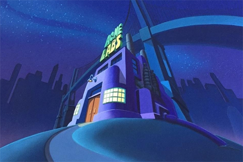
Can I just say that I think I’m somehow getting worse at keeping the screenshot count down?
Neither the cameo nor the main episode in this post are animated by TMS, so that’s not the reason for the surprisingly high screenshot count. However, the regular episode is animated by Wang Film Production, who are the same folks that animated the very first PatB segment and have done most of the episodes I’ve covered so far, including the previous one. I can tell they’ve gotten a better handle at animating our main duo in the skit we’re looking at today, especially Brain. Wang Film Production is no TMS, but they’ve gotten very, very good at expressions. They’ve also seemed to settle into a rounded and soft design for Brain, something that they’re kind of known for among fans if I recall correctly. Pinky can still be a little…off at this point in time, though.
Moving on, the cameo that we’re starting with is animated by Akom Film Productions. They’re the folks who usually do the animation for the Chicken Boo and Goodfeathers episodes, and they usually do a pretty good job with those characters. As far as our mouse duo go, though, Akom has only done “Opportunity Knox” so far. You know, the one with the oddly nightmarish Brain close-ups. Thankfully we get none of that since it’s only a short bit.
So yes, onto the cameo in “Noah’s Lark”!
So this is actually a Hip Hippos episode, but luckily we don’t have to deal with them at all right now. The premise is the story of Noah’s Ark, obviously, but the character of Noah is done as a parody of the stand-up comedian Richard Lewis, who was somewhat popular in the 80s. The most modern and notable media he’s been involved in that people on Tumblr might know him from (or at least, what I think folks here might recognize, it can be a little hard to gauge that since both millennials and gen z folks are the main demographic of this site) are Robin Hood: Men in Tights where he played Prince John, and Curb Your Enthusiasm where he plays himself.

Noah is rounding up two of every animal to go onto the ark (which is a popular depiction of how the story goes, but is actually false: it’s supposed to be seven male and female pairs of “clean” animals of each species and one pair of “unclean” animals of the same species, but that’s as far as I’m going into that topic). He’s nearly finished the list and has just been mauled by the wolverine pair, and…
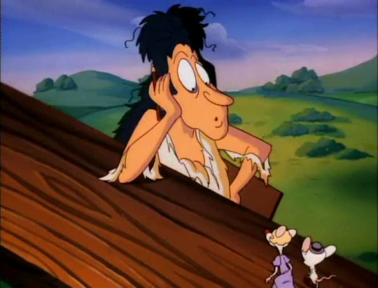
“Lab mice?...”
The fact that he’s specifically asking for a pair of lab mice raises a lot of questions that I don’t think we have time to unpack.
The pair of lab mice that he gets is, of course, Pinky and the Brain.
And Pinky is, for the very first time in the series, crossdressing, presumably to pass as a female mouse so he and Brain can survive the great flood by boarding the ark.
…This is also a lot to unpack.

“Check!” they both exclaim, although Pinky does it in a very deep voice for some reason.
Wow, look at the surprise and then hostile suspicion on Noah’s face there!
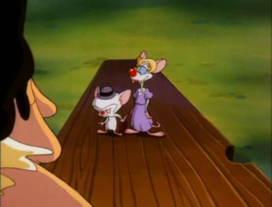
Their outfits are very 1950s, with Brain even carrying a suitcase. Anachronisms aside, these two really went all out for the “we are a normal, heterosexual pair” ruse, didn’t they? Not only is Pinky in a dress and a blonde wig, but Brain even put on a little bowler hat. Why did he feel the need to do that? Did he feel left out of dressing up otherwise? Was he afraid he wouldn’t look “manly” and hetero enough without it? I have so many questions…

“Whew! These pantyhose are killing me, Brain!”
Wow, for once it’s Pinky physically hurting Brain, even if it’s a relatively minor tug on the ear.
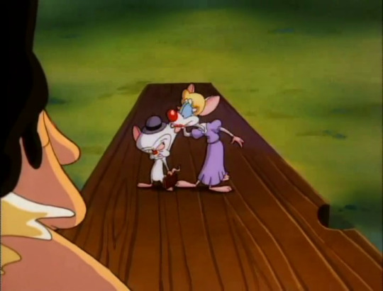
“I think I prefer knee-highs…”
…Pinky, you’re not even wearing pantyhose. What the hell are you talking about?
Assuming that this is just the result of an animation oversight (which, honestly, I’m certain it was), we now know that his disguise went so over-the-top as to include pantyhose which Noah wouldn’t normally see…and also it’s a type of pantyhose that Pinky doesn’t even like wearing, which implies to me that this is something Brain acquired for him.
There is just so much going on in cameos like these if you think about them for even a few seconds.
Also, I agree with Pinky. Knee-high pantyhose are much less uncomfortable to wear.

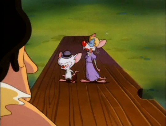
BONK!
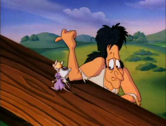
So the mice are allowed to board and the audience is left to think that their little ruse worked, but immediately after the two run off and are out of listening range Noah rolls his eyes and says

“Who am I to judge?”
Heavily implying Noah completely saw through it and let them on anyway. Wow.
That’s the end of their cameo. Who’d have thought that this little scene would be the precursor to Brain having Pinky crossdress to disguise him as Brain’s wife so many times in the series? And who’d have thought that this very first time wouldn’t fool anyone at all?
But now let’s move on to the meat of this rewatch post:


We open to Acme Labs at night, as usual, though I’ve never noticed until now how lonely and eerie the place seems if you ignore our mouse duo.
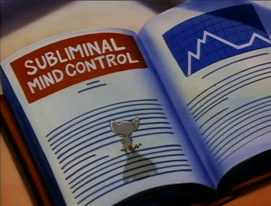
“Pinky… I believe I have conceived my most brilliant plan to date!”
Oh boy, we have another first for today! Brain is very much a fan of using temporary mind control for his plans. It’s the method he falls back on the most, which is very interesting when you consider his various psychological issues involving having control taken away from him all his life.
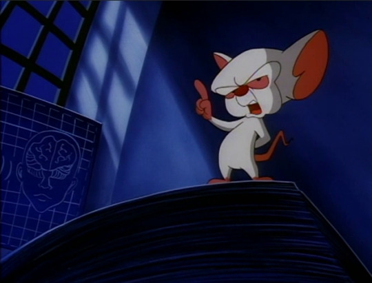
“I shall use subliminal mind control to take over the world!”
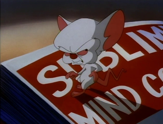
“…Pinky?”
The hand-on-hip pose here is great.


“Today’s inside story is country mega-star Willie Ray Cypress!”
Uh, Pinky? Considering that this is pretty much the expression you had while looking at Pharfignewton, I am very, very worried about you looking at the Billy Ray Cyrus parody the same way.

“Don’t tell my head, my empty hollow head!~”

“You know I wouldn’t understand!~”

Same, Brain. Same. It’s just like Pinky to enjoy a song as earworm-y as this (not to mention how relevant this parody is to his everyday experience with Brain’s plans), but lord was the real song this is making fun of annoying as hell back in the day. Like, I was a small child at the time this song came out, and I still hated how often this would be played on the radio.
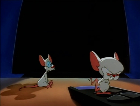
Luckily, Brain pounces on the remote’s off button and puts an end to the nonsense.
But oh, the look of sad betrayal on Pinky’s face is heartbreaking! I’m sorry, sweetie!
“It must be inordinately taxing to be such a boob.”
Heh, Brain said “boob”. /inner six year old

“You have no idea…”
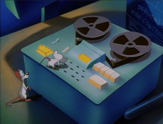
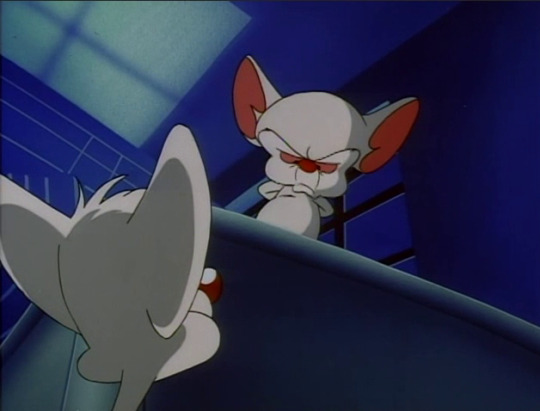
“Pinky, do you know what a subliminal message is?”
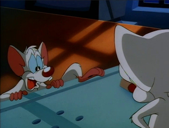
“Something you leave on a subliminal telephone answering machine?”
Nice try, Pinky.
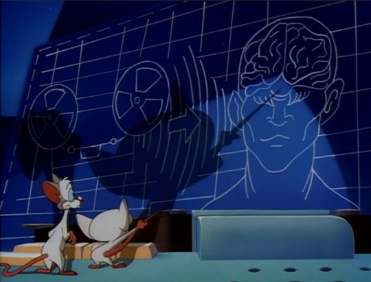
“No. It is a recorded message perceived only by the subconscious human mind.”
Two things here:
This diagram bothers me because my mind always interprets the way they’ve drawn the bottom of the cerebellum as the person shutting their eyes extremely tightly.
Brain using his own tail as a pointing stick is very, very cute and I love this detail.
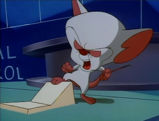
“I have recorded such a message.”
He’s still holding his tail, aaaa!~
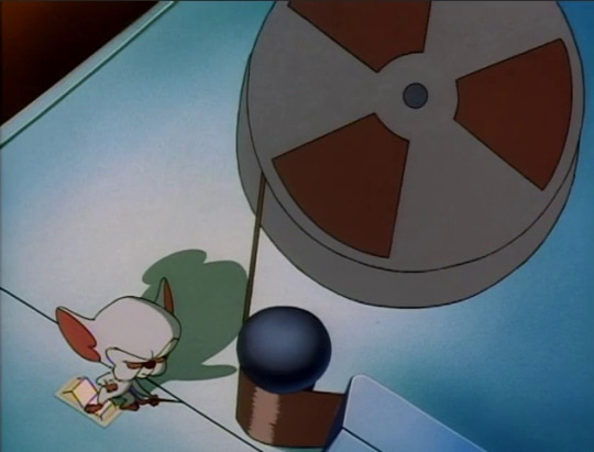
“Citizens of the world, you are under my control. You will do whatever I say…”
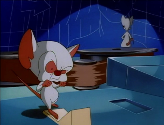

“Nice mix, but it’s not exactly danceable, is it?”
Oh, Pinky. Only you would sincerely compliment Brain’s incredibly dry mind control message and then immediately point out a flaw that has nothing to do with its purpose. Bless you, you stupid and wonderful little mouse.
I like how Pinky’s interjection startles the hell outta Brain for a moment, too.
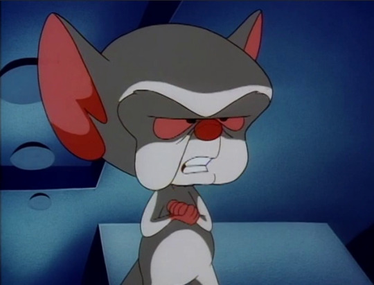
“If people heard this message enough times, they would succumb to my control and we could take over the world!”
Notice that despite Pinky being a minor annoyance and despite the fact that Brain claims that everyone will be under his control, yet again it’s still both of them taking over the world.

“What do you think, Pinky?”
And he still wants Pinky’s input. It’s small and scattered and very, very subtle, but in my opinion this is Brain’s most frequent way of showing that he cares about Pinky. Brain likely isn’t even aware that he does it. Pinky might not be aware, either.
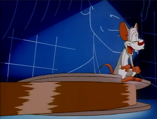

“I think I’m getting dizzy and I rather like it! Ahahahahahoo!~”


“Sometimes you hurt my head, Pinky…”
And yet, Brain. And yet…
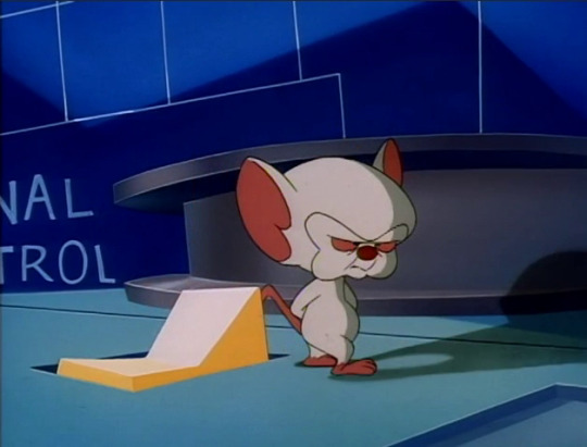
“The only problem: How to get this message repeated worldwide airplay…?”

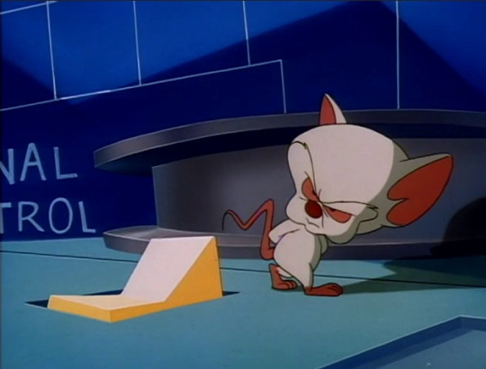
Offscreen, Pinky turns the TV back on and startles Brain again, but only for a moment.
Another great pose and expression here: Mildly annoyed, but interested and on the verge of an idea.
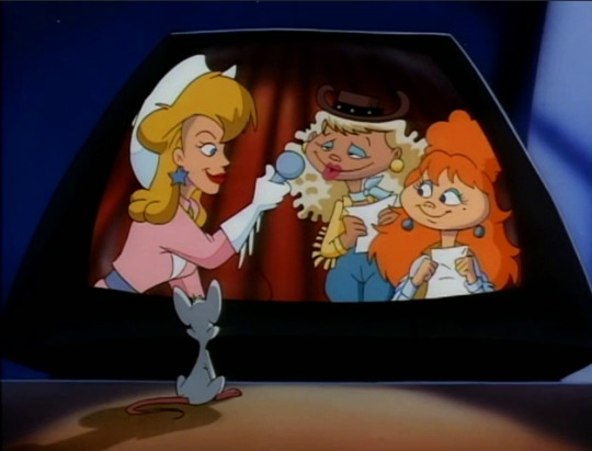
“I just adore Willie Ray!”

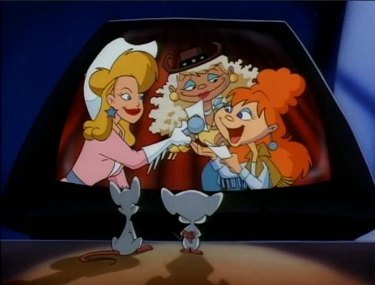
“I listen to his song twenty times a day!”
I…really don’t know why they chose to have this shot done with Brain walking over the “camera” towards the TV so we get a brief close-up of Brain’s mousey behind. It made me laugh, though, so I thought I’d share.
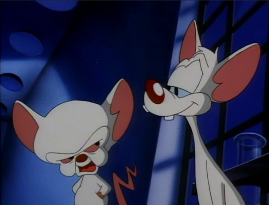
“Pinky… Are you pondering what I’m pondering?”
I’m also kind of obsessed with this brief expression of Pinky’s I unintentionally managed to capture. It’s a bit of a smug, knowing, and yet endeared look. I’m sure it’s completely unintentional on the animators’ part, but I love the idea it gives me of Pinky knowing exactly what Brain’s thinking but purposefully saying something entirely unrelated to playfully tease him.

“Well, I think so, Brain, but burlap chafes me so.”
To be fair, Pinky, I think burlap chafes everyone. And were you thinking about doing a potato sack race? That’s the only connection to burlap I can think of that would be in any way relevant...
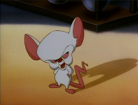

“Country music, Pinky. I will go to Nashville and become the biggest country music star of all time! Everyone will hear my record and my subliminal message and I will take over the world!”
In all honesty, that would probably be easier to do in the early 90s when this takes place since country music wasn’t such a…well, “dead” is a bit of an exaggeration, but country music as a genre is incredibly unpopular nowadays with the occasional notable exception. In the early 90s? Not so much.
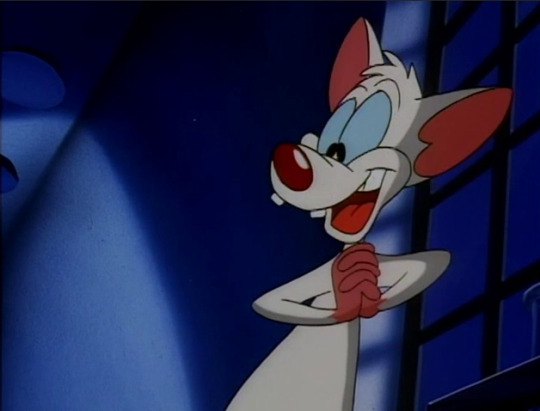
“Egad, Brain!”
This is the most enthusiastic swoon I’ve seen and heard from you yet, Pinky.
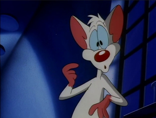

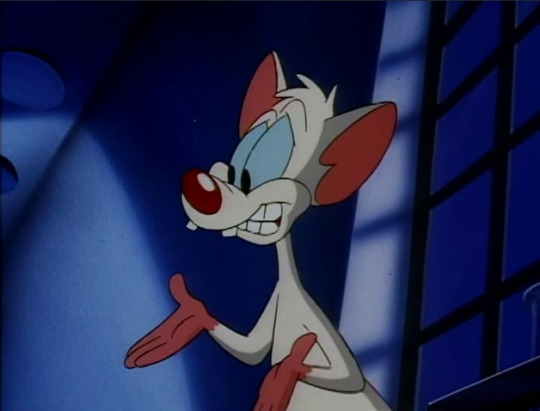
“Oh! But no, no… It takes people years of hard work to become famous, Brain.”
Well, that or they’re born into a famous family. Or they’re just rich.


“Why, take Kathie Lee Gifford for example: She did community theatre, and—“
I actually can’t find anything via Googling about Kathie Lee doing community theatre before she became famous. She seems to have studied music and drama in university, and had a folk music group in high school, but the only reference to theatre I can find is professional musical theatre in the late 90s.
It’s possible Pinky’s right, though.
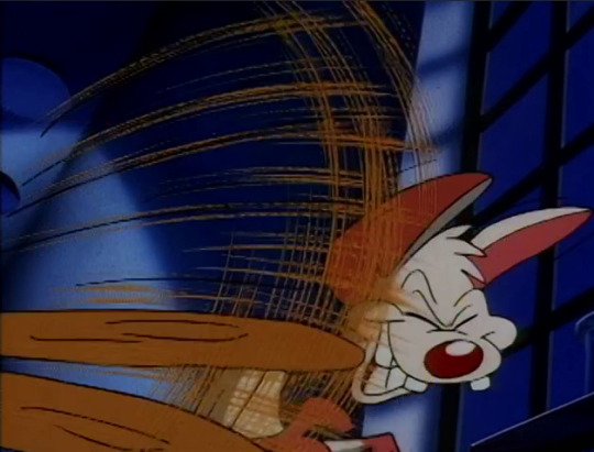
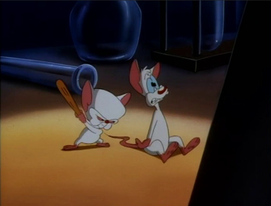
BONK!
BRAIN! …Wait, where did you even get that tiny club?
“Stop talking, Pinky, I must think.”
You… Brain, I think I’m starting to see why some fans believe you may be as neurodivergent as Pinky is, but in a different way. I can’t in good faith elaborate on that myself, since I haven’t been diagnosed as such and it would be completely disrespectful of me to do so, but if anyone wants a good little theory on that, try here.
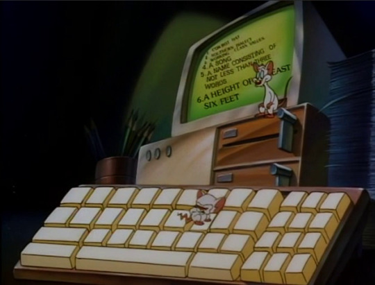
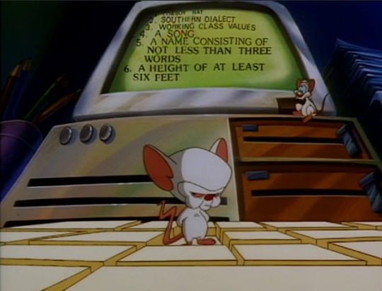
“I have calculated every ingredient necessary to become a country music mega-star. Read me the list, Pinky!”
He’s typing by hopping from one key to another, aww!
Eeeh, the lettering work on that computer is pretty bad, though.
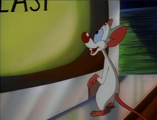
“A cowboy hat.”

“Check!”
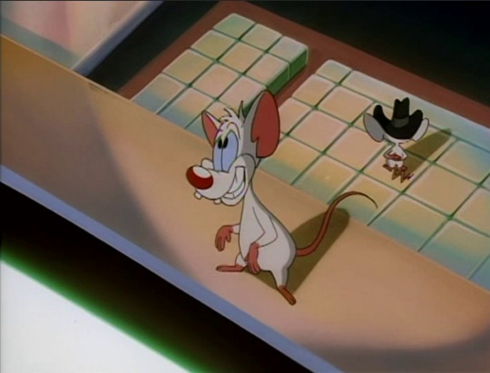
“A southern dialect.”
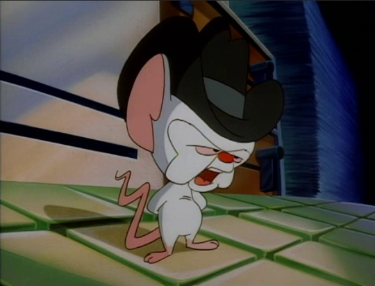
“Check, ya’ll!”
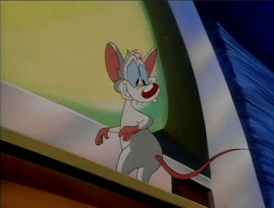
“Nice, Brain.”
The way Pinky says “nice” here reminds me of this meme. Also, aww, Pinky’s always ready with the compliments.
“Working class values…”

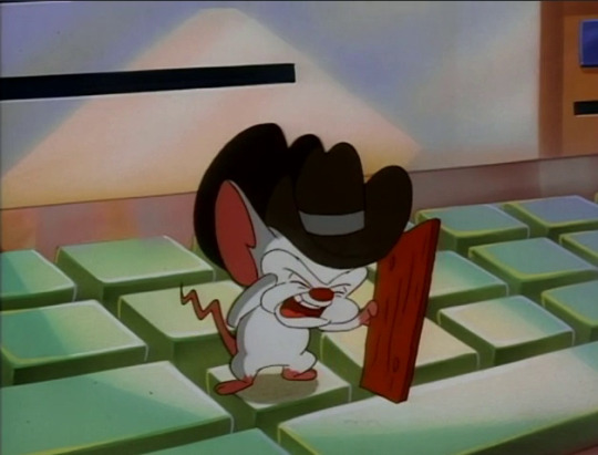
“I enjoy beef jerky and the comedy stylings of Gallagher. Check.”
His visible cringe at having to say he enjoys Gallagher is wonderful. I first heard about Gallagher through My Brother, My Brother and Me, but for anyone that doesn’t know, Gallagher is a frankly terrible prop comedian whose most famous act was smashing things on stage (usually fruits of increasing size) with a large mallet that he called the “Sledge-O-Matic”, ending with smashing a watermelon. It was apparently a mildly popular bit of comedy in the south. Does that sound entertaining? No? Yeah, that’s…that’s why Brain is cringing so hard.
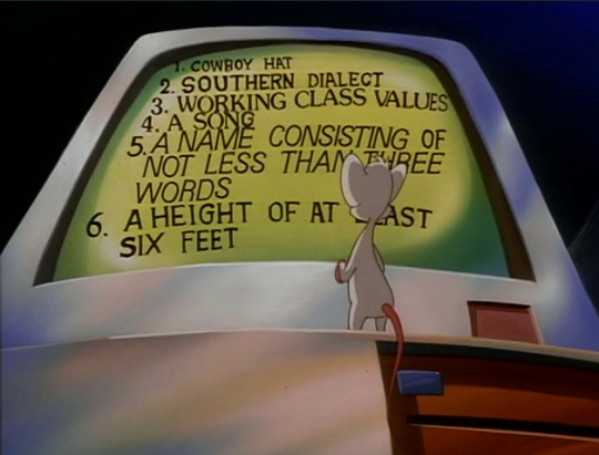
“A song.”

“Check!”
A song titled “A Song”. Brain, sweetheart, I think you’re going to need to put in a little more effort than that.

“A name consisting of not less than three words.”

“From now on, I shall be ‘Bubba Bo Bob Brain’. Check.”
I would make fun of him for this name, but honestly it’s kind of genius in its bland simplicity.

“And…a height of at least six feet!”

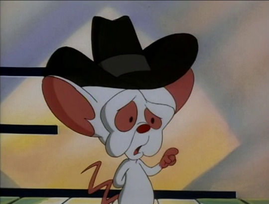
“Aaa--guebuh…”
Whoops. Forgot about that one, huh?

“Drat!”

“There must be some way for me to increase my height…”
Gee, if only you had a fully operational mechanical human suit just laying around.

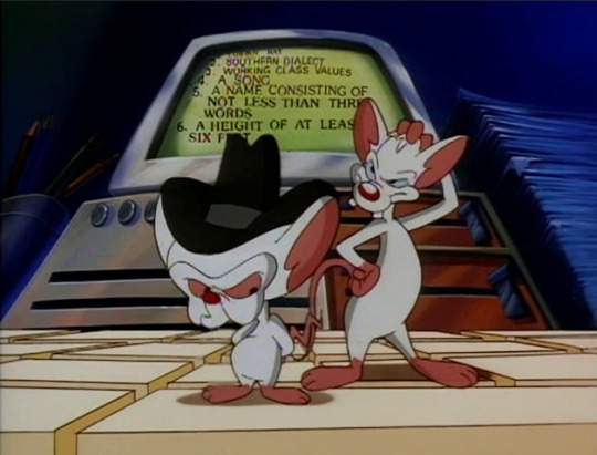
“Hmm, let me think…”

“Don’t hurt yourself, Pinky.”
He is trying his best!
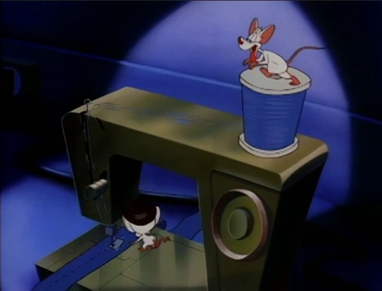
“Faster, Pinky! Faster!”
…Why does Pinky have to spin the thread? The whole point of sewing machines like this is that they’re powered electrically, Brain. Are you just making him do this so Pinky feels included?
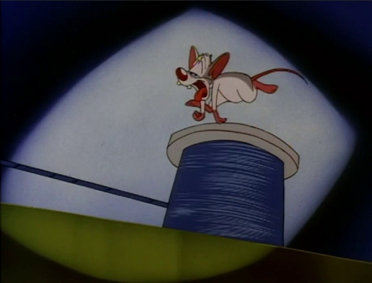


Oh. Oh no…
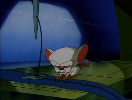

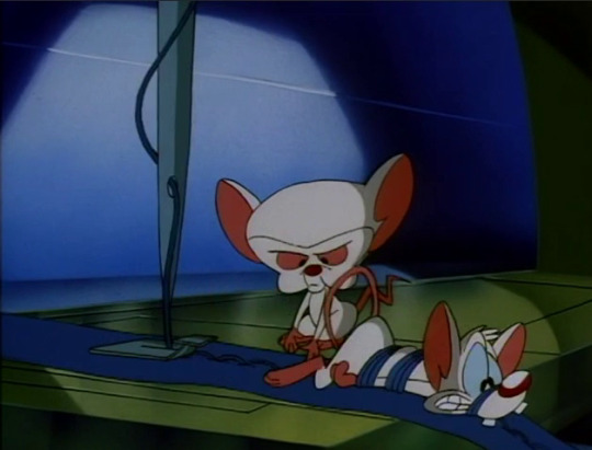
Brain’s “WTF?” face is great. He’s surprised and yet not at the same time, because things like this just happen when you have Pinky around.

“You amaze me, Pinky.”
“I do my best…”
A very cute exchange.
So instead of using the mechanical human suit they usually fall back on in times like these (maybe it’s under six feet tall?), the mice instead come up with…this.
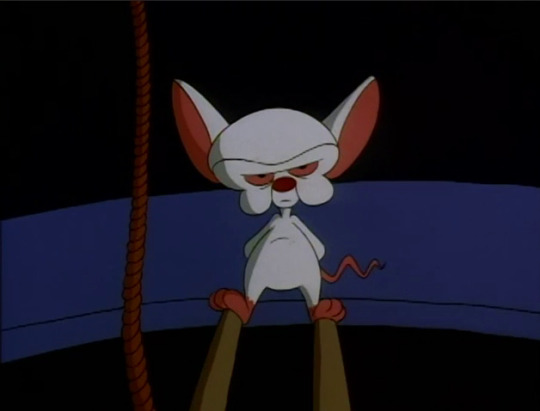
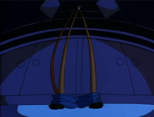
“Proceed, Pinky.”
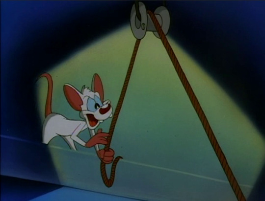
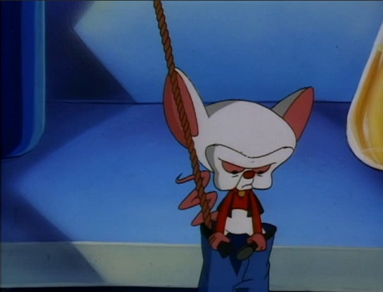

I have to give them some credit, regardless of how ridiculous this is, as sewing denim to make a very bizarrely thin and tall pair of jeans must have been an absolute nightmare.
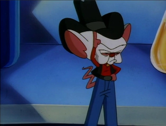
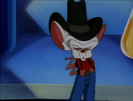
“Ki-yi-yippee-yi-yo. How do I look?”
I’m getting flashbacks to the similarly deadpan singing of “Camptown Races” from last episode. Brain’s really on a western kick lately, isn’t he?

“Oh, very nice, Brain!”
Your finger-framing may be focused on the back of Brain’s head for some reason, Pinky, but your pupils are definitely pointed a bit…lower.
“It’s ‘Bubba Bo Bob Brain’.”

“You are my manager, Colonel Pinky.”
This is a reference to Elvis Presley’s manager, Colonel Tom Parker, who was honestly quite the bungler when it came to managing Elvis’ career. I honestly don’t think Brain’s making a subtle jab at Pinky’s competency here for once because Brain’s grasp of pop culture he’s not already interested in is surface level at best most of the time.
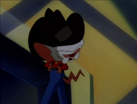
“You discovered me playing the guitar on the front porch of my humble pig farm. Any questions?”
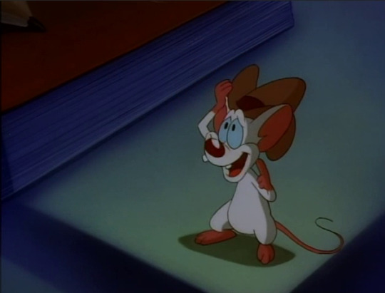
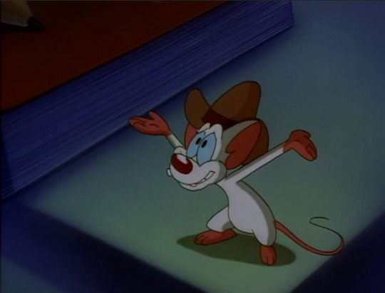
“Oh, just one: When you farm humble pigs, how far apart do you have to plant them?”
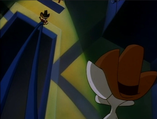
“…If I could reach you, I would hurt you.”
Hey now, you’re the one that asked, Brain.

“But for now, on to Nashville!”
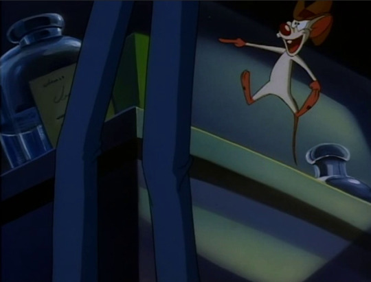
“On to Nashville!”

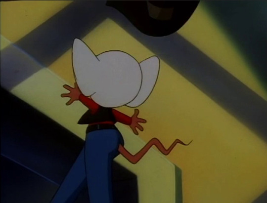
BONK!
“This is a pain that is going to linger…”
That’s what you get for rolling your eyes at Pinky’s enthusiasm.

No perilous car trips this time! Instead, the boys are getting bus tickets to Nashville.
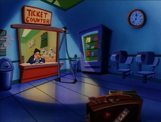
“Two tickets to Nashville, please.”
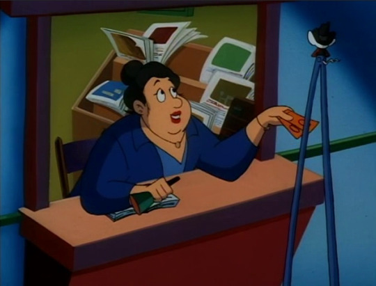
“Ooh-wee!~ You’re a tall drink a’ water, aint’cha, darlin’?”
…Ma’am? Excuse me, ma’am? Ma’am, are you flirting with The Brain?
Like, sorry, that “tall drink of water” saying is not just to point out that someone’s tall. It’s specifically for flirting with someone who is tall and gorgeous and a refreshing sight to see, like a tall glass of water on a hot summer day.
This lady is flirting with a mouse on stilt legs.
I know that Brain’s disguises are prone to inexplicably work even when by all rights they shouldn’t, but…
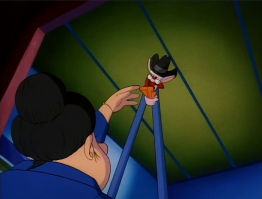
“Actually, I am a lab mouse on stilts.”
Brain does his usual bold and plain truth shtick and I’m a little surprised that he didn’t react to what she said beyond that. Then again, this is Brain and he’s quite terrible when talking to women in general, so maybe we dodged a bullet here.
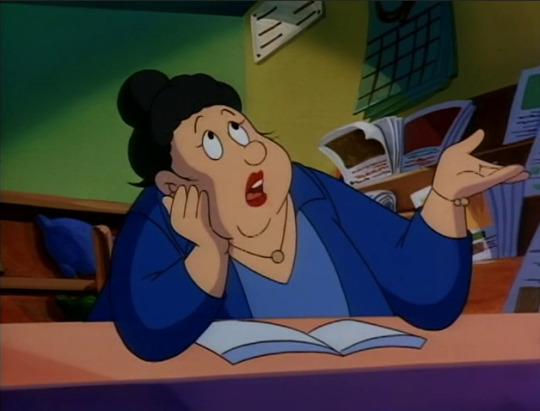
“…At least he didn’t ask me to pull his finger.”
I’ve worked in retail and food service for years, ma’am, and if that’s the extent of your experience with unpleasant men, consider yourself lucky.

“EGAD, Bibby-boo-bop-Brain! Round trips are so exciting!”
“It’s ‘Bubba Bo Bob Brain’, Pinky.”
“Right! Sorry. Zort!”
Honestly, Pinky’s version is much cuter.
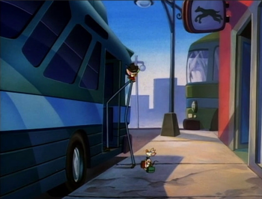
“Concentrate, Pinky, concentrate!”

BONK!
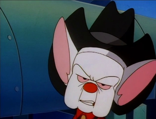
“YES! This pain will definitely be with me a while.”
Brain out here looking like a bad Minecraft texture.

Hello again, Warner Siblings! Gosh, that little fringed western skirt on Dot is cute.
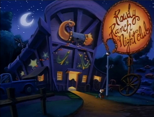

“’The Rowdy Ranch Nightclub’… What are we doing here, Boobie-baa-baa-Brain?”
I checked the official subtitles for this and yes, that is exactly what he mistakenly calls Brain here. We have had both of these two call each other “boob” or some permutation of it this episode.
Pinky and the Brain sure is a show that exists.

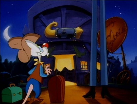
“…It’s ‘Bubba Bo Bob’ Brain. And according to statistics, and inordinate number of country western superstars have gotten their start at this very establishment.”
You probably didn’t need me to tell you this, but there’s no Rowdy Ranch Nightclub in real life. There is, however, “The Rowdy Ranch”, uh, ranch in Texas.
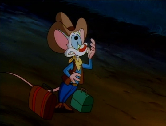

“Egad! [gasp] Do you suppose Minnie Pearl performed here?”

“One can only hope…”
Man, Brain, you are really laying the sarcasm on thick this episode. Come to think of it, he’s been slightly more sassy towards Pinky than usual this episode as well. I suppose he’s still sore about the end of the last one. You know, for reasons.
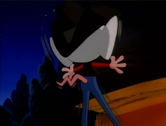
BONK!
At least he’s getting some karmic punishment for it, I guess.

“I am a telephone repairman from this area!~”
This little ditty this man is singing has bugged the hell out of me for quite a while, as it certainly sounds like it’s a reference to something but I never knew exactly what it was referring to until just now thanks to an old Animaniacs Usenet group from way back in the day: It’s a parody of the song “Whichita Lineman” by Glenn Campbell. The writers are really giving it their all with the pop culture references this time.

“When I give the signal, play the subliminal message tape.”

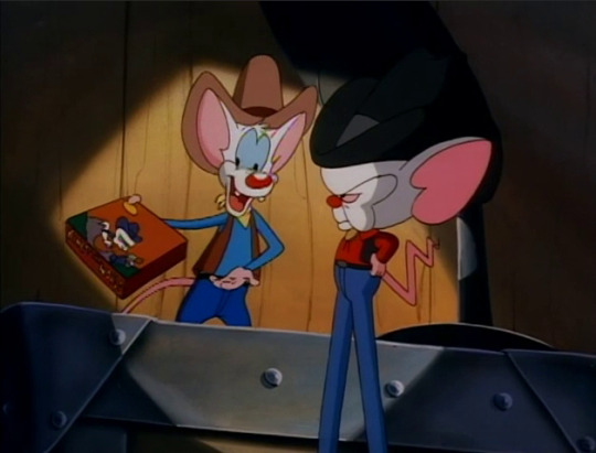
“Right-o, Bippie Bebop Balloola!”

“…Sometimes you frighten me, Pinky.”
Why, though?! Despite it being a mistake it’s honestly a goddamn adorable one. Why must you fear affectionate, innocent, unknowing malapropisms, Brain? Pinky’s still going to do what you told him to.
Anyway, Brain is ushered onto the stage as a newcomer and he’s…not exactly any more eloquent than Pinky was just now.

“Howdy, you all. Here’s a little…ditty I wrote. Hope you enjoy it…you all.”
Here’s the thing: Brain’s not one to get stage fright, and while he’s not the best actor he’s still usually better than this. He was saying “ya’ll” and getting the country-isms perfectly fine beforehand, although he was still doing it in his deadpan Brain way.
Now, suddenly, after hearing Pinky cutely screw up his fake name and going on stage he’s starting to mess up. It’s like Pinky’s error is still in the back of his mind and flustering him enough to throw him off for a bit.
He gets back into the swing of things when he starts singing his song, though.
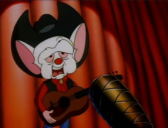
“I am a lab mouse, I escaped from my cage
Never had a job, never earned minimum wage.~”

“He ain’t half bad.”
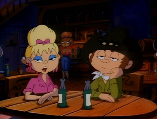
“Ain’t half good, either.”
OUCH. That’s a little harsh. Sure, the lyrics are kinda blah but he’s a decent singer here. Really, it’s just not a genre of music that his voice fits very well.
Also, lady? You’ve got a suspiciously busty doppleganger in the back there. That’s got to be a bad omen for you.

“But you will respect me, YES, once my plan is unfurled!~
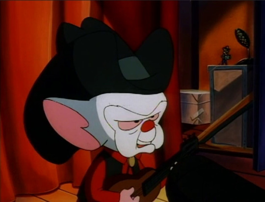
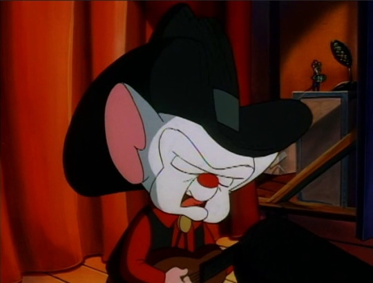

You will call me your leader, I’ll be king of the world!~”
Careful, Brain. Your complicated emotional complex is starting to show in those lyrics.
There’s some more nice facial expressions here too. I can’t really capture it with still images, but Brain’s got a very tender demeanor when he sings about being king of the world.

“Now, Pinky!”

…I just noticed that Pinky’s wearing a completely different outfit here at the nightclub than he was when boarding the bus to get to Nashville. He was previously in an all-white colonel outfit and now he’s in a more generic yet very sweet cowboy get-up. Did you make yourself an entire wardrobe, Pinky?
Another minor detail is that while Pinky’s cowboy hat is a generic tan colour (although before, it was white), Brain’s hat is completely black, which as per western film traditions marks him as a clear villain.
You and I know he’s not really a villain and is, at worst, an anti-villain…but I thought this was worth pointing out anyway.
“Citizens of the world, you are under my control. You will do whatever I say.”
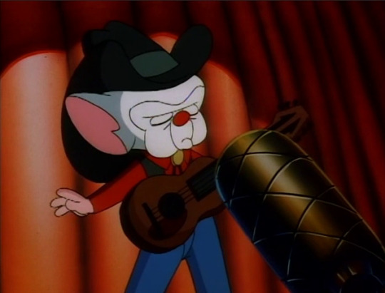
I love how he does this completely unneeded strum on his guitar in the middle of his subliminal message. It's for the drama!

“Buy my record and listen to it twenty times a day.”
Corporations be like…
Who am I kidding? Corporations nowadays would have you pay a fee monthly to have a song on your phone playlist and you would never really own a copy.
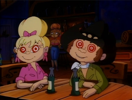
“Let’s buy his record…”
“And listen to it twenty times a day…”
Lady, that doppleganger is still over there. Do you need a distraction while you sneak out the back?

This smug lil’ jerk. Gotta love him, though.
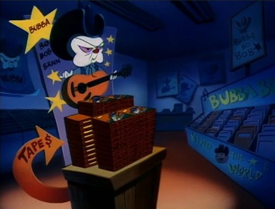

And so Brain’s cassette tapes fly off the shelves at record speed.
Man. Cassette tapes. I feel so fuckin’ old…

“I don’t know ‘bout ya’ll, but I can’t get enough of Bubba Bo Bob Brain. Let’s hear it again!”
JFC, that spittoon. Blegh! And just what do you need that rope for?!?
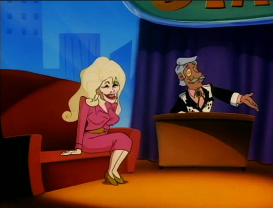
“Well, he’s the hottest thing to hit Nashville since my mama’s jalapeno grits! Here’s Bubba Bo Bob Brain!”
Having just recently learned what exactly “grits” is, I am very disturbed by the idea of jalapeno grits.
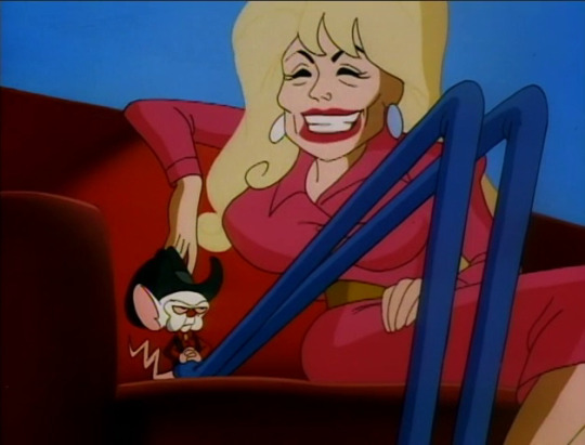
“I’m your biggest fan! What d’you say to that?”
Hi, Dolly Parton! I’ve gotta say that the animators nailed the caricature of 90s Dolly here pretty well. She’s instantly recognizable, unlike some other celebrity parodies Animaniacs does. It’s not just because of Dolly’s, uh…most renowned physical characteristics, either. That’s a very Dolly Parton smiling face.
Not much to say here other than that Dolly’s a sweetheart of a woman, from what I know about her, especially for a celebrity. She’s a staunch supporter of Covid relief and Black Lives Matter as well.
That said, she’s sadly—both in the 90s and now—most well known for…

“I’d say puberty was inordinately kind to you.”
BRAIN!
Well, yeah. That.
I guess now you can see what I mean about Brain not being very good at talking to women. Like, he’s definitely not ogling her here. In fact he’s just kind of…stating something he’s noticed and looking absolutely done with this whole celebrity thing. But Brain you don’t just make a joke like that about a woman’s bust size no matter how deadpan you do it, you ass!
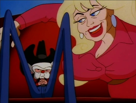
“Haha, go on.”
She takes it well, though, just like Dolly seems to in reality.
Still, though! Brain, you retroactively deserved all those run-ins with doorframes.

Continuing on the buxom southern women thing this episode has decided to run with (seriously, what’s going on here?), we now have a brief parody of a Hee Haw skit.
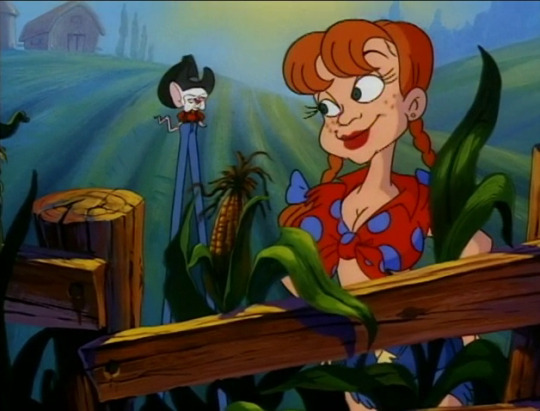
“Hahahahaha!”
“Hey, Bubba Bo Bob Brain, I just got back from France!”
“How’d you find it?”
“I used a map.~”
“Hahahahaha!”
Yeah, that’s an accurate depiction of Hee Haw style humour.
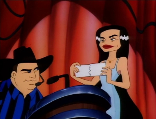
“And the Country Tune Award for best male vocal goes to…”
“Bubba Bo Bob Brain!”
Here we have Garth Brooks and Crystal Gayle emceeing this awards ceremony. I had to look up who these two were supposed to be, though, since the caricatures are pretty vague this time.


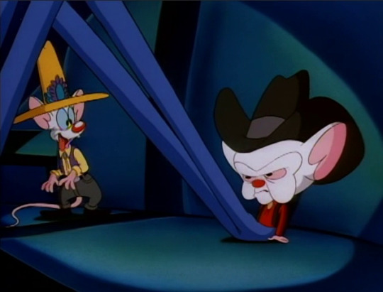
“EGAD! YIPPEE! Narf! Ah hahahahahaha!”
Aww, he’s so happy for Brain! And oh, is that yet another outfit I see? And a much more appropriately sunshine-y yellow and flamboyant one at that! Pinky really went all-out for this.
Again with the tongue hanging out too, except this time it’s more understandable.
“You’re embarrassing me, Pinky.”
And you’re continuing to be a jerk, wow. Someone needs a nap or something.
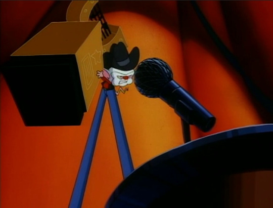
“Pardon my effervescence, but your accolade is more than any bucolic mouse merits.”

“What’s he sayin’?”
“I don’t know.”
Yes, Brain just used the word “effervescence”, much like in that one Tumblr Twilight meme. To those reeling from the fact that this compares Edward to Brain via their shared pretentiousness: You’re welcome.
Also, a Brain-to-common English translation: “Pardon my bubbly enthusiasm, but your award is more than any countryside mouse deserves.” Would that have been so hard to say, Brain?
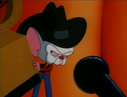
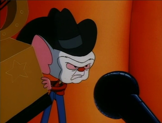
“…I’d like to thank my mama and Elvis.”
I wouldn’t thank Elvis. He was an asshole. But that’s probably not wise to say at a 90s country music award show, so I guess it’s understandable.

“Oh, how nice!”
“Well isn’t that nice!”
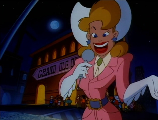
“I’m outside the Grand Ol’ Opry, where tonight’s concert featuring country music sensation ‘Bubba Bo Bob Brain’ is being televised worldwide.”
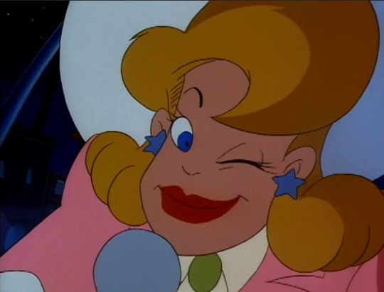
“In two words: Bubba is hot!”
I… That’s twice in this episode where a human woman thinks a tiny, big-headed mouse on stilts is hot.
Furries, come get these poor, confused women.
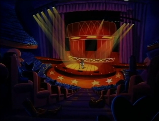

“You gotta know how to cut ‘em
Know how to shuffle
Know how to deal the cards, before you play Fish with me.~”
Hello, Kenny Rogers. I only know the song parodied here, “The Gambler”, again through “My Brother, My Brother and Me” and the long and hilarious conversation about it.
It’s kind of weird to have a song that was made famous by Rogers in 1978 sung like it’s a recent hit in an early 90s awards show, but ehh. Maybe the shelf life of hit country songs is a lot longer than songs of other genres.
And then you die in your sleep~

“Do you realize what will happen if the world hears my song just one more time?”

“An angel will get its wings?!”
If only, Pinky.

“NO, Pinky!”
I think all this country stuff is really getting on Brain’s nerves. He’s being snappy and irritable and lashing out an abnormal amount ever since arriving in Nashville, and there’s not a lot of joy in the minor successes he’s had so far. Like, compare Brain smiling and praising Pinky for his work during the alien encounter spoof they did together, the last episode with Brain cheerfully singing to himself when he was certain he’d win the race…to now where he’s yelling at Pinky for minor mistakes that no one but himself is aware of and being joyless and faking pleasantries and rolling his eyes at the country stars he’s surrounded by. This mouse is crabby as all hell, and I don’t think it’s just because he finds the whole country western thing stupid and below him. This is a mouse who’s done and will continue to do degrading things to achieve his goal of world domination without this much jerkishness.
I think he’s still fuming about the whole Pharfignewton and Pinky thing, and the current plan being a very rural, country-focused plan like the last one with the Kentucky Derby is just exacerbating it by reminding him of it. Like, you don’t even have to take it in the gay way I am and instead take it in a “how dare that goddamn horse take the complete attention of my friend/world domination partner away from me and my plans, this sucks and I can’t believe Pinky’s just being his usual dumbass self like everything is fine and the same” sort of way.
But the gay way makes way more sense, fight me.
…Okay, don’t fight me, I’m tired and old and I really don’t want to get in internet fights about cartoon mice.

“My subliminal message will take permanent hold, and the world will be under my control!”
Ooof! We’re back down to “my” control and not “our”. Jeez, Brain. You really are spiraling right now, aren’t you? Your attitude has quickly devolved from the beginning of this episode...

“Oh, that.”
And dang, even Pinky’s enthusiasm is starting to get deflated.
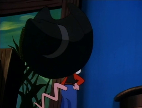
“Now, do you remember what you have to do?”

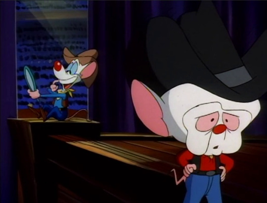
“Yes. I need to make a dental appointment. I have horrible plaque buildup!”
Pinky, you do realize that unlike a regular, non-sapient mouse you can just brush your teeth, right?


“The tape, Pinky, the TAPE!”

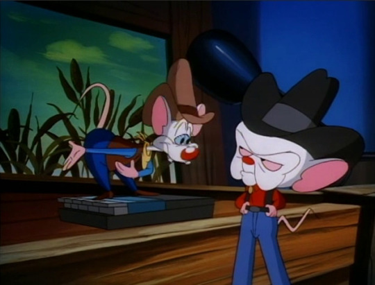
“Oooh, right! When you give the signal, I play the tape.”
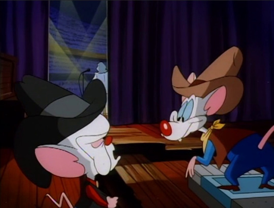
“And now, I’d like to introduce…”
“This is it, I’m on.”

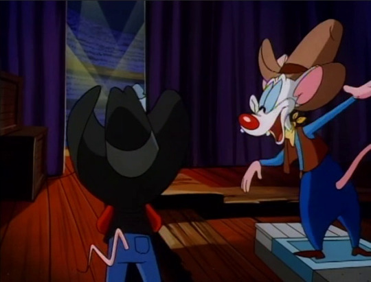

“Good luck, Booba Bip Bop Brain!”
Folks, I swear to you that I tried to get a decent screencap of Pinky slapping Brain to figure out if he slapped his back or his ass and for the life of me I could not get it. The slap goes by just that fast and I’d honestly have to go frame by frame if I wanted to get it, but my video player will not go that slow.
Either way, Brain is certainly startled by the contact but is fixated more on the continued mangling of his fake name.

“How many times do I have to tell you, my name is--!”
Uhh, Brain? Getting a liiiittle close there.
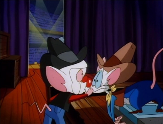
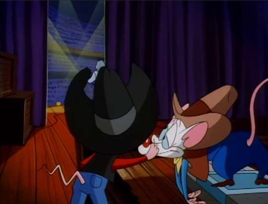
“—Bubba Bo Bob Brain!” exclaims Kenny Rogers. And oh boy are these screencaps exploitable. Again, you’re welcome.
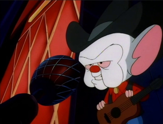
“Yee-haw! Let’s start this hootenanny!”
Better than last time you came out on stage to sing at a show, at least.

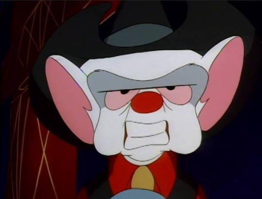
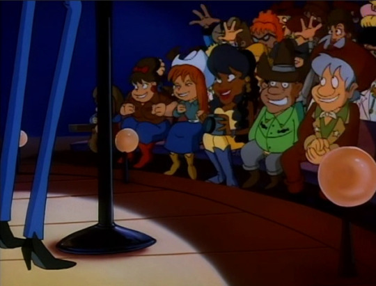
This time the crowd even sings along with him, and they’re not even hypnotized yet. Much better.
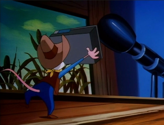
“Now, Pinky!”
“You are under my control, you will do whatever I say…”

“I will do whatever he says… Whatever he says… Whatever he says… Whatever he says…”
A confusingly consistent detail here: Every woman in the crowd has swirly red hypnotized eyes and every man in the crowd has swirly green hypnotized eyes. Why? Who knows!

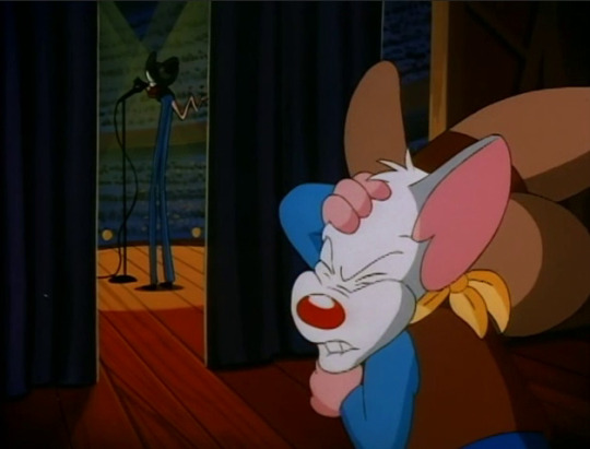
“Way to go, Blubber Boo Bean Brain. Narf!”
Heh, that hand flip.
It looks like Pinky is trying hard to suppress his verbal tic here for some reason? Or maybe he’s just realized that he’s messed up the name again and is cringing in anticipation of Brain yelling at him? Either way, poor guy… You really don’t deserve any of what’s coming.
And what’s coming? Well, given Brain’s heightened pissy attitude and his mental issues with not having things go exactly the way he wants them to, plus his obsessive need this episode to correct Pinky on this one thing that doesn’t need to even be addressed because no one else hears it, plus other repressed emotions…
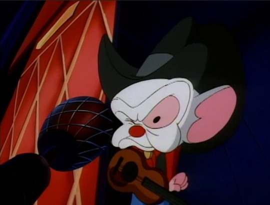
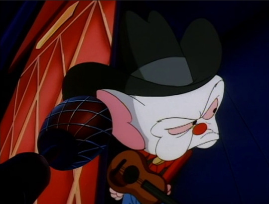
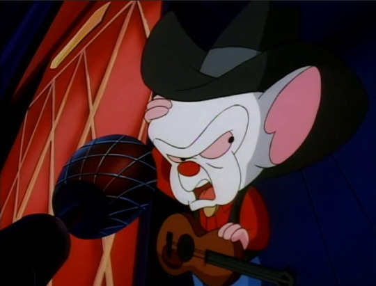
“Do me a favour and forget my name. While you’re at it, forget you ever knew me!”
Holy shit.
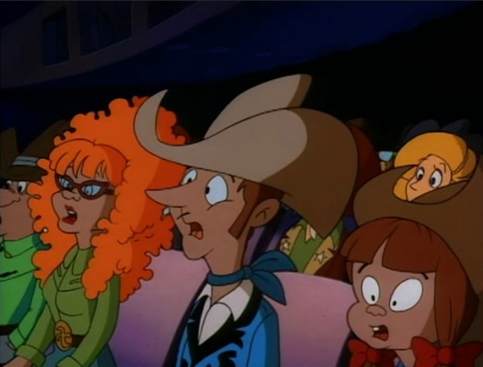
…Now you fucked up, Brain. Now you fucked up.
Man, I hate the one thick facial hair on the dude in the middle. It’s so unsettling.
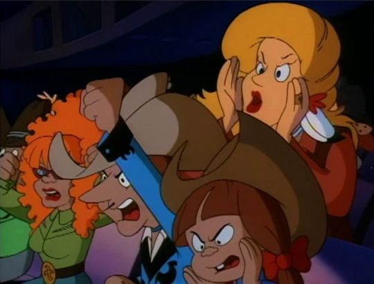
“Hey, who’s that skinny guy on stage?”
“Who is he?”
“Get him off!”
“Boo!”
“We wanna see someone famous!”
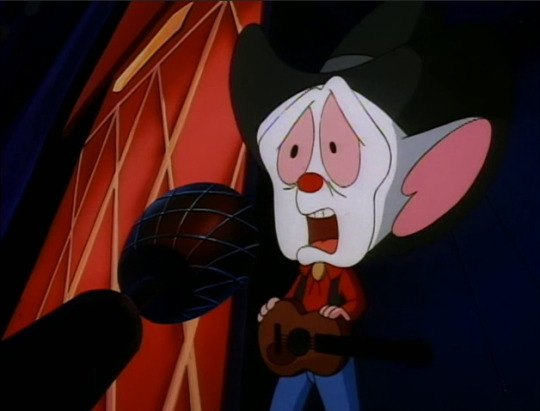

Yup. Look at what you did. You messed this up all because you were having a temper tantrum about Pinky messing up your stupid false name. You hang that head in shame. And you apologize to Pinky.
Later...

“Tonight’s inside story: A complete unknown somehow made it on to the stage at the Grand Ol’ Opry.”

“…Turn that off, Pinky.”
You know what? Keep it on for a bit, Pinky. Let Brain wallow in this humiliation just a bit more. He needs to have the lesson set in.

“I’m trying to concentrate on a better plan for tomorrow night.”

“Why, Brain? What are we going to do tomorrow night?”

“Same thing we do every night, Pinky:”

“Try to take over the world!”
Hey wait just a minute! You can’t just reuse this excellent ending from “Win Big” on this episode! Brain doesn’t yet deserve to get back to being cocky and determined after being such an ass!
Ahh well. He does get better, folks, I promise. This is just a rough patch. Brain is… He’s going through some things, I think. He’s not processing his emotions in a healthy way and it’s really coming back to bite him.
Listen, I understand this whole thing with Brain being extra grumpy and hostile after the whole Pinky dating Pharfignewton thing is largely coincidence. We don’t actually know what order these episodes were made in, after all, and the Animaniacs writers were not big on continuity.
Here’s the thing, though: I still find it fascinating that these episodes were aired one after the other…especially with a random cameo with Pinky and Brain disguised as a married couple in between. It makes for the beginning of a strange sort of arc that occasionally reminds us that, hey, these two mice are a duo and something is amiss when that duo is broken up or there is a strain put on that relationship.
I’ve read that after a while, network executives at the time tried to push for these mice to settle down and have families and for the skits and the eventual spin-off to largely abandon the whole world domination thing. They wanted it to be more sitcom-like to rival and imitate shows like The Simpsons.
That obviously doesn’t work. It can’t work. The writers, especially Peter Hastings, very much pushed back against the idea. When you have a duo of characters who fit together and play off one another so well, when the basic premise of a story is of a pair of characters working together to achieve a goal, and when those characters just mesh so perfectly and basically complete one another…trying to add another main character just puts the entire story completely out of wack and/or changes it into something unrecognizable. You can add reoccurring characters off to the side, sure. You can have a nemesis or two pop up and return every now and again. But with something like Pinky and the Brain where the main story is a small pair against incredible odds working towards a singular goal, disrupting that core relationship is going to cause a domino effect that will ruin the whole thing.
All this to say that I like this approach that’s going on here much more, even if it was completely unintended by the creative team: There is the element added of Pinky, off-screen, dating someone. It’s not something that’s brought up a lot and whenever it is brought up, Brain is irritated. We’ve seen at the end of the last episode where this development was introduced that Brain is unusually snappy, and now in the next episode he continues to be angry more often than he was before. It’s a more subtle and smooth way of seeing how these characters react if something or someone threatens to come between them, in a way that doesn’t immediately break the entire premise to pieces. Of course, it helps that Pharfignewton is…largely absent for all this and is only brought up every now and again. It’s not a perfect way to explore this kind of thing, but it’s preferable when compared to something like Pinky, Elymra, and The Brain.
However, after this episode Brain’s temper begins to de-escalate, and we won’t pick back up on this accidental “arc” for a few episodes. So to folks who are maybe a little bit bummed out about his behaviour here: don’t worry. We’re getting quite the breather next time with a very odd alternate universe skit courtesy of the Warner Siblings messing around with character placement, as well as an entire Animaniacs episode devoted to a Pinky and the Brain skit…fantasy style!
17 notes
·
View notes
Text

2020 / 53
Aperçu of the Week:
I can resist everything except Temptation (Oscar Wilde).
Bad News of the Week:
A Brexit deal has been reached in the final meters. While British Prime Minister Boris Johnson is celebrating the agreement as the "rebirth of a nation," it is being seen in Brussels and in the capitals of the EU countries for what it is: damage limitation. I can't recall such dishonesty in a democratic country to convince the electorate of an absurd plan. But why, really?
The only reason I can think of is a symbolic one: the islanders' elite feel closer to the fading memory of their former empire when they can wallow in supposed sovereignty -"Take back control!". Yet in an ever-shrinking world, any interdependence, especially economic, is simply the de facto status quo. And it is completely irrelevant whether the British crown or the European stars are depicted on British passports.
The United Kingdom got a small foretaste of an increasingly likely no-deal Brexit in the last days before Christmas, when France closed its borders because of a supposedly even more dangerous mutation of the coronavirus. And the British public registered in amazement that within days there could be empty shelves in supermarkets and pharmacies. As a reminder, the EU is and will remain the UK's most important trading partner; the opposite is not true. For comparison: about 50% of all UK imports come from the EU, the reverse is just over 6%. That's less than trade with Switzerland - which has one-eighth the population.
So expensive watches, gold, chocolate and cheese count more for the EU of 27 nations than ... humm ... well, than what, actually? Scotch whisky for sure, souvenirs of the Royal Family maybe.... I had to do some research. Gas turbines are number 5 on the British export hit list. Pharmaceutical products on 4, crude oil on 3, refined oil on 2. And on 1 cars and car parts. A closer look is worthwhile: Mini and Rolls-Royce belong to the German BMW, Jaguar and Land Rover to the Indian Tata holding. Bentley belongs to the German Volkswagen Group, leaving only Aston Martin in British hands. The large volume however is made up of Japanese manufacturers who have settled in the UK as a stepping stone to the EU - 80% of production is exported. That will change.
Likewise, the status of London City as a financial center will change, currently number one in the world ahead of New York City. On the one hand, it is hard to imagine that the EU financial industry will remain loyal to a "foreign" location. On the other hand, the portal function to the EU market also scored points here worldwide and that will be over on 01.01.2021.
Deal or no deal: nothing will ever be the same again. Completely unnecessarily, additional costs and bureaucracy will be created on both sides of the English Channel. Since the devil is always in the details, after the negotiations is before the negotiations - many details on the more than 1,200 pages of the agreement still need to be clarified, and disputes are bound to arise. But the point of no return has been reached. With the UK, the EU is losing an important player in the team. However, with Europe, the UK loses its coach, goalkeeper and top scorer at the same time. Good luck with that. Without sarcasm. Everyone will lose. Only to different degrees.
Good News of the Week:
After seven years of negotiations, China and the EU have signaled agreement in principle on the so-called "investment protection program". This regulates mutual access to each other's markets. China and the EU, especially Germany, have never needed an agreement to trade with each other. China has always been Europe's "extended workbench" with an endless, low-cost workforce. And Europe has always been the supplier of high-quality machines and tools for China's production facilities.
Direct market access, on the other hand, has long been problematic. For example, European companies had to enter into a joint venture with a Chinese company if they wanted to produce in China themselves - whether for the Chinese market or for export. This constellation often resulted in an unintentional transfer of knowledge in order to avoid the term "theft of intellectual property". This constraint is now to be eliminated. Another important aspect is the stipulation of fair competitive conditions so that, for example, no competitor gains an advantage through subsidies.
Even more importantly, the agreement provides that China must adhere to international sustainability standards. These include environmental protection and the use of resources on the one hand, and the social sphere, i.e. the working conditions of Chinese employees, on the other. China has a lot of catching up to do in both areas. Poisoned rivers and polluted air are still the norm today, but they should now become a thing of the past. And forced labor, child labor, excessive working hours without vacation entitlement and precarious working conditions in the factories are to disappear.
In contrast to the Brexit deal described above, this one shows the right way forward: a sensible economic agreement should ensure that both partners benefit without workers or the environment falling behind. That the EU is serious about this was shown this year by the suspension of negotiations with the South American Mercosur states. If these demands are upheld, one can really speak of a win-win-win-win situation.
Personal happy Moment of the Week:
On Wednesday I got an email from Tumblr informing me of the 1 year birthday of "Bopinion". In this one year I have published 132 posts of "Bo's opinion on what matters to me". All with effort and ulterior motive, so handmade and thoughtful. And I've enjoyed sorting and formulating my thoughts in this way. And more than once, my first follower, my 17-year-old daughter, sought discussion with me. Or pointed out a mistake to me. Linguistically - her English is generation-typically better than mine -, not content-wise - because I check all facts carefully and personal opinion is subjective and difficult to evaluate anyway.
For that I would like to thank her and everyone else who took the time to read my blog. Stay faithful to me in 2021, I will certainly have something to share again - even if I wish us all that this new year will be calmer and more relaxed than the old one, which will undoubtedly fill a special chapter in the history books. All the best & Stay safe!
#aperçu#thoughts#bad news#good news#News of the Week#happy moments#oscar wilde#brexit#uk#european union#london#brussels#China#deal#agreement#Blog#tumblr#birthday#opinion
3 notes
·
View notes
Text
INTERNET OF THINGS(IOT)
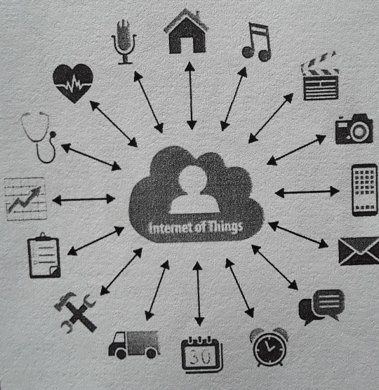
The definition of the Internet of things has evolved due to the convergence of multiple technologies, real-time analytics, machine learning, commodity sensors, and embedded systems.[1] Traditional fields of embedded systems, wireless sensor networks, control systems, automation (including home and building automation), and others all contribute to enabling the Internet of things. In the consumer market, IoT technology is most synonymous with products pertaining to the concept of the "smart home", covering devices and appliances (such as lighting fixtures, thermostats, home security systems and cameras, and other home appliances) that support one or more common ecosystems, and can be controlled via devices associated with that ecosystem, such as smartphones and smart speakers.
There are a number of serious concerns about dangers in the growth of IoT, especially in the areas of privacy and security, and consequently industry and governmental moves to address these concerns have begun.
History
The main concept of a network of smart devices was discussed as early as 1982, with a modified Coca-Cola vending machine at Carnegie Mellon University becoming the first Internet-connected appliance, able to report its inventory and whether newly loaded drinks were cold or not.Mark Weiser's 1991 paper on ubiquitous computing, "The Computer of the 21st Century", as well as academic venues such as UbiComp and PerCom produced the contemporary vision of the IoT. In 1994, Reza Raji described the concept in IEEE Spectrum as "[moving] small packets of data to a large set of nodes, so as to integrate and automate everything from home appliances to entire factories".Between 1993 and 1997, several companies proposed solutions like Microsoft's at Work or Novell's NEST. The field gained momentum when Bill Joy envisioned device-to-device communication as a part of his "Six Webs" framework, presented at the World Economic Forum at Davos in 1999.
The term "Internet of things" was likely coined by Kevin Ashton of Procter & Gamble, later MIT's Auto-ID Center, in 1999, though he prefers the phrase "Internet for things". At that point, he viewed radio-frequency identification (RFID) as essential to the Internet of things,which would allow computers to manage all individual things.
Defining the Internet of things as "simply the point in time when more 'things or objects' were connected to the Internet than people", Cisco Systems estimated that the IoT was "born" between 2008 and 2009, with the things/people ratio growing from 0.08 in 2003 to 1.84 in 2010.
The key driving force behind the Internet of things is the MOSFET (metal-oxide-semiconductor field-effect transistor, or MOS transistor),which was originally invented by Mohamed M. Atalla and Dawon Kahng at Bell Labs in 1959.The MOSFET is the basic building block of most modern electronics, including computers, smartphones, tablets and Internet services. MOSFET scaling miniaturization at a pace predicted by Dennard scaling and Moore's law has been the driving force behind technological advances in the electronics industry since the late 20th century. MOSFET scaling has been extended into the early 21st century with advances such as reducing power consumption, silicon-on-insulator (SOI) semiconductor device fabrication, and multi-core processor technology, leading up to the Internet of things, which is being driven by MOSFETs scaling down to nanoelectronic levels with reducing energy consumption.
Privacy and security concern :
As for IoT, information about a user's daily routine is collected so that the “things” around the user can cooperate to provide better services that fulfill personal preference. When the collected information which describes a user in detail travels through multiple hops in a network, due to a diverse integration of services, devices and network,the information stored on a device is vulnerable to privacy violation by compromising nodes existing in an IoT network.
For example, on 21 October 2016,a multiple distributed denial of service (DDoS) attacks systems operated by domain name system provider Dyn, which caused the inaccessibility of several websites, such as GitHub, Twitter, and others. This attack is executed through a botnet consisting of a large number of IoT devices including IP cameras, gateways, and even baby monitors.
Fundamentally there are 4 security objectives that the IOT system requires:(1)data confidentiality: unauthorized parties cannot have access to the transmitted and stored data.(2)data integrity: intentional and unintentional corruption of transmitted and stored data must be detected.(3)non-repudiation: the sender cannot deny having sent a given message.(4)data availability: the transmitted and stored data should be available to authorized parties even with the denial-of-service (DOS) attacks
IoT adoption barriers :
Lack of interoperability and unclear value proposition
Despite a shared belief in the potential of the IoT, industry leaders and consumers are facing barriers to adopt IoT technology more widely. Mike Farley argued in Forbes that while IoT solutions appeal to early adopters, they either lack interoperability or a clear use case for end-users. A study by Ericsson regarding the adoption of IoT among Danish companies suggests that many struggle "to pinpoint exactly where the value of IoT lies for them".
Privacy and security concerns
As for IoT, information about a user's daily routine is collected so that the “things” around the user can cooperate to provide better services that fulfill personal preference. When the collected information which describes a user in detail travels through multiple hops in a network, due to a diverse integration of services, devices and network,the information stored on a device is vulnerable to privacy violation by compromising nodes existing in an IoT network.
For example, on 21 October 2016,a multiple distributed denial of service (DDoS) attacks systems operated by domain name system provider Dyn, which caused the inaccessibility of several websites, such as GitHub, Twitter, and others. This attack is executed through a botnet consisting of a large number of IoT devices including IP cameras, gateways, and even baby monitors.
Fundamentally there are 4 security objectives that the IOT system requires:(1)data confidentiality: unauthorized parties cannot have access to the transmitted and stored data.(2)data integrity: intentional and unintentional corruption of transmitted and stored data must be detected.(3)non-repudiation: the sender cannot deny having sent a given message.(4)data availability: the transmitted and stored data should be available to authorized parties even with the denial-of-service (DOS) attacks.
Applications :
Nest
learning thermostat reporting on energy usage and local weather
Ring
doorbell connected to the Internet
An
August Home
smart lock connected to the Internet
The extensive set of applications for IoT devices is often divided into consumer, commercial, industrial, and infrastructure spaces.
Consumer applicationS
A growing portion of IoT devices are created for consumer use, including connected vehicles, home automation, wearable technology, connected health, and appliances with remote monitoring capabilities.
Smart home
IoT devices are a part of the larger concept of home automation, which can include lighting, heating and air conditioning, media and security systems. Long-term benefits could include energy savings by automatically ensuring lights and electronics are turned off.
A smart home or automated home could be based on a platform or hubs that control smart devices and appliances. For instance, using Apple's HomeKit, manufacturers can have their home products and accessories controlled by an application in iOS devices such as the iPhone and the Apple Watch. This could be a dedicated app or iOS native applications such as Siri. This can be demonstrated in the case of Lenovo's Smart Home Essentials, which is a line of smart home devices that are controlled through Apple's Home app or Siri without the need for a Wi-Fi bridge.[31] There are also dedicated smart home hubs that are offered as standalone platforms to connect different smart home products and these include the Amazon Echo, Google Home, Apple's HomePod, and Samsung's SmartThings Hub. In addition to the commercial systems, there are many non-proprietary, open source ecosystems; including Home Assistant, OpenHAB and Domoticz.
Elder care
One key application of a smart home is to provide assistance for those with disabilities and elderly individuals. These home systems use assistive technology to accommodate an owner's specific disabilities. Voice control can assist users with sight and mobility limitations while alert systems can be connected directly to cochlear implants worn by hearing-impaired users.They can also be equipped with additional safety features. These features can include sensors that monitor for medical emergencies such as falls or seizures.Smart home technology applied in this way can provide users with more freedom and a higher quality of life.
The term "Enterprise IoT" refers to devices uSed in business and corporate settings. By 2019, it is estimated that the EIoT will account for 9.1 billion devices
Commercial application and Medical and healthcare :
The Internet medical things (IoMT) is an application of the IoT for medical and health related purposes, data collection and analysis for research, and monitoring.[38][39][40][41][42] The IoMT has been referenced as "Smart Healthcare",[43] as the technology for creating a digitized healthcare system, connecting available medical resources and healthcare services.[citation needed][44]
IoT devices can be used to enable remote health monitoring and emergency notification systems. These health monitoring devices can range from blood pressure and heart rate monitors to advanced devices capable of monitoring specialized implants, such as pacemakers, Fitbit electronic wristbands, or advanced hearing aids. Some hospitals have begun implementing "smart beds" that can detect when they are occupied and when a patient is attempting to get up. It can also adjust itself to ensure appropriate pressure and support is applied to the patient without the manual interaction of nurses. A 2015 Goldman Sachs report indicated that healthcare IoT devices "can save the United States more than $300 billion in annual healthcare expenditures by increasing revenue and decreasing cost." Moreover, the use of mobile devices to support medical follow-up led to the creation of 'm-health', used analyzed health statistics."
A Nest learning thermostat reporting on energy usage and local weather

A Ring doorbell connected to the Internet

An August Home smart lock connected to the Internet .
Infrastructure applications :
Monitoring and controlling operations of sustainable urban and rural infrastructures like bridges, railway tracks and on- and offshore wind-farms is a key application of the IoT. The IoT infrastructure can be used for monitoring any events or changes in structural conditions that can compromise safety and increase risk. The IoT can benefit the construction industry by cost saving, time reduction, better quality workday, paperless workflow and increase in productivity. It can help in taking faster decisions and save money with Real-Time Data Analytics. It can also be used for scheduling repair and maintenance activities in an efficient manner, by coordinating tasks between different service providers and users of these facilities. IoT devices can also be used to control critical infrastructure like bridges to provide access to ships. Usage of IoT devices for monitoring and operating infrastructure is likely to improve incident management and emergency response coordination, and quality of service, up-times and reduce costs of operation in all infrastructure related areas. Even areas such as waste management can benefit from automation and optimization that could be brought in by the IoT.
1 note
·
View note
Text
Nah, not poorly written by a longshot. It wouldn't be one of the top shows on Netflix if that were the case.
What it is though is mediocre writing with highly appealing plot points and storytelling tools that are a pretty much guaranteed successful formula in keeping people engaged. Not super interesting or detailed or even very unique, just very appealing.
And you also have to remember the age demographic this is for. Of course it isn't going to be all that nuanced when it's aimed at a younger crowd and doesn't have any extra spice to it like supernatural elements, fantasy, horror, ect.
There's really nothing wrong with depending on small details, especially when the show is supposed to be a mystery that the audience is (mostly) solving along with the characters. It's the inconsistency of adding in lots of fun small details and then just... not really going anywhere with them that's more of a problem. It's the fact there's too many Very Convenient coincidences that end up kind of as unintentional red herrings.
I think the writing is actually pretty good in a lot of areas. Not great, but good, and could probably be a hell of a lot better with a better director and with a guaranteed, set amount of seasons. Gotta remember they only fully flesh out one season at a time because Netflix is a fickle bitch like that. We already know they have material for upwards of 5-6 seasons, but none of that would be at all ready to be printed into screenplay script. So things get scrapped while other things get shoehorned in with each season to do as much storytelling as possible. I wouldn't say this is very unique to obx either, it's kind of been the going trend of the last like, 8 or so years.
TV shows weren't filmed and polished and finished with post-production months in advance before the rise of Netflix bingewatching. Most were done episode by episode, which meant a couple of things: 1. If a network very suddenly gave your show the axe, you could call for an all-hands reworking of the script to wrap your show up. Oftentimes this meant rushed endings, but at least it was resolved. But USUALLY networks would order X amount of seasons or X amount of episodes, and that was USUALLY done like midway through the first season when they had enough ratings to judge it by. Now you make a whole show from start to finish and have no idea how it'll actually do and if you leave your audience on a cliffhanger forever or if you get to continue. 2. Longer series. 26 episodes standard. Now you're lucky to get 12. Usually 10. and that meant 3. Better storytelling. Episodes used to be 30 minutes standard, 45 minutes for special things. Now, if we actually had full 60 minute episodes today to justify cutting episode amounts down so drastically, that wouldn't be a problem. However, it's closer to 45-50 minutes per. About 780 minutes to tell a story back then vs. about 500 minutes now. There simply isn't time for writers to explore everything they want to anymore. The only real benefit Netflix comes with is a budget, imo. and honestly a show like obx could work just fine without a Netflix budget. Yes, its nice they actually shoot on location (or as close to as possible) where it's taking place in-universe but you don't have to do that. the only people who are gonna bitch are people that live in the real obx (which they do anyway) and geography nerds. cause you know what? they used to wing it with locations all the time and it was FINE. there's no major special effects or vfx, literally all of the actors in this started as unknowns and only a few are starting to gain traction - they do not need the Netflix money to make a damn good show. But that is unfortunately where the audience is now, and so the Netflix laws are what they must abide by.
I'd say given what little time they actually have to work with, they do a good job with most of their writing. It's still mediocre on a grand scale, but that isn't a negative thing.
Now that said, you are correct about the actors. the actors for obx are so above the writing and script it isn't even funny - and I think that's what can make it seem bad in some areas. I'm honestly shocked by the skill of Rudy and JD's emotional acting along with their normal acting - there's actors that have been in hollywood for literal decades that can't pull off the sincere level of emotion those two can. It's fucking insane and kind of unheard of for being so young and unknown previously. They're my favorites so I highlight them but honestly? The ENTIRE main cast has some truly incredible talent that's just kind of... almost too big for their script. I mean just take Rudy and JJ. Everyone agrees Rudy absolutely kills it every second he's on screen. He steals the show. He turned the character with some of the least amount of screentime to the fan favorite. But thats the thing! JJ is written very much as a supporting character while Rudy is acting him as if he is the star - and that isn't at all a complaint about Rudy. He's just that damn good at giving it his all into his roles, but the writers aren't writing for that level of talent. They wrote JJ as the token edgy, semi-antagonistic bad boy of the group with a tragic home life and good heart despite that, and Rudy took that and dialed it up to 100. Which left everyone frothing at the mouth for something more in-depth with JJ. And yet he remains the one we know the least about, because he wasn't written to be THAT interesting.
So anyway thats my way too longwinded way of saying no it's not poorly written but it's not great either but there's good reason for that.
Unpopular opinion: obx is poorly written and the writers depend on the viewers to pick up on all the small details that are important to the story or ignore details depending on what they decided not to follow through with. Which is a shame bc they have great actors.
#obx#outer banks#personally i'm still shocked and amazed how popular the show is#for having 0 fancy supporting elements to it#just your tried and true mystery-drama#now there are definitely spots in the script i hate#because it's so jarringly NOT something a teenager would say or do#but those are few are far between moments#if you want to see what poor writing really is#go watch literally any B movie of the 80s and 90s#or like any of the hundreds of sequels made in the 00s#or the very beginnings of the super hero movies before marvel
41 notes
·
View notes
Text
Making Room for Variation
Making a brand feel unified, cohesive, and harmonious while also leaving room for experimentation is a tough balancing act. It’s one of the most challenging aspects of a design system.
Graphic designer and Pentagram partner Paula Scher faced this challenge with the visual identity for the Public Theater in New York. As she explained in a talk at Beyond Tellerrand:
I began to realize that if you made everything the same, it was boring after the first year. If you changed it individually for each play, the theater lost recognizability. The thing to do, which I totally got for the first time after working there at this point for 17 years, is what they needed to have were seasons.
You could take the typography and the color system for the summer festival, the Shakespeare in the Park Festival, and you could begin to translate it into posters by flopping the colors, but using some of the same motifs, and you could create entire seasons out of the graphics. That would become its own standards manual where I have about six different people making these all year (http://bkaprt.com/eds/04-01/).
Scher’s strategy was to retain the Public Theater’s visual language every year, but to vary some of its elements (Fig 4.1–2). Colors would be swapped. Text would skew in different directions. New visual motifs would be introduced. The result is that each season coheres in its own way, but so does the identity of the Public Theater as a whole.

Fig 4.1: The posters for the 2014/15 season featured the wood type style the Public Theater is known for, but the typography was skewed. The color palette was restrained to yellow, black, and white, which led to a dynamic look when coupled with the skewed type (https://ift.tt/2t6W9cB).

Fig 4.2: For the 2018 season, the wood type letterforms were extended on a field of gradated color. The grayscale cut-out photos we saw in the 2014/15 season persisted, but this time in lower contrast to fit better with the softer color tones (https://ift.tt/2EdiXdb).
Even the most robust or thoroughly planned systems will need to account for variation at some point. As soon as you release a design system, people will ask you how to deviate from it, and you’ll want to be armed with persuasive answers. In this chapter, I’m going to talk about what variation means for a design system, how to know when you need it, and how to manage it in a scalable way.
What Is Variation?
We’ve spent most of this book talking about the importance of unity, cohesion, and harmony in a design system. So why are we talking about variation? Isn’t that at odds with all of the goals we’ve set until now?
Variation is a deviation from established patterns, and it can exist at every level of the system. At the component level, for instance, a team may discover that they need a component to behave in a slightly different way; maybe this particular component needs to appear without a photo, for example. At a design-language level, you may have a team that has a different audience, so they want to adjust their brand identity to serve that audience better. You can even have variation at the level of design principles: if a team is working on a product that is functionally different from your core product, they may need to adjust their principles to suit that context.
There are three kinds of deviations that come up in a design system:
Unintentional divergence typically happens when designers can’t find the information they’re looking for. They may not know that a certain solution exists within a system, so they create their own style. Clear, easy-to-find documentation and usage guidelines can help your team avoid unintentional variation.
Intentional but unnecessary divergence usually results from designers not wanting to feel constrained by the system, or believing they have a better solution. Making sure your team knows how to push back on and contribute to the system can help mitigate this kind of variation.
Intentional, meaningful divergence is the goal of an expressive design system. In this case, the divergence is meaningful because it solves a very specific user problem that no existing pattern solves.
We want to enable intentional, meaningful variation. To do this, we need to understand the needs and contexts for variation.
Contexts for Variation
Every variation we add makes our design system more complicated. Therefore, we need to take care to find the right moments for variation. Three big contextual changes are served by variation: brand, audience, and environment.
Brand
If you’re creating a system for multiple brands, each with its own brand language, then your system needs to support variations to reflect those brands.
The key here is to find the common core elements and then set some criteria for how you should deviate. When we were creating the design system for our websites at Vox Media, we constantly debated which elements should feel more expressive. Should a footer be standardized, or should we allow for tons of customization? We went back to our core goals: our users were ultimately visiting our websites to consume editorial content. So the variations should be in service of the content, writing style, and tone of voice for each brand.
The newsletter modules across Vox Media brands were an example of unnecessary variation. They were consistent in functionality and layout, but had variations in type, color, and visual treatments like borders (Fig 4.3). There was quite a bit of custom design within a very small area: Curbed’s newsletter component had a skewed background, for example, while Eater’s had a background image. Because these modules were so consistent in their user goals, we decided to unify their design and create less variation (Fig 4.4).


Fig 4.3: Older versions of Vox Media’s newsletter modules contained lots of unnecessary visual variation.
Fig 4.4: The new, unified newsletter modules.
The unified design cleaned up some technical debt. In the previous design, each newsletter module had CSS overrides to achieve distinct styling. Some modules even had overrides on the primary button color so it would work better with the background color. Little CSS overrides like this add up over time. Whenever we released a new change, we’d have to manually update the spots containing CSS overrides.
The streamlined design also placed a more appropriate emphasis on the newsletter module. While important, this module isn’t the star of the page. It doesn’t need loud backgrounds or fancy shapes to command attention, especially since it’s placed around article content. Variation in this module wasn’t necessary for expressing the brands.
On the other hand, consider the variation in Vox Media’s global header components. When we were redesigning the Verge, its editorial teams were vocal about wanting more latitude to art-direct the page, guide attention toward big features, and showcase custom illustrations. We addressed this by creating a masthead component (Fig 4.5) that sits on top of the global header on homepages. It contains a logo, tagline, date, and customizable background image. Though at the time this was a one-off component, we felt that the variation was valuable because it would strengthen the Verge’s brand voice.


Fig 4.5: Examples of the Verge's masthead component
The Verge team commissions or makes original art that changes throughout the day. The most exciting part is that they can use the masthead and a one-up hero when they drop a big feature and use these flexible components to art-direct the page (Fig 4.6). Soon after launch, the Verge masthead even got a Twitter fan account (@VergeTaglines) that tweets every time the image changes.


Fig 4.6: The Verge uses two generic components, the masthead and one-up hero, to art-direct its homepages.
Though this component was built specifically for the Verge, it soon gained broader application with other brands that share Vox’s publishing platform, Chorus. The McElroy Family website, for example, needed to convey its sense of humor and Appalachian roots; the masthead component shines with an original illustration featuring an adorable squirrel (Fig 4.7).

Fig 4.7: The McElroy Family site uses the same masthead component as the Verge to display a custom illustration.

Fig 4.8: The same masthead component on the Chicago Sun-Times site.
The Chicago Sun-Times—another Chorus platform site—is very different in content, tone, and audience from The McElroy Family, but the masthead component is just as valuable in conveying the tone of the organization’s high-quality investigative journalism and breaking news coverage (Fig 4.8).
Why did the masthead variation work well while the newsletter variation didn’t? The variations on the newsletter design were purely visual. When we created them, we didn’t have a strategy for how variation should work; instead, we were looking for any opportunity to make the brands feel distinct. The masthead variation, by contrast, tied directly into the brand strategy. Even though it began as a one-off for the Verge, it was flexible and purposeful enough to migrate to other brands.
Audience
The next contextual variation comes from audience. If your products serve different audiences who all need different things, then your system may need to adapt to fit those needs.
A good example of this is Airbnb’s listing pages. In addition to their standard listings, they also have Airbnb Plus—one-of-a-kind, high quality rentals at higher price points. Audiences booking a Plus listing are probably looking for exceptional quality and attention to detail.
Both Airbnb’s standard listing page and Plus listing page are immediately recognizable as belonging to the same family because they use many consistent elements (Fig 4.9). They both use Airbnb’s custom font, Cereal. They both highlight photography. They both use many of the same components, like the date picker. The iconography is the same.


Fig 4.9: The same brand elements in Airbnb’s standard listings (above) are used in their Plus listings (below), but with variations that make the listing styles distinct.
However, some of the design choices convey a different attitude. Airbnb Plus uses larger typography, airier vertical space, and a lighter weight of Cereal. It has a more understated color palette, with a deeper color on the call to action. These choices make Airbnb Plus feel like a more premium experience. You can see they’ve adjusted the density, weight, and scale levers to achieve a more elegant and sophisticated aesthetic.
The standard listing page, on the other hand, is more functional, with the booking module front and center. The Plus design pulls the density and weight levers in a lighter, airier direction. The standard listing page has less size contrast between elements, making it feel more functional.
Because they use the same core building blocks—the same typography, iconography, and components—both experiences feel like Airbnb. However, the variations in spacing, typographic weights, and color help distinguish the standard listing from the premium listing.
Environment
I’ve mainly been talking about adding variation to a system to allow for a range of content tones, but you may also need your system to scale based on environmental contexts. “Environment” in this context asks: Where will your products be used? Will that have an impact on the experience? Environments are the various constraints and pressures that surround and inform an experience. That can include lighting, ambient noise, passive or active engagement, expected focus level, or devices.
Shopify’s Polaris design system initially grew out of Shopify’s Store Management product. When the Shopify Retail team kicked off a project to design the next generation point-of-sale (POS) system, they realized that the patterns in Polaris didn’t exactly fit their needs. The POS system needed to work well in a retail space, often under bright lighting. The app needed to be used at arm’s length, twenty-four to thirty-six inches away from the merchant. And unlike the core admin, where the primary interaction is between the merchant and the UI, merchants using the POS system needed to prioritize their interactions with their customers instead of the UI. The Retail team wanted merchants to achieve an “eyes-closed” level of mastery over the UI so they could maintain eye contact with their customers.
The Retail team decided that the existing color palette, which only worked on a light background, would not be clear enough under the bright lights of a retail shop. The type scale was also too small to be used at arm’s length. And in order for merchants to use the POS system without breaking eye contact with customers, the buttons and other UI elements would need to be much larger.
The Retail team recognized that the current design system didn’t support a variety of environmental scenarios. But after talking with the Polaris team, they realized that other teams would benefit from the solutions they created. The Warehouse team, for example, was also developing an app that needed to be used at arm’s length under bright lights. This work inspired the Polaris team to create a dark mode for the system (Fig 4.10).

Fig 4.10: Polaris light mode (left) and dark mode (right).
This feedback loop between product team and design system team is a great example of how to build the right variation into your system. Build your system around helping your users navigate your product more clearly and serving content needs and you’ll unlock scalable expression.
Making Room for Variation published first on https://deskbysnafu.tumblr.com/
0 notes
Text
Forever Beautiful: Costuming Patti Lupone in “War Paint,” Part II
Welcome back! Last time, I took a look at some of the overall outfits that were worn by Patti Lupone in her role as Helena Rubinstein in War Paint. Costume designer Catherine Zuber did a fantastic job in creating outfits that matched both Ms Lupone’s fiery personality and the spitfire character of Madame Rubinstein, who was the more sharp and snappy of the two main characters in War Paint. This time, I want to look at some of the detailed accessories that Ms Zuber created for this production. Hopefully, I’ll be able to do the same with Christine Ebersole in future posts--though Patti Lupone has the lion’s share of the promotional stills.
I left off on the white and blue outfit worn by Helena, noting that there were accessories that needed to be discussed. Withour further ado, here’s a great image of what those accessories are: a bright red scarf and our first up-close taste of the jewelry created for the program (as ever, thanks to Playbill and Broadway.com for the stills in this review):

I noted that this dress as a whole is rather pale, almost pastel, in quality and that the fabric is designed to be light and airy. As a result, to make it “pop” a bit more, Ms Zuber needed to accessorize it and make it a little more memorable. Without jewel work or beadwork (and not every costume needs or should have those elements!), there’s freedom to mix and match a couple different styles. Here, Ms Zuber has chosen a rich red scarf that perfectly matches Ms Lupone’s lipstick for this scene--and in a musical that is about cosmetics, it is impossible to believe that this was unintentional. It draws the eye in a way: the human mind naturally seeks out patterns and similarities when we process what we see, so having a matching colored scarf and lipstick would help make the overall appearance a little more memorable.
The jewelry, on the other hand, is something else. Everything that Madame Rubinstein wears in this musical is heavy, beaded or jeweled, and a bit clunky--and that last point is not an insult! It’s no surprise that Helena Rubinstein, who considered herself quite plain in life, had a preference for big, showy jewelry that had some heft to it. Ms Zuber has done her homework here. With credit to helenarubinstein.com (the home of Madame Rubinstein’s company, now a division of L’Oréal), have a look at the real Helena and some of her jewelry:

The jewelry the actual person being depicted preferred was heavy and a little unwieldy, designed to draw attention to it rather than the woman herself. Here, Ms Zuber has done the same thing with a series of heavy beaded necklaces, a large Maltese cross badge on the waist of the dress, matching heavy bangles on Ms Lupone’s wrists, and a heavy pendant hanging at the top of her bust. What these items of jewelry do is exude a sense of style--not necessarily a sense of fashion, but they give the audience the idea that Madame Rubinstein is a woman of some character who doesn’t necessarily jump straight for what’s trendy, and that when she does, she wants a lot of it.
This is carried over into other outfits as well, and not just the white outfit I’ve spent so much time on here. There is another white outfit during the performance, and it shows off some different jewelry in another style, but showing a similar theme: large and eye-catching.

Have a look at the older style in use here. This is a little more refined a set of jewelry, but with a large and a little clunky styling to it. Once again, we see the giant bangle on Ms Lupone’s wrist, while this time the eye is drawn immediately to the large emerald (though almost certainly not real emeralds in a costume, no matter the production values!) earrings that dangle from each earlobe. They’re big and a little clunky, far from the dainty earrings that the modern eye would expect to adorn “women of a certain age” as the theatre trope puts it. There is also the rather large jade ring that she wears on her left hand. But once again, there is some nice historical precedent for this choice on Ms Zuber’s part. Have another look at the real Helena Rubinstein:
(Photo credit in lower left corner)
Helena was clearly always a fan of large rings, and while without a color sample to match it to, it seems possible that the ring on her right hand is the one that Ms Zuber has tried to replicate in style if not in exact design. This is important when designing a costume for a character who existed in real life and not just in the imagination of a theatregoer.
But there is one more piece of jewelry that is absolutely gorgeous and fulfills one of the great rules of accessories when they possess detail: memorability. In the final numbers of the musical, Helena Rubinstein is in an old fashioned outfit (the top of which was seen as the second photo in this post) with one heck of a set of necklaces (courtesy of Playbill):
Look at the sheer heft and weight of this piece. This necklace set is meant to be remembered and committed to memory, and even people in the nosebleeds of the Nederlander Theatre would be able to see and remember this fantastic example of costume jewelry. According to Catherine Zuber herself, this piece even had input from Patti Lupone, who wanted a memorable piece in which to finish her role as Madame Rubinstein. And when your actress makes a request, as a costume designer you have a duty to at least try and make it work. We as the audience are richer for having been exposed to this one, and it gets quite a bit of stage time during “Beauty in the World” and “Finale,” as it should. But like all the other accessories, it doesn’t distract from the actress herself. It complements the figure of Ms Lupone and reminds us of who her character is, and once again acts as a kind of eye-drawing element--important because the diminutive Ms Lupone is next to Christine Ebersole (who is quite tall by comparison) for the entirety of the final number.
One final set of accessories deserves some analysis, and it includes the Blue Hat I’ve mentioned a few times. I’m not sure quite what it is that enraptures me so about this outfit, but it really has caught my attention since I first became aware of War Paint coming to Broadway from Chicago. (Thanks once again to Playbill):
According to Lindy Woodhead’s book War Paint, upon which the musical is based in whole, as Madame Rubinstein got older, her choice in fashion became more and more eccentric, and that is on full display here. While eye-catching, the set of heavy stone-and-bead necklaces is clearly wild and a bit uncontrolled. Ms Lupone is also costumed in a heavy, almost velveteen fabric that allows the jewelry to stand out even more. The brooch on her right shoulder is another Maltese cross (similar to that in the white outfit at the top of this post) and is designed to show off the large star-sapphire element at its heart--but it does something else very important.
Remember what I said in my last review about how accessories tie in with a costume in order to accentuate certain elements? Look between the brooch and the hat, and specifically the small gold-and-blue badge that acts as an anchor for the velvet flares and the feather emerging from the top of the hat. Rather than simply duplicate the design, Ms Zuber used a fleur-de-lis design to give just a touch of delicacy to an otherwise very heavy costume design. That’s pretty neat, especially since the color scheme and stone still tie it in with the rest of Madame Rubinstein’s jewelry.
When considering costumery, I think there is a misconception that it is just about the clothing, and that someone else is charged with designing the accessories. Nothing could be further from the truth. Ms Zuber worked closely with a New York jeweler in designing each of these pieces, and consulted with the actress originating the role of Madame Rubinstein in order to be sure that the pieces would match the needs of the production and the personality of the person who would be wearing them.
This last point is one of the reasons that I think the right costumes can make a good production into a truly spectacular one or, on the other hand, drag down a decent production and mark it as less wonderful than its Broadway competitors. In the case of War Paint, I think that the costumes for Patti Lupone to wear in her guise as Helena Rubinstein definitely fall into the former category. As an eccentric character with a forceful personality and compelling storyline, she demands to be costumed in style and with gusto. On both those counts, Ms Zuber has achieved a resounding success.
Next, we’ll take a look at the much more subtle but no less magnificent costumes that Catherine Zuber designed for Christine Ebersole to wear in her role as Elizabeth Arden, the other doyenne of the cosmetics industry.
Stay tuned!
43 notes
·
View notes
Text
The Jehanimation Awards: separating the best of 2016′s animated movies from the rest

Between all the political turmoil, the near-relentless stream of high-profile deaths and the release of Batman v Superman: Dawn of Justice, it has been widely accepted that 2016 was A Bad Year. As a member of the human race, last year probably was a bit of a disappointment in most respects; look at it as an animation enthusiast, though, and the picture starts to look quite a bit rosier.
In fact, I’m going to go a step farther than that and call 2016 one of the best years for feature animation in recent memory - which is saying a lot given how much the bar has been raised since the 1990s. Since the advent of CGI tore up the rulebook and made it easier for newer studios to compete with Disney on an equal footing, it’s felt like we’ve been constantly on the cusp of a new, more diverse landscape for mainstream animation, allowing a wider range of studios and directors to present wildly different visions in a competitive marketplace, rather than a single company monotonously ruling the roost. Obviously, the conservative and formula-driven nature of the business has meant that potential hasn’t always been realised, but in 2016 we got a glimpse of how that theoretical vision would play out in reality - and it was a pretty exciting thing to behold. I can’t think of many previous years in which so many companies - from the US and elsewhere - were able to produce such a broad spread of high-quality movies for different audiences, resulting in a glut of animated movies occupying the top spots in not only the worldwide box office rankings, but also in lists of the best-reviewed films of the year.
Faced with such an embarrassment of riches, it feels difficult and somewhat reductive to pit them against each other and pick out a small handful as being the best - but that’s just what we do around this time of year anyway, so who am I to argue? Still, my intention here is not to add to the somewhat adversarial sentiments that awards season can sometimes generate; this is simply my personal evaluation of all the new animated movies I got to see in 2016, with my favourites highlighted. Your own mileage will, of course, vary, because such variety is the spice of life; with that said, I’m pretty sure this list is 100% objectively correct, so I’ve no idea why you’d disagree.
Immense thanks go to the wonderful Jamie Carr for the header image and icon for this blog! Go follow her on Twitter at @neurodolphin!
THE NOTABLE OMISSIONS

Before I get into evaluating the best of 2016’s crop, I should probably acknowledge that, contrary to assumption, I am not omniscient, and was therefore unable to see every animated movie that came out last year. There are upsides to this, as it means I missed out on having to watch bargain-bin garbage like Norm of the North or Robinson Crusoe (aka The Wild Life), and was able to judiciously pass on higher-profile but poorly-reviewed efforts like Blue Sky’s Ice Age: Collision Course and Rainmaker Entertainment’s Ratchet & Clank; unfortunately, it also meant not getting to see most of the less widely-screened animated movies from overseas, which is a great shame. I haven’t, for example, been able to see The Red Turtle or My Life as a Zucchini - two of the five nominations for this year’s Best Animated Feature Oscar - nor did I catch the well-reviewed French-Canadian production Ballerina (known in the US as Leap!). I also freely confess to being underexposed to anime, meaning I didn’t see anything from Japan this year - with one important exception, which I’ll come to later. I’ll certainly hope to correct some of these oversights at a later date.
THE ALSO-RANS
The following movies are the films that - for one reason or another - didn’t quite connect with me this year. Some are better than others, but to some degree or another I wouldn’t say they succeeded at what they set out to do.
The Angry Birds Movie
This was probably the weakest animated film I saw last year, which - given its essentially functional mediocrity - reflects pretty well on 2016’s lineup as a whole, even though it doesn’t retroactively make The Angry Birds Movie any more impressive.
I’ve already written a complete review of this film, so I don’t want to waste too much additional time on this one, but looking back I do find it striking just how middling this film was, especially when viewed in the context of everything else that came out after it. It remains deeply frustrating that The Angry Birds Movie actually did a lot of the groundwork necessary to produce a better-than-expected adaptation of a plotless physics-based puzzle game - devising a striking look, hiring great actors and laying the foundation for a potentially interesting thematic discussion on the role of anger in a healthy society - before totally squandering that potential on a script that favours lightweight, rambling and puerile comedy over any opportunity to advance the characters or emotional stakes. It’s a film that lazily follows a bog-standard Shrek-lite formula of cheap pop culture gags, toilet humour and sitcom punchlines, seemingly without realising that said playbook is now several years out of date - which, I suppose, is somewhat fitting for a belated spinoff to a mobile app whose popularity peaked about five years ago.
As I say, there are aspects of The Angry Birds Movie that are slightly better than they needed to be - and I’m willing to accept that it’s not easy to reverse-engineer a script that culminates in birds launching themselves into a pig’s castle via catapult - but I feel less charitable towards it in hindsight having since seen DreamWorks’ Trolls, another brand-derived movie that applied infinitely more honest craft and creativity to its subject matter, and achieved exponentially superior results as a consequence. The fact that Angry Birds was able to utilise its stronger brand recognition and well-timed release window to ultimately outgross Trolls on a worldwide basis just emphasises the point that this isn’t a film in need of my charity, or one worth holding up for any reason other than as an example of the kind of lazy work the rest of the industry has long moved beyond.
The Secret Life of Pets
2016 was a banner year for Illumination Entertainment, as the studio not only made the jump to releasing two films within 12 months for the first time ever, but was also able to turn both into bona fide global smash hits without any reliance on their flagship Despicable Me/Minions franchise. The Secret Life of Pets was the more conventional of the two outings, with its higher box office takings showcasing the strength of the Illumination brand as it exists today; however, the film itself also offers an equally sharp insight into the how much room the studio has to grow.
As I alluded to in my recent post about Illumination, there’s a lot to admire in The Secret Life of Pets, and its great success is no mystery to me. It leans heavily on many of the studio’s established strengths, including a flair for kinetic caricature and imaginative physical comedy, and its bright visual style and design work meant it played a significant role in a broader reawakening of the general public’s love affair with talking animal movies. However, it’s also an unintentional showcase of Illumination at its weakest, particularly in its willingness to foreground shallow slapstick over meaningful story development, and its allergic reluctance to challenge the audience emotionally. That the film’s plot is essentially a beat-for-beat pet-oriented remake of the original Toy Story invites comparisons that do not flatter Illumination’s movie, as The Secret Life of Pets is an infinitely shallower film that passes up several golden opportunities to give its characters proper dimension, resulting in an experience that’s basically sweet-natured and inoffensive, but never comes close to making a lasting impression.
With $875 million grossed worldwide, The Secret Life of Pets was undoubtedly one of the year’s biggest success stories, and represents the start of a franchise with considerable potential mileage; however, the series will require a significant injection of depth, pathos and substance if the resulting series is ever going to be able to aspire to anything more than a vehicle for the episodic and rote delivery of middlebrow gags with a bare minimum of investment.
Kubo and the Two Strings
A passion project by Laika Entertainment’s president and CEO (and sadly forgotten rap legend) Travis Knight, Kubo and the Two Strings didn’t do huge business at the box office, but it’s quickly emerged as one of the critical darlings of the year, and a major awards contender. While I love pretty much everything this hugely admirable piece of work represents, I can’t quite bring myself to extend the same feeling to the film itself as a piece of storytelling.
In fact, I’d probably rate Kubo and the Two Strings as one of the bigger disappointments I experienced last year, which is a real bummer, as I have a deep and unbroken fondness for Laika’s work, dating back to their days in their previous incarnation as Will Vinton Studios. Kubo is in most respects their most ambitious film yet, blending their traditional focus on emotional intimacy and dark atmospherics with an epic fantasy sweep. When it works, it’s absolutely magnificent - their stop motion animation and design work has now evolved to the point where it almost looks indistinguishable from CGI at times, and their grasp of subtle melancholy is as peerless - but there’s a shakiness to the story’s fundamentals that I’m unused to seeing from a studio as famed for their attention to detail as Laika are. The tone lurches wildly from tearjerking grimness to flippant buddy comedy and back again; the actual quest narrative is irritatingly coincidence-driven and never more than vaguely explained, giving the audience little scope to share the journey of discovery; and most damagingly, the script doesn’t seem to know what it wants the lead characters of Monkey and Beetle, setting them up as jovially bickering sidekicks before saddling them with dramatically pivotal backstories that feel overly on-the-nose and don’t mesh with their personalities at all. The result is a film to which I gradually lost my emotional connection as it progressed, which is pretty fatal for a story that ends as intimately as this one does.
Add to that some questionable decisions regarding casting - I won’t harp on this too much, but I will say that it’s weird for a film this conscious about authenticity and tone to pass up the benefits that an Asian cast would provide in that regard, and that none of the actual cast give such indelible performances that they couldn’t have been swapped out - and you get a film ranks as my least favourite Laika movie to date. Admittedly, it’s a difficult category in which to compete, but it’s still a shame not to be able to join in the general chorus of appreciation surrounding a film that generally reflects so much of what I love about animation. I still thoroughly appreciate Laika’s work in almost single-handedly propping up the medium of stop-motion through sheer passion and bloody-mindedness, but for me the narrative elements of Kubo and the Two Strings got away from them - and when you’re making a film specifically designed to celebrate the power of storytelling, that creates a hole in the middle of the movie that no amount of technical splendour can fill.
Finding Dory

The top-grossing animated movie of the year, Pixar’s Finding Dory was always going to be a commercial slam-dunk, given the special place its predecessor Finding Nemo holds in the hearts of many; the big question was whether it was going to be able to measure up to the first movie’s legacy in terms of filmmaking. The answer? Ehhh.
That’s certainly not due to a lack of effort, of course; as I’ve touched upon in my previous post concerning this movie, Finding Dory is not a phoned-in sequel, and you can tell that returning director Andrew Stanton has put thought and consideration into how to expand the self-contained story of Finding Nemo outwards in a way that feels organic. The resulting development of the character of Dory - a mentally impaired protagonist seeking to make peace not only with her own past, but also with herself and the way her condition affects her - is rich with emotional pathos and feels like a natural continuation of Finding Nemo’s key themes, as well as forming a meaningful statement on disability in its own right.
Beyond the oasis of that central storyline, however, Finding Dory enters choppier waters. Dory’s journey may be significant in emotional terms, but dramatically it feels small, with the epic, sweeping journey of the first movie swapped for a claustrophobic single-location setting for the majority of the sequel. That reduced sense of scale isn’t helped by the flimsiness of the supporting cast, populated by half-formed ideas like Hank the octopus (who feels like he has a character-defining backstory lying on a cutting room floor somewhere) or one-note gag characters like Destiny, Bailey, Rudder and Fluke (who never come close to being properly developed). Worst of all, Finding Nemo’s protagonist Marlin is purely along for the ride this time, with very little to do other than complain in a way that becomes grating and unentertaining fairly rapidly. The result is a two-hander where one hand is significantly more developed than the other, which - as Nemo himself would tell you - makes it much harder for Finding Dory to swim in the smooth, straight lines you’d expect from a Pixar film.
That said, I’m not sure exactly what I expect from a Pixar film these days. Finding Dory is far from a bad movie, but it’s a pedestrian effort from a studio that seemed to effortlessly maintain a much higher orbit before the turn of the decade. Finding Dory owes a lot of its success to goodwill left over from those peak years, but the lack of love the movie has received on the awards circuit suggests that at least some of that is starting to run dry. There’s a Dory-style lesson to be learned there: old memories aren’t enough to sustain you forever - you have to be able to form new ones, too.
THE RECOMMENDATIONS
The following movies are the films I saw that didn’t quite make my best-of list, but nevertheless worked well enough to make a positive impression. These aren’t the year’s best animated movies - but they are good ones.
Storks
Storks seemed to come and go without anyone really noticing it happened. I myself missed it at the cinema, and catching up with it many months later, I can sort of understand why; it’s a thoroughly odd duck that doesn’t quite fit with any preconceived notion of what an animated feature would look, sound or play like. The aesthetic splits the difference between big-screen polish and Cartoon Network stylisation; the tone wants to be manic, but grounded; flippant, yet also heartfelt; rambling, but wholly plot-driven.
You know what? For all that, I rather enjoyed Storks, although I’m not sure I’d call it a completely functional film. The first animated movie from live-action comedy director Nicholas Stoller (Forgetting Sarah Marshall, Neighbors) is a relentlessly high-energy experience that is inevitably irritating and wearying at times, but feels full of a certain kid-in-a-candy-store enthusiasm for the boundless absurdist possibilities that animation can provide; it is also a movie that understands the importance of having a heart, and keeps it beating in the right place. Ultimately, Storks doesn’t have anything more profound to say than “babies are nice, and finding your family is great”, but it’s sincere about the way it says it, whether that’s through the oddly charming quasi-romantic chemistry between the avian middle manager Junior and scatterbrained teenage orphan Tulip, or through the engaging B-plot of a young boy reconnecting with his workaholic parents as they wait for delivery of a new baby brother. It’s also an understatedly progressive movie in a couple of ways - it’s nice to focus on a mixed-gender comedic pairing where the female member gets to be the zany one for a change, and you even get some pleasantly matter-of-fact representation of LGBT parent couples thrown in towards the end for good measure, albeit in blink-and-you’ll-miss-it fashion.
That said, this is also an incredibly ramshackle piece of work, full of non-sequitur narrative detours and extended joke sequences that don’t really land - antagonist Toady, an obnoxious business-bro pigeon, feels like an out-of-control SNL skit in place of an actual character, for example. That’s a weakness that cuts across many parts of the film, in fact; Stoller gives the script more of a mannered, improvisational feel than is strictly good for it, resulting in a whole lot of gag lines that feel purely like punchlines crafted by a writer, rather than effective expressions of character. Nevertheless, on balance, I’m happy that the revamped Warner Animation Group are using their post-The Lego Movie relaunch to establish a distinct identity for themselves, rather than going down the me-too route of their Quest for Camelot days; I think it’s even better that their chosen identity is one that tries to honour the company’s offbeat Looney Tunes legacy, as that’s a style we don’t see often enough in the modern feature animation landscape. Clearly, we’re going to be getting a lot of Lego spinoffs and sequels that uphold a Phil Lord/Chris Miller-flavoured variation of that approach, but that type of comedy is good for more than just endless Lego movies - and so are Warner Bros. In that respect, I’d like for Storks to be the beginning of a more diversified lineup from Warner Bros, not the end, which is why this imperfect little movie just about edged its way into my recommendations category; the quality isn’t always there, but the right spirit is there in spades.
Kung Fu Panda 3

In another year, Kung Fu Panda 3 would have been a much bigger deal than it ended up being. It was a very good animated movie in a year full of them, a talking animal film coming out just as the genre suddenly became ubiquitous, and a high-quality sequel to a franchise that had probably been away from the big screen a few years too long for audiences to still be invested. Heck, even in China - the market where this US-Chinese co-production was clearly ordained to sweep aside all comers - this belated threequel had its thunder stolen, reigning briefly as the region’s highest-grossing animated movie ever before the breakout success of Disney’s Zootopia took the title away after only one month.
All of that is a bit of a shame, because - as I’ve mentioned - Kung Fu Panda 3 is a very good movie, even if it is unquestionably the weakest instalment in the trilogy. It lacks the energetic freshness of the 2008 original and the impressive emotional scope of 2011’s Kung Fu Panda 2, the bracing darkness of which Kung Fu Panda 3 largely backs away from in favour of something a bit cosier and smaller-scale. In that respect, this is very much the Return of the Jedi of this series, with all that entails - right down to being set in a hidden village of cuddly bears - but none of that makes it anything like a bad film. For one thing, it’s absolutely beautiful to look at - one of the most aesthetically gorgeous pieces of animation I’ve seen for a while, with vivid colours, stylised action, stunning 2D sequences and masterful incorporation of the look of Chinese paintings into its visual style. That respectfulness goes beyond the visual elements, though; the first Kung Fu Panda may have been a watershed movie for DreamWorks in adopting a tone of loving pastiche rather than broad spoof, but the sequels have been so reverential to the genre and culture that inspired them that you almost wish they’d dropped the comedy focus altogether and pivoted the series in the direction of full-on anthropomorphic wuxia adventure, with a tone closer to the How to Train Your Dragon movies.
Still, what we’ve got from Kung Fu Panda is pretty great, thanks not only to their embrace of the excitement and philosophies of martial arts cinema, but also to their commitment to strong characterisation of their key players. Po the panda remains a delightful creation, with Jack Black consistently finding and underplaying the notes of earthy wisdom and spiritual growth in a character who could easily have come across as 100% fanboy goofball, and his relationship with the elderly goose Mr Ping - voiced with wonderful warmth and eccentricity by the brilliant James Hong - remains one of the most oddly affecting father-son relationships in animated cinema. The addition of Po’s birth father Li Shan (Bryan Cranston) to that dynamic in Kung Fu Panda 3 is handled maturely, in a way that celebrates unconventional family structures, and that emotional throughline works in tandem with the spiritual concepts of the story to provide a strong foundation. In truth, there’s not all that much going on beyond that, other than colourful action setpieces - once again the supporting cast, including Po’s brothers-in-arms the Furious Five, are left frustratingly underused and underdeveloped - leaving Kung Fu Panda 3 feeling like the slightest entry in the series; nevertheless, it’s still a satisfying, funny adventure that brings the series to a fitting thematic conclusion. In truth, Kung Fu Panda probably is a series whose time has passed; if that’s the case, I’m glad it got to impart a few more words of wisdom before moving on.
Sing

The second and less conventional of Illumination Entertainment’s 2016 efforts, the musical extravaganza Sing may have been the lower-grossing and slightly less well-reviewed of the two outings, but for my money it outdoes The Secret Life of Pets on every level creatively - to the point where I’m wondering if everyone else saw these two movies the wrong way around.
When I call Sing “unconventional”, I’m not really talking about its approach to genre and storytelling, because frankly it really couldn’t be any more conventional in those respects. This is a big, broad, goofy, follow-your-dreams jukebox musical that garnishes the X Factor/American Idol template with a sprig of Muppets-style save-the-theatre backstage drama - you know, in case the overstuffed ensemble cast didn’t already have enough underdogs to root for. Said ensemble, which includes a shy teen elephant with an angel’s voice, an overworked mother pig with dreams of stardom, a young gorilla seeking to escape a life of crime and a punk rock porcupine breaking away from her controlling jerk boyfriend, is packed to bursting with character arcs that you’ll be able to predict with perfect accuracy the moment they begin - or perhaps even before then, if you’ve seen any of the too-numerous trailers for Sing that essentially summarise the entire story beat for beat.
But when judging a movie like this, it’s important to remember that cliche is not inherently a sin - a familiar recipe can still taste fabulous when the ingredients are prepared with care and attention, and so it proves with Sing, a movie that’s made with infinitely more sincerity and ambition than it’s been given credit for. It feels good to be able to praise an Illumination movie for those qualities, and that’s where the “unconventional” aspect comes into play, as this is a film that has clearly benefited from the studio searching outside its usual creative talent pool and taking a punt on Garth Jennings, the likeable British filmmaker responsible for The Hitchhiker’s Guide to the Galaxy and Son of Rambow. A prolific director of music videos, Jennings is clearly someone with a passion for music that saturates Sing, turning what could have been an empty exercise in celebrity animal karaoke into a genuine celebration of the restorative power of music. That earnestness also bleeds into the characterisation, which - for as formulaic as it unarguably is - is written and performed with enough heart-on-sleeve honesty to paper over many more cracks than Sing actually has. Sure, there are times where it feels like the sheer multitude of characters means certain moments don’t get the focus they need, and there are certainly notes and song choices - particularly the use of Leonard Cohen’s “Hallelujah” during a moment of sombre redemption - that will be too on-the-nose for even the most wide-eyed audience member, but beyond that there’s really nothing wrong with this movie at all, to the extent that I’m a little confused every time I see a bad review of it. It’s certainly not perfect, but it’s assembled with such professionalism and such a conscious eagerness to make you happy - especially during its barnstorming, impossibly fleet-footed finale - that it seems churlish to refuse.
Despite what I perceived to be a relative lack of appreciation of its full merits, I’m happy to see that this film did well for itself, and I hope it encourages Illumination to make more movies with this kind of heart behind it. Sing’s emotional stakes may be somewhat prosaic, but they’re big and bold and dominant in a way that prior Illumination movies, with their focus on slapstick silliness, have seemed shy about embracing. In a previous post, I lamented the studio’s inability to produce a truly classic movie up until this point, and expressed a hope that Sing might be a step along the right path; in that respect, it delivered. Sing may not be the first great Illumination movie, but if they keep going in this direction, they may just get there.
THE BEST OF THE YEAR
In descending order, these are my top five animated movies of the year. They may be very different films operating and succeeding on different levels, but in my view these are the films that really encapsulated all the facets of what I love about animated cinema, and exemplify the form’s boundless versatility.
5. Sausage Party
In film criticism, originality is often taken to be a cardinal virtue; we mark films down for adhering to weathered formulas or archetypes, and give credit for the ones that do things we haven’t seen before. When Sausage Party was released last year to rock-solid reviews, many were shocked, but really, they ought not have been that surprised - after all, it’s not often that we get to see what a truly original movie looks like.
On paper, Sausage Party seems transgressive without being all that groundbreaking; after all, we’ve seen crude animated movies for adult audiences before, from Fritz the Cat through to the works of Trey Parker and Matt Stone, but there’s something about the way Sausage Party was positioned that made it unique - sure, it was made for a mere $19 million, but this was that rare R-rated animated film that was ordained to compete in the big leagues, rather than breaking out from some underground niche. US-produced adult animations usually accept their status as esoteric oddities, embracing unfashionable visual styles and anti-mainstream sensibilities; Sausage Party rejects that, using modern tools and an aesthetic that credibly approximates the familiar look of its Disney/Pixar contemporaries to mark itself as a film designed to be seen and embraced by the biggest possible audience. Regardless of what you might think of the film itself, the manner of Sausage Party’s release was trailblazing - the first proper attempt by a studio in years to break American adult animation out of its enthusiasts-only ghetto and show that cartoons for older audiences can be appeal on the same level as a live-action movie of the same genre. That Sausage Party went on to gross of nearly $100 million in the US should be seen a massive win for the medium, and will hopefully embolden the industry to further experiment with the kinds of animated stories and visions they’re willing to bankroll in future.
Of course, this victory would feel tainted if Sausage Party had turned out to be exploitative trash, but watching the final film, even hardcore Sausage-sceptics would have to admit it’s a movie that embraces substantive ideas and commits to them, hard. Your mileage is likely to depend on how well you click with the sensibilities of Seth Rogen and Evan Goldberg (Superbad, This is the End, The Interview), who’ve made a career on exploring challenging concepts in unabashedly juvenile terms, because this movie represents the apotheosis of their operating model to date; taking the Pixar template of “what if X had feelings?” to its most lurid conclusion, Sausage Party is a deceptively literate spiritual odyssey that confronts sentient food items with the brutal reality of what they were created for, sending them spiralling into existential crisis and surreal voyages of self-actualisation. As a deconstruction and critique of religious thought, it’s intelligent in a number of ways, opting against abrasive confrontationalism in favour of a humanist, pluralist conclusion that encourages people to reject the limits that society places on them and be their authentic selves in a non-judgemental fashion; what’s just as impressive is the way it’s able to explore this essentially benign, moderate message in such relentlessly coarse, taboo-shattering terms, without feeling like it’s working at crossed purposes with itself. This is a film with legitimately interesting things to say about the evils of dogma, the need for respectful discourse, the importance of actualising your sexual identity and the destructiveness of identity-based conflict - and does so almost entirely through the medium of cartoon violence and dick jokes. All of this builds to a jaw-dropping third act of insanely violent, sexualised excess that’s honestly unlike anything I’ve ever seen in a mainstream movie - and yet somehow still feels reverent enough to the spirit of Toy Story that its credentials as a legitimate entry in the same animated adventure genre remain unbroken.
I’m ardent in my admiration for what Sausage Party represents, and I say that with full acceptance of its problems. Its gleeful indulgence of ethnic stereotyping, for example, doesn’t really pay off with a satirical point clever enough to justify it all, while the sheer crudeness of the film - the villain is literally an anthropomorphic douche - is likely to stop a lot of people from connecting. I also need to give acknowledgement to the widespread stories of mistreatment and exploitation of the animation team by production company Nitrogen Studios and co-director Greg Tiernan, which puts that thrifty $19 million budget in a different light; that can’t really be excused, but it also doesn’t invalidate the fact that the resulting film is a valuable, singular piece of pop art that’s worth much more than the sum of its parts. It’s up to you to decide whether knowing how the sausage was made is enough to put you off; all I’m saying is that it’s worth trying, because Sausage Party is both tastier and more nutritious than you might expect.
4. Trolls

One of the main reasons why 2016 ended up such a good year for animation is that, due to some strange quirk of scheduling, many of the major studios ended up releasing two films during the year. I’ve covered Illumination’s pair already, and I’ll be coming to Disney’s duo momentarily; for now, I want to give some much-needed kudos to the oft-criticised DreamWorks, who not only turned out a fine Kung Fu Panda sequel, but also somehow elevated a reboot of the Trolls toy franchise from cultural detritus into a genuinely joyous moviegoing experiences.
I expounded at length quite recently about the many virtues of Mike Mitchell and Walt Dohrn’s cuddly little movie, so I won’t add too much here, other than to say that my admiration for a film that still stands out as a surprise of the most pleasant variety hasn’t dimmed. There’s always a special kind of joy that comes with being blindsided by a great film that comes out of nowhere, and Trolls is the very definition of that: the concept sounded terrible, the early marketing was appalling, and yet the final film is confident, earnest, visually beguiling and bursting with an infectiously guileless goodwill that’s much harder to evoke in a sincere way than Trolls makes it look. Indeed, in a world where Sony Pictures Animation continues to struggle to strike the right tone with its various adaptations of the esteemed Smurfs franchise, DreamWorks deserves applause for nailing the right mix of sweetness and spice on the first attempt at what’s essentially the same concept. That’s not to say Trolls is wholly derivative, though; if the “happy forest friends” setup isn’t exactly groundbreaking, there’s ambition to its lightly-sketched philosophical exploration of the spiritual origins of happiness, while its sharp humour and aesthetic exuberance ensure it never forgets to make you feel the emotion it’s examining. If there’s one lingering disappointment, it’s that more people didn’t notice exactly how impressive this fluffy and genuinely uplifting jukebox musical turned out to be; with its theatrical run topping out at a solid but unspectacular $339.5 million worldwide, Trolls remains one of 2016’s better-kept secrets, a movie that seemed to pass most people by. That’s an unfortunate outcome for a film that I’m willing to list among the best animations of the year, but it does at least preserve its status as a surprise package waiting to be opened, shared and discovered by more people.
I hope, too, that DreamWorks take solace and pride in the quality of the work they put out in 2016. Both Kung Fu Panda 3 and Trolls both ended up as modest rather than overwhelming commercial successes, but there was a solidity and assuredness to both movies that the studio hasn’t always found easy to come by; these are qualities that will serve the company well as it prepares for life under the new ownership of Universal. Of course, DreamWorks will always be DreamWorks, and maybe inconsistency is baked into their DNA: the fact they’re following up such a strong 2016 with a 2017 slate consisting of The Boss Baby and Captain Underpants: The First Epic Movie seems like a testament to that. But hey, this time last year I was busy writing off Trolls, so what the hell do I know?
3. Moana
It’s weird for me to think about this, but most people born after about 1990 or so probably don’t actually remember a time when Disney were the undisputed kings of feature animation. Ever since Pixar released Toy Story in 1995, they’ve ceased to be the only game in town, and there were times during the mid-2000s when they looked to be drifting into irrelevance; since then, however, they’ve come roaring back, and I feel as though 2016 will be seen in years to come as a point where Walt Disney Animation Studios really reasserted their dominance, even more so than their historic success with Frozen in 2013. I’ve praised Illumination and DreamWorks for the impressive feat of releasing two good movies in the same year, but that pales in comparison to Disney, whose achievement in releasing two potential all-time classics within eight months is little short of a miracle.
Due to its choice of genre, Moana was probably seen as the safe option out of the two movies, but anyone who’s seen it will know that writing it off as just another Disney princess musical is doing the film a massively reductive disservice. Veteran directors Ron Clements and John Musker’s (The Little Mermaid, Aladdin, The Princess and the Frog) first CGI movie feels like a substantial and welcome reinvention not just of their filmmaking approach, but of the “princess movie” template in general. This is a formula that Disney have been committed to tinkering with since the 1990s Disney Renaissance era, but never to such a root-and-branch degree as Moana, which takes only the most essential components of the template - to paraphrase the script itself, the fact that its protagonist “is the daughter of a chief, wears a dress and has an animal sidekick” - and builds a rousingly individualistic seafaring action-adventure with a refreshing perspective. It’s not just the fact that Moana feels different from her predecessors, with her Polynesian origins and stockier build, it’s that she functions differently; unlike any other Disney princess, she’s a swashbuckling hero first and foremost, embarking on a world-saving quest through active choice, rather than stumbling into one as a byproduct of some mission of family duty. On that foundation, Musker and Clements build a film that consistently zags where other Disney movies zig. This is an action-adventure that’s basically without a true villain; where the male lead, the blustering demigod Maui, remains strictly a supporting player, with no hint of unnecessary romantic intrigue; where the main animal sidekick is a scraggly idiot rooster that actively hinders the quest, while the cute, marketable pig stays home.
Of course, different isn’t necessarily better, but it certainly feels like a value-added bonus when your film is already as good as Moana is. Technically, it’s one of Disney’s most accomplished efforts, with astounding water effects and a beautiful oceanic palette, and it benefits from the same sparky dialogue and buddy-comedy chemistry between its leads that’s become a Disney trademark. Musker and Clements seem to have made progress on overcoming the somewhat episodic feel of their previous movies, with more of a sense of coherent driving momentum pushing forward the story, and they’ve certainly come on leaps and bounds in terms of cultural authenticity since the days of, say, Aladdin, with the Pacific Island setting treated with great respect in aesthetic, spiritual and casting terms. Then, of course, there’s Lin-Manuel Miranda, Opetaia Foa’i and Mark Mancina’s compositionally intricate and effortlessly catchy soundtrack, which is probably the finest from Disney since The Lion King - and hell, even The Lion King didn’t have a glam rock David Bowie style parody sung by a giant kleptomaniac crab, so maybe Moana has even that one beaten. It’s not all perfect, though; much as I loved the film, it does have a few pacing problems; the story spends an unusually long time getting Moana to leave her home island of Motunui, only to occasionally feel becalmed once the journey actually gets underway. The open ocean is an evocative setting, but it can also get pretty repetitive, and there are points in Moana where you start to miss the broader ensemble cast and diverse backdrops that we might have gotten if not for all the lonely, endless blue.
None of that was enough to prevent Moana from becoming one of the best and biggest animated movies of the year - though you get the sense that some pundits were expecting a bit more commercially from Disney’s first big princess musical since Frozen. It’s true that Moana’s solid $575 million-and-counting worldwide total doesn’t bear comparison to Frozen’s record-setting $1.27 billion - but then, when you think about it, Moana didn’t really turn out to be all that comparable to Frozen anyway. It’s possible that Moana reinvented so much about what makes a princess movie that it no longer registered as being one in the eyes of the audience - or perhaps it was never really a princess movie in the first place, and scored its own success on its own terms. Princess or not, she is Moana, and that’s good enough for me.
2. Your Name (Kimi no Na wa)
As I mentioned before, I have an unfortunate blind spot when it comes to anime, with my exposure to Japan’s prolific feature output basically limited to Studio Ghibli films and a small handful of others. That’s something I’d like to work on, so I jumped at the chance to see Makoto Shinkai’s blockbusting romance Your Name at the cinema last year as a way of putting that right; what I got was an outstanding and emotionally overwhelming reminder of everything I’ve been missing out on.
Your Name is a difficult movie to categorise - my best attempt would be “supernatural gender/body-swap tragicomedy-drama disaster romance epic”, but even that would be underselling the deft changeability and tonal fluidity of this marvellously-constructed movie, which came within a hair’s breadth of ranking as my favourite of the year. Part of that versatility comes from its mastery of the medium - I know it’s not intended to function as a primer on anime, but it couldn’t have done a better job if it tried, such is its command of everything that defines the format at its best. Here’s a 2D animated film that feels truly modern, that pushes hand-drawn animation to new levels of technical beauty and adventurous stylisation without feeling even slightly retro; here’s an animated film that can speak directly to a teenage and young adult audience, with a pop soundtrack and frank allusion to concepts of sexuality and gender identity, and evoke that lived experience of yearning adolescence in a way that feels sophisticated and universal; here’s an animated film that knows how to bring metaphysical mystery, power and spirituality to its narrative with a light touch, leaving just enough traces of magic to lend an edge of unknowable enormity to the intimate character story we’re being told. These are areas in which the best anime movies uniquely excel, and Shinkai seems to understand implicitly how to leverage these strengths without any of the weaknesses.
But Your Name isn’t designed to be appreciated on a beard-stroking conceptual level; for all its artistic accomplishment, it’s a weepy teenage romance at heart, and you couldn’t ask for one better. Its protagonists - small town girl Mitsuha and Tokyo boy Taki, who mysteriously find themselves intermittently swapping bodies - are enormously likeable leads with whom it’s easy to empathise, whether it’s Mitsuha’s longing to experience life beyond her idyllic but fishbowl-like rural community, or Taki’s increasingly passionate desire to connect directly with the girl who’s literally changing his life from the inside. The latter quest comes to form the driving emotional engine of the film, and writer-director Shinkai does a fine job of creating a palpable closeness between the two characters, whilst at the same time putting them in a situation where every conceivable obstacle - time, space, fate - stand in the way of them ever meeting. If that sounds melodramatic, that’s because it is, but Your Name knows exactly how to sell a brand of epic romance that makes the audience feel like they’re seeing something much more profound than the feelings of two people; that’s partly a function of the gorgeous hyperreality of the visuals, but also a testament to the way Shinkai unfolds the story, expanding what starts out as a light, sweet body-swap fantasy into something larger and more mythic. To say more about how Your Name pivots and pirouettes through different plot ideas and genres would give too much away about a film that benefits greatly from being unpacked at its own pace, so I won’t go further, other than to say it builds to something that’s sweeping, exhilarating and wistful in all the right ways.
If it sounds like I’m giving this movie the hard sell, that’s very much intentional - certainly, Your Name doesn’t need any more of a push in Asia, where it’s been a record-breaking success, but Western audiences seem to be much less aware of it, as evidenced by its surprise omission from this year’s Best Animated Feature Oscar nominees. This may be partly because because the film isn’t actually due to be released in US theatres until April 7th 2017, a stunningly long delay that nevertheless gives me an opportunity to urge any American readers to make sure they catch it on the biggest possible screen. After all, Your Name helped to show me everything I’m missing by not watching enough good anime; the least I can do to return the favour is to make sure nobody misses this one.
1. Zootopia

Nobody who’s followed this blog for any length of time will be shocked by this choice; in fact, nobody who saw the Oscars or pays any attention to the film industry in general will be too surprised, as Disney’s Zootopia has proven a commercial phenomenon, a darling among reviewers and an awards magnet. Inevitably, this means the film has started to attract a few contrarian potshots, but I’m not interested in engaging with that; after all if we can’t take a moment to earnestly celebrate one of the best and bravest films Disney have made in decades, then why do we even watch movies?
I’ve spent a lot of words talking about Zootopia over the last 12 months, and yet it still doesn’t feel like it’s left my system; with its incredible visual design, instantly lovable character chemistry, deft pacing and bubbling comedic energy, it encapsulates pretty much every one of Disney’s traditional strengths, while also excelling in areas where the studio have never traditionally dared to tread. As a piece of worldbuilding, its thoroughness exceeds many science-fiction films - the breathtaking wonder of the first train ride into the city of Zootopia is a Disney moment for the ages, rendered with such immersive intimacy that I’d love to see it retrofitted as a VR experience - while the film’s vaulting thematic ambitions and willingness to delve into challenging social commentary feel like a seismic sea change for a company with a reputation for corporatised artistic conservatism. That I rate Zootopia as the best animated film of an incredibly strong year doesn’t preclude acknowledgement of its imperfections - the police procedural elements are a little oversimplified, it can be episodic at times, the metaphors can sometimes be heavy-handed - but it’s the intelligent, open-hearted generosity of the thematic dialogue it opens up with its audience that makes those concerns feel small. This is a pointed, satirical and often overtly politicised piece of work, addressing deeply divisive issues of prejudice, system bias, internalised privilege and societal identity, and yet it manages to do so in a way that feels pluralistic, universally empowering and non-judgemental - a feat that most adult-oriented media struggles to achieve. It’s a film that educates without lecturing, that shows asks you to find your own answers rather than spoonfeeding you solutions, that shines a light on the problems that society faces but still lets you walk out feeling energised, rather than depressed. That’s difficult for any movie to achieve; for Disney, with almost no experience of making topical satire, to be able to pull this off while still ticking all the boxes of a superlative, adorable and hilarious family adventure is one of the greatest accomplishments in their entire 80-year history of feature animation.
Honestly, if I have any lingering feeling of disappointment about Zootopia, it’s the question of why the message it expressed so eloquently didn’t end up making a bigger impression on those who saw it. That a movie with such an explicitly educational theme of cultural unification and overcoming differences was able to gross more than $1 billion in a year as riven by political division and opprobrium as 2016 is a testament to cinema’s value as a means of escape; unfortunately, it also probably tells us a lot about the cognitive dissonance that prevents people from actually living up to the virtues expressed by the media they enjoy. I started the year wondering whether Zootopia would be as good a movie as we deserve from Disney in 2016; I ended it wondering whether 2016 deserved Zootopia. Nevertheless, I’ll try to hold on the virtues the film embodied, and take heart from the fact that children raised with this heartfelt, articulate and deeply empathetic movie stand a much better chance of learning the right lessons from it than the rest of us did. After all, if a naive rabbit and a jaded fox can learn to overcome prejudice, see things from other perspectives and make the world a better place, maybe there’s hope for the rest of us mammals as well.

#Zootopia#zootropolis#your name#kimi no na wa#moana#trolls#dreamworks trolls#sausage party#sing movie#kung fu panda#storks#Finding Dory#kubo and the two strings#the secret life of pets#The Angry Birds Movie#best of 2016#oscar#academy awards#Disney#film analysis
8 notes
·
View notes
Text
Building a Miniatures Wargame Army Part 2 - Preparation!

So, it’s time to buy some miniatures, and as I said in my last article, I went with Peter Pig and a little Khurasan. The Khurasan are a bit bigger than the Peter Pig fellas, so I may use them as Russian Guardsmen and just live with it.
So, we start with an unopened pack of miniatures. I wanted to show how miniatures are typically packed, usually in a plastic bag of some sort, with a backer card describing the contents. In that regard, Peter Pig bags are minimalist, with only one number for the range and another for the figure pack in that range. I’ve taken to writing on the back of the pack in sharpie what’s in the bag, so I don’t go insane trying to figure out what the hell it contains!
Pictured above are two bags of Peter Pig figures and some metal files I will use to clean up the miniatures. This is really the first thing you should do once you remove the miniatures from the package. It’s important to examine the miniature for extra burrs of metal or mold lines that will detract from the look of the miniature.
The good news is, while it may be a chore to find the flaws in the miniature, it’s not as hard to remove them with a few good strokes of a metal file. In the two pictures below, I examine this Peter Pig flag bearer for any such flaws. I only found some small burrs on the base, which is about right, along with a mold line on top of the hat and along the flagpole. Take note of the detail and expressiveness of the miniature as this is what makes a good miniature!
After you’ve spent time filing and checking over the miniature, it’s time to give them a bath. That’s right. A bath.
I have a small Tupperware container that I use, and all you need is a bit of hand soap or dish soap to do the job. Why are we bathing them, you ask? One of the things that goes into the production of metal miniatures is a mold release agent that’s meant to ease the removal of the metal figures from the mold. It’s hard to see once it dries, but its residue is there, trust me. And you’ll notice and curse it when your paint doesn’t adhere to the miniature as well as it should. So, a bath with some soap and water clears that small problem right up. I simply dunk ‘em, soap ‘em, and agitate the water and soap with a bit of a shake, then time it for two minutes.
After that, you simply put them out on a paper towel to dry. That usually takes about ten to fifteen minutes or so. You can do several sets of figures at a time and have one set you’re filing and cleaning, another set bathing, and another set drying. When you’re a wargamer, every step with your army is an assembly line!

Also, you will notice that I’ve laid the figures out in pairs. This allows me to visualize the unit I want to create and how they’ll be organized for eventual basing and play. It helps me because then I know:
I’ve got a suitable variety of miniatures on a base, or that the similar miniatures look good enough
I’ve made sure there are a commander and flag bearer for the unit command stand
What you see pictured here is a basic unit for my rules, For the Proletariat. I designed the size of the battalions around the bag size of the Peter Pig range. And so far, so good. Any extra figures from a given pack (I end up swapping out a rifleman for one of the flag bearers) should be put aside as they can be swapped into other units. Remember, the Russian Civil War had both armies, especially the Reds in the early part of the war looking like a motley crew. But even the Whites had a variety of uniforms and sources of equipment.
The next step is to prepare your miniatures to be painted. This is also a relatively easy task. The first step is to use white glue or a sparing amount of super glue to put the figures on a temporary base, like a popsicle stick. I mount a battalion of eight miniatures to a stick, which works out to a battalion of infantry or a squadron of cavalry, as they will be mounted two to a base in their final form.
After that, take them outside and put an undercoat on them! Some notes about spraypaint The first is obvious:
BE CAREFUL WHERE YOU SPRAY AND SPRAY IN A WELL-VENTILATED AREA!
I really cannot stress this enough. Spray paint has chemical propellants that aren’t good for you if you breathe them in, and you can do a lot of unintentional damage if you spray the wrong way. It’s also good to wait until the day is calm, sunny, and the temperature is between 60-80 degrees Fahrenheit with low humidity. It means that for me, being in the DC area, I have two narrow windows to spray up my miniatures - spring and fall. So, I take advantage of it when I can for as long as I can.
Some may ask, why do you undercoat your miniatures? Metal, by itself, isn’t a great medium for most acrylic paint to stick to, but specially made primers do an awesome job of giving the paint a layer to adhere.
Two pro-tips: One, I buy most of my primer at the auto parts store and Home Depot. Rust-Oleum brand does as well as specially made hobby primers for about half the cost. And second? If you can’t paint outside, use artist’s gesso. You can pretty much glop the stuff on, and it will shrink as it dries.
Now, what color do you prime? There are many schools of thought, but I tend to prefer black (for most paint jobs) and grey (for lighter paint jobs, such as primarily yellow, or white, or smaller scales, like 15mm and below). These miniatures are small enough, so whatever colors you put down, you want them to “pop!”
So, when you spray them, shake the can vigorously in accordance with the directions on the can. Spray in quick, even bursts, and make sure you don’t spray in one place two long, or you’ll put too much paint on the figure!

See, all ready to be painted, I’ve since done at least half of my Reds, and I am still working on the Whites! So, it’s not hard if you put your mind to it to get an army done relatively quickly. The main thing you need here is focus! Focus and you can do it too!
--
At SJR Research, we specialize in creating compelling narratives and provide research to give your game the kind of details that engage your players and create a resonant world they want to spend time in. If you are interested in learning more about our gaming research services, you can browse SJR Research’s service on our site at SJR Research.
--
(This article is credited to Jason Weiser. Jason is a long-time wargamer with published works in the Journal of the Society of Twentieth Century Wargamers; Miniature Wargames Magazine; and Wargames, Strategy, and Soldier.)
0 notes
Video
youtube
HALSEY - YOU SHOULD BE SAD
[5.60]
Please, no one tell Halsey where Jukebox HQ is...
Kayla Beardslee: Halsey does not have enough to say. Well, correction -- it sounds like she doesn't have enough to say. Maybe working with another songwriter or two (the only ones credited are her and producer Greg Kurstin) might have helped coax out some more vulnerable, detailed lines, but as-is this song is desperately lacking in material, both musical and lyrical. "I wanna start this out by saying/I've gotta get it off my chest": as a well-known singer-songwriter, that's your opening line? Egregious filler? The only lines with narrative value in the first verse are "Got no anger, got no malice/Just a little bit of regret," and I don't even believe them -- this is an intensely petty song, and there is no pettiness without a bit of lingering anger. She then repeats "I'm gonna start this out by saying" in the (very short) second verse: the song has started, Halsey, and you're clearly treading water to make it to the chorus. Even the bridge, typically the best point to add new meaning to a song, is wordless. "You Should Be Sad" is just a prechorus and chorus, and as for the actual material in those parts, well, it's okay. Halsey tries to characterize the guy as selfish and cold through admittedly catchy abstractions ("you're not half the man you think that you are") and tropes ("money, girls, and cars"), but her focus on all the things she tried to do for him, rather than his specific transgressions -- like cheating, which is never mentioned in the song -- makes "Sad" feel more like gratuitous punching down. And Halsey can do pissed-off: "3AM" is a highlight from Manic, and I've learned to love "Nightmare." The problem with the lyrical pettiness here is that it's supported by an underwhelming chorus and a guitar riff so limp it needs medication. I have a lot of respect for Greg Kurstin as a synthpop producer, but between this and the loud-but-flat "GIRL," I have little faith in his work with country. Halsey cited "Before He Cheats" as an inspiration for the "Sad" music video, but can you imagine Carrie Underwood singing about keying her ex's car over a track this empty? Angry, loud Halsey and completely stripped, confessional Halsey convince because those versions of her feel raw and believable and don't rely on nuance. When she dials it back to this awkward midpoint on "You Should Be Sad," the finesse just isn't there. [4]
Nortey Dowuona: Halsey has slowly become a better artist over the last few years she's been on top, and this sandcastle of shape-shifting acoustic guitar and windy soft pedal vocals, with lurching, loping drums pulling the mix ahead, stands as tribute to that -- not just that it fits Halsey's shimmering croon, it also swirls blunt observations ("I tried to help you, it just made you maaadd") and pointed ones ("I'm so glad that I never had a baby with you, cause you can't love something unless there's something in it for you") into a rising glass tower, studded with river stones. [7]
Tim de Reuse: Deconstructed 21st-century country, riding entirely on the strain of Halsey's overproduced vocal harmonies. There's something in the directness of "I'm so glad I never ever had a baby with you," but between the bombastic swells of strings and effects and her every-syllable-deserves-emphasis delivery, none of it has any room to breathe. [4]
Brad Shoup: It's country the way Avicii pictured it, with one major innovation: those sheets of guitar, shaking with rage. Country tends to mask its rage as sorrow, but here Halsey and Kurstin give the arrangement as much punch as the line "I'm so glad I never ever had a baby with you." [6]
Alex Clifton: "I'm so glad I never ever had a baby with you/cos you can't love nothing unless there's something in it for you" is such a beautifully vindictive line, up there with "I hope you meet someone your height/so you can see eye to eye/with someone as small as you." "You Should Be Sad" is by far one of the more surprising and successful sonic experiments on Halsey's third album, feeling simultaneously understated like a good country song and anthemic like a Sia number. Manic is the closest I've ever come to understanding the appeal of Halsey, in part because she's not hiding under layers of storytelling and persona -- this is far more raw emotionally than she's written previously, and I'd argue it's more daring than creating an elaborate Romeo and Juliet album-long retelling. I've not been one for persona!Halsey, but if this is the music she releases from now on, I'll gladly become a fan. [8]
Isabel Cole: There's an interesting tension between the music's gentle, mournful prettiness and the ugliness of the story depicted, a tension echoed in the lyrics: the way she announces she harbors no anger nor malice before tearing into a devastating takedown. (That line about the baby is deliciously spiteful.) Halsey's performance also embodies this split, sometimes crooning efficiently alongside the melody's delicate turns, sometimes snarling with such spite you can almost see the spit; the creak in her voice sounds by turns sweet and bitter. [7]
Michael Hong: Perhaps there's no song quite as affecting on Manic as "More," a lament to the child Halsey never had and to the one she hopes to have one day. Then, retrospectively, "I'm so glad I never ever had a baby with you" becomes all the more scathing, especially from a woman who once told Rolling Stone, "I want to be a mom more than I want to be a pop star." The rest of the track doesn't cut anywhere as deep as that line, sounding petty and lost rather than biting. Halsey's jump from alternative to pop to country makes "You Should Be Sad" sound like a lost A Star is Born-cut and equally as performative. [5]
Thomas Inskeep: Does the acoustic guitar indicate that this is her Lady Gaga-circa-Joanne bid for "serious artist" cred? I appreciate the nastiness of this, at least, and that brief little explosive note that leads off each chorus. [5]
Ryo Miyauchi: Words say one thing over laid-back faux-country, but Halsey's performance suggests the very opposite, and "You Should Be Sad" sounds like a bomb waiting to go off because of it. Staying with generalities feels like a favor to not rock the waters, and the rare moment she does lay out the specifics, it sounds aggressively personal. [6]
Wayne Weizhen Zhang: So boring, emotionless, and bland, it's hardly worth finding specific traits to complain about. [2]
Alfred Soto: With Greg Kurstin digging the hook into listeners' necks, it's impossible to dismiss the craft of "You Should Be Sad," nor would I want to. Halsey, like so many predecessors male and female, revels in her malice as if she had to endure the terrible relationship for the sake of writing well about its demise. Her best single since "Strangers." [7]
Vikram Joseph: Whenever I hear Halsey I just think of the time when someone quote-replied to a tweet (from a Lana stan account, naturally) saying "Without Lana there would be no Halsey, Melanie Martinez, Billie Eilish or Lorde" with "You mean to say we could have avoided Halsey?" Cruel, but more memorable than a Halsey song. [4]
Maxwell Cavaseno: At some point last year, some net teen in my feed called Maren Morris "an even worse Halsey" and I proceeded to kiss my teeth and remind myself that as I've grown up, cyberbullying brats off the timeline is unbecoming to my zen lifestyle. Nevertheless, there is some unintentional synergy here given that Morris's frequent collaborator in Greg Kurstin helps make the lesser of two evils to that random geek hit the nail on the head. "You Should Be Sad" is maybe one of my least favorite of the singles off Manic thus far; it does the most light-hefting lyrically and the vocal performances feel the most stitched together. It ends up reminding me of Post Malone's "Broken Whiskey Glass," where you have Hex-era Earth-style doom spaghetti western guitar screaming raw power at you while the subject is more interested in conveying indignation and contempt than a emotion that suits the tension it hopes to convey. Thankfully there's other and better Halsey singles that do this without trying to get all Red Dead Redemption on you. [6]
Joshua Minsoo Kim: Halsey's voice has a tone well-suited for this balance between verge-of-tears introspection and fist-clenched perseverance. The songwriting and production bolster her pain and redemption in equal measure: the steady, mid-tempo beat grounds her emotions so the screeching guitars can simultaneously vindicate, provide solace, express rage. You can register all those feelings in Halsey's delivery of the titular line, and you can sense how strong she is underneath the composure. [7]
Katherine St Asaph: It's a nice enough acoustic take on the melody of "Let's Talk About Sex." I hope that's conciliatory enough to not get accidentally wished 9/11 upon again. [6]
[Read, comment and vote on The Singles Jukebox]
0 notes
Text
How Brands Use Hashtag Marketing to Increase Brand Awareness
Did you know that using more than two hashtags in a tweet can negatively affect your engagement? But on Instagram, you can use up to 10 hashtags before you see a dip in engagement. Small details like that can mean all the difference in building brand awareness on social.
To get the most out of your hashtag marketing, you’ll need to define your goals. Will you be using hashtags to discover content or to contribute to a conversation? You can certainly do both in different campaigns, but having a more narrow goal will help you pinpoint the best content and hashtag use.
Brands use hashtags in their marketing in a variety of ways. This article will provide you with a few real-life examples of how some popular companies used hashtags to increase their brand awareness. At the end, we’ll also discuss how you can keep track of each campaign’s success.
Branded Hashtags: Serena & Lily
The first and most basic aspect of hashtag marketing is having your own branded hashtag. Oftentimes, the hashtag is short, memorable and includes the brand name in some form. If you’re having difficulty coming up with the best one, do some research on what’s already being used for your brand. Your customers might already use a branded hashtag even without your knowledge.
Your basic branded hashtag should be used on an ongoing basis. It applies to any post and can be your fallback hashtag if you think you’re in need of one on your post.
Pick your pillowscape: which look is your favorite? Answer below in the comments. #serenaandlily #livingroomdecor (Tap to shop)
A post shared by Serena & Lily (@serenaandlily) on Jan 28, 2018 at 8:06pm PST
Serena and Lily’s branded hashtag #serenaandlily is used in practically every post the brand puts on Instagram. It also operates as a community hashtag, adding up to over 14k tagged posts.
Check out our Stories for a fun shopping trip with @JamieLSigler and designer @rwdwhitespace at #SLlosangeles: https://t.co/wUhLUxIwwl pic.twitter.com/7xIl7zmBft
— Serena & Lily (@SerenaandLily) August 18, 2017
In Twitter, though, the brand switches from tagging their own name to using a hashtag for a store location. Twitter’s shorter character limitations often force brands to prioritize their hashtags. In this case, adding #serenaandlily to a post would have been repetitive.
Community Hashtags: West Elm
A version of branded hashtags, community hashtags are often used by larger brands to engage their consumer base.
These hashtags still include the brand’s name in some form and often tacks on something like “AtHome” or “Community.” In practice, consumers will use the community hashtag on a photo that features the brand or service. The brand will then select from the hashtag and feature the best on its feed.
This practice has many benefits. Consumers often feel like they’re part of a larger community and use the hashtag to find like-minded community members. The brand incorporates user-generated content to add authenticity to its feed. And third, brand awareness is subtly spread in the hashtag.
Ideally, you won’t be only taking from consumers but also engaging on the photos with the community hashtag.
West Elm asks its customers to use the #mywestelm hashtag to share how they’re using the pieces in their own homes. Having this separate community hashtag offers West Elm the ability to showcase various styles and give their followers some inspiration.
For best practices on creating a successful user-generated content strategy, check out our complete guide!
Related Article
The Ultimate User-Generated Content Guide
As a business, you look for ways to humanize your brand and build trust with customers. One of the better Read More …
Campaign Hashtag: B Corporation
Used as part of a marketing campaign or a contest, campaign hashtags have a start and end date. Brands create these hashtags specifically to track contest entries and measure conversation around a marketing campaign. While these hashtags may have the brand name in them, it’s more important that the campaign slogan or message is conveyed.
When utilizing campaign hashtags, you’ll want to do some research ahead of time.
Beyond the standard search to make sure the hashtag isn’t already in use, also check how the hashtag looks in various iterations. Combining words together in lowercased letters shouldn’t spell new, off-brand words. They also shouldn’t have any unintentional double entendres.
For too long, business success has just been about profit. We urgently need more companies to consider how they make money & the impact they have on employees, suppliers, environment, & community. #BCorps are changing the face of business, and we're proud to be one! #BCorpMonth pic.twitter.com/9ccKtteKYh
— Divine Chocolate USA (@DivineChocUSA) February 2, 2018
February is B Corp Month and B Corporation runs a hashtag campaign that involves certified companies, giveaways and other content. It’s a great way to get the word out about what they do and allows other B Corporations to connect to each other.
Event Hashtag: ASCE
Like campaign hashtags, event hashtags often have a start and end date. If it’s an annual event, the same hashtag may be used. But some events also like to have a year-specific hashtag to separate new conversation from last year’s.
Brands often use event hashtags to join in and create conversation around the event.
For conferences, brands may even live Tweet using the event hashtag. In this case, a company is using another brand’s hashtag to share information. When conference attendees search on the hashtag, the company shows up as active participants and more notably, spreads brand awareness.
We will be tweeting live Friday and Saturday from the Multi Regional Leadership Conference in Omaha, Nebraska. Follow along and share your thoughts and experiences with #MRLC18. pic.twitter.com/pfRu2KYA4F
— ASCE Headquarters (@ASCETweets) January 25, 2018
Some talented local Younger Members from the Nebraska Section set an example for #leadership and #BuildingABetterWorld by organizing a charity gift bag assembly with goodies for the local @ChildrensOmaha hospital & those staying at their Rainbow House. #MRLC18 #Omaha #GivingBack pic.twitter.com/wcuH73k3Ln
— ASCE Headquarters (@ASCETweets) January 26, 2018
“The Infrastructure Report Card has not been above a D+ since 1998. What policy will you implement to put us in a position to raise the grade?” 2019 ASCE president-elect nominees answering some important and challenging questions prior to this May’s election. #MRLC18 #Omaha pic.twitter.com/Lvc1D6zuaO
— ASCE Headquarters (@ASCETweets) January 27, 2018
The American Society of Civil Engineers recently hosted the Multi Region Leadership Conference. It first posted about how it would live tweet from the events and post interesting and engaging updates for its audience.
You don’t need to host an event to live tweet from it. Attending an event and sharing updates from lectures and panels is another way to show to your audience how you participate and learn in a community.
Product or Service Hashtag: GoPro
Multi-product or service companies use hashtags to highlight different aspects of their brand. This is an especially useful strategy if your products or services have different audiences. In a way, this is similar to a branded hashtag as these separate products or services might have their own brand.
Product or service hashtags can help consumers do research on a product. If a company offers multiple products, it can be troublesome to sift through many photos just to find the few you may be interested in. A company may use both a branded hashtag and a product hashtag in a post.
From a mountain lake in #Oregon to the ancient ruins of #Jordan, travel the 🌏 with GoPro #FeaturedPhotographer @thebtown 📖👇 • Photo 1: There’s nothing like a bird’s-eye view of a beautiful mountain lake. On every drone flight, I remind myself to take some photos. It’s easy to get caught up just shooting video, but the photos help to immortalize the moment and capture the beauty of a scene. When shooting photos from the air, I try to switch up the angles and see the earth from new perspectives. Here I am shooting straight down at the lake in Single Photo Mode on the #GoProHERO6. • Photo 2: The Karnak Temple of #Egypt is mind blowing. 134 pillars shine pure gold in the light of a setting sun. For this shot, I set my #GoPro to two-second Time Lapse Mode and walked around the pillars in awe. In doing so, I was able to capture the moment organically. The moment is so impactful that it’s easy to forget you’re shooting, but I try to always look back at the GoPro every once in awhile to double-check the framing. There’s no shame in checking out your shots on the LCD screen to make sure you’re getting the shot. Some of these moments truly are once in a lifetime! • Photo 3: Every adventure is worthy of a good ol’ #GoProSelfie. They really encapsulate the moment, who you’re with, and what you’re doing. In this shot, I am with my fiancé @shaylyn.marie on one of our many adventures up to #MountTamalpais to watch the sunset. For selfies, I put my #GoProHERO6 in 1-second Time Lapse Mode and rotate the camera vertically. The great thing about Time Lapse Mode is that you can live in the moment without having to worry about hitting the shutter button. • Photo 4: Gazing down on the Treasury in the ancient city of #Petra, Jordan. It’s one thing to see the Treasury from the ground, but to make the hike up to the lookout and get a glimpse of the Treasury from a new perspective is something else entirely. For this shot, I used Time Lapse Mode, ISO 400, and dropped the EV Comp down to -0.5, so that the Treasury wouldn’t be overexposed as the camera metered for my body. This self-captured, over-the-shoulder, shot is one of my favorites because it tells the whole story.
A post shared by GoPro (@gopro) on Feb 2, 2018 at 1:08pm PST
Feed your #wanderlust with this week's GoPro #FeaturedPhotographer, @enrikui. 🏔👇 • Photo 1: One of my recent adventures led me to this wonderful place. Overlooking #Italy's Lake Garda, it's a breathtaking view! For this shot, I setup my 3-Way Mount as a tripod, placed my #HERO5 in Time Lapse Mode, and ran to enjoy the view! • Photo 2: This is me in the middle of a mountain road on the Passo Falzarego. I set up my #GoPro on the ground using the 3-Way Mount as a tripod and my girlfriend, @carlottacottini, shouted "GoPro shoot Burst!" to capture the memory! • Photo 3: I shot these #StarTrails on my #HERO4 during a trip to the #Dolomites. We were in the woods near a small village that was distanced from light pollution. Inspired by the magnificent beauty, I wanted to capture the unique moment. I started a Night Lapse and let it run for a while so that I would have enough shots to create the star trails later. • Photo 4: When there's not a lot of #snow, @pietrocaloi and I like to get creative with our GoPros. In this picture, we used snow fired from a cannon to block out the light, creating a very special background for the trick.
A post shared by GoPro (@gopro) on Jan 19, 2018 at 12:43pm PST
You break it, we’ll replace it. No questions asked. #GoProPlus now includes damage replacement, cloud backup, unlimited photo storage, accessory discounts, + more. Click the link in our bio to get started. ☁️ 🎬 🙌
A post shared by GoPro (@gopro) on Jan 31, 2018 at 1:12pm PST
GoPro offers a range of cameras and likes to use model-specific hashtags to show which cameras were used for certain posts. These hashtags may not be as popular as the simpler #GoPro hashtag but they help customers filter search results. The company also offers GoPro Plus, a subscription-based service for storage and sharing. This service has its own hashtag and is used whenever the company talks about it.
Trending Hashtag: Warby Parker
Another common strategy for hashtag marketing is to jump into trending hashtag conversations. These conversations are often fast-paced, short lived and unpredictable in their occurrences.
A major advantage in contributing to a trending hashtag conversation is that when timed correctly, the brand exposure and payoff can be astronomical. The day after a viral trending hashtag on Twitter, news networks often capture the most popular Tweets.
However, there are quite a few downsides to this strategy. Unless you’re already tracking conversations in your feeds, this strategy requires you to be more attentive, more often. It can be risky jumping into a trending hashtag without knowing why it’s trending in the first place.
Finally, your company might not be the best fit for a hashtag. Sometimes it’s better to watch things unfold than to risk being tone deaf.
We've had some unexpected visitors in our stores this week! #pokemongo pic.twitter.com/YtMT2iJR7D
— Warby Parker (@WarbyParker) July 13, 2016
When Pokemon Go first became a sensation, Warby Parker jumped in on the hype and posted some fun photos of Pokemon being spotted in their stores. The result was a more authentic and fun brand.
To find trending Twitter hashtags, check out this post to dive even deeper:
Related Article
How to Find the Best Twitter Hashtags
Including trending and popular Twitter hashtags in your social media posts is a great way to boost your messages to reach people Read More …
Holiday Hashtag: Foodstirs
When planning your content calendar, you may find that certain holidays use their own hashtags. Everything from #4thofJuly to #maythefourthbewithyou to #nationaldonutday can become an opportunity for your brand to have fun.
One cautionary piece of advice is to make sure that your content is still relevant to your audience. If your brand doesn’t seem like it would celebrate National Pie Day, don’t force it into your feed just to capitalize on the holiday.
Using holiday hashtags correctly can help you brand be discovered in search results. To find some of the most popular holiday hashtags, we prepared a calendar for you.
Eat more HOLE foods 🍩🍩#nationaldonutday 〰 Shop our Out of This World Donuts before they’re gone! 👉foodstirs.com
A post shared by Foodstirs (@foodstirs) on Nov 5, 2017 at 9:25am PST
Foodstirs offers baking mixes, so National Donut Day was right in their wheelhouse. Its colorful, attention-grabbing photo tempts their audience to try the mix out for themselves at home.
Tracking Hashtags
There are various hashtag tracking tools available to you. Depending on which kind of hashtag you’re using, you may use only one or a combination of any of the below methods:
1. Outbound Hashtags
Reports like Sprout’s Instagram Outbound Hashtag Performance are good at helping you determine your most engaging hashtags. This is helpful if you’re testing between different branded hashtags.
2. Campaign Hashtag Monitoring
Any hashtag campaign needs an effective monitoring method. In Sprout’s Smart Inbox, you can have posts with the same hashtag across multiple platforms show up in one place. It makes social media monitoring easier than switching between networks.
In Instagram, you can also choose to “follow” a hashtag. If you follow an interest hashtag, like #latteart, you’ll likely find new accounts to engage with.
3. Hashtag Listening
Use social listening to track conversation around specific hashtags or phrases. Sprout’s Twitter reports let you know which phrases are most commonly used with your brand. These might give you a good idea of which hashtags to use.
Hopefully, this article gave you some ideas to try out for your next hashtag use and real-life examples to emulate. We’d love to know how you’ve been using hashtag marketing and what you’ve found to be successful. Leave us a comment down below!
This post How Brands Use Hashtag Marketing to Increase Brand Awareness originally appeared on Sprout Social.
from SM Tips By Minnie https://sproutsocial.com/insights/hashtag-marketing/
0 notes
Link
Hi everyone,
I'm deji, and in this fourth leg of the running tutorial, I'll be exploring as the sub-heading indicated 'knowing when the climax comes' especially in relation to 'Understanding the Unseen' among others.
So, come along with me.
In grasping the meaning of a printed page, there's yet another thing which contribute more to the reader's understanding and pleasure.
And that's the climax or simply climaxing.
What then is climax?
In imaginative writing or speech delivery, climax is the point when the writer's or the speaker's emotional and dramatic intensity peaked.
Rarely a one off thing but transitional
It could happen many times over in a printed page just like when driver of mass transit bus stopped over at designated terminal for commuters to disembark.
It the point when the hearer or the reader is called not just to action but in highlighting what matter most to the writer and to which every other details in the narrative are subordinated.
Something akin to orgasmic experienced by lovers, if you get the drift.
And it doesn't just happen.
It is the by-product of a deliberate process initiated and slowly followed through by the author aimed at arresting quickly the reader's or interpreter's attention.
It objectives are lofty and worth every reader's attention.
It is the surging, forceful, and rhythmic summit of all interesting activities the writer slowly builds up through the series of words, phrases and adjectives.
A classic example is from the Roman orator, Cicero:
"To put a Roman citizen in chain is a misdeed; to scourge him is a crime; to kill him is almost a parricide; to crucify him- what shall I say? For so nefarious an act there is no word"
Equally worth a mention is this illustration of mine:
"As a people our patience, understanding and perseverance by now are never in doubt; but those who resolve behind the scene to prolong our misery and suffering by denying what truly belong to us through the use of force or other ungodly tactics shall pretty soon be met strength for strength; power for power and might for might."
Whether the selection you're reading is a novel, drama or poem, be sure to expect it.
It is an important thread that runs through the fabric of every worthwhile imaginative literature.
But when there's a sudden drop from the important to the less important in imaginative writing anticlimax is what you get.
It could either be intentional or unintentional.
And it's not without its effects too.
In any case, it is for the sake of humour or simply being funny as in this example of mine:
"The everyday Nigerians understood perfectly what hardship is all about; this they daily express with their deluge of angst and complains and award winning happiness"
In many a novel, drama, short story or poem you might have read the author holds it jealously in focus and don not for anything let the cat out of the bag; he subordinated his narrative to it and patiently wait for the right moment to swing it with power.
Going through scripted pieces, the interpreter is therefore encouraged to pay close attention to how the writer achieve the climax as may occur in his literary creatures.
Otherwise the reader’s understanding of a printed page hovers only around the half way mark until this aspect is taken care of.
Finally, as an exercise in knowing when the climax comes, we turn once more to the reading of my own poem titled: The
Business Register.
In the selection, the reader can see how I slowly build up the climax which comes especially at the end of the poem...
The Business Register
I
They were your ideas of a dignified old couple,
Perfect perceptible to eyes,
Index by conservative piety;
There’s a matrimony in heaven consummated you say.
Needles the overstated narratives the sail was long
And arduous and many a storm swift
Arose to wreck their marital ship; Survived,
Now they proudly berthed at life nocturnal shores.
And subsequent a household name the community wide.
They were your standard reflections of the cross;
Mouthpieces of the good news;
They worshiped faithfully as the clock:
Many at the marble-porch parishes;
Many at their humble home;
And not a little nags or fight or bedlam was heard from their floor.
Except perhaps omniscient nature do record some
Behind closed door, of hearts bruising unseen, untold.
The proud parents of lovely sons and daughters;
Perfumed emissaries to our stuffy-aired world;
And how as morning stars they brightly shone through
Firmaments of social and religious engagements;
Like they use to say, to know a great family,
Into the children all must look. The husband
A perfect gentleman widely likable,
Who kept an open door to children not even his from far and near;
Even wayward nondescript were welcome;
And at his table he feeds them equal all;
Quick with rod at his right hand
To prove justice is love to their aberrations;
And with the left draws them close for soothing sermons;
A good man known also gospel by inheritance: His dwelling,
Though a small home with walls unbuilt;
And bath and kitchen
And detached crude convenience unroofed;
And ventured borehole and chairs and canopies now on threshold disrepair;
Like they use to say,
A man who raised himself a room apartment,
Has proved an achievers’ grade,
Ceases to be a member of the renters' club.
But sudden died, first, Lord of the house as is often the case;
When from vigil an ailment struck to cast in haste;
And tributary wailing and mourning rend the chamber's air;
II
Next entered widow Shoboe as heir apparent to estates bequeathed;
A dame hearty lightly built to sail with all winds;
For whatever they were worth, she has her honors too:
As sings the Sunday's choir a dancing Ikoto;
A leading light among the class of good women;
An ever charming sight for her years advanced;
Her gifts munificent she bestows more on the haves
Than the haves not; while a typical widow would her failings blame
On a dear deceased, wax lyrical his multitude of virtues,
Lineage; such alive rarely acknowledge; shrewdly appreciate.
Accentuating the truism: "till gone don’t know what you have got".
But Shoboe is an atypical widow who by the day more disgruntled became.
Piping to ears unsolicited her vexed notes of ascending murmurs:
Of how meagre the patrimonies, empty the vault;
Of how little accomplished her suggestions profound never took;
Of how once he brought a strange woman, their matrimonial bed defiled;
Of how she could have been history, save God and man;
Of how the union really was a patchwork through the years;
And of how-this how-that poorly fixed never fixed;
Often all these she spit fired faced down the narrow balcony
Where beloved Kith and Kin hollowed the dead a marbled rest home;
Not even once did his paean sublime from her mouth freely flowed;
His fate sealed a worst mortal of all, unworthy a husband;
Now five years the thriftless dowager reigned;
Her stewardship to none but self alone rendered;
As ever a working bee save the hive's empty;
Pouched the year's round rents and rates collected;
And in defaulters ears the reminder she crooned
On the go dusk or dawn; in trade all rivalling,
Even tenants struggling starters;
Every known article, she vowed to trade
In not too distant future; Inquire one not on her wooden-stall
And with lightning speed ordered, bungling yet the arithmetic
Of the gains; at threescore and more life seemed just began
And in it simply revels; a party freak her ears everywhere
Went for the breaking news; denied invitation the concerned
Mantle sooner arrived with her grievances. Their plea accepted;
Her avail next time she vouched. So consumed to splurge on
Things mundane that not a line or circle or square drawn.
Nor a shade of color splashed;
Nor a brick added as improved re-inventions to the wheel-heirloom
She's been so critical, mauled denigrate all these years.
NOTE: Ikoto is a shell of some mollusc.
0 notes
Text
Evaluation
My first steps into the major study module were very slow. The freedom of being able to choose our own projects and working on what we enjoy the most was very exciting. However, the struggle began when it came to deciding about the projects. To help me with this, I have considered the things I believe I am good at and also what I’d like to and what I could see myself doing in the future. At this point, I was still making slow progress trying to find and come up with projects and briefs as I was thinking too much into it. The quick ideation workshop with Save As really helped me to pick up the pace. Their methods really worked for me and got me coming up with small ideas that had room for further development.
‘Durable. Desirable. Decor.’ tag line for Dulux was one of the first outcomes of using the quick ideation methods. This idea came from using alliteration which adds continuity to the tag line. It is an effective way of creating a positive effect on the audience as it makes the slogan more memorable which creates more engagement with the brand. To begin with, I applied ‘Durable. Desirable. Decor.’ to a Dulux product in a form of a poster. However, the paint can on its own did not show what the catchphrase was trying to tell. Therefore, I recreated a room setting where the paint was shown in use on a wall. From this, accidentally, came the idea of making a stop motion animation. Even though it was random, unintentional and without a reason for it, the stop motion fitted in well with the tag line. This is because it shows that Dulux creates a durable decor that will last no matter what is going on inside the walls, such as the movement of things in rooms as shown by the moving furniture in the stop motion video.
The next brief also came about with the use of Save As’ ideation techniques. This time, I have looked at the method of challenging and questioning the audience. I have randomly chosen Disaronno as the brand to apply this to. ‘Thirsty for some d?’ was the question that I came up with which was a play on words to create an innuendo. This could be seen as slightly amusing and comical by the audience, therefore captivating their attention. Since this would create a different image and audience for Disaronno, the starting point was to change the look of it. I did this by modifying the packaging but still showing the quality of the product. I have been guided to look into the flavour of the drink which I believe worked well because it shows what it is about, especially to the part of the audience who have never tried Disaronno before or aren’t aware of what flavours and ingredients it uses. The use of blossom hints to the audience that the main ingredient grows on trees and is helping to make links to it. The rose gold foil texture applied to the blossom maintains the premium feel of Disaronno.
One of the logical things to work on was own business cards to be able to start creating a visual presence. I wanted to show myself through them and I thought that an easy way of doing that would be using my own handwriting as it really is something of my own. I really like how that has turned out as it is unique in terms of no one else having exactly the same typography because it uses my writing. However, due to my surname being uncommon in the UK, I used a more legible typeface at the back of the card incase it was read incorrectly. This also reminds the viewer of the card of who I am while looking at the details.
While working on my own business cards, I have been approached by a photographer who I collaborated with in the past. The photographer asked me if I could create an identity for her along with business cards. I wanted to create a logotype which, on its own, tells the audience that Klaudia Morgalla is a photographer without having to state it. Klaudia Morgalla’s initials both use straight lines and have straight edges which worked perfect for creating rectangular shapes like the obvious shape of cameras. I have kept the camera shape simple and just to its outline, so that there isn’t too much going on and the initials can be made out easily. I have really enjoyed doing this as it allowed me to work and communicate with a client.
I really wanted to show personality and who I am in one of the projects. Having originated in Poland is one of my main qualities which some might not pick up on. I wanted to feature that in my work as, from an employer’s point of view, it shows adaptability, knowledge of a different culture and good communication skills. Since I interpret a lot for friends and family, my initial thoughts were to create a brand for myself to sell an interpreting service which I could maybe use in the future if I chose that career path. However, as some circumstances have changed, I needed to interpret a lot more for an immediate family member. Unfortunately, with other commitments, I could not always be there to offer that help and started thinking about how else they could communicate if I’m not there. In the past, in urgent situations, over the phone communication worked well for that as I could be contacted immediately. However, some people may not have any friends or relatives to go to for interpreting. This is where they could use Lingua. Lingua is an app which offers over the phone interpreting on request. It uses a similar principle to Uber. I wanted to make the app easy to understand and use as it would mainly be used by an older audience who don’t pick up languages very well and might need more help with it. I think that the colour use in the prototype is friendly and inviting which would make the audience feel more comfortable using the app.
My last major study project began from a conversation and became a collaboration. Having a lot of love for food, especially really unhealthy food, we were looking at the healthier options and came up with The Plant Pot. The Plant Pot is a concept for a vegan restaurant which uses self grown, fresh ingredients. It would also engage with its customers by providing them with seeds to grow their own vegetables at home which would create a bigger impact in terms of healthy eating. The restaurant would also offer classes and keep its growing facilities open to the customers for them to be able to get directly involved with the brand. This would happen under supervision as quality would need to be maintained. I really enjoyed doing this project as it involved the most experimentation. It also showed that you can work with a friend on a professional level and that there would still be disagreements about the work as co-workers, which we easily kept separate from our relationship as friends.
Major study has definitely developed my technical skills and also made me tackle a problem in a way I am not comfortable and confident with such as creating an app prototype for Lingua. It has also expanded my communication skills as during this module I had the opportunity to work aside a partner and a client which required different forms and tones of communication. I have found major study a challenge which I tried my best to tackle alongside other commitments which largely affected my practice and performance. However, I believe that I have managed to find the right balance in the end and was able to evenly distribute my focus on this and other things.
0 notes