#but it didn't look quite right so i added a few colored overlay layers
Explore tagged Tumblr posts
kiro-sveta · 1 year ago
Text
Tumblr media
Some cozy camp vibes for @ameliarobiniii, because they introduced me to Laid Back Camp some time ago, and it's delightful, and I wanted to draw something warm and nice for them!
53 notes · View notes
purity-town · 4 years ago
Text
Little late getting to these -- that's fully the fault of a class project I spent all of Monday/Tuesday and most of Wednesday working on -- but I finished my project and wrote up some long replies to these!
(Apologies for any funny formatting -- I'm trying out the beta for the new post editor!)
Tumblr media
Absolutely not.
Tumblr media
Nope! There are a few people who do know (other guides Andrew's met before, the Dryad, and I'd imagine the Witch Doctor knows something's up even if he doesn't know why), but none of them live in Purity Town proper, and the Dryad and Witch Doctor aren't the kind to participate in rumors or spread what isn't theirs to share. The old man is also aware just because he and Andrew have talked about their curses, but he's 1) not currently in town and 2) not going to share even if he were.
Most folks don't know much about Andrew in general; Becca probably knows the most out of the townsfolk, knowing a little bit about his family and where he's from (he has some pretty specific skills as a hunter that betray this, but he doesn't talk about his exact town of birth), but no specifics and certainly not time periods.
Andrew is good at keeping things quiet; he has to be.
Tumblr media
I would actually appreciate if you didn't post to Pinterest -- usually I'm fine with people reposting with credit (several of the things I've posted to my DeviantArt have found their way to Instagram, for example) but Pinterest has something of a reputation for stolen art (things being reposted from another Pinterest post without credit this time, or credit being hard to view for users not logged in or just viewing through Google). So reposting elsewhere is fine (though if you repost to Reddit or Instagram, tag me at u/Ariibees or @Ariibees)! I'd just prefer my works stay off of Pinterest.
Tumblr media
The terminology related to The Guide/Andrew/The Guardian/The World’s Core/The WoF is all confusing because on some level, they’re all the same being. Kind of like trying to talk about Jekyll and Hyde -- same guy, different looks/actions, haha.
For all intents and purposes, references to the WoF being the barrier/core/whatever behind or within which the spirits of light and dark are contained is equivalent to saying “these spirits are held trapped by the magic of the Guardian, who when summoned appears as the WoF.” I do break slightly from the official lore in how the WoF/Guardian/thing holding back these spirits works (mostly because I don’t really like the idea that the Hallow is a “temporary guardian” or whatever), but the basic concept of “these are trapped by [thing that makes up the WoF]” remains unchanged.
Tumblr media
If “loony cultist” is a reference to something, I’m so sorry, but I’m lost on it. If you’re just talking about the lunatic cultist in a funny way, then yes, they’re in here as a very plot-significant character!
Tumblr media
I had to google what meme you were talking about, but it did make me laugh.
Andrew’s most annoyed by the nickname because people do like to call him Guide, and for someone who’s dedicated his whole life to his role, it can get tiring. He doesn’t really *mind* being called Guide -- it’s fine, that’s what he is and as long as people are respectful of his job he’ll take what he can get -- but at the same time, he’d like for people to stop thinking “Aah! Monster!” or “Weird academic know-it-all” and just...treat him like a normal person sometimes. So he fights to be called Andrew. And...Malik comes along and gives him a nickname that he doesn’t like and doesn’t allow others to use, save for maybe a small group of people of which Malik is not a part. So, not cool, man!
Tumblr media
People love to overcomplicate explaining shading/lighting, and if you wanted to you could certainly go on and on about reflections of light off the ground and shading colors and all sorts of things, but as I’m writing this at 1 AM I don’t really care to.
If you really want to get into shading, I see nice ones on DeviantArt or Tumblr from time to time, or you can always watch a YouTube video on it. Really, though, just keep at it, think about how the shadows should look and work, and you'll get better at it eventually and pick up new ideas on how it all works. (And this is coming from someone who is new to making comics and actually started as a painter.)
Purity Town’s shading comes down to this: simplicity. As much as I’d love to spend hours and hours redrawing the panels I don’t like and carefully shading every fold of fabric and painting detailed backgrounds, I’m a full-time college student and will be working full-time over the summer -- I don’t have the time. So, I cut corners: I reuse backgrounds or use brushes (see: bricks, trees, clouds) that make certain details easier, and I try not to obsess too much over panels I’m not fully happy with. Shadows go where they feel right, and light on the opposite side.
For shading, this comes down to making things quick and easy. For these last few pages, character shading/lighting has only been five layers. One hard light layer for the bluer soft shadows, one overlay layer for darker soft shadows, one linear burn layer for hard shadows, one soft light layer for soft lighting, and one overlay layer for hard lighting. I’ll often also make use of glow dodge layers for lighting, or change the color balance or add more hard/soft light layers if there’s a very heavy color filter on the scene (such as a celestial event, blood moon, or outdoors at night).
Using all the different layer types is essentially a cheat code to fancier lighting -- don’t want to use flat black? Boom, hard light or overlay or burn will give you colored shadows. Want to make your light brighter? Glow dodge will make it burn your retinas.
Sorry that this isn’t a very comprehensive guide, but in my mind, shading and lighting is really something that you pick up over time and it’s hard to sit down and write a guide for it without making it into a massive essay on art theory that I don't even know proper terminology for because I'm not an art student. Of course with some googling you’ll find *proper* guides for this sort of thing from art majors and the likes, and those can be super helpful and technical! But for Purity Town, I just sort of go with what feels right and what's easy to replicate.
Tumblr media
Firstly, I’m happy to hear you’re liking the comic!
Secondly, those buttons are actually there due to the theme! (For those on mobile who can’t see it, I have the theme set to only display on desktop as I prefer the current mobile layout on phone.) I’m using the simple webcomic theme (a quick Google should tell you how to install it for yourself) -- except I’m not actually using it for the webcomic features; rather, it’s a case of “this is the most simple, nice-looking non-default theme I could find.”
The previous/next buttons are added by the theme with the intent that the blog is being used as a typical webcomic website, with nothing but comic pages being posted. However, I post asks and other art here too, and I do so with the intent that people looking at #Terraria or their dashboards in general will see it. So...I use html formatting to make the first/previous/next/last links, along with an index and chapter-by-chapter viewing (using /tagged/chapter##/chrono) so that no matter where you’re coming from, you can still navigate just the pages!
If you want to add just the previous/next buttons, I can’t really help you -- web development is not my area of study in the slightest. But you can check out the theme that they come from and if you want to install only them, you can surely find a tutorial on it somewhere!
(As a side note, the comments section is not from the theme, it’s from a site called Disqus. I don’t expect many people, if anyone, to leave comments, but since I link back to this site a lot and many folks don’t have Tumblr accounts, it’s an option I like to make available.)
Tumblr media
Hiya! My hike was pretty nice; it was a short and easy one, but that was quite appreciated as the trail is unmaintained from November to April, and the trail was covered in fallen trees and quite rocky. Still had fun, though!
And for backgrounds, it depends! For indoors scenes (or outdoors scenes with buildings) I don’t tend to use references, outside of looking up things like “which side of a door is the handle on.” I will, however, integrate real-life textures (see: the quilt and rug in Guide’s house, the wood walls on the building in the background of this week’s page), and paint over paintings from the Terraria wiki.
For outdoors scenes, for simple backgrounds (such as foliage-heavy) ones, I typically don’t need references. I like the difference between detailed, lined indoor/man-made object scenes vs. painted, messy outdoor scenes. But for things like mountains, I do sometimes look up references to help with color choices and the likes.
The town’s layout is a bit strange in that depending on the scene, the background could be drastically different. One side of town faces more mountainside, one side faces the orchards/open hillside, and the other two sides face various degrees of open space and more mountainside/forest. References taken on top of mountains are helpful to get an idea of what degree of foliage I should include between the characters and the sky.
Though this is very specific to the town of Purity -- other towns/villages will have significantly different-looking backgrounds, even the foliage-heavy ones.
That said, what's even more helpful than looking at photos is looking at paintings. Spirit: Stallion of the Cimarron is really good for getting an idea of how to draw grasslands and distant mountains, plus Studio Ghibli movies in general!
17 notes · View notes
thisnerdsadventures · 4 years ago
Text
I, a campaign manager
so in addition to being a CTO, a CS major, and a dorm vice president, i was also a campaign manager for 2 weeks (the exact campaign that I was managing is not entirely difficult to figure out if you really want to know, especially if you click on the links BUT i will be trying to not mention it specifically here lol). You might be wondering - (1) why and (2) how did you end up becoming a campaign manager..... you're not even a poli sci/gov/humanities/literally anything vaguely related to this major??
You're correct, yes, how did this happen? Well that's a great place to start this story:
How in the world this happened
Friends drag you into stuff. This happens to be the same friend that dragged me to New York, and then was 20% of the reason I got dragged into the negotiation class, and then was maybe 15% of the reason i got dragged into nonprofit activities? In terms of providing unique opportunities in my life, she definitely takes the cake. So one day, she says "I'm running for this position," and me and the squad says "we gotchu." What does that mean? Clearly wasn't sure in the beginning, but we were texting campaign strategies and slogans and tiktok ideas in the chat for fun. None of us had any real responsibilities, especially since the actual candidates were still weighing the playing field and figuring out their platform.
I also was a course 6, so I guess there was some expectation that I would make the website, even though I didn't actually code the website from scratch.
but anyways, it was actual campaign time.
CAMPAIGN SZN
After they figured out the campaign platform, it was game on for the campaign materials. We spent a lot of time on artwork, we photoshopped pictures from a photo shoot, we came up with campaign motto ideas, we brainstormed strategies for officially announcing the campaign. We had an actual campaign meeting to talk over things in mid-April where I met like six different people, friends from both candidates on this ticket, who were supporting this effort. We had a google drive AND a Dropbox. Look at this:
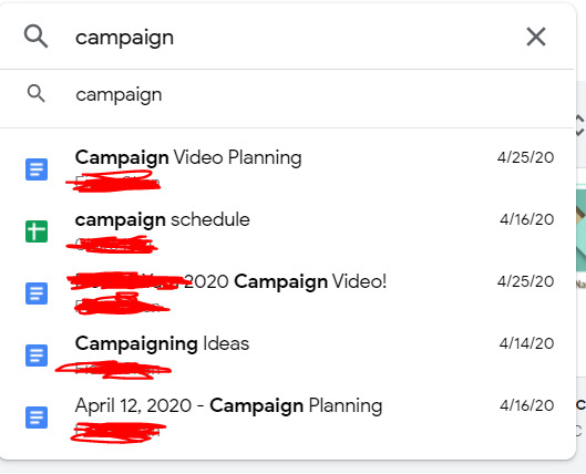
Tumblr media
Despite this seemingly organized effort, it was not that organized because this publicity team didn't actually actively do anything for like a week. Many reasons for this: one being it was actually the semester, and it was also CPW weekend. Unfortunately for me, that weekend was literally hell for me, because I was managing this site for our nonprofit, CPW events (so like five zoom calls on a Saturday), classes (because those are still happening), and then the campaign thing finally started, about a week before voting opened. In the form, of a website.
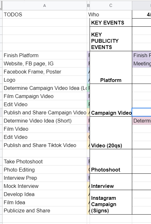
Tumblr media
So the tl;dr is I developed an entire Squarespace website in one night. Yes, one night. I had to model it from I think the website from a Harvard campaign site, which took me like three or four hours on a Saturday night, which is a very fast time in my opinion to learn how to use Squarespace. I also bought a domain and figured out how to connect it to Squarespace at like 1 in the morning, which was the first domain I ever bought in my life!
Tumblr media
(It expires in a month. I am absolutely going to let it die.)
Also, if anyone from squarespace is reading this for some reason, yall made a really solid product. I actually was very happy with my experience. You all should use it, I am 100% not sponsored by them at all, but honestly it was a very good experience. If you need to develop a website in four hours and don't have a lot of webdev experience, definitely consider it. You can even see website clicks and user analytics, it's actually really put together.
The next day we spend a lot of time going through website changes and artwork changes. It's bad. We had so many discussions about color palettes and the advantages of a 3 column vs 4 column layout. Yes. I'm serious. I'm starting to go crazy.
If anyone's interested, I would say that our website definitely was better than the other campaign's website. Like objectively. Like both campaigns were great, but the website? well. Here's the link (archived because I only paid for 1 month of squarespace :D) The amount of detail that went into it is actually incredible, the amount of spacing, i even had to custom CSS the header image so that mobile headers would show up correctly.
THE CAMPAIGN VIDEO
so sometime during this week, I had this thought about making a really good campaign video. I was very inspired by some of these Google ads that started with a Google search bar. (Yes, I am aware that I am that much of a Google simp.) To be honest, rewatching this ad, I really definitely just copied this entire ad lol, it's ok we don't have to talk about that.
That Wednesday, we coincidentally talked about what makes campaign videos successful. We talked about how Trump's incendiary imagery helped stoke the flames and how it was really effective in getting people to vote, and eventually helped him beat Clinton in the presidential election. So I went and took that and grabbed news clips and campus videos and overlayed that in the video, and it went from like a solid 6 to an 8 immediately, in my honest, unbiased opinion. You can see what I mean in the video itself: [link].
We also had to put together quite a few interviews about what they wanted from the school and were looking for in their candidates, which took a million years of coordination, but we somehow got it done in three days, and everything was put together in a flurry of a weekend, unending changes and small fixes for sixteen hours straight. I could not even tell you how much I learned about premiere pro and how to use layer masks and everything. I even composed the music for the first fifteen seconds of it. Literally, composed, it.
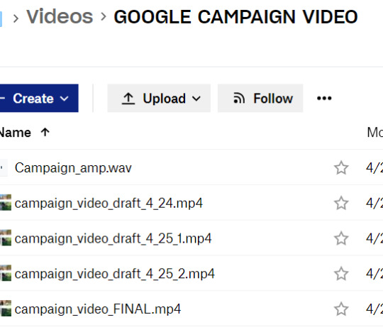
Tumblr media
And so on a Sunday afternoon FINALLY right before voting, the video drops. I'm sitting in my backyard absorbing the sun because I hadn't left my computer for 48 hours straight.
It gets like 1000 views or impressions or something in like two days, which is incredible for me, since I'm not a professional by any standards, but I am considering being a professional campaign manager at this point. By the way, we're also managing an Instagram page, a Facebook page, a tiktok page, a website, our individual social media pages, and we're trying to synchronize this video drop and all of our publicity efforts across every single one of these channels. It's chaotic at best.
VOTING SZN
So it's voting week, where we give everyone an entire week to vote. Across the week, it's mostly a waiting game, we make a few more tiktoks and funny videos that we publicize to get out the vote more. The last day, we're thinking about it, and we know the final vote's gonna be close, so we message every. single. person. in our Facebook friends list. I think I singlehandedly convinced like twenty people to vote (and hopefully vote for our ticket).
There's a lot of drama about different stuff. I won't really talk about it because I think it got really messy, but this week and entire couple weeks was a lot to get through honestly. As a reminder, I'm also working on my senior thesis and my nonprofit website work is peaking at this point, so everything is very, very bad and none of us have slept in a while. Also it's the pandemic.
Finally, the results come out. We lost by like 20 votes or something, out of 1500 or so total votes casted or something like that. It's one of the highest voter turnouts in school history or something, I don't quite remember. After that, we're so emotionally drained from this whole thing that we just don't talk about it for a while and that's that.
If the ticket won, I wonder how it would've turned out. I feel like things would've continued to be busy, and maybe that's not a great thing. So maybe everything happened for a reason. I don't know, but those three weeks were quite interesting, quite fun, quite odd. I'm putting those videos in my personal portfolio and am putting Adobe Premiere Pro and Squarespace on my resume and moving on.
Anyways, thought I'd just share! i haven't posted in a while, and this was definitely one of my #weird #odd stories from my time at MIT, which is quite reminiscent of #weird #odd at MIT in general.
#m
1 note · View note