#but!!! it's done!!!! i might have to do some bugfixing/tweaking in the future but! that's not important!
Explore tagged Tumblr posts
Text
it might be midnight where i am, but what better time to announce.....
THE BOY IS HERE!!!

after a good couple weeks of work, the Fake Peppino mod for Don't Starve Together is officially out to the public! stop by the workshop page HERE if you wanna take a look, and if you've got the game, i'd be delighted if you gave him a try! he was a lot of fun to make, and all art and dialogue for the mod was made by me!
GO CHECK HIM OUT BRO!!!!!
#here he is MY SON!!!!!!!! my very good boy who i had to wrestle with a good many times trying to get his dang code to work!!!!!#but!!! it's done!!!! i might have to do some bugfixing/tweaking in the future but! that's not important!#i hope those of you who have the game will give him a try! i've been having fun playing around with him 😁#just have fun trying not to starve to death!!!#my art#pizza tower#pizza tower fake peppino#don't starve#don't starve together
96 notes
·
View notes
Text
2020 May Update
I hope you're all staying safe and healthy during this time of Coronavirus!
We continue towards the finish line, slowly, but surely. Coronavirus did throw a few wrenches in our plans. Our talks with a publisher about a possible sponsored appearance at an upcoming event stalled.
But that was always just a possibility. We have a backup plan. If we didn't win a sponsor, we were just going to pay our own way to a convention. That's what most indies do! Anyway, that's canceled too. It doesn't seem like there'll be any conventions to showcase in the near future...
Nevertheless, we did move forward in other areas. We've got the press materials ready as well as the game's official launch site up. You can view it in its prelaunch state at this link. NOTE, It is in a "prelaunch" state, so some media links are being withheld until reveal time. But there are a bunch of new pictures and artwork you can look at.
You might notice the link reads "phoenotopia.wordpress.com". The plan is to direct "phoenotopia.com" to it in the near future. That means if you wanted to reach this tumblr specifically, you'll have to visit it at its tumblr link, "phoenotopia.tumblr.com" (which, I just noticed doesn't work... huh). Anyway, since this is a dev blog, I'll talk a little bit about the journey of creating the website.
SQUARESPACE vs WIX vs WORDPRESS
I actually tried 3 different services (in the above order), before I settled on wordpress. I did a bunch of researching, and most reviews seemed to point at WIX >= SQUARESPACE >>> WORDPRESS.
I went with Squarespace first, since it was recommended a bunch on some youtube videos I saw (guess marketing works). Even though it didn't win outright in the reviews, my impression of it was "less quantity, but more quality." I tried it and found it serviceable. It was kinda sluggish, with some not so intuitive areas. I had to ask for help a few times for some things that would seem simple ("how do I change the BG and font color and of the music player?", etc).
That was last year, when I *thought* I was near launch and would need a press site soon. One year later (present day), it was time to create a press site again, and since my website with Squarespace expired (I had only signed up for a trial period), it was a good opportunity to try Wix, especially since Pirate had lots of praise for Wix.
My impression of Wix was that it was... too distracting. After I chose a theme, in the editor view I felt bombarded by menus. Everywhere you move the mouse, things kept lighting and popping up. And it was slow. So I guess it was sorta like Squarespace, but maybe even a little worse?
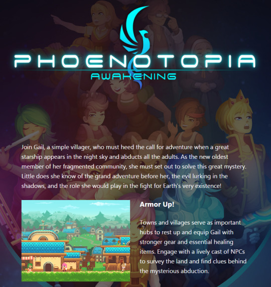
(Easy ways to preview the website from phones and tablets was one of wordpress’s neat features)
What prompted me to try Wordpress was one of their slogans "35% of the web uses WordPress". If it's good enough for 35% of websites, it's good enough for me! I ended up liking it most of all. It's definitely less featured, which suited me, since I'm not trying to create something too fancy either. Unlike the other website builders which emphasize free-form, wordpress was more rigid. I couldn't drag and drop an element just anywhere - I found that comforting in a "I can't screw this up" sorta way. The most important thing was that it was fast. Loading the editor view to Wix took 11 seconds vs 4 seconds with Wordpress. And the speed advantage of wordpress extends across every action. Similarly, when Chrome launched 10+ years ago, it was also less featured vs Firefox, but it became my choice browser. I guess speed is something I value highly.
Anyway, my experience is from a drag/drop perspective with minimal coding. This is also NOT a paid advertisement. However, if wordpress would like to send some money my way, I would not be opposed... (call me!)
Achievements, Bugfixes, and Cleanup
Lots of small tasks and polish was done over the past 2 months. I finally fixed the time tracking bug - important because the Speed Run achievement depended on it. I also finally finished implementing all the technical stuff for the achievements. There was a bug where some enemies would stack up too many light sources, causing them to appear too bright and drain system resources. That's now also fixed. Lots of other small ones that don't bear mentioning.
A neat trivia about the game is that there's a final super hard achievement for those seeking to prove their mastery over the game. The player has to beat the game having never picked up a heart or energy upgrade. When playing under this constraint, some enemies can even kill the player in one hit! In the game's most current iteration, even I failed to achieve it, so I'm definitely going to have to go in and tweak things a little more.
Age Ratings
I went and got the game's age rating. I did a little research on this - it's quite fascinating. ESRB would be the age ratings board for the United States (where I'm based). But if you were in Europe, you'd get a PEGI rating. Then there's ACB for Australia and so forth. So if you wanted to launch a game globally, you'd have to deal with this process over and over, and each country rates things a little differently... that's a lot of work!
Enter IARC (International Age Rating Coalition), which aimed to simplify the process by being the one standard that you apply to, and from which you could then get the equivalent rating for all participating countries. IARC is an entirely automated process - probably necessary due to the boom of digital titles across all platforms, particularly mobile.
IARC is great for me, because they relaxed the standards for getting a rating. From my understanding, the process used to be more difficult. And you'd have to pay ESRB a hefty chunk to get a rating, but with IARC, it's totally free! So long as it's for digital and it's used only on licensed sites and store fronts. If I wanted to launch the game physically, I'd have to deal with ESRB on an individual basis again.
Without further ado, here's Phoenotopia's IARC ratings:

Fascinating... Phoenotopia is rated "Mature" in Australia... but for "Horror". Which seems suspect. The horror elements are rare (remember Dreadlands?). But when I was answering their questionnaire, they provided a video example of what they considered "horror", and it was pretty mild. About as mild as my game, so I checked that box. It is what it is...
We also got a "Teen" rating for ESRB for reasons of Fantasy Violence and "Mild Blood". This one is kinda iffy. In the game, if you hit a giant bug, it spits out a few drops of green blood. Does that really count as blood? Ocarina of time skirted by with an E rating 2 decades ago, and it let a dude spit out green blood. However, since IIARC is an automated process, I didn't see any place to dispute. But also, I wouldn't have disputed it anyway. A "T" rating is cooler than an "E" rating!
I'd like to mention this is not a paid advertisement for IARC. However, if IARC would like to send some money my way, I would not be opposed... (call me!)
Submission
I expect to polish the game for about 2 (maybe 3) more weeks. After which, I'll be submitting the game to the console "authority". From my understanding, I'll then have to wait a month while they "inspect" the title. After which, I'm then cleared to have an official launch date - which I'll probably set to be 1 month after getting approval.
So the plan is to have a very short marketing campaign. The reveal trailer will basically drop 1 month before release. And we're going to sprint to the finish line. Some marketing campaigns are 6 months to a couple years. Ours will be one month... Let's hope it works.
Wrench
That's what the plan looks like right now, but there is a possible upcoming wrench in this whole thing. I recently learned that my version of Unity is too old. Games running on old Unity versions are not automatically accepted - so I'll have to apply for an exemption. If the exemption gets rejected, we can't launch without upgrading, which will require *significant* work...
This came as a surprise to me. When I started dabbling in games development a decade ago, the most common advice I found online was "Make Games, not Game Engines." I interpreted this to mean lock in your technologies. There's always going to be a new and shinier bell or whistle, but if you keep chasing it, you're not going to work on the actual content of the game. That's probably what kept me to releasing the original game on Flash. That was a game I was making as a hobby while working a full-time job. By the time I quit my job to go full-time indie dev, Flash had long been a dead technology. But I remembered "do you want to build game engines or games?" And so I pressed forward.
So that mindset could potentially backfire here. If PC was the lead SKU, we wouldn't have these issues since PC is more relaxed as a platform. Consoles, as I'm now learning, have an ever forward shifting window of technologies. If we get rejected for the exemption, there's a couple ways we can play it. One, we go through the pain of upgrading which will take months... Two, we pivot and make PC the lead SKU again, but have to handle porting that plus its specific features, which will also take months...
So why is updating such a big issue? Unity has changed drastically over the years. When I started, it was a lot less 2D friendly. They didn't have an official 2D tilemap solution, so you had to build your own or buy a 3rd party library from their asset store. I used 2DTK for tilemaps - 2DTK is now entirely deprecated. Similarly, I had to search for and purchase a good asset to display crisp text - since you couldn't even do that in Unity back then (heh). That's the story for a lot of old Unity stuff. Think of it as a first mover's "disadvantage".
Hopefully it won't come to that, since I'm pretty spent as a developer. I've been ready for this to be over, and I know many of you feel the same. Hopefully soon! As usual, I'll update in 2 months at the latest (end of June). An update might come earlier if we have some good news to share sooner. Until then!
Fanart and Cosplay
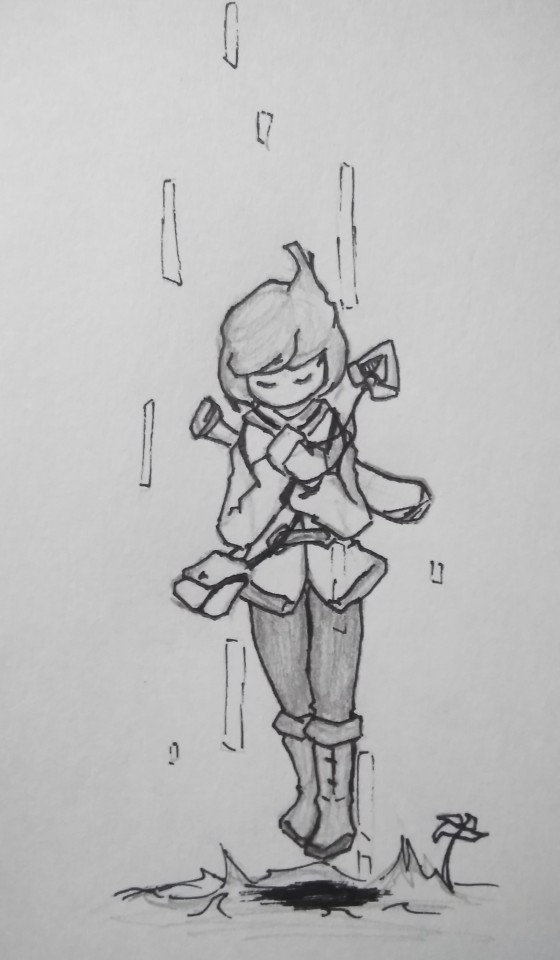
This first picture comes from roccy_chair and shows Gail basked in light. I like how her pose and equipment together form an "X". That's a neat hidden symmetry. The way she floats also kinda reminds me of Crono's "Shining" spell. Perhaps Gail should have the ability to cast spells? Hmmm...
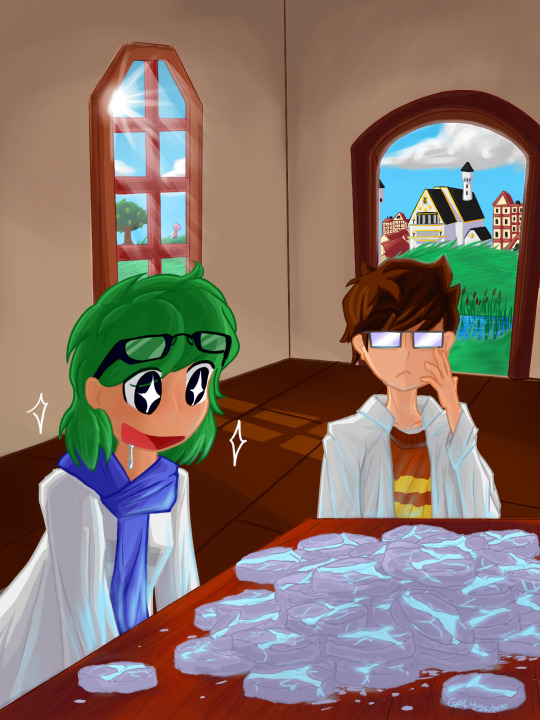
Cody G returns with a new art depicting the 2 Moonstone enthusiasts. I like Fran's starry-eyed expression here. That's true love on display. I also like how the Moonstones are depicted as flat and coin-shaped. Very unique! Also note Gail makes an appearance in the back :D
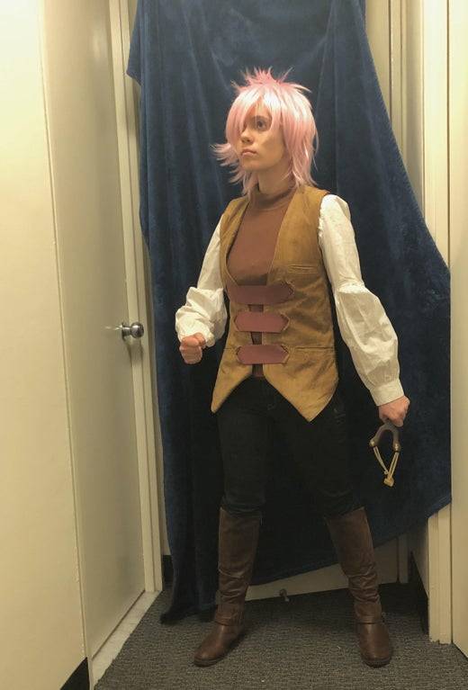
Thanks to M1shaaa for this cosplay of Gail! There's a lot to like here! The vibrant pink hair. The costume with 3 stitches across the vest. The pose with slingshot, accurate to Gail's depiction in the box art. Amazingly, this might also be the very *first* cosplay of Gail! Will and Pirate both alerted me about it excitedly since they were pretty stoked. We joked that we crossed the final milestone in terms of fandom.
43 notes
·
View notes
Text
Building a ProtoDungeon
With the impending release of The Waking Cloak’s first demo, ProtoDungeon: Episode I, I thought it might be fun to write up a list of things I actually did to get this demo off the ground.
Since the demo is pretty small, and limited to a single main mechanic from The Waking Cloak, people might not realize just how much work went into this. The Waking Cloak is not feature complete at all, and so I couldn’t just copy+paste all my code, slap on some art, and call it done. I had to build tons of systems from the ground up, which will then be used in The Waking Cloak (and future ProtoDungeons). For example, The Waking Cloak doesn’t even have working doors!
This is what I started with:
Camera
Decoupled from player so that it wouldn’t break if the player wasn’t in the room (logo room, title room, etc.)
New state to follow the swap energy
Collision
Added “corner rounding”
Added “point collision” checking
Dialogue system
Added the ability for different dialogue box styles
HUD
Added the ability to show/hide it
Added displaying key and chapel seal count
State machine
Pixelated Pope created both versions of the state machine I use. The Waking Cloak was on the old version, and I updated this to the new version (which includes a draw portion for each state, very useful)
That’s it. Might seem like a lot, but let’s compare it to what I built brand new for the ProtoDungeon:
Designed the dungeon
A few weeks of messing with graph paper, sticky notes, and Tiled
Streamlined dungeon creation process
Rough sketches to graph paper to Tiled whitebox to GameMaker whitebox
Previously I just painstakingly built the final version directly in GameMaker, which was slow and difficult to find problems early on
Actually building the rooms in GameMaker
Swap mechanic
New states for player
Energy ball
Swappable object parent
Breakable swap objects (jars)
Non-breakable swap objects (blocks)
Several revisions to speed and mechanics
Originally the player could move around while the swap energy was out, but this proved 1) not all that fun, 2) difficult to keep the player out of trouble, 3) difficult for the player to focus on two things at once, especially while the swap energy was changing direction
The next revision, the player had to hold the spacebar to keep the swap out. This didn’t feel very fun.
The swap energy moved MUCH slower, then tweaked it and made it way too fast. Settled on a compromise for player control: press space and the swap energy goes really fast, hold and it goes slow.
Originally the camera did not follow the swap energy (since that would be weird if the player was moving and couldn’t see what they were doing), but changed this later on after I rethought that (and due to a suggestion from my first playtester).
Two levels: initial, and ability to change direction
Block pushing mechanics (the very first version of ProtoDungeon had this before The Waking Cloak as a prototype, but I also improved how collision, player push animations, and so forth worked)
Trigger/listener/broadcasting system (to hook up buttons and doors, mainly)
Buttons
Doors
Normal
Doors that close after you enter a room
Doors/gates that open when you press a button
Locked doors
Chapel door (requires special chapel seal)
Pits
These were working in the prototype earlier, but I added falling between floors
Cliffs and walls
Including one-way jump/slide down cliffs
Z-height--needed several things from this:
Player needs to be able to go up stairs within a room and be “above” the lower level
Swap energy fired at a lower level will hit walls
Swap energy fired at a higher level will go over walls
Essentially created a parent object that everything inherits from to add a “z” and a “height” variable, and then zones that modify objects’ z when they’re in those zones
Also added optional z-checking to collisions
This will also be nice for when I get to the jumping ProtoDungeon!
Player “teleportation” (stairs, doors, etc.)
Transition manager (for fades, wipes, etc.)
I have one of these in Genogatchi, but it’s not as robust and didn’t use the GUI layer
Added circle transitions
Added white transitions
Much easier transition triggering
Cutscenes
Had this in Genogatchi via FriendlyCosmonaut, but improved on it and added more functions (going to room, properly working with the transition manager, etc.)
Throne movement logic
This was extremely complicated/buggy and I still don’t know why
Swap mirrors
Resetting items when leaving the room and returning--tricky, because we don’t want to reset items if you’ve solved the puzzle
Art
Gosh, I thought I could just take all my art straight from TWC and recolor it, but it was a LIE... only thing that came over was grass/trees/walls/pits/gates and some HUD elements
I had to draw literally everything else from scratch--the player and all her animations (SO MANY ANIMATIONS), blocks, jars, jars falling down pits, three kinds of floors, tables, stools, arrows, arrow launchers, doors, buttons, rugs, swap energy, scrolls, keys, chapel seal (HUD and in-game versions), chapel seal pieces (HUD and in-game versions), bookshelves, dressers, stairs up and down and in-room, the final item, throne, exterior windows, braziers, and more
Of course adding the art to all the rooms took a while, though it helped to have the whitebox
Getting hurt
Arrows, pit
Getting reset in the room when you fell down a pit
Player health system
Writing
Intro
Outro
NPCs
Etc.
Audio
I was surprised at how much there was to do here
Designing and creating the sounds (probably 25 or so of these?) in FamiTracker and Bfxr
Playing them consistently, balancing the volume, not looping/looping, etc.
Game over state
New control system to allow keyboard/controller
Juju’s GameMaker input system, but with a few tweaks--this is 1-player only, and I also needed to fix issues with my crazy joysticks which apparently constantly poll for input setup
Win “cutscene”
Logo
Music
The most intimidating thing I’ve done in gamedev, kept getting in my own head and getting discouraged. Took me about a week, and a lot of scrapped tunes.
Then had to put it in the game and get it looping seamlessly
Improvements to debugging display
Also hid some hotkeys behind the debugger so the player doesn’t mess up their experience
Title screen
Loads and loads and loads and loads and LOADS of bugfixes and tweaks
I counted 95+ of these on my Trello board, not including tons of bugs I fixed during the process of actually creating each feature, and not including the bugs left at the time of writing
All this took approximately 2-3 months. Not too shabby! And I’m very excited for the next ProtoDungeon, because even though the next dungeon won’t have the swap mechanic, I can build on this foundation instead of creating everything from scratch! That means I might even be able to include stuff like enemies and a boss, or menu settings. And then who knows what I’ll be able to do in the third and onward ProtoDungeons.
All of this loops back into The Waking Cloak. I’ll be able to get feedback as we progress through the ProtoDungeon and really make The Waking Cloak the best it can be.
That’s all for now. See y’all on the demo release on April 6 (or March 30, if you’re a patron!)
32 notes
·
View notes
Text
Version 311
youtube
windows
zip
exe
os x
app
tar.gz
linux
tar.gz
source
tar.gz
I had a great couple of weeks. E3 was fun to watch, and then I got back to proper work, mostly fixes and improvements to the new download systems.
pixiv fixed and other downloader stuff
I have made a new parser for the new dynamic pixiv layout. It was not simple, but it seems to work ok, including for manga. It only gets unnamespace tags in romaji/kanji (fetching just romaji/translations was a bit of a pain), but Pixiv's unnamespace tags have never been high quality, so unless you have a particularly important need for them, I recommend you not parse them. You should be updated to be using this new parser as soon as you update. My understanding is that everyone has been updated to the new layout, but if you are still on the old one, please check out network->manage url class links to roll back and let me know if you need any more help. Also, pixiv now lists a 'page' namespace in its downloader/subscription tag import options, if you want to parse page:1, 2, 3 for manga downloads.
In a similar way, I have fixed the new inkbunny parser, which was fetching and tagging additional unwanted files. It now visits each page of multi-page Post URLs independently to get the correct File URLs. Let me know if you still have trouble with it, including any example links that break!
The multiple watcher also has some bells and whistles--it now remembers its highlight, displays the URL of the current highlight, provides ways to set checker/file import/tag import options, and presents 'added' time in its watcher list. This added time is new, so for any existing watchers it will be set as the next 'load time', but it will remember thereafter.
Tag import options now has a 'get all tags' checkbox that advanced users may wish to use to override some missing-namespace weirdness related to the new downloader stuff currently being half-complete. I expect to do some more here in the coming weeks.
misc
Some kinds of regular file search are now much faster. Ratings searches, in particular, should now be pretty snappy.
Importing and exporting serialised .png objects through the new url class/parser dialogs is now easier--the little export panel now fills in better defaults and remembers the last location used, and the respective lists should now support .png drag-and-drop import. So, if I or anyone else gives you a new parser .png to try out, you can just drag it right onto the network->manage parsers dialog and it should import no prob.
Illustration2Vec project for advanced users
A user has done some really neat work integrating the machine learning Illustration2Vec project into hydrus. If you are interested in playing around with auto-tagging using ML systems, please check out the conversation starting here: https://8ch.net/hydrus/res/9115.html#9142
Although I am up to my neck in downloader overhaul at the moment, I am still enthusiastic and increasingly optimistic about integrating ML into hydrus in a variety of ways over the coming years. I am particularly interested in us generating our own models using our own CPU/GPU cycles. This is all extremely new tech, and my chief concern is how to make flexible and reasonable and productive workflows around it, so if you check this out, please let me know how it works well--and less well--for different situations, what you think is ultimately practical to achieve, and how you might like to integrate it into a future workflow.
full list
wrote a new parser that muddles its way through pixiv's new dynamic javascript layout. it seems to get everything working again. it gets tags in kanji, although the unnamespaced pixiv tags remain low quality, and you may wish to just not parse them at all anyway
fixed some misc parser text handling, unicode conversion etc...
the new pixiv parser has a 'page' tag stub that should inform tag import options in the old downloader
the multiple watcher now remembers the highlighted watcher through a session restart
the multiple watcher now shows the highlighted watcher's url up top
the multiple watcher now has checker, file import, and tag import options, which it will assign to all new watchers it creates
the multiple watcher now has a 'set options to watchers' button that will force-set the current options to all the selected watchers
the multiple watcher now has an 'added' column with watcher creation time listed. storing this creation time is new, so any existing watchers will get a new creation time of their next load time, but it is remembered henceforth. the listctrl here is now pretty crushed for width, so maybe we'll rejigger some stuff here
watchers added to a multiple watcher will now have a status of 'just added' for five seconds
watchers that are added to a multiple watcher that is already watching them will now have the status of 'already watching' for five seconds
the multiple watcher list now has a much taller minimum height--layout here is another work in progress
fixed the inkbunny parser (and a related tweak to the inkbunny url class)--it now uses the new 'multiple-file-per-post' import object generation to actually walk through the pages of the mini-gallery (which for inkbunny have -p2- suffixes on the url) to fetch only the correct files and url-associate them neatly
tag import options now has a 'get all tags' checkbox, which can override the normal namespace checkboxes. it gets all tags, even those with namespaces not listed, which happens for several reasons in the new download system. (eventually, the namespace list may be replaced with a slightly different system)
watcher tag import options no longer list 'filename' under their namespace checkboxes--they just have this 'get all tags', which works for everything (so watching yiff.party pages should now get tags)
simplified and sped up similar files search at the db level
sped up some ratings search code
generalised some common file search optimisations, meaning they now apply in more situations and can take advantage of some other speed-ups:
similar files system predicate is now faster
inclusive ratings searches are now faster
duplicate relationship count searches with non-zero-inclusive count are now faster
removed some clumsy old ratings search optimisation code
exporting serialised objects as pngs is a bit easier--now, it displays current export path better, will remember the last export location used, and for single png exports will pre-fill the filename and 'title' value with a reasonable default
the content parser, page parser, and url class listctrls now accept serialised png files when drag and dropped!
the simple downloader should recover and continue better from malformed urls during a page parse
the url downloader should now recover better from various situations where it cannot not derive some tag import options (including urls with a 'file' url class, such as 4ch/8ch direct file links)
parse test results will now state the priority value of urls
gave the 'updating' section of help a pass and wrote a little more on how to do a big-version-gap update
when a new multi-file import object inserts its child file import objects while being looked at in the ui, the listctrl should now correctly refresh the displayed indices
subscriptions will now wait up to 90s for bandwidth (was 30s before, I think) before quitting, which should avoid a few more early-quit events
cleaned up some server decompression bomb testing
users with admin-level accounts can now upload decompression bombs to file repositories, better options on this will be avaliable in future
the manage urls dialog will now OK on the same 'manage_file_urls' shortcut action that can open it (like manage tags and ratings already do)
fixed the string converter for new file lookup parsing scripts
started work on some in-the-background mass file reparsing, but I want to get some nicer ui going before I pull the trigger on any of it
file reparsing now repopulates the table for md5, sha1, and sha512 hashes if they are missing
improved some ffmpeg error parsing
moved from basic list to a pop-faster collections.deque for importable path parsing and duplicate search branch regen
added a BUGFIX option to options->gui that forces minimum width for popup messages in the continuing attempt to deal with some funny fit/layout calculation in certain Linux WMs
fixed how some 'unrepairable db' error messages are displayed in Linux systems
cleaned up a ton of old tuple-stripping code from the db
updated to new sqlite for windows build
misc improvements
next week
I was getting a bit too tired before the break, so I gave myself a bit more sleep every day this week (and spent a bit more time keeping up with messages, my ongoing battle), and it worked well. It felt good to get back to it. I now want to hammer out the last outstanding parsers and get into the meat of the gallery parsing overhaul.
1 note
·
View note