#bem gave me a tummy ache it's nearly 4am and i'm about to peace out
Explore tagged Tumblr posts
Text
As a companion post, i also redid my least favourite Gwent card art into a top 20, though i daresay a lot of the technical complaints are universal. I'll try not to be too mean.
Also under the cut.
My (but i am objectively correct) top 20 least favourite Gwent card arts:
They can't all be precious...
There's a certain amount of "why is she naked" or "why is she dead" or "why is she dead and naked" kinda art, but then Karol Bem rolled up and somehow made the card pool so much worse. At least Whoreson Jr. is technically impressive.
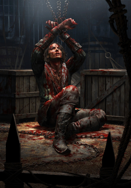
20: Ciaran aep Easnillen by Bryan Sola ...however i'm still allowed to not like it when my blorbos suffer on their card arts. Bryan is a great artist and i'm sure he didn't mean malice, unfortunately this is Ciaran's most memorable (read: literally only) scene. This is mostly personal bias.
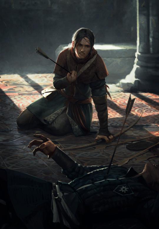
19: Milva by Bartłomiej Gaweł To be nice! I like the tiled floor, that's a nice level of detail. I like her practical outfit in the spirit of the old minigame art, too. Heck, even the tragic irony of the scene wouldn't be so bad - she clearly shot before getting shot... If only this wasn't Milva's only card art for years and if she wasn't a well-explored book character with plenty of scenes to choose from. It could've been way worse too i guess.
18: Chapter of Wizards by Maciej Łaszkiewicz Listen. Maciej is a cool artist with a very distinct, also quite "classical painting" style. I like a lot of his pieces from the last card sets. But. Whose idea was to solve the question of representing a historically changing organization with a statue of its founders? Furthermore, who thought people are gonna be blown away by the in-game avatar this inevitably spawned? :D It's just funny more than anything. I guess I can appreciate the Lord of the Rings reference.

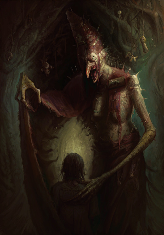
17: Mammuna, also by Maciej Łaszkiewicz This one is unfortunately not that funny. I'm not sure i can explain it; it's a Monsters card, offputting things are the name of the game. This is one of the artworks that definitely, or probably, fall under completely personal reactions, or at least i never heard loud complaints about it the same way say Coup de Grâce is widely considered one of the best Nilfgaard card arts. Maybe i don't like how the character design seems a bit random, maybe i'm tired of the tired witch=hooked nose trope, maybe it's the color scheme and weirdly unpleasant looking textures. I guess it's just very much not for me.
16: Selfeater by Alicja Użarowska Similar case as previously. I don't even mind a lot of gross art - the infamous Parasite (the parallels now that bg3 is out lol) isn't on this list - and the Monsters faction is there to go crazy with this type of stuff. And yet, i can't stand this little abomination, and neither can most of the Gwent playerbase. It's not even the toe-in-mouth that really makes it bad, at least for me it's the texture and stretching of its skin. It simultaneously looks like it's melting and about to tear apart. Just an overall no thanks.

15: Miner by Christof Grobelski Christof is my new, excuse the zoomer language, pogchamp, because i think he is severely underrated given the crazy impressive lengths he went into with card art like Vivaldi Bank and even Phooca, and Miner isn't really bad. Unfortunately, fear of depths.

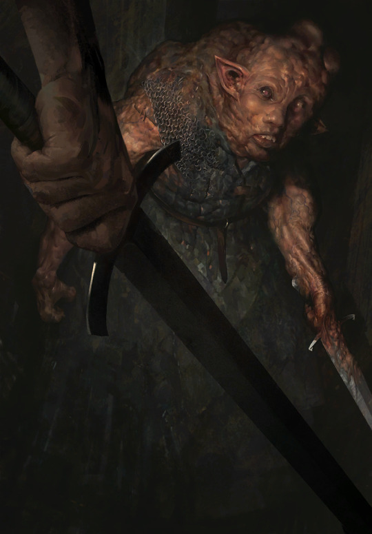
14: Doppler by Bartłomiej Gaweł Bartłomiej loves himself some dirt and mud and wet beast wednesday, and i can appreciate that. But this one isn't it. The palette, the scene. This, beside Dudu's card art, is the only way dopplers are represented in the game, and that's a shame. Leave the poor soul alone :(.
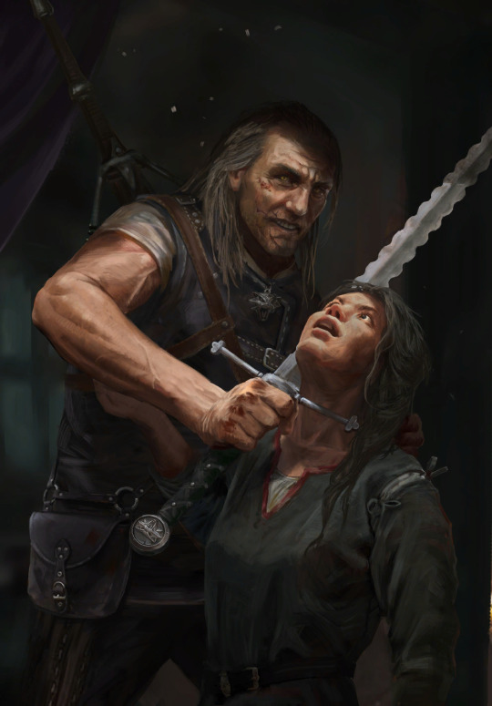
13: Brehen by Oleksandr Kozachenko I'm sorry to say, this is the weakest Way of the Witcher art. I appreciate it's the one scene everyone knows Brehen for, but why must he look like the village lowlife parents tell you not to talk to? I mean, not that Brehen could be trusted with kids. He's despicable, but that doesn't need to be communicated by making him look unappealing. On the other hand, wouldn't his personality have more impact if he was comparatively good looking? Or maybe i'm a shallow bitch who'd rather some eye candy... To give some credit to the character design though, the fact the lady is wearing the opposite of revealing clothes is a welcome refreshment. And i quite like the shading on her clothes too.
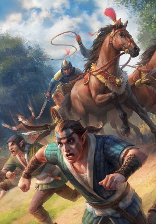
12: War Chariot by Grafit Studio There are a couple of more fairytale-like, bright and whimsical card arts, and there are arts with smoother, almost glossy textures, neither is really my issue with this. What rubs me the wrong way is the scene itself. It comes off as showing the elves as something grotesque, the butt of a joke, and, sure, this is a Northern Realms card, but it still feels... unserious in the wrong way. Admittedly i am biased.
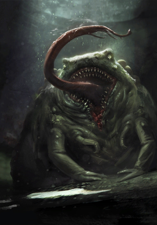
11: Toad Prince by Marek Madej It's again a matter of personal taste in the Monsters faction, because in essence, everything i don't like about it can really be justified by having the red faction sticker. But he still looks like a formless mass of vaguely green snot to me. And his comparably thin little arms look like he's wearing long sleeves that also got covered in green snot. Which, admittedly, was the case for the whole sewer in Hearts of Stone, so who am i to complain. It's far from the worst, maybe it shouldn't be this high on the list, at least this piece mostly fades into obscurity and Marek is an actually skilled artist. I'm saying this because Bem's time draws near.
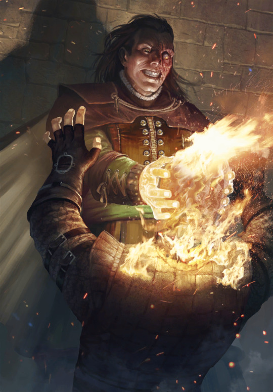
10: Vilgefortz by Nemanja Stankovic Full personal bias. Technically very much fine between the different textures, little drama in the lighting and fire particles borrowed from Bryan Sola. Look at the crazed look in Vilgefortz's face, lore accurate. Then look at the gloves of the guy he's melting into paste. And then suffer with me.
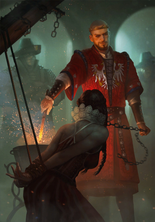
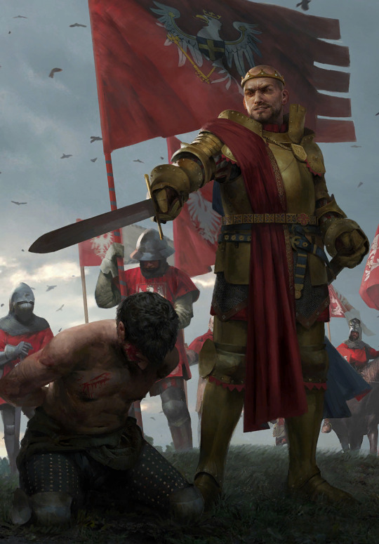
9: King Radovid V by Nemanja Stankovic and Radovid: Judgment by Valeriy Vegera Ok, this is a special case. I'm lumping them together because my issue with them is the same; their metatext. CDPR has a very obvious boner for Radko and despite writing him to be a complete cringefail idiot, they keep pretending like he's the coolest mf this side of Yaruga. If they actually allowed him to be the 17yo grooming victim he is with some nuance and without the thinly veiled nationalism projected onto the worst possible candidate with no self-reflection, i'd hate his ass (at leas the Gwent one) a lot less. Also the second art is the stupidest decision in the last card drop. Calanthe died for this. Literally.
8: Saov Ainmhi'dh by Ivan Vilmant Price of Power's infamous outsourcing of card art led to this unfortunate letdown. The artist tried! You can tell. But, in a spark of bitter irony, the spectral deer ended up looking as plastic as the Hobbit movies it references.

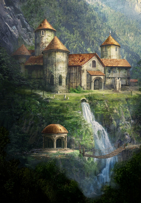
7: Temple of Melitele by Karol Bem This should be higher and would be if i didn't have to go through some more "please don't do this, good artist". But trust, this is one of Karol's worst crimes against good card art. From afar it looks alright! Cute piece with maybe even a bit of an old postcard vibe. Then you look closer and it falls apart completely. From the top; some roofs have texture, some don't. Some windows and arches don't line up or have ever so slightly off perspective. In places that are unexplainably sharper or blurrier than others, it's apparent Karol used extra assets. And on the very left, the foliage just sort of blends in until it disappears, because Karol doesn't understand depth. As a cherry on top, check out the little wooden bridge making no sense. The more and closer one looks, the more of a mess it is. Karol, you bloody hack.
6: Savvy Huckster by Siarhei Hlushakou This one, surprisingly enough, is more bearable upon closer inspection, but something about it used to absolutely grate my nerves when i still played or watched the game somewhat regularly. I don't know if it's the odd use of its color palette, the kind of obsolete idea of a card to begin with or the weird rocks on the tray unpleasantly standing out, or all of the above, but i can't stand looking at it for too long. But again. At least the artist actually painted something. Right, Karol?

5: Kerack Cutthroat by Valeriy Vegera Technically alright, if only too dark and washed up. Then again, the scene itself is tired too. The "why is she naked and dying?" And actually, taking the premium into account, why must she be getting stabbed over and over infinitely? Y'all didn't think this one through, did you. I'm sorry Valeriy, i still love your art, but this one really wasn't it on pretty much any front. But, even for this one, like every other legitimate artist on this list, you get the honorary "not a hack" badge.

4: Saint Gregory and Rosa and Edna var Attre by Karol Bem These two don't necessarily have all the same issues, but i guess there isn't enough slots in the universe to describe Karol's astonishingly low levels of competence. St. Gregory suffers from Karol's lack of depth understanding, but moreso it's a good example of that thing he does where he applies atrocious amounts of noise or grain onto everything. Enlarge and look at the area of and around the center left guy in the forefront. I'm also really not a fan of the magic fire glow this thing has. Rosa and Edna deserved so much better. To get the carelessness out of the way, check out Rosa's thumb in the foreground. What. Both their faces are inhumanly smooth, someone said they might be 3D models painted over and i wouldn't be surprised. Even in such a detail as the texture of the wooden sword you can kind of tell Karol relies on outsourced assets and thelike a lot; he doesn't have that much of a personal style (other than the awful grain) so when a unique texture shows up, it's probably safe to assume he pasted it in. To top it all off, the lighting of this piece is atrocious.


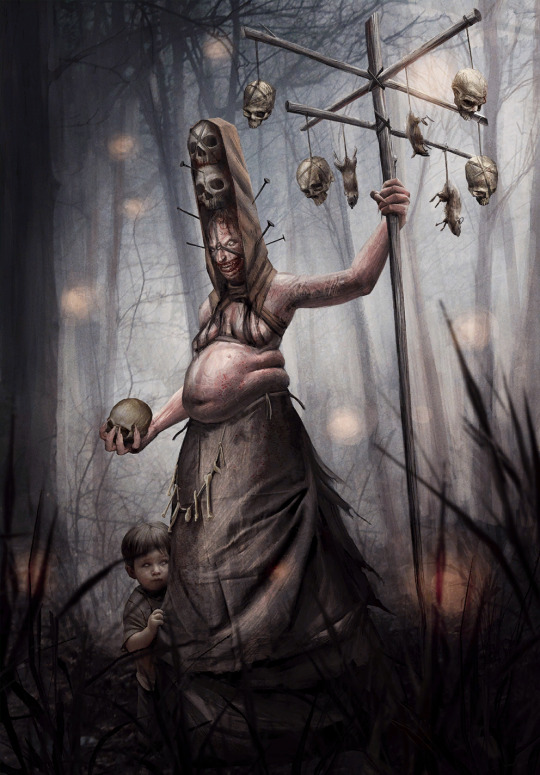
3: Yaga by Bogdan Rezunenko and Lesser Witch by Karol Bem Fatphobia. Just don't. That's to Bogdan. You, Karol, quit trying to fit in with the cooler kids, and by that i mean you should've long since quit making Gwent art by the time this unfortunately saw the light of day. I did promise i'll try not to be too mean, but there really isn't much to say about these two. Bogdan is a capable artist who should maybe check his biases or maybe just think about whether the way too estabilished visual shorthands for evil are faulty (they are). Karol Bem wouldn't know believable illusion of perspective and good texturing if they smacked him across the face.

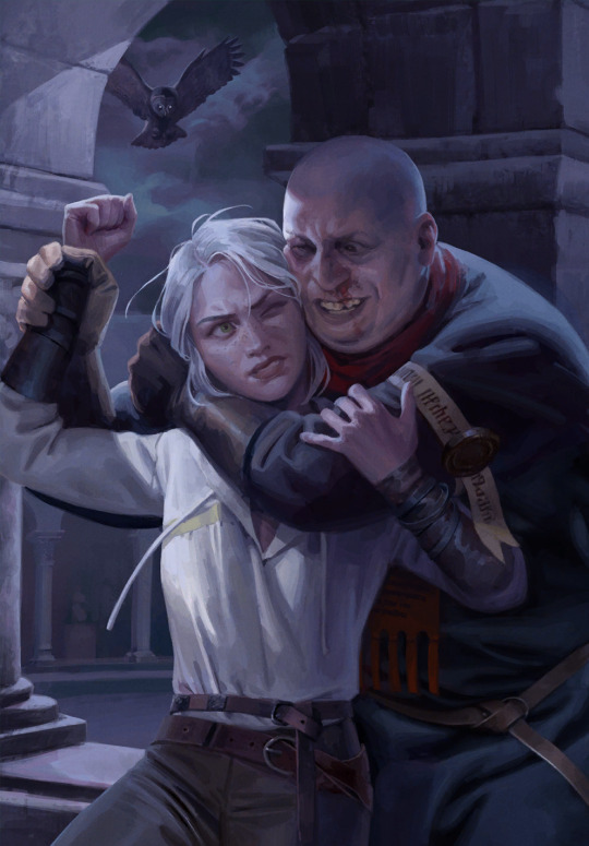
2: Artaud Terranova by Katarzyna Bekus Molegion actually tried to explain this one to me. And, sure, having terrible characters with terrible traits represented by doing terrible things is fine on paper. For once we got a book scene, too (god why are most of the book scenes in Gwent all the painful stuff), that's cool. Making the canon pedo fat, i think less so. It's otherwise technically a good artwork with merits, i like Ciri's hair, the textures in the columns and the color palette. The pose, as much as i hate it, makes anatomical sense (this will become relevant in a short bit). But i can't get over how in the premium Ciri has to wriggle around waiting for Geralt who just won't show up. In the end, did Terranova have to exist in Gwent at all? Since this was in the Thanedd drop, why not a Nilfgaard Isengrim card? That would've been cool. He actually has a few usable book scenes.
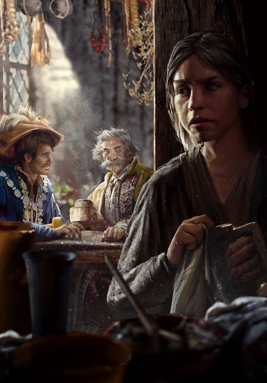
"Honorable" mention: Little Bird by Karol Bem Karol's worst tendencies: the card. A pile of assets, none of which are fitted, or in the case of the stuff hanging from the ceiling, even cropped well. Misunderstanding of depth, the hanging herbs are blurry but the guys under them are sharp, the items in the foreground are blurry again but way too much. Strands of the girl's hair straight up cut off in the middle and then resume again. And, of course, a noise effect to try to cover it all up. I swear to god Karol.
1: Vereena by, of course, Karol Bem I hate to hate it. Because it could've been another book-adjacent scene and the color scheme is actually a rare moment of brightness for Karol, because usually, Vereena is put in colder tones. But unfortunately, he bungled this one in a whole new kind of spectacular fashion. The leg. The leg is very obviously, undeniably, comically, anatomically...incorrect. The rest of her isn't very good either, the front hand looks awkward, her neck and shoulders aren't properly built. The foot is too small. Even the hair is made in a way that makes it look like a weirdly solid mass. The drapery doesn't make sense in the waist area. On a vibe or depicted scene level, there are probably pieces i loathe more than this one, but as an artist and a person with legs, the painfully obvious anatomy issue of this one earns it the title of worst Gwent art in my book. Karol Bem is a hack, which is why this happened at all. I'm willing to believe he's not a malicious person either, but he should probably stop seeking work in a field he clearly has to fake his way through. Perhaps he'd make a better graphic designer?

To add something more positive at the end of this list as a whole, Gwent has a card pool of, i believe, a little over a thousand and a couple hundred, and the strong majority of it are incredibly stunning works of art. The overall quality is of its own kind, and it's much easier to choose 20 amazing and impactful pieces than find 20 that are bad enough to be ripped apart online. The existence of premiums is cool, but the static art on its own is some of the best modern fantasy art to be found. That's really heckin cool for an obscure game set in a relatively obscure universe.
#shut up elis#the witcher#gwent: the witcher card game#bem gave me a tummy ache it's nearly 4am and i'm about to peace out#read peace as pass btw#(im fine)
4 notes
·
View notes