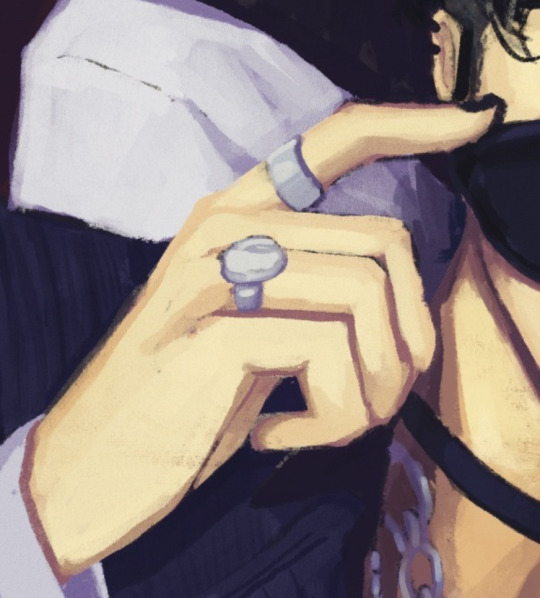
#and then we're segueing to a lighter tone
Explore tagged Tumblr posts
Text
WIP List Tag Game
List all your WIPs and write a sentence for each vote that each one gets in a 24 hour poll! I was tagged by @reverieblondie . Tagging... @redroomroaving (because I know you're made of WIPs), @graysparrowao3 and anyone else who wants it!
#rolan#bg3 rolan#lia bg3#cabbage writes#<3#C28 is in final drafts which is why it is not here#It's fucking wrecking me but I'm getting through it#and then we're segueing to a lighter tone#thank fuck
23 notes
·
View notes
Note
You've already seen this, but this is me formally giving you permission to rip it to shreds with critiques ✨️

Have fun hehe
Honestly I've been dying to actually be okay at art so im getting my notes ready 🧎♀️
Okay hi I was blocking some lighting for a drawing and now I'm making tea before bed and I'm ready to go. This is gonna get lengthy so cutting here for everyones convenience
I like the general vibe of it. You set the tone of the drawing very well and I can see the type of imagery you're going for! That's really great because understanding vibes and emotions is something that is harder to teach and easier to have an instinct for. I don't know if thats what you're going for but if it is congrats and also a huge part of my comments will be based on this because my goal in a critique is to understand your intent and help make that come through as best as possible
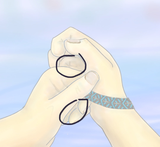
Also, hands are hard and these are not bad at all. I feel like they're probably referenced which is excellent, always use references if you can't get it right and use references even when you think you can (i say, knowing i don't use references like half the time rn). Building your visual library is the one of the most important things to learn as an artist.
I think my main overarching theme for my critiques is that its taking the middle road (hear me out).
This is a very common thing for a lot of people which is that they don't go super detailed, but don't go super simple. They don't go super dark, or super light. Everything is kind of low contrast, wishy-washy, if that makes sense. You wanna go one way or the other. If you want it to be detailed go detailed, if you want it to be simple go simple. Right now it's in this middle ground between simple (with the blurred airbrushed blending and the light lines on the hands) and detailed (with the folds of the fingers and on the creases on the thumbs and the nails).
Similarly, you want to make a definitive decision on whether or not you are using linework on your drawings, or if you want to use some linework but not everywhere (like on the rest of the hands vs the nails) you want it to make sense with the image.
If we're talking values (as in light and dark) of the image, the creases on the hands should be darker than the outlines (fold ur hands the same way as the image, you'll notice that these are the darkest spots).
Personally I definitely mix line-work and paint over in my art but if you take a look at this hand from my Blackjack drawing you'll notice that the line-work is either lighter or not present where the light hits on the back of the hand.


it's probably a little more obvious what i mean in my cheerleader annabeth. when I do leave lines on my work i actually alpha lock the lineart and colour over them with a lighter colour where the light would hit.
while we're on the topic of middle roads and values, i'm gonna segue into my point about contrast.
i totally get the like washed out light vibe but even images like that need dark darks and light lights. some people post pics that totally wash the image out for the aesthetic but when you're drawing you generally wanna have contrast.
these spots (marked) should have your darkest shadows. especially if you're looking out onto water which would generally add a slightly backlit effect to the lighting because water reflects a helluva lot of light and usually have pretty harsh shadows as a result (you can fold ur hands like this and put it against a light and see what I mean). personally would recommend a super dark shadow there with a touch of rim lighting.

i know the lighting isn't quite the same but if you take a look at the polaroid of my late night talking drawing you'll see what i mean when i say that washed out soft vibes still have dark darks. the dark darks are actually what make the light lights pop and make it feel purposely washed out.


stealing this from carries moodboard but as you can see, waterfront image with a washed polaroid aesthetic still has dark darks and light lights.
My second point about contrast is sort of a comment on sharpness (?). This is another thing that's common with a lot of digital artists is that they will simply airbrush/smudge/blend until they die and this results in super soft shadows. IRL does not always have super soft shadows. Here is my rendering process if you're curious
I think you could use some harder shadows (especially given the setting) in particular around the creases of the hands. Especially with the blurred background (which, same so true) you want the focal point of the drawing to be less soft. This is why the bracelet looks so good. It's got all the darkest darks, and highest contrast, and it's the sharpest. If you look at my work (when will i shut up about myself smh) you should be able to see a healthy mix of soft shadows and sharp shadows. Its about the balance 🤌
Another point that is also about contrast (ugh i know, but art is all about balance and contrast unforch). Is that I think you need sharper lines and shapes overall. Again this is why the bracelet is so nice to look at because of the sharp lines. Fingers have bones and therefore have hard edges. If you look at someone with their hand balled up you'll see that the knuckle is a much sharper edge than the curved line you're currently using on the left hand. It's so key to find a balance of sharp lines and curves (if you go back to the real time video of me inking you'll be able to tell, especially in the hands, how I mix curves and hard lines).
Some other minor comments:
i think the fingers on the right hand are a little off, it should be a little more tapered and you should see some of the nail from this angle
the composition is super centered so i think you should straighten out the horizon line a little bit. the hands are already asymmetrical so you want to balance that out with a perfectly straight horizon
personally i would make the sky a slightly more sky blue shade than you've got going right now. skies are often actually closer to white on like an overcast day and don't usually hue warm/purple until sunset.
i think you're using black or something to shade? i won't be that type of person to say you definitively can't use black to shade (and to you're credit i think i see a tinge of orange and blue around the shadows) but you should know that most shadows aren't black and that using black can grey out or desaturate your image and make it feel flatter and more lifeless. personally i use deep blue/purple on shadows but if you want to learn to make black work for you more power to you.
Anyways this is a behemoth. Thank you for letting me do this 🫶
17 notes
·
View notes