#and i end up doing a lot of movement in my editing program to make up for it
Explore tagged Tumblr posts
Note
hello!! I really hope this isn't a rude question, bc I'm genuinely curious. I've been wondering for a while now why people who make gifs from a movie or a show or whatever get upset when somebody else uses the gif in something or want credit for it. Is the process difficult? I'm not 100% how to make a gif but I can't imagine it being that arduous. Anyway like I said not trying to be rude have a good day :D
hey there! it's not a rude question if only because you're asking in the first place instead of just discrediting it.
the thing a lot of people don't understand is how much work actually goes into making a gif, because we don't just plug the video into a gifmaking program and call it a day. a lot of us start JUST with the process of pirating the highest quality video we can find, which can be anywhere from an hour or two of downloading to days at a time (my record is five days for all five seasons of the a-team, but that's a story for another day)
so there's already at least a few hours potentially, just from downloading. granted, we do other things obviously but that's still time that's going into the process.
so you have to download those videos, find the clip you want, and then there are several different methods of getting the clip into whatever program you use (i use photoshop). most of the time i have to reformat the video from .mkv to .mp4, because PS doesn't take .mkv but the highest quality videos are typically in that format. so i put that into a reformatting program, which can take at least another hour depending on how long the file is.
so i've finally got the file ready to go in photoshop, and then i can actually start working on the gif itself. i've now spent at MINIMUM two or three hours just getting this video ready. then i personally clip it down to the exact scene i want it and go from there. if you're just doing a random assortment of scenes, you can choose whatever you want. but if you're doing a scene itself, you have to clip that scene in bursts so you can add the subtitles based off the mouth-movement.
so say you're doing a gifset of your favorite character from a tv show. well, you don't want to just have all of the gifs come from the same episode. so you do the reformatting process all over again. more hours. you do that eight or nine or ten times until you have all the scenes you want. and THEN you can start the actual editing process.
what size should it be depending on what kind of gifset you want to do? 540x540? 540x405? do you just crop it first or should you resize it? the resolution might go down depending on how you resize it. do you know what smart sharpen is, and which levels you should have it on in order to make the scene look the best? what's a smart object? what percentage should your frame rate be so it doesn't look too fast? it's completely different between live action and animation, after all. do you know which colors you should use in the adjustment layers, like selective color? does levels or curves work better for what you're trying to do? how do i get rid of the yellow in this scene so it matches the other gifs? what's the difference between linear contrast and medium contrast? should you use exposure or vibrance to get the shadows you want?
you've done all that, it looks good! you go to export it as a proper gif so you can post it to tumblr. but don't forget your settings on that either! transparency dither, web snap, the amount of colors and what size it should be. you do all that and the gif ends up being over the 10mb limit. so now you have to go back and carefully chip away at the frames until it's under the limit, which means you ultimately have to choose what to sacrifice from that scene so you can properly export it.
so you try again. okay, it's on 9.7MB. that's going to read as 10MB on tumblr. back in you go to chip at it again until it's going to read as 9MB instead. finally. you export the gif, add it to tumblr, and then tumblr doesn't like how it looks when you import it and destroys the quality, so you have to go back and try different export settings until it looks the way you want it.
so you do that nine more times. The Entire Process. downloading and reformatting the .mkv, getting the scene you want, clipping it, resizing and cropping it, coloring it, exporting it, and if you're adding subtitles then it's an entirely new process to add on! and don't forget that if you're doing a mix of scenes, you have to color them all depending on their own lighting, so you're basically doing the process again from scratch.
then you try to think of a fun caption. maybe you want to choose a line you feel best summarizes the character or scene. you put that caption through an HTML formatting program so it can be a gradient (the easiest part!), make the caption look pretty, and then tag it and press send.
you've spent HOURS on this process. literal fucking hours. you've been learning how to carefully manipulate the colors to look good, you know what frame rate looks the best, you have all of your settings saved as .psds.
and then someone right clicks, saves the gif (or just copies it) and posts it to twitter with their own funny little caption.
they get 26k likes, who knows how many retweets, a bunch of new follows. they get all the attention for that gif when they put zero work into it. all they did was write a caption and press send.
you got 400 likes and 165 reblogs on your gifset over on tumblr. maybe you get some tags on it if you're really lucky.
so tell me. wouldn't you be a little frustrated, too?
and just in case anyone wants to try and tell me this doesn't happen, you're welcome to compare the stats on this gifset of godzilla versus the repost on twitter.
#so yes it's a very arduous process#and yes we DO have a skillset that no one really acknowledges#part of the reason i stopped making gifs is simply because they kept getting stolen#and i was tired of seeing it#replies!#and i'm not putting this under a read more so yall can read it yourselves
259 notes
·
View notes
Text
My Over-Analysis of The Daycare Attendant (FNaF)
ALRIGHT so this is going to just be a big ramble about all the things I've noticed (or have learned from others' posts/videos) about the DCA as well as some headcanons (hopefully I remember to add those lol) about them. These guys are currently rotting my brain and I need an outlet to express the absolute mess that is my current train of thought.
So uh, if you wish to proceed, good luck! I have NO IDEA how long this is going to end up, and I may also add-on to it (probably in reblogs) either because I realized something new or new material comes out (looking at you, Escape From the Pizzaplex). I also cannot guarantee any form of organization so...whoops ^^;
ALRIGHT so the first thing I wanna start off with is something I just kind of thought of/noticed pretty recently. Carousel.
This minigame in HW2 HAS GOT TO BE a confirmation that Sun and Moon are older animatronics. I thought that since I started to brainrot over them (a bit after SB first came out). They look old. They sound old (talking about their joints/movement noises). Even their designs seem a bit old. And Carousel gives me even more evidence towards this.
The carousel is called the "Fazbear antique carousel" which means it is definitely a bit on the older side. And who's voice is used as the pre-recorded message for technicians when it breaks down? Sun's. Also, Moon seems VERY comfortable maneuvering around on a (somewhat) functional carousel. Seems like he's got a familiarity with it.
The carousel also seems to be linked with Fallfest in some way (the background and the fall-time theme), and we know Fallfest happened a WHILE ago.
Also, just something I've thought about, the carrages/carts/booths/whatever that the Fazerblast minigame takes place at? There's a sun and a moon carved into the wood on them. Fazerblast also seems to take place during Fallfest.
Also Jack-O-Moon's just Moon wearing make-up/painted over. There's some chips in the paint that shows his normal colors underneath. Maybe that's why he's a little spooky gremlin man lol
Adding onto this: I've pondered if the reason Sun burnt out being a daycare worker/being the one in control most often, while Moon is so desperate to stay in control could be because Moon used to be the one who was primarily out. There's like, 0 evidence for this, it's just a thought I had. If it's true though, I can see why they'd be ill-suited for their current rolls lol
-
Something else I've thought about related to this is how Glamrock Freddy addresses the Daycare Attendant. He called them "it." Makes me wonder if the fact they're old either lead to either 1. Him not realizing they're also sentient (older model = less advanced) or 2. There's some programming/system that all the Glamrocks have that lets them recognize eachother as other people, but the Daycare Attendant isn't part of it.
Could also just be that they don't interact enough for Freddy to really know them as a person and not just something that exists. Or they also use it/its pronouns ¯\_(ツ)_/¯
-
Something else HW2 implies is that...the DCA got damaged when Sun was the one in control, not Moon. Makes me wonder what exactly happened to them to cause that...
I also do wonder what happened first: The daycare was destroyed, or all the lights (except the emergency ones) went out. If the lights in the daycare were on when the place was wrecked, maybe, just maybe Sun had a hand in disassembling those endos that wondered in. (I think about those endos in Ruin a LOT. They got messed up, man. Claw marks and severed robot hands in the play structures.)
Edit while still in drafts: Idk what my brain was thinking in this moment lol. Still kinda curious which one messed up the endos though.
-
If you're wondering why I think Sun could possibly have torn apart a few endos, it's because of the disassembled STAFF bots in the loft. I feel like if Sun was against tearing apart other robots, then he probably would have gotten rid of the pieces of STAFF bot left in their room. Maybe him and Moon both have a mutual dislike of those guys.
Another edit: Apparently there's some STAFF bot-like bots in Secret of the Mimic, and the Mimic seems to really not like the DCA in particular, so maybe they had some past beef with each other.
-
Also, on the topic of Ruin for this one: I have a few different reasons for why I think Moon decided not to chase Cassie.
1 - He's not under Vanny's control anymore and lost some of his aggression. He still has some aggression in the very first interaction he has with Cassie, but he's also...prooobably not in a good state of mind tbh. The sound of his laughing is a lot more bitter/forced sounding. (He might also be kind of desperate to do his job since he finally has control???)
And even when you do just stroll up to him without turning on any generators, the death animation is kind...weird. When viewing it from a 3rd-person perspective, he seems to pick Cassie up off the ground while using his wire. Cassie does try to fight back, but what kills her? Might have been a fall. It seems like Moon may have dropped her. Whether it be on purpose or by accident? No idea.
(Also, gonna touch-up on the 2nd jumpscare: Moon is in active pain during it and seems MUCH more aggravated. Makes sense as to why he goes for the jugular in that one.)
2 - This one's my silly reason as to why Moon doesn't chase you: Their missing foot.
Compared to Sun and Eclipse, who we see walking with their busted leg, the only time we see Moon put any weight on it, aside from just standing, is the initial encounter with him. He uses it for some balance, having it on the bar of a lower part of the play structure while his undamaged foot is pushing off the "wall," but it doesn't seem like it's the most optimal for balancing (he does fall backwards lol). Even when he spins around when the 2nd generator is turned on, he puts more weight on his undamaged leg.
Makes me think that, without his hee-hoo gremlin way of walking/dancing around, a chase isn't really worth it to him. Either that or he's a bit cautious about his damage.
3 - Which is most likely the reason why he doesn't: Steel Wool wanted to make the daycare segment easier than it was in SB. A LOT of people got stuck in the daycare for a while before the colored glow was added to the generator wires lol.
Either that or the daycare was a bit of an afterthought/rushed.
-
BONUS: I think Cassie was banned from the Daycare. Why? When she had the VANNI mask on, the word "BANNED" is written in distortion over the Moondrop ads on TVs in certain areas. This wouldn't make sense unless she had been banned before since the AR world seems to get a bit personal at times (and even if she knew Gregory got banned, it probably wouldn't do that).
I also find it really interesting that it's over a Moondrop ad. Makes me wonder what happened...
...
Cassie also doesn't talk to Moon like she does Chica, Roxy, Sun, Freddy, and even Monty...
I literally just connected these dots while writing this. Help.
-
Another Ruin thing I've been pondering is: Why don't Sun and Moon have a puzzle when they're being rebooted? They are THE only thing (if I remember correctly) that a Fazwrench is used on that doesn't have a puzzle. I know the Mimic says that Roxy is one of the last security nodes, but, is that even true??? It could have easily been lying to Cassie about that.
But anyway. My best guess is so that there'd be an unbroken cutscene with Eclipse, but I'm imagining how cool it would have been if they added one of those little Flow Free puzzle things where you had to connect a Moon icon to a Sun one and then boom Eclipse happens.
THEY HAD AN OPPORTUNITY AND SQUANDERED IT!
-
ANOTHER THING I find interesting is how any character with a speaking roll in SB and Ruin just call Sun and Moon "The Daycare Attendant" (aside from themselves). Glamrock Freddy and The Mimic both address them as such, even though in both instances the one they're talking about is Moon.
And what I also find interesting is that while Sun addresses Moon as either "him" or "the other me" as well as including him in "us," Moon actually calls Sun by his name in Ruin. This makes Moon the only one so far to call either of them by their name and not their title or just the use of a pronoun.
In Ruin, Moon also flip-flops between plural ("us" and "we") as well as singular ("my") after the 2nd generator is turned on in the daycare.
Honestly, I just really think these guys' speech mannerisms are interesting.
-
SPEAKING OF SPEECH MANNERISMS something someone else pointed out is that Sun and Moon both repeat words/phrases when they're distressed/agitated.
REMEMBER TO ADD-ON TO ABOVE FUTURE ME THERE'S GOOD STUFF HERE
^I'm leaving this here because I think it was funny to leave off my draft here lol.
ANYWAY as I was saying. Some instances of this that I can think of at the moment for Sun is when he says "Keep the lights on. On. On..." since even just the thought of the lights going out absolutely terrifies him. There's also when the lights do go out. "No! NO! Why would you do that??? Light's on! Light's on! I warned you! I warned you!!!" That is THREE repetitions going on. Once the lights come back on? "Rulebreaker! Rulebreaker!" Dude's ticked, and once again repeating words.
Gonna go to Ruin now. "New friend? New friend!" and "Reboot! Reboot!" are both said when Sun's desperate. We also get another "Light's on! Light's on..." from him. Then, if you go up to him with one generator on, he repeats "no" a lot before telling Cassie it isn't safe yet. Dude knows the danger Moon could be towards her in this state, and he's also really close to his current goal (getting rebooted), so he definitely would have a lot to worry about in that moment.
Help. Wanted. 2. Oh boy lol. I don't remember a lot of Sun's lines from this since he got SIX. WHOLE. MINUTES. of new voicelines. Anyway, the one I remember most is when he gets mad at you and yells "Bad kid! Bad kid! I'm putting you in time out!" I am genuinely blanking on if there's any other instances of him repeating something in HW2 but oh well I've got enough examples from him lol
Makes me wonder about him saying, "Hey, hey! Are you having fun yet? Are ya? Are ya???" Seems like he might be nervous that he's not doing his job right. Poor guy...
Anyway, as a transition between Sun and Moon, let's take a look at a line they both share!
"Clean up, clean up!"
Both of them have different emotions behind this line, Sun sounding anxious and Moon sounding mildly aggressively annoyed (lol).
On to Moon! I'm going to skip right to Ruin since this is the one he talks the most in. The one line this is most prevalent in is, "Naughty! Naughty! The light makes us hurt! Grind, grind, grinding gears inside my head! We can't move. Error! Error!!!" after the second generator is turned on. That is, once again, another three repetitions in a single line. Dude is Going Through It™.
But anyway, there was something else I found interesting about Moon's voicelines. He...has always had a lot of repetition in them. "Naughty boy. Naughty boy. It's past your bedtime. You must be punished, Nighty-night." "Naughty, naughty." "Knock, knock." "Hidey-hide. Hide away..." as well as "Bad children must be punished" + "Bad children must be found."
This brings up the question: Has Moon always been kinda agitated about something? (Honestly, could just be that he hates being locked away in his own body most of the time.)
-
Just gonna plot this here and say I feel like Eclipse is kinda a Steven Universe gem-fusion between Sun and Moon. Sun saying that they "need to be whole" and Kellen Goff saying that Eclipse is like the perfect balance between Sun and Moon (saying something along the lines of Sun's Yin to Moon's Yang) in Dawko's "The FNaF Show" interview (season three episode). Also, since Sun was able to say "thank you" to Cassie, I feel like he and Moon are both still fully aware and present, but just in a much more peaceful state where they can actually cooperate.
-
SPEAKING OF ECLIPSE- I. I just think I realized something HEAR ME OUT-
Okay, so, since Kellen described Eclipse as being "reborn" in his Tweet about them (if I remember correctly), and Eclipse's first line being "Happy Birthday!" AS WELL as the Balloon Boy arcade easter egg, is makes me think Eclipse used to be around, but ended up getting deactivated/"split" at some point.
"But 'Happy Birthday' is a reference to Frosty the Snowman when he was made." YES BUT! Frosty also says that when he gets resurrected!
Sun knowing that there is a possible way for him and Moon to "be whole" also seems to show that they may have been that way at some point in the past. My guess as to what happened? Well uuuuuuh
Alright, so, this has to do with the books. In Tales from the Pizzaplex, I believe it's Bobbiedots Part 1, the main character (Abe) tells the guy he's training that at one point, that Sun and Moon, after no longer being used as stage animatronics, had been reprogrammed (the light trigger was something they has also tried to remove). My guess is, if Eclipse used to be a normal thing for them, and if the books are accurate in this case, then THAT is when they were split.
-
I know I've mentioned her a lot, but I find the comments Cassie makes about the Sun and Moon AR merch very interesting.
"I used to have so much fun in the daycare." and "I never slept better than I did in the daycare." could be either taken as genuine, which would mean Sun and Moon used to be good at their jobs as daycare attendants (or Cassie was just weird lol), or could also be a little sarcastic. I doubt they're sarcastic, since they'd probably have some kind of drawn-out vowels in them if they were. Also, I find the description of the masks ("FUN FUN FUN!" for the Sun one and "Sleep." for the Moon one) to be pretty funny.
Also, the "Weird. it looks just like the other one." for the golden Moon plush is very interesting to me. For he golden Sun one it's "Funny. It looks just like the other one." which, yeah, Sun's usual colors could easily be replaced with gold and he'd look very similar. But Moon? Nah. Makes me wonder if Eclipse was around back then, or Cassie had seen them at one point, even if they weren't around anymore (maybe promo material or something idk).
-
Sooo that is all I have for now! I will inevitably remember something I forgot to put here like, right after I post this or something. I'll definitely add any additional stuff I think about in a reblog.
It is 1:07 am. I meant to go to bed like, and hour ago.
G'niiiiiight~!
#my stuff#rambling#OMEGA rambling this time#FNaF#FNaF DCA#FNaF Sun#FNaF Moon#FNaF Eclipse#DCA Sun#DCA Moon#DCA Eclipse
109 notes
·
View notes
Text
Some jumping + conditioning resources for @wyrddogs
The Truth About Jumping by Carolyn McIntyre
This one doesn't get specific, but the last paragraph does explain the concepts behind conditioning for jumping and why it's important. She does mention that you need to target the front limbs, rear limbs, and core. That message I got there was conditioning all over will help, lol. From what I grasp, strengthening the front end helps with the forces from landing, while strengthening the rear will help add power to the take off. The core holds everything together.
Canine Conditioning Coach Video Library
You can sort the videos by using the tags. There are videos behind a paywall, but you can sort to find the free videos only. I think a lot of the beginner/foundation exercises are free. You can also sort by the body region the exercise targets as well. I feel like I need to make an obligatory mention of the FB group Canine Conditioning and Body Awareness. CCC owner is also an admin on this group and sometimes will review videos. You could also search the group for discussion about jumping related exercises. What I think is really cool about her site is that if another program has an exercise your dog is struggling with, you can see if there's a foundation level video available on CCC that might help you build up to that other exercise.
Movement Puzzles
Not specifically jump related, but I do think Mud had a lot of fun with this concept and I did notice his coordination improved while working on them. I need to get back into it. I think there are videos on her FB page that can give you ideas. The foundation 2 Bowl Game is free. I paid for the class (after she changed it to lifetime access, lol) and never worked through it it as written. I just sort of got the concept and ran with it.
Focus on Jumping by Bobbie Lyons on Clean Run
This appears to be a purely conditioning based self study course on Clean Run. Just the list of skills the class says it will address gives you an areas and movements you can work on. I think I actually had this class bookmarked at one point for Mud when it was only on Bobbie's website. I believe that was a working class with no audit option, so it cost more and I didn't see myself following along when I didn't know if Mud was sound. Now it's on my radar again.
I follow a good chunk of canine fitness or rehab pros on FB and other dog sport people sometimes share stuff. I saw this two part webinar series shared a couple weeks ago. Like I said in my comment, I was having a hard time thinking of things that weren't behind a paywall. There seem to be plenty of those. I'm going to guess that's partially the fitness trainers protecting themselves. They don't want people saying they found this exercise plan on the internet and then it injured their dog. Most of them will only work with sound dogs. I think some of the conditioning pros might have a video or post here and there that get a little more specific on their FB, but trying to track them down would be challenging.
Edit: I also feel like I should mentioned that you shouldn't feel like you need to buy all kinds of inflatable equipment. I honestly use board like items the most. I actually picked up a couple of these things (not this exact brand, but same item) after someone posted about them and they get used the most. They happen to be wide enough for Mud to sit on, but not really long enough, so I really should make boards, but we've been making due with what I've got. Any exercise is better than nothing.
#canine conditioning#dog agility#me on the conditioning soapbox again#guys#it really does help#like for realz#also so much of my equipment comes from the thrift store#i found freaking klimbs there#and a bosu#i've only purchased like big foam blocks and some propel airs at full price#oh and the step stools#i bought those full price#worth every penny honestly#i used those myself lmfao#i love multi function dog training stuff#my barrels that are pop up trash cans get used as trash cans
41 notes
·
View notes
Note
Hi! I'm thinking about making a podfic of one of my favorite fics and I wanted to ask for a couple of tips because I adore your podfics and I have run into a couple problems very early on.
how do you do deeper voices? my voice is fairly high (I'm a soprano that can occasionally deep down into lower alto) and most of the voices in the fic are male. I also always sound about twelve in recordings lol
how do you make distinct voices? again, I have a lot of different voices (probably 5-7 that talk the most, with many many other reoccurring characters).
pacing of reading. I tend to speak/read very quick and in my practice recordings, it sounds like I'm talking much faster than I felt I was. any tips on that?
what recording programs are best? currently I'm using voice memos on my phone. which. is clearly not going to give me the best sound, regardless of the app I use, but I don't have many options.
I am living in a dorm right now and live in fear of my suite mates hearing me (my roommate not quite as much as she likes to dub and does a lot in our room--though she does it in mandarin so I cant understand it). not to mention background noise of doors opening and whatnot. if you have any tips on that as well, that would be great!
I love your podfic, you put so much soul into them, and I hope that I could do that too!
Hello fellow podfic-er! I’m so excited for you to make a podfic!
The nice thing about podfics is that I usually don’t have to create characters from scratch, they already exist in the TV show. If I’m struggling with a character, I just rewatch some clips of them talking and imitate it!
Deep voices: I, too, have a high, childish voice and struggle with deep, Manly Men. I guess the main tip I have is to...give up. What I mean is focus less on pitch and more on tone. If you speak too low, it’ll be less expressive and will probably hurt your throat. It can work for minor, 2D characters, but don’t do it for main characters that have a wide range of emotions (you may notice that my Mighty Oaks Fire Sage Zuko voice swings higher when he’s emotional oops). Instead, use your normal pitch, and make a character sound adult by using an authoritative tone. Another thing I do is play up the childish and feminine voices. We might not be able to make the adults sound adult, but we can make the kids sound extra kiddish by comparison.
Distinct voices: I’m a tactile learner, so for me, it’s all about the physicality. Every time I do Azula’s voice, I make a pinched face like I’m eating a lemon. When I record Ozai, I sneer. For Sokka, I jut out my chin and flail my arms. It looks silly, but no one is around to see. There’s lots of YouTube tutorials about how to make different voices by varying speed and tone and nasal quality, but I get kinda lost in the sauce with those theory lessons. The only way I can really get myself to do different voices is if I’m working off of a reference. I just watch videos of other cartoons and live actors and then copy them.
Pacing: Pacing is hard. I especially struggle with the editing and often end up cutting things wonkily. Audiobooks tend to be slow because you’re less likely to get tongue tied that way. If I have a big hunk of text that I find myself racing through, I slow myself down with physicality again. I’ll lean in on important words or mime out the actions. For example, on the line, “Zuko turns, grabs the bar at the side of the ship, and throws himself back over,” I'll turn my body on the word “turn,” grab an imaginary bar on the word “grab” and then lurch forward on the word “throw.” Adding in movement can bring variation to those big blocks of text.
What recording programs are best: I don’t know! I use Audacity because it’s free. Adobe Audition is great too, but it’s expensive. I am very lazy with the podfics. I don’t have a professional set-up. Basically, I make a comfortable nest of pillows in bed or my closet, use an iPhone VoiceMemos app to record straight into the phone mic, send the audio file to my computer, convert the audio to a WAV file, put it in Audacity, add a Noise Reduction effect, and then cut it down. Once I’m done editing it, I export the Audacity file as an mp3, upload it to archive.org and Spotify, and then embed those links into Ao3. Feel free to DM me if you have other tech questions. I am not particularly savvy, but we can Google it together? If any voice actors on Tumblr have professional advice, please chime in.
Silence and privacy: Background noise is a big headache for me too. I live in a noisy area with lots of planes and a squeaky elevator. I usually record now in my closet surrounded by pillows and blankets, so it’s fairly soundproof. If there’s a noise, I usually wait for the sound to stop, record the line again, then edit out the mistake in post. At the end of the day, though, sounds will slip in. It’s just a podfic; we’re doing this for fun not professionally, so it doesn’t need to be polished. I think most listeners’ attitudes is that something is better than nothing. If you’re in a school dorm, there might be music practice rooms, a radio recording booth, or empty classrooms you can use instead.
Storage: Something I didn’t realize going in was how much storage the audio clips take up. Make sure you save and delete projects as you go. One time I finished editing an Audacity project, but it wouldn’t let me save it because I ran out of storage and I had to start over.
I’m so glad you like the podfics I’ve done and that it could help inspire you to make one too! I started making podfics because I fell in love with @pixieinthesky’s fantastic Salvage podfic (it's an absolute gem). Keep the chain going!
Have fun!
65 notes
·
View notes
Text
A Look Into My Hades Fan Animatic
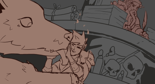
I don't know to call this other than a collection of resources and reflections about the process of making the animatic. Hopefully it's interesting or helpful for someone. But feel free to ask questions if you'd like clarification/more info!
___
Inspiration (A non-exhaustive list)
It's possible that I've seen/read fan works that may have inspired me unconsciously, so there's no way I can possibly include references to them all. However, the ones I listed here are ones I recall looking back at repeatedly.
The fancomics "First Flight" and "Bonehead Boon" by Liana Sposto
Robbie Elliot Art's animation "Take Tonight"
Toastyglow's animation "Glitter & Gold" and PMV "This Year"
Storyboards posted by Paige Caldwell (@/papernewt) on Instagram
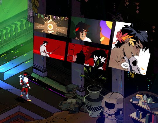
Zag admiring some of these beautiful fanworks.
The following sections are below the cut: References, Songs, Script and Thumbnails, Studies, Drawing, Editing, Random Facts
___
References
These were very helpful to creating the animatic!!
In-game references
Hades Wiki
3D Model of Zagreus by @/chunyou_ on Twitter
I also used screenshots I took while playing
General references
"How To Direct A Fight Scene" by Howard Wimshurst
Poses from the photo libraries of The Pose Archives and AdorkaStock
3D Model of Male and Female Heads by William Nguyen
I also just looked stuff up online or took videos of myself acting out some of the movements.
___
Songs
I thought of basing my animatic on any of the following songs:
"Icarus" by Bastille
"Dirty" by grandson
"Underworld" by CYPRSS *
"I'm Still Here (Jim's Theme)" by John Rzeznik
"I'm Gonna Win" by Rob Cantor **
"Could Have Been Me" by the Struts
They all have a varied degree of "Zagreus vibes" but I wanted a song that could be used to show as much of the game as possible. "Could Have Been Me" was the song that I could imagine more things for, so it is the one I ended up using.
* Look at this awesome Zagreus fan art based on this song
** Some of the lyrics for this song are so fitting for Zag but others are pretty ooc.
___
Script and Thumbnails
I've seen other artists annotate the lyrics to the song they are working with and attempted that here. But that process is a little confusing for me, so I kept these descriptions vague. It was helpful in keeping track of ideas, since some of them are faster to write down than draw. Especially for fight sequences.
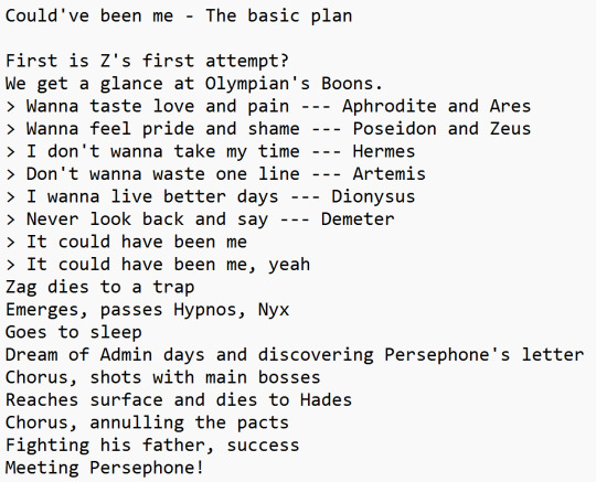
I used Storyboarder for the thumbnails. I opted for this program because (1) it lets you add an audio file and (2) it has very basic tools. It can be used in a more nuanced way than I did. However, with 3 and a half minutes of frames to work out I needed something that helps me draft down ideas efficiently and without overwhelming me. And this was pretty good program for that.
The script and thumbnails happened in tandem a lot of the time. Think of it as brainstorming, both in vague writing and loose drawings. At this point I am trying to see if these ideas flow with the song, if they are readable, if they achieve what I had in mind.
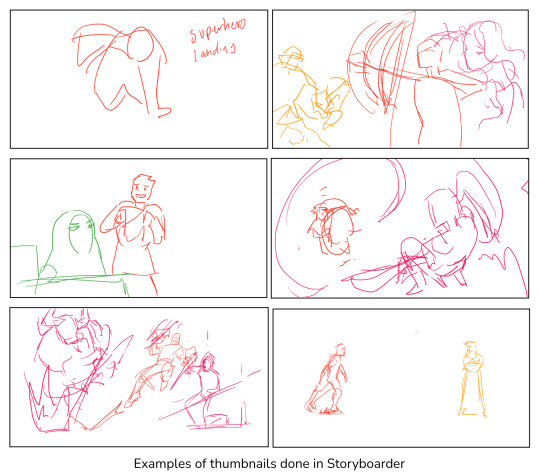
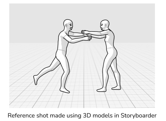
___
Studies
Okay. So I am happy with my ideas. Now. How do I make sure the drawings are identifiable as taking place in the game?
This is where those in-game references came in handy. I looked back at my thumbnails and made a list of everything I would need. From characters to locations. Once I had these down, I made folders to make sure everything would be nice and organized.
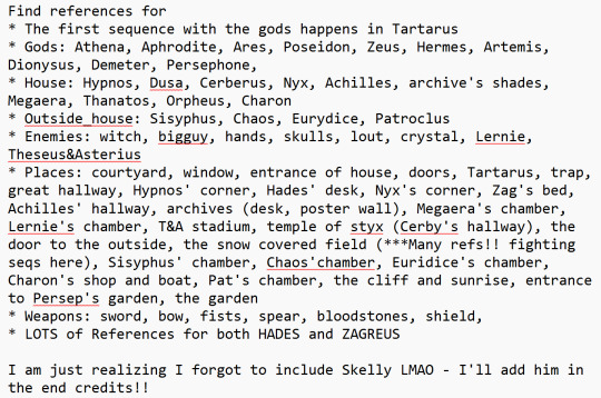
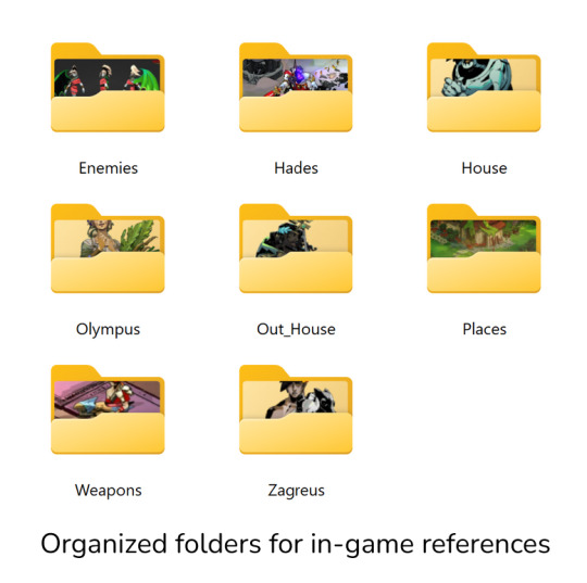
I tend to avoid backgrounds like the plague. However, for some of these shots to work I need to give the viewer a sense of where the action is taking place. I know that I struggle imagining three-dimensional spaces while drawing digitally. So, using my thumbnails and the references I gathered, I did studies of all the locations I thought would be important using good old paper and ink. This also served to fine-tune shot compositions.
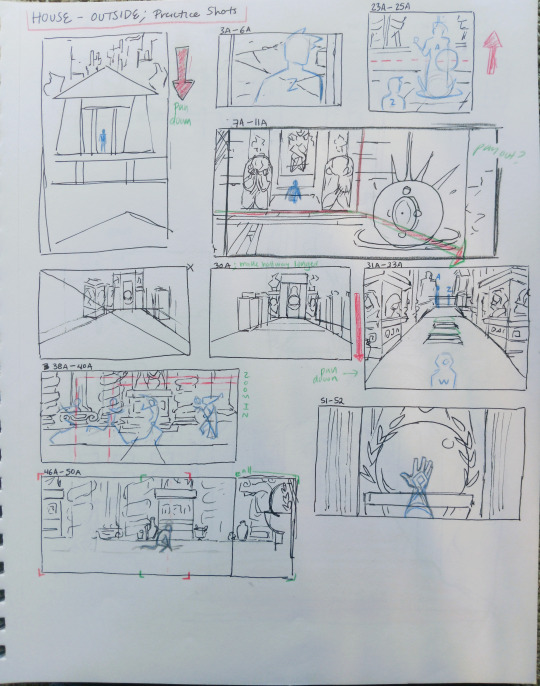
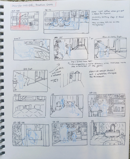
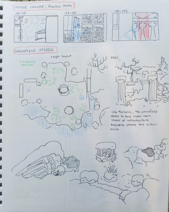
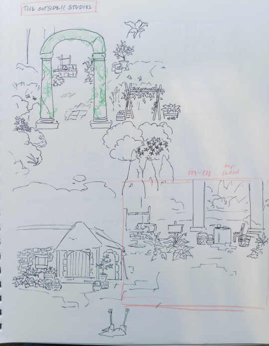
___
Drawing
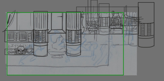
The animatic itself was drawn using Krita. Usually, I worked on all the backgrounds using the studies as a base and then added the characters. My drawings started very rough for a couple of reasons. The main one was that with ~200 frames ahead of me I was afraid of letting my inner perfectionist get me stuck. I kept reminding myself that, being an animatic, the drawings could be rough as long as they are still readable. As I got more comfortable using Krita, I was able to create cleaner backgrounds.
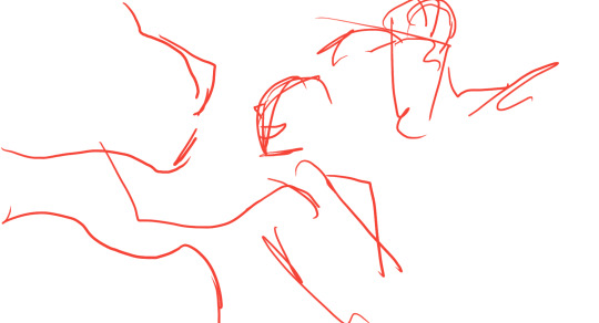
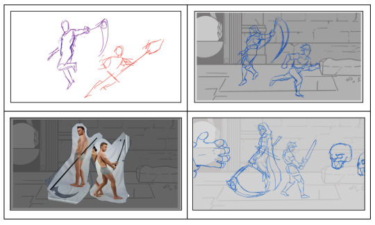
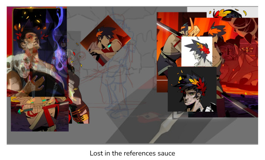
Even so, I hit an art block around the two minute mark where I Could Not Draw. This is where I heavily relied on those References I Keep Talking About. They were my savior and are the main cause for the more "finished" look towards the end of the animatic. I think the best example of this was the shot featuring Thanatos. I was deep in the art block territory by the time I needed to go from thumbnail (top left) to final frame. No matter how much I redrew them, I didn't like how they turned out (top right). To work this out, I found references from The Pose Archives and used them as a guide (bottom left) to get a sketch that I liked (bottom right). I felt this look was more sketchy than I've would like so I ended up cleaning it. I followed a similar process for most of the frames following this one. As a result, the final frames of the video turned out cleaner.
___
Editing
Once I had all my frames ready to go, I imported them into HitFilm Express and made a composite shot where I basically just matched the timing of the frames to the music. Frames that have camera movements (like the very first frame) were made in their own composite shots. I ended up having to delete some frames so some sections didn't feel rushed. In the end, there's like 5 versions of the animatic because I kept making little changes. The biggest was adding Zag's dialogue at the beginning since I felt the video started up too quiet. I don't have any images for this stage. Please have this comparison instead.

___
Random Facts ✨
Adding color was a last minute decision, it was mainly because I thought a colorful sunset would be prettier. My original plan was to shift the gray tones of the background into more yellowish tones once Zagreus reaches the surface, but keeping everything monochromatic.
If you pause quickly on the very last frame you'll see I accidentally made Zag's leggings black instead of red. I was on auto pilot at this point. Adding color was worth it overall but so time consuming. My respects to people who do fully colored animatics.
I wish I made Meg a pinker (or blue) hue rather than purple. In my mind I saved purple for characters related to Nyx (hence why Hypnos, Than, Chaos, and Charon have shades of purple). But I guess it is a sweet detail because of how Meg confides in Nyx in the game.
I kept a log of all my progress. Apparently getting the thumbnails done took about five months (August 2023 - January 2024)?? Anyways I leave you with these entries.


___
Thank you for reading! I hope it goes without saying but I really appreciate all the support this animatic has received. All the hearts and comments and tags, they mean a lot.
16 notes
·
View notes
Text
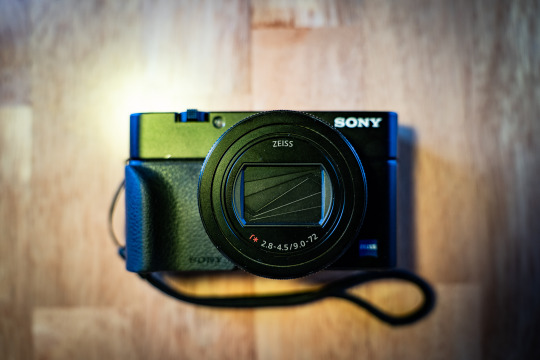
Sony RX100 VII Thoughts After Two Months
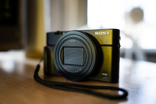
PROS:
Stacked sensors are the future. Well, technically the present considering that Canon, Nikon, Sony, Fuji, and OM Systems all use stacked sensors in their top of the line cameras. Either way, finally getting to experience shooting with one on a daily basis has made me want one in pretty much any camera going forward. The benefits are twofold: Not only do you get shutter speeds up to 20 frames per second, and without a mechanical shutter flipping in the way obscuring your view in between shots, but you also get no rolling shutter while doing it. Pretty much every Sony camera can shoot 10 fps bursts with the silent shutter, but any movement can give you a jello-like effect since the sensor reads out so slow on non-stacked cameras. The only con, at least on this camera, is that you can’t shoot flash at higher than 1/100 with the electronic shutter. That’s still plenty fast for a lot of stuff, but well below the 1/2000 you get when shooting the mechanical shutter.
The fast frame rate wouldn’t make much of a difference if the camera was bad at autofocusing, but this camera is great at it. It has a lot of the same fancy focusing stuff that my full frame Sony has like human/animal eye autofocus and all the tracking modes I’m used to. It actually makes the camera pretty solid for wildlife if you can get close enough at the 200mm end.
Speaking of that, the 24-200mm equivalent is a great range, and one that I missed a lot since I traded away my Tamron 28-200 to help cover the cost of my A7RIV. The small size and extra 4mm on the wide end actually makes it even more convenient than that Tamron.
Aside from covering a broader range than the 24-70 equivalent lens from the older RX100 cameras, this lens also seems noticeably sharper. The last RX100 model I had, the Mk. IV, just didn’t seem as crispy as this lens is.
It has a touchscreen! It’s wild to think that the previous RX100 cameras I owned didn’t have this basic ass feature, but Sony was very late in putting touch screens in their cameras. Ironically, I don’t really use it in this one because the AF is good enough that I can just do focus and recompose with tracking.
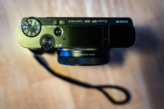
CONS:
It’s still only a 1” style sensor so high ISO isn’t the cameras strong suit. Programs like DXO PureRAW help a lot and let you get somewhat usable images at ISO 6400 in a pinch, but you’re kinda pushing things at that point.
While the lens is sharper and covers a wider range than the older models, it’s also significantly slower. At 24mm equivalent it’s already at f/2.8 where the old cameras were f/1.8. It’s f/3.2 at 25mm, f/3.5 at 33mm, and f/4 at 40mm. From 109mm to 200mm you’re at f/4.5. The relative slowness of the lens combined with the small sensor means that this can struggle getting quality images in low light without a tripod or something.
No USB-C. My Fuji, Ricoh, and larger Sony all have USB-C charging, which is amazingly convenient when traveling. I haven’t really gone anywhere with this camera yet, but having to account for a micro USB cable is annoying since pretty much everything aside from my iPhone uses USB-C.
It’s expensive. Just like my Mk III and Mk IV I got it used so it was cheaper than retail, but the copy I got cost about twice what I paid for the previous models.
Start up time is just a tad bit slower than I’d like. The GRIII and X100V both beat it that regards, albeit those aren’t zoom lens so I have to cut the Sony some slack.
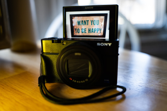
SAMPLE PHOTOS:
(The sample photos were edited in Lightroom Classic and DXO PureRAW2. Also, the sensor creates a roughly 2.7x crop factor, so the 9-72mm lens equates to 24-200ish)

Young Bird | ISO 160. 72mm. f/4.5. 1/200.

Graffiti Shot from a Car | ISO 100. 33.98mm. f/4. 1/400.

Stickers | ISO 100. 29.67mm. f/4.5. 1/100.

City Hall | ISO 100. 38.13mm. f/4.5. 1/200.
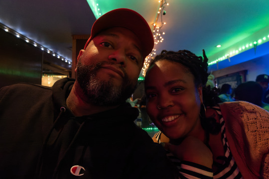
Flip Up Screen Selfie with My Friend Hanae | ISO 3200. 9mm. f/2.8. 1/40.

Zoomed in Graffiti | ISO 640. 72mm. f/4.5. 1/500.
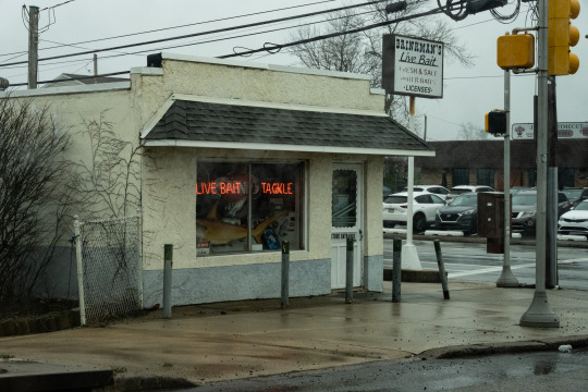
Fishing Store Neon | ISO 800. 28.67mm. f/8. 1/200.

Flowers | ISO 200. 72mm. f/5. 1/640.
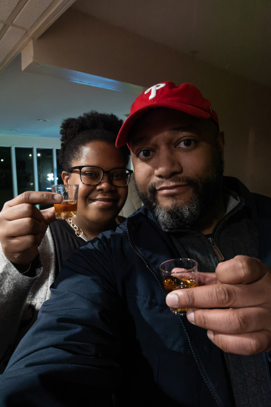
Selfie Shots with My Sister | ISO 3200. 9mm. f/2.8. 1/100.
32 notes
·
View notes
Text
FD-
with nearly half the teams cut after the RD, the FD was all teams who had Grand Prix assignments (except S/F who weren't yet eligible 🇨🇦→🇮🇪)
PiriHara's Chicago program was a surprise - it hadn't made much of an impression over a stream, but what do you know, Broadway is better live 😅
Olivia and Tim - they never did work out the timing glitches in this program. at least he made it to the end without struggling so much condition-wise like he did at Challenge Cup a few weeks ago. catching up to her in one season was a tall order. i really love how languid and easy she can make it look while covering big ice. send him to IAMO for the summer. it's no consolation to them, but going below both sibling teams allowed the Czech Republic to keep 2 spots for next Worlds
Taschlers were low balled - in no reality should they be below Davis/Smolkin
the swan lakes - D/S in this context, skating against strong teams, look so very small, shallow and with not much ice coverage. it doesn't help that they picked huge music that normally would be danced by an entire stage full of swans. plus their music cut had a couple awful jarring edits - the audacity to slug in extra notes in Tchaikovsky 💀 i might be the only one so bothered lol
the Mrazeks by comparison looked smoother and faster and smarter in that they picked some of the gentler swan lake music including the waltz. for a first year senior team, they can be proud. another first year team who's been even more stellar is Hannah and Ye -
omg they were so good - they're able to be so emotional without feeling over the top. just expressive and connected to each other. lovely ❤️
i like Demougeot/LeMercier - i'm going to look forward to see what they do next. i hope they keep being quirky
really happy to see T/V and R/A live - T/V are willowy and ethereal, and her ballet background shows. but i don't think they get down into the ice. i like this FD a lot, but the interest in it is in those arm movements and elements more so than the skating. R/A i liked the RD a little more than the FD but like them very much
CPom are raising their game all the time - so happy for them and their well earned rise. what i love is that not only do you see them becoming better skaters and performers, but you can see they believe - their confidence in themselves is at a completely different place than it was 2 years ago
omg, live i didn't see just how long Charlene's skirt was caught on her blade at the end. idk if Barbara in the kiss and cry was holding her breath to see if the judges used the little mistakes to put F/G ahead. thank god they didn't, because G/F still have such a higher quality
and Piper and Paul - this program uses the glide and sweep of the music to emphasize that in the skating in a beautiful way. a skated program is so much more satisfying than an element-fest like C/B's. as impressive as their elements and performances can be, i don't know if i've ever been moved by a program of theirs
my favorite of the entire event - LaLa - i was crying by the gorgeous OFt. they alone would have been worth the trip. but gratitude to all the skaters and their coaches - my cup's full. i'm still processing
6 notes
·
View notes
Text
Mixing an Old Anime Dub with HD Footage
How I'm trying to mix every episode of the old FUNimation English dub of Detective Conan/Case Closed with the new remastered footage currently being released on Blu-ray in Germany.
This is less of a tutorial and more of a, "I-don't-really-know-what-I'm-doing-but-this-is-my-process" sort of thing. I welcome suggestions for improvements! Many thanks go to Fabre on the Detective Conan EN Community Discord server for getting me here at all; my earlier method of mixing, requiring me to cut the audio a bajillion times, is definitely not recommended.
Since I just posted a clip from Episode 76—thank you for the warm response!—I'll demo here with Episode 77! It's the start of a Heiji case!
Programs
Every program I use is free (though some have paid options available). These programs are:
MakeMKV, for ripping Blu-rays and DVDs
HandBrake, for ripping DVDs and compressing files
BeHappy, for audio conversion
DaVinci Resolve, for video editing
Subtitle Edit, for exactly what it says on the tin
Getting the Materials
To rip the Detektiv Conan Blu-rays, I use MakeMKV. (Note that the file size will be very large.) I also try to use MakeMKV to rip the FUNimation Case Closed DVDs, but there can be struggles. With Seasons 4 and 5 of the Viridian Collection, for example, not all episodes would rip without a lot of finagling. In that situation, it's easier to use HandBrake instead, making sure to select a FLAC codec for lossless compression of the audio.

Audio Conversion
With Detective Conan, the Case Closed DVDs have an audio "framerate" of 24 FPS, but the Detektiv Conan Blu-rays have an FPS of 23.976. They've gotta match for easy mixing. The way I fix the discrepancy is to convert the FUNi audio to 23.976 FPS, which can be done with BeHappy:

I use WAV Writer for a lossless conversion, and I've learned to select the "Normalize to 100%" option because I've had strangely low audio levels otherwise (as can sadly be heard in my Episode 76 clip).
(Also, one of my biggest struggles with BeHappy was how to even get the job going. So, putting it out there for anyone else who might need it: to get the conversion started, you gotta click that "Enqueue" button on the bottom right. It is indeed a button!)
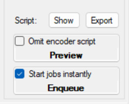
I use FFAudioSource, and with the "Configure..." button on the far right of that, I can select the stream index to convert. (For many of the FUNimation volumes, Stream Index 1 is English stereo, Stream Index 2 is Japanese stereo, and Stream Index 3 is English surround sound.)

My mixing process involves lining up the Japanese audio of the FUNimation DVD with the Japanese audio from the German Blu-ray; then, I copy any movements or cuts to the English audio. So, I convert both the English and Japanese audio tracks from the FUNimation DVD.
But this is unnecessary. You can also line up the dub with the Blu-ray audio directly. I just don't trust myself to do that because they're not going to match up exactly due to the different languages.
Resolve can also have trouble importing the audio from my Blu-rays, so I BeHappy that audio as well, just making sure not to select the "TimeStretch" option.
Video Editing
The mixing isn't too complicated. Like I said above, it's about matching the Japanese audio tracks of the DVD and the Blu-ray. I solo the Japanese audio track from the Blu-ray, mark the starting point of a sound, and then I repeat the process with the Japanese audio track from the DVD and line up the markers (and solo both Japanese audio tracks together to make sure they're properly synced). Anything changed on the Japanese audio track from the DVD is copied to the English audio track(s).

Rinse and repeat. Timings generally need to be checked at transition points: the opening, doors, ending, post-credits, next-episode previews, and "Next Conan's Hint" segments. The Blu-rays also have blank sponsor screens and end-card jokes that aren't included on the DVDs, and I fill these spaces by either editing in the English version of the song that plays during the sponsor screen, or by simply copying the Japanese audio from the Blu-ray for content that wasn't dubbed.
There are some more nitty-gritty details involved with openings. For OP 1, I edit in the full English version of the song from Episode 1, while for OP 2, which wasn't dubbed (with OP 1 played instead on the DVDs), I use AI vocal isolation to isolate the audio of Shinichi's opening speech and edit that with the Japanese song. For OP 3, no full English version of "Nazo" exists, so I just kind of have to awkwardly splice in the Japanese version at the end during the sponsor screen.
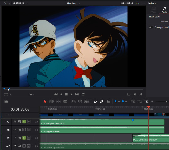
Of course, this is a lot of extra effort that even the German Blu-rays don't do for the German dub. Songs and intros are entirely left in Japanese there, vastly simplifying this work. But I definitely want to preserve the English songs. And also, I love making things harder for myself.
Subtitles
Finally, I'm all about subtitles! Some of the FUNimation volumes include English dub subtitles, which I like to include on my final mix.
To extract them from the DVD, I use Subtitle Edit. I go to File -> Import -> Subtitle from video file...
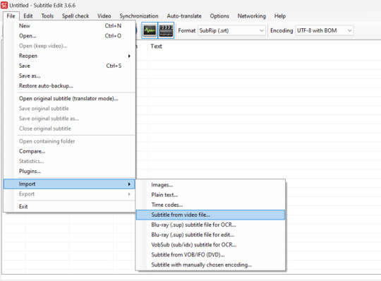
The file does have to be an .mkv, which can be made with MakeMKV or HandBrake.
Once I select the file (in this case Episode 77), I use these settings to OCR the subtitles:
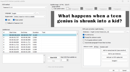
I make sure to have "Prompt for unknown words" checked because OCR (Optical Character Recognition) isn't a perfect process and may make mistakes.

"How's it goin (TM)" is pretty great, though, ngl.
I run through the OCR and fix anything that's needed. Since the FUNimation subtitles are a little hard to read, I also try to quality check them thoroughly for errors—though, I usually do that after the next step, which is timing the subtitles to the remastered mix.
Much like the BeHappy process, I want to start by changing the framerate of the subtitles from 24 FPS to 23.976 FPS. This can be done by going to Synchronization -> Change frame rate...
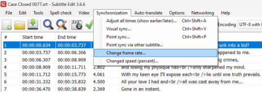
After that, I can attach the remastered video file and time much like I did with the video editing. I go to Synchronization -> Adjust all times (show earlier/later)... and click the "Selected and subsequent lines" option at all of the transition places that need adjusting. It definitely helps to have the waveform on when timing.

I also like to attach Crunchyroll subtitles for the more literal translation of the original Japanese script. The .ass files can be found here. Crunchyroll subtitles are timed very closely to the Blu-rays; all that needs to be done is a second or so of delay at the start. I also OCR the German subtitles from the Blu-ray and use those to time the Crunchyroll subs, but it's just as effective to use the waveform and/or your ear to time them.
And speaking of Crunchyroll subs, I like to copy their formatting for my OCR'd subs. To do this, I first need to export the Crunchyroll styles, which can be done by opening the Crunchyroll subtitle file in Subtitle Edit and clicking the big "A" by the checkmark for "Advanced Sub Station Alpha styles."
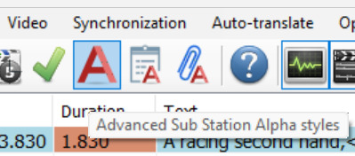
The following menu will pop up, and from there, I just have to click the "Export" button to save the styles.

After that, I have to change the .srt file of the OCR'd subs into an .ass file by opening that file and selecting "Advanced Sub Station Alpha (.ass)" on the "Format" drop-down menu.
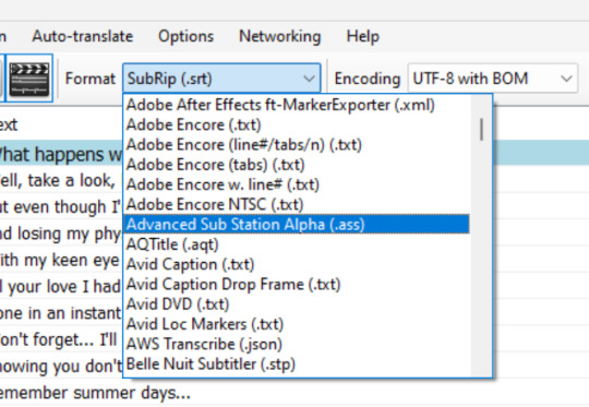
Then, I again click the big "A" by the checkmark for "Advanced Sub Station Alpha styles" and hit the "Import..." button on the menu to import the Crunchyroll styles. I delete the original "Default" style afterwards and rename the Crunchyroll default from "Default 2" to "Default."
And that's basically it! There are some things I kind of glossed over; for example, I have to assign buses in video editing to get all the different audio tracks the way I want, and I do have to add subtitle lines to the English dub subs to get subs for things that weren't on DVD. But this is the basic process of preparing the video and subtitles.
Compression
The last step is compressing with HandBrake. I wind up with ginormous file sizes after exporting from Resolve, and it's nice to get something smaller. Plus, with HandBrake, I can also attach all my subtitle files to the video.
To do so, I just need to pop over to the "Subtitle" tab and select "Import Subtitle" on the "Tracks" drop-down menu.

The subs can even be named. I keep mine soft so that they can be toggled on or off, but they can certainly be burned in, too, if that's preferred.

Compression settings are utterly beyond me, unfortunately; my file sizes are still ginormous even after HandBraking. But there are several presets on the program that can be used.
And that's really the whole process!
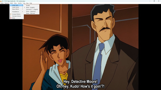
Note that I use the German Blu-rays, despite their shortcoming of the name boxes being edited in a way that can't be turned off, because there are no other Blu-ray releases of this remastered material at the moment. Maybe one day I'll write a post about all the Detective Conan available on BD—it's surprisingly little!—but this is it for now!
Thanks for reading!
#detective conan#case closed#ramblings#shut up goop#long post#idk why i wrote this but i hope it's interesting/useful! happy to answer any questions if there are any
38 notes
·
View notes
Text
Gif tutorial by Alinelovelace
Alright, I'll be doing 3 things here today:
1.) Sharing the programs and websites I use
2.) Showing y'all a tutorial on how I make my gifs (this is my first tutorial, so if anything doesn't make sense, don't hesitate to message me, send me an ask, or comment on this post!!!!!)
3.) Sharing some resources by insanely talented gif makers (because I learned how to make gifs by following tutorials)
It's probably important(?) to mention that I use a Windows laptop
A.) Programs and websites:
ezgif: to make my gifs and do light editing
You can make gifs with video clips or screen caps. I'm not advanced enough to use screen caps, though they're supposed to make gorgeous gifs. I use ezgif to make the actual gif and edit the timing (which I end up having to tweak on Photoshop but...)
I also like ezgif because no watermarks!! I will do anything in my power to get rid of watermarks from websites and editing programs because they bother the hell out of me!
Photoshop: for the rest of my editing
This is where I recolor and add text.
A great alternative to Photoshop is Photopea, which I've used before I "obtained" Photoshop. It's FREE and online, so you don't have to download anything! I highly recommend it if you really want to get into gif coloring !!!!
Currently, I get my videos from torrents (bc I have a wide selection for my family to watch on our tv). But I used to use the Xbox game bar on Windows to record the clips I wanted on online streaming sites (unfortunately there's not a whole lot up and running anymore), then cropped and cut them. If anyone's interested in that, I could probably post a separate tutorial for that another time :)
There's also screen cap websites out there and YouTube. And probably dozens of other ways to get videos that I don't know about!
Video cutter
If you use full length episode videos and don't know how to crop them on your laptop (like me)
★★★★★★★★★★★★★★★★★★★★★
B.) Tutorial:
I'll be remaking the first gifset I ever made since I've learned A LOT since then! It should be pretty simple since there's only one set of subtitles.
Another time, I could do an edit tutorial like my That 70s Show ones. It's just taking the same concepts as this tutorial though, and playing around with colors, fonts, and font placement.
1.) Find your video/screen caps:
Since I no longer have the video from my first gifset, I just googled "Mulder throwing pencils season 10" on YouTube. After finding the video, I copied the link and pasted it into a YouTube to MP4 site ((this site has never given me popups or tried to get me to download something that isn't my video file)).
2.) If your downloaded video clip is short enough, you can just stick it into ezgif. If not, you may have to cut it using a website or a computer program.
Ezgif.com -> video to gif -> browse -> select your file -> upload video
3.) After clicking upload video, you should find yourself on this page:
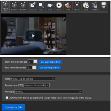
If you need to do any kind of video editing (cropping, rotating, resizing, etc) this is the place to do it! This is also where you make your gifs.
For the first gif, I don't need to change the start time, since I'm starting at the beginning of the video. 0 seconds is fine. But for the stop time, I'm going to play the video, pause where I want my first gif to end, then press "use current position" by end time.
I don't usually touch the settings for size, FPS, or method. If the gif doesn't have a lot of movement, I check "optimize for static background"
Then press convert to gif.
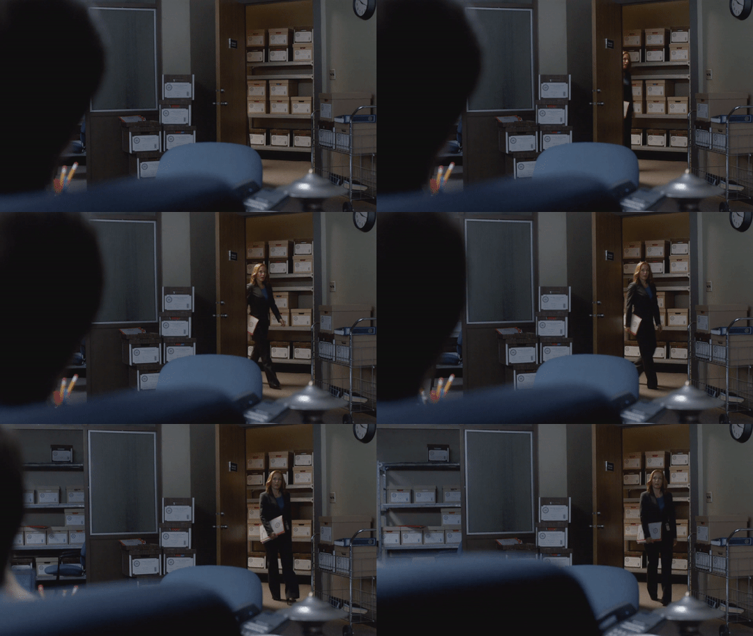
Here's the product I got. Since it's such a short clip, it moves a little fast for me.
I'm going to click "speed" which is below the gif. You're brought to this page:
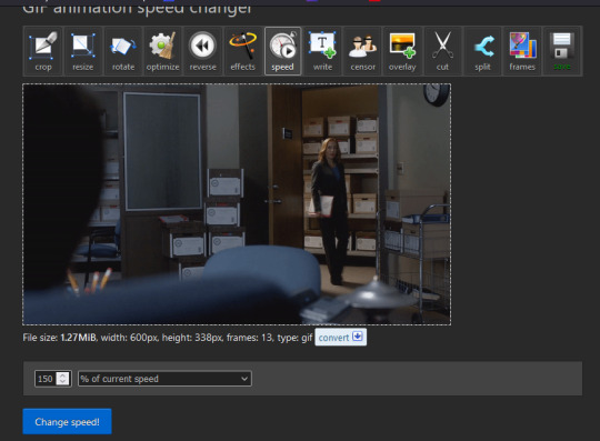
This is completely up to you for speed, but I find that between 60% and 85% end up looking good. If you don't like it, just change the number in the box and press "change speed". I ended up with mine at 65% of current speed.

A little better, right? The gifs that turn out best are 3 seconds to 10 seconds in my experience. This one is 1.5 seconds, so it's a little fast.
After that, rinse and repeat for every gif you need to make.
4.) Editing time! This is for Photoshop (if you use Photopea, I very much recommend this tutorial. It's very well explained!)
Go ahead and open all of your gifs once Photoshop is booted up. Then click window -> timeline
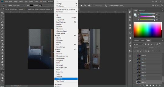
Now you have a handy dandy little timeline on the bottom.
The first thing you're going to do click play and decide whether or not your gifs are running at the speed you want. If yes, move on to next step.
If not: click on the three lines -> select all frames -> little drop down arrow. You should have a variety of times available to choose. Usually, I click other, then put somewhere between 0.04 and 0.08 seconds. Click play again. If you don't like it, try this step again.
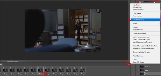
If you need to crop your gif, three lines -> select all frames. Press "c" on your keyboard and crop accordingly.
4a.) Color editing
This is where things get complicated. Just remember coloring is subjective and everyone does it differently. This is just an intro to the different tools most gif makers use to alter color.
You don't have to use all of these! I definitely pick and choose depending on how I want the coloring to look. When I'm making a gif set, my coloring isn't as adventurous as when I'm making an edit. It doesn't feel worth it to give away my settings for this gifset since it changes depending on the coloring and lighting of the scene.
All of these tools can be found under "create new filter adjustment layer"
• Brightness/Contrast
This one is the easiest in my opinion. It's pretty straightforward. The more you drag brightness the right, the brighter your gif gets. The more you drag contrast to the right, the higher the contrast is.

• Curves
This adjusts lighting with color values. It's another tool that's hard to explain. I just drag the little circles on the chart until it looks good

• Color Balance
Like every other setting, exactly what you do with this tool is up to you. Color Balance adjusts the overall tint of your gif. I recommend editing highlights, shadows, and midtones for the best results.
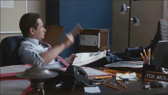
• Channel mixer
This one is one of the most complicated tools when making gifs in my opinion. It's best for getting rid of weird colored tints (think the blue coloring in Twilight). I'll just link a tutorial here for it. I don't make enough gifs to know how to explain it.
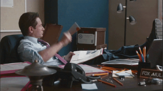
• Selective color
Hands down my favorite tool, though not only specifically for gif making. This tool allows you to select a color (reds, yellows, greens, cyans, blues, magentas, whites, neutrals, blacks) and edit each color group. For example: my skin in photos usually has a weird red tint. I can edit the reds in my photo using this tool to make it look less abrasive.
You just play around with the different colors and bars for each color until each color group looks good. I recommend hitting the highest value to see how the color changes/what parts of the gif are affected by the change.
In the instance below, I wanted to see how magenta affected the blue colors, so I dragged magenta to 100. Now, knowing what kind of color changes magenta will make to blue, I can adjust accordingly.
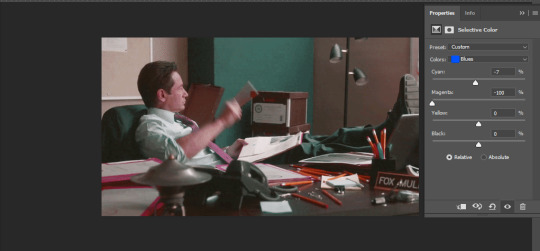
Messing around with the each color put me here:
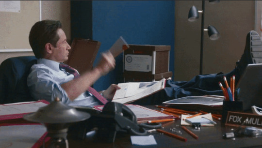
• Vibrance
Another pretty self explanatory tool! Vibrance and saturation bars make the gif colors more colored and vibrant.
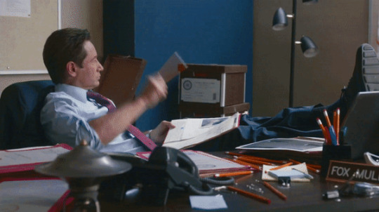
• Applying the filters to all frames
Shift click to select all the filters, and drag them above all the layers. They should now be applied to all the frames.
If not, select all frames with the three lines menu drop down like before -> click the little eye to turn off visibility, then click it again to turn it back on. You should be able to see everything now.
In order to carry the same colors from gif to gif, I take pictures of each setting and edit each filter adjustment layer accordingly. I side by side compare and make adjustments if the coloring doesn't match quite right. I'm sure there's a better way to do this, but I'm not experienced enough yet.


4b.) Subtitles
This part isn't too bad. For subtitle text, I use Calibri. Myriad pro bold italic and Arial are also really good options though!
• Text
Go to the sidebar and select text. Drag yourself out a box approximately where you want your subtitles. Type whatever you want. If you don't like where it is, click the move tool and drag it wherever you'd like.
Here are my text settings:

• Blending options
Right click your text layer and select "blending options" at the top. I edit stroke, which adds an outline. I also edit drop shadow, just because it adds a little depth to the text

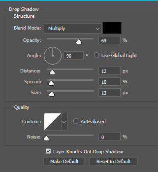
• Applying to all frames
Drag the text layer to the top, just like you did with the adjustment filter layers when coloring. The same troubleshooting applies.
5.) Exporting
I know there's other ways to do this, but this is the way that makes the most sense to me.
Select all frames on the timeline -> file -> export -> save for web (legacy) -> save
With everything together, you go from:


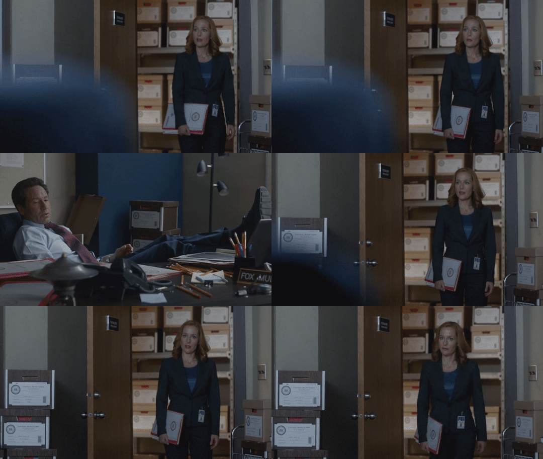
To:
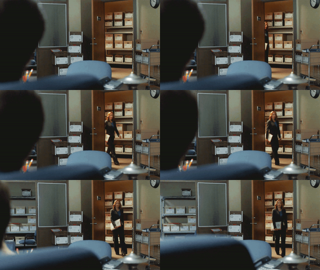


I had the subtitles in two parts because my first one had the subtitle in two parts (consistency).
Happy giffing!~~
★★★★★★★★★★★★★★★★★★★★★
C.) Resources:
This is a collection of resources both for Photopea and Photoshop
Photopea Resources:
Photopea giffing tutorial by @heroeddiemunson
Photopea gif coloring tutorial by @heroeddiemunson
Photopea removing yellow tint tutorial by @lacebird
Photopea gif making tutorial by @aragarna
Photopea gif making tutorial by @ashleyolsen
Photopea changing background color of gifs by @benoitblanc
Photoshop tutorials:
Giffing tutorial by @dqmeron
Subtitle tutorial by @itsphotoshop
Blurring gif backgrounds by @clubgif
Inverted colored text tutorial by @spaceslayer
Gradient text tutorial by @tawaifeddiediaz
Gif coloring tutorial by @logangarfield
Color consistency tutorial by @clubgif
Channel mixer tutorial by @zoyanazyalensky
11 notes
·
View notes
Note
do you have any tips for makign the pngtuber?! it looks so cute, are they just idle animations or do they actually move when you draw etc?
it's just idle animation, the movement on the drawing/gaming ones just use the blink slots to randomly change between the "normal" pose and the "doing something" pose. i used veadotube mini so the only thing I directly control is the shift between talking/not talking and switching between the different states (standing/drawing/gaming). they're quite simple, it's just the movement of animation giving it the illusion of complexity. I know there's a way out there to map mouse/controller movement to your vtuber thing, but I didn't look into it because... well. I didn't want to lol
things can be as simple or as complicated as you want it to be. I'd recommend keeping the designs simple so it's faster to draw and make variations of. it took me one night to work on this one and I learned a lot about better ways to organize/set up my art/file for exporting as I was making edits. if I had a really intricate-looking drawing to start with, I'd have spent more of my time just drawing a single pose instead of being able to place an image in the program to see how it works and how things look in it. I started with just 2 static images and then went "what if it moved a bit" and then added things as I went. breadth vs depth, I guess.
hmm... as for tips...
the talk mouth is on a layer that covers up part of the face when I unhide it. this was nice because when I made a change to the animated drawing/controller poses, I could export out the talking variation immediately by just turning 1 layer on, instead of having to swap/redo changes between multiple layers (annoying). I also had the parts that moved (the arms) in a separated group, so when I changed the thickness of a line on his vest I didn't have to redo that change over and over again across 3 more frames. I still had to redo it for the 3 poses, but that's just 3 times total instead of 1 + 3 + 3 = 7 times total. if I were to do this again, I'd have things set up in a way where the different variations use as many of the same layers as possible, so changing something in one place automatically works for every pose.
and you can keep your life simple. for the animated frames I didn't redraw the arms from scratch for each frame of movement-- I just used the liquify tool to nudge them slightly and fixed up any small sections that looked weird. it ends up looking very intentional but with less work. it's easy to make it look bad though if you don't keep it subtle, I just had to feel it out by doing it.
...and you don't need to do any animation if you don't want to!! I just think it's cool and also a fun challenge. all the stuff I did on this one is built upon my experience making that older one I linked in my post, 2 years ago. the goofy crying pose i made for that is where I learned you weren't restricted to static images for the stand/talk/blink/blink-talk poses.
the drawing sprite in my new one has the default pose set as a looping "drawing" animation, and the blink is set as a "paused drawing" image. it used to be the other way around but I found a limitation with how setting the random start time and duration of the blinks worked, so I switched them.
#pivasks#the entire learning process is about trying to do something specific and finding out all the ways to do it bad.#and eventually you solve enough problems to end up with something less bad. perhaps good eveb#I tried the liquify thing because I wanted slight movement without the full effort of redrawing...#the only reason it worked out is because I've used liquify and done enough animation-adjacent things in the past to know what to avoid lol#that's experience I guess. look at the difference between my old one and this new one. that's experience!!
6 notes
·
View notes
Note
okay I was scrolling through your blog (a normal amount? too much? I'm sorry if this is weird I don't know if dragging up old posts in acceptable on this site!) and saw one where you said you use vim and I am curious about that! I tried it a while ago and was like... okay I can see how this might be faster once you get REALLY good at it, and it would definitely be useful to have the ability to export easily in multiple formats because I have realized suddenly that it seems like AO3's downloads frequently mess up the formatting? (Or maybe just fail to fix messed-up formatting that the browser smooths over?) Sooo yeah do you use it to write or just for code or what? is it worth it to become a Vim Person?
HELLO this is actually one of the things I most love to talk about because vim is my Favorite Piece Of Software. I love it well beyond a normal amount. That being said it's ummm not for everyone and not for everything. I'm putting this under a readmore because this is too long to inflict on poor unsuspecting souls who are just here for Hannibal content.
Section 1: The ways in which vim is useful
Vim is most useful when the stuff you're working on is more structured and what you're doing is more rote. So something like code (which, yes, is what I learned it for) is very formally structured, and something like html is sort of vague scaffolding around text, which is pretty much a blobby mush where really nothing means very much of anything. (The number of times I ct. only to get pulled up short by an honorific is very high, and I am grouchy.)
Part of the thing that makes structure good is that vim is more useful (relative to a traditional editor) when you can precisely define the action you want to take. Getting better at vim is really about improving your vim-vocabulary so that you are more able to make precise statements about what it is that you want vim to do. I use a "normal" markdown editor for drafting, because what I want to do is "write the next bit" which is not a very vim-interesting action and obviously not very precise. I do use vim for editing, though, because often the things I want to do are, like: "replace this word with some other word" (cw), "delete the end of this paragraph" (D), "rewrite this bit of dialogue" (ci"), "remove this whole paragraph" (dd)--you get the idea.
Also, the place that vim goes from "ok, this seems pretty good" to "this is invaluable" is really when you want to repeat stuff. Something like "the compiler is giving me 25+ pedantic warnings because the file I'm working on was written prior to the introduction of the C++ override keyword" or "I'm rewriting an API so I need to fix the function name in these dozen callsites, remove the first argument, and swap the places of args 2 & 4." These examples are programming-related because I haven't found a use for macros in writing yet. (I live in hope.)
Section 2: If you want to learn vim, here are my tips
I don't really want to tutorialize because there are a lot of those out there already. I do wish to dispense some general philosophical wisdom. (!!!!!)
First of all, keep in mind that the bar is very low. Normal editors are not really that productive. Fancy WYSIWYG editors (which I hate, equal and opposite to my vim-love) are negatively productive for me, because I will get distracted and/or distressed by all the available buttons, formatting options, and whether I accidentally italicized any of the spaces. You don't need to be maximally productive in vim to make use of it, and you don't really need to know that much to match the capabilities of a normal plaintext editor.
If you want to learn vim, I would pick a small set of keys to understand first. Like, i and I (capital-i) to enter insert mode, <Esc> to get back to normal mode. bwhjkl as basic movement options. u and <ctrl>r for undo/redo. If you must, y and d for copy/cut, p and P for paste. (System clipboard--I'm sorry--accessed with "+, so "+y or "+p for example.) That is probably well over enough.
After you get a handle on the basics, the fun part of vim is figuring out where your inefficiencies are and learning how to improve them. Realizing that you're pushing more buttons than you want to be pushing, figuring out how to describe the thing you want to do in a google search, and then finding out that vim has a key to do that. gg G } { c % $ ^ zz . ; and so on, and so on. The world is your oyster &c. (The sheer delight I felt when, more than half a decade after starting to use vim, I found the aforementioned ci"? Indescribable.)
Section 3: In which I address the actual ask
Ok ok okokok sorry. I've written all of this to tell you that I don't actually know what the weird formatting stuff you're talking about is. I read pretty much all long fic on an ereader after downloading as epub and I haven't noticed anything bizarre with the formatting? When I do want to go in and poke around in an epub I usually just use calibre's built-in editor.
In terms of exporting your own plaintext/markdown writing to multiple formats, I use pandoc. I've been very happy with it, but it isn't anything that couldn't be done by hand (and also doesn't require you to start from Vim In Particular). I would love to talk about pandoc but aaaggggh this is already way too long (sorry).
I do have strong feelings about writing in plaintext (glorious! small! no weird formatting distractions! what you see is what's in the actual file you're really writing it there's no secrets) versus WYSIWYG (too many buttons! what do they do! am i using it wrong if i don't push them! why is the filesize so big! what are your secrets, renamed .zip file!) but vim isn't the only choice if you want to go the plaintext route only the best one no, look, I spent the whole of section 1 talking about this, I am not allowed to go backwards. Honestly, though, if you're interested I'd say go for it! Vim is fun to learn and very clever! Knowing vim feels a little like knowing a weird, hyper-specialized little language.
#in re: tumblr etiquette I am sorry to report that I have no idea#seems fine#i am the furthest thing to an etiquette expert that exists though#if i ever have not interacted with a post there is a nonzero chance that it's because i couldn't figure out the properly polite way to do i#and if i have ever interacted with a post there is a >50% chance#that i have had some private angst about whether i was Doing It Wrong#should that reblog have been a comment#or a like#or an original post#i do not know#anyway i am always (too) delighted to talk about#vim
6 notes
·
View notes
Text
Open Custom Night Devlog #1: After A Year, I’m Really Doing It This Time
Oh boy I have a lot I wanna say and rant about after working on this for such a long time.
WHY AM I REMAKING UCN?
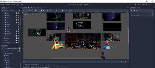
Screenshot of the main scene of Open Custom Night as of writing.
I really dislike Clickteam Fusion 2.5. When I was a wee lad I saw FNaF and wanted to make my own video games. I was inspired! So I spent the next 4 years of my life learning it. Huge mistake. CTF2.5 isn’t built for really doing any sort of complex games that might require multiple global objects or things of that nature. It’s very very limited. Not only that but it’s like 300 dollars for the full edition. Like no man fuck that. I decided that in order to prevent other kids from wasting their time learning such a dumb engine that’s hard to pirate and unreasonably expensive, I would remake UCN for it to act as an open source fangame template.
BUILDING THE AI
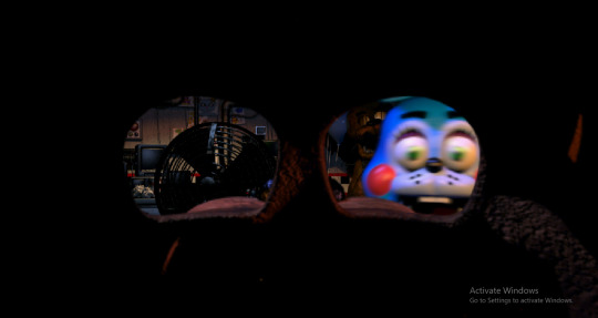
Scuffed photo showing Toy Bonnie in the office
So when I was first figuring out how to make AI for FNaF games, like back when I was on Clickteam, I came up with this: (rng.randi_range(2/(Global.animatronic), 4/(Global.animatronic)) And it works fine. Except... it doesn’t go from 1-20, it went from 0.01 to 0.20. I found later that this gave super wild results as some characters wouldn’t be able to move for upwards of 300 seconds on level 1 which is just downright silly. I then changed it to 0.11-0.30. As of now, it works just fine. I can change the range depending on the animatronic along with whatever specific calculations they may need.
This has a few implications. Whereas there is a small chance of animatronics failing movement opportunities repeatedly keeping them in place for long periods of time, this new AI calculation for some characters will guarantee that they will ALWAYS move within a specific time range.
MAKING ANIMATRONIC MECHANICS AND BEHAVIORS
Freddy was quite easy to get going as was Chica. A bit of a stumper for a moment was Toy Bonnie and Toy Chica. At first, I just had them go into your office until they reached a hard coordinate and if the mask wasn’t on in time, they would kill you. This movement was also scripted in the code itself. This worked but it was just a tad cumbersome. I decided to update this to have them move to a coordinate object that I could freely move around without needing to update the code to. But their movement would continue to be scripted. It wasn’t until recently I realized that I have animation tools in Godot which means that I can now animate this process!
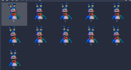
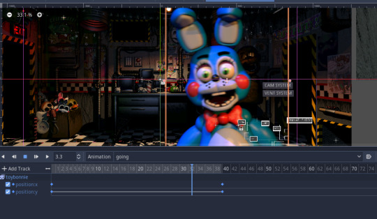
A look at Toy Bonnie’s keyframed animation along with his sprites are shown
I basically did the same for Toy Chica and the rest was history! BB and JJ are pretty unremarkable although they were both annoying to do as well. I also used these new animation tricks on them.
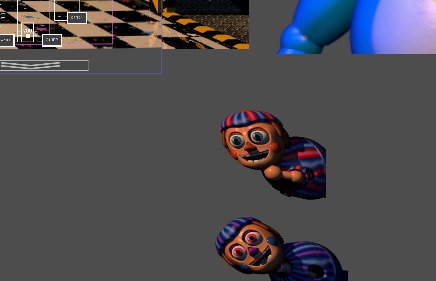
Demon spawns getting ready to strike
Mangle wasn’t too bad to program- at first. She required a new system to be added, the vent snare system. To be fully frank, I’m not quite sure how the map was animated in UCN. Did he update position manually for each phase she moved in depending on the path? Maybe? I hope not. What I did is that I animated out his path with keyframes and then for each time his timer ran out, his phase was updated and that also updated what frame of the animation he was on.


A look at the animation and Mangle’s code.
The main thing towards the end is that I wasn’t quite sure how to make it so Mangle knew which snare was active. I could’ve probably made some code about it but I wanted to try something a bit outside of the box. Mangle has raycasts attached to her. When those raycasts come into contact with an area collision shape, he’ll check if it’s specifically a snare or the “freedom” object. If it’s a snare, she’ll go back to the start and decide on what path he wants to take to get back to you. If she touches the freedom object, she’ll find herself in your office.
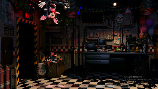
“Just hangin’ out!”
Before I move to the next bit I want it to be clear that I wasted like 30 minutes to an hour on trying to fix a bug with Mangle’s vent animations not playing properly. The way that I set it up is that everytime their phase is updated, the animation player will seek a certain point in the animation that corresponds with this. Since the animation was set to 1FPS, that means that phase 1 will go to frame one and so on. But I didn’t change the other animations to 1FPS. So that caused some uhhh. Issues. Haha.
A NEW PERSPECTIVE?
Give love and kisses to this handsome fellow. Without this guy I wouldn’t have the proper office effect quite yet. For some reason, in Clickteam, this effect lags games hard. It seems to be much more optimized in Godot. Due to this, there may not need to be any performance settings for a while. I’ll likely still have to include them anyways but man it’s nice to get some good frames.
MISCELLANEOUS CHANGES TOO SMALL FOR SECTIONS
Destroying animatronics: In order to save on resources when running the game during a hectic night, animatronics are straight up destroyed on the start of the night when their AI is set to zero. This means that they’ll all still be loaded and checked through at the start of a night however so this is mostly for long term performance. A way to load in ONLY the necessary animatronics at the start of the night to help performance in general is being looked into.
Dynamic audio: Some audio within the game now changes volume automatically depending on where it’s located. Previously I believe this was done by hand via code (something like, if in office, set the volume of music box to 0). Now due to the new engine, the game will handle this by itself without any coding being needed.
Music box additions: “Metal Scratchin’ (Sonic Rush)” has been added to the lineup of music that can be chosen at random.
WRAPPING UP
While I disagree with Scott’s political views and morals, working on this project has made me sympathize with him more as a game dev. If you wondered why a lot of the UCN enemies feel like random garbage, there are two reasons
Game design reasons. There would be way too much mental stack and stress from each animatronic having a counter that requires multiple steps.
Making some of these systems really fucking suck and it’s easier to make clones of characters or guys who don’t really do much.
Even though I’m not making a brand new game, some of the changes I’ve implemented bring out inherent changes in how UCN functions which means the design of the game has also severely changed. This is on top of whatever liberties I’m taking as well. Game development is hard man. But it doesn’t need to be perfect. It just needs to be a good template. This likely will not be a 100% recreation of UCN down to it’s easter eggs and extras but it’ll give new devs an idea!
Thanks for reading all of this if you even did! I’m gonna try to keep updating this as much as possible.
- Nemi
2 notes
·
View notes
Text
Learn Emacs?
I think Emacs is something best learned on the side, as a platform - as a programming language, a REPL for that language, a set of libraries, a framework for making GUIs (primarily but not exclusively text-oriented ones), and a package ecosystem. But you should not actually try to use it as your primary text editor, or even learn it as such. If you're like me, you'll spread this journey out in many little tries over many years, and that's fine.
Try the goodies built into Emacs that are not text editing. Try dired. Try eshell. Install Magit and try that. Maybe install and try a preconfigured bundle of config and packages like Spacemacs, not to grow into it but just to see what it's like. Try some Org mode stuff. If you ever use SSH or FTP or whatever, or even just sudo, try TRAMP. Try TRAMP with dired, try TRAMP with eshell, try TRAMP with anything else neat that you've found.
If you're like me, you'll probably walk away after each little thing thinking "yeah okay that's neat, But I don't really get what the big deal is, I could do the same with thing [...]". You'll notice how you could compose a lot of little UNIX programs together to do the same stuff, and you'll like that design more. You'll be annoyed by the startup time vs Neovim, you'll be annoyed by the out-of-the-box deficits relative to VS Code and IntelliJ's stuff and so on. That's fine. The goal is to gradually sample the platform.
To a much lesser extent, only if you're interested in sampling yet another possibility for text-editing interfaces, you might want to try learning its out-of-the-box keybindings for text editing, but... look, personally I think the out-of-the-box experience is at best bad-relative-to-what-you-already-know. I tried it a few times and for me, vi-style modal access to cursor movements and edit operations is a far bigger win than Emacs-style modifier-key access to the same.
You will see mentions of swapping Ctrl and Alt, because that's the layout on the old computers that Emacs' defaults were designed for. You'll also hear people suggest rebinding CapsLock to Ctrl. Honestly I think this is a lower-value detour, presupposing that Emacs as an editor out-of-the-box is worth learning, if only you could just optimize it a little to not give yourself RSI. But if you're going to do that, I suggest also trying Sticky Keys. Maybe it's just me, but I find Emacs' constant modifier key demands far more ergonomic if I can latch or lock modifiers as-needed.
Eventually, once you learn Emacs-as-a-platform enough, you'll start to see that all the little lisp functions and "modes" do a better job of being small composable pieces that do one thing well than UNIX CLI programs. Once you're sufficiently fluent in Emacs-as-a-platform, you'll find it easier to implement the behavior you want in Emacs than in the shell, or in your favorite editor.
And then, only then, will it have been worth it to have learned Emacs. Because then you can build your editor in Emacs. If nothing else, there's a critical mass where it becomes easier to incrementally improve your favorite editor by emulating it in Emacs first. And someone else has probably already done most or all of that work. And then you can keep incrementally improving on it, converging on an editor that's personally optimized to you - a bespoke tailored tool for exactly your mind.
Or that's the idea anyway. I'm not at the end of that journey, I'm just forecasting where it leads. After years of on/off poking at Emacs in various forms, I'm finally fluent enough that I'm incrementally creating something better than my favorite editor (and shell, and window-managing workflow) within Emacs. Not for the sake of doing anything with Emacs, but just because it feels faster and easier within Emacs now than outside of it. I don't know where this lurch ends. Every other lurch into Emacs ended with disappointment, with just enough inefficiency or annoyances that I just gave up on it. This is the first one that felt like it could end with me switching to Emacs as my main thing, but it's still entirely possible that this too will run out of steam.
And that's fine, that's the whole point I'm getting at. Every time I've jumped into Emacs, I made some sort of progress. And then I jump back out and run for a while with a terminal, shell, vi, and various CLIs as my daily tools, because I have to get stuff done after all. Sometimes I did some mix of both - I have memories of using Spacemacs to edit and a separate terminal with a shell for git.
2 notes
·
View notes
Text
White Knight - Chapter Two
Cory Ellison x OC (FanFiction) - MATURE 18+
Cory Ellison's coffee is stolen one morning in an unconventional first meeting with Elenora McKnight (Yeah, it's another Elenora character I really need to find new names). I do totally ship him and Bradley together, but I like my OC's
**Sorry for the delay in writing guys, I've been busy with the holidays, then A holiday, then I've been trying to get some books read, and then I ended up switching editing/writing programs so I had to transfer a lot of stories but I'm back!**
Warnings - There is mention of rape in this story.
Read: Chapter 1

Chapter Two:
Cory couldn't help but fidget with the crisp, white tablecloth as he waited for Elenora to arrive. Even though he thought he had left this nervous habit behind years ago, the weight of their impending discussion made it resurface. The lawyers had thoroughly reviewed the document and only had a few minor notes to make on any possible disputes. But even they were surprised by how easy and clean the deal seemed. There was hardly any room for Elenora to do damage to the company.
As they sat in the cozy restaurant nestled in the heart of the city's historic district, Elenora's choice drew Cory's admiration the warm colors, quaint decor, and homey atmosphere made it clear that this wasn't going to be a glitzy affair with crystal and caviar. It was still high class, but in a more understated way.
But what really struck Cory was Elenora herself. He struggled to wrap his head around her - someone her age shouldn't be trying to buy a legacy news outlet. They should be buying clubs and spending money on expensive cars, designer dresses, and top-shelf booze. Yet here she was, using her wealth to invest in non-profits and modest homes adorned with yarn and books.
No wonder she had disappeared off his radar over the years. She didn't seek attention or praise; she distanced herself from the lavish world she came from. Despite being in the spotlight of the Me Too movement, Cory hadn't even noticed her until now. And as she entered the restaurant, it was hard to believe that anyone could ever miss seeing this woman.
Her long hair cascaded down one shoulder in smooth, straight strands. Her dress, a rich shade of red with a high collar and delicate lace detailing, gave her a dreamy and romantic aura. The form-fitting bodice accentuated curves that had been hidden under the professional attire she wore to the office. Elegantly stylish, yet simple and understated - it was a perfect reflection of Elenora herself.
With the click of her black heels against the polished wooden floors, Elenora glided towards Cory with a confident smile. The sound of her steps echoed softly in the restaurant, creating an air of sophistication and grace. As she approached, Cory stood up from his seat to greet her, his eyes taking in her stunning appearance.
"Elenora, you look absolutely radiant," he said with admiration.
A small smirk tugged at the corners of her lips as she looked over the older man's attire.
“And you Cory, you’ve changed your suit. I like this color much better; it makes you seem more at ease."
The black suit he had worn earlier was now replaced with a dark grey jacket, a sharp contrast against his crisp white shirt and dark tie. A wait staff, dressed impeccably in matching black uniforms, followed Elenora and helped her into her seat. Once settled and her clutch carefully placed on the edge of the table, Cory joined her at the table.
Their conversation was quickly interrupted by a waiter approaching with a platter holding two drinks. "Bourbon for Sir, and a Gin and Soda for the lady," he announced before slipping away.
Elenora raised an impressed eyebrow at Cory. "You did your homework."
"I rearranged my entire day after your unexpected visit. I figured a fact-finding mission was necessary," he replied smoothly.
"I would expect nothing less from the Great Mr. Ellison," she remarked with a hint of amusement in her voice. She picked up her drink and took a delicate sip before setting it back down on the table. "Now tell me, who is Elenora McKnight?"
Cory leaned back in his chair with a sly smile. "From my research, she is an advocate for human rights, valuing authenticity over materialism. And should anything or anyone she loves come under threat, she will defend them with unwavering ferocity."
There was a moment of silence as Elenora's piercing gaze seemed to see through Cory's exterior. Her mind raced, processing his unexpected answer. It was not the response she had anticipated.
"Ahh, I seem to have left you speechless," Cory observed. "And I have a feeling that doesn't happen often."
Elenora's slender fingers wrapped around the crystal glass, her nails painted a deep crimson that matched the faint stain on the rim of the glass left by her lips. She downed the drink in one smooth motion, relishing the burning sensation as it slid down her throat. Setting the glass back down on the table, she narrowed her eyes, determination shining through their deep hazel hue.
"Usually, everyone's first response is to give me pity," she said, her voice laced with a hint of bitterness. "They look at me like I'm some broken doll in need of fixing. But you aren't looking at me like that."
Cory's gaze remained steady, his intense blue eyes meeting hers without faltering. "How am I looking at you, Elenora?"
"Like you're waiting for me to set fire to the world," she replied with a small smirk.
"Then we are on the same page," he said, matching her smirk and picking up his own glass. He downed it in one go, mirroring Elenora's earlier actions. With an easy confidence, he waved a waiter over. "Another round, please."
With a nod, the waiter disappeared into the bustling restaurant. Elenora turned her attention back to Cory.
She smiled at the waiter who had returned drinks in hand and asked, "Could you please have Sanjo bring over a platter of his fresh catch for today?"
"Right away, ma'am," he replied before disappearing once more.
"Hope you like sushi," Elenora said, turning back to Cory with a glint in her eye.
"I love it," he replied, his tone filled with admiration for her boldness. "Almost as much as I loved that deal you sent over. But I still have a question. I've read some of your work and it's good. If what you want is to report, you could do that anywhere. So why U.B.A.? Why this company when you could work anywhere?"
"It's you, Cory," Elenora said with conviction. "I want to work at U.B.A because I want to work with you."
"I'll do my best to meet your expectations, Elenora," Cory said with a smirk.
He extended his arm to grab his drink, and their eyes met in a heated stare. Their glasses touched, producing a crisp sound that echoed through the tense air. They both took a sip, their lips lingering on the rims of their glasses as they maintained their intense gaze towards each other.
A loud, booming voice rang out across the bustling restaurant floor, causing both Elenora and her companion to turn their heads in surprise. Elenora's eyes crinkled with amusement as she suppressed a laugh at the sound.
Standing up gracefully from her seat, Elenora turned to greet the owner of the establishment, Sanjo Hatching and strode over to him with open arms.
"Sandy!" Elenora's voice was just as loud and enthusiastic as the man's, and she enveloped him in a warm hug. Sanjo returned the embrace, his large hands resting gently on Elenora's shoulders as he looked her over with a fond smile.
"You don't write, you don't call, and then I find out from my maitre d' that you've requested a table for two tonight."
"Sorry, Sandy," Elenora apologized with a sheepish grin. "I've been traveling the world since it reopened. I've only been back a few days, and you were going to be one of my first five stops."
"Five?" Sanjo exclaimed incredulously, turning to look past Elenora at Cory. "You hear this one? Used to be I had to unlock my doors for her because she would get a craving for my southern fried chicken after spending all day and night in that studio of hers."
Elenora laughed heartily, memories flooding back from her years as an aspiring artist. "And you were a lifesaver for it. Sanjo, this is Cory Ellison." She gestured towards her companion. "Cory, this is Sanjo Hatching, the proud owner of this wonderful establishment."
Cory stood up, his hand outstretched in greeting to Sanjo who eagerly took it. As they exchanged pleasantries, Sanjo's eyes roamed over Cory before settling on Elenora. A smile stretched across his face as he leaned in towards her. "He's quite cute," he remarked.
A slight cough escaped from Cory's lips at the comment, and Elenora couldn't help but let out a giggle in response.
"Now now, let's keep this professional, Sandy. This is a business meeting."
"Honey, I've seen your business meetings," Sanjo countered with a mischievous twinkle in his eye. He gave Elenora a once-over before turning back to Cory. "She doesn't dress like this for just any meeting."
Cory flashed a smile at Sanjo's remark. "Do you come here often?"
"This one believed in me when the banks wouldn't. I owe her everything," Sanjo explained gratefully.
Elenora placed a reassuring hand on Sanjo's shoulder and turned to face Cory. "You would have been fine on your own; I just wanted to help get you going sooner. Plus, I needed easy access to your amazing food or else I would have starved."
"Don't let her fool you. She may seem timid and reserved, but when it comes to business, she's a shark. Whatever project this is for, trust me when I say she will exceed your expectations," Sanjo praised.
Elenora's cheeks flushed pink and the rosy hue spread down her neck and across her visible collarbones.
"Well, she already has my endorsement, but it's reassuring to know I'm in capable hands."
"Oh, you most certainly are..." Sanjo began before Elenora quickly covered his mouth with her hand.
"I know exactly what is about to come out of that dirty mouth of yours, Sandy. Time for you to bid your farewells and make sure your new chef isn't burning down the kitchen," Elenora said with a stern tone, though a mischievous smile played on her lips and her shoulders shook with suppressed laughter.
After she removed her petite hand, Sanjo bowed his head ever so slightly in a gracious manner. “It was a great pleasure to meet you, Mr. Ellison.”
“You as well, Mr. Hatching,” Cory replied with a genial smile.
“Ahh, and here is your food,” Sanjo exclaimed happily as the sushi arrived at their table. “Try not to fill up too much; I have some surprises I would like you to try. See if you think I should add them to the menu.”
“That sounds delightful, Sandy,” Elenora chimed in as she stepped away from the man to sit back down across from Cory. A few moments later, the two were left alone with a beautifully arranged platter of sushi sitting before them.
Cory couldn't help but notice the elegant setting of the restaurant, with its minimalistic yet refined décor, was a far cry from the usual fried chicken joints.
“So this place doesn’t strike me as a fried chicken type of establishment,” he remarked, eyeing the delicate china plates and crystal glasses on the table.
“It's my guilty pleasure,” Elenora admitted with a playful smile. “Sanjo makes fried chicken that rivals any southern style cooking, and it is truly exceptional. But he likes to keep his menu more on the upscale side for the general public.”
Several hours had passed, and the once bustling restaurant now sat empty as Cory and Elenora remained at their table. Cory's suit jacket was haphazardly draped over the back of his chair, and his tie hung loosely out of the pocket. The sleeves of his shirt were rolled up, and his carefully slicked-back hair had become slightly disheveled from running his fingers through it in laughter.
Elenora, meanwhile, had produced a clip from her clutch and hastily pinned up her hair. Her discarded shoes lay on their sides on the floor, forgotten in the midst of their lighthearted banter. She sat with one bare foot resting on the seat of her chair, the skirt of her dress pinned under her knee to maintain her modesty in her relaxed pose. With chopsticks in hand, she attempted to pick up a spring roll, but after a few failed attempts, she resorted to impaling it with one stick.
Cory couldn't help but laugh as Elenora finally managed to take a bite of her roll. After setting down the remaining half on her plate with a satisfied groan, she turned to Cory with excitement. "You have to try this one; it's amazing!"
Smiling, Cory took the protruding chopstick offered by Elenora and finished off the piece. "Mmm," he hummed in agreement as he chewed and swallowed. "That is good."
"SANDY! THAT'S THE ONE!" Elenora suddenly shouted through the empty restaurant.
"PERFECT!" Came the enthusiastic response from Sanjo in the kitchen.
Cory's phone, which he had absentmindedly placed on the table earlier in the evening, suddenly lit up with a new message. The bright screen displayed a time reading of one thirty-seven, causing both Cory and Elenora to pause their conversation. A fleeting shadow of vulnerability flickered across Elenora's face, tugging at Cory's heartstrings.
"We should probably call it a night," Elenora said, her tone shifting from light-hearted to business-like. "I'm sure you'll have your hands full tomorrow."
"Yeah, I can already imagine the reactions from the board," Cory replied with a sigh. "Some will see your offer as the solution to our problems, while others will question your intentions and I'll be left to fight for your cause."
"Ah, old men set in their old ways," Elenora muttered with a resigned shake of her head. She slowly stood up from her seat, a mix of determination and weariness evident in her movements. "SANDY! WE'RE LEAVING!"
A muffled groan came from another room before Sanjo's head popped out from around the corner. "Fine, go have your fun without me. But you better not miss next month's gathering. I've noticed you haven't filled out the RSVP."
"I wasn't sure if I would even be in town, but it looks like I'll be sticking around for a while," Cory replied with a smirk.
"Excellent! I'll put you down for two then," Sandy chimed in with a cheeky wink, eliciting a chuckle from Cory.
With a tug on his coat and a quick check of his phone, Cory and Elenora gracefully exited the restaurant as Sanjo held the door for them. The crisp night air hit their faces, carrying with it the faint scent of jasmine from nearby gardens. Once they were on the sidewalk, Elenora turned to Cory, her expression softening in the dim streetlights as the weight of the evening settled upon her.
“I hope you know you’re going to be my plus one for that event. Because if you don’t show up with me, I won’t hear the end of it.”
“Send me the details,” said Cory, deftly unlocking his phone and offering it to her. Their fingertips briefly brushed against each other, sending an unexpected shiver down Cory's spine.
Taking the device, Elenora meticulously typed in her first and last name along with her phone number, her touch lingering on the screen before passing it back to Cory. He quickly composed a message and Elenora felt her own phone vibrate in her purse. She glanced around the quiet street before turning back to Cory, her eyes searching his for something she couldn't quite put into words.
"Don't you have a driver?"
"I told him to leave after we got to the champagne. The studio provides a few rooms at a hotel a few blocks away, and I'm sure I can walk in a straight line for at least ten minutes," explained Cory, pointing towards a direction away from the restaurant. Despite his nonchalant tone, there was a hint of reluctance in his voice to part ways with Elenora.
Elenora's voice carried a tinge of longing as she pointed in the opposite direction, towards her home an hour away. "I'll try to flag down a cab," she said, resigned to the fact that she would have to leave this moment behind.
But then Cory's suggestion filled her with excitement, his eyes sparkling with eagerness as he closed the distance between them. "Why don't you come to the studio tomorrow? I mean today. Stay at the hotel tonight and I'll have some clothes delivered for you. You can experience the hustle and bustle of the U.B.A. firsthand."
A bright smile lit up Elenora's face as she stepped closer to Cory, feeling his warmth enveloping her. She allowed herself to lean into him, if only for a brief moment. "No funny business?" she asked in a hushed tone, her heart fluttering in her chest.
Cory grinned and draped his jacket over Elenora's shoulders, his touch lingering longer than necessary as he savored their fleeting connection. "No funny business. You'll have your own room and I'll let my female assistant know your sizes. We can even grab breakfast together in the morning, but you better not steal my coffee again."
Elenora smirked playfully, her eyes glinting with mischief as she soaked in Cory's presence for just a little while longer. “I make no promises.”
Chapter Three Coming...
1 note
·
View note
Text
Platformer Game Development
Edited on 5/4(April)/2024
I have found a lot of findings from the first-time experience of using Gdevelop for creating a game. There were many things I managed to pull off and many I could not. I’m going to talk about things I managed to make into reality by seeing pictures.
Achievements and Learnings

1st picture: I was able to implement a very plain menu screen. The game can be started by pressing the left mouse button on start.

2nd picture: This is the main game component. The game is still in a very primitive form but functional. Here is the list of mechanics I successfully implemented in the game.
: Player character movement, including a double jump
: Some slime enemies to fight, they can also damage player
: A respawn area (red area) to prevent player character from stuck in falling
: Scoring mechanism by collecting coins and defeating slimes
: Goal flag as an objective for completing the game
: Sound effect to be played when player collects coins
3rd picture: This is a screen that player will see if the player character successfully touches the goal flag at the right. Its style is basic as well and shows you the overall score at the end.
I found most of the programing aspects to be a lot more time consuming than I initially expected. Even the simplest thing such as turning the slime in another direction requires so much convoluted processes of setting up variables to each object. However, I had a lot of fun tinkering with codes to make them work, even though I had a lot of frustration through programming when I could not make them work correctly.
Inspiration from the Book
In terms of inspiration from the reading, I think my primary focus for this time was on formal elements over dramatic elements. Both of which appeared in chapter 2 of Game_Design_Workshop(Fullerton, T. (2018, pp. 31-56)). I feel that although it is not something spectacular, I managed to put some essence of the element into my game. In the book, the definition of the game was described as completing an undetermined goal with an uneven reward for players in a closed area alongside a set of rules to follow (Fullerton, T. (2018, p. 48)). In my game, there are rules such as player character lose life if a player fails to jump over the pit and it is a closed area apart from the reality. Competition might not be in my game as this is a single player game, but generally met the structure of the game described in the book.
Thoughts on Reading
If I have a chance to improve the game further from here, I would like to implement management of resources that was discussed in chapter 5 of the book (Fullerton, T. (2018, pp. 129-166)). Resource flow plays a crucial role in determining the difficulty of games in almost every genre of videogames and the reading made me think again about why some games feel more unbalanced while others do not.
Reference
Fullerton, T. (2018). Game design workshop : A playcentric approach to creating innovative games, fourth edition. CRC Press LLC.
0 notes
Text
What is kinetic type?
Part of my research was to understand what the fundamentals of kinetic type truely are. I wanted to find out why is it important in todays environment and ultimately, what makes a good kinetic type animation.
I looked at a resource posted to Explain.Ninja and found exactly what I was looking for. The author (unnamed) states that:
"Kinetic typography definition is a type of visual art where the text plays a significant part. The task of the text is not just to convey the semantic meaning but by all means available: movement, color, shape, and size, to correctly build and enhance this meaning, causing the viewer to have more vivid emotions and experiences. So the text brings dynamics and life into the reading."
While I had previously defined kinetic type I much prefer this description. Now that I am somewhat more understanding of the animation process (albeit incredibly new) I have a new-found respect for this description and I therefore agree with the quote.
Why is kinetic type important?
"Kinetic typography is another way to beautifully style text with animation. This technique allows for a flexible presentation of information, which is why it is widely used in music videos, advertisements, scientific programs, and content from video bloggers. A particular kinetic typography style used in digital assets will make these elements catchier and more effective in impressing a new audience. One of the significant reasons why kinetic type animation video is so useful is due to an entertainment factor. An audio-visual description added will get a very short amount of time to impress the viewer, as well as engage. So you shot once and hit twice."
It seems to me that from this description that kinetic type is important to grab the attention of a viewer. It is essential in fluid media such as video/movie/TV production and therefore is a quintessential asset to learn as a designer. And the end of the second paragraph relates directly to what I am doing; by bringing in another sensory element (such as visual in my case) I can better engage the viewer and "hit twice". In relation to a business, introduction of multiple sensory elements is a key principle in strategic design (as per content learned from my strategic design minor). We are reinforcing the message (the audio) by introducing a visual gauge to capture the attention of a viewer.
What makes good kinetic typography?
"Kinetic or motion typography may look both classic and fresh styled in graphic design. Dynamic motion typography is good when the elements that make up the film text can move in relation to one another. Moreover, every UI animation should be justified and have a goal. This means that your moving texts as with any design element should also help the user achieve the goal and highlight the outcome. The best process will include selecting elements like alphabet case, typeface, set, and font size. It should justify line length, inter-letter, inter-word, and line spaces, and the relative position of text and other illustrations included if any."
From what I understand from this paragraph is that good kinetic type assists the viewer (or user) to achieve a goal. Within the context of my own work that would be to better understand Helen Clark's stance on the legalisation of Cannabis within New Zealand. Furthermore, justification of relative positioning, spacing and illustration work should be done (and due to this being a project I of course will be doing).
When should you use kinetic typography?
"Kinetic design is especially useful for animated videos that require a lot of text or too large words, as it may be slowed faster and enough to simplify them and capture the attention of the viewer."
This point is especially useful since Helen Clark is talking incredibly fast in my audio and uses many large words that by visually seeing moving around would better stick in the head of a viewer. Although due to restrictions of the project, I will be unable to edit the pace of the audio.
Concluding thoughts:
Overall I am glad that I looked into why kinetic type is important, when it should be used and what makes good kinetic typography. My understanding and reasoning of what my overarching goal is; to make something that pops, and gains the attention of the viewer rather than just a plain caption on a black screen. I have the opportunity to create a creative and dynamic project that I can relate back to the character of Helen Clark.
0 notes