#also see me LOVING how Maxwell Fine talks about the differences between nick andcharlie's bedrooms and the thoughts on those UGH YES
Explore tagged Tumblr posts
Photo
Screaming. Crying. Throwing myself against a wall; A walkthrough of Netflix’s ‘Heartstopper’ with Set Decorator Maxwell Fine
Image credits: Netflix, Rob Youngson, See Saw, Maxwell Fine
This post has been copied from Maxwell Fine's website for future reference.
My phone didn’t stop buzzing on a random Wednesday in February 2021. Colleagues and friends were tweeting, facebooking and whatsapping me to tell me See Saw was producing a new show called Heartstopper for Netflix and I had to get myself involved. After making a little bit of a name for myself in LGBTQIA+ creative projects earlier in my career It sounded like the perfect fit for my next TV show!
I’m Maxwell Fine and for the past 10 years I have worked as a Set Decorator in TV, Advertising and Music promo. I’ve been in the most bizarre and fabulous situations on set from steaming silk curtains for Kate Winslet on a Lancome campaign to watching Lady Gaga be strung up to a studio ceiling in Japanese ropes for an Art Film. I’ve made panel shows, scripted comedies and fiercely bold dramas for BBC, Disney and Netflix amongst others - the list really does go on and on.
Thankfully, my phone often rings and my inbox is filled with requests here and there “can you do that?” or “Are you available to jump on this?” and on this particular random Wednesday afternoon, the brilliantly bold and BAFTA award winning designer Tim Dickel, asked me to jump on a Zoom to discuss a new project.
I had never heard of (the absolutely delightful) New York Times Best selling Author, Alice Oseman’s ‘Heartstopper’ before the script landed in my inbox. Like a lot of people, once I discovered it I couldn’t get it out of my head. There were so many parallels to my own life and I immediately understood why it was a queer story that just had to be told mainstream. If you can, you must - and so we did!
A few years previous I had campaigned for Switchboard LGBT+ helpline with the launch of my Print and Neon sculpture project ‘Robbed’. I created a load of typographical artworks inspired by a mentally exhausting jaunt I had with an ex partner who struggled with coming to terms with his sexuality.
The Art Department on a shoot take care of everything visual. From designing and building sets, booking Animals and Characters Vehicles, Food styling through to all the props and furniture used to dress a space. Paperclips to Spaceships - it’s up to the Art Department who design, buy and coordinate. As a Set Decorator, I work with a Designer and team to bring their vision to life through … stuff!
Observation is king.
I learnt to be a keen observer really early in secondary school. I was around 14 years old when I found myself squirrelled away at the back of the Art Classroom. I found myself set up on a stool next to the photocopier because I wouldn’t stop talking to my friends all lesson. I soon worked out that I really liked playing with materials and making things and so, headphones in I would sit for hours and hours, in lunch breaks and after school - making things. Painting, drawing, crafting sculptures, working with layering, cutting things out, trying again and again to make something out of nothing - a theme that would take me into this weird and wonderful career in Television!
We were being taught to observe. A weird task perhaps but an important one that would give me grounding for my future career working in TV design! As students, we would look at the world around us and try and replicate. Impressionist brush strokes, shadows and highlights on fruit, the texture of an onion out of papier mache - whatever we were working on - observation was king. Looking back now, I can not stress enough the importance of this life skill.
I gently honed my craft and with a lot of encouragement from teachers I passed my GCSE in Art and moved onto A Levels, then graduated Secondary school to a Foundation course in Art and Design and then onto Central Saint Martins to study Performance design as a University degree.
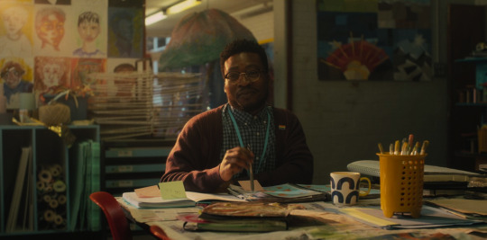
When we find Charlie sitting alone on the floor in the Art Classroom pondering life, it really made me think back to my own experience at school. Okay - so it’s wasn’t quite the same and our stories are different - but that connection to creativity and our shared curiosity with the world Charlie has is familiar to my story too.
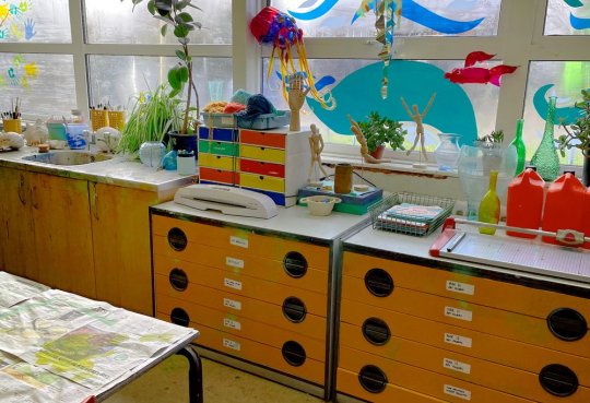
In practice, being lead by our brilliant designer Tim, I tried to take the messy creativity of my own Art Classroom at School through to the Art Classroom at Truham. Together with our fabulous Production Buyer Zoe Seiffert and our Art Department team, we worked to create endless lists of what we were going to put in this empty room to bring it to life as a working Art Classroom.
I dug out some old photos I had of my Art room and we started to observe and take notes. Paint bottles, dirty brushes, coursework, notebooks, portfolios, stacks of paper. “Plants! We always had plants!” Zoe noted - quick - we popped some plants in the space and then our Art Assistants started making sketches of leaves, paintings of trunks to put around the place - as if the students had had a botanical project of some sort and had made work from the objects around them. All the amazing Artwork you see in the space was conceived by Tim and made in house by our team. Themes of Identity, open doors, the eye project, animal and environmental sculptures, self portraits - we were really exploring classic school themes here!
We added layers upon layers to bring life to the abandoned school we were filming in. We brought in coloured glass objects on window sills for light to bounce through, splattered paint all over the walls and repainted furniture. Our Art Assistants made recycled sculptures from coloured cellophane we found at a recycling warehouse on the outskirts of London. Tim has a knack of finding brilliant source images to work from. Sea animals, giant Jellyfish sculptures, Cassette tapes made from string, Fingerprint Artwork made from Newspaper cuttings - the creativity was endless!
You may notice throughout the series the Artwork in the room changes as the story moves through the seasons and our Characters develop their romance. Cacti sculptures come into bloom, Tissue Paper buds begin to blossom and we add more detail as the series progresses - in a way, the props here have their own way of growing with the Characters!
To say this set specifically was a labor of love is an understatement. We moved the artwork around the walls more than you’ll ever know, mounting, stapling, creating labels and really trying to capture the vibe of a busy British Secondary school Art room. We knew it was the one place in School where Charlie seeks refuge and so the relief of uncapped creativity needed to come through the props and dressing in this space more than anywhere else in the School.
Continuing our theme of integrating Alice’s illustrations, the sets in the Schools are almost their own character!
Tim was keen to create contrasting shapes and block colours to define spaces and keep the visual clean and graphic. The team made some epic 3D science posters in the Higgs form room and printed a semi transparent window film of the Periodic table to put in the window panes. Throughout the schools you can find nods to illustrations. From the Hokusai inspired blowing leaf mural (drawn by Alice!) in the Hallway (a beautiful nod to the winds of change!) at Truham to the Julian Opie inspired mural outside by the picnic benches. The best design ideas are often the simplest.
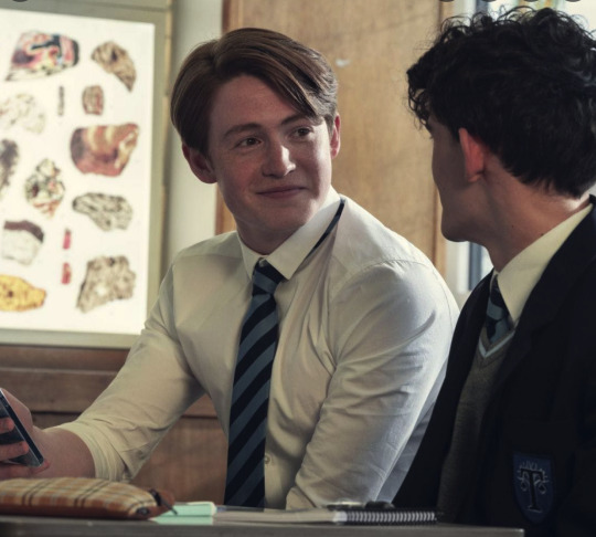
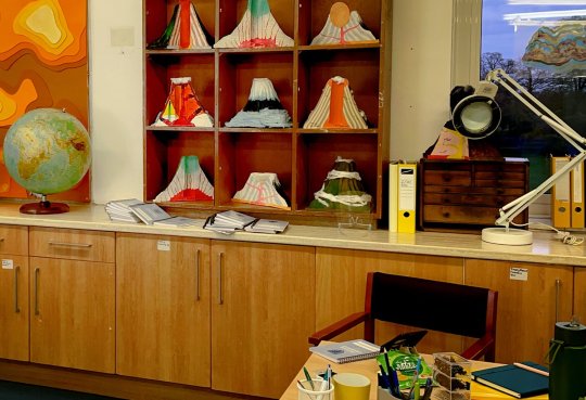
Tim wanted to work with the concept of a Geography classroom in the Truham Form room. Volcano sculptures made by students (actually made by our super talented Art Assistants) and segmented diagrams of Geodes and Rocks on the windows. We even found some really cool sandy beige school chairs from the 70’s to use here. Tim loves using light panels and placed a brilliant display of backlit images of rocks in the corner behind Nicks head for the scene where Charlie and Nick first meet. I loved the idea of rocks being formed under pressure and the metaphor of our characters blossoming romance - it all seemed to fit quite nicely. There are little gems like this all over the sets if you’re on the look out!
How to fill an empty space
Rule number one: Some spaces need to remain empty and some spaces are full on purpose.
Everything you see on screen is intentional, from dying plants to folded post-it notes. The colour of confetti through to the pattern on Nellie the dogs collar - every single item was hand picked by the Art Department with intention. You might think, why does this matter? Well, if it was any other way - we’d be telling a different story!
I talk a lot about contrast in this blog and really it’s the idea of full spaces vs empty spaces, light rooms vs dark rooms that bring the magic of a set together. The Dark, empty hallway Charlie follows Ben down vs the busy bright and colourful Art Room Charlie feels truly comfortable in to discuss his innermost feelings with Mr Ajai - everything we do is designed to support the storyline.
Working from Alice’s source material, we wanted a sense of hand drawn details in our sets. You can see this in patterns on ceramics and fabrics all over our sets. We tried to select elements that had a friendly illustrative element to them, from mugs to water bottles, curtains to cushions. The shapes within objects have softness, curves, uneven lines - we set ourselves guidelines to know what sort of objects to search for when we were buying.
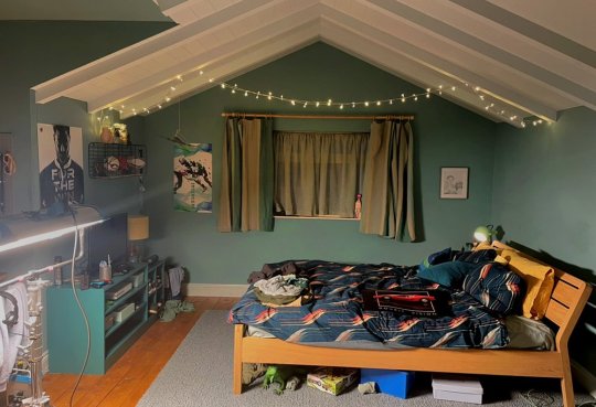
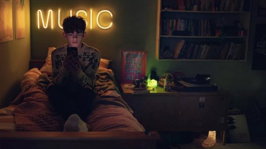
As in most film shoots, we worked to create the perfect environment for our characters to exist in to let the story unfold. Charlie’s room is eclectic and messy because his story can be seen as eclectic and messy. He absorbs everything going on around him, over thinks and questions everything, so our question was; how do we show this through stuff?
Nicks room is more uniform in style. Nick’s life can be seen as more stereotypically ‘together’ than Charlie’s and so his Bedroom reflects this. It looks more settled and more formulaic. For me, the way Charlie embraces his sexuality is a direct result of him being so creatively curious in life. Although he might not think it, he’s bold, courageous and sure of himself. We wanted to create a design contrast between Nick and Charlie’s spaces to show their differences. Having such rich source material from Alice’s illustrations was a brilliant starting point for us to create from.
Our team worked on fleshing out the illustrations and adding layers of British Teenage life to them. We discussed how these characters would have grown up in these bedrooms and what the objects would be within them that make the bedrooms theirs.
There’s magic in the clutter!
We try to create a sense of realism by mixing and contrasting objects and colour tones. Brand new things next to vintage fabrics, hard surfaces next to soft, light next to dark. It can even get as granular as Matt next to Gloss - it’s all in the contrast. People tend to gather things in their environments over time from all sorts of places. It’s our job on a shoot to find the balance and create a convincing space in a super fast turn around -often a matter of weeks from concept to finished set.
Charlies bedroom wanted to be messy but also had to have a sense of ownership. We wanted to give him layers and layers of life that had collected as he’d grown up in the bedroom. We start with working out the furniture and then the rest falls into place from there. Our question often was, if there were 100 objects available what ones would Charlie pick to have in his bedroom? Out of all the things in the world, what represents him the most? Lamps, shoes, trinkets and bedding, books and posters - everything chosen specifically with the character in mind. I like to think the props tell their own story!
Early on Tim was keen to involve graphic shapes in the design for Heartstopper which came directly from Alice’s illustrations. The key to this was pulling reference directly from the Graphic novels. Stripes, stars, squiggles, leaves - you can see it in every scene and every shot. I found the rug from Charlie’s bedroom in a closing down sale in North London. We thought it worked really nicely with its bold geometric shapes in the scene where Nick and Charlie are on the floor doing homework.
I knew from reading my scripts (1000 times) that we had a sleepover here and our Characters would be hanging out on the floor. We found a vintage mattress to pull in on the floor for this scene and a load of random bedding and camping accessories we imagined would have been hauled out of the attic by Charlie’s dad. Charlie’s ‘cabin bed’ is raised up on cabinets which gives us some texture and shape behind him when he’s leaning against it sitting on his bedroom floor.
I found a job lot of amazing vintage erasers - we really wanted a sense of collections and nic’naks on shelves, stuffed behind the bed and on the desk. Our Art Assistants set to work scribbling, doodling, scratching marks into the furniture and remaking various things to turn one thing into another. A camel sculpture wears a vintage Action Man jacket, Toy Soldiers climb around Charlie’s bedroom door. It went on and on, including the excessive Converse piled around the room and plenty of Knitted jumpers noted in the graphic novels! If you looked super closely, we even scratched height marks into Charlie’s bedroom door frame as if his parents had noted different heights as he grew up.
Tim wanted realism in the sets to ground them in something believable and provided us with a lot of creative references to work from. We spent a long time researching what teens had in their bedrooms to guide us! I was asked if I could frame one of my Art prints for Charlie’s bedroom and we thought that the iconic ‘Stand Tall’ print would be the perfect piece to pop on his bedside table. It’s available to buy here if ever you needed an ounce of positivity and encouragement in your life too!
Our fantastic Art Assistant Anastasia Louka is a creative force and is behind most of the hand drawn elements in the show. Anastasia set about doodling and drawing, scribbling and making little personal bits all over the sets. The idea was to show a life lived in these spaces. We love stuff and our stuff (much like our clothes) show the world who we are.
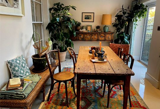
Charlie’s house wanted to continue on the theme of being relaxed and creative. We wanted to create a connection to Charlie’s bedroom with a more grown up feel to it. The house needed to be familiar and cosy - we settled on the idea of his parents, much like Charlie being worldly people who had collected a variety of things in their lives. Peoples homes and bedrooms are often nests where they bring objects back from their experiences out in the world. Human beings are brilliant collectors of stuff and we try to show this when we work on sets for any project.
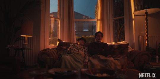
We set about buying in a load of artifacts from their travels, lots of terracotta and memorabilia from Europe. We thought about trinkets they may have brought home from a holiday to put on Kitchen surfaces, bits and pieces Charlie’s Dad may have collected over time on the fireplace in the living room. Teapots and vases, jugs and magnets - all sorts! I found a patterned sofa on eBay that I thought looked super comfy and something his mum would have bought when they moved in. Maybe something to bring gentle nostalgia for that iconic scene where Charlie is asleep on the Sofa with Nick.
I think the whole vibe of the house is that they’ve been there since Charlie and Tori were kids. There’s something about an old house that is so warm and lovely rather than something new and clean looking that can be a bit more hostile as an environment. Rather than going heavy with pattern, we worked with variations on tone and colour shades within ceramics and various pieces of wood furniture with knocks and deep wood grain to look like they had lived a life. We carried this through to slouchy cushions and floppy tropical plants, everything we put into the space was to create a sense of warmth, the sets here were almost sunkissed.
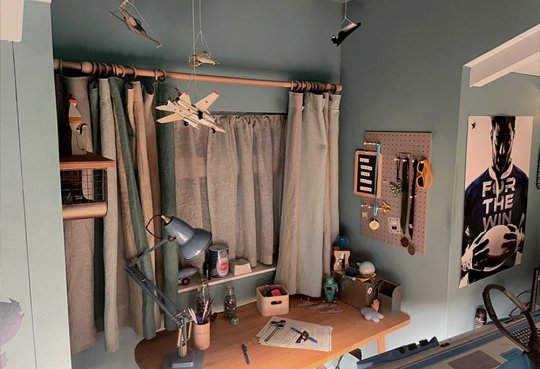
Nick’s room wanted to be a contrast to Charlie’s. In Charlie’s bedroom we see a lot of personal creativity in the objects he surrounds himself with. It’s almost like his Mum has decorated it for him and he’s added personal touches as a layer on top of that. We start our story with Nick not really knowing much about his sexuaility, so we wanted to add heteronormative touches to his room to ground his Character visually.
Our King of Rugby has a lot of trophies and sports medals. We dressed Robots on the window sill, Tin Spaceships and sports themed games, metal gridded shelving, Aeroplanes hanging from the ceiling and of course a load of hoodies everywhere - it’s a boys bedroom. There are a few bits from when he was younger but we thought maybe his mum had had a good clear out and a redecorated as he grew up. He even has a double bed!
As with all our sets, when we have hard surfaces we needed to cosy it up a bit and we do this here with soft linen curtains, throwback bedding and a slouchy corduroy beanbag. I especially loved Alice’s ‘Straight boy puts up one string of fairy lights for Christmas and never takes them down’ vibe.
Of course, there’s buckets of personality in Nick’s bedroom too but we wanted it to be less free flowing and fluid than Charlie’s. Knowing Nick’s mum was a Doctor we thought there had to be a sense of formality and style to the space to contrast with Charlie’s wholly creative and organic environment. The most ‘out there’ this room gets is the bright yellow sunglasses hanging on the peg board! Crazy Nick ;) There’s more structure to the objects we put into this space, less eclectic and more scandinavian design themes - block colours and cleanly shaped objects in light wood, chrome and frosted perspex. I think this sets the tone for a teen who seemingly has his life together and allowed us to strike that distinction when he realises it may be taking a turn in a different (but fabulous) direction as our story develops. I guess it depends on how much you think ‘stuff’ defines a person.
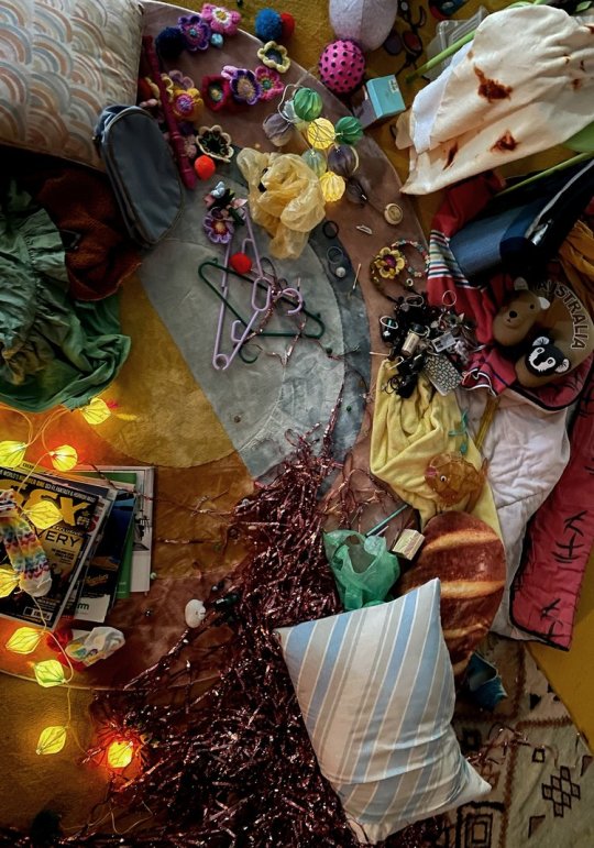
We had the challenge of bringing life a few more amazingly detailed bedroom sets for the other Characters in our story. We knew we wanted a Top-Shot of Darcy’s room and that they were super super expressive as a person. We set about finding all sorts of things to have on their bedroom floor that they could lay amongst from toys to clothes through to random bits of bedding from their childhood and even some fun fairy lights and streamers to throw into the mix. Elles bedroom was a bit more refined, she’s a talented artist so we made a load of doodles and paintings to put on the wall. The fun part was getting variations between the bedrooms and this comes through in the detail the team put into the sets.
Tao’s bedroom was bursting with Polaroid photos and amazing Artwork made by our in house Graphic Designer Mike Cranston. For this set, Tim wanted to push through that Tao was a film lover so we collected a load of vintage equipment, old cameras and even wire sculptures of cameras to dot around his bedroom. Tim found a gridded wallpaper to use as the base to line up all the wall elements with and it flowed from there - LED lighting behind the bed, cool perspex shelves to display his collection of cameras on - it all came together and was the perfect setting for Tao and Elle’s movie night together!
Tara’s bedroom was one of my favourites - the script said she was surrounded by stuffed toys - so we went to town and covered her entire bed in 40 teddy bears! We also got to work on a snippet of Isaacs bedroom as he sits against a wall (classically) head in a book! With all of the sets, we tried to get a lived in look going by washing bedding on a high heat and leaving out to air dry and putting them on the beds unironed. It’s all in the detail!
Harry’s 16th Birthday party is where it all comes together so we had to make it fabulous! When Designer Tim asked us to arrange Balloons all over the exterior of this magical building I knew exactly who to call. Our fabulous Balloon Queen Jane and team were up for the task! We had some coloured balloon samples sent to our office and plotted out where the balloons would go on a print out of the building. There were 1000’s of Balloons inflated indoors the day before filming and then were strung out of windows for the shot when Charlie arrives at the party in his dad’s car.
Another challenge on this set was to recreate Floral arrangements from the books when Charlie and Nick have their first kiss. I took note of Alice’s illustrations and I knew Jenny Tobin (Florist to the stars!) could do them justice. We referenced Daisies and meadow flowers with their big relaxed droopy heads and floppy leaves. It was important to us the florals were friendly and approachable instead of stiff and corporate. Charlie and Nick run off to find a quiet spot to catch up at the party and we wanted to try and match the florals here to Alice’s Illustrations as best we could in real life. A lot of thought goes into everything we put on screen and most of the florals in Heartstopper are Jenny’s brilliant work.
Towards the end of our shoot schedule, in the middle of Summer we started work on the Herne Bay / Pier sets. Our designer Tim had some amazing mood boards of truly British Seaside scenes so we set about pulling in all the various items we’d need to recreate that. Our production buyer Zoe found some fantastic sealife balloons that we thought harked back to our Art Classroom sculptures (we love a throwback reference!) and we filled baskets with all sorts of things you’d find at the seaside. From buckets and spades, through to pool noodles and parasols - if its on a beach we had it.
One of the final scenes we filmed was the merry-go-round fairground ride that was (inside scoop!) filled with crew!! Safe to say, by the 5th time round I was feeling like I was about to vomit but it was far too late to get off as we were already filming and I was right in the back of shot.
Of course there are plenty of other sets that we worked on for the show that I haven’t gone into detail about but overall we worked to create a fully realised splash of queer teen British loveliness throughout. I was continually humbled by the 110% our team put into every day at work on this project, we really were all working at a million miles per hour to make the visual the best we could and try to do Alice’s brilliant world justice.
All said and done, I hope our side of the story has come through in the props and set dressing for the better! It was a massively exciting project to work on and myself and our fantastic production buyer Zoe felt a huge responsibility to Alice, the fans and the LGBTQI+ community to inject as much vibrancy and life into these sets as we could. We knew from the start how groundbreaking this show would be for Netflix and our community as a whole. We made sure we took extra care selecting every one of the thousands of items we put into the sets and felt so lucky to have Tim, Alice, Patrick, Zorana and Euros to guide us each step of the way.
We could not have done it if it wasn’t for the inspiring framework our designer, Tim Dickel had set out for the visuals for the show - his endless creativity and passion for storytelling is compelling and bursts through every scene! Most importantly, we had a tonne of fun pulling it all together which is really, what it’s all about.
As always with the LGBT+ projects I work on, we stand on the shoulders of the giants who have come before us and we pay immense gratitude to everyone in the queer space past and present who have created work to better the community we all belong to.
#heartstopper#heartstopper series#Maxwell fine#set decoration#I have lifted the photos and text directly from the web post because I couldn't find a source anywhere else#I just wanted to hold it as reference#there's nothing quite as fascinating as the character of the sets inside a show/movie#it's all in the little details - and to fill a set you need HUNDREDS and nothing has gotten in there just by accident#I could pore over sets for hoursss if I was allowed and to listen to every item being talked about for the why and who and where of it all#SIGN ME UP.#I love that the carousel scene at the end is mostly cast because what a gem of a scene to highlight the growth and the build and the coming#together of nick and Charlie to that point in time#and in terms of the show itself - they couldn't have had that without the incredible team involved#also see me LOVING how Maxwell Fine talks about the differences between nick andcharlie's bedrooms and the thoughts on those UGH YES#set design
85 notes
·
View notes