#again the alt text box is a bit too short for me to include all the details I want but that's. eh
Explore tagged Tumblr posts
Visit Tumblr Blog
Explore Tumblr blogs with no restrictions, modern design and the best experience.
Last Seen Tumblr Blogs


Fun Fact
The average Tumblr user visits about 67 pages every month.
Photo
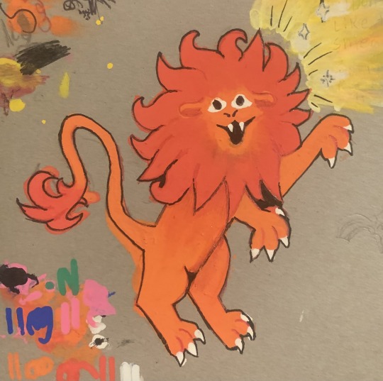
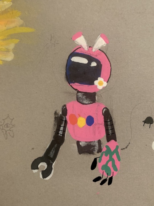
For christmas I got a set of POSCA paint pens! these two are some practice drawings I did. They’re fun to use and the colors came out just how i hoped they would!
#tbt#again the alt text box is a bit too short for me to include all the details I want but that's. eh#traditional art#posca pens#paint pen#posca markers#lion#robot#tv head#videosphere#< those two inspired the bot character#I might use it's design again. I like it!
16 notes
·
View notes
Text
Here are some various things that I have been loving this winter in no particular order or category.
Every season or so, my preferences change in all areas of my life, like books, movies, foods, clothes, etc.
Also, I really want to know some of your favorite things in winter because I am always looking for suggestions!
These are a few of my favorite things (this winter):
Snacks/Foods
Photo by Kristina Paukshtite on Pexels.com
White Chocolate Tea
Every year I get this white chocolate tea from Dragon Marsh in Downtown Riverside, an it really never ceases to surprise me. Each year when I run out I move on to a new tea and forget just how much I love it until I buy it again and fall back in love. I have even gotten other people (even ones who don’t usually like tea) to love this tea.
It is toasty, silky and all around cozy. I really feel the winter joy when I have a cup of this, some popcorn, and a winter movie on.
Photo by Pixabay on Pexels.com
Apple Cider
My partner, roommate, and I love this instant apple cider that takes only a second to make, but it is super yummy.
It is quite sweet with a bit of tart, so I (a savory person) add a clove and a dash of cinnamon sometimes and let it steep for a few minutes before drinking it.
Ultimately, I love that this has replaced hot chocolate for me, and it’s convenient. The club I run for school devours these at every meeting, and we go through a box every week at home.
Books
The Da Vinci Code by Dan Brown
Image from Goodreads
I don’t know why, but every year for the last 4 years I have reread this book. I don’t always read the entire thing, but I do pick it up at least once.
Maybe it’s due to nostalgia or just habit, but this time of year, I really enjoy this book’s atmosphere and writing style.
I haven’t read the rest of this series yet, but I am happy to just keep picking up this one.
It doesn’t help that this series is fine to read in any order, since each book is written kind of like a stand-alone.
This is book TWO in the Robert Langdon series.
Image from Goodreads
The Starless Sea by Erin Morgenstern
This book takes place in mid-winter with secret societies, old libraries, and all of the bookish feels, so naturally it is a great winter read.
I just picked this book up last week, and I am really loving it even just 50 pages in. So, I will probably finish this book in December, but it is a bit long so I won’t speak too soon.
Movies
Classic Children’s Claymation Specials/Movies and Cartoons
I don’t know what it is about these, but I love the old Stop Motion movies for Christmas along with some newer ones. (I believe most of the older ones were made by Rankin Bass.)
As strange as it is and as most people don’t know, I don’t watch a lot of TV or movies. When I do watch a movie, it’s usually a children’s animated movie or show.
I know it is odd for a 21 year old woman with no children to almost exclusively watch kids movies, but I am who I am.
Some of my favorites:
Santa Claus Is Comin’ To Town (1970)
The Year Without a Santa Claus (1974)
The Nightmare Before Christmas (1993)
How the Grinch Who Stole Christmas (2000)
Elf (2003)
The Corpse Bride (2005)
A Miser Brothers’ Christmas (2008)
Coraline (2009)
Frozen (2013)
Clothing
#gallery-0-5 { margin: auto; } #gallery-0-5 .gallery-item { float: left; margin-top: 10px; text-align: center; width: 33%; } #gallery-0-5 img { border: 2px solid #cfcfcf; } #gallery-0-5 .gallery-caption { margin-left: 0; } /* see gallery_shortcode() in wp-includes/media.php */
I got this sweater from Forever 21 from their 40% off cardigans sale. It is crazy soft and a nice grey/blue/green color. It has big pockets and barely reaches my knees. Not too warm for SoCal, but enough to go out in.
These socks are from Lian LifeStyle on Amazon. I love the colors and they are not too thick or too thin. The toe is a bit thin, so I do wear a thin pair of socks on top of these with my boots.
I got the short version of this dress from YesStyle during the summer, and I loved it so much that I ordered it in grey as well. This dress is versatile for most seasons in SoCal. You can dress it up or down, and it is so so cute for my personal style. This is probably my favorite piece of clothing ever.
Miscellaneous
Dollie Comforter Set from Wayfair
Image Source
We got this set for our bed, because our master bedroom gets pretty cold at night and we don’t like heaters.
It is like a cloud of softness, and I have a hard time getting out of bed every morning. We haven’t tried washing it yet, but it hasn’t seemed to be too fragile to do so.
I sometimes even use the corner of this comforter as a pillow; that’s how soft and fluffy that it is.
Thanks for checking out some of the things that spark joy in my life.
All images of products are those of the location I purchased them (all book covers are from Goodreads). I do not own any of these images. We are not sponsored by any of these products.
Happy snuggle season!
-Knight of Cups ❤
~Pragmaster, your visit and support is appreciated beyond possible demonstration. Your feedback and support is valuable to us. Nevertheless, you are the Pragmaster of our Pragmastery, so do feel free to share your opinions and experiences. Stay pragmatic and spread positivity!
~The opinions and beliefs of our writers do not reflect upon Pragmastery as a whole. Our writers have the freedom to share their subjective opinions in a respectful and considerate manner. The individual author of each post is responsible for fact checking and representation of discourses.
If you would like to discuss a concern or report harmful content, please contact us using our Correspondence page. If an author’s content is not to your liking, please feel free to browse our other authors’ pieces to find a more suitable read for your personal taste, or kindly agree to disagree by clicking off of this site. Please do not waste your time expressing your opinion in an overly negative or inconsiderate manner, for those comments will be removed from the site.
~Any and all content on this site is the creative and intellectual work of our authors. The distribution and reuse of any content on this site without permission is strictly prohibited. If you would like to share a piece with credit to the author, please contact us using our Correspondence page. Do not steal steal the work of our writers or use their work as your own. If you are unaware of the specific definition of plagiarism, we have linked some resources for your convenience.
Only things that spark joy are allowed on this list! Here are some various things that I have been loving this winter in no particular order or category.
0 notes
Text
Foundation Portfolio Pt. ii - Magazine Content Page
Though I had not pre-planned my content page, I had a few ideas for my content page.
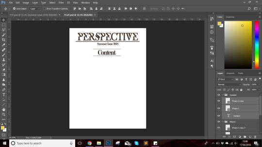
Step 1:
Again variables like the dimensions had be the same as the cover page because they were from the same magazine thereby it simply would not make sense for the content page to have different dimensions. I kept the resolution 150 inch/pixel and the colour mode of 8 bits since the content page it more about functionality than the aesthetic itself.

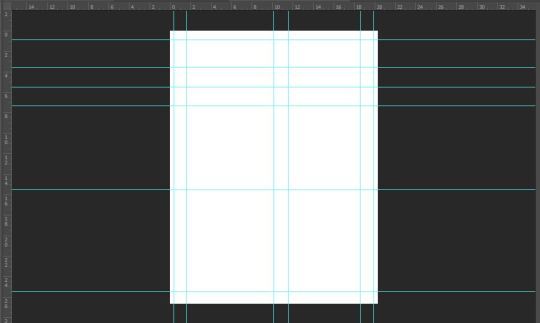
Step 2:
Once I press ‘enter’ I had my plain white base layer of 8in*10.5in before me. The first thing I did was press Ctrl ‘R’, which make the ruler visible. Next I dragged lines from the vertical and horizontal ruler to adjust my alignment and create a rough draft of what was in my head. (shown below)
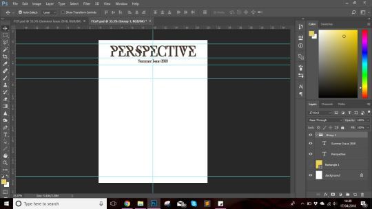
Step 3:
In my content page I had decided to include the masthead and the date/issue number, using the same typeface since repetition creates familiarity with the house style and the magazine itself. Additionally, it creates a more professional and sophisticated outlook, while drawing the audience’s attention as well. Using the Type (’T’) tool, I clicked at the top of the base layer and wrote the masthead ‘Perspective’ inside the text box using ‘Exodus’ font in a slightly smaller font than that i used for the cover page; 59.67 pt for content page and 73.69 pt for the cover page.
I opted for placing the date/issue number right below the masthead as it would captivate the reader’s attention. Further more following the house style I chose to keep the colour of the masthead and date/issue number on the content consistent with that on the cover page’s. This again creates a sense of brand and familiarity amongst readers.
Using Ctrl (;), I was able to make my rulers disappear for when I would need them later since they could easily reappear using the aforementioned keys.
Step 4:
Next I decided to place the ‘Content’ title. After sorting through different alignments, I opted for the center alignment for the placement of the title since I had planned to create a two column layout for the text (headings, page numbers, article descriptions and any highlighted article) present on the page. For the ‘Content’ title i used Modern No. 20 as the typeface.
Next I wanted to highlight and separate the masthead and date/issue number from the Content title hence I utilized the ‘Line’ tool (present in the vertical toolbar on the left near the bottom, above the ‘Hand’ tool) to create a sort of divider to make each element stand out without looking haphazard and mixed up.
I gave the ‘Content’ title two vertical borders so that it would immediately standout for the audience and it would help them navigate since they would immediately know that it was the content page.
I later changes ‘Content’ to ‘Table of Content’ only to change it back since it seems text bookish rather than something you would see in print media like magazines
Step 5:
Now it was time to move on to the arrangement of text on the content page. With that being said I pressed Ctrl (;), making the rulers visible and rearranged them. Following after, I started with my cover story by placing on the left side of the center partition, seeing as though it should be the first article to capture the any viewer’s attention. For the typeface I chose to use Modern No. 20 for the title/heading and page number, while using Luzia for the description. The reason behind this was to create brand familiarity by maintaining house style.
I useful tip that my teacher gave to my class was to zoom in and compare the file to the actual size of the print by holding the paper of our required dimensions next to it since often times, the text comes out looking too big or too small seeing as though the screen size varies.
I had opted to go with a two column layout in order to stick with the conventions seeing as though most of the Art & Culture magazine that I had come across had a very neat and minimal layout with text like letters from the editors absent. They had highlighted articles and anchoring images present which I plan on including; about four or five.
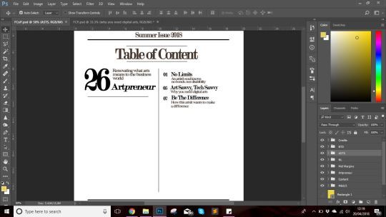
I had decided to keep the right hand more functional by including the articles whose titles and inspiration I had taken from my rejected cover story ideas.
Another thing I did, which was tiresome but rewarding was that I arrange each article title, its description, and page number with in its respective group. This made copying the layer to give the following look a lot easier.
Additionally, I had copied the layers by simply selecting it and drag it with the mouse while holding Alt. It definitely made my work easier considering the number of layers I would have had to make manually.
At the end result, I had a neatly arranged layout on the right hand side of my content page. I had left a space in between 07 and 16 so i could add an anchoring image to add some colors and aesthetic to the right side of the content page.
Right side:

Left side:

For the left hand side I kept a more aesthetic look, and kept the mid section empty so that I could later add to the three anchoring images that I had planned for. Keeping up with the house style I used Modern No. 20 for the article title and the page number and Luzia for the article description.
Step 6:
The next thing I added, was the footer; the team credits and the page number. For the team credits I followed conventions and placed it above the footer and separated it by placing a divider above it which I made using the Rectangle tool. I used the serif font ‘Baskerville Old Face’ which I italicized to make it standout individually and make readability easier and creating a professional look.
For the page number, I used roman numerials for the starting four pages to indicate that they are not a part of the articles and are simply preset for functionality and to aid readers in navigating to their article of interest.
For the team of my magazine, I chose individuals from various backgrounds as I had wanted my magazine to represent stories from all cultures, ethnicity and background, seeing as though I had chosen International audiences as my secondary audiences. Having a team with diversity meant that not only would it help my magazine to grow but it also be able to give a more accurate picture; through the eyes of a local rather than a stranger.

Step 7:

For the anchoring images on the content page, I conducted a shoot in school from 8am to 1pm on the 26th of April. I had used natural lighting or florescent bulbs as the key light source since I found it sufficient and used my Canon EOS Rebel T6/1300D and utilize my prime Canon EF 50mm f/1.8 STM Lens as it provides Aperture Priority and hence was able to complete my shoot with the help of my friends. For this shoot, I had come up with ideas some by taking inspiration from Pinterest and some off the top of my head.
Throughout my day I had conducted my shoot which I had split for each models i.e., my friends Manal, Khizra, Omeza. For each of the shoot I had come up with different ideas and had asked for my friend Sania and Khizra’s advice since their aesthetic sense its quite good.

At the end of the day, I short-listed the pictures and got this result:

This was the outlook for now, but like the cover page, a refined/final version was all that was left.
0 notes