#again not a bother at all i'm just terrible at answering asks quickly FDGHJD orz
Explore tagged Tumblr posts
Note
hey sun! sorry to bother you, but I'm currently doing a commission for a guy who wants a portrait made in the disco elusium style and I've never drawn in that style before ^^;
any tips, especially how to color?
not a bother at all! and while i'm not an expert on the disco elysium art style since i don't think i've done enough studies on it to say that i'm confident on saying what to do, i'll try my best to list out the things i've noticed while mimicking the art style. i'll split this into two parts, the composition of a portrait and the rendering and technical stuff behind it
i'll keep it under read more bc some of these portraits i'll be talking about are spoilers! whoops!
COMPOSITION
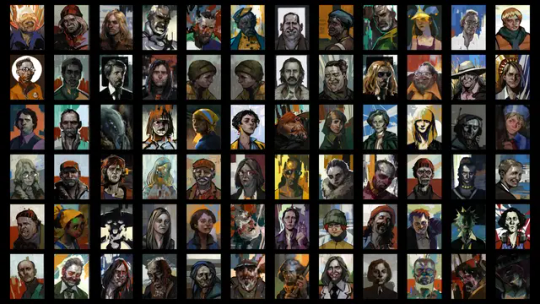
there's like, an unbelievable amount of variety when it comes to the portraits of disco elysium! personally, when i'm trying to mimic the art style, i try and look at the portraits in the game and see which of these characters are the most similar personality-wise to the character i'm trying to draw, and then i reference
1. PERSONALITY AND GROUNDEDNESS
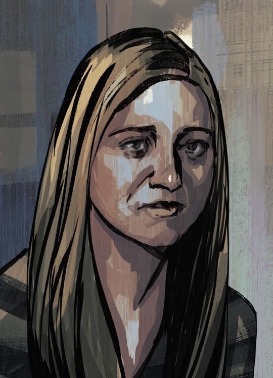
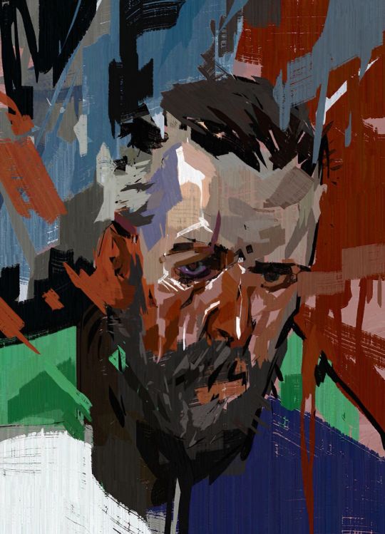
let's compare the portraits of these two characters, ok? we have sylvie and idiot doom spiral. right off the bat, TOTALLY DIFFERENT VIBES, and that's good because we can instantly tell what kind of people these characters are supposed to be! and that's something disco elysium is excellent at.
sylvie's portrait is very simple; a very limited palette is used and the rendering on her is rather exact even with the rough-esque rendering that disco elysium's art uses. idiot doom spiral's portrait, on the other hand, is a lot more chaotic. there's more disorder to his portrait with how the paint strokes in the background seem to mix in with his face, there's a disheveled quality to how he's rendered.
ask yourself, how grounded is this character you're drawing? on a scale of sylvie to idiot doom spiral, how normal does their portrait look?
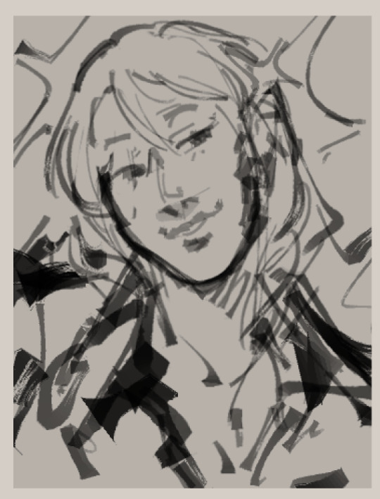
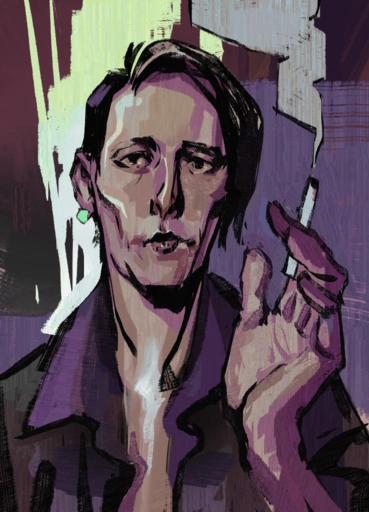
now, i'm not done with this klavier but i think it's pretty obvious that i heavily referenced smoker on the balcony's portrait because they have very similar vibes and role: pretty boy npc who your protagonist may or may not be a little infatuated with pftt (there's just something so different about them! i can't put my finger on it...)
2. WHAT DO THEY STAND FOR/THE ABSTRACT

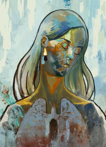
ok! besides personality, they also have a knack for just doing some gorgeous portraits that truly reflect just, the history of a character and their role in the story. now i'm not the best at analysis so these are just gonna be some very simple observations about kim and dolores dei's portraits pftt.
the big white circle behind kim's face, besides doing an excellent job of framing kim, is very reminiscent of a nimbus which we typically see in religious art. it makes kim look like a very important figure, someone you should listen to. it's also kind of like a nod to how kim is like the few people who's like, civil and even nice to harry after his whole mind-breaking bender.
for dolores dei, GODDD i can rave about this portrait forever, it's such a favorite of mine. first, the rendering of her skin, she's like an opal or a golden statue; it's otherworldly, which makes sense because that's what harry thinks of her. and then, the splotchier and messier rendering below her, it's like she's fading away, she's just a distant memory of the past.
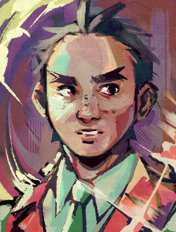
i'll use this very quick doodle of apollo in the de style to explain my point about symbols better. what is it that you want to emphasize about your character? are there any motifs you'd like to show?
i definitely wanted to portray apollo as determined and even heroic-looking in this portrait. leaning into his name, added that rim-lighting as if the sun was shining on him. emphasized his badge by giving it this exaggerated shine on it and lastly, made the background like the one he has when he perceives.
3. LOCATION
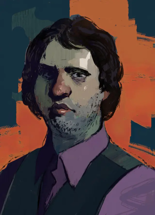
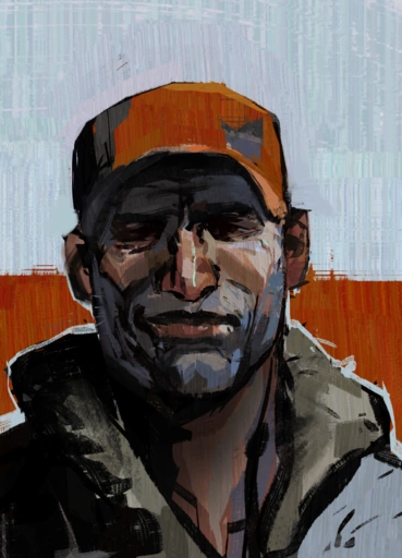
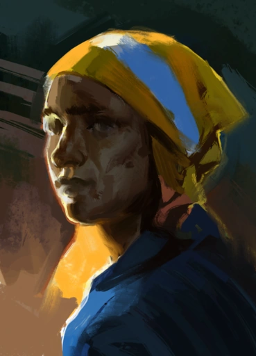
for backgrounds, i feel like you can go either three ways: abstract colors, political alignment, and location.

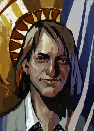
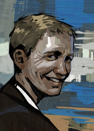
(i'm not happy that i have to use gary as an example here but he's the most blatant example of the second type of background AKSKSKS orz)
ok! so harry's bg, pretty funky, pretty fun. gary's bg, he's a fascist, that's the fascist flag in de. moving along trant's bg looks like a very abstract version of the wall in the building he's seen gazing at, heck, the way he's head is turned to you looks like you just called out his name and he quickly turned around to look at you but he is still very much facing the building.
more examples of those three things! garte: colors. titus: that red block is present on all union members. dicemaker: facing the window in the darkness of her workshop.
RENDERING
de has fairly very realistic looking faces, so brush up on your knowledge of the anatomy of a face or collect many faces/portraits that look the character you're trying to draw and reference the SHIT out of them!
1. BRUSHSTROKES

you're gonna be needing some brushes that have a texture to them ok. you're gonna need to slap those bad boys in that digital canvas and go wild ok. you can still do lineart kind of not everything is like rendered RENDERED bc some portraits make heavy use of smoother-looking black strokes to indicate lineart. ok i love you
2. PALETTES
think back to personality and symbolism, what colors are strongly associated with your character, and how grounded are they. the more normal they are the more minimal colors are used but if there's something going on with them you can go so so so wild
and also, you can eyedrop tool the colors from any of the de portraits, makes life easier pftt
3. HOW TO RENDER? HELP?
i'll go ahead and put my drawing of butch!kim here bc i basically just did a study of kim's portrait pftt. the art style is very painterly so i'm so sorry to say that you're gonna have to paint 😔 i know... i'm so sorry...
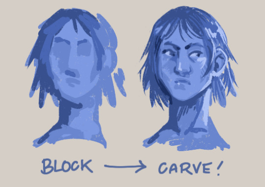
so block your colors! block your shadows and chip away on that thang, give it dimension! don't zoom in on your canvas in the earlier stages bc you'll end up fixating on one tiny part instead of the whole painting itself, and that's gonna make the duration of your drawing so much longer lol
ok i've been writing this for way too long and i can't think anything more to add so if there's anything else you want to know that i didn't mention here, feel free to ask me again. now good luck 🫡
#again not a bother at all i'm just terrible at answering asks quickly FDGHJD orz#sunnysidetutorials#sunnysideanswers#marchmay-may#described#id in alt text
63 notes
·
View notes