#Michigan State Graphic Design
Explore tagged Tumblr posts
Text
Competing in a Tshirt design competition for Skills USA Michigan 2024 tomorrow!! Shitting my pants 🤪😋🥳
#Im taking graphic design classes at a career tech center and all the career tech centers in Michigan are competing#other states as well but they have their own competition.#only me and one other person in my class is competiting because the class voted for our designs#i gotta go to Lansing 😔#no water for me tomorrow 😔😔😔
15 notes
·
View notes
Text
hello here is 3.29-3.31! absolutely devastating for my bingo

hello it's part 3 of 3 for my cool fun graphic design adventure!! part 1 and part 2 got too long. to recap i am recreating this t-shirt design but with the magic 8 ball songs instead of city names:
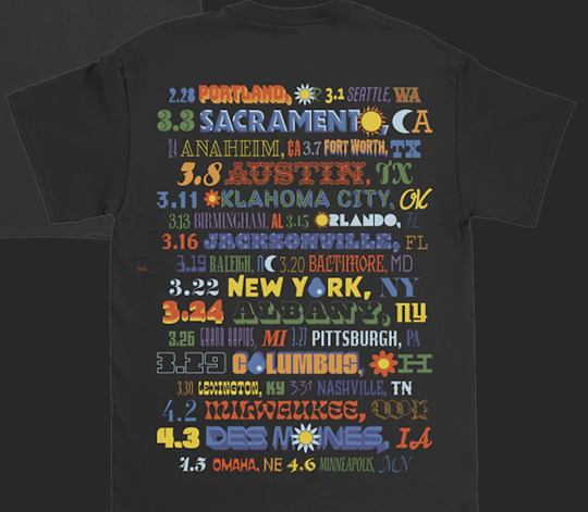
here is the current draft, updated through 3/27 (pittsburgh) (!!!!)
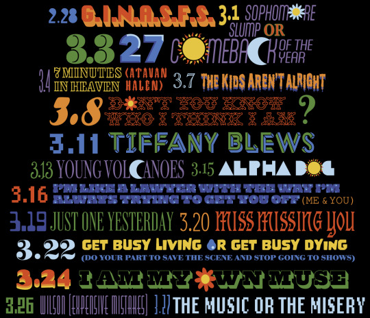
#notable changes from our last entry:#1. finally found the proper font for portland and changed ginasfs#2. started adjusting row heights and widths to make the composition more similar to the original#3. returned the flower to volcanoes and put the moon in jet pack#and put the other flower in music or misery instead of my own muse#feels better like this i think but idk i want your thoughts. help#also committed to putting the parentheticals in the state fonts rather than the city fonts#so expensive mistakes has been adjusted to the michigan font#however i could not find the kentucky font for the fucking life of me so i have frankensteined together something that is passable for#ten years#if anyone knows what font it is. please lmk#but this will do for now#anyway. ANYWAY. wilson and jet pack blues were on my list of songs that would Get Me A Little Bit#so i'm having a time over here#five shows remaining!!! two updates left!!!!#bees' graphic design adventure#fob#i am still working on figuring out a way to distribute this when it's finished#i think i'll put it up on my inprnt maybe?? and also make the file available on like google drive or something#so ppl can print it on their own stuff#i still dk what the best way to do shirts is and i'm not sure i have the energy/time to figure it out but i do want ppl to get what they#want#so if ppl can print their own shirts with the file then that could slay#okayyyyy goodnight!!!!#wait jk i forgot . spotlight 2???? holy shit??#was noodling around playing it on piano earlier bc i learned it a couple weeks ago#from the sheet music i found somewhere on here#my god. the shrimplications.#if he does love selfish love its over for me i fear. top tier truant wave song#anywayyyyyy actually goondight for rreal!!!
40 notes
·
View notes
Note
wait, you're a lawyer? for real?
I got an associates in stage tech, a double BFA in Graphic Design and 3D Design, and then went to law school on full academic scholarship, booked twelve classes, fell asleep during the Bar Exam three times (but passed with flying colors before the curve), and the motion for my admission to practice (put forward by my brother, also a lawyer), started, "My sister has many issues, but the one before the Court today is that of her admission to the State Bar of Michigan."
And somehow yes, they do let me practice law.
#i try to to brag about myself because that is a midwestern seven deadly sin#but i will be honest: i am excellent at school. I could get a degree in anything#even things i would be genuinely terrible at#because im just really good at school.#it is not a useful skillset post graduation.#anyway my brother and i were in law school with an overlap of about a year and a half and our peers fucking hated it#because he went through and booked a ton of classes#breaking the curve kind of a lot#and just when they thought they were rid of him and the curve could go back to normal: here i come with the same bullshit#also to be clear the Bar is two full days . i didn't fall asleep three times in like a one hour test.#.... although i have also done that.
845 notes
·
View notes
Text


Image 1 - Mystique Belgian Chocolate Packaging: The packaging is designed to convey a sense of luxury and quality. The gold foil accents suggest an exotic and premium chocolate experience. The inclusion of the Belgian flag color indicates the origin, known for high-quality chocolate. The cocoa percentage is prominently displayed, catering to consumers who are specific about the intensity of their chocolate.
Image 2 - Caution Wet Floor Sign: This is a standard safety sign used to warn about slippery surfaces. The bright yellow color is used for high visibility and to draw immediate attention. The bold, capitalized "CAUTION" text and the universally recognized triangular warning symbol with a person slipping denote the purpose of the sign even from a distance. This sign is a good example of functional design that prioritizes clear communication over aesthetic considerations.
Image 3 - Ice Breakers Ice Cubes Gum Container: The container features a vibrant and refreshing design, with cool blues and whites to represent the peppermint flavor. The use of a clear, icy motif, along with the image of ice cubes, reinforces the product's promise of a burst of freshness. The branding is clear and modern, appealing to a young, energetic demographic.
Image 4 - Clorox Disinfecting Wipes Canister Container: This product packaging uses the recognizable Clorox brand colors of blue and white, with a hint of yellow to suggest the lemon scent. The label communicates effectiveness with phrases like "Kills 99.9% of Viruses & Bacteria," which is especially reassuring in a health-conscious market. The packaging is practical, with a focus on the ease of use and the benefits of the product.
Image 5 - Spartans Banner: The banner uses the school colors and the Spartan helmet logo to represent Michigan State University. The message "WE ARE SPARTANS OF A BETTER TOMORROW. SPARTANS WILL." is inspirational, suggesting that the students and community strive for improvement and success. The design is simple yet effective, with a clear message that aligns with the university's branding.
These descriptions highlight the varying objectives of graphic design in different contexts, from selling a product to communicating a hazard to inspiring a community. Each design balances aesthetics with functionality to achieve its specific purpose.
2 notes
·
View notes
Text
The "Woke" Agenda: Fear the Queer
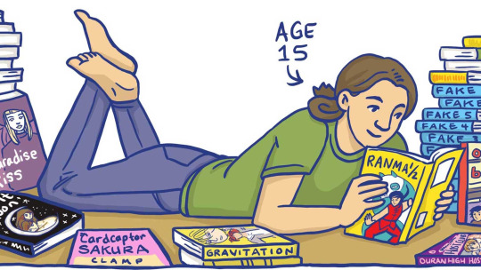
Book banning's have unfortunately always been around in the United States. Just about any book can be removed from public library shelves if the public themselves deem it necessary, though in most cases a review process is used. Most people think of famous examples such as 1984 by George Orwell, The Adventures of Huckleberry Finn by Mark Twain, or To Kill a Mockingbird by Harper Lee when book banning's are brought up, and for good reason. These books were very divisive as they acted as a commentary for the systemic flaws of society, flaws few wanted to be reminded of. It is for this reason that these books are considered such important pieces of literature.
But what of modern banned books? Unfortunately, it is more of the same reasoning that originally banned the great classics, even if the topics of the books have changed. When observing the American Library Associations' (ALA) statistics for banned books, the most common themes are those of queerness and racial oppression. These themes are not listed as the specific reason behind why these books were banned, but instead were hidden behind labels such as “sexually explicit content”, “anti-police” rhetoric, profanity, or promoting violence. All of these labels become stretched and distorted under the eyes of angry parents, designed to evoke rage in the casual observer.
In one example from October of this year, a group of protesters numbering in the hundreds disrupted a public school board meeting in Dearborn, Michigan. Even after a heavy police presence, the meeting had to be canceled for safety reasons as the protests became more and more intense. The adults were described as screaming at the school board, booing, and generally disrupted any civilized discussion. Roxanne McDonald, the chairman of the board, even pleaded to the protesters, saying "Let’s show our children how to behave with civil discourse," to no avail. The books the protesters were targeting focused those with queer topics such as Flamer by Mike Curato and Gender Queer by Maya Kobabe. Fears of pornography and other "inappropriate" content were thrown around before the meeting ended.
This is a perfect example of the fear-mongering can quickly get out of hand. What many parents don’t realize is that there are likely hundreds of books in your high-school-aged child's library that have the themes they are protesting. New York Times bestselling book The Fault in Our Stars by John Green, a book rated 14 and up, even contains an explicit sex scene between minors. (the horror!).
This fact asks the question: if these books are not unique in their controversial themes, why are they being targeted? How did Gender Queer, a two-year-old graphic novel published by a now-defunct company, become one of the most challenging pieces of comic literature in modern America?
The answer comes from the examples of book banning where those involved manage to say the "quiet part" out loud. Jeremy Glenn, a superintendent from a Texas school district, is even being investigated by the federal government for discrimination after he was quoted in a leaked recording after he instructed the school districts libraries to specifically remove queer books.
“I acknowledge that there are men that think they’re women and there are women that think they’re men, I don’t have any issues with what people want to believe, but there’s no place for it in our libraries.”
Later in recording, Glenn clarified further saying, "It’s the transgender, LGBTQ and the sex — sexuality — in books." This excuse completely throws away the charade of "protecting the children from obscenity" as was obvious from the start of the book banning craze.
The fact is, the banning of books has never been about protecting children. The true reason is far more cruel:
Parents do not want their children to read diverse stories because they are afraid of them "becoming" queer, or, god forbid, woke.
It is blatant bigotry.
Luckily, the future isn't dark. Despite news cycles loving to talk about how much hate and disgust these parents have for those different then them, there are far more people speaking up in support of these books then against them. Many bookstores across the country have brought special attention to banned books, creates displays celebrating them. Organizations such as the Comic Book Legal Defense Fund, the American Library Association, and the American Civil Liberties Union are all fighting to keep these important books on school shelves and available for everyone.
Every year that passes, despite trials and tribulations, I believe the world becomes a little safer and a little more welcoming. Books like Gender Queer could not exist 50 years ago, and hopefully in the next 50 years a majority of people will look back and think: How could anyone have hated this?
2 notes
·
View notes
Text
Grinch Santa Hat I Hate People But I Love My Michigan State Spartans Christmas Logo Shirt
Grinch Santa Hat "I Hate People But I Love My Michigan State Spartans Christmas Logo Shirt"
Celebrate the holidays with a dose of humor and school spirit in the Grinch Santa Hat "I Hate People But I Love My Michigan State Spartans Christmas Logo Shirt". Featuring the iconic Grinch in a Santa hat and a fun, cheeky message, this shirt is perfect for Spartans fans who love their team but could do without the holiday crowds!
Product Features
Design: A playful Grinch graphic with a Santa hat and the text "I Hate People But I Love My Michigan State Spartans," combining festive humor with Michigan State pride.
Material: Comfortable and soft cotton fabric that’s perfect for all-day wear during the holiday season.
Fit: Available in unisex sizes for a relaxed, casual fit.
Occasion: Ideal for holiday gatherings, game days, or just lounging at home while showing your Spartan pride.
Why You'll Love This Shirt
It’s the perfect mix of humor and holiday cheer for Michigan State fans who want to express their love for the team (and a little bit of Grinch-like grumpiness). A must-have for any die-hard Spartan fan this Christmas season.
🎄 Buy Now and spread some Spartan cheer (with a touch of Grinch)!
4o mini

0 notes
Text
Michigan State Spartans Crystal Heart Shirt
Michigan State Spartans Crystal Heart Shirt: Show Your Spartans Pride with a Touch of Sparkle
Overview Add some sparkle to your Michigan State Spartans gear with the Michigan State Spartans Crystal Heart Shirt. Perfect for fans who want to display their school pride in a stylish and unique way, this shirt combines the iconic Michigan State logo with a dazzling crystal heart design.
Product Description Crafted from a soft, high-quality cotton blend, this shirt offers maximum comfort with a touch of flair. Whether you're cheering for the Spartans, hanging out with friends, or representing Michigan State on campus, this shirt lets you wear your pride in style.
Design Details The shirt features a crystal heart graphic with the Michigan State Spartans logo at its center. The sparkling crystals make the heart shine, adding a fun, fashionable twist to your typical team apparel. It’s a standout piece that blends school spirit with a touch of glam.
Why You’ll Love It This shirt is more than just a fan shirt—it's a fashionable way to express your Michigan State pride. Comfortable, versatile, and stylish, it’s the perfect addition to any Spartans fan’s collection.
Product Details
Material: Soft, high-quality cotton blend for cozy comfort.
Fit Type: Unisex sizing for a relaxed, comfortable fit.
Design: Crystal heart graphic featuring the Michigan State Spartans logo.
Occasions: Perfect for game days, casual wear, or showing off your Spartans pride in style.
Care Instructions: Machine washable for easy maintenance.
Show your Michigan State pride with this sparkling, stylish shirt!
Purchase Link: Get the Michigan State Spartans Crystal Heart Shirt Here
Find more Michigan State fan gear at Limotees.

0 notes
Text
Best Universities for PhD in Computer Science in the USA
Massachusetts Institute of Technology (MIT)
Application Dates: Typically December 15 for Fall admission.
Cost: Approximately $53,790 per year (tuition).
Available Courses: AI, machine learning, robotics, computer vision, and cybersecurity.
Stanford University
Application Dates: Usually early December for Fall admission.
Cost: Around $57,861 per year (tuition).
Available Courses: AI, natural language processing, human-computer interaction, and software engineering.
Carnegie Mellon University
Application Dates: Generally December 8 for Fall admission.
Cost: Approximately $50,100 per year (tuition).
Available Courses: Machine learning, computer graphics, databases, and algorithm design.
University of California, Berkeley
Application Dates: Typically December 2 for Fall admission.
Cost: About $14,226 (in-state) and $29,346 (out-of-state) per year (tuition).
Available Courses: AI, data science, networking, and software engineering.
California Institute of Technology (Caltech)
Application Dates: Usually December 15 for Fall admission.
Cost: Approximately $60,864 per year (tuition).
Available Courses: Algorithms, machine learning, computational neuroscience, and robotics.
University of Washington
Application Dates: Typically December 15 for Fall admission.
Cost: About $30,000 (in-state) and $56,000 (out-of-state) per year (tuition).
Available Courses: AI, computer systems, data science, and human-computer interaction.
Harvard University
Application Dates: Generally December 1 for Fall admission.
Cost: Approximately $52,000 per year (tuition).
Available Courses: Theoretical computer science, machine learning, and programming languages.
University of Illinois at Urbana-Champaign
Application Dates: Typically December 15 for Fall admission.
Cost: About $15,000 (in-state) and $30,000 (out-of-state) per year (tuition).
Available Courses: Artificial intelligence, computer vision, and software engineering.
Georgia Institute of Technology
Application Dates: Generally December 15 for Fall admission.
Cost: Approximately $10,258 (in-state) and $31,370 (out-of-state) per year (tuition).
Available Courses: Cyber-physical systems, machine learning, and data analytics.
University of Michigan, Ann Arbor
Application Dates: Typically December 15 for Fall admission.
Cost: About $24,000 (in-state) and $51,000 (out-of-state) per year (tuition).
Available Courses: AI, computer networks, and software development.
Conclusion
Choosing the right university for a PhD in Computer Science in the USA involves considering application dates, costs, and the specific courses offered. Each of these institutions provides a unique environment and set of opportunities that can significantly impact your academic and professional future. Be sure to check each university's website for the most current information regarding applications and tuition.
#Best Universities for PhD in Computer Science in the USA#Best Universities for PhD#PhD in Computer Science in the USA#Best Universities for PhD in Computer Science
1 note
·
View note
Text
Michigan Wolverines Hail to the Victors Stanley Tumbler Cup

Product link: https://inspirdg.com/product/michigan-wolverines-hail-to-the-victors-stanley-tumbler-cup/
Store link: https://inspirdg.com/
Michigan Wolverines Hail to the Victors Stanley Tumbler Cup
The Michigan Wolverines Hail to the Victors Stanley Tumbler Cup is a vibrant expression of team spirit and university pride. The tumbler’s bold design showcases the unmistakable Wolverines’ navy and maize colors, making it instantly recognizable to any fan of the University of Michigan. On one side, the iconic block M is front and center, with a fierce-looking Wolverine mascot roaring in the middle. Surrounding this are various Michigan-themed icons, from helmets and jerseys to fun details like the Michigan map and slogans like “This is Michigan.” These graphic elements create a rich, engaging design that captures the school’s competitive and historical legacy.
The opposite side features the famous phrase “Hail to the Victors”, a nod to the beloved Michigan fight song. This bold statement is illustrated in a sharp, eye-catching font that radiates excitement and team pride. The surrounding elements, including fun doodles and symbols like Michigan’s signature block letters, reinforce the energetic theme of the design. Each element on the tumbler contributes to the overall feeling of Wolverines pride, making it perfect for fans who want to show off their allegiance to the team.
The tumbler itself, made by Stanley, guarantees high-quality functionality. With its durable construction, ergonomic handle, and reliable insulation, it keeps beverages hot or cold for hours, making it ideal for game days or everyday use. The glittery blue base adds a fun, stylish touch that makes the cup stand out even more. The Michigan Wolverines Hail to the Victors Stanley Tumbler Cup is not just an accessory but a statement piece for dedicated fans who want to combine style and practicality.
Style & Design of Michigan Wolverines Hail to the Victors Stanley Tumbler Cup
The Michigan Wolverines Hail to the Victors Stanley Tumbler Cup combines vibrant graphics and spirited symbols, making it the perfect accessory for die-hard Wolverines fans. The design features the imposing block “M” at the center, with a roaring Wolverine mascot that brings an element of intensity to the cup. Surrounding this focal point are various playful motifs like stars, Michigan logos, and football helmets, all in the school’s iconic maize and blue color scheme. This side of the tumbler is all about Michigan pride, radiating excitement and school spirit with every glance.
On the opposite side, the legendary phrase “Hail to the Victors” takes center stage, boldly capturing the essence of Michigan’s fight song. The large, dynamic font gives the words a commanding presence, making it clear that this cup represents one of the most victorious and celebrated teams in college sports history. The surrounding images, including the Michigan state outline and other classic Wolverine symbols, further enhance the cup’s visual appeal, making it a well-rounded tribute to the university.
Finally, the glittery blue base adds a touch of glamour and sophistication to the design. This Stanley tumbler is not just about aesthetics, though—it’s designed with functionality in mind. Its durable construction, large handle, and straw make it practical for both game days and everyday use, while its insulation ensures your drinks stay hot or cold for hours. The Michigan Wolverines Hail to the Victors Stanley Tumbler Cup is an ideal fusion of style and utility for any passionate fan.
0 notes
Text
Find a piece of design and use your caption to describe its denotative meaning.
This book cover that reads “The Guest List” with a stormy castle behind it sets the physical scene for the book. When reading the book which takes place in Ireland, the reader can use the cover to imagine the weather and environment of the story. The title lets the reader know that some sort of event or party will most likely center this story.

Use the same piece of design (can be the same photo or a different photo of the same object) and use your caption to describe its connotative meaning.
This book cover uses dark colors and stormy, mysterious imagery to foreshadow danger and conflict to come in the book. The note under the title which reads “You’d kill to be on it” adds to the spookiness and elusivity of the book. The use of the word “kill” adds another layer of danger to the book, and foreshadows some type of violence or even murder to come in the book.
Find a piece of design and describe its iconic function (remember icon/index/symbol from the lecture).
The Spartan head in its iconic function is now mostly used for marketing and branding. The Sparty head is easy to shrink and expand, it can be white and stand out against a dark green background, or vice versa. It is on virtually every piece of University property from sticky notes to sweatshirts. The Sparty head is a recognizable icon that has lasted and will last for so many years to come due to its amazing versatility and flexibility in the marketing space.
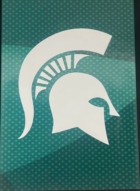
Find a piece of design and describe its indexical function.
Sparty himself acts as representation for our school. He is at football games, career fairs, and club meetings always showing up with an incredible energy that represents Michigan State’s spirit. Sparty himself is not as versatile and flexible when it comes to being used as a marketing tool because of his small details and intricacy. Shrinking or expanding Sparty to find different materials is less functional and logical than using the Sparty head.

Find a piece of design and describe its symbolic function.
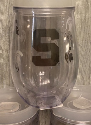
The structured, bold sans serif “S '' that represents Michigan State in its symbolic form. The “S '' can not only be a symbol for the State, but it can also be a symbol for Sparty himself. This symbol represents Sparta and Spartans without actually being a graphic of a fighting spartan. This “S” is also commonly used on marketing and advertising materials because of its simplicity and ability to fit many different formats, just like the Spartan head.
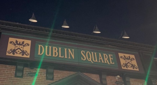
Find a piece of design that references a past “style” and in your caption say what you think the design is trying to signify by its reference to that style (think about the Stubb’s BBQ sauce example).
This bar is Irish-themed, hence the name Dublin Square. They use quintessential gaelic-inspired typeface to embody the medieval highland brand. Inside, there is Guinness decor, old Irish sayings all over the place, and an Irish-themed menu. The brand uses hints of green here and there, as well as traditional clan crests and clover motifs to signify the luck of the Irish. Drinking beer and dancing while having a good time is one of the most Irish pastimes, so this bar tries to create a fun-loving atmosphere that starts with its brand typeface and imagery.
0 notes
Text

2024 | Exhibition: We Profess poster selected for the 20th anniversary travelling juried exhibition, ‘I Profess: the graphic design manifesto’, curated by Chris Corneal and Audrey Bennett.
5–16 Feb Portland State University, USA.
16 Feb–15 March Metrospace, East Lansing, MI, USA.
15–30 April University for the Creative Arts, Farnham, UK.
1–30 June San Francisco State University, USA.
9 Aug–20 Sept University of Michigan, USA.
6 Sept–4 Oct University of Memphis, USA. https://www.audreygbennett.com/baohouse/i-profess
Project team: Siân Cook & Teal Triggs
0 notes
Text
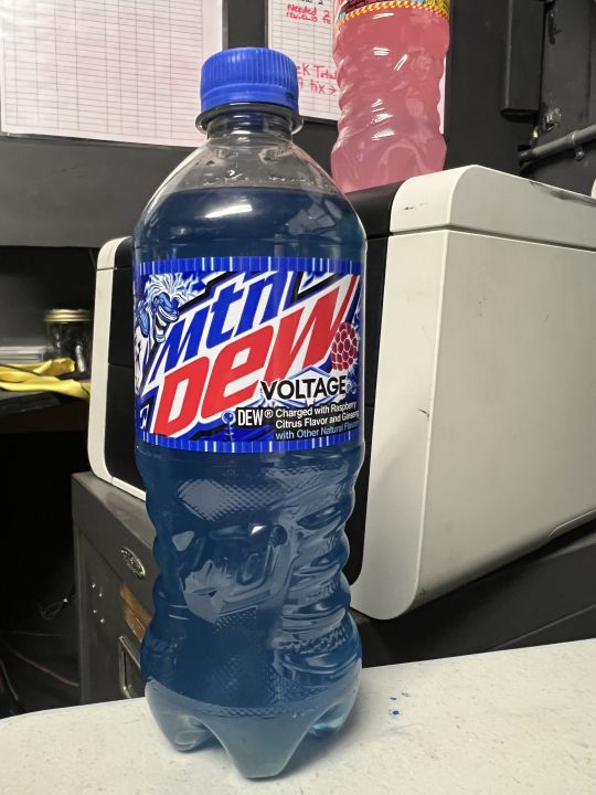
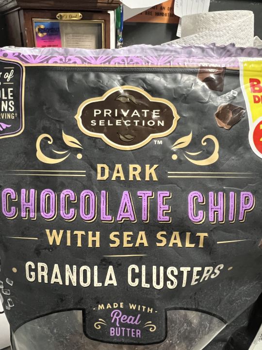
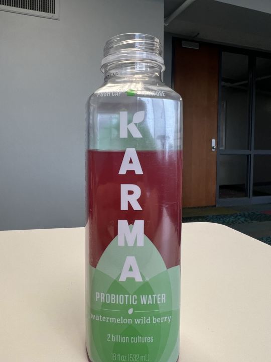
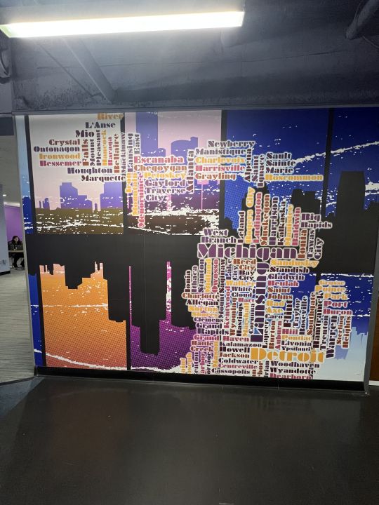
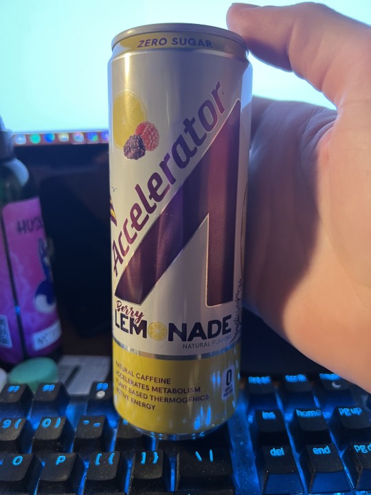
Image One: In the first image, we have a bottle of Mtn Dew Voltage. The graphic design shown in the logo where it says voltage shows sharp edges reminiscent of lightning or electricity. Sharp diagonal edges also are used in the font of the text, along with bold lettering to give a electric feel.
Image Two: The graphic design in this image is shown in the flowing lines of the logo to give off elegant and luxury energies to fit the brand name of, "Private Selection". It also uses flowing lines reminiscent of Art Deco design which is commonly used in high luxury applications.
Image Three: In this image, part of the logo of Karma is the spreading leaf at the bottom to give the message of health, as greenery and plants on packaging is used to insinuate a natural or healthy product. Another fun fact is once the flavor is added in, the liquid turns red and the contrast between the green logo and the red liquid signifies a watermelon's colors.
Image Four: In this image, the cities of Michigan are sized and placed in their general geographic locations to create the shape of the state of Michigan.
Image Five: As mentioned prior, sharp diagonal lines signify movement which is characteristic of the message energy drinks want to show. Another very interesting detail about the image is the main logo is shaped like a car gas pedal which is where the name, "Accelerator" fits. It also looks like an abstract version of a capital A.
1 note
·
View note
Text


Image 1: Crunch Fitness logo. The letters are contrasting in their orientation to each other. A few slope downwards and then they slope upwards again. This gives some of the letters a larger look than the others providing emphasis on the front and back of the brand. I believe this is to number one, make the logo more recognizable because people often look toward the front/back letters before reading the word. And two to feed into the illusion that the hand is grasping the word signifying a "crunch" effect.
Image 2: This is a vinyl cover, there are a few contrast points. The word Michigan is slanted and enlarged to create the main focus of the album: Michigan. While the area around the state's name is left for some less important information. The cover also includes graphics that signify some of Michigan's characteristics that would be easy for people who lived there to pick up on. I think the designer left a good balance of words to images that really gives the viewer a lot to look at.
Image 3: This is another vinyl cover, here there is a lot of negative space. The designer fits the abnormally jagged font in the upper left corner to leave room for the image of the dark building to take the spotlight. This gives a lot of dark space on the cover, letting the viewer know it might be a grittier/dark slew of songs/topics on the album, the font of the title also plays into this. The darkness of the cover compared to the lightness of the title and windows create a contrast which leads the viewer to look at those points as they stick out. I think they did this to draw attention to the theme of "good times being had through tough circumstances". i.e. The brightness of the windows in the dark building.
Image 4: This is also a vinyl cover. This is the simplest one but it does the most for me. The simplicity of the title area with nothing but white around it contrasts so well with the high-definition picture of the women below it. I think this contrast leads the title to carry more meaning, the viewer can read the title "Tell me I'm pretty" and instantly go to the picture of the girl and feel as though she is asking them that question. The contrast between the title and image really puts the focus on the image and makes this a very aesthetic cover to look at.
Image 5: This is the back of one of my favorite t-shirts. It uses a lot of repetition between the words Adidas and Chicago to achieve a really cool design. The overlap between the words and the colors almost gives it some sort of 3D effect for the viewer. I think this effect was intentional and makes the lines used for the letters very active as if they are illuminated against the dark background.
0 notes
Text


Image #1 - This image captures a curated collection of books in the Michigan State library. This composition reflects the fundamental role of typography in graphic design, showcasing how the careful selection of fonts and layout contributes to conveying information effectively and aesthetically. It leaves a visual impact.
Image #2 - This vibrant poster I saw at a store features Spiderman and Green Goblin, serves as a visual pleaser to the viewer with its dynamic colors and bold pop art/comic style. The strategic use of contrasting hues, dynamic composition and illustrations show key graphic design principles. The poster is able to show the power of color theory and visual elements to captivate and communicate. Makes it more memorable.
Image #3 - In this image it's a picture of a project I worked on for my Chicano Latino Studies class. It features the theme Hispanic/Latino Culture, accompanied by a picture of person playing guitar . This image underscores the fusion of text and visual in graphic design to convey cultural narratives. The blending information and visual elements to engage and enlighten audiences and diverse cultures.
Image #4 - Graphic design is a great way to demonstrate emotion through creation. Like the image shows a resilient doll, adorned with patches, tears, and a broken heart yet still resiliently smiling. This was a hobby project I had in mind and created. The sign "Good Gone" shows a narrative of endurance amidst challenges. This exemplifies how graphic design serves as a medium of storytelling. This allows emotions and messages to be conveyed visually.
Image #5 - Graphic design is able to pick up two separate things and fuse them to make one. The fusion of culinary and visual storytelling in this example. The illustrations and text not only show case the essence of Korean cuisine but also exemplifies the graphic design's role in making the culinary experience visually enticing. The page where it shows "Intro to Korean barbecue" recipe demonstrates how gd transcends cultural boundaries, providing a universal language that enhances our connection to diverse cuisines and traditions.
1 note
·
View note
Text
ALL ABOUT ME!!!
Hey, my name is Shadae. I'm a sophomore with a major in entrepreneurship and a minor in visual merchandising. I am also a licensed cosmetologist. I was born and raised in Kalamazoo, Michigan with 5 siblings and a dog I've had since I was about 5. I've always been very creative, meaning I've always liked to draw, paint, write, and I even do all of my current graphic design work. As I stated, I am a cosmetologist, so my goal is to eventually have a full-service salon of my own, as well as a hair care line. I ultimately just want to be wealthy and travel the world. Through this blog, I hope to become more comfortable with expression on social platforms. I think making myself know online is kind of a fear, so I hope to work through that. A company that I think does good in regard to social media is Fashion Nova.
They are not only consistent, but they target their clients well. Most of the ambassador deals they give are to people who are consistently in the media, fashion guru's, social media influencers, etc. All of these people have a following who fit into the target market for the company. They also price relatively well in comparison to their product quality.
1 note
·
View note
Text
🌞👚🌊 Breezy and Beautiful: Embrace the Heat with Trendy Women's Tank Tops in Michigan 🌞👚🌊

Hey, fashionistas of Michigan! ☀️👋 Are you ready to beat the summer heat in style? 😎🔥 Let's talk about the ultimate summer fashion essential: women's tank tops! 🎉💃
🌟 Stay Cool: The scorching Michigan summers demand outfits that keep you cool and comfortable. Enter the breezy and lightweight women's tank tops! 💨💕 These chic sleeveless wonders are perfect for lounging at the beach, hiking the dunes, or strolling around downtown.
👗 Trendy & Versatile: Who said tank tops can't be stylish? With an array of designs, colors, and patterns available, you can effortlessly create stunning outfits for any occasion! 🌈✨ Pair a flowy boho tank with denim shorts for a beachy vibe or rock a fitted graphic tank with jeans for an edgy urban look.
🌺 Embrace the Florals: Floral patterns are blooming this season, and Michigan's natural beauty harmonizes perfectly with them! 🌸🌿 Flaunt a floral tank top, and you'll feel like a walking garden amidst the lush scenery of the Great Lakes State.
🌊 Lake-Ready Fashion: Planning a day at the lake? 🏖️🛶 Opt for a cute nautical-themed tank top to complement the waterfront vibes. Add some cute anchor or seashell accessories to complete the beachy ensemble! 🌊🐚
👯♀️ Squad Goals: Fashion is even better when shared! Grab your besties and coordinate your tank top looks for a fun photoshoot. Show off your girl gang's unique style and celebrate friendship with an unforgettable summer memory. 📸💖
💃 Night Out Glam: Don't underestimate the power of tank tops for a night out! Pair a silky or sequined tank top with a chic skirt or high-waisted pants, and you'll be turning heads at every dance floor and rooftop party! 🌃🎉
👉 Pro Tip: When choosing tank tops, consider the fabric! Opt for breathable materials like cotton or linen to beat the heat while looking fabulous. 😉
So, ladies, let your summer fashion bloom with trendy tank tops that perfectly capture the essence of Michigan's sun-soaked adventures! 🌞🎀 Remember to stay hydrated, wear sunscreen, and most importantly, radiate confidence in your summer style! 💪💕
1 note
·
View note