#I'm only paying because staff earned enough goodwill and that could change very rapidly indeed
Explore tagged Tumblr posts
Text
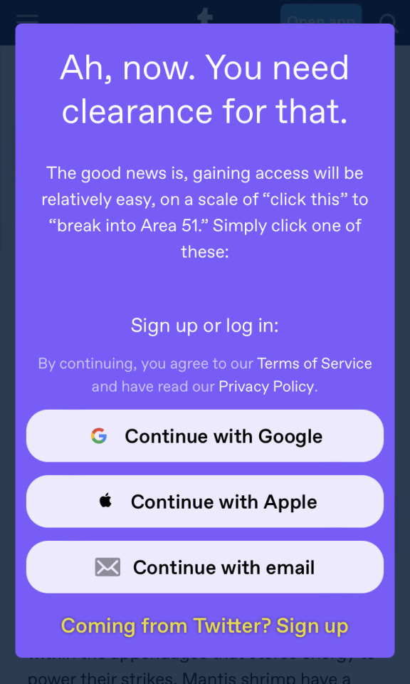
Yeah, this is a "feature" of the new dashboard-style blog view. Scroll too far, or even try to click on a post, and Tumblr will force you to log in. It's not just a mobile issue either—the desktop site does the exact same thing! You can't even send anonymous asks, a feature explicitly not tied to accounts, if you aren't logged in! It's ridiculous!
Thankfully [url].tumblr.com blog views don't do this... but not every blog has it enabled. New blogs, and blogs that used the default Tumblr theme during the rollout, now force everyone to use the new view by default. (If this might be you, please turn on "Custom theme" in your blog settings as above! You don't have to actually choose a theme, it's just flipping a switch.) Which sucks, because even logged in, the new view lacks basic features like pages and default-visible timestamps.
So, what can you do about this?
Enable a custom theme for your blog(s), so readers can dodge the login wall
Disable "use default mobile theme", so mobile readers can dodge it too
Access tumblrs via [url].tumblr.com so you don't get login walled
If you're technologically savvy, use uBlock Origin and add ||assets.tumblr.com/pop/js/modern/async-login-wall-*.js$script,redirect=noop.js as a filter to prevent the login wall from appearing at all—but you also have to disable the filter every time you need to log in, so it's a hassle
AKA a bunch of individual-level workarounds that do nothing for occasional readers. Be familiar with the site already or sucks to be you, I guess!
This is a terrible state of affairs. Tumblr's biggest strength is flexibility. Blogs can be anything from reblogging for friends to making original posts to writing longer-form content for off-site audiences. Why is Tumblr now trying to control the relationship between blogger and reader? It can't compete with bigger sites like Twitter and TikTok on ensnaring users in a toxic ecosystem, so why is it trying to? Why is a site that relies on being a more pleasant alternative making the potential-new-user experience worse?
My understanding is that Tumblr's paths to profitability rely on user contributions and goodwill. Right now, @staff, shenanigans like these and the recent app layout changes are making me seriously reconsider my ad-free subscription.

I don’t know if I’m late to the party here noticing this, but @staff what the actual hell is this. This is what I get when I click on the link to my own mantis shrimp post, shared on Twitter. I can see the first half, and then I get forced to log-in to keep reading.
I write a free blog on your free platform, and you’re using link sharing on mobile to try to force people to sign up? Not only is this absolutely not okay - this isn’t a paywalled site and my content isn’t subscription only - but it really fucks me over as a science communicator who relies on posts being shared easily to disseminate information.
This is absolutely not okay. I’ve used this site for eight years to do for science outreach and loved it. This choice leaves a really nasty taste in my mouth.
#HATE this.#tumblr is increasingly only usable on desktop#and I don't need ad-free there. that's what ublock is for#I'm only paying because staff earned enough goodwill and that could change very rapidly indeed#tumblr meta
28K notes
·
View notes