#I wanted to read Moby Dick. There are 60 pages left and it's taking me ages which fucks with the flow of the book
Explore tagged Tumblr posts
Visit Tumblr Blog
Explore Tumblr blogs with no restrictions, modern design and the best experience.
Last Seen Tumblr Blogs


Fun Fact
Tumblr was named as a finalist in Lead411’s New York City Hot 125 in Aug 2010.
Text
I kinda need to study but not really so I just spent the last two hours reading about the London East End and its accents
#it all began because the words Bethnal green appeared in my mind. I still haven't figured out where I've heard them or read them last#I wanted to read Moby Dick. There are 60 pages left and it's taking me ages which fucks with the flow of the book#I knew I shouldn't have started The Terror but I couldn't wait anymore#I want to know what happens in Moby Dick D:#personal
2 notes
·
View notes
Note
brynn hi hello!!!!! 20 + 13 + 17 for the book asks please <3 i want to hear all your thoughts you are just so cool!! xoxox hope your flights goes well MWAH!! <3
liv hiii!!!! and stop it youre making me blush... the flight is over which i'm thrilled about! how are you what are you thinking abt tell me!
what was your most anticipated release? did it meet your expectations?
i'm not much of an anticipator! i'm really not a part of the wider book culture... i have no clue what's happening out there..
i guess braiding sweetgrass by robin wall kimmerer? i'd heard some fantastic things about it and it did for the most part meet my expectations! i think it dragged around the middle and towards the end.. but nearly every essay had me on the brink of tears (pls i'm begging take this with a grain of salt. i cry at dove commercials, and at those barbie ones where five year olds are lecturing to a college class and then it fades out and they were playing with a barbie the whole time...)
uhh and true grit by charles portis... it did come out in the 60s but. the cashier told me i'd love it and he was right. i did
what were your least favorite books of the year?
you're a pot stirrer. do we need to talk more about the seven husbands of evelyn hugo? bc i will. what a bland dry shallow book. it was so.... lackluster? ineffective? unoriginal? i just found it boring on all fronts. i've never read a book that left me with so little after i finished it. i can't even talk about it at length bc it's already slipping from my mind; it might as well have not existed.
also moby-dick. felt like pages were added the more i read. it was some sort of never-ending infinite silk-pulled-from-a-pocket magic trick. shocked and appalled that somehow more pages kept appearing after i finished one... i would've dnfed it but i was reading it for a class :/ and my prof was so kind, she reminded me of jessica day and she loved moby-dick. she loved it so much. so i read all of it for her <3 despised every second
the monk by matthew lewis and the italian by ann radcliffe. classic classic gothic literature. so much happening... so little actually being done. i do however respect how incredibly horny both of them were.
did any books surprise you with how good they were?
east of eden... persuasion by austen... but i'm going to answer this indulgently and say i reread gregor the overlander by suzanne collins. and though i wasn't surprised by how good it was bc collins is fantastic and i trust her implicitly... i just feel the need to emphasize what a masterclass in middle grade fiction the underland chronicles are. whatever youre thinking when you see 'middle grade fiction' literally erase it from your mind bc the series beats out everything i've ever read. percy jackson kid this harry potter kid that... hit me up if you know anything about giant rats and the casualties of war ok
#phew. writing these answers out... restraining myself from going on too long.#i would talk more about evelyn hugo but i returned the book to my friend so i can't even reference any of the cheesy lines. shame! giving#that book back was. so. not fun. bit back being too obvious of a hater bc she enjoyed it and i enjoy letting ppl enjoy things. thankfully#she hated the main protag as much as i did so we talked mostly abt that#anyway! shutting myself up!#asks#reading#liv tag#LIV i do want to hear ur thoughts though about evelyn <3 i was so interested in reading daisy and the six but now i don't think its worthit
6 notes
·
View notes
Text
First Post and Introduction
Hi! Call me Joe. Does anyone recognize that first line? It’s a paraphrase from Moby Dick by Herman Melville, who wrote “Call me Ismael.” to start the massive novel. I’m a writer too. I suppose you could call me an author, too, since I self-published a book on Kindle Direct Publishing (KDP). The link, if you’re interested is down below. The book is based on a food blog I’ve been writing for the last 6 1/2 years. It details my life through cooking and includes recipes, tips, tricks, restaurant reviews, book reviews, anecdotes, and some short stories. That link is also down below. I try to write the blog once a week, but life gets busy for me all the time, so some weeks I’ll post several times, and other weeks, not at all. There’s over 800 posts, and I’ve numbered them for easy access. So, if you want to know about food, it’s all there.
https://hohcopelandwj.wordpress.com/
Mostly, I like to write fiction. I started writing when I was in the second grade, which is also when I published my first short story for the school’s yearbook. I don’t remember what the story was about, but I do remember how proud I was to see my name in print as the author. I must have been 6-7, so that would be 60 years ago. I’ve been writing ever since. Last year, I participated in NaNoWriMo, National Novel Writing Month, and completed the goal! It’s an unofficial competition to complete 50,000 words in 30 days. That’s 1667 words per day, or about six and a half pages typed double-spaced. It’s completely on the honor system, although they do have a system for tracking word counts. You could conceivably write “All work and no play makes Jack a dull boy.” over and over until you had 50,000 words and it would count. I worked on a novella I want to publish, and only got to the beginning of chapter 7 before I reached my goal. I’m still plugging away at it.
When people find out I’m a writer, inevitably their first question is “What have you written that I’ve read?” Since I don’t know their likes or dislikes, it’s a tough question to answer. When I started my “real” writing career, I was writing short stories and articles for children and early teens. I had moderate success, but not a financial windfall by any means. The second question I’m asked is usually “What do you write?” The easiest answer to that is “Whatever captures my interest that day.” When I was a teenager and wrote incessantly, I was heavily into science fiction and fantasy. Asimov was king, and everyone wanted to be as detailed as Tolkien. But as I grew older and more experienced, my tastes changed. I started writing more slice-of-life stories and literary stories. The third thing most people will ask is, “Do you want to write a book with me? I’ve got a great idea! I’ll tell it to you and you can write it up. We can split the money half and half.” I always reply “So I do all the work and you get half the money? Nope.” “Oh, but it’s my idea!” “Then you should write the story.” “I don’t know how. I’ve tried before but I never do it right.”
Like every skill, writing can be learned. No one is born knowing this stuff. It takes practice. I wake up every morning thinking about what I’m going to write that day. Some days it’s the blog. Some days, it’s just some letters or emails I have to get done. Other days, my “writing” is actually re-writing; revisions are the true work in a novel. And always, I’m working on ideas. I once made a deal with God that I wouldn’t die until I’d written the stories for every idea I had. I’m going to live forever. Once, I got involved with a church in my home town, a very controlling group of people. They were sincere in their beliefs, and just as sincere in their sense of rightness. For three years, while I was with that church, I put away my writing. When I finally left and took up writing again, I was worried that it had left me. It hadn’t, and the ideas are still pouring out of me today. Ideas are the easy part. Every writer I know, and know of, has a huge list of ideas they’ll never get to before they die.
I once tried to give a writer friend an idea for a vampire story that I thought was a great story, but I didn’t have time to write it. He wrote vampire stories so I thought he’d like to take it. He loved the idea, but didn’t take it because “I don’t have time for the list I’ve already written down. You should write it.” I might some day.
So, here’s the info for my published book at Amazon. You’ll notice that if you have Amazon Prime, it’s free. If not, it’s only $1.99. It’s excerpts from my blog, funny stories and recipes to go along with them.
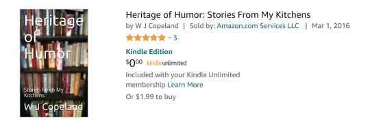
And this next pic is my KDP (Kindle Direct Publishing) page with the three projects I’ve got listed there. That list will be growing soon, but I’ll tell you about that in the next entry.

Herne’s Hart is a fantasy/adventure story involving centaurs, a human man, and Gaia the Earth Spirit. Ring of Magic is an action/adventure story set in the days of legendary Robin Hood.
This was a long post since you don’t know me. I wanted to put as much in this post as I could to answer your questions. Please, always feel free to comment, ask questions, make suggestions, or just say HI. My goal is to post something at least once a week, but hopefully twice a week. My food blog will automagically post here if I’m lucky. If not, I’ll link it by hand. I’m also on Facebook, and on Instagram. If you send me a friend request on FB try to let me know where you learned about me. There’s some less-than-savory people out there, and I’d rather not deal with them.
So, have a great day and

1 note
·
View note
Text
Myu Ranks Books Read in 2018
I made one of these posts last year.... So here is one for this year.
These are not ranked based on objective literary quality, but by how much I enjoyed reading/listening to them.
Legend of the First Empire (Michael J. Sullivan)
Age of Myth, Age of Swords, Age of War
It isn’t as bleak as “The First Law” books. There is still hope, but i don’t expect a happily-ever-after ending when the series wraps up in a few years.
I would place it on par of the Cycle of Arawn books.
The characters are well written and will be put through the ringers emotionally and physically.
My fav died at the end of the 3rd book so... there is that.
The Dematr Saga (Jack Campbell)
Part 1: Dragons of Dorcastle, Hidden Masters of Marandur, The Assassins of Altis, Pirates of Pacta Savanda, The Servants of the Storm, Wrath of the Great Guilds
Part 2: The Daughter of Dragons, Blood of Dragons, Destiny of Dragons
A healthy dose of World Building and Realistic action.
“Chosen One” trope and YA romance plot dropped down in the middle of it, but not in an insufferable way.
You will want to visit many of these places and actually visualize how this world works.
Does not shy away from the violence of war, even though rated a YA series.
Brief Cases (The Dresden Files)
It was so refreshing returning to the world of Dresden after finishing Skin Game a few years ago. I was thirsty for some more.
The final story with Dresden taking Mouse and Maggie to the the zoo was one of the best ones in the series.
Fred the Vampire Accountant & Undeath and Taxes
While I was missing Dresden, this series feels like “Dresden Lite”... for the Young Adult Crowd.
However, the main group of characters are all adults, no “young kid saves the world” tropes to worry about from the main cast.
From the same writer as the NPCs book.
Genesis Fleet: Vangard and Ascendant (Jack Campbell)
Jack Campbell going back to the Lost Fleet universe and giving us more space battles, politics, and likable characters.
Very Hard Sci-Fi.
Season of Storms (The Witcher Saga)
Geralt is having a bad few weeks, the story.
If you liked “The Last Wish” and “Sword of Destiny” you will like this story, as it is more or less a novel-sized version of one of the short stories.
Lord of The Rings: The Hobbit, Fellowship of the Ring, The Two Towers
A Classic, and I am going to get to the Return of the King and Simirellion soon.
Frodo and co. run into a retired Elder God in the Fellowship... wtf.
The Punch Escrow
Get the audio book. Mat Mercer reads it.
The book itself is written well.
A think-piece on teleportation, cloning, and morality of killing people.
Differently Morphious, Jam, Mogworld (Yahtzee)
Parody of the world as seen through the eyes of sarcasm.
Yahtzee reads the books and he does a really good job at it.
DM goes a little too hard on criticizing SJW internet culture. But sets up a good basis for a sequel with characters that are likable enough and mysterious enough.
Shift (Silo Saga, Book 2)
I liked this one more than the first book Wool.
You find out why the Silos were built and why they were in them.
Things aren’t going to end well for the main protag.
Halloween (1978) Novelization:
If you want to know where all the weird witchcraft came from in the middle movies...
More about Michael as a Child and about what he was doing in Smith’s Grove before he decided to give no more fucks and shut up for 40 years.
Alien: Out of the Shadows, Alien: River of Pain (Audio Drama)
Well acted, though i should’ve prob liked listening to the proper audio book version of them more than the radio drama version.
No Country For Old Men
If you like the move, you’ll like the book. They follow each other beat-for-beat.... Tommy Lee Jones and Javier performances are prob the main reason to watch the movie.
La Morte D’Arthur
It takes a minute to get over the “modern English” language. And after that your brain would be randomly speaking in it for the next week.
Dead horses.
Lots of Names being tossed around.
Nobody knowing who the hell the other person is, because of helmets.
Parable of Sower
Post-Modern, fall of civilization.
Main character a WOC
Heavy on religion, even one that is being made up in the book.
Maisie Dobbs
WW1-era and post era story.
Deals with PTSD/Shellshock and what happened to the injured from the war.
The crime mystery part isn’t difficult to figure out.
Till we Have Faces (CS Lewis)
From the writer of Narnia, one of his final stories to write.
Puts some realism in a classic Greek/Roman myth.
The Soul of an Octopus
you will cry for an octopus.
The Good Girl
Sorting out what is truth and what isn’t is perhaps the bigger draw of the book.
The ending hands us the answer.
The Handmaid’s Tale
First season of the show follows the entire book and is more an expansion on the book.
There isn’t a sequel to the book. Get the Anniversary edition with the “Post Fall” historical account to get some speculation as to what could have happened next.
I am Number 4
Neil Kaplan read the Audio book... and that is why i got it
It is average in just about every other reason what so ever.
Lies my Girlfriend Told me
that bitch.
if you are wanting teen drama and LGBTQ rep that isn’t sugar coated.
White Fang
segments from the wolf’s pov are really good.
some things can’t be translated well onto screen.
The Left Hand of Darkness
Gender-neutral society.
Not much else to set it apart from other science fiction to come out at the same time or after it.
I am Legend
Man Pain
Science Vampires
Typical story of Who is the Man and Who is the Monster?
Stinker Lets Loose
The voice acting is good.
Trying too hard to sound like a Politically Incorrect comedy movie made in the 60′s and 70′s.
Willful Child.
Another example of trying to hard to be Retroactively funny.
If you want to follow a poorly written Zapp Brannigan around for an entire book.
Moby Dick
Too long. No Fun.
The middle 200 pages could be taken out and would still read just fine.
Endurance: Shackelton’s Incredible Voyage
It droans on way too long in places.
Not a pleasant subject.
Non-Fiction.
Free book. If you like tragic realistic stories that are a slog to read, else-wise don’t buy it.
Books in Library that Hadn’t gotten to yet:
A Christmas Carol
The Spear of the Stars (Cycle of Galand, book 5)
Bloody Acquisitions (Fred the Vampire Accountant, book 3).
Extinct (Extracted, Book 3)
Return of the King
The Lion, The Witch, and the Wardrobe
Stephen Fry’s Victorian Secrets
The Lady of the Rivers
2 notes
·
View notes
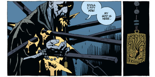
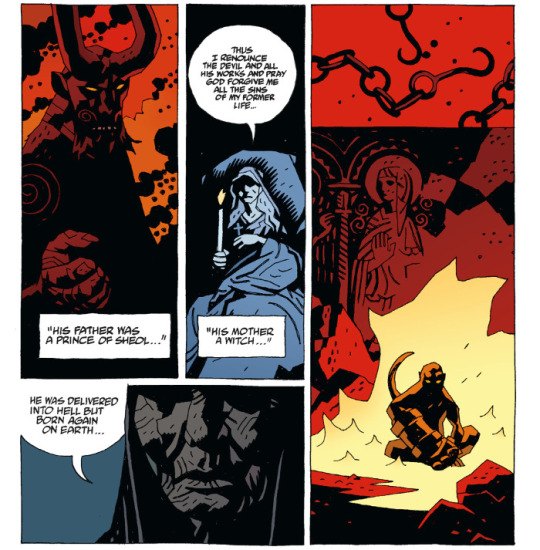
Photo

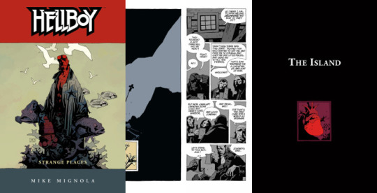
Strange Places: The Island
Words & Art: Mike Mignola | Colours: Dave Stewart | Letters: Clem Robins
Originally published by Dark Horse in Hellboy: The Island #1 & 2 | June & July 2005
Epilogue - Originally published by Dark Horse in Hellboy - Volume 6: Strange Places | April 2006
Collected in Hellboy - Volume 6: Strange Places | Hellboy Library Edition - Volume 3 | Hellboy Omnibus Volume 2: Strange Places
Plot Summary:
Hellboy emerges from the depths of the ocean to a crag of wrecked ships and navigates an island of ghosts, ruminating on who he is, who he was, and who he’s meant to be.
Reading Notes:
(Note: Pagination does not represent anything within the issue or collections themselves, it is solely in reference to the chapter.)

pg. 1 - The bleakness in these panels from the white skies, white water, the faded colour to the gulls and the ships, this feels like purgatory. In his introduction to this story, Mike Mignola said that he was inspired by William Hope Hodgson’s Sargasso Sea stories, which explains the setting, but this feels so much further removed from the world. That Hellboy has landed himself in a no man’s land.
Also, I think a potential interpretation of “The Third Wish” and “The Island” is to see them as two parts of the death and resurrection of Hellboy. Maybe not literally, maybe so, since everything here seems to be an existential exercise. In the former, you could see Hellboy going to a “hell” in the underworld of the sea and the final panels are vague enough that he could have drowned. Then in “The Island”, his soul is traversing this kind of purgatory, facing his demons and angels, while searching for a way to exist again.

pg. 3 - Absolutely stunning work from Mignola and Dave Stewart. The fading, distant sunset just adding to the feeling that wherever Hellboy is, there’s soon to be no light or warmth.

pg. 4 - This is a nice summary of the last story. The appearance of others is certainly strange.
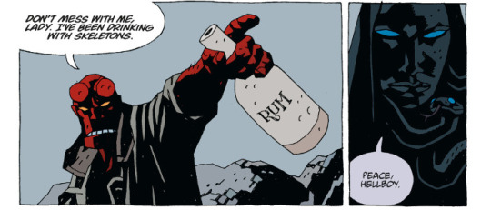
pg. 5-6 - The sea shanty, what’s actually looking more like flaming mugs than just sloshing ale, and weird orange colour definitely give it a feel that something’s wrong here.

pg. 7 - And there’s the rub. You do wonder, though, if Hellboy’s drinking with ghosts or if his loneliness and drink have him hallucinating happier surroundings.
Also, I just love the presentation here. The layout for the page and bottom tier’s grid is just interesting.
pg. 8 - Hecate’s looking a bit different from her last appearance, but it’s interesting to see her here to lay claim on Hellboy. The moon in the background is a nice little hint to her identity, if anyone was confused at the onset before she’s explicitly named.

Also, like the monkey with a gun panel, this is probably one of the funniest sequences in a Hellboy comic.
pg. 9-11 - Hecate’s reasoning for Hellboy to join her is kind of weird, reiterating a binary choice that Hellboy himself has rejected the notion of before.
That’s also probably one of the creepiest, most terrifying “I want you inside of me” propositions from a woman...or iron maiden. Somebody should probably do a study of the sexual innuendo in Hellboy and how awkward and strange much of it happens to be.

pg. 11 - Hellboy atop the cliff, tossing away the rum bottle, discovery of another skeleton, and then fade to black is probably one of the scenes in this story that most reminds me of The Seventh Seal.
pg. 12 - And then things possibly get stranger. Being unfixed in time and place give you a lack of orientation literally, so the appearance of a castle randomly on this island is even an odder prospect.

pg. 13 - When has Hellboy ever done the “sane” thing?
pg. 14-15 - Like the castle, the appearance of the priest, knights, and the man they’re judging as a heretic is hard to place, unexplained, making you wonder if it’s something currently happening, something that has happened previously and we’re just getting a flashback, or what.

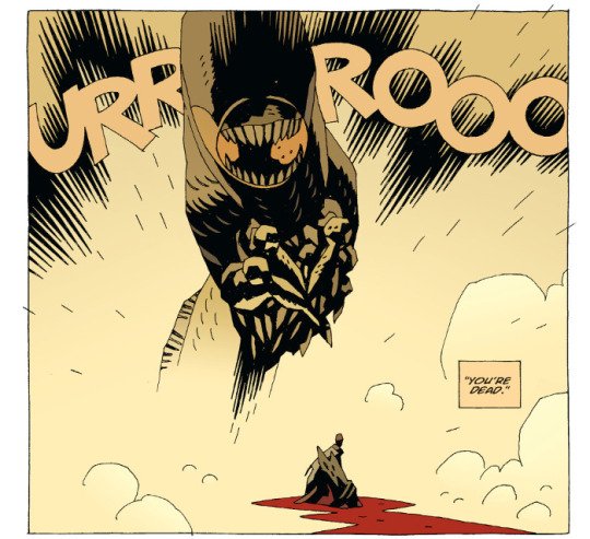
pg. 18 - Sudden monster appearance is sudden.
pg. 19-21 - Impressive battle, though there’s an interesting level of futility that Mignola introduces through referencing Moby Dick. That Hellboy is losing himself in continuing this battle.

pg. 22 - Yeah...grievous impalement probably isn’t good.
pg. 24-25 - I definitely seems more now that the bit with the priest is in the past. With the heretic telling the priest that he’ll rise again some time in the future.
pg. 26-27 - The juxtaposition of the heretic’s words in the past over the events in the present with Hellboy are well done. The art as well is just phenomenal. The darkness, the spot colours of red, the designs for the sculptures and decorations, the resuscitation of the old heart, you kind of just have to stare at these pages a few times to take it all in.

pg. 28 - Aside from just looking cool, there are also possibly some hints as to some of the story elements in what otherwise may just seem like random images.

pg. 30 - Mohlomi’s reappearance is certainly interesting. Especially serving as a kind of psychopomp for Hellboy. It makes you wonder if his role even in “The Third Wish” was merely a passive guide, ferrying Hellboy from one place to another.
pg. 31 - I absolutely love that the heretic has taken Hellboy’s colour scheme, along with his blood. It helps reinforce the idea that this is an assumption of Hellboy’s life and destiny, that he’s basically stolen everything of Hellboy’s existence to spur his own resurrection. And in doing so, Hellboy’s colour has faded and left him grey.
There’s also a visual similarity to the wound pattern and silhouette of Rasputin. From a conceptual standpoint, it sets up Hellboy against not just someone who has taken on his essential life spark to serve as a kind of doppelganger, but also a representation of his opposite.

pg. 32 - The heretic basically explaining it to us, and Hellboy just not having any of it is typical. Absolutely gorgeous art still from Mignola and Stewart.
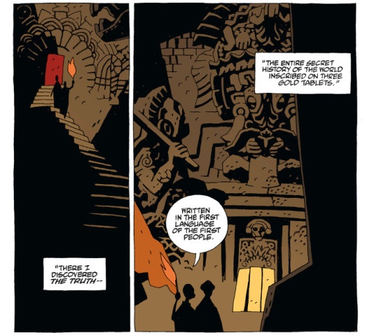
pg. 34 - The legend of those gold tablets (alternately copper in some tellings, I think, but mostly gold) is real. Again, it’s a testament to how Mignola tells a story, weaving in bits of pre-existing folklore, urban legends, mythology, occult, and magick with his own inventions to tell a bigger story.
pg. 37 - I find it very interesting that as soon as Mignola goes into the creation story for Hellboy, the constrained layouts and grids ends. Suddenly we get a full bleed page, something we’ve not seen often in the series. Visually, it signifies that something bigger is being told here, even if you don’t necessarily comprehend that on a first reading.

pg. 39-40 - And that full-page storytelling continues through with the creation of the Ogdru Jahad and their offspring.
pg. 41 - And just weird happenings regarding the creator race of Watchers and the one who basically constructed their “devil” in Ogdru Jahad, and how his bits and pieces ultimately come down to Hellboy’s conception.
pg. 42 - This conception of the creation of gods and monsters, of mice and men, is interesting. Even if predicated on a faulty understanding from Blavatsky.
pg. 44 - Just stunning use of colour from Stewart.

pg. 46 - And it gets woven back into the narrative that started in Seed of Destruction and is currently running through this narrative movement in BPRD.
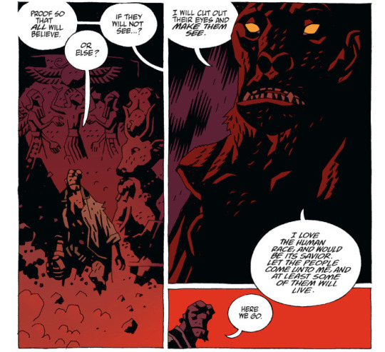
pg. 47 - It’s interesting that it always cycles back to the crazy. Delusions of grandeur and an attempt to run the world, to have it accept him as a saviour, anyone who disagrees be damned. It’s an interesting counterpoint to Hellboy, who doesn’t want to be a hero but tends to do the right thing just because it’s “right”.

pg. 50 - I love it when Hellboy provides his own sound effects.

pg. 51 - It always sucks when hurting the villain hurts you yourself. This mirror nature between the heretic and Hellboy is fascinating. It’s also interesting to see what effect Mohlomi’s trinkets are having.
pg. 52 - The heretic’s assumption of Hellboy’s “true” form, even as this nascent Anung Um Rama demon--though looking a wee bit more like Astaroth--is interesting. It’s a sign of a path not taken.
pg. 53 - Creepy worm is back.

pg. 54 - The heretic suffering as the worm creature thing dies is an interesting touch. Gorgeous artwork.

pg. 56 - After all that...

pg. 57 - Ominous hint of things to come.

pg. 60 - Love the use of the fairies and night creatures and whatnot again as a kind of Greek chorus for the epilogue.
Also a hint for what comes next in the main narrative, “Even now he is bound for England.” which I think picks up in Darkness Calls.
pg. 61 - I find it interesting that Hecate has apparently fallen silent, likely living by Hellboy’s wish for her to leave him alone (at least for the time being).
pg. 62-63 - Nice reiteration and reinterpretation of who Hellboy is.
pg. 63 - It’s also interesting as to just how much of Hellboy’s eventual fate is shaped just because this little hobgoblin, Gruagach, couldn’t handle his smackdown from being a jerk back in “The Corpse”.
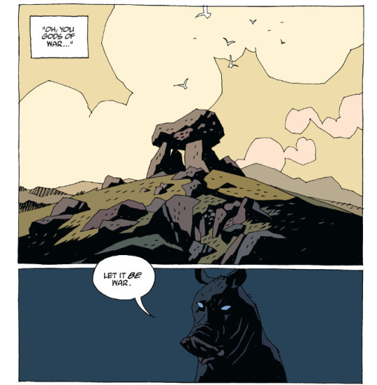
pg. 65 - Just let it go, pig dude.
Final Thoughts:
So...if “The Third Wish” was a fairy tale, Mike Mignola’s tragic take on Hans Christian Andersen’s The Little Mermaid, this is something else entirely as a follow-up, somewhere between The Seventh Seal and Black Narcissus. It’s bleak, distant, esoteric, and absolutely lush when it comes to its use of colour to set mood and atmosphere.
While it is a resumption of the origin cycle for Hellboy that has played out before in the narrative a few times now since Seed of Destruction, it’s also a bit of transference and confrontation of Hellboy’s destiny that plays out here. Where previous iterations may have been an emotional response and rejection, here we get a more measured physical and intellectual rejection.
This also feels kind of like a dry run for the storytelling approach that we’re going to eventually be seeing in parts of Hellboy in Hell. This story definitely takes us to some strange places.

d. emerson eddy is just a broken machine, with all the layers of dust some things have started to fail. Some things. Some.
2 notes
·
View notes
Text
Creating a Year Art Book
After the brief, I get started in writing notes of what projects I’ve done in my first year at university, including some of my own artwork in my spare time.
Digital Magazine Designs
My Own Comic Designs
Learning How to Make a Video
Project Old School
Art Requests
Workshop Designs
Christmas Drawings For My Family
Art Assessments
Bottle-cape Designs
Perspective Drawing
Creating My Own Book Cover
Creating My Own CD Cover
Live-Drawing Sessions
Typography
Logo/Packaging Designs
These are the titles I’ve written from the all the projects I did this year. Next I go to word document to write down the notes in full sentences of what I made in these projects and my own artwork.
My Artwork of My First at University of Cumbria
contents
Contents
Introduction-
Digital Magazine Designs-
My Own Comic Designs-
Art Requests-
Project Old School-
Learning How to Make a Video-
Workshop Designs-
Christmas Drawings For My Family-
Art Assessments-
Bottle-cape Designs-
Perspective Drawing-
Creating My Own Book Cover-
Creation My Own CD Cover-
Live-Drawing sessions-
Typography-
Logo/Package Designs-
Introduction
Introduction
My name is William Jackson, this is my first year at University. I was born in Blackpool, and raised by a good mother, father and brother growing up and living in pubs and hotels my father has owned since I was born.
Before going to university I spent 3 years of college studying art and design, learning lots of new things in the course, drawing, printing, photoshop and ceramics. Now I am now at university, I’ve be learning new art techniques and skills to become a better artist in the future.
Digital Magazine Designs
Digital Magazine Designs
In the start of my first year at university, I made a couple of digital magazine designs in one or two projects.
One magazine was about my trip to Keswick with all of the classmates that are in the same course that I am.
The other magazine was about how the pyramids of Egypt were built in ancient Egypt.
I did the magazine designs by creating some drawings of my own (comic characters and artefacts), some images I’ve taking from the internet or taking photos from places I’ve been or seen to. I made these magazines in that kind of mixture, because I enjoy reading books since I was a little boy and I have been into comics since I was 10 or 12 years old.
What I hope to do next year is make some more magazine/comic designs and make better written work in them.
https://issuu.com/grillustdropbox/docs/my_visit_to_keswick
https://issuu.com/grillustdropbox/docs/how_were_pyramids_built_
My Own Comic Designs
My Own Comic Designs
During my spare time in college and in university, I’ve been working on comic designs of my own.
The other year at college, I did a small comic strip based on the classic novel “Moby Dick”. How I did the work, was in a mixed media set of pen, pencil, dry-point printing (etching) and photoshop (on the computer) each art material I did them in order with one picture after the other with another mixture of cartridge paper, parcel paper and sugar paper to get a little historic effect in the artwork, they work really well.
The first comic design I’ve made of my own is based on the game trailer Assassin’s Creed Rogue, and the Second comic I’ve made is based from the movie Armageddon. The name of the comics are called “the hunter” it is short story about man walking through a dark background killing his fellow knights and friends in his path, the second comic is called “Armageddon” a story about how an asteroid had crashed into the earth during the time of the dinosaurs.
I did the comic design in drawing, photoshop and indesign, to make it into a successful comic design. I’m already working in third comic design and more after that.
That is something I’m wanting to do in the future, to be a comic artist.
https://issuu.com/grillustdropbox/docs/the_hunter
https://issuu.com/grillustdropbox/docs/comic-_armageddon
Learning How to Make a Video
Learning How to Make a Video
During my first year at, there were a couple projects that were in video designs. Planning the video is one thing, making the video is another thing.
One video was a stop-animation of a pack of Haribos curling into a ball, then a phoenix emerges in the centre and flies away.
The other was working with one of classmates and partner Lily of a short thriller film of ourselves in old book shop, where Lily walking around the shelves for a book, till I attack and kill her with a book in hand, then later on a friend of mine is walking around town till he finds Lily’s body by the water fountain.
The videos didn’t go exactly the way I wanted them to be in, but I did my best I can in them. The problem was, in the project I had use these computer apps Premiere Pro and After Effects, and learning how to use these apps was really difficult, because I have used them before. What I’m planning to do next year is learn more of how to use these apps to make some videos and how to get some sound effect in, and for some of my own artwork, because I think it might come in handy and I have a friend who could teach me some things in creating videos.
When it comes to computers, create art in them is more difficult than drawing them in paper.
https://www.youtube.com/watch?v=8gUbMquGArI
https://www.youtube.com/watch?v=-KCDkkMrUvA
Workshop Designs
Workshop Designs
In the first term my group and I go into some workshop to learn new things for illustration and graphic design, text-style, print-making, wood-making, photography and metal-making.
I enjoyed going to them. The workshop were in six sets...
Wood
Metal
Photography
Print
Silkscreen
Embroidery
Here is what I enjoyed most is...
1. Metal- Going to the metal workshop was the first time I’ve ever been in any art course I been to, what I made in there was a metal sculpture of a dragon and took home as a Christmas present for my brother, he loved that a lot. I haven’t done any sculpting since I was thirteen, I use to do small paper sculptures dinosaurs and thunderbirds in my spare time when I was in secondary school.
2. Photography- Going to photography was the first workshop my group and I went to, so using a camera and (if we wanted to) using Lightroom for adjustments was another thing I’m familiar with and of course there is the darkroom I’m familiar with, I did some of these in a few projects when I in college. The darkroom photos I enjoyed the most, because there is some mystery of the object is without any detail or colour. I also learned how to use ultraviolet photography which was fun do to, I would like to do that again next year.
3. Print- Doing some prints is very familiar, when I was in college I did lots of printing making (lino-printing and Dry-point printing/etching). Now at university I did some more of that and learnt how to do etching on metal plates, which I kind of enjoyed doing, because I used other materials to get some shading or tonal effect, when I the plate printed it a good texture and composition.
Next year I’m planning more of these prints for one or two of my own comic designs.
4. Wood- I made wood before, when I was in secondary school, so wood-making is very familiar as well, the fun bit was making a couple of business card-holders for my brother and my dad, then doing some small drawings on them. They were both happy for what I made when I gave it to them on Christmas.
5. Silkscreen- Learning how to use silkscreen printing is different than lino-printing or dry-pointing printing (etching), but it was very interesting, because I could a couple of colours in one print but I think I can put in some more colours in other prints with some more learning.
6. Embroidery- Using the sowing was a little tricky with, but with some practise and patience, from the digital magazine of the pyramids I did a bit of artwork of the pyramids and the equipment and materials of how they were built. I might get better at other things in text-style in time.
Project Old School
Project Old School
In the first term at university, I was in my second project after the first project (the digital magazine designs).
The project was about creating eighteen to twenty-one task from a set of instructions on paper:
OLD SCHOOL
Two weeks of exciting and challenging manual tasks where only perfection is good enough!
Tasks 18-21 should be started immediately and progressed while you are working on the shorter exercises. As time management and organization are just as important as creativity it is crucial you complete all the tasks within the allocated two-week period.
BOOKS
TASK ONE (30 minutes):
Create an A5, portrait format, saddle-stitched book. It should contain 20 pages of white paper.
The cover should be made of a thin, coloured card. The front should feature a decorative motif of four, 5mm diameter holes cut through to reveal the white page below. The holes should run vertically along the right-hand edge: inset by 12-14mm (hole centres) with a spacing between each hole of 40.5mm (centre to centre).
Any page creep should be carefully trimmed.
TASK TWO (60 minutes):
Create an A5, landscape format, stab-stitched book.
It should contain 12 sheets of A5 paper and 2 sheets of thin, A5 card to act as a cover.
The holes for stitching should be placed at 15mm and 10mm from the left-hand edge.
The interior sheets should have a cut, decorative motif achieved as follows:
Sheet one contains a 50mm square hole (centered at 95mm from the right-hand edge and 74 mm from the top edge).
All subsequent sheets (apart from the last) should also feature a square hole that uses the same centre as above but diminishes in increments of 4mm per sheet (i.e. 46mm sheet two, 42mm sheet three
Any page creep should be carefully trimmed.
TASK THREE (45 Minutes):
Create an A5, landscape format, perfect bound book.
The cover should be made from a thin card.
The spine should be at least 5mm wide.
The first 20 pages should be vertically perforated 50mm from the right- hand edge. The final two pages should fold out (by an additional 40mm). Any page creep should be carefully trimmed.
Presentation
TASK FOUR (10 minutes):
Window mount a postcard behind an A4 sheet of mounting card. The mount should be hinged to a backboard.
The hole should be cut with a 45-degree bevel.
TASK FIVE (10 minutes):
Surface mount six postcards (all in the same orientation) on a mid-grey sheet of thin card
TASK SIX (10 minutes):
Using a pen draw the outline of a perfect, 47 mm square in the middle of a sheet of A4 layout paper. This should be presented in pristine condition, the only marks on the paper being the ink outline of the square.
TASK SEVEN (10 minutes):
Take an A4 piece of thin card. Using a compass draw a circle with a 50 mm radius, centered on the sheet.
Using a scalpel or craft knife cut out a perfect circle. Both pieces should be retained and presented.
The curve should be continuous and smooth (no corners)!
TASK EIGHT (20 minutes):
Emboss a circle, square and equilateral triangle onto a sheet of white, A4 cartridge paper. The shapes should be 45mm high, share a baseline and be centered (landscape) on the sheet.
TASK NINE (30 minutes):
Cut the word SHOP out of black paper and mount it on an A3 sheet
of white cartridge paper. The word should be set in uppercase letters 90mm high, be carefully spaced (kerned) and sit on a common baseline. You should use the font Rockwell Extra Bold.
As with all the tasks, no glue or construction marks should be visible.
The Third DimensionTASK TEN (30 minutes):
Using thick paper/thin card, create a perfect, white cube. Each side of the cube should be 90mm long.
TASK ELEVEN (60 minutes):
Using black, thick paper/thin card create a three-dimensional capital letter ‘R’.
You should use Rockwell Extra Bold and the letter should be 150mm high and 40mm deep. It should appear solid when viewed from any direction like this…
TASK TWELVE (10 minutes):
Create a full-size; first angle orthographic projection of your 3D letter R.
All construction lines should be in pencil with the actual projection rendered in black ink.
TASK THIRTEEN (10 minutes):
Create a full-size oblique projection of your 3D letter R.
All construction lines should be in pencil with the actual projection rendered in black ink.
TASK FOURTEEN (10 minutes):
Create a full-size isometric projection of your 3D letter R.
All construction lines should be in pencil with the actual projection rendered in black ink.
Colour and ToneTASK FIFTEEN (90 minutes):
On a stretched sheet of A3 cartridge paper, using red, blue and yellow
paint create a colour wheel that looks like the one to the right (omit the text).
The diameter of the wheel should be 200mm.
TASK SIXTEEN (30 minutes):
On the same sheet of stretched cartridge paper and using black and white paint, create a sixteen step Grey Scale that looks like this >>>
Dimensions: 240mm high X 50mm wide
TASK SEVENTEEN (30 minutes):
Using the same format as above, select one of the secondary colours you mixed earlier and position it in its correct position on the Grey Scale. Now create a tone scale for the colour by adding black to darken it and white to lighten. The scale should be positioned 15mm to the right of the Grey Scale. When complete, each step should be tonally identical to each of theGrey Scale steps that lay along side.
Squint your eyes to accurately judge tone!
A Parting of the Ways…
Tasks for Graphic Design StudentsTASK EIGHTEEN (60 minutes):
Print out the above document – Type Rendering.pdf.
On good quality tracing paper and using a sharp 2H pencil, carefully render all the copy at actual size. No construction marks should be visible on the tracing paper.
TASK NINETEEN (90 minutes):
Following the instructions (Constructed R Instructions) draw this letter to fill an A2 sheet (landscape format).
All construction lines should be included (either pencil or fine line pen). The finished R should be solidly inked in with… … ink!
TASK TWENTY (3 hours):
This is a poster designed by a German poster artist Erich Gruner. The original is painted in gouache (poster paint).
Using paint, create a perfect copy on a sheet of A3 paper. All colours and textures should be identical to the original.
We will be looking for accuracy of colour, tone and edge quality.
TASK TWENTYONE (4 hours):
A series of exercises to develop a feeling for curves…
Print out these three sheets (Exercise 1-3) at actual size (A4) and complete each design. You should use a pen for 1 & 2 and a brush for number 3.
Most of the designs are symmetrical but please note; a few are asymmetrical.
They come from a Victorian book of instruction for school children.
Print out these two sheets (Exercise 4-5) at actual size (A4).
Using brushes and black ink copy them at approximately the same size
on an A3 sheet of cartridge paper.
This is the only exercise where no preliminary drawing or tracing is allowed – all drawing should be done with the brush.
Tasks for Illustration StudentsTASK EIGHTEEN (60 minutes):
This portrait of a Breton boy by Henry Lamb is a pencil drawing on cartridge paper.
You are asked to make an accurate copy of it using the appropriate grades of pencil – as with all these tasks you can base it on a tracing.
The drawing should be approximately 150mm mm high.
TASK NINETEEN A (2 hours):
This is a dip pen and ink illustration by Mervyn Peake.
Make an accurate copy of it using the original media and techniques
The image size should be approximately 140 mm high.
TASK NINETEEN B (3 hours):
TASK TWENTY (3 hours):
This is a wood engraving by Clare Leighton
Produce an accurate copy of it using scraperboard.
The image should be approximately 180 mm tall.
This is a watercolour by Arthur Melville.
Reproduce it at the size of 300mm high on stretched watercolour paper.
TASK TWENTYONE (2 hours):
This illustration by Brad Holland is painted in Acrylics on canvas.
Paint an accurate copy of it 250mm high.
When I started doing the tasks, they all seemed simple enough to do, making small (A5) sketchbooks, creating 3D paper models and making some drawings in the artists’ style.
I didn't finish all the task, but when I presented my work, along with everyone else artwork with same tasks I had in the project to my tutors, they told me I had almost succeed everything, there were some that didn’t go the way they should be, either I didn’t follow the instructions properly or I didn’t read the brief more.
What I need to do in the future, I need to read briefs of the project a bit more carefully and if I need to ask for help on what I need to do, I’ll go to the tutors.
Art Requests
Art Requests
Before I started going to university, some people have been asking for some of my drawings, from friends of mine and local people from places I use to work.
Six people from The strictland Arms, have asked me for my artwork (a local restaurant and bar) during my time in college.
Graham- a former manager who has asked to do a drawing of favourite Car as a goodbye present.
Miles- a former assistant manager who has asked me to do drawings of all the Dinosaurs of Jurassic Park.
Olivia- a Staff member, who asked me to do a drawing of herself before her baby would be born.
Chris- A former pot-washer and chef, who asked me to do drawings of a couple gorgeous woman in 50 pin-ups and the same drawings I did for Miles, all the Dinosaurs of Jurassic Park.
Lee- A chef who has asked to do drawings of his dog and cat and a copy of my first comic design (The Hunter).
Ethan and Abi- Former staff members and best friends since primary school who have asked me to do drawings of themselves in their childhood.
A couple of tutors from Kendal College, I gave you some of my artwork as a thank you for teaching me.
Mike and Amy- Tutors of mine during college, I gave them a copy of my “Moby Dick” comic strip. A large drawing based on a museum fossil of a big shark tooth Megalodon with small drawings and facts about this extinct shark.
Amanda- A supporting tutor of mine when I need help, I gave her a photoshop design based on a song I have decided to use in a art project, (Take That- Rule the World).
At university I did some birthday drawings for my friends who share the same flat with me in the halls residence. Each of them in comic poster designs.
Euan- Of us in character designs at his side in Scotland.
Freddie- Of her and her dragons as Queen.
Micheal (Freddie’s boyfriend)- Of him and her as King and Queen of the dragons.
Jules- Of him a travelling wizard.
I also did some more drawing them as goodbye present
Myself (illustration and graphic design)- As “King of the Beasts”.
Euan (Filming)- As “King of the Scottish”.
Freddie (Fine Art)- As “Queen of the Dragons”.
Jules (Creative Writing)- As “The Travelling wizard of England”.
Lucy (Policing)- As “Captain of the Seven Seas”.
Chloe (Dancing)- As “Actress of Carlisle”.
Flat 250 (the flattop the halls residence we’re staying in)- As “The Gang of Flat 250”.
Everyone was happy of the work I made for them. There will be more art requests soon and I’m happy to make time to do them.
Christmas Drawings For My Family
Christmas Drawings For My Family
Near the end of the first term, for the Christmas holidays, I did some drawings for my family as Christmas presents. I did loads of poster-like-comic designs for nearly everyone during the holidays, there were two or three people I didn’t get drawing for them because they have just been invited into the family or didn’t know what draw for them.
My parents (Matt and Sarah)- A business card-holder, for my dad’s card in his office and a drawing of Grandma to remember her by.
My brother (David)- A business card-holder for his cards at work, a drawing of Grandma to remember and a metal sculpture of a Dragon I made from university.
My cousins (Ryan, Sophie, Oliver and Alice)- Small A5 books, each created in different sets for Sophie, Oliver and Alice and a comic poster of my Cousin Ryan.
My Uncle (Steve)- A drawing of my Grandma to remember her by.
My Aunt (Nicky)-A drawing of my Grandma to remember her by.
Family Friends (Mike, Linda, James and Emma)- A Christmas card for Mike and Linda and comic poster design for the twins James and Emma.
My Aunt’s boyfriend (Gary)- A Christmas card for him.
My Grandparents (John and Mary)- A Christmas card for them.
My Grandfather and Step Grandmother (Bill and Lee)- A Christmas card for them and an old drawing of his car.
My uncle’s Girlfriend (Olivia)- A poster drawing of her favourite singer Lady Reshurr.
My Aunt and Uncle (Mark and Nicky)- A Christmas card for them
My Aunt and Uncle (Tishe and Kent)- A Christmas card for them.
My Godfather (Will)- A Christmas card for them.
I am very proud of doing these drawings, next Christmas I’m planning to do some new drawings for my family.
Art Assessments
Art Assessments
From the other projects me and everyone in the course are doing, in the first term we have been doing some art assessments from one of the tutors.
The assessment is about working in a small group of four or five, of designing our characters in any decade and country we’ve been given and then creating a video together. The decade and country we have given for the assessment is the 1960s British.
What I enjoyed doing the most was creating my own character design. The did a character of my brother David, when I was at Secondary school I was making comic drawings based on the classic novel “The lost World” where there is a secret land full of Dinosaurs, my brother asked me to him in the story, so with a few others who have asked if they can be in the comic story. The funniest bit is when he asked was “Do not kill me in the story” and I said “Maybe”, so from looking through all the other design characters I’d drawn, I thought for this assessment I could the character design of my brother again. I did another character of a lizard man, but everyone in the group like my brother better.
For something like that, I hope to do some more character designs of my own next year.
Bottle-Cape Designs
Bottle-Cape Designs
Sometime around February, I made some more spare-time making sone new designs of my own.
Back at home me, my brother and my parents have been doing some bottle-cape collecting, placing them in a glass jar, since my Father owns the Brewery in Lancaster. When I start my first year at university and later on my job at the bar and hotel (Gosling Bridge) in Carlisle I do my own bottle-cape collecting. So around February I use the bottle-capes to create new designs for my Dad and the brewery.
During my time in secondary school I did a drawing of the brewery when it was built in Lancaster for my Father and other staff members, they then use it to display it on the pump-clips, posters, on bottles and on the brewery vans... this is something that has made me really happy to see.
What I did for the bottle-capes is stuck them in a large plank of wood and then paint over what I want to paint. So far I have made three bottle-cape designs a rose flower of Lancaster, the title or “Lancaster the Brewery”, and third design is about putting quotes from the bottle-capes I collected from the brewery, so far only my parents and my brother and my friends know I have made these designs, and soon the staff members of the brewery will be surprised of what I made.
Perspective Drawing
Perspective Drawings
Around October (Halloween), I did a project of perspective drawing.
There are other kinds of perspectives from whatever the eye is seeing.
Bird’s eye view- a bird seeing what’s below on the ground when flying.
Human’s eye view- when someone is seeing a view from a distance.
Worm’s eye view- a worm seeing what’s above in the sky when crawling through the floor.
The first thing I did was do some practise drawing of perspective
set of cubes or cuboids, one or two chessboards, and one or two
objects.
Next I did some more perspective drawing with a couple of
backgrounds. A chess set in a human/worm’s eye view at once, a steam
train of the famous Flying Scotsman, then the last perspective
drawings I did were of a deer park with sheep at a distance with my
family’s dog in close-up and a tunnel with one of my flatmates
(Freddie) at the other side to the entrance.
When I presented my work to my tutors, they were impressed that I
understood the meaning of perspective, the drawings weren’t exactly
they asked for the drawings they asked was of a dark alley street
with a cat in the centre.
This is another reason why I need to read the brief of the projects
a bit more. Look on the bright side, at least I tried.
Creating My Own Book Cover
creating My Own Book Cover
Before I went home for the Christmas holidays, I was given an other
project about creating a book cover in the artist’s style. But First
I need to do some research on the artist I was given in the project.
The artist I researched was Rockwell Kent, an illustrator who has
done his drawings in a mixture of drawing pen, painting and
printing. Seeing some of his artwork is a little like going back in
time, due to some of the book covers and pictures he has made like
Moby
Moby Dick
Mary Poppins
Bridget Jones’s Diary
Heart of Darkness
The Damned United
Pride and Prejudice
1984
Gorky Park
Tom’s Midnight Garden
The Right Stuff
Murder on the Orient Express
Midnight’s Children
The Tin Drum
Cold Comfort Farm
Under Milk Wood
Macbeth
Fahrenheit 451
The Motorcycle Diaries
Germinal
Pies and Prejudice
These were the chooses I needed to make, to create my own book cover. At first I wanted to do a book cover of Moby Dick, but since I’ve designed a comic strip of it I decide to do something else. I chose to do the Murder on the Orient Express. I chose this because I’m trying to do something different, plus my grandfather enjoy trains before I was born then I enjoy trains as well.
I made lots of drawings and prints of trains, the weapons from the murder (knife and gun). They were okay but weren’t exactly the style from the artist I was given in the project, eventually I did the artist’s style, made a couple of more drawing and decided which is the best one.
What I think could improve to develop if I were to do is add a tiny touch of red (blood) to make it a bit more of a murder.
Creating My Own Record Cover
Creating My Own Record Cover
After the Christmas holidays I started on the next project straight away at university.
My group and I were asked to create a CD/record cover based on the bands and the songs we were given from our tutors. The band and song I was given were...
The Joy Formidable- This Ladder is Ours!
Thomas Dolby- Cloudburst at Shingle Street
The Tornados- The Telstar
Doing some research and listening/watching the songs, I chose to do the Formidable Joy- This Ladder is ours! Looking at the video and reading the lyrics of the song, I then think of something I did when I was in college last year. I was working on one or two songs I (Take That- Rule the World or Tinie Tempah- Wirtten in the stars), using a couple of lines from the lyrics and designing a portrait of the song. This was something I did for a record cover of the Formidable Joy, doing some drawings, lino-prints and Photoshop designs I have the work printed from the computer and carefully cut and stick the design together, to the size and shape the record cover should be in. Presenting the design to my tutors, they tell me they record capture the imagination and energy from the pictures and quotes from the song.
If I was asked to create another record, for another song, I would chose the song I like to do.
Live-Drawing Sessions
Live-Drawing Sessions
After the Christmas holidays were done, in the second term, me and any of my group that were interested go to live-drawing sessions. When I was in college there were some live-drawing sessions going a few times, but I never went to any of them, it was for the older students to go to them, this year is the first time I went to any of them. Every week we were given a spot with a stand, board and A1 paper and the models we use for our artwork taking turns every week and every week we use different art materials to try out new things this year (trying to get us out of our comfort zone). The models was a man named Nick and a woman named Helen.
The materials we used for our drawings were...
Pen
Pencil
Charcoal crayon (Black, white and red)
Writing Ink (Using some water for tonal/shading)
Coloured Paint (oil paint, water colour paint or acrylic paint)
Most of the drawings I did of the models I’m quite proud, there are some drawings I think I could a lot better, what I need to do to make better drawing next year for live-drawings is practise by looking at the drawing with one eye and looking at the subject or object with the other eye.
Typography Projects
Typography Projects
What was a little more challenging and a little frustrating was the typography projects.One project was about creating an article I was given and write in a few sets
Square format- 140mm x 140mm
Portrait format- 245mm x 100mm
Landscape format- 115mm x 207mm
The article I was given was...
The Sun: Living with Our Star
Discover the story of humanity’s ever-changing relationship with our nearest star - the Sun - through hands-on expe- riences, unique objects, and stunning imagery in our latest exhibition. Set at the centre of our solar system, the Sun’s brilliant light shapes our sense of time, our health and our environment. People have tried to harness its power and uncover its secrets since the dawn of civilisation. From 3,000-year-old artefacts to upcoming space missions and even a nuclear fusion reactor, our new exhibition takes you on a visual, action-packed journey that brings the science of the Sun to life. Bask in sunlight on an indoor beach, try on historic sunglasses in a digital mirror, and watch the Sun rise around the world on a huge illuminated display as you explore the fascinating story of humankind’s relationship with our closest star. During the exhibition there will also be a screening of the absorbing documentary ‘Let There Be Light’. The screening is followed by a discussion—and most likely no shortage of lively debate—about the viability of nuclear fusion and solar energy as the answers to reducing our reliance on fossil fuels.
6 October 2018 – 8 May 2019
Tickets £16, under 16s free, other concessions available Special Exhibition Gallery, Level 1, Science Museum, Exhibition Road, South Kensington, London, SW7 2DD
www.sciencemuseum.org.uk
Doing this was a little frustrating because I needed to get them...
one typeface in as many sizes as you see necessaryt
wo typefaces, each in two sizes
one typeface and its related bold, in one size only.
And get the titles and sentences a good composition sets was difficult to do, because from all of that this is first time I created a type of article. But when I got it all printed out and set in A1 grey card paper, the tutors have told me I made some good and strong composition in them and getting all the word in the same size as I’ve made them in.
In the other typography project, was about creating a poster for a on-coming festival about creative typography, so me and my group needed to create our own posters and the tutor can decide which is the best to have. I wish they took my design despite it too have a strong composition and good information about the festival but somehow I got the information a bit big than the last typography project it is a bit disappointing, but the bright side is that I get to enjoy doing some artwork experiments on drawing, colouring, painting and cutting typography fonts A to Z.
If I were to do it again was, only get the information a bit smaller, but create some more colourful and creative fonts.
Logo/Packaging Designs
Logo/Packaging Designs
Then the last project was about creating a logo design of my own, inspired by other logos that have been made around the world like Pepsi, Shell, Snickers, etc.... In this project, I was to work with someone (a partner) to suggest work kind of logo design we could do, the partner I was with is a young girl named Katelyn (Kate for short).
The Logos we needed to inspired by are...
New antique furniture
A portable anvil
Mirrors that make you look thin
Nylon stockings for men
Cardboard houses
An irritable Sat-nav
Yorkshire Swiss roll
A straw based breakfast cereal
A clockwork car
Fashionable shoes for dogs
Fizzy yoghurt
Thermal bras
Cuboid footballs
Heated toilet seats
A cheese fountain (for parties)
A cactus with rubber spines
Concrete mattresses
Radioactive hair dye
Hats for horses
Self-cleaning dustbins
Wool burning stoves
Pop-up self-assembly furniture
Emulsion paint for Goths
Celebrity pasta shapes
I did a lot of drawings and photoshop designs of logo names my partner written, I can’t remember what exactly each were, but those I like, I used creating the logo ideas, along with a few drawn pictures at the side. The best design and final piece I did was an antique logo design, with my dad owning a brewery in Lancaster, there is an antique shop (warehouse) next door to it, whenever I go to visit the brewery I would sometimes go the antique shop to see what they have in there (one time I went and bought an old comic for me to read with).
My partner worked on a presentation, of a logo she has worked on, when we showed to designs to the tutors, but when I tried to email the presentation to them it somehow couldn’t send, but my partner how managed to make to presentation later on.
If we were to do this project again, we would discuss some more ideas, logo designs and work on a presentation together.
Thank you for Reading...
Thank You For Reading...
Being at university has been different and challenging than it is at home and college. I came to university not only to learn more art and design, but to learn how to live with by myself away from my parents and family. This has been a good year. Doing some new artwork and skills has not only been challenging (driving me out of my comfort zone), but has made me learn new things in the course.
Maybe these new skills will let me do them again, to help me become a better artist in the next two years at university. Who knows?... Maybe you’ll do something like I have done too in the future.
After I write the notes and wrote it down on Word Document I use one of my sketchbooks that I haven’t used yet and get the writing printed and cut-out where they need to be in the book, next I took some images to go with the idea of what I made and designs at university.


But I had to get them in photoshop and get them printed, when that was done I cut out the images and stick them from where they need to be in and the last thing I do is write tiny notes around the images of my artwork so when someone reads what I did they’ll which is which with the notes at their side.


When I come for university next year (and hopefully a successful year) I would like to create another book of what I made both art projects and my own artwork to make it more exciting for people to see.
0 notes