#I tried to draw everything with Blender's grease pencil
Explore tagged Tumblr posts
Text

Saw this amazing animation reel by animator Curie Lu and was inspired to do some animation with glowing freckles Danny.
I also made a second version with a special effect on the eyes like in the reference but I'm not sure whether it looks better or worse:
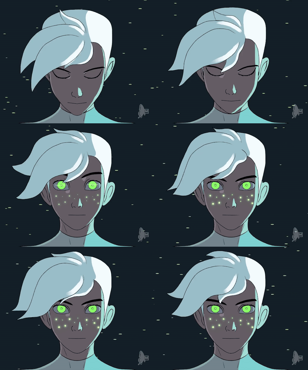
#danny phantom#fan art#fan animation#glowing freckles#danny fenton#2d animation#blender#grease pencil#my animation#my art#I tried to draw everything with Blender's grease pencil#actually not bad for pure 2d animation work#filling tool was a headache to understand in the beginning#but now I think this filling tool is even better than the ones in various 2d painting softwares
2K notes
·
View notes
Note
Hi!
I absolutely adore your art, could you please share how you create your animations? I’ve never seen anything like that before.
Thank you! <3
Hello. Thank you a lot for the kind words.
I draw animations irregularly, in a spare time just for fun, so never developed a proper step-by-step pipeline. This is a regular hand-drawn 2D frame animation: I draw sketches, clean-up, do a linework, color, render and compose elements with backgrounds then, all in Photoshop with the video layers instrument.
Recently, I started to compose the scene and all separate elements of the scene in Blender to add some illusion of a three dimentional space, but it's not working as I wanted. I believe there is a separate instrument in this program just for the sake of frame animation (grease pencil?..), but I haven't tried it properly yet, ha-ha. So mostly I keep drawing everything in Ps.
2 notes
·
View notes
Text
Ok I couldn't sleep so I tried to recreate some of the visual effects from this brick wizard animation. I'm gonna break this down into parts because 3d is complicated and even then I'm gonna be missing some of the parts, like the sharp pixely look that I don't have any experience with simulating. This is in Blender 3.6 btw, and I think that individual tutorials on modeling, shading, and physics will do a better job at walking somebody through the process than a sort of compilation post will, so I'm not going to go into excruciating detail on each step with like, explaining the various editing modes and such (unless somebody asks)
The Model
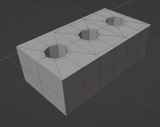
It's just a brick. I made a cube, scaled it to roughly brick sized, and then cut some holes into it by using an addon called Loop Tools that lets you make faces into circles from squares. I definitely fucked up the topology here, some of it is weirdly inconsistent, but it didn't affect the final result so we get to ignore the bad practices.
The Shader
This is the easy part, because if you want flat colors without bothering with shadows or reflections, you can just literally do this:
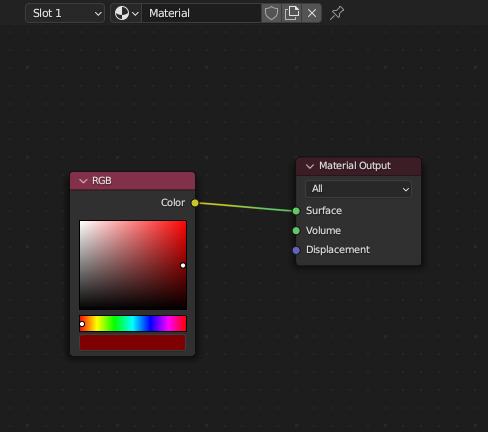
In the Shader Editor, if you hook up the RGB color input directly to the Surface output, the shader just says "I am red" and ignores everything else. You can definitely get more technical here if you want a toon shader, looking up blender cel shading can get you some really good free resources and files for stylish filters. After applying this, you get

because there's no lines on it, and no shadows to show any kind of depth.
The Line Art

Blender has presets for line art, you just make a grease pencil object, tell it to draw lines on the whole scene, and it'll have a pretty reasonable preset for a scene at standard meter scale (if your objects are real small, real big, or real complex, you'll definitely need to tweak settings to make it look normal)
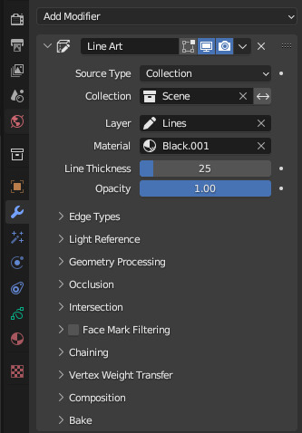
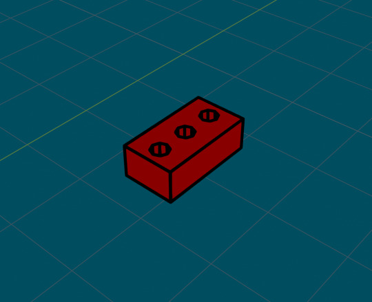
I didn't change anything and it looked good enough, so I just moved on because it is late
Also, grease pencils will draw based on the active camera, so if you have no camera, you get no lines, and if you do have a camera but you're not looking through it, they will look really weird
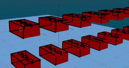
The Physics
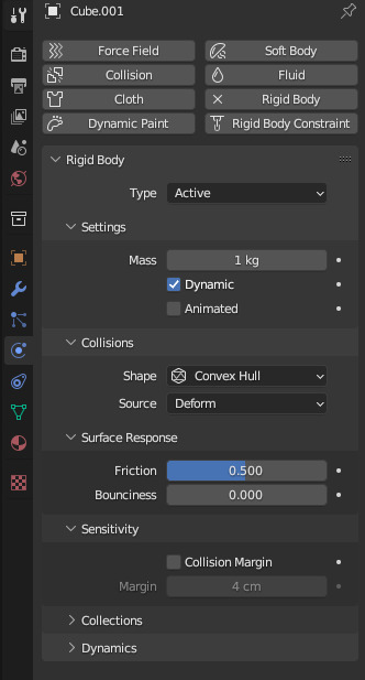
You just kind of turn on Rigid Body in the physics tab, and since it's a square you don't have to do anything else. If this was a weirder shape and I wanted it to be really accurate, I would change collisions from Convex Hull to Mesh in the dropdown.
I also made a big Plane object and scaled it up to serve as the floor, and did basically the same thing here
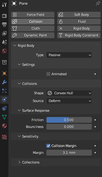
but I set it to Passive instead of Active so it wouldn't be affected by gravity or other forces.
More The Physics

To 'throw' the bricks, I made two Force Field objects, one set to Force, and one set to Turbulence. I then jacked up the strength on both while playing the animation until the force seemed right, and keyframed the Affect settings so that I could have them turn off before they hurled the bricks completely off into the distance.
I also upped the Noise setting on the Force object so that the bricks would move a little randomly. It's really fun to add and remove different force fields and mess with the sliders to see what they do, especially if you want to make, for instance, a Dracula Tornado (another thing I did at one point for unknown reasons)
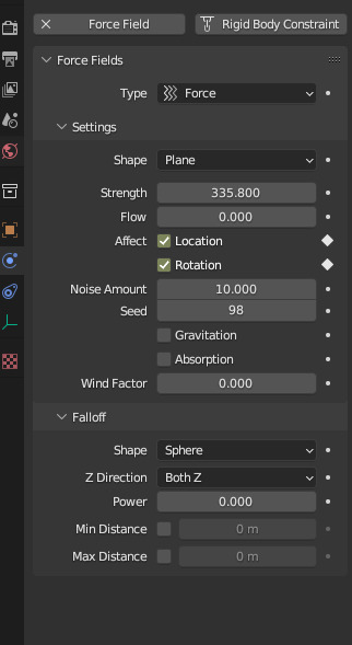
If you click the little circle at the right of a setting, it'll tell Blender when you want that setting to apply. So you go to frame 1 in the timeline, click the circles to make them into diamonds (which shows that they're keyframed) then go to the frame in which you want them to change, turn off the settings, and click the keyframe buttons again.

then, when the animation hits that frame, the setting will update accordingly. You can scoot these keyframes around to get things just right.
The Other Stuff that isn't in this
Other things I didn't do:
I didn't set a material that can have the brick drop shadows on it. It probably could've been really simple, but I already rendered the video so
I didn't get any further into cel shading effects, where you flatted the shadows and highlights into solid color blocks. If you're a little comfortable with blender, this site can just hand you a material that has all the options for a solid cel shader, it works pretty well.
My animation is also much higher res and lacks that nice looking pixel filter. I tried just rendering at a lower resolution but the default settings anti aliased it to hell so I'd have to learn how that was done, which is beyond me at this exact moment.
To be honest, it was surprisingly fun just typing this up, and a lot of this modeling stuff is something you kind of have to pick up from bits and pieces of other, more focused modeling tutorials, so if anybody that sees this wants to make lil' flat color low poly models, I'd be pretty happy to do something better considered and explained.
1 note
·
View note
Text
Learning Outcome reflection.
I want to take some time to reflect on my learning outcome this past year of my studying and how it affected some of my decisions in the last semester.
When I first began the master’s degree, I was pretty sure I wanted to pursue the 2d and 3d mashup animation. In the first semester, there was definitely a lot of experimentation with it. The ‘Red vs Blue’ project was done using the camera projection in Cinema4D. I also tried Blender’s grease pencil in ‘Places of mind’ and continued to explore that in the ‘Optical Sounds’. Then after a lot of playing, I decided to go back to 2D with ‘Light and Shadow’ project. I slowly eased myself into learning Blender to jump in a fully 3d animated project called ‘Memory’.
And after all that, in the second semester I used my 3D skills to create a base for rotoscoping for the poem animation.
Surprisingly, I decided to not use 3D at all in my Major Project. Everything for ‘Withing me’ was 2D. The only time I used Blender was to visualize Amy’s room (and a bad attempt of sculpting Amy’s head for reference). I decided to have this project done in 2D because I felt like I couldn’t fully express myself using 3D. I still haven’t found a way to keep my preferred style and combine it with 3D. I also realized that 3D animation is extremely difficult to make by myself and as much as I’m happy that I got to learn so much during the ‘Memory’ project (such as modelling, rigging and animating), I was scared to take on a bigger project.
The time I spent exploring different possibilities, made me realize that I miss painting and that my painting skills are my strength that I should keep on showcasing. So that’s why I changed my tactics to exploring design and style. I came to understanding that that’s where really lays my passion – in pre-production.
I got to learn more about perspective drawing, and I’ve implemented new solutions to my drawing process as I mentioned before in my blog. I’ve also learnt how to make a more thoughtful animatic, that helped with the creation of the film. I realized that I lack knowledge on 2D animation basis and despite that I managed to push myself to complete the film. This semester consisted of constant drawing practices, which helped me be more consisted in animating.
It’s very interesting to look at this project because it is so much in my comfort zone and so out of my comfort zone at the same time. I have never made an animation like this, so it has been a challenge for me to collect all my knowledge on drawing, painting and designing and use it in one project. I found comfort in combining layers in After Effects and felt lost most of the time I sat to animating Amy. Probably that’s why this project wasn’t as overwhelming as ‘Memory’ where every single task was a learning process full of challenges.
Finally, I learnt to voice my ideas clearly and talk about my achievements to people (even though it still doesn’t come easy). Writing this blog made me realize that I do have a lot to say. Perhaps I am one of those people that have their thoughts all over the place. I use it as my strength because it is this part of me that helps me be more creative. I always thought that because I do a little bit of everything and don’t specialize in anything is bad. This year helped me realize how I can use it to my advantage.
0 notes
Note
Hi!! Your art is amazing, I love it so much!!!! Ur animation especially is just. 10/10. I was wondering though...what program do you use? I've been trying to get into animation and I figure the best way to find a program is to ask an animator ❤️
Hello ! ❤️
Thank you so much for your kind words !
When I started animating, I used to do it traditonally on paper.
Nowadays, I use Photoshop for drawing and coloring every frame of the animation. After that, I assemble everything in After Effects, decide the timing for each frame, and render the animation. I also use After Effects for some visual effects (for example, the fireflies on the “Sky: Children of the Light & Journey” animation).
It’s important to mention that you don’t have to use these software exactly, there are other free software you can use ! For example, you can try Blender (which is free !) that enables you to do 3D animation and modeling, as well as 2D animation (using Grease Pencil), in the same software !
As for animation itself, there are tons of animation techniques and styles, it depends on what you are aiming for and your preferences ! (eg: for movies, videogames,...)
To begin with, i recommend you learn the fundamentals of animation and practice them, doing some exercises (on paper or on the computer), as you can see in this video : https://www.youtube.com/watch?v=uDqjIdI4bF4 . If you are interested in 3D then i highly recommend Blender, and Blender Guru’s tutorials ! I also recommend taking a look at the book “The Animator's Survival Kit” by Richard Williams ! :)
And most importantly, if things don’t turn out as expected in the first tries, don’t give up and keep practicing !
Feel free to reach out to me anytime ❤️
1 note
·
View note