#I think I was slightly more experimental and did a few more ambitious pieces ���� but as always a lot to improve on
Explore tagged Tumblr posts
Visit Tumblr Blog
Explore Tumblr blogs with no restrictions, modern design and the best experience.
Last Seen Tumblr Blogs


Fun Fact
28.6 is the average number of monthly visits per US mobile user.
Text


I'd give this year a 99% Raven out of 10
#2023 for comparison... get ready for the rant#I think I'm pretty content with my art this year and Im very proud of the stuff I did in sept-oct#So much so it was hard for me to choose which one for oct#I think I was slightly more experimental and did a few more ambitious pieces 👍 but as always a lot to improve on#But I kind of drew hardly at all for nov/dec (at least in terms of 'big' pieces cause I was quite busy with school and comms and whatnot)#Buttt once I finish those up Im looking forward to actually drawing again I miss it and I have ideas#Also tbh things a lot of what Im proud of this year are just asrv sketches I did earlier this year maybe Ill post my favs later
12 notes
·
View notes
Text
How prog were Queen?
By Dave Everley
On 9 January, 1971, Kevin Ayers and Genesis played a show together at the Ewell Technical College near Epsom in Surrey. Ayers was 18 months out of Soft Machine, and making a name for himself as a psychedelically-inclined art-folk rake. Genesis had released their second album, Trespass, a few months earlier, and were carving out a place in the vanguard of the burgeoning progressive rock movement.
There was a third band propping up the bill that night, a bunch of transplanted Londoners calling themselves Queen. In contrast to the wilfully artful approach of the headliners, their music was more straightforward: a heavy, if ornate blend of Led Zeppelin’s earthiness and the flights of fancy of Yes.
Not everyone in the small crowd watching them was impressed, but they caught the attention of one person. After the show, Genesis frontman Peter Gabriel pulled Queen’s blond-bombshell drummer Roger Taylor to one side. Gabriel’s band were about to dismiss their own drummer, John Mayhew, and were looking for a replacement. Was Taylor interested in joining Genesis? The reply was instant: thanks but no thanks. Taylor was utterly dedicated to Queen – there were gigs to play, places to go, and many musical adventures to embark on.
Had Taylor accepted the offer, the course of music – and specifically prog – would have been very different. Genesis would have flourished with Gabriel upfront, though whether they would have survived and prospered as they did without a Phil Collins to step into the breach after their talismanic singer’s departure was another matter.
The knock-on effect on Queen would have been greater. Taylor was an essential part of their carefully balanced four-way chemistry; a chemistry that would go on to throw up some of the most ambitious and game-changing music ever recorded. While Queen weren’t a capital ‘P’ prog band, they were infused with the spirit of the movement, combining its forward-looking values with its absolute disregard for the existing rules. Taking their cues from the likes of Yes, Genesis, Van der Graaf Generator and even Pink Floyd, their flamboyantly cavalier approach would go on to inspire such modern masters as Dream Theater, Queensrÿche and Muse. And, in Bohemian Rhapsody, they ensured that one of the biggest-selling singles in history was, at heart, a prog song. Forget the luxuriant moustaches and sawn-off mike-stands that would come to define them: if the prog ethos meant avoiding the expected, then Queen were definitely a prog band.
“Diversity was probably their greatest asset,” says former Dream Theater drummer and confirmed Queen devotee Mike Portnoy. “From song to song, they could be so different. You could have something that was folk followed by something that was rockabilly followed by something that was metal. And that’s one of the biggest things about prog, having that open-mindedness.”
Queen’s schooling in prog came early on. Brian May’s very first band, 1984, played a 4am slot supporting Pink Floyd at the Christmas On Earth Continued all-nighter in 1967. A year later, his next outfit, Smile – also featuring Roger Taylor – played with Floyd again, this time at London’s Imperial College. By the time of their gig opening for Kevin Ayers, Smile had changed their name to Queen and recruited Freddie Mercury. Collectively, they admired Yes, Van der Graaf Generator and especially Genesis. “Foxtrot is a prog rock classic,” Roger Taylor later wrote in the sleevenotes to Genesis box set 1970-1975. “Arrangements were highly complex in these early days, setting a benchmark for the style of the times.”
When it came to finding someone to produce their debut album, Queen’s first choice was John Anthony, who had worked with both Genesis and Van der Graaf. With Anthony and co-producer Roy Thomas Baker behind the desk, the eponymous album trod heavily in Led Zeppelin’s footsteps. But there was another, altogether more visionary band straining to spread their wings: My Fairy King was a filigreed slice of flamboyant rock’n’roll, while Liar metamorphosised through several different time changes and timings.
Those wings were fully unfurled on the follow-up, 1974’s Queen II. The title was the most prosaic thing about the record: the music inside was as fevered and baroque as rock gets, informed equally by Zeppelin, Yes and crazed Victorian artist Richard Dadd, whose 1864 painting The Fairy Feller’s Master-Stroke inspired one of the album’s most prog-leaning tracks. It may have been rooted in the heavy rock of the times, but its cavalier approach and sheer sense of scale pegged Queen as a defiantly progressive proposition.
“Queen weren’t like Yes, who had a dualistic role of guitar and keyboards, where both shared the terrain,” says Yes guitarist Steve Howe, supported by Queen at Kingston Poly in early 1971. “Brian had the terrain to himself. The remarkable thing was that he was the front and the back man. It required him to come up with more than guitar solos… He had to come up with a semi-thematic approach to play the guitar. And what he did was keep colouring.”
Queen’s prog inclinations would be deeply woven into the fabric of their early albums, from the audacious multi-part theatrics of Queen II’s March Of The Black Queen to the schizophrenic attack of the two-part Lap Of The Gods from 1974’s Sheer Heart Attack. Even in their more commercial moments, they marched to the beat of their own drum. What other band would have dared serve up something so unusual as Killer Queen?
“It was their diversity,” says Mike Portnoy, who first heard Queen as an eight-year-old in the mid-70s and covered many Queen songs while in Dream Theater. “Their albums took the prototype that The Beatles laid down with the White Album, where you had four different artists bringing in very different styles. Every song was so diverse. You get to A Night At The Opera, and you had this giant multi-layered epic like Bohemian Rhapsody next to something like Seaside Rendezvous or Love Of My Life.”
A Night At The Opera was Queen’s grand artistic statement and their most unashamedly prog album. Pitched around the epic twin tentpoles of The Prophet’s Song and Bohemian Rhapsody, it married their far-reaching vision to a distinctly British barminess. Taken on its own, the eight-minute The Prophets Song, with its incredible ornate a cappella middle section, would be enough to grant Queen access to the Prog Hall Of Fame. But even that sits in the inescapable shadow of Bohemian Rhapsody. Time and success might have lessened its impact, but that song remains the most dazzlingly unique piece of music ever to sell five million copies.
“There are epic things that come along every so often,” says Steve Howe. “There’s Sgt Pepper, there’s Bridge Over Troubled Water. And there’s Bohemian Rhapsody. I don’t know when I first heard it, but once it was there, it was such a formidable thing. You’re thinking: ‘How many tracks did they need to do those vocals? How did they write it? Who invented it? It really was astounding.”
Bohemian Rhapsody encapsulated one of the key things that gave Queen such a distinct identity. Like The Beatles and Beach Boys before them, they used the studio as an instrument – not least when it came to their vocals. And Bohemian Rhapsody raised the bar about as high as it could go.
“They sang each of those parts and triple-stacked them,” says Mike Portnoy. “You heard all three of their voices singing in all three vocal ranges. That’s what made the depth of their music so complex. It wasn’t the instrumentation, it was the vocals. That’s unusual for prog music. When I think of my favourite prog music, it’s always the musicianship that draws me. But with Queen, it was the vocals. It was so deep.”
For all its success, A Night At The Opera would be Queen’s grand kiss-off to their prog roots. Later albums streamlined their sound into a more conventional format. Much like Genesis, the 80s found them swapping experimentalism for chart rock.
It wasn’t until the end of their career as an active band that Queen would again sound so adventurous. During 1989 and 1990, the band began work on their penultimate album, Innuendo, in London and Montreux. In the summer of 1990, Yes guitarist Steve Howe paid a flying visit to the Swiss city, where a chance encounter with a former guitar tech found him being invited to Queen’s studio to hear the album as a work-in-progress.
“Inside, there’s Freddie, Brian and Roger all sitting together. They go: ‘Let’s play you the album,’” says Howe. “Of course, I’m hearing it for the first time: I Can’t Live Without You, I’m Going Slightly Mad. And they saved Innuendo itself until last. They played it and I was fucking blown away.”
If that was surprising, then what happened next was utterly out-of-the-blue. The members of Queen asked if Howe wanted to play on the title track. The Yes man politely suggested they’d lost their minds. It took the combined weight of Mercury, May and Taylor to persuade him.
“They all chimed in: ‘We want some crazy Spanish guitar flying around over the top. Improvise!’” recalls Howe. “I started noodling around on the guitar, and it was pretty tough. After a couple of hours, I thought: ‘I’ve bitten off more than I can chew here.’ I had to learn a bit of the structure, work out the chordal roots were, where you had to fall if you did a mad run in the distance; you have to know where you’re going. But it got towards evening, and we’d doodled and I’d noodled, and it turned out to be really good fun. We have this beautiful dinner, we go back to the studio and have a listen. And they go: ‘That’s great. That’s what we wanted.”
Released as a single in January 1991, Innuendo gave Queen their third Number One single. Like Bohemian Rhapsody 25 years before it, it was as unlikely as hit singles get: a six-and-a-half minute musical jigsaw, complete with flamenco runs, classically-inclined orchestral overloads and maverick 5/4 timing. Queensrÿche covered the song on 2007’s Take Cover album, while you can hear its echo in Radiohead’s Paranoid Android and Muse’s more elaborate sci-fi epics.
“In the world of rock, Queen stands out as a good example of the clash between guitar and piano in songwriting,” Muse’s Matt Bellamy has said. “I think that’s where you stumble across those more unusual arrangements and chord structures.”
Today, Queen have left a bi-polar legacy. They’re arguably best known for their pop hits – Radio Gaga, I Want To Break Free and of course, Bohemian Rhapsody, that ultimate prog Trojan Horse. But their spirit of adventure remains unmatched by all but the boldest of their peers.
“There was no rulebook for Queen,” says Mike Portnoy. “They broke most of the rules that existed, and then they wrote a new set.”
102 notes
·
View notes
Text
10 MORE albums I missed in 2017
Okay, so I’m feeling like a real numskull for this one here, not for missing out on talking about these albums in the first place last year, but because I already did a piece about albums I missed last year, and somehow completely forgot to include some of the albums I’m going to talk about here. Some of these I found out about this year and am giving my belated thoughts on because I think they deserve it. But some of these... I was just sterpid, and forgot to talk about them in the post I ALREADY DID about albums I forgot to talk about.
Anyway! Here we go, ten more albums I missed in 2017.
Arckanum - Den Förstfödde

This was one of the albums that made me originally want to make the first installment of posts on albums I missed last year, but in my infinite idiocy, I somehow left it out. And since Arckanum's mastermind, Johan Lahger, has now retired the project this year to focus on his writing career, I definitely wanted to talk about his last album under the Arckanum name. The occult mystique that has overlaid Arckanum's intimidating black metal aura from the start is here on Den Förstfödde as well. And this album ends Arckanum's artistic journey with such ritualistic and meditative tranquility amid the expansive spiritual darkness it conveys, and it does so quite powerfully, with a great, well-versed blend of slow-burning grooves and dark atmospherics to wrap everything great about Arckanum up in one final dark atmosphereic swell of slightly experimental, minimal, black metal. Another addition, a final addition, to the Arckanum legacy, Den Förstfödde is a grand and fitting conclusion to the catalog of one of black metal’s truly unique contributors.
Loss - Horizonless
I had heard a fair amount of hype surrounding this debut album, but I never really got around to checking it out somehow until earlier this year. A bit more of a slow drone-y sort of doom release, Horizonless is an example of something that usually isn't my cup of tea, but ended up being pretty potent and immersive. The band do focus on the more morose and mournful side of the genre, and they show themselves to be quite adept for the most part when it comes to capturing that doom somber. It's a sufficiently long project, but one that doesn't overstay its welcome, a good starting point for the band, but I think they are going to have to do some work on their compositional approach if they're to make a more noticeable mark on doom metal in the coming years. They have the sound narrowed down, and they do show some pretty impressive writing chops on certain tracks on here. I would just love to see this band take this sound to its highest heights with compositions that lend themselves more fully to the tone the band works best with.
Vader - Dark Age
This album came out at the tail end of 2017, and even though I was desperately looking for something better to end my year's worth of discussions on than Asking Alexandria's self-titled disaster, Vader's Dark Age didn't seem like the right kind of release (a compilation album of rerecordings of songs from the band's debut album) to end the year with. Also, it came out four days before the new year, while I was working on my year-in-review lists, hardly enough time to digest the thing and present my thoughts on it. However, as I've come back to this thing a few more times throughout this year, I've found the band's modern approach to their old songs an interesting alternative album experience at least. The steadfast death metal traditionalists make predictably little effort to shake up their sound stylistically, but this album, a rarity of its type, serves as a fascinating exhibit of a close comparison of old and new, showcasing how different they sound on the production fronts, where they differ compositionally, but also how the style of old would fare in today's studios.
Venom Inc. - Avé
I don’t exactly know what kind of Queensrÿche-esque split Venom is undergone, but I can say that this Venom Inc. offshoot has brought a more ambitious and refreshingly modern set of songs to the table than what Venom have been bringing for the past however-many years now. I have seriously not paid Venom much attention since hearing some of the goofy tracks off their previous few albums and giving up most hope of Cronos trying to seriously update his band’s prototypic sound. As vibrant and gruff as Avé is, however, it’s still incredibly drawn out and mostly just a surface-level modernization of the band’s evil thrash metal sound. Still, I appreciate the effort to bring a little bit of the kind of epic bombast akin to the likes of Behemoth to this album, and if this new appendage of Venom really puts its creative head down and focuses on trimming the fat and playing to the strengths of Tony Dolan’s gruff snarls and Jeff Dunn’s knack for groovy rhythms, they can make themselves a name to continue to keep an eye out for.
Godflesh - Post Self

I'm still not sure how exactly I missed a new Godflesh album last year, but it was pretty crazy last year; I remember only hearing of a new Morbid Angel album coming down the pipes about a week or so before it's release, so I guess I'm not super surprised. But either way, it was a pretty unexpected release, somehow. Anyway, Godflesh followed up 2014's fantastic A World Lit Only by Fire with Post Self, an album that leans a little bit more on its portion of atmosheric experimental industrial pieces than its predecessor, but one that is not without its infectious, beat-driven cuts as well. Post Self is mostly the expected continuation of Godflesh’s extraordinarily flawless industrial metal legacy. The ingredients haven’t really changed all that much, but they never really have, and yet something about Godflesh’s consistency remains admirable in a way that hasn’t staled the way the singular motives and predictability of bands like Slayer, Megadeth, or AC/DC have all transformed from selling points to fans’ clamor for something different. Godflesh don’t really deviate, and it’s perhaps because they have such a dominant reign over their musical territory, and Post Self is as solid of a reinforcement of their stronghold as any. All in all though, it's as solid as any album by the mighty and reliable Godflesh, and one I wish I had gotten to sooner before it started distracting me from 2018's metal.
Artificial Brain - Infrared Horizon

The potential for a future, technologically induced apocalypse at the hands of AI seems like the perfect subject matter at the perfect time for a technical death metal project like this, and the sci-fi-minded Artificial Brain seem like just the group to make a statement on the subject. I enjoyed their Labyrinth Constellation album from 2014 for its merits as a solid, virtuosic death metal album, but I was looking for the band to expand their sound a bit more on Infrared Horizon. I don't base my critiques off what I was hoping for from a particular album, and I won't do this album that unusual unfairness here. But man did it feel like a missed opportunity, one the band luckily still has. They could have done so much more than simply spit out more instrumental prowess, which is fine and dandy by its own merits once again. But I was really hoping their expression of the celestial would involve more than the usual sustained dissonant guitar chords and their embodiment of the technological would involve more than robotic technicality. Complex drumming, dissonant guitar atmospherics, tasty slaps of unsubmissive bass, nasty snarls, deep and entirely unintelligible growls: this album has all the ingredients to make your usual techdeath chicken noodle soup. And that's kind of all the album amounts to, a slush of technical wankery. The few times the album ascends beyond techdeath's basic standards, it reveals the band's excellent writing chops and creativity, like the dynamic and bass-heavy "Static Shattering", that I wish popped up more frequently on this album. It's not bad by any techdeath standards, but it seems like this group are punching a bit below their weight, I hope. Definitely still worth the time to digest and appreciate.
Replacire - Do Not Deviate

I heard the hype around Replacire’s Do Not Deviate a little bit late (as in earlier this year), but I have not really connected with that hype. It’s an animated and dynamic progressive death metal release, but the sophomore project still has its kinks to work out, and I didn’t completely see what all the fuss was about. It’s definitely a cut above most of the techdeath crop, but I think there is definitely growth to be done upon the ground laid by this record in the small areas. The band clearly know what they’re doing when it comes to the basics of techdeath (as much of an oxymoron as that might seem to be), it’s just those few quirks to figure out and mold into an identifiably unique sound for the band. The quality playing and presentation of what Replacire are technically and imaginatively capable of does, of course, make a great case for the potential this band has, so I will be looking out for the mastery of the madness strewn about this album on their future releases.
Scour - Red

I didn't really pay Scour much attention when their first EP, Grey, dropped in 2016, mostly because the thought of Phil Anselmo trying his hand at black metal seemed kind of goofy and like something that wouldn't end well. I thought this project would fizzle away not long after this second EP, but that was entirely me judging the book by its cover. One day earlier this year I figured that since they were just EPs I'd check 'em out, why the hell not? And I was pleasantly surprised with both. It's not the most groundbreaking black metal around, but it's hardly the amateurish embarrassment I thought it would be. Even though the black metal vocal style Phil employs on here isn't nearly as technical as his usual melodic gruffness or even other black metal vocal styles, his continued exploration of different techniques at his age continues to impress me. And he still manages to maintain his unique tone and tambre while implementing these new styles. As for how it compares to their first EP, Red is rather stylistically similar and similarly compositionally consistent, but it finds them seemingly more confident on all fronts: Phil with his improved black metal screams, his integration of his lower register growls, and the well-versed band (comprised of members of Pig Destroyer and former Cattle Decapitation bassist, Derek Engeman, who brings that band's guitar style all across the two records as a highlight feature) with their more confident writing and bolder instrumental performances. This EP and the last both possibly benefit from the potential hiding of any major compositional incompetence in the consistently short run times of the twelve tracks between them, but Scour's channeling of the sardonic, nihilistic side of black metal with compelling conviction across these tracks is respectable at the very least. Scour is no novelty side project and far more than just a curious experiment for Phil. The group has the chops to justify their entrance into the readily scornful territory of black metal. Perhaps these short, small releases mark the extent of their creativity, but perhaps not. I'm very curious now as to where this project will go from here and what they might put forth on a full-length.
Amenra - Mass VI

I have stated don't like when bands name albums based on how many albums they have, but I should probably clarify that it doesn't bug me as much when it plays a clear role in their artistic intention as opposed to a lazy showboat of "look how many albums we've made". I don't mind Amenra's numbering of their albums as "masses" because they clearly put effort into embodying a metallic version of that traditional Catholic ritual (even if it's not as true to an integration of those traditional musical elements as Batushka are). Mass VI is perhaps the culmination of the band's work up until this point, with a steady improvement on their sludgy post-metal sound showing signs of crystalizing here on this record. It's not a particularly long album, but it does what it needs to in the time it has, and that is to set and maintain an atmosphere. Amenra do well to capture a sense of liturgical ambiance amid the clashes of sounds they play with across Mass VI, and they do well to expand on them beyond the simple fundamentals of post-metal mood-setting with some truly dynamic shifts between somber, sweetly sung ambiance and soulful crescendos of guitar distortion.
Heresiarch - Death Ordinance

This album is one I found out about this year, completely randomly. I was in a record store and I stumbled upon the band's EP, Hammer of Intransigence. I had never heard it and it was relatively cheap so I just went for it. I then went to find the rest of the band's catalog and found that they had released their first LP last year, Death Ordinance. The lesson from this I suppose is that I'm sure as long as I'm around, I will never find or cover everything I like from a certain year in that year. There will always be stuff I go back and find that I wish I would have known about earlier. As thorough as I am being this year, I'm sure I'll look back and find something I missed, possibly a favorite new artist I didn't even hear of this year. And that to me is wonderful, I'm so glad there is so much metal out there to find and enjoy through this constantly exciting musical journey. Death Ordinance is a meager, but solid enough gruff death metal project that focuses on drawn out sections of low-register guitar groove and bellowing growls to carry its dismal moods. I think the band will need to work on the arrangement of those grooves into more intentional structures on long-form projects like this going forward, but it's a decent enough start.
And that's it for albums I missed in 2017. I'm sure there's still plenty out there that I just have not heard that I am missing that I would love to not be missing, but for now, this is it.
#arkanum#den förstfödde#loss#horizonless#vader#dark age#godflesh#post self#Replacire#Do Not Deviate#Venom Inc.#Ave#artificial brain#infrared horizon#scour#red#amenra#mass vi#heresiarch#death ordinance#black metal#ambient black metal#industrial metal#technical death metal#post-metal#death metal#thrash metal#speed metal#progressive death metal#techdeath
2 notes
·
View notes
Text
Dusted Mid-Year Exchange: 2018, Part 2

Part two covers mid-year favorites from H. C. McEntire to Yuzo Iwata. If you missed part one, check it out here.
H.C. McEntire — Lionheart (Merge)
Who recommended it? Justin Cober-Lake
Did we review it? No.
Ben Donnelly’s take:
Country music likes to provide bona fides in the lyrical details. Be it bad boy specifics of a truck model or coffeehouse ballads spiked with animal bones and rusty weathervanes, the singer signals that they know life out on the dirt roads. What's striking about Lionheart is how it delves into the particulars of a North Carolina life, from textile miles to chicory and gardenias. Indeed, nearly every song mentions the local flora, yet such details fall into place incidentally. McEntire describes places where nature is growing over every outbuilding and brick alley. There's a sense of discovery in theses settings where relationships with friends, family and a lover play out. All those vines were too common to notice until now, when love and the gratitude that follows make the mundane vivid.
McEntire longs for the present moment perfected, not a past reconstructed, and that's why her rootsy details don't have anything to prove. She’s comes to this twang a decade after playing the knotted indie rock also endemic to the region, a style that leaves nary a trace musically here. When she sings “I’m the clown who feeds the crows,” she’s both a figure in her natural habitat and someone who knows the other locals are smirking and murmuring, as she wanders on her own.
Efrim Manuel Menuck—Pissing Stars (Constellation)
Pissing Stars by Efrim Manuel Menuck
Who recommended it? Jonathan Shaw
Did we review it? Yes. Jonathan said that a “mind-scrambling collision of plasticized media culture and geopolitical rapacity provides the thematic impetus for Pissing Stars.”
Bill Meyer’s take:
Words and notes are mere platforms; it’s the blasted, low-definition, high-contrast sound of Pissing Stars that hits you first and leaves a mark. Menuck (founder of Godspeed! You Black Emperor and Silver Mt. Zion) uses grimy sonic filters to amplify an emotional anguish whose extend deeper than the current geo-political situation. The album’s organizing preoccupation is a love affair between TV personality and an arm dealer’s coddled son, which caught Menuck’s attention when he was in his teens (he’s well into his 40s now). The songs address love and money, and the impossibility of redemption and the yearning to transcend that impossibility, not as binary relationships but as far boundaries of a vast and incomprehensible field. Menuck sounds broken and partially remade, awash in sounds made to match.
Mesarthim — The Density Parameter (Avantgarde Music)
The Density Parameter by Mesarthim
Who recommended it? Ian Mathers
Did we review it? Yes Ian admired the way that Mesarthim, “seesaws from something even the staunchest, pettiest gatekeepers would have to admit are metal, to sections featuring patterns and instruments that, in a different context, would make perfect sense at a rave.”
Eric McDowell’s take:
“Safe to say that black metal’s got what it takes to make innocent listeners uncomfortable: the corrosive distortion, the pummeling drums, those terrifying roars — not to mention all that netherworldly symbolism, mythology and branding. But if Mesarthim’s keeping somewhat more experienced listeners (Bandcamp dabblers, Dusted midyear exchange reviewers) on their toes, it’s not because they’re doubling down on those tropes. It’s because they take such a free hand with gestures to genres that seem to take the legs out from under their black metal persona.
Not to overstate the case: The music on The Density Parameter, the Australian duo’s third full-length, is plenty dark and crushing. But then there are the unsettling touches — the synthetic arena-rock drums and boxing-movie-montage keys of “Ω,” the bleeding-heart strings of “Transparency” or the ghoulish club beat of “74%.” To say that Mesarthim sounds like a band bored with convention is really to say that they sound pumped about the possibility of subverting it. And when they want to indulge, they can do that, too, as they prove in the album’s final overpowering minutes.
Roscoe Mitchell and the Montreal-Toronto Art Orchestra—Ride the Wind (Nessa)
youtube
Who recommended it? Derek Taylor
Did we review it? Yes. Derek said: “Flimsy idiomatic descriptors like jazz, classical and the like are irrelevant to the proceedings, replaced by the umbrella adjectival phrase of organized and energized sound.”
Jonathan Shaw’s take:
Adequately describing music this enormously complex, aesthetically confrontational and confident requires a technical vocabulary and understanding of jazz history that this reviewer lacks. For this 2016 set, Mitchell wrote and worked and played with the 19-piece Montreal-Toronto Art of Orchestra. Their varied instrumentation and dexterous, evocative playing create some dizzying experiences: see the transition out of the choppy clatter of “Splatter” into the lyrical grace of the first few minutes of the title track. From staccato, oddly percussive reeds to undulant brass and strings—it’s a sharp and then gorgeous progress.
A couple reference points occur: Mingus’s orchestral and ambitious Let My Children Hear Music (1972), especially the whirling, swirling “The Shoes of the Fisherman’s Wife Are Some Jive-ass Slippers”; “A Brain for the Seine” (1969), a long composition by the Art Ensemble of Chicago, in which Mitchell has been a key player throughout its long and bewilderingly experimental existence. Those dates invoke the high point of the American free jazz avant-garde, and few personages loomed as largely, or productively, in that period as Mitchell’s.
That begs some questions: Can we still have an avant-garde in the early 21st century? Can a figure as established and prominent as Mitchell produce authentically avant-garde art? If the avant-garde is thought as a political and historically specific phenomenon, likely not; the postmodern and late capital have reduced those possibilities all but completely. But if by “avant-garde” we mean a style, and a style specific to jazz, then this music carries its mark and its intensity. It’s also lovely and bracing to hear Mitchell work through a new arrangement of “Nonaah” here, a song that recalls the mid-1970s cultural environment of its original composition and appearance in Mitchell’s oeuvre. The song caps this set, and in doing so insists that we hear history at work. Thanks, Derek, for recommending this stirring and provocative recording.
Kacey Musgraves — Golden Hour (MCA Nashville)
youtube
Who recommended it? Patrick Masterson
Did we review it? No.
Derek Taylor’s take:
“Jazz is dead” — it’s a declamatory provocation at once reductive, alarmist and cavalier that’s been floating around for the better part of a half-century, uttered by the idiom’s traditionalists, progressives and detractors alike. The same fatalistic phrase could equally and erroneously be applied to country music. Twenty-nine year old Texan Kacey Musgraves isn’t exactly a corrective to that combative line of thought and her brand of musical expression is fraught with certain stylistic choices (concessions?) that appear cardinal in this age of Country Music Awards commodification. But embrace of pop conventions has always been efficacious strategy going back to Countrypolitan, Western Swing and even The Singing Brakeman.
Golden Hour, Musgraves’ fourth album, is reportedly a reflection of recently-found, matrimony-rooted optimism, audible in the gilded acoustic guitar melodies that serve as the skeletal frames for the songs around which a warm-blooded corpus of lap steel, banjo, drums and noninvasive keys is fleshed. Her voice is a modest wonder, musing on solitary afternoons leavened and enriched by the safety that comes in knowing that loving companionship is the current and foreseeable norm or using the kitschy metaphor of a “Velvet Elvis” to elucidate her lover’s left-of-center appeal. Apart from others of her age and ascendant success, she seems to cotton that the gifts of prosperity and stardom need not come through the mercenary espousal of whatever pop chart-calibrated admixture the A&R suits and million-bean counters deem worthy of exploitation.
Olden Yolk—S-T (Trouble In Mind)
Olden Yolk by Olden Yolk
Who recommended it? Ben Donnelly
Did we review it? Yes. Jennifer Kelly said, “The vocals slide over one another like colored transparencies, creating shifting shades and moods.”
Ian Mathers’ take:
“Je suis les enfants/in the barrel of a gun” is a heck of a way to open an album, and the mix of the slightly sinister and the slightly baroque carries throughout the first Olden Yolk record. Which means, yes, building on that proud legacy of twee bands not afraid of the Velvet Underground, and I see those Clientele comparisons and can agree with them too. At points though I also think of early, spikier Go-Betweens. All of which is to say that the considerable charms and pleasures of Olden Yolk are coming from a distinct and well loved (if sometimes underestimated) lineage. There are discernible traces of psych-folk, jangle-pop, even a bit of the tang of the garage in there, but as with any act producing music worth paying attention to, here all those referents are just attempts to point at the contours of the very specific, individual thing Olden Yolk are doing. Whether it’s the brasher likes of “Esprit de Corps” or the lovely eternal sigh of “Gamblers on a Dime” or especially the forbidding sprawl and tangle of the closing “Takes One to Know One,” Olden Yolk build on the past with such verve and panache they never feel of the past.
John Prine — The Tree of Forgiveness (Oh Boy)
youtube
Who recommended it? Isaac Cooper
Did we review it? Yes, Isaac said, “Prine finds his warmest balance yet between boundless empathy and joking detachment.”
Eric McDowell’s take:
Portrait of the artist as an old man, the cover of John Prine’s first album of original music in 13 years says it all. He looks a bit tossed around, sure, but sly as ever. He’s surrounded by darkness and wearing black, but his face glows. Perhaps he’s “seeing the light,” but he’s gazing right at us, eyes skeptical, mouth ready to crack an acid joke.
On The Tree of Forgiveness, Prine’s intimate and gruff voice doesn’t so much guide us from light to dark as show us their inseparability. Often they’re embodied in the figures and narratives characteristic of Prine’s music. There’s the down-and-out beggar of the trucking-on opener, “Knockin’ on Your Screen Door” whose family “up and left me / with nothin’ but an 8-track / another side of George Jones.” On “The Lonesome Friends of Science,” there’s the poor washed-up Pluto, “once a mighty planet there / now just an ordinary star / hanging out in Hollywood / in some old funky sushi bar.” While other tunes have an earnest tenderness that makes us want to pin Prine himself as not only their singer but also their subject — the strings-saturated “Summer’s End” or “Boundless Love” (“If I came home, would you let me in / fry me some pork chops and forgive my sins?”) — that risky move is no more tempting than on the closer, “When I Get to Heaven.” “I’m gonna get a cocktail / vodka and ginger ale / and I’m gonna smoke a cigarette that’s nine miles long / I’m gonna kiss that pretty girl / on the tilt-a-whirl / yeah, this old man is going to town”: The plan feels pure Prine, but it’s also sketched as a sing-along, inviting us to share in the fantasy.
If everyone’s already pointed out that Prine’s always been this way, singing with wit about old age and death and wearing black since the early days, then I guess he’s done his job.
Alasdair Roberts, Amble Skuse & David McGuinness — What News (Drag City)
What News by Alasdair Roberts, Amble Skuse & David McGuinness
Who recommended it?
Bill Meyer
Did we review it? Yes. Bill Meyer said, “Turns out, the news is that Roberts has made the most unabashedly gorgeous record of his career.” Bryan Daly’s take: This inspired trio has shepherded both the songs and the traditional instruments on which they were played from deep in the past and conveyed them to the present, with all the care and fortitude it took to deliver news through the wild countryside in the age when they were written. An old Britain comes vividly alive not only because of the scholarly work that has been done in presenting them faithfully, but also because of the emotions that streak these songs with color. After spending some time with these characters in the world where they live and die, casual understanding of the song's history and meaning becomes insufficient. Digging through the archives for context becomes its own rewarding pursuit. But just as digging through the archives these days can mean typing few words into your phone, the world is another place from when these songs were written. Amble Skuse's subtle weaving of shifting modern noise provides the most sublime moments throughout, like the ambiguous but familiar clacking that opens the album. Is it a camera? A typewriter? A horse? What news is being prepared? Lest we forgot we haven’t slipped into the times when these songs were first sung, a familiar hiss and static of the current grounds us in the now.
Alasdair's ageless tenor also plays well against McGuinness's period instruments (grand piano, dulcitone), illuminating timeworn themes like betrayal and confused notions of honor. Characters are portrayed with such sensitivity that the dust that might have gathered on their stories has been shaken off in travel through time. When the players imbue such reverence for presenting the past as is done here, songs arrive freshly felt. The news travels fast, even through the space of hundreds of years.
Caroline Rose — Loner (New West)
LONER by Caroline Rose
Who recommended it? Justin Cober-Lake
Did we review it? No
Patrick Masterson’s take:
Loner leads off with a song called “More of the Same,” but such a description could hardly be less apt for Caroline Rose’s third full-length. In the wake of 2014’s I Will Not Be Afraid, Rose took her catchy but simple country-tinged folk, her insecurities and her formidable wit and lathered a thick coat of synth-tinged pop on it. Press materials cite Justin Timberlake and Britney Spears as inspirations, both of which seem like more than lip service (check the FutureSex/LoveSounds vibe of “To Die Today” and, well, this cover of “Toxic”), but perhaps the most clear pop parallel is on the significantly altered (and, hence, appropriately titled) “Soul No. 5,” where her shog-off attitude toward admirers recalls Nicki Minaj or peak-era Ke$ha before she dropped the dollar sign: “I like to hit ‘em and quit ‘em / That’s just my style,” she shrugs with flair.
Bang, bang and away she goes is right: Whether it’s this kind of forthright pop approach or something more serious (and seriously invested) like “Jeannie Becomes a Mom” – I’m still thinking about how she ends with “Now you’re in real life” reverbing out to the point that you can barely understand it before metaphorically clarifying right at the finish – and closer “Animal” or even the funny, cringe-worthy cat-call escalations of “Smile! AKA Schizodrift Jam 1 AKA Bikini Intro,” every song on here moves at a swift clip to showcase some point along the spectrum of Rose’s talent. Call in Britney, call in Ke$ha, call in Angel Olsen, call in The Replacements — none of it seems quite sufficient. Caroline Rose is a league apart and better than she’s ever been.
Salad Boys — This Is Glue (Trouble in Mind)
This Is Glue by Salad Boys
Who recommended it? Jennifer Kelly
Did we review it? Yes. Jonathan Shaw said, “The contrast of blithe pop with alienated, distraught lyrics is nothing new. This record reinvests that contrast with liveliness and complication.”
Patrick Masterson’s take:
The cover to This Is Glue is almost comically accurate, an album of pastel shades. Listening to “Blown Up,” which kicks off Joe Sampson’s 12-song, 45-minute-long sophomore LP under the Salad Boys name into gear with a propulsive indie-rock fling before segueing into “Hatred,” which… sounds like anything but, gives you the two major speeds of the record in just about nine minutes. So yeah: The Christchurch, New Zealander loads up on soft-baked indie jangle like it’s 1986. In one of Dusted’s first reviews this year, Jonathan described it as “compulsively listenable from the jump,” which is nearly as damning as it is praising. Put it on! Forget it’s on! And on and on and on.
But look at the album art closer and you’ll see the bright speckles of red and that smear of darkness to the left – there’s more going on than initially meets the eye. Same goes for the music; working harder to hear the details rewards multiple plays. Stuff like “Psych Slasher” or “Under the Bed” are fairly overt hits, sure, but there’s also “Scenic Route to Nowhere,” where Sampson’s accent is most evident and there’s this almost Oneida-esque stretch at three-quarters distance; the über-jangle of “Exaltation”; the frontier strings in “Dogged Out”; and “Right Time,” which had me remembering some of my earliest indie-rock encounters listening to 3WK and realizing I had no idea what I didn’t know. Trouble in Mind tells me these lyrics are “more claustrophobic and yearning” than 2015’s more upbeat Metalmania, but the way Sampson barely ever rises above an inside voice even at full emoting had me focusing harder on the guitar tones, frankly; in this way, Salad Boys’ closest analog to me isn’t whatever I forgot from the Left of the Dial box, it’s another Antipodean group increasingly lost to the salads of time: Ides of Space. I mean that as a compliment, and I almost never give stuff like this compliments. Eat up.
Tove Styrke — Sway (RCA)
youtube
Who recommended it? Ian Mathers
Did we review it? Yes, Ian called it, “ a perfect sparkling little showcase for how much the craft and delivery of this kind of pop song can matter.”
Jennifer Kelly’s take:
Um, yeah, Swedish electro-pop, not my favorite. Ian’s right, though, Styrke is good at what she does, imbuing glossy, focused-tested beats with soft, engaging humanity. “Sway,” one of the singles, has a big sweeping chorus, a sugary blast of “Swaa-aa-aay” that could melt the hardest heart, while “Say My Name” slathers staccato rhythms with giddy female empowerment. Styrke’s girlish voice has a nice touch of vulnerability to it, shading marketable hooks with recognizable human feeling. Production is immaculate, meticulous, air-tight, engineered for maximum impact. You could do worse, obviously. But really, when so many good, less commercially viable bands are vying for your attention, why spend time on stuff that’s doing just fine without you?
Yuzo Iwata—Daylight Moon (Siltbreeze)
Daylight Moon by Yuzo Iwata
Who recommended it? Bryan Daly
Did we review it? Yes. Bryan said: “these are deeply thrilling guitar-driven instrumentals with the room-live warmth and sense of play found on the Matrix Tapes, and mentally chasing a melody on any of these songs captivates fully.”
Jonathan Shaw’s take:
It’s hard to know if “Gigolo” intentionally alludes to “Gigolo Aunt,” one of the most coherent songs on Syd Barrett’s eponymous final record of studio material. But Yuzo Iwata’s delightful tune has the same lively, blithely bouncy quality as Barrett’s, and it plays a similar role on Daylight Moon. “Gigolo” is a space of unadulterated joy on a record that’s otherwise redolent with more difficult feelings. The difficulties are suggested by variations in tone; the record’s instrumentation is invariably simple, with Iwata backed by a straightforward rock combo. That anchors the record in a consistent sonic vocabulary. But Iwata’s playing projects the record onto multiple emotional planes: the meditative lilt of “Up on a Dragonfly”; the foreboding, spaghetti-western shamble of “Border”; the gently somber “Goodnight, Daylight Moon.”
The most intense sounds on Daylight Moon assert themselves on the fuzzily metallic “Drone Beetle” (recorded in 1999, unlike the other songs on the LP, which date from September 2015), and on “Daylight Moon II,” easily the record’s most incendiary performance. It’s got an aching, terrible beauty, and it feels like the fiery catharsis that offsets the goofball charm of “Gigolo.” Both songs are terrific, but “Daylight Moon II” is more vividly present, Iwata’s soloing seeks transcendence. It gets there. I wish it were here longer.
#mid-year 2018#h.c. mcintire#efraim manuel menuck#mesarithm#roscoe mitchell#kasey musgraves#olden yolk#john prine#alasdair roberts#amble skuse#david mcguinness#caroline rose#salad boys#tove styrke#yuzo iwata#midyear
5 notes
·
View notes
Text
un_earth'd
Final Project Production Analysis
This film idea truly started after I had set out to complete the experimental motion graphic piece at the end of year two, using the same base raw copyright-free track I used for this piece. I thoroughly enjoyed planning out abstract shots and scenes to the exact second, connecting meanings based on various material layered over each other before I truly knew what I wanted to do once my degree had finished. Unfortunately, after Covid commenced with other unfortunate circumstances, I did not end up completing the project. Instead, over the summer, I spent time thinking about what was right for me.
I found that by the start of the third year I could better my original ideas to more specifically suit the modelling, texturing, creating path I wanted to go down after realising in the first semester that Houdini was not for me. I established that modelling and texturing is something that I can retain my concentration on for an extended period, unlike animation and rigging. I have also always been fixated on realism while creating fine art and wanted to carry this over now that I had the foundational skills to a few industry-standard software. So, for this semester, my goal was to focus on these things.
Wanting to create a full-blown, realistic character up from the design up until the peach fuzz hair on her face was the most challenging part of my whole project, and also turned into the main part. Originally, I was going to attempt to make the character in time for the “Search for a Star” competition back in January. Unfortunately, this was not the reality. The workflow was too big and too unknown for me to complete at the time. Having been advised to complete a simpler part of my film to get back into the workflow easier, I think this was the correct advice for me to follow. I started on a few scenes including the chess pieces and the nanobot before I worked my way up to the character. This meant I started to familiarise myself with the back and forth between Maya, Z-Brush, and Substance Painter again, which was half the battle. The most difficult part was the clothes. I had never used Marvellous Designer before this module and decided to use it to make a realistic character, so this took time to learn and utilise. I do feel proud that I came out of this with more knowledge. I taught myself the basics of Marvellous Designer and am now able to create more using it. At the design stage, I refused to come up with a design that included flowing, overlapping fabric with a repeated texture on it. I could not understand how this would work until I got into Marvellous Designer and tried it myself. Now I know to transfer both the retopologised mesh of the un-simulated cloth and its UV map onto the simulated one. I used all the software for their purposes and got to an outcome. Despite this, I still feel that there is much more to learn about workflow than what I composed through countless YouTube videos and tutorials.
The easiest part of this project was the last few scenes I created. I was just utilising tools and methods that I had learnt in my previous modules to fill in the remaining scenes, but faster. I had time to play with MASH slightly more than I have previously. The whole child drawing scene only took me between one day to two days. It was easy and quite satisfying to build on foundational skills like hard surface modelling, rather than attempting to understand difficult tutorials.
I have learnt so much this year that I did not know previously. Most importantly, I figured out what I would be happy to do as a career. Morally, I learnt about the importance of researching your character's background in depth, and as a result, I learnt about the importance of Afrofuturism. I also learnt other unexpected technical details about nanobots and butterflies, which is fascinating. Technically, I learnt about Marvellous Designer and how to utilise it in both an animation workflow and a modelling workflow, how to use alpha brushes in Z-Brush working faster with Z-Brush in general and moving towards a more flexible workflow in SP using masks and paint layers. In Maya, I learnt how to further optimise my scene, the possibilities of MASH in Maya, and more industry-standard techniques for modelling under variations of circumstances.
I would like to learn more about the ideal workflow for designing a working character from start to end. I would also like to learn how to build from a skeleton/muscle mesh to create something scientifically accurate. I will still always continue learning about making neater meshes and reducing the polycount where possible.
The most enjoyable part of the process was sculpting the body and face of the character. I loved using the alpha masks as well as hand sculpting in bits of detail and seeing how the shapes came together over time. As mentioned in the beginning, I also loved coming up with the animations to slot into the correct time, and their abstract meanings. The least enjoyable part for me is notorious for being hated by the animation community, which is rigging! I created three rigs for this module, by the butterfly rig there were much fewer mistakes, so I have learnt more about creating them, yet they are tedious to work with, sometimes go wrong and take a long time to correctly weight paint yet they are so important.
Looking back at my project, I think I was most successful at analysing objects or shapes and recreating them within a 3D space via modelling or texturing. Despite not making all the models I wanted to make, I was able to produce the ones I did make to a high quality. Quite clearly, going off the original plan and comparing it to the final film produced, I think that the thing I will most need to improve is time management as I had to re-plan my time spent on various parts of my project multiple times. However, I planned an ambitious piece originally, and despite it not being the original plan, I was able to adapt and re-create a new and detailed animatic and time plan once I figured something else out. I still plan to create the original piece while re-doing and improving everything I had mentioned about my final film in my design document in my spare time.
To conclude, I believe that I have successfully completed the brief. My two and a half minute animation shows off all the skills I have learnt in the past three years and despite it not being what I had originally set out to do, I can say that what I did do was completed to the best of my ability rather than it being rushed. There was a lot of analytical research that went into this before semester two and after, which helped immensely further down the line with designs. I was able to adapt to the time I had to come up with new design solutions which fit the brief so that the film made sense after changes. I also believe I can continuously learn by finding my resources and understand what is good about my project, what could still have been improved and ways how it could be improved. For the future, I will be focusing on time management, further ways to improve my modelling and character design as well as optimising my After Effects scene when composing scenes together. It would also be interesting to try out some compositing using real-life footage in my spare time.
My main takeaway from this project is to focus primarily on what is important to you personally and your career, doing so in a healthy, inspiration fuelled, way. I found what I like doing and what to take with me on the next steps in life. Thank you to the lecturers that have taught me and given me advice along the way.
0 notes
Text
Evaluation of Final Outcome
My overall theme of ‘Dog Breeding’ differs greatly to what I initially thought I would base my work on. I initially thought that ‘Animal Rights’ would inspire me to create work on farm animals and use the abattoir as a setting for my work as that is where the most violence and loss of life occurs in animal related industries. Instead, I wanted to focus on an issue that does not as obviously link to animal rights and that as far as I know has not been covered by artists which is ‘Dog Breeding’. Being inspired by George Orwell’s ‘Animal Farm’, I took the themes of power, vulnerability, business and man-made infliction as opposed to the subject of farms and farm animals. I nave not researched a lot into the theme of ‘family’, a theme that I thought would be prevalent in my work due to its emotive connotations, but instead researched into the themes of health, competition and business. Consequently, my work came to not focus so much on catharsis, but instead to reflect the current dog breeding and dog show issues as awareness. I hadn’t thought about dog shows as ’garish beauty pageants’ or the health problems many pedigree dogs suffer so I felt motivated to research the issues and gain a lot of knowledge from it. I have still used ‘Speciesism’ as an issue subtly in my final piece as my dog show pageant rewards only pedigree dogs: the British Bulldog; King Charles Spaniel; Poodle; and Pug; not mongrel dogs. My research has touched on eugenics and the Aryan race to show similarities between how The Kennel Club sets out criteria for ‘desirable’ characteristics in dog breeds, as did Hitler in Nazi Germany for the ‘perfect’ race;or in The Kennel Club’s case, the ‘Breed Standards’. I have supported my Project Proposal by using both 2D and 3D medias in my final piece, something that I planned on doing in my Project Proposal to create more detail in my work.
In my opinion, all of the research that I gathered for my project was relevant even if it did not link directly to dog breeding. At the start of the project, I kept my research broad into ‘Animal Rights’ generally, so researching animals in entertainment, food, animal testing etc which allowed me to gain a broad insight into the injustices of animal treatment and their vulnerability, being victims to human dominion. My research at that point was mostly from articles or photos on the internet or reading chapters in literature or philosophy books for intellectual insight into the the issue. My research started to focus on dog breeding when i decided that producing artwork on dogs and their rights would be interesting as it is not widely researched so I gained very relevant primary research by visiting the RSPCA in Derby where I learnt about their reasons for being there and their experiences. Only then did I decide that ‘breeding’ would be a fascinating and unique topic to focus. looking at the consequences of overbreeding on dogs quality of life and standard of living. I took many photographs at the location of the dogs which I used in my experimental pieces of work, but the whole experience made me want to create work that exposes the suffering and helplessness of many dogs as I found the experience sad and overwhelming. As a result, this research moved my ideas forward because it inspired and motivated me to research deeply into dog breeding which linked to dog shows, The Kennel Club, Crufts, pedigree dogs and health defects.
One of the main problems when creating my final piece was time management. It took me longer than I expected to finalise my final piece plans as I was still experimenting with ideas and materials. However, what helped enormously was the weekly plans and frequent evaluations that I did which really helped me to organise my timing and preparations for my final piece, especially in the last few weeks of my project where my schedule to get parts of my project completed was hectic. Another problem that I encountered was experimenting with materials at a late stage which was to be used specifically in my final piece that I hadn’t used before. For example, making my own canvases using wood, canvas sheets and emulsion paint, or even combining 2D and 3D pieces in my work which I hadn’t done previously in my experiments. Making the rosettes out of ribbon was part of my final piece that I hadn’t tested out before, therefore I was unsure about whether it would suit my final piece, eventually deciding that it added to its garishness. I resolved making my own canvases from scratch by asking one of my lecturers to give me a tutorial on how to make one which I carefully noted so that the canvases I made were of good quality. I did worry to begin with whether the canvas sheets were stapled tightly enough to the wood, however, I adjusted them by stretching them tighter over the back. I resolved my lack of practice into combining 2D and 3D elements in one piece together by gathering 2D and 3D experimental pieces and roughly positioning them over each other. This was where the thought of adding 3D protruding eyes for each dog came from, and also the thought of using mod rock for skin disorders came from. I also did a little research into artists who use both 2D and 3D elements in their work which made me feel comfortable with what I wanted to produce and the effect that it could give. Overall, I am glad that I did make my own canvases as it feels more personal to me and part of my art, as well of being of better quality than a shop-bought canvas. I am also happy with my combination of 2D and 3D elements in my final piece as I feel it gives a greater grotesqueness and realism to my work.
I played to my speciality of painting for my final piece as I felt that it would overall be of better quality if I did. I think that I developed as a painter when painting my final piece as looking at my overall portraits, (specifically the Bulldog and King Charles Spaniel) the finish on them looks quite professional. I think this is because I learnt to add water to acrylic paint which gave a smoother and more blended finish. Although I did not build on as many skills in painting my work, I did develop many skills in 3D / sculptural pieces of work. I had never made eyeballs out of newspaper, tissue paper and embroidery thread before, nor had I ever made rosettes out of ribbons so in my opinion I have developed greatly in 3D work and in learning how they compliment 2D pieces also. I was experimenting with materials even when I was creating my final piece which was risky as they were to be used in my final piece. Although it could be seen as disorganised, I think that is how I personally work and am confident that my final piece will look accomplished when I have a clear vision of what I want my final piece to include. I worked in this way for the Sudbury Hall project which I felt brought more imagination and creativity to my work. For this project, I didn’t plan to make my own canvases but it has really expanded my practical skills and has added more individuality to my work as they are the exact size that I required and slightly rugged as well which shows they are homemade. I did adapt my work to an extent when considering the experiments I carried out for the final piece, however, timing did make it difficult to change too much of my final piece plan, so I just had to make the best quality work I could out of my current final piece idea.
I think that I managed my time well to begin with in the project as this was the experimental time and the weekly action plans certainly did help me organise the current week and week ahead to get as much work done and supplies gathered as possible. However, despite having the plans later on in the experimental period, I feel that I got a little carried away with experimenting and not planning early for the final piece because there was so much in my research on dog breeding that I still wanted to explore in my art. Nevertheless, I became more strict on time management when I started my final piece as I wanted to make sure my work would not be rushed and be the the best quality possible as I was aware that the size of my final piece was quite ambitious, especially with them being detailed paintings. I used my journal continuously to record the development of my project, however, when my action plan sometimes got quite chaotic, I tended to reflect and develop and organise my work in my head, so forgot to fully evaluate my work at every stage. Nevertheless, I would catch up with the reflections and evaluations in my journal after the chaotic schedule so that all my thoughts and plans were recorded throughout.
Overall, I think that my final outcome is successful in terms of its appearance and effective in conveying the message that I wanted it to. The detail of my work is good as I don’t think I have spent so long on a single piece of work before and so I am very proud with the scale of it and its appearance generally. The 2D and 3D pieces give it an inventiveness that it would not have had without the 3D pieces. I think that the meaning of my work is easily translatable also as it shows the contradiction of ill/ deformed dogs being rewarded in a Crufts show which demonstrates clearly that I am showing the negative aspects of Crufts and dog breeding. Looking at the final work, there is a good balance of grotesqueness, detail and meaning. I wanted to stay clear of creating work that was too gory as I am sensitive to such material and I did not want the meaning of my work to be ignored/ overshadowed by the overwhelming grotesqueness of it. Furthermore, I am a little dissapointed that my last two portraits (the Poodle and the Pug) are not as detailed and have less of a professional appearance then the other two portraits. I think this is because time became an issue and the pressure was getting to me to finish soon at that stage.
Overall, I think that my work has been a success in its appearance, scale and meaning, which will hopefully be supported by the feedback in the exhibition.
1 note
·
View note
Photo


Kanye West: Inside His Creative Agency DONDA
The brand the everyone wants to create but no one really knows what it is...
Kanye West’s first creative agency, DONDA, still remains as a mystery to most of us. They continue to crank out album covers and projects, but no one really knows who is exactly behind the work. Obviously, Virgil Abloh is down, but who else? VIBE discovered that a former Mercer Kitchen waitress by name of Hanna Christian was one of the first employees and helped hire others. However, she is no longer on-board. So who else is down? VIBE investigates…
The rest of the DONDA stable is virtually anonymous. And West has a tradition of cobbling together a rotating cast of collaborators, which makes it tough to distinguish who’s actually part of the core clique. Liner notes on Yeezus list Joe Perez as DONDA graphic designer and Justin Saunders as art director. Those who are believed to have worked with the company consistently include West’s longtime barber and style consultant Ibn Jasper, art directors Matthew Williams and Guido Callarelli and graphic designers Nathaniel Brown and Alex Milsom. Perez declined to be interviewed, and the others did not respond to requests. Before Abloh could even be contacted, he sent a pre-emptive refusal: “We appreciate the interest, but our staff is not doing interviews at the moment. If our stance changes, we will be in touch.”
BEFORE HANNA CHRISTIAN started working for Kanye West, she was a waitress at The Mercer Kitchen. The exclusive restaurant serves as the cornerstone of New York City’s Mercer Hotel, where West and Jay Z camped out in early 2011 to record their album, Watch the Throne. When West returned in October of that same year to take a series of meetings, Christian, then a 21-year-old college dropout and aspiring visual artist, struck up a conversation. For a week, West picked her brain about everything from architecture to fashion to art. He invited her to a Watch the Throne tour stop in New Jersey. She came back to work the next day raving about the elaborate stage design. Noted visual artist Es Devlin (a frequent West collaborator who’s also worked with Lady Gaga and Rihanna) projected video of sharks and Rottweilers onto enormous cubes that doubled as podiums for West and Jay Z during the show. After gushing about the design elements, Christian went for broke. “I love The Mercer,” she blurted out to Kanye. “But I want to work with you!”
Christian was hired on the spot as West’s personal assistant. And within 24 hours, she was attending the Victoria’s Secret Fashion Show at the Lexington Avenue Armory in NYC. Three months later, he announced his latest venture, DONDA, an experimental design agency named for his late mother. Christian transitioned to office manager, interviewing applicants and helping to build the company’s early infrastructure.
She’s bubbly and effusive when she talks about her big break into the entertainment industry. But when asked something seemingly as innocuous as where the DONDA offices are located, Christian shuts down. “I can’t talk about it,” she says firmly. “It’s in my confidentiality agreement.” A confidentiality agreement with a clause about office headquarters? Sounds ludicrous. But no one does private and mysterious like Kanye West. And for a potential entity born out of one of his legendary Twitter rants, it almost makes sense. Almost.
In January 2012, West laid out a series of tweets, highlighting his plan to create a firm with more than 22 departments staffed by a bevy of experts in divergent fields. He name-checked everything from architects, video game developers and nutritionists to doctors, lawyers and what he called “app guys,” plotting to house them under DONDA.
His master plan reads like a stream-of-consciousness riff that becomes an epically ambitious screed (think Jerry Maguire’s infamous manifesto). There will be summer school programs with filmmaker Spike Jonze! An overhaul of the prison system! Nutritional consultation on achieving energy balance! Amusement parks! West tweeted: “We want to create, advertise and produce products driven equally by emotional want and utilitarian need.”
The kicker was that he intends to not just turn a profit or join the billionaire’s club. He wants to change the world through design and fill the void of late Apple cofounder Steve Jobs. A bit extreme, sure. But Kanye’s bombastic statements are expected. And for a man who secretes naked ambition and pretentious overtones from his very pores, it almost makes sense. Almost.
DONDA may sound slightly absurd, but the idea wasn’t completely random. Even before his Twitter proposal, he fantasized about launching a creative clique to those in his inner circle. In 2008, during a New Zealand press conference promoting 808s & Heartbreak he talked about building art installations. Four years later, he aimed even higher. “I want to work on cities [and] amusement parks,” he said while premiering his short film, Cruel Summer, at Cannes Film Festival. “I want to change what entertainment experiences are like.”
Kanye’s fight for creative control is long-standing. Collaborators describe him as a hypercritical presence on photo shoots and film edits. So it’s no surprise that with DONDA, he was looking to circumvent middlemen who might dilute his vision. “They wanted to eliminate the person who has to interpret the idea to the brand,” says Marc Moran, who cofounded the Chicago-based RSVP Gallery with West’s longtime right-hand man Virgil Abloh.
Post-rant, West moved quickly. Just a day after the online proclamation, his attorney Brad Rose filed the first trademark papers for DONDA. The list of goods and services sounds more profit-based than the good works and lofty world improvement goals in his mission statement. Expect to see the DONDA name on “toys and playthings, plush toys, teddy bears… home furnishings, bedding and linens…”
He also tweeted an e-mail, [email protected], for like-minded aspiring trailblazers to pledge DONDA. Thousands of applicants poured in, according to Christian, who left the company in May 2012 and now works as a creative assistant for actor Jason Sudeikis. “We moved forward with quite a few people who submitted portfolios,” she says, refusing to reveal who made the cut.
Essentially a future funnel for West’s obsession with his legacy, DONDA is poised to be the ultimate vanity project. And yet, he barely references it by name. Rather than a string of credits on an official Web site, DONDA projects are denoted by album liner notes, cryptic tweets, hashtags and Instagram photos (“NUMBERS ON THE BOARDS. NO ARTWORK. DONDA,” @virgilabloh) from his inner circle. Will this mysticism carry on to a true vision with results? Some experts are doubtful.
“When [Kanye] talks about Apple and those other companies, [he] has a very clear mission or statement in mind,” says Andres Nicholls, a partner in the brand and marketing consultancy Prophet, which lists GM, BMW and Visa as clients. “I tried to find a Web site. I couldn’t find any. He needs to formalize the vision of the company if he wants to expand to a broader consumer.” In addition to no website, DONDA no longer has a brick-and-mortar presence. Christian followed up her interview several weeks later to give an update on the DONDA office in New York: it no longer exists. “When I was there, we were just starting to set up shop, so I’m not surprised that so much has changed since I left.”
Expanding to a broader consumer may prove difficult for West, considering his desire to keep everything he does under tight wraps. During a June listening session for his newest album, Yeezus, at New York’s Milk Studios, a black van was parked outside, projecting a video of Kanye (shot by his go-to director Nick Knight) rapping the lyrics to his single “New Slaves” onto the side of a building. The screenings were part of a larger, international guerilla-marketing scheme— Kanye’s idea—that initially took place in 66 cities. When pressed for info on the installation, a woman operating the video offered a non-committal smirk and riddled responses:
Are you a member of DONDA? “We don’t have any input in the content. We’re just hired to project it,” she said.
What’s the name of the projection company? “I’d rather not say.”
Did Def Jam or DONDA hire you? “I’d rather not say.”
Following West’s lead, the DONDA collective hasn’t done interviews regarding their affiliation. LinkedIn profiles and liner notes help piece together a rough masthead, but there’s no clear consensus on who’s involved. One source suggested finding Virgil Abloh because “he is DONDA.”
Abloh’s credited title has varied from head creative director to art director for DONDA. It’s easy to see why the Chicago native and former architect would be Kanye’s right-hand man when it comes to DONDA. Abloh has the holier-than-thou hipster vibe down cold. He’s a Birkin-bag-carrying dude who owns a clothing boutique that sells $200 T-shirts. He drops obscure style references, like waxing poetic about the genius of German industrial designer Dieter Rams.
The rest of the DONDA stable is virtually anonymous. And West has a tradition of cobbling together a rotating cast of collaborators, which makes it tough to distinguish who’s actually part of the core clique. Liner notes on Yeezus list Joe Perez as DONDA graphic designer and Justin Saunders as art director. Those who are believed to have worked with the company consistently include West’s longtime barber and style consultant Ibn Jasper, art directors Matthew Williams and Guido Callarelli and graphic designers Nathaniel Brown and Alex Milsom. Perez declined to be interviewed, and the others did not respond to requests. Before Abloh could even be contacted, he sent a pre-emptive refusal: “We appreciate the interest, but our staff is not doing interviews at the moment. If our stance changes, we will be in touch.”
Whoever’s pulling the strings, the overall theme seems to be minimalism. And so far, DONDA’s work still falls in the domain of hip-hop: album artwork stage sets (West’s Atlantic City Revel Resort shows); promotional apparel; and visuals for Ye’s G.O.O.D Music compilation, Cruel Summer. With the interactive video for West’s “Black Skinheads,” DONDA has been focusing on multimedia projects. They were also hired to re-edit the trailer for The Canyons, starring Lindsay Lohan.
The DONDA-designed cover for I Am Not a Human Being 2 spotlights a lone butterfly on a black background. And instead of a cliché mean-mug close-up, 2 Chainz’s Based on a T.R.U. Story features two chains draped over a black backdrop. Some say the DONDA design style currently on display is a brilliant respite from hip-hop’s often-aggressive literalism. Some say it’s basic. “Because hip-hop has been so literal, esoteric things excite people. But it doesn’t mean that it’s good,” says Joseph Buckingham, aka Joe Buck, a graphic designer whose album artwork includes the classic De La Soul Is Dead cover. “That seems to be the trend now, to just be beyond hip-hop. Kanye plays that game well.”
The abstract approach can be vexing for the executives who write the checks. “The label wants to go with what’s obvious and marketable,” says Courtney Walter, a creative director who’s designed packaging for Chris Brown (Fortune) and Miguel (Kaleidoscope Dream). “If it’s conceptual, sometimes you’re pushing boundaries that make more of a statement than you need to.”
West is already barreling full steam ahead with his own music. Yeezus is the musical equivalent of a splash painting. From the anti-packaging to the loony American Psycho–inspired commercial starring two Kardashian family affiliates. He does what he wants (and more importantly, corporate bigwigs allow him to do what he wants) because it’s profitable. Kanye’s audience is built-in and primed to respond to whatever he’s pumping out, even if it’s a pair of $245 Nike Air Yeezy’s, which once sold for $90,000 on eBay.
“Marketing is usually so much about ‘reach,’” says Patrick Ehrlund, creative director of B-Reel, the company that produced West’s 2012 commercial for the Cruel Summeralbum. “Because Kanye West is such a strong brand, you don’t necessarily have to worry about reach, because it will always reach people. So it’s about how you affect people. Visuals have become a much more permanent and visible part of hip-hop. I think it’s amazing that artists are exposing people that might not be exposed to these kinds of artistic things.”
It may be unrealistic to expect DONDA to run like a traditional business and actually attempt to attract media attention. Especially since Kanye has become more paranoid about his message being misinterpreted. The true test will be marrying his laissez-faire approach with the eventual need to gain investors if he’s serious about turning DONDA into a conglomerate.
“From a funding point of view, it can be a challenge when you have people who aren’t used to thinking outside the box,” says Jessica Irish, director of academic affairs at Parsons’ School of Art, Media and Technology.
West’s ambition to succeed Apple is clearly a stretch. But he may have the ultimate business consultant in Steve Wozniak, who cofounded the iconic tech brand with Jobs. They met this year and discussed Kanye’s top-secret plans. When contacted for comment on DONDA, Wozniak stated via e-mail: “I have opinions about it, but they would be personal between myself and Mr. West.”
West isn’t alone in his determination to push the margins of the entertainment industry. From Nicki Minaj and Drake to Jay Z and Pharrell, rappers are expanding their résumés beyond endorsements and fragrances. Ten years ago, vanity labels and clothing lines were compulsory. Now, it’s about creative direction for major brands. West can certainly transform DONDA into a lucrative movement. He’s defied odds before.
In February 2012, four months after the lukewarm reception to his women’s collection, West started work on the first official DONDA endeavor—the Cruel Summer short. He commissioned three design firms and a post-production company and scored funding from the Doha Film Institute in the Gulf state of Qatar, where the film was shot. The team spent four months constructing an unprecedented seven-screen display and a white tented pyramid to contain it.
That May, his 30-minute movie about a car thief and an Arabian princess (He even consulted with a local Arab woman on wardrobe) screened at the Cannes Film Festival. The verdict from most media outlets: flawed, but ambitious. The movie has yet to be released on DVD or screened anywhere outside of Cannes. It hardly matters. Kanye pulled it off, and his first step to achieving what he wants with DONDA was complete.
Whether DONDA becomes another told-you-so moment or a pipe dream remains to be seen. Limitations exist in the corporate world, but from the looks of it (the ambiguous anti-business business plan), West wants to see just how much he can break the rules. As DONDA progresses, he’ll have disciples and cynics, either blindly following or silently skeptical, but never counting him out.
Story By Clover Hope
#donda#artwork#creative#creative agency#agency#design#kanye west#pusha t#big sean#john legend#common#2 chainz#chicago#kardashian#north west#saint west#pablo#yeezus#good music#jay z#roc nation#g.o.o.d music
1 note
·
View note
Text
Mini Challenge #2 - No Need To Adjust Your TV Sets...
This mini had our girls twisting and turning with their makeups, designing their best optical illusion makeups! Let’s see how they did!
Analyse Thropic

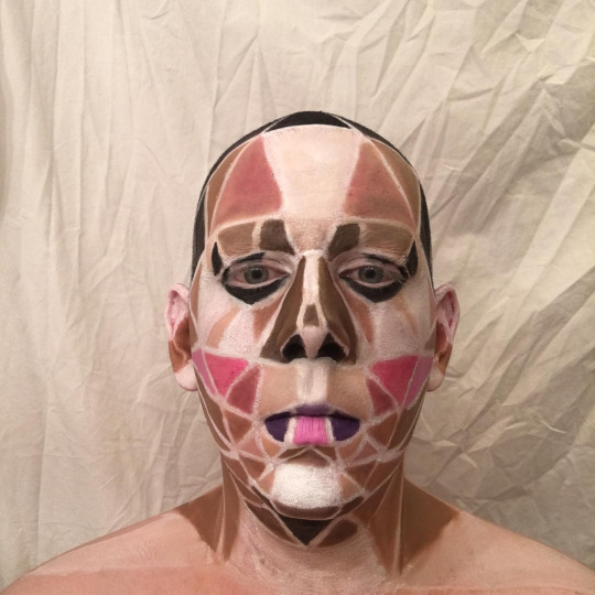
For this illusion makeup mini, I did a low-poly makeup look made of graphic triangles and quadrilaterals. The shapes are arranged and colored to mimic the placement of a standard drag beat, but the non-blended nature of these shapes gives the look a sort of computer-generated feel.
Lila: When you said you were doing a low poly look, I was so excited because it’s such a fun aesthetic. Now, I do like how you’ve set it out, it’s really intriguing and the effort into even the most minute areas, like how the hair and ears are covered. It’s just that your white line spacing is really putting it off the perfect-o mark for me. If you used a really, *really* thin brush the finesse your white spacing, it would honestly have made it look more low poly, because it’s coming across as mosaic rather than low poly. Good job with this, however! I hope you come back to this look in the future since it’s such an original idea.
Gluttoni: Anal! This is a very cool optical illusion and I like your take on the facial anatomy. Can't say it's the most innovative of them all but I can tell you are listening and learning so I can really ask for more.
Letha: I quite like the idea here, Analyse, its very “Your internet connection ain’t shit, so here’s some 144p playback”. The placement of the shapes, as well as the colors, make sense when deconstructing a face. Where you lose me is the white lines. They make everything too stark and disjointed, instead of just low-poly. I think had the shapes been connected while still holding their crisp lines, it might have been more effective. But good job, nonetheless!
Toni:I think this is a really interesting concept and I like that you went outside you comfort zone! Clearly you know your base paint because this style of paint requires you to know where everything goes. I would have loved to see thinner lines between the shapes to really drive home that it was all one image that was in low poly, as well as adding a few more triangles to add a bit more of the feel to it, but over all this is well done!
Antonina: Hey darling! I like what you’ve done here, it’s a great base for a future look. It just doesn’t feel like something finished. I think using this and adding more drag details, like more eye makeup, lashes and a fuller upper lip is something you should explore in the future, because it really is a good start. I’m not getting a super strong illusion from this, but I love the colors you have used and even tho the lines on your face could be sharper, I think they look good right now as well. You keep surprising me, keep it up!
Avana Noir
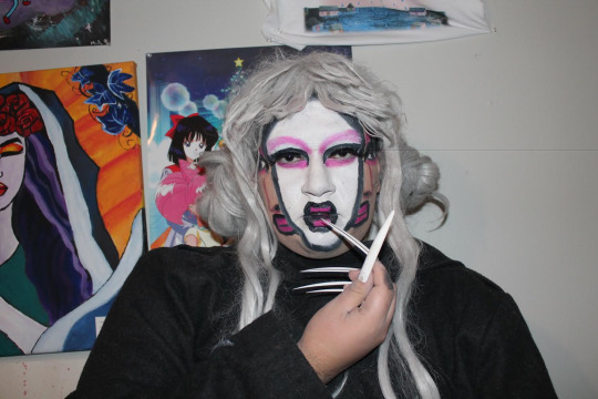

Hello Judges and TDR community. For this Mini I was inspired by surrealism art. So i decided to paint myself with three faces. Since surrealism if very out of this world and very imaginative. I really wanted to push what i can create with a makeup brush. This was kind of challegning but I think I did a great job. I was also inspired by the makeup used by the Japanese Geisha, hence the white face and uses of pinks. I hope you enjoy this look! Thank you!
Lila: On paper, and in execution, this is a great optical illusion and I hope you indulge with it a little bit more since it sticks to your aesthetic really well. For what it is, however, I wish you could’ve blended the Ghost In The Shell-like real face a lot more to show that the face is beneath the illusion of a split. I’m getting a Kim Chi vibe from this and I really think you could use this makeup in your look again, just as a whole white face rather than the split, but if you were to do this again with the split, I would concentrate on detailing the looks to appear more consistent with your features, because its looking a little messy. Overall, I do enjoy this, good submission, Mom!
Gluttoni: I was actually really surprised with your submission in the best way possible. This was ambitious and quite a cool illusion. I think this is probably the cleanest I've seen your makeup so honestly keep on this track.
Letha: This is a really fun idea, Avana, and the creativity really shows through with this concept. The illusion works if I don’t look too closely at it, but the details up close sort of spoil it. It would be more effective if your lines were crisper, and had more highlights/contours on the faces you added, as well as the perimeter of the middle face, to make them really pop. But still, good job!
Toni:Oh she had to show me she wore her nails, okay i see you! I really like this! I think it was a smart optical and for your first time atempting it I think it’s really well done. I do wish the lines were cleaned up more so it was clear that it was a clear split of the two faces and so that there arent just these huge black lines going down your face. I so think that you could have used a bit on the fine tuning of the fake faces. But over all this is a really cool look and something I think you should redo to go out in!
Antonina: You were one of my personal favorites this week! I’m getting Picasso meets Studio Ghibli from this. I don’t have a problem with the messy lines in this, because it’s supposed to be artsy. I got dizzy looking at your submission, and that’s a good thing when it comes to optical illusions, right? The line’s could be darker though, and the wig looks a little to plastic-y. A really dark line around the white face, and maybe a black wig would take me all the way to Spirited Away, but I still love this as it is.
Daddie Dearest
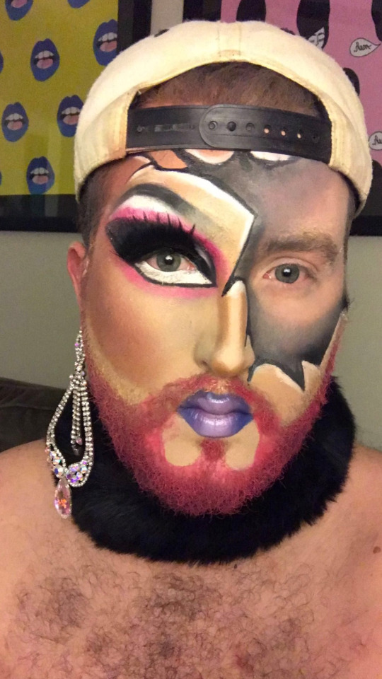
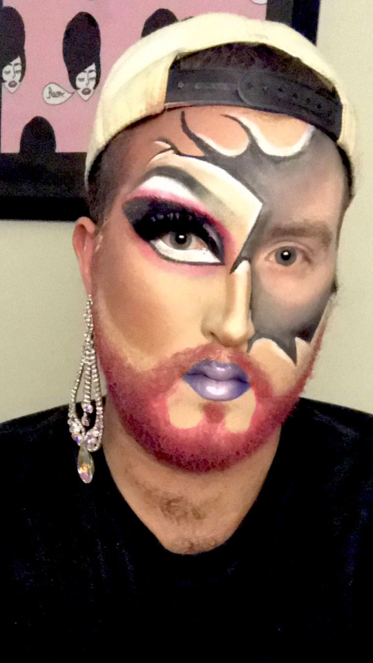
Let me first apologize for the quality of this submission. I was on very constricted time this week, and I hope the judges know the quality of my work is better than this. Anyway, my favorite part of drag is the transformation, so I chose a look that displayed both sides of Daddie in an interesting way. The drag side was heavily inspired by my lovely boy-girlfriend, Ellie Dee. For the boy side, I wanted it to look like someone took a hammer, smashed my face, and removed the pieces. Thanks judges!
Lila: I think makeup is one of your strongest assets, and I love your beat a lot because it’s so creative already with the element of your beard. However, I know this mini challenge has thrown half of you off, but you could’ve taken the crack to the Nth degree here. It would’ve been fun to see some sort of skin peeling illusion or something like (this) where the paper would rip off. Although there is an illusion here, I wish it was a little bit more than it is. Nevertheless, good job!
Gluttoni: Yo Dad, I'm just going to be honest and say I was expecting just a tad more from you. You are clear one of the more advanced makeup artist in the competition so a take on something you've done the previous week disappoints me slightly. I'm going to hold that against you because I respect you as an artist and this evidently still good work.
Letha: Daddie! The makeup is BEAT as always, and I love the contrasting tones/colors. That being said, if I haven’t seen this exact look from you, I feel like I’ve seen similar, and while it’s good, it’s not really pushing the creative envelope. I don’t get a big sense of an optical illusion, but still, there’s no denying your skills, so good job!
Toni: I know this week was really rough on you because you had to scrap your first idea and then quickly make something new out of nothing so I want to give you points for that because I know you were in a panic. I like this a lot, is it the most exciting thing out there? no but Its solid. I think you could have gone all the way and maybe blacked out some chips where it looks like pieces of your face had fallen off kinda like a cracked doll. Over all I think this is a good submission for your situation.
Antonina: Hola papi! This is very pretty, it’s a cool submission, but it’s not the best match for the challenge. But you already know that. I think this was just another chance for you to keep practicing your makeup. You look great, but it was not one of my favorite looks I’ve seen from you so far. The gray part looks a little random and rushed. Maybe if the parts where your real skin tone was showing was white or at least a lot lighter it would give it more dimension. Keep on pushing papi, you got a lot of stuff to show us I can tell.
Dotte Com
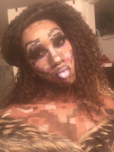
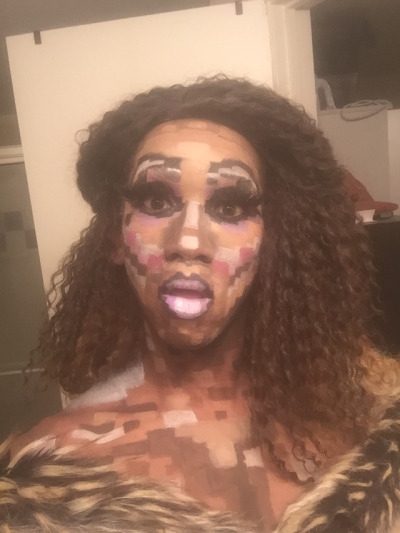
Behold the face of pixel perfection! It was difficult to mine my crafting skills when it came to this challenge, but that didn’t stop me one 8-bit! There’s more than just drawing squares, since your 3D shape has to appear 2D. It was one direction that I enjoyed playing with and I feel like I rose to this cyber-occasion.
Lila: I LOVE this, and I expect to see you continuing this type of experimentation. This was a huge risk and it is up there with one of the more creative choices of this mini challenge. Two things (because I’m nitpicky) that you could’ve enhanced our digital experience with, the pixels could be a lot smaller in some places, your nose contour is looking a lot wider than usual and it could’ve been shaped just to make it more narrow. And, instead of the wavy hair, you could’ve treat us to more of a squared off headpiece or wig, just to tie in that digital look you were trying to serve. This illusion was really exciting to wait for and you did such a great job with it, none the less!
Gluttoni: Dotte! I am so proud of you for this one! You really took the theme and ran the fuck away with this. Not only that you definitely tied it into your own persona to really seal the deal. It's a little rough around the edges but I think got good grasp on different hues and saturation that I wouldn't expect from you. Keep blazing a path like this for yourself and I think you may find yourself in the top way more often. Being tenacious will get you everywhere in life.
Letha: This is a really cool idea, Dotte, and totally fitting for your aesthetic. I’m not totally feeling the hair here, as something shorter or maybe with a blunt bang might have carried the whole “cybernetic technomatic” type vibe a little more. Overall, the pixels are in cool places and seem to mimic a face (as well as down the neck yas thank you for doing that), I would appreciate cleaner lines though, as it appears muddy in places. I love how you took this mini as an opportunity to both experiment with your makeup skills, as well as expressing who Dotte is, so Halleloo to that!
Toni: Dotte I was worried for you with this that it wasn’t going to be enough but I really love this. I think its fun and just enough of an illusion to really be interesting to look at. I love that you paid attention to the challenge and did everything from shoulders up because that was asked of you and not many of your sisters took that chance. I think if you were to do this again it would be nice to slow down and really make those lines hard and crisp, mostly around the eyes. I really loved that, good job this week!
Antonina: I think this is the best I’ve seen you look! The colors are perfect for your face! Of course you shouldn’t do pixel makeup every week,but I think you could really use parts of this in your “normal” makeup. The dedication alone of painting your chest is great. I know hair isn’t part of this challenge, but a small comment on that anyway. I love this hairdo, I just want some more volume on top of your head. Great work this week.
Ebony Boss


For week 2 I told myself I was gonna step it up majorly. I feel as if my cracked porcelain doll really did that. I wanted to do an illusion that is not the most well known for being an illusion. I think the look is one of my best and really does make me look like a cracked porcelain doll.
Lila: While I agree that this is the best you’ve looked in a while, this is a little safe for what we’ve received for the challenge. I do think you have stepped in terms of bringing us a stronger beat than you’ve done in the past, but I think it’d be much more impactful if you chiseled your contour to a fine point to try and create that porcelain perfection most dolls have. Try to bring in your contour on your nose a little bit more to make it seem more narrow. I wish the elements had a lot more, like adding really thin cracks in different shades, a brown perhaps, just to compliment the harsher cracks. Overall, this is a good submission this mini!
Gluttoni: My dear Ebony, I am glad I got to see you start and finish this look because I can easily differentiate the growth for the before and after. You took my advice for cleaning up your line and might I say I think the overall illusion benefited from that greatly. You have a very stoic face which I think would be softened if you were a little more expressive. I want you to look as personable as you actually are. The concept of this look is good and extra points for making it a whole look but do you think this the most inventive idea you could achieve. Push yourself darling.
Letha: You really are improving with every mug you do, Ebony, and that is evident with this look. The cracks have believable shapes to them, especially on the forehead, and some shading/highlighting would sell them even more. The nose contour is a tad muddy and doesn’t really make your nose look thinner. The cheek contour could also be moved up a bit, as it is basically on your jaw. The contour color threw me for a second, but it does make sense with the story you’re telling, but it is a bit muddy/patchy in places (the forehead, for instance). I wish the lips had a more “dolly” shape to them, but the mouth lines are cute. I will say this for taking mug pics- find your lens and find an expression. A wide-eyed doll expression could have helped sell this look, but you look a tad over it, so keep that in mind for the future! Strong work!
Toni: I said this to you before but I’ll say it again, I think this is the best you’ve looked ever to me. I think that you should take what you did here and apply it to your normal makeup. I do wish the lines were a bit more clean and sharp, as well as maybe being a bit more, for lack of a better term, polished and flawless like most dolls are if that make sense. I think if you spent more times on your eyes as well to give us that doll eye shape would sell this more. Also girl, where is your lash going? what is she doing? over all I am really proud of you!
Antonina: Hey babe! Great step up, I don’t even recognize you besides that nose contour that still needs work! The look is very cute though. To really make it an illusion, I would have wanted you to make your skin look like porcelain. A lot of shimmering highlight might do the trick. I see doll, I just wanted MORE doll. Take it over the top, the concept is cute but needs more work to really fool us you’re a cracked doll. Keep on pushing doll face!
Judah Kiss

Hi judges! So we originally talked and this mini was going to be late due to personal circumstances around my new job, and I was very upset about it. Woke up this morning at 7am and couldn’t sleep; so I got right to work to submit something.
For this mini, i chose to attempt to recreate Bearonce Knowes’ negative face makeup, with the purpose of makeup turning my face into ‘camera negative’. With more time and more blending I think it would have come out better, but the idea is there, and I’m very happy to have submitted something on time.
Lila: I see a drive in you that is surrounded in a lot of passion for this competition, so I wouldn’t be so hard on myself! Now, Although there are elements that are slightly askew and rushed, I do like this. It’s a nice play on an optical illusion in the sense that it’s more of a inversion - bezold illusive where you’d have to manipulate the image to see it’s opposite contour-highlighting. I think you’ve said it best in your description that if you did have a little more time, you’d have been able to perfect this makeup job. Nevertheless, great job, I hope to see you come back to this idea and perfect it in the future because its a fun little makeup you’ve created!
Gluttoni: Judah, girl.... This is probably the opposite of what I expected from you. I know you have a keen eye for detail and this keep of makes me want to retract that idea I have of you. The idea itself it's definitely on par with the creative force that I know you to be but the execution leaves something to be desired. I think your proportions need to flesh out sometime during the competition.
Letha: This is such a cool look, Judah, and even though it is a replica of a look someone else did, it’s very creative. I do agree that some more time on blending would have served you well, as well as having more time to make crisper lines. More work around the eyes, and perhaps some white lashes would also have been a really neat addition. I do think the bare neck reads as stark against the grayscale face and the dark shirt, so either painting it black or some sort of gray would have helped. All in all, strong work, Judah!
Toni: I’m glad you were able to get on in time and I see the clear influence. I do like this and think for your first attempt at it that it was done well but due to rushing there are issues with it that really shatter the illusion. I think if you had more time to slow down and focus on blending and making sure it was one flawless transition from dark to light then it would be a really amazing look! Good job!
Antonina: I didn’t need to read your explanation to understand your concept. It’s very obvious, and I like that. It’s a good thing that you have references and tries new things. I know your lines and blending is normally much more clean than this, so I hope stress won’t be your downfall in this competition. I see creativity and passion, so I hope you will have time to really perfect your next submission.I know you’ve got what it takes.
Klinker

I'm the Russian Window. The ruined country post war represented by Windows with their flag's color.
Lila: I’m gonna be honest, I don’t see much of an optical illusion with this makeup. It’s more mondrian artsy fartsy than a head being taken off the body or an eye socket being pulled all the way down to the chin. With your makeup, try to set it so that it isn’t shiny with translucent powder, or even baby powder for that matter. I wish you gave this a little bit more dimension as well as the flat colours could’ve had that Phi Phi O’Hara look to them. Overall, its an alright submission.
Gluttoni: *Gluttoni’s Critiques will be edited in later, she apologises in advance!*
Letha: Heya, Klinker! This look makes for a cool photograph, but I’m not really getting “optical illusion”. Part of optical illusion is tricking the eye to seeing something that isnt really there, and the best way to sort of “cheat” new shapes is to have either a totally matte surface, or to have shine in very specific areas. With this paint, the colors aren’t “set”, so your skin sort of shines and the illusion is betrayed by the real shapes that are there. I would suggest powdering to make it more believable, but good job, nonetheless!
Toni: Well dear I can’t say im too excited about this submission because it seems instead of doing an optical illusion you decided to give us a bit more of an art movement, something very “some body that I use to know”. that aside im glad you went out of your comfort zone but for next time you do this make sure you set your makeup so you dont look so dewy and make sure to have very clean and very sharp lines like an actual mosaic would have.
Antonina: As art photographs, I think this is really cool. As submission for this challenge, not so much. I don’t know how to critique this really, because I like it for all the wrong reasons. The photos are strong and feels almost political for some reason? You are so unexpected, and I love that, but for the second time in a row I can’t really connect your submission to the challenge. Don’t waste this chance to grow, because I see a lot of good in you that I want to see more of.
Lexi Lamour

Well would you believe this shit?! I woke up from a well deserved nap after results were posted Monday and when I went to roll over and get comfortable my body moved....but my head didn't!!! When I went to reach for my head I found that it was detached from my body! In a PANIC I picked it up and ran to the mirror only to find out that my fear was true! I came to get my phone only to find a message from that witch bitch, Analyse! She was NOT happy about coming 2nd in the main for week one and while still in her witchy look cast a spell on me to sever my head! Only thing is there are 2 things that worked in my favor. 1) She got the spell wrong.....and 2) I don't have a soul....just a dark empty void of a shell. At first I was shocked, but then I decided I still looked good. I guess things could be worse! ¯\_(ツ)_/¯Hi, Judges! I knew what I wanted to do as soon as I saw what the mini challenge was. This was a fun bit of makeup that I've always wanted to try and see how it looked. I really enjoyed doing it and taking a multitude of different pics. I couldn't choose which ones to do, so I picked 2 that fit in with the first part of my description. Now....can you tell Analyse to fix me.....before I throw my head at her!!!!!!
Lila: I am honestly happy with this. No, it’s not a full face of makeup, but it’s definitely an optical illusion that I was expecting to see. It would’ve been fun to see you in some face makeup, even if it was just like a little beat on, it would’ve been funny to even have some sort of like Toni face mask realness, like you were in the spa chair getting your facial done. Take care with how you draw the hollow part of the neck, I would’ve love to have seen some reds or whatever your drag character oozes inside, even if you stuck Lisa Frank stickers all over the inside area I wouldn’t have been mad! Nevertheless, I’m happy that you went down this route, and I like this submission a lot!
Gluttoni: *Gluttoni’s Critiques will be edited in later, she apologises in advance!*
Letha: Now THIS is an optical illusion! Even if I hadn’t read your explanation it would have made sense, which is always a plus. I’m guessing the “curse” aspect is why it’s such a clean cut, but I still think adding some things like a trachea or some arteries (not gore, just a cross-section) might have helped sell the illusion a bit more, as right now it’s just sort of a patchy gray. I do wish there was a little more going on on the face, even like a sleeping mask because you “just woke up”. Still, this is a great job, and you really sold it!
Toni: This is an illusion! I really am shocked by this because this is so cool and at first i was like “what the fuck?”. I would have loved if you had done more thought, because it is a shoulders up it does seem a bit bare, even a light paint would have added something to this submission. It was smart to ahve a balck back ground that way it would make sense to have the black in your neck. Over all this is a really well done illusion.
Antonina: Hi Lexi! I’m gonna be honest....I don’t see it. Maybe I’m just stupid lol. The disconnected head is a good idea though. Without any face makeup, the neck is the only thing to look at, and then it looks a little weak. Maybe I’m just a little spoiled with your last main challenge submission. The top part of the neck makeup where it’s really black looks really cool though. The idea is good, it’s exactly the kind of thing I was hoping for. The end results just didn’t match my expectations because I know how fierce you are.
Marcella Fox
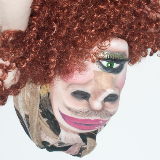
Hello judges! Let me introduce you to my great Aunt Hortense - she was a model back in the 1980s, known for her high cheekbones and striking gaze. She felt out of the public eye after a scandal involving a grapefruit, and since then has kept a low profile. The menopause has been rather unkind to her, resulting in a more-than-barely-noticeable moustache and, as you can see, she is still recovering from her recent rhinoplasty procedure. Still though, she never steps out of the house without a face full of make-up - I’m sure you can all agree she still looks glamorous! I had a lot of fun with this mini challenge! I immediately thought of doing an upside-down illusion, and I was inspired by this cyclops I saw while googling ideas. I made an eye to put in my mouth, turned my actual eyes into giant nostrils, and hid my real nostrils with a plaster/bandaid. My eyebrows became a moustache, and I drew a giant pair of lips on my forehead. I wrapped a scarf around my head to look like, well, a scarf :p And held some hair underneath my chin to complete this fab 80’s look :]
Lila: SHOCKED. GAGGED. PULLED THE PAG. Marcella Fox, this is friggin’ CRAZY and I love it. The fact that some people won’t be able to establish you’re upside down and your eyeball is your mouth opened, I keep having to look back and do double takes because it’s SO interesting. I only noticed that you were upside down when I saw your hand holding the wig, and I’m just a sporadic mess because there’s no words to describe how you hit the nail on the head for me this challenge. One thing, and it’s a little nitpick, is if you had some sort of stand or piece of fabric tacked to your headwrap so that it looks like your character has a body, but like, honestly, the tiniest nitpick isn’t gonna take away how much I am impressed by this look. Great submission, Marcie!
Gluttoni: *Gluttoni’s Critiques will be edited in later, she apologises in advance!*
Letha: Up until this very moment, Toni had always been my favorite Cyclops from the 80′s. But NO LONGER, Marcella, it’s your Aunt Hortense! You managed to brilliantly combine camp/comedy with technique and the result is honestly so amazing. The lines are great and make sense, and the highlighting on the lips is so good. Your workarounds for hiding your natural features are also quite clever (though i would have suggested a bit more dramatic of a bandage for the rhinoplasty, as the beige of the current one gets a little lost in the shuffle of the face). These are honestly just nitpicks though, because I am still in AWE of this piece. Amazing job, Marcella!
Toni: YOU COME INTO MY HOUSE? AND MAKE ME LOOK AT THIS MONSTER?? I’m shocked, gagged, disgusted, horrified and I love every bit of it! This makes me so freaking uncomfortable to look at but in the best was possible. I think this holds truest to what a makeup illusion should be because this is so hard for my brain to process. If you wore this look out youd get tipped no question. Just make sure to have those really clean lines so that everything looks a bit more realistic, but over all im SHOOK BITCH.
Antonina: Wow! This is like a challenge: “How many faces can you find?”. I get so much backstory just by looking at your pictures, and to read your description was a joy. Keep taking every chance to be funny! The creature you created is so interesting and I can’t stop staring at it! I honestly don’t know what to say more than you did such a great job.
Paprika

My makeup for the mini was inspired by 80s Patrick Nagel, in the way that he drew the features of so many of the women in his prints and the color scheme he used, as well as (obviously) miss Kim Chi. I love drawing on my face and doing creative mugs so for the opitcal illusion challenge I wanted to play off of that and BECOME a drawing.
Lila: You are so pretty and no matter what you do, optical illusion or normal face, you’re always gonna make me jealous. I would consider this an optical illusion because I’ve seen a lot of people try this with the Marilyn Monroe tutorials and stuff, so I’m pleased to see you go down this route! You look like a CD cover for an indie music band which I enjoy. I wish the black was a little more black than grey. I’m guessing you used either a black face paint or eyeliner, so to get that pure black just set the area with some eyeshadow of the same colour. However, great submission this week, Paps!
Gluttoni: *Gluttoni’s Critiques will be edited in later, she apologises in advance!*
Letha: This is a very cool look, Paprika, and beautiful as well. The colors are simple but the effect is still striking. I would suggest better lighting (I’m guessing that’s a window to your right, try facing it so the tone is more even all over your face) as well as a better backdrop, even hanging up a black sheet could work. I like the shapes of the face a lot, but I would recommend setting the black with shadow to help make it as opaque as possible. The hair is brown instead of black, which is fair if that’s all you have, but having a more solid (less flyaway) hairstyle would match this look I think. Overall, great job, Pappy!
Toni: As someone who has Nagels art hanging all over her drag room i am so glad to see you do something like this! I really think this is striking and true to the art style. I don’t think this is what would be considered a standard illusion but the way you did it really sells it for me. I think if you really darkened thosse shadows and cleaned up your lines it would be so amazing. Good work this week babe!
Antonina: I really like this. I wanna see a video of you in this look reading poetry in french. It looks really good, there are some areas that could use some more work though. For example, the crease lines are very different from eachother. If you’re gonna do this again, make the dark parts darker and maybe some cool collar bone shadows? I think you’re on the right track, keep it up.
Phoebe St. Jefferson

For my mini I was really anxious about this, because make up is for sure one of my insecurities in drag. Despite this i chose to do something really ambitious and yolo my way through this. I decided to turn myself into a snake/reptile type creature, but also blend my hand into my face. For this I followed the example of this video: https://www.youtube.com/watch?v=sekYblpNDAo But I also tried to make it a little more cartoony, something fun that will actually look like my kind of style. For the make up I primed, sketched out where the mouth was with clown white, then darkened the lines with a cheap eyeliner pencil. For the color of the snake I went in with clown white mixed in with a little black eyeshadow. The hardest part of this challenge was taking a picture where all the lines matched up. Anyways enough of me rambling. Hope u enjoy boos xoxoxoxo.
Lila: WHAT? Scared of makeup my ass! This is by far it’s one of the more creative submissions we received! I see an optical illusion in this, honestly. It must be a trend to have snakes on this cycle, so I cant wait to see who does a snake for the main challenge. One thing to watch is your positioning with this type of optical illusion. I can see a small shed of skin at the bow of your thumb and index finger, and you could’ve colour matched your hoodie and background to try and make it pop a lot more. Otherwise, great submission, Phoebs!
Gluttoni: *Gluttoni’s Critiques will be edited in later, she apologises in advance!*
Letha: This look is honestly incredible, Phoebe! It’s very creative, and you went outside the box by incorporating/camouflaging your hand into the illusion! Are the lines perfect and crisp? Not entirely, but the effect is still there. I would appreciate a bit more detail on the mouth itself, as it reads more of a flat pink, but it’s still really cool. One way I could see this look being elevated would be to have had the hand painted as a CLOSED mouth with maybe the tongue flicking out, then lowering your hand to reveal the open mouth, but I can understand the difficulty of trying to pull that off lol. You should be very proud of yourself, Phoebe, and I hope this mini helps you with your makeup insecurity, because from what I see, you can do great work!
Toni: Honestly for your level of makeup skills this is amazing and I’m so glad you went down this route and took my suggestions. I would make sure to pay attention to where you are taking your pictures and their position because they can alter how its viewed and I think if you had the opportunity to take it against a solid background it would have made this more striking but I really love this over all!
Antonina: Thanks for the nightmares Phoebs!! This creature is scary af lol. This is one of the most memorable submissions we got this weak! That paint must have taken you quite some time to do! If you want to do this look again, get some snake eye lenses to get the full fantasy, but for a week 2 mini challenge of TDR I think you’ve shown a lot of dedication already. All the blacks could be darker, but most imporantly around your eyes. It looks a little sloppy. But hey, whatever, this is a great sssssssssssubmission.
Sugar Monroe

For this “optical illusion” mini, I was inspired buy a lot of color blocking makeup I saw and also stained glass? Idk. This is what I came up with. Lol
Lila: When I opened up the submissions, I got a little bit of an Indiah Ferrah / Phoenix 1st Episode Workroom vibe when I saw some of the other girls doing a similar look to what you’ve done this mini. While the whole mondrian-mosaic fantasy is kind of the go-to illusion, it’s not really optical, or for that matter original. a spin on this could’ve been following the natural contours of your face with the shapes or even doing your contours with the black lines and a blending of all the colours. It just doesn’t scream illusive to me. With your colours, try to add a darker and a lighter hue too, just to make them seem 3-D. Overall, this was an alright submission.
Gluttoni: *Gluttoni’s Critiques will be edited in later, she apologises in advance!*
Letha: While I do think the colors are very refreshing and vibrant, a lot of the critiques I had for Klinker apply here, Sugar. The black lines are generally strong and not muddy, but setting the areas with a corresponding powder (or even a translucent color all over) would have sold an illusion more. You lose opacity in some place, the white/purple most noticeably, but most of the areas pop quite nicely. I feel like the illusion aspect of the challenge could have been executed better, but I do enjoy the look you made. Solid work.
Toni:I know you had some troubles with this mini but i do wish you had worked more with the judges to find something you were able to do ebcause this is much less of an illusion and more just kinda an art style makeup if thake makes sense. Be careful on that babe. But I do want to give you props for going out side of your normal paint, if you were to do this again I’d say think out those black lines so that you can have more color showing as well as adding more shapes. Good luck this week love!
Antonina: The red and the pink looks really bright and good, but what’s going on with the purple on your forehead? All the other colors looks good, but you should have filled in the purple a lot more. It’s not my favorite submission this week, but that doesn’t mean you look bad, it’s cute. I just wasn’t surprised by it. I think you did a good job for what it is, but I wanted more of a concept. Also, a little more color on the lips wouldn’t hurt. I believe in you Sugar, surprise us next time! This is alright, but give us more!
6 notes
·
View notes