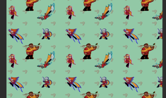
#I know there's a way to crop tiling art to make it look nicer but that's beyond my tired little braincell rn
Explore tagged Tumblr posts
Text

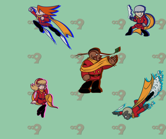
My 2023 @secret-cyborg for @little-huitzil! Eh, but why's it kinda positioned funny?

That's because it's a tiling background~ I had a lot going on this year but I still wanted to fulfill this so hope you like it! I couldn't really think of who to focus on, so I figured the more the merrier c:
#secretcyborg2023#cyborg 009#cyborg 002#cyborg 003#cyborg 004#cyborg 005#cyborg 008#c009#luparaneo art#I know there's a way to crop tiling art to make it look nicer but that's beyond my tired little braincell rn#if you see any little errors PLEASE let me know so I can fix them!!
14 notes
·
View notes
Note
Hi, your art is stunning. May I ask what program you use to draw digitally, and if you have any tips on how to get the forms and colors as incredibly accurate as you do?
Aw, thank you! I still feel like very much an amateur at this; my first digital painting of this type was this one, a month ago, and I don't really know what I'm doing, so take my advice with a grain of salt.
I use Clip Studio Paint currently, though an older version from when it was a one-time purchase instead of a subscription. (Why is everything subscriptions these days.) In the past, I've used Krita, which was free, but I haven't used it for this kind of painting per se.
For these paintings I've been using the default "Dense watercolor" brush for laying out blobs of color and the "Transparent watercolor" brush for subtler shading and smoothing. I expect these are not the ideal tools for this or anything, just sort of the brushes I've gotten most used to working with in coloring in CSP, which I stumbled into kind of randomly while messing around.
To get the forms right: something I started doing for my Good, the Bad and the Ugly kick early when I'd started on that in September was to do a rough sketch with the screenshot on the canvas at the same size and every now and then drag the sketch layer over the screenshot to check myself off - see if I'd made some feature too small or positioned it weirdly, etc. This felt a little like cheating but it did also just kind of help give me a better sense for it and for the ways in which my initial eyeballing tends to be off so I can adjust for it, and then once I had the very rough sketch of where everything is, I could detail freehand on a second sketch layer from there which feels a lot less like cheating.
However, for the last three paintings I did, instead of doing that I have been using a trick I saw my dad using when doing traditional oil painting, namely using a grid: enable the grid option in the CSP view settings, line the reference up with the grid, and then focus on each individual 'tile' of the grid. While working on this latest one, my canvas looked like this, for example:

So when sketching and while working on it from there, I could look at the individual square on the grid that I was working on and try to match it to that individual bit of the reference, which is a lot easier than trying to eyeball the whole thing at once.
As you may be able to tell, the colors don't feel super accurate to me when I'm working on it and actually looking at the screenshot beside it; it's all a little off and less detailed, but then it looks a lot nicer once you crop the reference out of the canvas. For this one I actually experimented with using the color picker tool to pick out some of the extremes of the colors I worked with for each given area - some of the brightest highlights on the face, a nice midtone, some of the deepest shadow - but this isn't all that helpful because film grain means the overall impression of the color is different, and there are a lot of nuances. Something I did do, also for some of the previous paintings where I specifically didn't use the color picker as a challenge to myself, is try painting a brush stroke on top of the area in the screenshot whose color I'm trying to replicate and keep adjusting until it feels like it just about blends in. But even then color is very hard. There are so many subtle nuances and shades and it's hard to adjust the exact shade of some color I've already put down other than by just painting over it again and then redoing the details - unless, of course, I just put another layer on top and set it to Hue or something. I did that a little with the barbed wire around his neck on this one, to make it less blue after I'd first put it down.
Buuuut mainly I think the key to making these sorts of things look good, as far as I've felt, is just to be willing to spend a whole lot of time noodling on them. There's always more you can do with it to make it better.
I found the checking myself off by dragging the sketch on top of the screenshot trick very helpful, even if it does feel like cheating, just by virtue of the fact it makes the outcome look better, which makes me less likely to ultimately go "ugh, this isn't right" and just want to stop working on it and move on. And that's very helpful, at least to me.
Finally there's the general just draw a lot, etc. I have been posting art daily on this blog since the beginning of 2016, and it's been a slow journey of my very intermittent efforts at human portraits getting slightly, slightly, slightly better each time. Just these feel like a pretty massive level up in the space of a couple of months, though, and I think that's largely just because I got obsessed enough with a movie to want to spend the time to draw one million cowboys instead of doodling Pokémon, and also allowed myself to use whatever neat tricks would help me make them come out well enough to stay motivated on it.
7 notes
·
View notes