#I know it doesn't make a lot of sense to complain about the Searchbar having a big bunch of space to itself
Explore tagged Tumblr posts
Text
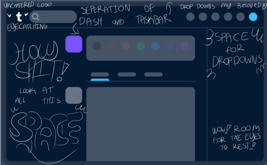
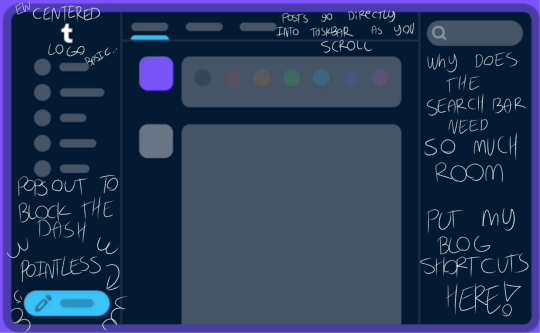
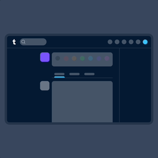
Amazing how they managed to make a Gif that perfectly shows off everything we loved about the old layout and hate about the new one and still decided to try and sell the change as a good, well revived addition to the web site


Nothing about the new layout is streamlined, it’s all clunky and cramped and is honestly a mess of practical design compared to the old layout, but Tumblr higher ups will do whatever they want with no regard for the majority, we already knew this from Tumblr LIVE.
So if you’re like me and find this layout actually impossible to use but also have no where else to go, here’s a post for an extension that changes it back. Because the community does what Tumblr can’t; Make a functional Website.
A new way to navigate Tumblr
If you use Tumblr on a web browser, you might have noticed us testing a brand new navigation on your dashboard in the last month. Now, after some extensive tweaks, we’ve begun rolling out this new dashboard navigation to everyone using a web browser. Welcome to the new world. It’s very like the old world, just in a different layout.
Why are we doing this? We want it to be as easy as possible for everyone to understand and explore what’s happening on Tumblr—newbies and seasoned travelers alike.

Labels over icons: When adding something new to Tumblr in the past, we’d simply add a new icon to our navigation with little further explanation. Turns out no one likes to press a button when they don’t know what it does. So now, where there’s space, the navigation includes text labels. Since adding these, we’ve noticed more of you venturing to previously unexplored corners of Tumblr. Intrepid!
What’s already been fixed? Thanks to feedback from folks during the testing phase, we’ve been able to make some improvements right out of the gate. Those include returning settings subpages (Account, Dashboard, etc.) to the right of the settings page instead of having them in an expandable item in the navigation on the left; fixing some issues with messaging windows on smaller screens; and streamlining the Account section to make it easier to get to your blogs.
What’s next? We’re looking into making a collapsible version of this navigation and improving the use of screen space for those of you with enormous screens. We’re also working on improving access to your account and sideblogs.
That’s all for now, folks. For questions and suggestions, contact Support using the “Feedback” category. Please select the “Report a bug or crash” category on the support form for technical issues. And keep an eye out for more updates here on @changes.
#I said I'd give them till the end of the month to give us a switch to change it back and they said BET#No wonder all my emails got ignored#I know it doesn't make a lot of sense to complain about the Searchbar having a big bunch of space to itself#when my main praise for the old layout is the big bunch of blank space#It's about the shift of space the Drop Downs DESERVED that space to themselves so they wouldn't block the things your actually looking at#Plus that's where collapses DMs go#As always the Tumblr user base has to do everything themselves#I'm not back btw not yet I'm still gonna stick the the original plan of End of August#At this point just because I'm upset and don't want to be here when they just keep pulling this shit#I'm also gonna take a while to figure out the extension for myself#Anyway fuck you Tumblr#If Aethy didn't look literally exactly like this I'd just pack up and move there but it's the exact same stupid Twitter layout over there#Fuck you Twitter you actively made the internet worse and then erupted into flames
27K notes
·
View notes