#I had to remember how to use masks in photoshop
Explore tagged Tumblr posts
Visit Tumblr Blog
Explore Tumblr blogs with no restrictions, modern design and the best experience.
Last Seen Tumblr Blogs


Fun Fact
In 2020, 44% of users from Denmark used Tumblr daily.
Note
Why reblog machine-generated art?
When I was ten years old I took a photography class where we developed black and white photos by projecting light on papers bathed in chemicals. If we wanted to change something in the image, we had to go through a gradual, arduous process called dodging and burning.
When I was fifteen years old I used photoshop for the first time, and I remember clicking on the clone tool or the blur tool and feeling like I was cheating.
When I was twenty eight I got my first smartphone. The phone could edit photos. A few taps with my thumb were enough to apply filters and change contrast and even spot correct. I was holding in my hand something more powerful than the huge light machines I'd first used to edit images.
When I was thirty six, just a few weeks ago, I took a photo class that used Lightroom Classic and again, it felt like cheating. It made me really understand how much the color profiles of popular web images I'd been seeing for years had been pumped and tweaked and layered with local edits to make something that, to my eyes, didn't much resemble photography. To me, photography is light on paper. It's what you capture in the lens. It's not automatic skin smoothing and a local filter to boost the sky. This reminded me a lot more of the photomanipulations my friend used to make on deviantart; layered things with unnatural colors that put wings on buildings or turned an eye into a swimming pool. It didn't remake the images to that extent, obviously, but it tipped into the uncanny valley. More real than real, more saturated more sharp and more present than the actual world my lens saw. And that was before I found the AI assisted filters and the tool that would identify the whole sky for you, picking pieces of it out from between leaves.
You know, it's funny, when people talk about artists who might lose their jobs to AI they don't talk about the people who have already had to move on from their photo editing work because of technology. You used to be able to get paid for basic photo manipulation, you know? If you were quick with a lasso or skilled with masks you could get a pretty decent chunk of change by pulling subjects out of backgrounds for family holiday cards or isolating the pies on the menu for a mom and pop. Not a lot, but enough to help. But, of course, you can just do that on your phone now. There's no need to pay a human for it, even if they might do a better job or be more considerate toward the aesthetic of an image.
And they certainly don't talk about all the development labs that went away, or the way that you could have trained to be a studio photographer if you wanted to take good photos of your family to hang on the walls and that digital photography allowed in a parade of amateurs who can make dozens of iterations of the same bad photo until they hit on a good one by sheer volume and luck; if you want to be a good photographer everyone can do that why didn't you train for it and spend a long time taking photos on film and being okay with bad photography don't you know that digital photography drove thousands of people out of their jobs.
My dad told me that he plays with AI the other day. He hosts a movie podcast and he puts up thumbnails for the downloads. In the past, he'd just take a screengrab from the film. Now he tells the Bing AI to make him little vignettes. A cowboy running away from a rhino, a dragon arm-wrestling a teddy bear. That kind of thing. Usually based on a joke that was made on the show, or about the subject of the film and an interest of the guest.
People talk about "well AI art doesn't allow people to create things, people were already able to create things, if they wanted to create things they should learn to create things." Not everyone wants to make good art that's creative. Even fewer people want to put the effort into making bad art for something that they aren't passionate about. Some people want filler to go on the cover of their youtube video. My dad isn't going to learn to draw, and as the person who he used to ask to photoshop him as Ant-Man because he certainly couldn't pay anyone for that kind of thing, I think this is a great use case for AI art. This senior citizen isn't going to start cartooning and at two recordings a week with a one-day editing turnaround he doesn't even really have the time for something like a Fiverr commission. This is a great use of AI art, actually.
I also know an artist who is going Hog Fucking Wild creating AI art of their blorbos. They're genuinely an incredibly talented artist who happens to want to see their niche interest represented visually without having to draw it all themself. They're posting the funny and good results to a small circle of mutuals on socials with clear information about the source of the images; they aren't trying to sell any of the images, they're basically using them as inserts for custom memes. Who is harmed by this person saying "i would like to see my blorbo lasciviously eating an ice cream cone in the is this a pigeon meme"?
The way I use machine-generated art, as an artist, is to proof things. Can I get an explosion to look like this. What would a wall of dead computer monitors look like. Would a ballerina leaping over the grand canyon look cool? Sometimes I use AI art to generate copyright free objects that I can snip for a collage. A lot of the time I use it to generate ideas. I start naming random things and seeing what it shows me and I start getting inspired. I can ask CrAIon for pose reference, I can ask it to show me the interior of spaces from a specific angle.
I profoundly dislike the antipathy that tumblr has for AI art. I understand if people don't want their art used in training pools. I understand if people don't want AI trained on their art to mimic their style. You should absolutely use those tools that poison datasets if you don't want your art included in AI training. I think that's an incredibly appropriate action to take as an artist who doesn't want AI learning from your work.
However I'm pretty fucking aggressively opposed to copyright and most of the "solid" arguments against AI art come down to "the AIs viewed and learned from people's copyrighted artwork and therefore AI is theft rather than fair use" and that's a losing argument for me. In. Like. A lot of ways. Primarily because it is saying that not only is copying someone's art theft, it is saying that looking at and learning from someone's art can be defined as theft rather than fair use.
Also because it's just patently untrue.
But that doesn't really answer your question. Why reblog machine-generated art? Because I liked that piece of art.
It was made by a machine that had looked at billions of images - some copyrighted, some not, some new, some old, some interesting, many boring - and guided by a human and I liked it. It was pretty. It communicated something to me. I looked at an image a machine made - an artificial picture, a total construct, something with no intrinsic meaning - and I felt a sense of quiet and loss and nostalgia. I looked at a collection of automatically arranged pixels and tasted salt and smelled the humidity in the air.
I liked it.
I don't think that all AI art is ugly. I don't think that AI art is all soulless (i actually think that 'having soul' is a bizarre descriptor for art and that lacking soul is an equally bizarre criticism). I don't think that AI art is bad for artists. I think the problem that people have with AI art is capitalism and I don't think that's a problem that can really be laid at the feet of people curating an aesthetic AI art blog on tumblr.
Machine learning isn't the fucking problem the problem is massive corporations have been trying hard not to pay artists for as long as massive corporations have existed (isn't that a b-plot in the shape of water? the neighbor who draws ads gets pushed out of his job by product photography? did you know that as recently as ten years ago NewEgg had in-house photographers who would take pictures of the products so users wouldn't have to rely on the manufacturer photos? I want you to guess what killed that job and I'll give you a hint: it wasn't AI)
Am I putting a human out of a job because I reblogged an AI-generated "photo" of curtains waving in the pale green waters of an imaginary beach? Who would have taken this photo of a place that doesn't exist? Who would have painted this hypersurrealistic image? What meaning would it have had if they had painted it or would it have just been for the aesthetic? Would someone have paid for it or would it be like so many of the things that artists on this site have spent dozens of hours on only to get no attention or value for their work?
My worst ratio of hours to notes is an 8-page hand-drawn detailed ink comic about getting assaulted at a concert and the complicated feelings that evoked that took me weeks of daily drawing after work with something like 54 notes after 8 years; should I be offended if something generated from a prompt has more notes than me? What does that actually get the blogger? Clout? I believe someone said that popularity on tumblr gets you one thing and that is yelled at.
What do you get out of this? Are you helping artists right now? You're helping me, and I'm an artist. I've wanted to unload this opinion for a while because I'm sick of the argument that all Real Artists think AI is bullshit. I'm a Real Artist. I've been paid for Real Art. I've been commissioned as an artist.
And I find a hell of a lot of AI art a lot more interesting than I find human-generated corporate art or Thomas Kincaid (but then, I repeat myself).
There are plenty of people who don't like AI art and don't want to interact with it. I am not one of those people. I thought the gay sex cats were funny and looked good and that shitposting is the ideal use of a machine image generation: to make uncopyrightable images to laugh at.
I think that tumblr has decided to take a principled stand against something that most people making the argument don't understand. I think tumblr's loathing for AI has, generally speaking, thrown weight behind a bunch of ideas that I think are going to be incredibly harmful *to artists specifically* in the long run.
Anyway. If you hate AI art and you don't want to interact with people who interact with it, block me.
5K notes
·
View notes
Text
Miraculous makes no sesne
so, if I recall, the only reason that people don't know Marinette and Adrien's identities are because "the magic of the miraculous alters their looks and voices" right????
but that doesn't explain how we have had so many episodes in the earlier seasons where Alya and (Marinette's friends) were sort of figuring things out.
we had in the episode that Alya found the history book that Ladybug dropped that she started to investigate who Ladybug might be and because their school is the only one to be using those exact history books she started to take notes of different students in her class. Marinette included. And from what I remember in the end of this episode she used this photoshop app and told Marinette that Adrien kinda looks like Chat Noir.
then in that episode where the pop star was making a music video about Marinette and Chat Noir, Adrien was already cast to be Chat Noir but then Marinette was offered the role for Ladybug. BOTH OF THEM suspiciously "lost" their masks (which should already be a clue) but then Marinette's friends were taking photo's of the two and commenting on how they look like Ladybug and Chat Noir.
also when Chloe tried to trick people and dress as Ladybug to pretend to have an interview between her and Queen Bee, everyone called her out on it because she didn't get the hair right.
Also there have been times when people figured out holders of miraculous' just by hearing them say a certain thing.
how did Felix figure Marinette out?
I feel like Nino told everyone else about his and Alya's secret, they at least all know Alya (and Chloe) has a miraculous. I doubt that the couples will keep this secret from each other so when Marinette and Adrien are the ONLY classmates without ones? Marinette really wasn't thinking
Adrien being Chat Noir's voice actor. common they sound the SAME you can't be blind to that
Not to mention MARINETTE AND ADRIEN THEMSELVES. the amount of times those two have kissed, held hands, been near each other. Adrien probably wears that fragrance he advertises. WE KNOW Marinette knows his scent. If these two like each other so much, and spent so much time together, how do they not know what the other tastes like (sorry), smells like, and feels like?
Edit: when I am talking about scent I mean NATURAL SCENT. don't what it is google it not my problem.
obviously this is a thing with the writing. But i feel like we should have sometimes seen the other characters POV's especially when like Marinette and Adrien (as superheroes) are interacting with the civilians. like maybe at least a bit of an alteration with their appearance, that probably would have been more expensive or more time. I don't really know, I'm not an animator but they should have explained it better or not have it in at all because there are a lot of contradictions with it existing.
#miraculous ladybug#also child me would hate the excuse so much#miraculous ladybug commentary#identity reveal#adrienette#marinette dupain cheng#adrien agreste#alya cesaire
18 notes
·
View notes
Note
Hi uzlolzu! Your art is so unique and captivating you've been my favourite artist since I was a teenager! I've recently graduated uni now and have done some freelance jobs here and there and I'm wondering how someone goes about building a stable freelance career as an illustrator. Can you share how you started?
Hello and thank you! That’s flattering and I’m very happy to hear it.
I can! Or I will try. It’s a pretty tricky question to answer, because my path into this has been organic and, in a way, one of least resistance.
In short: I was born into it.
Not in an “I’m the chosen one” way, of course, but in that my parents are artists and designers. Both currently work as graphic designers and have worked with illustration in the past. My mum is also a tailor and my dad is a wood carver (my sister does wonderful ceramics and has an education in tailoring too). Art and design, and working in those fields, is a core pillar of my family life.
All of this was pretty convenient for me regarding pursuing a career in illustration; I’ve always had access to all digital and traditional materials I’ve ever needed to draw or paint or do any craft (my first tablet was a 1999 Wacom Intuos 1), I grew up in an environment that was encouraging even when nothing was said, AND I had my parents’ extensive professional network available to me as soon as I was old enough to work. That last part has probably been more important than my level of skill ever was. I was lucky. I hit the ground running. So I can’t really remember a time where design or art of some sort wasn’t already my “career” (in my mind, I had an art career when I was four). It took quite a few years before I understood that I could technically have other jobs.
That said, my first paid jobs were photo editing ones that I got through my parents, not illustration. They were touch-ups, extending, cropping, resizing, masking… Those things that Photoshop often can do on its own now (or at least streamline) but couldn’t when I started almost 20 years ago (though PS and I have been friends for almost 30). Eventually, I got to do small illustrations for the same publications I had edited photos for, as well as some others. These kinds of illustrations still constitute a large part of my work hours, though in greater numbers and larger batches. They aren’t the flashiest, but they pay well. I also still work with my parents often. We’re all self-employed, but it’s really a family business setup at the core.
Moving outside of my inherited network…: I got my table top RPG-jobs by becoming part of the Swedish indie and semi-indie TTRPG scenes, which aren’t very big. It was straightforward to be visible enough and many people had their own (often tiny) projects that needed illustrations. Some of them contacted me. I think a not insignificant portion of the Swedish TTRPG game designers know who I am now, but I started small. Role-playing is one of my biggest hobbies, so networking came naturally. In my experience, these are flashier pictures to make, but rarely pay well (with some glorious exceptions). Anyway: If you have a specific field you want to work in, get involved in that field. There’ll probably be more people who want illustrations than people who illustrate in it.
Then there’s the concept art. I worked as a concept artists for Ubisoft Massive for a few years, and got this job partly through the game developer school (The Game Assembly) that I went to and partly because of my skills, I guess. But TGA and its proximity to Massive was instrumental. Game art is the only profession I have a formal education in.
So, when I started “officially”, I was already in a pretty good situation for it. Another important factor in my case, I think, is that I’m comfortable with many illustrator-adjacent disciplines as well, since the “packaging” or context of an illustration has always interested me. I use Adobe Illustrator and InDesign every week. Sometimes I do design work (layouts, logotypes, powerpoint presentations, annual reports, diagrams…), and I often do the in-betweens (infographics. Icons, patterns, other kinds of logotypes…). I prefer illustration and the in-betweens, but being open to branching out has given me more clients and, as a result, the ability to choose more freely which jobs I accept.
Either way. It’s really helped me to know a little something about all parts of a project, planning phase to phinished product. It makes it easier to talk to everyone involved, whatever their position and profession – programmer or printer. I know how to make a book from start to finish. It’s neat.
And, as you can see, there’s a lot of luck involved here and even if I know when I started getting paid, I can’t really say when I started developing the skills and the network I needed. That’s been a life-long process. And, of the two, I think the network has been more important for landing jobs than the depth of any particular skill of mine (though the variety of them might have helped). The more people who know you, the easier it’ll be, and that number of people will grow with the number of jobs you do. And I might as well add that physical meetings have worked better for me than just online contact. It’s easier to remember someone you’ve met, even if it was just for a few seconds.
And to finish off, I’ll add a few work samples that differ from what I generally post on Tumblr, since the ability to work in many styles has also benefitted me:
(Don’t let the text in the yellow box fool you. It’s Swedish lorem ipsum.)
18 notes
·
View notes
Note
Quick question, how did you do the animated banner for your account? I had no idea it was even possible so I'm kinda confused and surprised.
Hey nonny! lol that is not a quick answer tho afihdfkadh.
I'm not gonna give a whole tutorial on it just because working with custom highly animated gifs in Photoshop is a big manual process, very finicky and something i know is much more easily done in after effects (i just havent had the time to begin to teach myself that lol).
I will give some tips to get started though.
the basic structure of the animation in my pinned is an image layer (tmz layout), duplicated into multiple frames, then pasting gifs (toji looking back and mouse click) onto various frames via overlay that are playing at different speeds per action.
the click effect was me editing an existing gif of a mouse frame by frame resizing certain frames and recoloring the play button on certain frames. (lol i spent so much time doing this but this was before I knew about keyframes in the video timeline lol).
you need to learn about frame animations, the relationship between frames and layers, layer grouping, clipping masks, clipping masks onto layer groups, converting to video timeline for keyframes and smart objects to sharpen your gifs (the converting back to frame animation).
A good gif resource for creation is this directory which is a bunch of tumblr tutorials on gif making in photoshop. Honestly, this is great for beginners. I don't always do things exactly the way they do it in those tutorials and sometimes I use capcut to animate things to then important into photoshop but multiple ways to get to the same result tbh.
(remember if you are a student you can get a year of adobe creative suite for like $22 a month or you can pirate/torrent a copy of photoshop but make sure you have a VERY good antivirus and that it either comes cracked or has a keygen tool with it).
14 notes
·
View notes
Text
Get to know you- Sims Style
@clouseplayssims tagged me. I only play TS2 (never played TS1, only briefly played TS3 and only played TS4 for about 5 mins), so all answers pertain to TS2!
What’s your favorite Sims death?
Death by Old age. I live my Sims to live a long and fulfilled life. But, playing medieval, my more common deaths are 'death by childbirth' (mod), 'death by starvation', and 'death by fire'!
Alpha CC or Maxis Match?
In my medieval game, I use alpha CC. All Maxis items are hidden, so my game is pretty much 100% CC.
Do you cheat your sims weight?
No. My sims start off either 'average' or 'overweight', and how they change is up to them in game. (Can weight even be cheated in TS2?)
Do you move objects?
All the time!
Favorite Mod?
So many! But my absolute faves are the @sunmoon-starfactory suite of sets. They add so much to historical game play, and I would never be happy playing without them!
First Expansion/Game Pack/Stuff Pack?
I purchased TS2 discs going back to 2006.... I can't even remember the first EP/SP I purchased. I do remember hanging out for the release of Seasons though, and rushing to the shop to buy it after uni classes finished for the day!
Do you pronounce live mode like aLIVE or LIVing?
Live like aLIVE. However, the arguments for live like LIVing are pretty persuasive. You build in build move, and live in live mode!
Who’s your favorite sim that you’ve made?
I love the Sims I'm making for my Elder Scrolls 'hood. Current fave would have to be Wylandriah, a Bosmer elder!
Have you made a simself?
Never. I'm still on the fence about that one. I do find it a little weird putting other Simselves in my game.
Which is your favorite EA hair color?
Red. I'm partial to gingers IRL. I do use Pooklet colours though, and my fave Pooklet reds are Explosive & Pyrotechnic.
Favorite EA hair?
None of them?! They are all hidden in my game and I use CC.
Favorite life stage?
I am really partial to toddlers and children.
Are you a builder or are you in it for the gameplay?
Both! I love neighborhood decorating, building lots, worldbuilding, and playing. Currently still rebuilding my DL folder, and can't wait to get back to building and then playing my Elder Scrolls neighborhood!
Are you a CC creator?
Not at all. I have done a few basic recolours, and I can edit objects very primitively in SimPE. I would love to learn, but lack the time and patience!
Do you have any Simblr friends or a Sim Squad?
Not really. There are quite a few Simmers I chat to, either via email, Tumblr DM's or Discords.
Do you have any sims merch?
No.
Do you have a YouTube for sims?
No.
How has your “Sims style” changed throughout your years of playing?
I started with a mish-mash of CC I found on the exchange. Then, started on LJ and fell in with An_nas and Penny Sims, and became very Maxis Match. Then, drifted toward grunge (I miss my grungified Baskerville, it was spectacular!). Then, I took a few years away from Simming and came back fully committed to historical gameplay. My Elder Scrolls 'hood is my 'anything goes' hood, with supernaturals. I also plan an Anglo-Saxon 'hood set in the 800's, and an Anglo-Norman 'hood set in the 1300's. They will both be more 'historically accurate' within the confines of the game.
Who’s your favorite CC creator?
@sunmoon-starfactory, followed by Almighty Hat. there are so many others I love though!
How long have you had Simblr?
My first post was on 26th October 2015!
How do you edit your pictures?
I use Photoshop... Crop, unsharp mask, add border, occasionally add lens flare. I might use a filter if I can find one I like.
What expansion/ gamepack is your favorite?
Seasons.
Tagging @helene2troie, @12raben, @simbury (If you want to do it!)
18 notes
·
View notes
Text
february and everything after
Post-production for me consisted of colour grading, finding a piece of music for Peer to use diagetically (because I wanted to) and creating a title card/credits.
Colour grading: the longest process - I am not a colour grader. I am lucky I know how to use photoshop because I would honestly be lost without that knowledge! I did the absolute best I could. I’ve talked with Eva about how we probably need much more attention out on how to colour grade, or it should possibly be done out of house altogether. The idea that I could ruin the shots I’ve carefully prepared and lit just by not knowing what I’m doing is very scary! During shooting, Eva, Alex and I noticed a weird red tint on some of the shots, particularly when we stacked ND filters. I assured myself that I could fix this in post, because there really wasn't anything else we could do. We tried to offset it in camera, but generally it wouldn't leave! I found that doing a Node Tree where the 1st node was for Lift Gamma and Gain (as Paul thankfully advised me!) which I labelled LGG was a really good first step. Once the levels were correct (and I had ensured I was working in the correct colour space), I was able to start correcting issues, namely the red tint. I think in almost all the scenes I was able to eliminate it or work around it, especially scene 8 I think worked well. For scene 8 I layered various tints, making a 2nd node for a greener Lift, and the creating a 3rd node to bring the warmth back in the Gamma and Gain. This went a long way to adding depth and removing the dreaded red tint. I also did some selective masking for example on Harry’s jacket which had partly turned maroon. But I was able to make it blue/black again with the colour dropper mask and some blurring. I did this for any issue that had specific areas to change, another one was the white plastic bag in the loch. (Though that is the one I’m least happy with). Generally I kept up this process of LGG node and then multiple layers pushing green and then yellows and reds in layers until the shots had much more depth to them.
But in scene 11 (the last one) the red tint made the shore look distinctly meat-like, while the Jo's skin (especially) was also reddish-pink, so I couldn't change it. I tried to mask it but it looked even more obvious that something strange was happening. I managed to mask the reverse shot on Phoebe thankfully, but alas the whole thing is more pink than I wanted.
Generally I think I did well. I have to say I am curious about what a professional colour-grader would be able to do with it!
Song for Scene 4
We needed a different piece of music from scene 3 to 4, to show a change of time, and perhaps mood. Arina Brovanova (angel) had scored just one diagetic song to be used for this, so we needed another! (Though hers was great and is in scene 3). I had been thinking about how sometimes the most tense/best atmosphere creation with music comes from juxtaposition and the irony of using a happy song whilst such a tense scene was unfolding seemed like it might work really well. I remembered a song I had helped my friend Charis produce (that she wrote and composed, and I did harmonies for her and our friend Ben did some guitar on) called 'in your arms', which was a very feel-good song about vulnerability and happiness within that. It's a very sweet song but in this scene it ramps up the tension and I think it works really well! Peer and Orla happily agreed :)
Title card
I have been making film titles since 1st year, and all throughout my time at Napier. I love animation and typography, so I always opt to make titles when I can. For Saint Catherines, Orla and I thought combining the wave sounds you hear at the end with a water animation might be nice, so I animated a wave washing the title away (thanks Orla!).
2 notes
·
View notes
Note
Hi! I purchased the always connected full bundle. How exactly do I edit with it?
Hello ! First of all: thank you for purchasing my psd, I hope you enjoy using it as much as I enjoyed making it !
I also hope that it's ok that I'm posting your ask for everyone to see, I was going to answer it privately but I thought this could be a great way of posting a mini tutorial in case someone else has the same question ( let me know if you want me to delete this and i will ).
Below the read more, you can find an in-depth explanation on how to edit the "always connected" full bundle !
This is what the screen looks like as soon as you open the psd on photoshop:

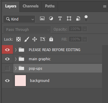
On the screen, you can see a note and the rules. The original layers are divided in the group layer, the main graphic group layer and the pop-ups group layer.
The first thing you should do, is to toggle off the visibility of the first group layer. You'll be left with what I call the main graphic ( images below ).

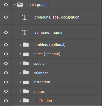
The main graphic has a lot of parts and possible iterations, so let me know if you want a more in-depth tutorial on how to edit them. But as you can see, I have some "optional" group layers, which means they can be used to substitute each other. That way, you can have the reminders aspect of the graphic, the notes aspects of the graphic or another photo, see below for the other two options:
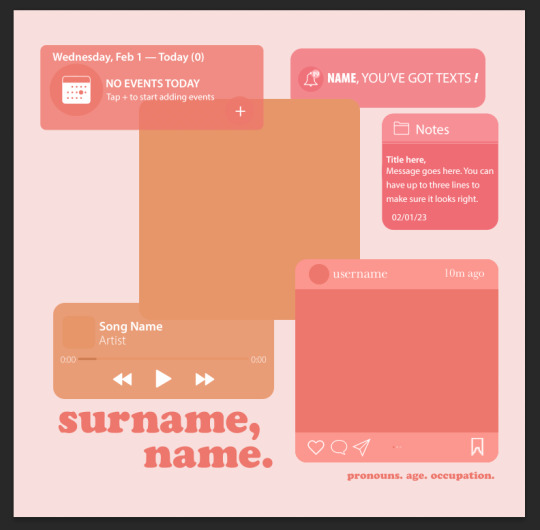

After you figured out which of the two options you want, you can start editing each individual group layer. All of them are formatted so you can just clip the photo to their respected shape and it'll work. ( to clip, the photo needs to be in a layer directly above the shape you want to clip them to and you can either use ctrl + alt + g on windows or right click the layer of the photo you want to add and select "create clipping mask" )
Now, onto the pop-ups. This is what you see as soon as you click the pop-ups group layer:

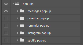
I made it so all of the elements in the main graphic had a customizable pop-up. That means you'll have to remember to edit the "widget notifications" to match the original graphic, but I think it looks cute when it's done. I also formatted all of them to work with clipping masks, so all you have to do is to go through the ones you want to use and clip the photos to the correct shapes.
I, once again, can go through a more in-depth tutorial about all of those group layers if you want, just let me know !
All of the colors and fonts are also fully customizable, so here's how to edit them to the palette you want/fits you the best:
First of all, I like to enable "properties". To do that, all you have to do is to open the windows menu and select properties. The tab below will open and you can choose where you want to leave it ( i like to add it to the collapsible menu next to the fixed one on the right of the screen )
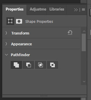
As you can see, "properties" allows me to see the sizes of the shapes, their colors and so many other aspects of the shape selected. To change their color, all i do is select the shape I want, open "properties" and scroll down to "appearance". Most of the shapes only have "fill" enabled, so I click on the current color and choose a new one.
Let me know if you have any more questions and I'll be happy to help !
4 notes
·
View notes
Note
hiiiii i really love ur gifs so much !!!!! im trying out some effects recently and i really like the third gif here : https://www.tumblr.com/khaotunqs/732573928879472640/i-cant-live-without-you-sand-me-neither?source=share how did u make this!!!! <3 (if its ok for u to share)
hello!!! thank you so much! 💖💖💖
here is the set anon is referring to!
here's me being way too long-winded about how i made that gif:
note: this assumes you use photoshop, and that you already know how to make gifs. i work primarily in timeline, so everything i talk about is specific to that method.
this wasn't super complicated, i don't think? i used @cal-kestis's tutorial on motion blur transitions with timeline to get that shift effect. i didn't make any adjustments of my own, since i liked the end result.
i made the two gifs that i wanted to shift between, and then clipped and blurred according to nik's tutorial. this is what my timeline looks like once i had my clips chunked:
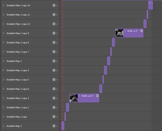
once i had the two gifs in the motion blur transition, i wanted to add something to give it a 'shining' quality, if that makes sense? i used this light leaks video on yt to make that happen!
since the video is an .mp4, i was able to open it up directly in ps, which i always do when i can, since it means to don't have to take screencaps of it. it automatically opens as a smart object and i can get the entire clip so i can move it around in timeline to get a segment that i like over the gif.
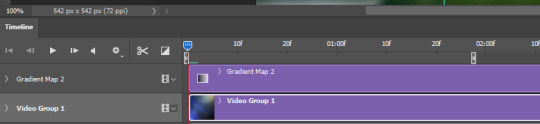
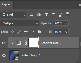
i set the video group to 'screen' and added a gradient map with my focus colors (green and yellow) on top of that. i created a clipping mask to clip the gradient map layer to the video group so the gradient map would only be applied to that specific layer. i set the gradient map layer to multiply (i found 'screen' made the whole gif too light).
so there's the gif part (i think i remembered everything?). now on to typography!

'you think i want you as my' and 'of course not' are in quicksand, bold, 10.5pt. 'boyfriend' is a font called pinch my ride, regular, 60pt. i changed the case for 'b', 'r', and 'd' from lower to uppercase bc i just thought it looked better!
in blending options, i added a gradient overlay in my focus colors and set the angle to -90 as i wanted a even lined gradient. i set that gradient overlay to 'hard light' and then set the layer to 'difference'. then (i'm sorry this is so long) i copied that text layer. went into blending options again, deselected the gradient overlay and drop shadow, selected 'stroke' and went with a 1px white stroke set to 'outside'. back in the layers, i set the fill to 0% so only the stroke was visible. once i had the stroke, i shifted that layer down and to the right (five cursor strokes each).
i converted my timeline back to frames (god bless @anyataylorjoy's action for this step) and tadaaaa:

i am truly terrible at tutorials, so i really hope this made some kind of sense! you can always send me another ask <3 thank you for asking, and happy giffing!
4 notes
·
View notes
Text
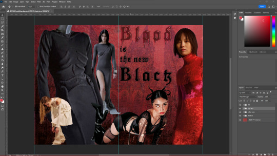
Lookbook - Front and Back Page
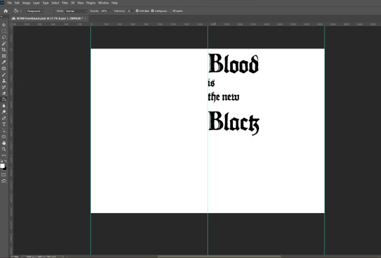
To start off creating this lookbook, I remember being told that we were allowed to rename the trend so after a bit of brainstorming I had decided to rename ”Grunge Romance” to “ Blood is a new Black” shortened to BITNB, as it is a spin-off of the phrase “____ is the New Black” meaning whatever word somebody starts off the phrase with it means it is the new chic or it is currently fashionable. I like this new name as it is memorable catchy and rolls off the tongue.
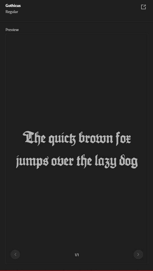
I had also decided I had needed to find a font that appropriately represent this trend, so after looking online I had found a serif font called “Gothicus” In Adobe's own font library. I like this font as it is obviously quite representative of the gothic subculture that is known for using Blackletter style/Old English script in calligraphy, and as Grunge Romance/ Blood is the New Black does take inspiration from the gothic subculture I thought this font would be great for this trend.
After using the text tool on Photoshop and selecting the gothicus font I had dragged out where I wanted my text to be and type out the trend name. I had also wanted an appropriate background As the front page of the lookbook would set the tone for the rest of the other pages, the front page of the lookbook should show the reader exactly what the trend is visually before they even start reading. I had gone online and found this fabric image, coincedentelly also called Grunge romance And how to use this as the background for my front and back page .
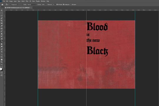
I had gone online and tried to find noise / grain details That would make the background more rugged and messy, as if it was quite old, As well as using the levels tool to change the darkness and lightness of the background enhancing certain details.
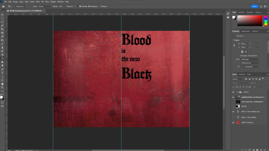
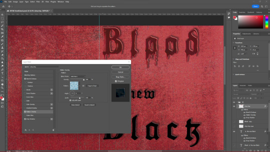
Next, as the name of the trend is “Blood is a new Black” I had an idea where I wanted to add a blood-dripping effect to the text, this had taken quite a while as I had not found any short solution to this and had involved me turning the text into a PNG image, although eventually I had figured out and had achieved the result I was looking for. I had decided I had only wanted the blood dripping effect to be only on the word ”blood” as it seemed right and it'd be more impactful and eye-catching for the front page of the lookbook. Next, I had wanted the rest of the text to stand out from the background so I had gone into the effects section of the text and added a drop shadow to the text so that the title doesn't seem flat against the background.
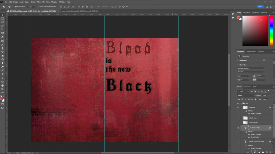
Going back to the blood dripping effect I had gone into the effects section, and added a pattern overlay of water, to make the blood seem more realistic in a way, I'd wanted this to be a subtle detail as if I had decreased the opacity the effect would show too much and the attention would be brought solely towards the word blood and ruin the rest of the page in my opinion.
My next step was to add some images of models that would represent the trend appropriately I'd found some on the WGSN website, under the Grunge Romance trend, as well as other sites. I had used the selection tool to highlight the model and use the vector mask tool to get rid of the background therefore only showing what I had selected with the selection tool, cleaned up any parts of the background that would shown by selecting the paintbrush, selecting the black colour, and selecting the vector mask and going over what parts I had wanted to be hidden. I plan to do this for all images and models that I want to use for the rest of this lookbook as it makes it easier to show/hide any parts of an image instead of selecting parts and deleting it, because if I had made a mistake and spotted it later, I would have to go back using the history section, therefore getting rid of any work I might have done after. After removing the background I had moved about and placed the images that I thought looked nice.
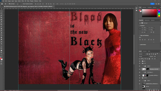
I had also used the Levels adjustment tool to change the mid-tones and undertones of the models as well to fit the theme of the trend which would be darker and sort of grittier as the original images were quite bright.
Before adding more images of models I had wanted to add something in the background so that it wasn't just a shade of red, so I had gone online and found a low-angle image of a church which I'd looked quite ominous and thought this would be perfect, so I had again used the vector mask tool and hid in the background of the image, lowered the opacity as to still show the details of the red fabric and placed it on one half of the double page spread, duplicated it and put it on the other side of the DPS so that it has a mirroring effect. I also decided to organise all my images into folders as to make finding certain images so that if I'd want to change anything in the future it wou;d be much easier and I'm not having to move about layers and getting confused about what goes where.
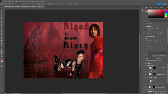
I found more images of models and clothing that I thought reflected the trend quite well, I used the levels tool for each image and made them each slightly darker but still made them stand out. I had again moved about and experimented with where I had wanted each image. Something that I had found quite useful while manipulating these images was while having the levels layer above an image that I'd wanted to change the brightness of, and selecting the Levels adjustment layer and pushing ALT In-between the levels and the image it would make it so that adjustment tool only affects that specific image, this would allow me to independently change the brightness of each image freely, which was extremely useful.
2 notes
·
View notes
Text
Author's Notes: Chapter 38 (Don't Talk to Strangers)
Alright, let's not waste any time and get right into it.
You know, it really should've been a full moon rather than a half moon to set the mood for this chapter, but that wouldn't have been historically accurate! This chapter takes place on May 31st, and the moon on May 31st, 2009 was a half moon (or a "First Quarter moon," same thing). I've been keeping a detailed timeline of events for the fic since day one just in case these little issues come up, so it's nice to finally be able to flex it. Chapter 30 also opens with a mention of the moon, but uses no specific phase in the prose because the pre-Chicago IX Boney chapters are a little more iffy with their timeline placement by virtue of being added after the timeline was finished (remember, all of this sprung up because of Depeche).
Originally, I wanted this chapter to open up on an extended scene of Cascada out on the water along with a crush/girlfriend, who I kinda regret cutting because I was really fond of her. Her name would've been Miki (after Miki Matsubara) and her Stand would've been named Shinedown, which had the ability to change the brightness of any object (not just making them brighter, but also "darker" too, kind of like the brightness slider in Photoshop). Shinedown's appearance would've been based off of a Ryūtō, a yokai that takes the form of a light dragon. Miki and Cascada would've been out stargazing together, with Miki being an astronomy nerd, and Cascada would've talked to her about no longer wanting to be an assassin rather than internalizing it like we see in the final chapter. I got rid of her both because I felt like her presence hurt the pacing of the chapter and I didn't really know what else to do with her after her introduction. I didn't want her to get masked or end up being Boney's victim because I felt like that'd come off as fridging. In the end I cut her, but she's still canon in my heart. I'd like to imagine she's somewhere at the resort.
Ever since I first read Stone Ocean I've had the headcanon that Rikiel is Midler's son solely based off of their similar hair colors (at least going by Midler's HFTF design) and because I think that's way more interesting than Dio just knocking up some random Floridian woman. That's why Midler mentions him never getting his license; Rikiel didn't get his either. But I get that this is a BIG headcanon to accept if you're not on board with it, and I don't want anyone to feel like I'm coming off as any more self indulgent than I already am, so that bit is intentionally left a little vague.
Originally, Midler was going to be the one who decapitated Boney with the chainsaw rather than Moon River. Once I got to writing the scene, though, I didn't like that it just kept making Cascada a sitting duck, so I changed it to have her kill him instead.
In retrospect I wish I introduced Finger Eleven a little earlier than I did because I feel like that'd make this whole chapter have a little bit more impact, like having him chastise Sara for pickpocketing or something small like that. Oh well. Shoulda woulda coulda.
Speaking of impact: the part of the chapter where Bad to the Bone activates had the single most intensive editing/beta reading of the entire fic. A close second might be the Aces High arc, where I notoriously changed the ending of it many times over, but that was more of a chapter's structure than of any one bit of prose. And that's all on me. I feel like this, more than him turning up naked in a bathroom or stabbing a kid with a spoon or whatever, this is the scene that needs to cement Boney's menace as a main villain. If this scene didn't work, then neither would the rest of the fic. So I insisted we review this part very closely until I feel like I got it right. Sentence by sentence, word by word. Honestly, shout out to @simpingforcreamsoda in particular for helping out with the editing process. I'm happy with how it turned out! I hope it gives you nightmares.
Speaking of which, I've written a short essay on how to write main villain abilities in stories like JoJo. I will post it shortly.
So, about the slur. I have no idea if this is something that'll cause drama or people will just forget about by tomorrow, so I will preemptively justify my usage of it here. First of all, I'm bisexual. I can say it. Second of all, I'm also not opposed to using slurs in media depending on the tone/context of the scene and the character that says it. Back in the author's notes for Chapter 22, I alluded to the fact that Fergie was originally going to say one as she beats up the homeless guy. I won't say which one it was going to be here, but let's just say it fit with her being named after one of the Black Eyed Peas. I changed it after the beta readers expressed some discomfort with the word and the last thing I wanted was to leave a bad taste in people's mouths over one random word that could easily be changed. This chapter was a little different. Like I said earlier, Midler was originally going to kill Boney, not Cascada, so he would've ran up to her and said "you worthless old hag!" When it came time to rewrite that line after I changed Boney's killer, the first thing that came to mind was what you see in the fic now. I put a pin in it and decided to revisit it later when I was doing my own personal revisions of the chapter before I shared it with beta readers, but try as I might...I couldn't think of any alternative! Nothing came to mind that felt more natural and less vulgar. So I showed it to the beta readers and, weirdly enough, their response was...positive? Don't get me wrong, they didn't react in a "yeah we hate lesbians" kind of a way, it was more like how Sonic fans will cheer upon seeing Maria die or how Mario fans got excited when Vivian's sisters were more explicitly transphobic to her in the Thousand-Year Door remake. I feel like that's at least partially because I told them in advance that I had a slur in the chapter, so they knew it was coming. That ended created this sort of ironic hype, a mock excitement for it. Like I said, it reminded me of Sonic fans cheering when Maria gets shot. So I figured if I just put a little warning for it in the author's notes on AO3, it'd be fine.
Holy shit I cannot believe that this is the chapter where Bad to the Bone gets revealed and I've spent like half the author's notes talking about one word that has nothing to do with the transformation scene.
"I am deathless. I am immortal." Hmm. Why does that sound so familiar?
This chapter was originally going to be much longer, even ignoring the Miki stuff, with more scenes at the end. These scenes were cut and moved to the next chapter. Unlike basically every other time this has happened, this wasn't because the chapter was getting too long—of all the chapters in the fic to have an insanely high word count, this felt like the best fit. No, I just genuinely thought that this was a better place to end it (actually I originally wanted to end it on "Boo!" but my beta readers suggested we at least keep in Boney explaining how Bad to the Bone works, which was definitely the better play), and because by starting the next chapter at this particular cutoff point, I can do a fun narrative parallel with a previous chapter :P
Music references:
The chapter is named after a Dio song of the same name.
Finger Eleven is named after a Canadian rock band of the same name. I am honestly shocked this name survived the beta reading process because I literally only chose it because of Quagmire Toilet. Surprisingly, kid named finger was not a factor, but also fits very well.
Gloomy Sunday is named after a song written by Hungarian pianist Rezső Seress and made famous (at least in the USA) by Billie Holiday. The song is also occasionally called "The Hungarian Suicide Song" because of an urban legend that people would kill themselves after listening to the song. Guess how Boney got out of the void.
Warpig, the Stand user briefly mentioned by Midler at the start of the chapter, is named after the song War Pigs by Black Sabbath.
1 note
·
View note
Text
Hey friends! ICYMI, I was asked to share some before & after walkthroughs, so I thought I'd start with Cheveyo the bald eagle (original post here). This is an older edit, but I had it on hand, and it speaks to a little bit of everything that was asked for (in-camera & post).
BEFORE / AFTER
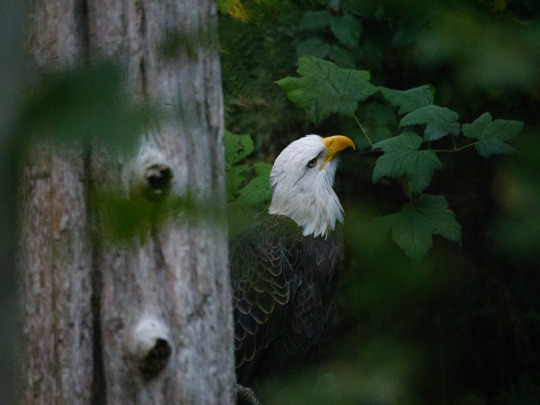

✱ KIT Panasonic GH6 + LEICA DG 100-400 ✱ SHUTTER 1/125 sec ✱ APERTURE f/4.8 ✱ ISO 12800
WHAT'S ALL THIS, THEN?
I took this at Northwest Trek's Hoot 'n Howl event, meaning this is late in the evening, very low light, with the widest aperture I could get under the circumstances. I did bring my tripod but felt bad about pulling it out given the kids all around, so I held my breath and shot this handheld. All of which is to explain my buckwild ISO of 12800. I normally cap it at 6400.* *if none of that made any sense, and you'd like it to, check the cut at the end of this post. So we've got a whole bunch of noise, and some pretty lackluster lighting, but sharpness could be worse:
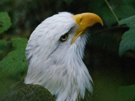
We used to have to deal with ISO noise manually in Photoshop. These days, I like Lightroom's Denoise button pretty well, within limits, and that's what I used here. Sometimes Topaz Sharpen and/or Denoise can also help, though with fur and feathers it can get sort of smooshy and odd.
EDITS


Curves for that sort of cinematic look; color grading to taste. That's pretty much it here. I did a lot of desaturating in greens/blues to make Cheveyo pop, along with some color grading in the shadows and midtones. Some people hate this look, but I'm less interested in how the camera captured it than how it felt at the time. YMMV! Throw on a gradient mask to brighten her up and draw the eye where we want it, and I would normally add another mask around the iris, but apparently I didn't find it necessary this time. And we're done!*
AFTER
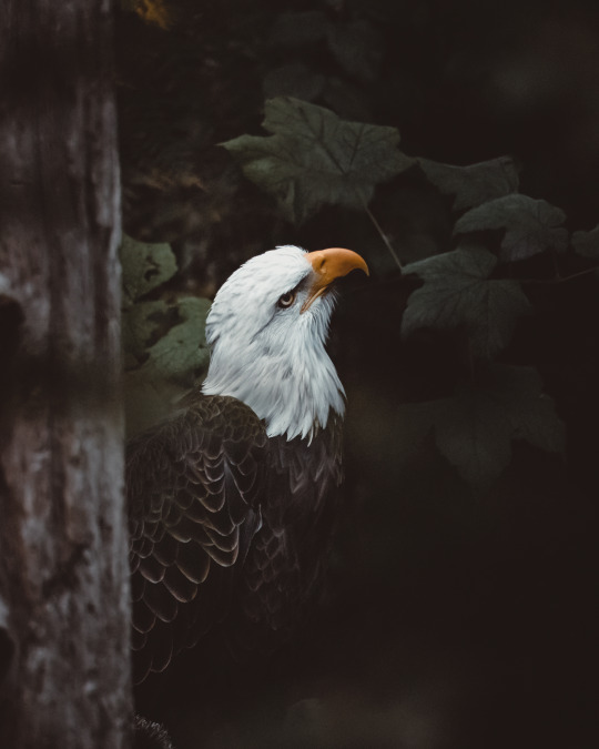
*But remember that I'm simplifying the edit for the sake of clarity. I usually start with one of my baseline presets that I've made for myself, and then I tinker with it a while. Just play around with the edit til you're happy. It's not always linear.
Feel free to send any questions to my ask box! I try to catch tags & comments, but there's always a risk they'll get buried in my notifications. Let me know if there's any shot in particular you'd like me to deconstruct next! 🤍
under the cut: CAMERA SETTINGS ANNOTATED
✱ KIT Panasonic GH6 + LEICA DG 100-400 This means: I'm using a really long lens. I shot this at 161mm. The widest aperture I can get at that zoom is f/4.8, and shooting handheld makes me less steady, risking an out of focus shot. ✱ SHUTTER 1/125 sec I was in Aperture Priority mode (AP), so this setting was automatically adjusted by the camera according to the ambient light available. It's as high as it is because my aperture is as wide as it is and because my ISO is as high as it is. ✱ APERTURE f/4.8 The lower the number ("f-stop"), the wider the lens opening, the more light gets in. More light = faster shutter speed & a lower ISO = less noise, less risk of motion blur. Also a shallower depth of field. If you think of aperture like an eyeball, if you're at f/1.2, your eyes are absolutely bugging out and you can practically see in the dark. At f/22, you are squinting like your life depends on it. People tend to confuse this because they think a "bigger" number (f/22) should mean "wider." Instead, think of it like that your eyeball is 22% closed, versus 1.2% closed. This is not real camera math, but it can help you remember. ✱ ISO 12800 The higher the ISO, the greater your sensor's sensitivity to light. A higher ISO increases your shutter speed, reducing the risk of motion blur. On a bright sunny day, your ISO, if set to auto, might be 100. Anything over about 1600-3200, depending on the camera, starts to risk ISO noise, which has to be handled in post. Sometimes it can't be fixed, so you want your ISO only as high as it has to be to get the shot. (I'm in my office right now, pointing my camera at my bookshelf. If I manually adjust my ISO to 100, my shutter speed drops to 1/2 sec. At ISO 6400, my shutter speed is 1/200 sec.)
My camera is usually capped at 6400, because it's built for that to be okay, if not ideal. This means that my camera will read the light situation and decide what my ISO should be, but it will not go over 6400 unless I tell it to. For this shoot, I turned it up because I was photographing animals at night.
TL;DR: Shoot in Aperture Priority, as wide open as possible, with ISO on auto or set to something high that you know your camera can handle, for a low-light shot of a subject that is moving little, if at all.
#on photography#photography#pacific northwest#pnw#nature photography#wildlife photography#photographers on tumblr#mine: photos#lensblr#how to#photography tips#editing tips#photoshop#lightroom#lightroom classic#original photographers#naturecore#long post#pnwander edits
47 notes
·
View notes
Text
https://www.reddit.com/r/AskPhotography/comments/125114x/how_do_photographers_create_this_saturated_soft/?utm_source=share&utm_medium=android_app&utm_name=androidcss&utm_term=20&utm_content=share_button
This was a surprise to see pop up on my feed - I can tell you exactly how these were made, as I'm the photographer who shot them. Few different techniques going on depending on which image you're talking about so I'll try to go through them.From the start: All the images were shot digitally. Images 1 & 4 I had a 1-stop green resin filter on the camera (in order to get more intensity out of the reds and yellows), the rest were unfiltered.
Lighting:
Image 1: Was flash: Large Westcott umbrella coming from behind camera to balance against the sunlight. From memory might have had an assistant with a bounce on camera right too, just to wrap the light a touch.Image 2 & 5: Mix of daylight and tungsten continuous light. As I remember it, I had a HMI through a 12x12' silk to camera right, a Aputure Lantern at a 45 degree above the model, a ARRI Redhead on a dimmer w/ diffusion that I used more-or-less intensely depending on the shot to add warmth and shape the light on her, and then lots of black polyboards camera left to deepen the shadows.Image 3: All daylight continuous. Aputure Lantern was the key light, think I had a small softbox on his lower body just to raise exposure. Medium softbox as a back/background light (spilling on both). Then black polyboards on right side to deepen shadows.Image 4: Daylight with a bit of bounce camera right
Processing:
This is the biggest element for the "look" you're talking about. There's a lot of adjustments and very specific choices I make that go into the general feeling of them, so it's difficult to talk about them all. Broadly speaking, I like deep shadows, crushed highlights, bold reds and strong contrast. Blues, greens and skin tones I do more on a case-by-case basis. I use Capture One for the initial grading and export (which takes the image about 40% of the way there), then Photoshop to complete the rest of it. Almost all of my adjustments are made using "Curves", "Selective Colour" or "Hue/Saturation" and either masking it across the photo, or using "Colour Range" to apply whatever the adjustment is selectively.
Printing:
Images 1/3/4 are also printed/rescanned/re-edited on. I find straight digital can feel a bit sterile at times, so I'll often print my photographs in order to soften them down and add a bit of texture. Spent years using a cheap printer and simple paper, these days I've got a more expensive one and better papers but I'm unconvinced it's objectively better - Just different. Process goes export digitally > retouch in photoshop > print > rescan > re-edit in photoshop, as the printing process moves around colours and tones, and so requires adjusting back to being "correct".
Mindset:
One more thing that I think is worth talking about, that often isn't mentioned very much in online discussions of photographic practice, is that all these decisions don't come from a place of "trying to achieve a certain look" - They come from a place of taste and opinion that I've built up through thinking about the kind of feeling I want to create, and the sort of story I want to tell. I've always liked the organic nature of paintings, so I started printing in order to take the images from pixels to ink. My processing is often quite chaotic, where I'll have dozens of adjustments (Image 1 had 19 in digital, and then 20 more in the print) that all do subtle different things, which I'll then "paint" across the photo, similar to how a painter might build up tones using layers of paint across areas of the canvas. Almost never do I think about my own "style" - I just think "Does this look right or wrong?", and by the time it looks "right", its invariably fallen in line with everything else I shoot... and that only comes about from making a lot of photographs.Anyway hope this helps and glad you liked the images.
Happy to answer more questions if you've got any too.
0 notes
Text
CoD Notes: BO1 Finished
I had been worried that Black Ops 1 would unfairly feel like a step backwards for me since I decided to do MW1/2/3 back to back and MW3 came out a year later. This was not the case. Black Ops feels like such a revelation to the franchise. The story isn’t high art, but it feels so much more involved than anything else in the franchise up to this point. The voice cast is far more stacked than ever before. Alex Mason as a protagonist is far more interesting than any previous protagonist. I think his largest competition is Soap, who only gets to be more than silent player avatar in MW2/3 and even then isn’t as interesting as Mason.
I mean, this one game has so many more memorable characters than any other Call of Duty. Ed Harris’s Hudson, Ice Cube’s Bowman, Gary Oldman’s Reznov, Woods all stand out but even Weaver, Dragovich, Steiner, that one scientist guy in Kowloon, are all so much more vivid than the tryhard wannabe NPC’s of something like Ghosts (oops, I beat many games in a row without taking notes).
The plot twist alone elevates this game from “stupid annual release” to video game hall of fame. I’d argue that video games are the best medium for plot twists. It’s no Bioshock, but the Reznov twist is so fun and so well executed. I remember it blowing my mind as a kid and it was a ton of fun to see all the little hints as I went through this time. But I’ve already talked about the game at large twice. Let’s get into the last few missions.
Crashed plane assault mission was fine. I noticed the radio shout out a “Sergeant Blundell” which I recognized as Jason Blundell, the main Black Ops guy, this time. Also very funny and on the nose to have a section set to Sympathy for the Devil.
Snowy mountain assault was just okay. The top-down tactical part was clearly a stepping stone to the Strike Team missions of Black Ops 2. Didn’t love that section. But it was kind of funny to get to play as Hudson. This series seems to have some sort of quota to meet on having multiple playable characters. I did struggle really hard on one checkpoint in this level.
Then is the Vietnam mission where you get to fly a helicopter. I remember liking that part as a kid and it’s fine now. I’ll admit that these ‘Nam levels blend together for me.
But then we’ve got the Rebirth Island assault where you sneak around as Mason and do a gas-mask armored strike as Hudson. It’s pretty cool to get to see the same moment from two perspectives, a rare good use for having multiple playable characters. I will admit that Hudson’s breakable gas mask ended my life many times though.
Then the big plot twist as a cutscene mission, which is very fun.
Then finally the big boat assault and underwater base. Nothing too special gameplay wise, but generally a nice capper on the game.
And I love the implication that Mason killed JFK. I mean, it’s a very strong implication, but I suppose they never outright confirm it was him who pulled the trigger. I half expected the final scene of zooming in on Mason photoshopped into the background of a JFK pic to turn into a “JFK assassination simulator” for a second, but instead it transitions directly into the opening cutscene for Five, which is such a treat.
I did manage to get to round, like, 9, I wanna say, on Five. Sadly died right I before I could PaP because I forgot how the weapon thief mechanic worked and ended up double buying a gun. The voice lines in this map are even funnier to me as an adult who has more context on this era.
Overall, I think this game is peak CoD as far as campaigns go. First, set out to tell a story that would work even outside of this series, then drench it in a particular era and add a bunch of fun weapons and setpieces.
In the rankings so far, I think this is going at the top.
0 notes
Text
Reflection
Fundamentals class has taught me so many skills and I feel so much more knowledgeable about adobe products compared to when I started.
Out of all the programs I struggled the most with illustrator. The bezier curves and pen tool would drive me insane as I had only used the programme a couple times prior. I was never able to get the shapes I wanted and I tended to add an excessive amount of anchor points to simple shapes. But now every time I use Illustrator I feel like I’m improving which is a great feeling.
I have definitely improved the most in Illustrator. Understanding the bezier curves is probably my biggest accomplishment as I now feel confident in using all 4 anchor point types (corner, curve, hybrid and broken). I have effectively used them throughout this class in a tonne of different contexts.
One thing I would like to improve on is remembering and using shortcuts within InDesign, Photoshop and Illustrator. Toby has done a good job at training us to use these shortcuts but my brain is deciding to be stubborn, I just need to try force myself to use these shortcuts even If I need to look back on my Tumblr or even google them to figure it out which will take up some time but it would definitely be worth it in the long run. There are shortcuts for pretty much everything within Adobe to make the user experience more efficient. If I keep practicing I will eventually wrap my head around a lot of the short cuts. I have been good at pressing V to go to the selection tool, A to get to direct selection and X to swap between fill and stroke in Illustrator. A lot more room for improvement.
During the process of creating this booklet I learned a lot about exporting and mock-up templates. Paying attention to whether you want to export as pages or spreads, if it's going to be printed, check crop marks and bleed, etc. Much more knowledgeable about the properties of how to export and print documents.
I have also learned that mock-up templates exist and I love it. Found it quite easy as photoshop does it pretty much for you if you've downloaded a template. You just have to edit the smart objects and place your design over it and it will appear on the product. It’s so easy yet looks so professional.
My favourite task within the class would be the ‘Jumping Man’, although I wasn’t there for the class I was still able to check moodle and I got a classmate to help me out. I love the look of mixing photography with digital graphics/elements and I felt this task gave us the freedom and opportunity to put our own creativity with the prompt.
Another one of my favorites was the Beatles booklet I designed. Really helped push my understand of InDesign using parent pages, margins and collumns. Just had fun creating it using bright colours and making illustrations of the yellow submarine, octopuses, bubbles, etc. Very childish and had a lot of fun which was quite refreshing.
This task also helped me tone my skills of layer masking and introduced me to smart objects and linking a photoshop file with an illustrator file. I was stupidly happy with my final result of my guy jumping through space, entangled in abstract colours with 2 cats alongside him. It was a fun task where we got to use a lot of different photoshop tools which is a programme I was familiar with prior to this course.
Super happy with fundamentals as a class. It’s helped improve my understanding of adobe products which comes in very handy in my other classes. Definitely want to continue the skills I’ve learned in this class and expand more on it in my future design projects.
1 note
·
View note
Text
Reflection
Overall this course as taught me a lot of skills in all three programs. Coming into this course we were asked to rank our skill level in each app. My original rankings were:
Illustrator: 7
Photoshop: 3
InDesign: 0
If I was asked to reevaluate my skills now I would say my Illustrator has changed from a 7 to a 9.5, Photoshop has changed from a 3 to a 6 and InDesign from a 0 to a 7.
Even at the start of this course, I was already very comfortable with Illustrator as it was the main program I used for design in high school. I was familiar with most of the tools we learnt so that learning was really just developing and mastering them. At the start of the course I bezier lines were frustrating and while I could draw reasonably well with them, I avoided it at all costs. I now really enjoy using the pen tool and bezier lines. I used it in so many of the tasks through out the course and I found every time I got faster and better. One thing I wish I knew in high school was the short cuts for the selection tool (v) and direction selection tool (A). This would have saved me so much time!
I knew very little on Photoshop when we started this course. I had done some drawing and image manipulation in digital technology at high school but that was the extent of my skill. Even now I don't feel I know a huge amount of what Photoshop offers but I'm very comfortable with what I learned in this course. I have used the adjustment tools were learnt outside of class numerous times as it was so simple to understand. I also found selecting and mask images was really fun and easy to pick up. I missed week 5 originally so I had to catch up later so I didn't have the chance to do it before week 6. It was explained to me in class and I found I grasped it pretty easily. I admittedly did forgot some of the stuff I learnt but I was able to refer back to tumblr and it was easy to remember after a quick recap.
Before this course, I had never heard of or used InDesign before. We used InDesign in our graphic design class as well while learning it so this made it way easier to learn as I was using it for around 9 hours a week in classes. I found that InDesign was really easy to use and especially helpful for text layout. The columns tool was really helpful in creating even, balanced layouts in my graphic design class. This also taught me a lot about general text, like a lot of the terminology (e.g. kerning, tracking, leading).
I think the program I found hardest to work with was Photoshop. While I enjoyed fixing the images, I've never had a very good eye for photography so it took me a while to be happy with my results. It was also frustrating how a lot of the commands didn't overlap with Illustrator. In Illustrator you hold down shift to restrict when resizing where as in Photoshop it morphs and manipulates it. This pissed me off quite a lot. But with time this became more natural and I just learnt it and did it without thinking.
If I didn't understand something in class I was able to go back and find the instructions on Moodle or Teams. This really helped me keep up to date and properly process what I was doing. I also used videos on Youtube to help me if I couldn't figure something out. Often they were on older versions of the programs but they were still mostly the same.
I think my favourite task was the two illustrations we had to make in Illustrator. For my first one I decided to make a bike. I used the pen tool as well as pathfinder to do this. Once I was done, I decided I wanted to add to it as I didn't really find it challenging. I decided to add two parrots to the bike because why not? To challenge myself, I didn't trace them from the reference I just tried my best to make the right shapes and then used the direct selection tool later to edit it after. I really loved my second illustration, I got quite carried away and just kept adding and adding to it. I decided to try recreate my original drawing as a challenge and I wanted to see what I could produce when using Illustrator.
Overall I was pleased with my final booklet project. To be honest I don't think it was the best display of my Illustrator and InDesign skills. I decided to procrastinate this booklet a lot as we had a lot of other projects due at the time. I started the booklet on Wednesday night which in reflection was stupid. I really should have chipped away at it over the days prior so I wouldn't have had to do so much work on Thursday night. But for the time period I did it in I'm pleased. I do like the actual book. I really enjoyed researching all about the different meanings behind common nursery rhymes. I decided to make my book a book for adults rather than children. I kept the cartoonish style of nursery rhyme books but added some much more disturbing imagery.
If I was to repeat this I would have liked to make some more vector images so showcase some more skills but I'm pretty happy. I definitely shouldn't have put it off. I really liked my drawing for 'Ring Around a Rosie'. I'll probably end up adding more detail to it once this course is finished.
0 notes
Text
Reflection of Fundamentals
• What did you know about this process before you started?
before i started taking this course i only had a slight idea of how to use illustrator and InDesign. but i had a lot of knowledge in photoshop before. i didn't know the purpose of every software and the reason we use what one. so it was super helpful to now understand what we use what software for.
• What problems did you encounter?
throughout the course of taking this class, many challenges arised. mostly in class when i'm still working on the last step, while the next step is taught and then i get far behind. throughout the class i also had troubles when i made the smallest mistake on my computer then the next steps would not work.
• How did you solve these problems?
i would usually ask the person beside me in class or call on Alexia to help get me back on track. this was super helpful and explained really clearly.
• What did you learn during the process?
i have learnt so many skills to take away from this class. from basic vector lines (that i can now finally do much easily than before). then also with editing photos using the curves tool ( a tool i had seen lots before but never understood how to work it). then also into InDesign, as a place to put all the skills we learn and t create text and layout to export easily in the form we want.
• Who/what influenced your process and how?
my work was clearly influenced by my lecturer Toby, it helped as he demonstrated each and every task and repeated the steps til everyone had understood it easily. but i also enjoyed many of the lessons, gaining so many skills. therefore, i was motivated to learn more and practice what i had learnt.
• One thing I would like to improve on ...
layers, mask and selecting. we did this in week 5. this was one lesson i struggled to keep up on. i had used the masking tool before, but when we started to change the colour of the oranges in the fruit bowl, i got stuck behind and couldn't quite understand the whole concept in my mind. this wouldn't be a tool i would use often with what i'm passionate about in design. but i think it wold be handy to know because it is used quite often in photoshop.
• What did you enjoy most about this project/process and why?
my favourite part of our course was learning the InDesign content. one thing i always wanted to learn was the indesign software but it was too difficult on my own. so having the help was so helpful and motivating! i really enjoyed learning about wrapping the text around images, and about exporting it into mockups. these two things were questions i had for awhile and couldn't wait to learn.
• What resources did you use to investigate/complete this project?
for our final project of the children book, it was really helpful looking back through my own tumblr blog to remember basic shortcuts or steps to do things. when i forget, it is handy to have this blog to look back n and gain more understanding and be refreshed of my knowledge. it was as helpful having the lecturers nearby to ask questions when needed, so we could gain full understanding on our tasks.
overall, we used the three adobes softwares of Illustrator, Photoshop and InDesign to complete this course. i found it helpful paying for the adobe subscription so i have it on my laptop. therefore i can do it at home too. this was a perfect resource for me to do more work from home and keep gaining knowledge and understanding.
• What are the project / exercise’s strengths and weaknesses?
the strengths for me in this course was probably my efficiency in gaining understanding. i found that. was always finished earlier while steps were still being repeated (not with all though) but this meant i had more time to put more in my tumblr blog so i have more information to look back on. i could work on both my tumblr and the project at the same time throughout all classes.
weaknesses would defiantly be my skills in masks, in photoshop as i mentioned before. t was a bit struggle and took a very long time to fully understand as there was many steps to keep going back to.
• How would you use this process again?
i believe i would use many f the skills i've learnt in the rest of my study and hopefully my career afterward. i have already seen many of these skills and tools come in handy in my DT1 and DT2 classes and i am sure they will for the next semester too. the skills are all relevant.
• What were your goals for this project/exercise? Did they change?
my biggest goals were literally just to learn something new. i found that every lesson i learnt multiple new things, so this was defiantly achieved. the thing i looked most forward to was using InDeign, so it was defiantly a goal for me to just learn the basics of that software.
• What is the most important thing I learnt, personally?
At first i did not see why i would need shortcuts because it was just more to remember. but i know understand that after working away your fingers get sore and it is much easier when you don't need as much movement to each tool in the tool bar. this was a very important thing to learn because it has already made things so much easier. it also means i wont be searching under headings to find the tool i need if i know the shortcut.
• What most got in the way of my process?
motivation. although i loved this course, sometimes when other work piled up in other classes i had less motivation to do the work.
• How did I help others during this process? How did others help me? What was useful?
throughout the process of this class, the person next to me often needed help catching up o steps, so i would step in and give her a hand. this also helped me, because teaching someone else gets the understanding more in my mind by saying it aloud. so that was helpful for both me and the person next to me. this was super useful to remember more knowledge.
overall, this class was a super good foundation to design. i learnt plenty skills to take out into the wider area of design and careers too hopefully. the lecturers did n amazing job and really came alongside us to teach us well.
0 notes