#I don't have as personal a vendetta against this one as I do Eine Variation
Explore tagged Tumblr posts
Note
OK but when you're free of all the other obligations and able to do it can we get the Ines skin writeup anyway because I liked the Eine Variation one and why do they keep giving Caprinae ops skin like this do they just hate goats at hypergryph or what
Okay so I got this ask a month and a half ago and am just now getting to responding to it. In that time, I got a job as a professional VFX artist so my opinion means double what it did before. So that's fun! Respect me and bow to me, peasants.
I wrote a massively long writeup here and then my page refreshed and I lost all of it twice. Let's speedrun this shit, alright? (She says, immediately writing a 5 page unhinged rant.)
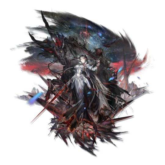
This skin sucks because of the exact opposite reason Eine Variation does, it's just too fucking detailed for its own good.
...Also what the fuck is that in the background is that a goddamned alien spaceship has anyone else noticed this?? This is a bloodline of combat skin this is canon does ines just fight aliens at some point what the FUCK?
Anwyay VFX in the readmore.
Deploy animation. I hate you. I hate this. I hate it.
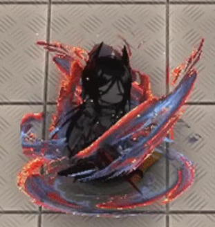
It's rare I get to see an entire skin's mistakes in microcosm like this! That's fun!
This is so detailed that it actually ceases to have any real shape or identity. This doesn't look like shadow, because skins can just. Change character lore to make something look cool yes I'm still mad. Is it stars? That would explain the weird yellow dots, and there are stars in the art. Fire? No, it's not actually fire, there'd be fire here. Burning fabric? It only looks like that if I squint and zoom in, but I can't... think of anything else.
The colors are so awful. The way that there is a hard line between the dark lavender and the scarlet which then fades into orange is. A choice. I would not have made. At all. In any way. Ever. At any point. Also the random dots of yellow are very funny because they are so clearly just random pixels of yellow. Some of them even aren't in the orange, so they're just like, highlights that have decided to break out of the highlighted areas. Did they.. want this to look like her burning dress? In which case, why are they.. blue? Her dress is black with orange embers, I don't GET IT.
Also small thing but it has a drop shadow, but like. She's literally in all black until she fully appears. And the swirling ribbons are dark-colored. There's no worry about them not standing out against a light background. Is that just supposed to look like she's surrounded by shadow if that's the case then why isn't the rest of this shadow AGH.
This looks weirdly... JPEG compressed??? Like, you can kiiinda see it in the big version, but if I shrink this down to phone resolution...
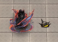
GOOD LORD SHE'S BEEN DEEP-FRIED.
S1 is good. I like it. It's simple, elegant. Good use of colors, and I think the impact looks great, good use of red and orange to create visual interest. Not gonna bother to screenshot it, it's not that interesting NEXT
S2!
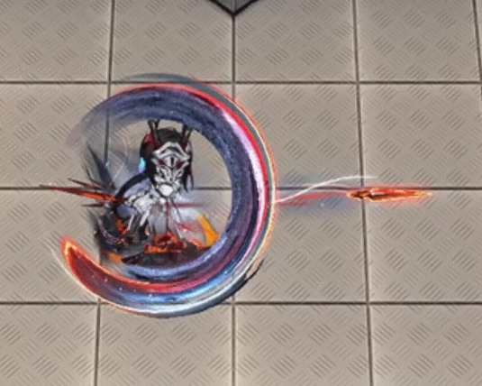
Stop it. Stop it. Put a few colors away. I am counting 8 distinct colors in this one swing alone, and then two more for Ines herself. Stop it. That is too many colors. Add less colors.
I don't even see what the colors are there FOR. Are they selling the tip of the swing? That's not right, because the red highlights start at the tip, then swirl inwards until the red is in the inner part.
I do actually think this one is a lot better at actual resolution.
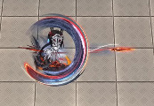
It's still too detailed, and that detail ends up being crunched and not really... serving any purpose in the grand scheme of the effect, but I do think it is... better. It makes it more clearly light on the outside, dark on the inside.
Also I hate the ends of this swing. I hate it. Why is one a perfect circle that's been stretched out and the other end a rectangle that's fading out. Why is that how you did this. This effect looks like two different swings that have been stapled together like goddamned Catdog.
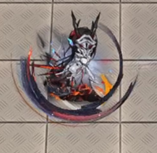
BUT WHEN IT FADES IT HAS AN INKBRUSH LOOK SO WHAT IS THIS EFFECT.
Why not lean into the burning dress look? Have it be a black trail that like, burns away when it fades? That would be STUNNING, anything but. Whatever is happening here. Mrgrgr okay fine it can't get worse right
DEAR READER. I PRESENT. S3. THE CULMINATION OF EVERY SINGLE PROBLEM.
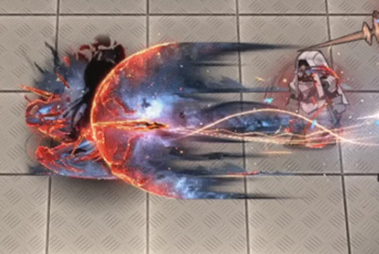
So this IS a stars theme after all. This IS stars? Just wanna make sure we're all on the same fucking page here.
Dear reader. I hate this. So fucking much. This may be, and I do truly mean this, the worst piece of VFX I have ever seen in any game. This doesn't read as a piece of VFX in an anime game, it reads like the background of a YA fantasy novel's cover.
The nebula doesn't move. It's static. It is clearly just a jpeg. It's not even doing the Chowder screen-space orientation thing. It's just. There. Inescapable.
The comet itself just. Ends. It doesn't fade out or taper. It just. Stops. There's barely any anti-aliasing here. It's just a hard line between the comet and the background.
Ines herself is surrounded by identical dark lavender and orange energy, so there's no visible difference between the effect and herself. Sure. It's not going to be onscreen long anyway. Who cares.
The center of the comet is bright white as if it's the highlight of the effect, but it's... it's off-center?? so it's ultimately... Highlighting something. is it highlighting the sword? Is it supposed to be a haze that shows you the sword? But it doesn't look like it because it took me 15 minutes while writing this to realize that the sword was there at all because it's the same orange color as all the other highlights and so it gets eaten. If your highlight color stops drawing my eye, then you've fucked up because that is literally what a highlight color is supposed to do. Where am I supposed to look at this thing, where is the focus, the shape?
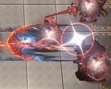
It's even funnier that the blade leaves a little cartoony goofy team rocket blink when it leaves, before immediately turning into whatever public domain NASA star image they're using for the comet. A real glimpse into what it would look like if Spiderverse sucked ass. (I do like the blink itself tho, a small little blue haze to add color and contrast against light backgrounds, smart touch.)

Explosion sucks. Suddenly they decide the palette is something entirely different. Where did the yellow come from. Yellow isn't even on the art. I guess when your palette is that big, you can change them up how you want. I would actually like this effect if it was slightly less detailed and in a skin that had actually used this pallette. It reminds me a bit of Specter the Laurentina. But with this level of detail and these colors... This somehow looks more like a YA book cover. A Sword of Goats and Stars. Fuck me I hate it.
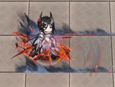
I almost like this buff uptime indicator, It's just that the red from the swords fades into the orange on her dress and makes the whole thing muddy. Also she has an actual roiling flame behind her LMAO GET DUNKED ON HOEDERER THAT'S RIGHT I WILL DUNK ON HIM EVERY TIME EVEN THIS PIECE OF TRASH HAS ONE UP ON THE HOE LMAOOOOO
(In fact I actually... think this might be a recurring texture? It looks familiar, but I can't pin down from where. This is a bad screenshot for showing it but I'm not bothering to get a new one. This is my mental breakdown and I get to choose the visual aids.)
Anyway, maybe I'm being mean. After all I'm criticizing an effect for being too detailed when I am actively zooming in and looking at the details. So let's shrink down to the resolution of my phone just to see how it would-
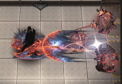
Ah.
Final Ouroboros VFX ranking: A jpeg compressed photo of a wizard airbrushed on a van / 18 Originium Prime. Actually wait no that sounds too cool. Uh. The wizard is also racefaking. Now it's no longer cool. Nailed it.
#arknights#arknights vfx breakdown#emphasis on breakdown again#I don't have as personal a vendetta against this one as I do Eine Variation#but I do think this one is genuinely bad#Shame. Ines would have crushed it with an actual skin
49 notes
·
View notes