#I didn't include my thoughts I had during making the animatic
Explore tagged Tumblr posts
Note
very random question but making the whole recent animatic you did (which was AMAZING btw) how do you feel about it in terms of progress you've made on your art skill? because like I've also very recently started getting into making animatics and it seems like a constant flow of working on the art and personally I've felt a shift in how I approach making normal pieces of art, so I was just wondering how much of that feeling would be there for you after finishing such a big project? I'm sorry if that didn't make sense lskdjfal i just kinda want you to talk and ramble about your thoughts and all during making the animatic sjskla
-🍪
no one's ever asked me about this stuff before, so buckle up because this might turn into a lengthy fucking ramble
to start, if we were to talk about progress, I'd have to talk about it more in retrospective than just my latest animatic. it's been three years since I started animating, and this particular animatic was more of a silly and short side project, I didn't put much thought into it really.
before diving into animation, I had a foundation in graphic design, four years at a tech school. this gave me a strong grasp of the basics and by that I mean visuals, colours, composition, and more. but yeah, when you transition to animation your view on art definitely shifts, at least mine did. because animation, at its core, is storytelling through visuals. so you're basically delving into film, and now you're not just thinking about static elements, you're considering movement, pacing, cinematography, even sound design. and as an animator, you're the director, the cinematographer, the storyboard artist, and the editor. each role requires specific skills. you need an understanding of visual storytelling, character design, motion graphics, timing, and so on and so on! and you're learning them along the way as you work on your projects. I'm learning all that still, and if you take a look at how my animatics looked in 2020 and now it's so much progress. HELL, both in my animation AND my drawings.
if you really think about this riptide animatic in retrospection you're basically seeing 10 years of my hard work on perfecting those skills combined into one silly video lol BUT without it, for me it's just silly thing that I did and I'm just glad people seem to like it, I'm not dwelling on progress here
now, when it comes to how I feel after finishing a project? in general? it's a mix. there's a sense of achievement, sure. like here I have to mention my short film again. I spent a whole year on it, mostly working on my own but with some guidance from my thesis supervisor. the film is 7 minutes long, and I worked on animating it from march to august. and when I compare the start to the finish, I can SO clearly see the improvement, both in terms of skill and artistic vision. BUT I also tend to look back and think about what I could've done better or differently. and while I see areas for improvement, this self-critique pushes me to get better with each project. eeeh it's a bit of a love-hate relationship with my work really. that's how it always been for me lol
#ask#a lenghty fucking ramble#i hope i anwsered your question?????#i lost myself in the ramble sorry lmao#I didn't include my thoughts I had during making the animatic#because it was basically no thoughts head empty for an entire month#there's a point where things come to you naturally and you don't think about it really#i just drew the sillies
26 notes
·
View notes
Text
There were two panels related to Spy x Family at Anime Expo this year, with the first on Day 1 being Toho Animation's panel featuring both Spy x Family and Kaiju No.8.
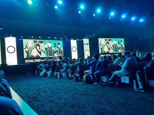
The panel started with the SxF portion, with the special guests being the series director, Kazuhiro Furuhashi, and the CODE: White director, Takashi Katagiri. They also had the six SxF ThreeZero figures on the stage with them 😀
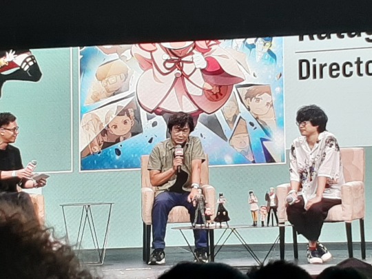
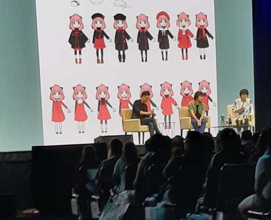
The MC asked them some questions, like what their favorite scenes were from their respective works and who their favorite character is. They also showed behind-the-scenes footage of both the Loid/Fiona tennis match in season 1, and Yor's fight scene against Type F in the movie. We got to see both of these scenes in rough animatic sketch form and then in line art form, which was pretty cool (it wasn't clear if photo/video was prohibited at this panel, but I didn't want to risk it by being caught blatantly recording these exclusive clips, lol). Then they showed off some of Anya's unused outfits from the movie.
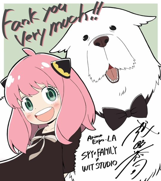
At the end, they showed this original illustration by Kyoji Asano, made specifically for this event 😁
And that was it for the SxF part of the panel before they moved on to Kaiju No.8...and to be honest, it kinda overshadowed the SxF part, mostly because it featured two of the main Kaiju No.8 voice actors, one of which was extremely hilarious and charismatic. Plus there were a lot more segments compared to the SxF part. The interview with the guests seemed longer, they did three live voice overs, showed a pre-recorded special message from the band that performs the Kaiju No.8 opening, and then they took a group photo with the audience (and maybe something else that I'm forgetting). It seemed like the SxF part took up about 35% of the panel's time while Kaiju No.8 took up 65%. Not sure why it felt so unbalanced, but it was still fun.
Next was the panel on Day 3 for Production IG and their related studios WIT and Signal MD. Heads of each studio were there, including George Wada from WIT. Photo/video wasn't allowed once the panel started, but it basically consisted of an interview with the different guests, then trailers/teasers for their upcoming projects, then a Q&A session.
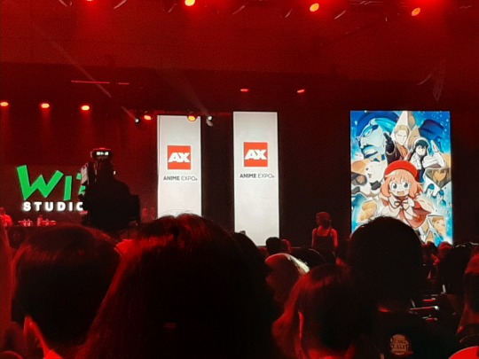
WIT is the studio that makes SxF, so I was hoping for any news about season 3, specifically if WIT would be more involved with it than they were with season 2. For those who don't know, season 1 of SxF was made by both WIT Studio and Cloverworks. But when they decided to make both season 2 and the movie in 2023, they split up the work, with WIT focusing on the movie while Cloverworks did pretty much all the work on season 2 (which is why the animation in season 1 and season 2 looks a bit different). According to this tweet, the official staff listing for season 3 is the same as season 2, meaning WIT will once again have little involvement. But despite this, they had a slide during the presentation with the season 3 promo image (preceded by the CODE: White teaser trailer, which made the crowd go wild - glad there were lots of SxF fans in the audience!) George Wada also said in regards to season 3 that they're "working hard on it."
I wanted to confirm during the Q&A if WIT would again take a backseat during season 3's production as well, but unfortunately the panel only had a few minutes left when it was close to my turn, and then they opted to pick a few random people in line for their last questions (which I thought was kind of unfair). Guess we'll just have to wait and see if anything changes with that staff listing once we get closer to season 3's release.
Overall, while Takuya Eguchi's appearance at last year's AX was more fun, it was still cool to attend this year's SxF-related panels as well. Hopefully season 3 will either be airing or close to being released at next year's AX, so we'll have even more SxF events!
#spy x family#sxf#spy family#spyxfamily#sxf anime#anime expo 2024#ax2024#anime expo#sxf movie#sxf code white#spy x family code white
55 notes
·
View notes
Text
Hedge Fund Freakout - Final Project

Hedge Fund Freakout is a 2D platformer game available on itch.io. Play as a disgruntled office worker who has had enough! Bust the security cameras that watch you bounce around in the building in your frantic escape. Make your way to freedom or risk wasting away in the monotone and monochrome office space.
Link: https://lyranomora.itch.io/hedgefundfreakout-test01
Programmer/Designer: Lyra
Artist/Producer: Alexis Moorhead
For our final project, my game developer partner and I chose to continue working on Hedge Fund Freakout. As of now, we have added a comic to help players understand the story and hint as to the game's objective, elongated our first level, and fixed a bug that allowed players to complete the level without breaking the camera.
Our focus now is to add more levels to our game, which have been sketched out, implement the sounds we have for our game, and, based on our most recent playtest feedback, add in a list of controls to introduce players to the mechanics used in the game.
Between me and my partner, we aim to implement at least two more levels, as we didn't want to overestimate our abilities within the timeframe we have. However, I believe we may have time for an additional level. As far as sound goes, I believe we are only missing information to give proper credits and implementation.
After my recent post about HFF's progress, I suggested the thought of adding in a short comic to have the player easily grasp the story, inspired by my experience playing "Cake Mania" and "Diner Dash" which implemented that dynamic, in lieu of a mini-animatic we initially had concepted. There was also an included scene of the character punching a security camera, which I thought might point people toward the goal.
During our most recent playtest, we tested out the comic and elongated level. The comic was semi-successful, as players fully grasped the story, but some players didn't quite grasp the goal. Some players misunderstood that the new "deactivated" camera was meant to be attacked, whereas other players still didn't understand that they were meant to attack the cameras.
To rectify this, my partner and I agreed on adding one more scene after the comic to show players the game mechanics. The idea would be to tell players how to use the mechanics with a little repeating animation of the mechanics in use below each explanation.
Last Post || Next Post
3 notes
·
View notes
Note
18, 34 and 48 for the qsmp ask game :D
18. Favorite side character/non island residents (This does not include eggs)
Oooo I have to go with Elena on this one. I love a good morally gray scientist, and the recent revelations about her backstory are very Repo: The Genetic Opera.
(Were it not for my lack of drawing abilities and complicated compelling art, artist probably a creep feelings about Repo I would love to make a short animatic of her with part of one of Nathan's songs from that opera)
But if we're allowed to include the Purgatory 2 cast members under a very stretched definition of "non-island residents", my answer changes: Condifiction. 100%. Would be incredible if he could be added to the main cast one day.
34. Free space to talk about anything QSMP related :D
can i talk about qQuackity's tormentous nightmare i want to talk about qQuackity's tormentous nightmare
(by which i mean that time he had a near death experience, toured a Hell of his own making, and then was the first guy on the server to get resurrected during the story [always a landmark in this kinds of stories])
like my thoughts are a bit scattered but. oh my god. it is so rare that we get a direct window into a character's head, and when we do i pounce on his like a starving tiger presented with a meat pumpkin
His hell nightmare version of Tilín telling him he doesn't deserve heaven
The way that he fails every test (doesn't earn Tilín's forgiveness, neglects Richas like he feared he was doing in life, can't make himself let go of the idealized and imagined life he could have as Tallulah's stepfather and probably as Tallulah's father's husband [choosing artifice over the inevitable way he'll ruin something real])
and it's unclear how much of that is him genuinely failing, Oscurucho setting him up to fail to torment him, or his dying mind just deciding failing is what he does, proving to him that he really does deserve Hell
And yeah, I'm reading into it all, sue me. I'm enriched.
SPEAKING OF READING INTO IT, something about qRoier's absence in these streams has possessed me. Because I spent all of the streams just like. Roier today? Vision of Roier in qQuackity's Hell today please? Please he could absolutely kill the role of a guy's dying brain demons. But no. No dice. No Roier :[
Which I then immediately started reading into ASJSJSJ because when only one character in a pattern is missing, that starts seeming notable. And every single one of qQuackity's list of loved ones appears in his tormentous nightmare. except Roier
That's weird, right? He's the only person qQ can't see being in Hell. /probably not the intention but feasible interpretation
Which kind of makes sense? Roier's succeeded at so many points that qQ's failed. Finding love. Walking down the isle. Being a good parent to his own son. Being a better parent to Quackity's kid than Quackity. And then, when Bobby started losing lives, it was never neglect, it was a code attack and an adventure gone wrong. And then, when Bobby was dead for good, Roier didn't go around trying to steal other people's children and threatening murder and any of the various bullshit Quackity did when Tilín died. That fucker grieved better than him.
(obviously this is all just qquackity's knowledge of roier- god knows roier's really had his more morally dubious and heartbreaking moments)
But anyway. The one time Roier appears in Quackity's vision of Hell, he's just text messages in the QSMP server chat. He's not only not shown in Hell, he's not in Hell. He's alive, he's on the island.
And Quackity tries to send messages to him, ask him for help, and they don't go through. He can't do a thing for him, and it's not even his fault. He just doesn't know what's happening in Hell. He's a whole fucking plane of existence above Quackity, thriving and living and unreachable.
dammit i switched into writer mode. anyway, this is my overanalysis of whatever qQuackity's deal is with qRoier
TLDR: I love katabases so so much I think every character should have to take a quick tour of their personal Hell sometime
48. Has the QSMP inspired you to learn new languages? If so, which ones and what have you done to do that so far?
It's definitely inspired me to want to learn new languages- I want to learn Portuguese and French and Spanish and Korean and and and- but I haven't been able to make much progress aside from a frequently broken duolingo streak in Portuguese and then taking Spanish classes. AP classes are kicking my ass right now, but I hope to do more language practice during the summer.
4 notes
·
View notes
Note
Ask game: 24 22 and 19
19. What are come of your favorite pieces of c!Dream animations/songs/other types of video/audio content?
The Old Days animatic by Knp lives rent free in my brain. Watching that animatic changed the trajectory of my life I'm so serious it's so aklsjdhsgajksdshass the way it so perfectly represents c!dream's longing to return to a simpler past? when he could laugh and have fun with c!george and c!sapnap???? the way you can see when c!dream stops smiling in the animatic?? aughhhh c!dream team my c!dream team you are a wound that never stops aching.
22. If you had all the time, resources, and skills to create your ideal piece of c!Dream fan content, what would it be?
I've talked about it before, but genuinely You and I Drink the Poison From the Same Vine (my theoretical c!dreambur semi-canon compliant fic that I talked abt in the post linked). I think about it all the time. I would love to just... have the commitment needed to write this long fic that examines canon through the lens of one non-canon element being added.
Also, it'd be really really fun to write interactions between c!punz and c!wilbur (where c!punz doesn't understand why c!dream keeps c!wilbur around and does what he wants and c!wilbur holds his connection to c!dream over c!punz's head like a taunt).
Uh, other than that, I have a slide show about c!dream that I never finished. I started making it with the goal of presenting it to my non-c!dream sympathetic irls haha
24. When/how did you become a c!Dream apologist?
Okay, this is going to get long and I may get into way more detail than I need to, so buckle in because this was quite the journey for me.
So, I didn't get into the fandom until around august-september of 2021. However, I had multiple irls who were really into the dsmp in late 2020-early 2021. And, uh, they're very very non-sympathetic to c!dream. (also believers in the l'manburg mythos, but we are not getting into that...) anyway, I heard a lot about the dsmp from an outside perspective during my time of not being in the fandom. And this included hearing about the exile arc (with one hilarious instance where my friends did not specify it was rp so for a moment I thought cc!dream was just a really really bad dude 💀) and hearing about how horrible c!dream was how evil he was etc etc.
In typical "I am not invested in this fandom at all but my dear friend is" fashion, I just agreed with them. All of my info came from hearing them talk abt something they were interested in, so why would I disagree?
Anyway, flash forward, like, half a year, and I begin watching the manhunts. I got really into them and ended up reading some non-dsmp fics. And then everything spiralled and I got sucked into the fandom. I remember reading some c!dream redemption fics, and I was really enjoying it, but I still didn't consider myself an apologist. Afterall, my entire first impression of him was how horrible he was through my friends.
Anyway, I don't have an exact timeline, but it wasn't until I actually followed someone from dreblr that I started fully embracing my c!dreamisms and my c!dream apologism. I kept my c!dream apologisms hush hush in front of my friends for so long. I still do to an extent. I'm scared, okay? And I don't wanna get into arguments with them, so it's best to just, like, not bring it up I guess.
#c!dreamie has always been my favorite character though#it definitely started with some cc bias bc I got into the fandom via manhunts#but it has evolved from that#stella answers#sioster#dreblr#ask game
4 notes
·
View notes
Text
Mid Semester Break
During the break I began by finishing up the first version of my type specimen booklet, since I hadn't done so by the Thursday it was required for. It ended up going much slower than I intended it to, since I think I was agonising too much over layouts and details I wanted to add to every spread, even when they may have been unnecessary or not the best in terms of the thought and execution behind them. This needless indecision ultimately ended up forcing the video I also had to make by the 20th April out to a much later date.
For the actual booklet finishing however, I felt that through the process of making it, it needed more to it to help it become more sophisticated, since it was always going to turn out quite simplistically because of its layout. I felt it needed a bit more than just the text and rectangular forms that were going to be taking the centre stage of the booklet. I contemplated adding textural images within the red area only within my booklet, but I felt that I didnt really have any images that had strong relation to parts of my booklet other than the Wallace crest, which I could use for my pepeha spread. Since I felt this idea wouldn't really work effectively, I then though of the possibility of making use of an idea I had put to the side right near the beginning of making the booklet.
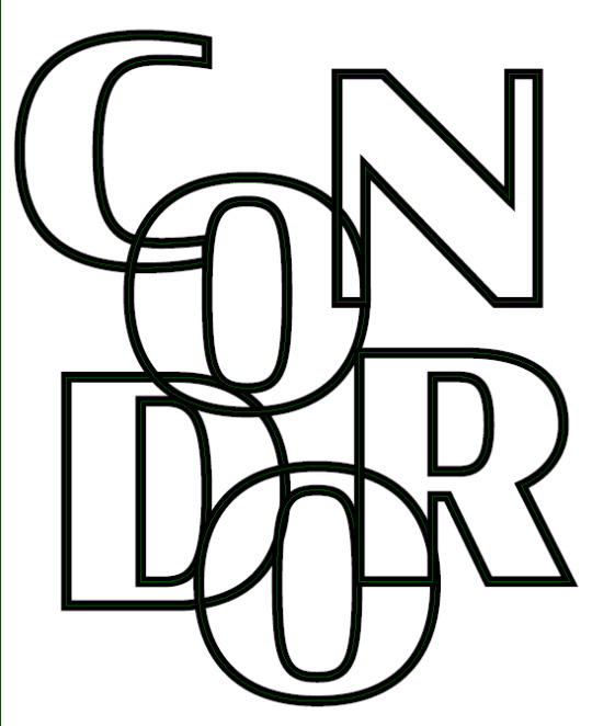
This idea of text as conjoined outlines was something I initially was going to use for the focus of a whole spread, but it never really found a place in my booklet until I thought on how to reuse it now. Instead of placing images in the red areas of my booklet, I thought it could look quite interesting to place text in this way in that area instead.


Compared to the image idea it to me has more relevance to the rest of my booket, as it shows another unique usage of my text while also relating to the subject of the spread that its used in, kind of like a subtle title.

I think in this first trial the way it resembles text but looks more like linework when the rest of the elements are present in the spread is quite an effective addition to my booklet. In this first trial, the text I used has good relevance to the rest of its specific spread, as it uses the letters in the word PEPEHA to create the lines that overlap one another, leave the boundaries of the spread and sometimes conjoin. Even though this wouldn't necessarily be noticeable in the full spread, I think its a nice detail that actually makes it purposeful beyond just adding something more to the spread. Because of how well I felt it turned out, while staying on theme the largely graphical, straight cut and imageless design, I decided to incorporate it into every spread where there was an area of red, so that this more sophisticated depth could be reached. I didn't end up wanting to include it in the white areas as I felt it would reduce the difference between the two 'halves' I was getting in my design.

I first added this new element to all the spreads I had already done, along with adding some extra elements to the introductory spreads that showcase other parts of the typeface and how it would look scaled up, while also providing some balance the the rest of those spreads. Once this was done, I then moved on to creating the rest of the spreads I wanted to get done in order to have a first completed version of the booklet.
I began by taking a part of the booklet design I had stuffed over and putting it together as an actual spread, as I had earlier included it within my introductory spreads, but only one half on each spread, which doesn't really work with the format at all: I was probably thinking about too much like it were an animatic, which it wasn't at all.

Once I worked that out and put it back together on one spread as it should’ve been, I found it’s comparable simplicity to be a bit refreshing, as its a clean showcase of some of the typefaces weights in a more practical manner, and also with scale and exploration of lowercase letters alongside the capitals. I also found it worked quite well being fully red, something currently unique amongst my other half split spreads.
Having assembled that spread I then moved on to the weights one, which turned out to be a massive problem and by far the most difficult spread to finish. I struggled for ages trying to work out a layout that would strike a balance between all the key elements that would be there: the red area, white area and type itself, both for the weights showcase and an extra piece of information I felt like I should add.

I went through at least 6 different explorative versions of this spread, probably more since I was changing so many things, large and small really quickly, often not screenshotting some of them since i was so desperate to find a breakthrough with it. That eventually came though, with the spread that would become my final.
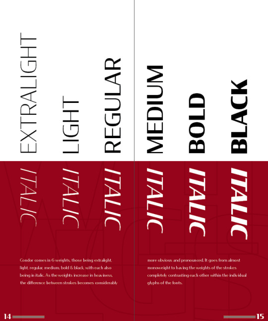
The biggest things that made this one work where my other attempts didn't were the halving of the type elements, making some enclosed in the red area and in white, while the others were within the white area and in black. I placed the regular fonts on top while adding the italic versions of them below, creating quite a successful balance and visually indicative design, that also makes good use of the fact that its going to become a page eventually.
After solving this perplexing spread I made a start on something that I felt would've been a bit more simple to understand in terms of layout, the contents page.

The idea for this final design came about quite quickly, which I knew was inspired by one or more things, but I couldn't think what they were. I wanted the typeface's name to be used in a titular aspect again, in a similar way to how most novels often do that with the cover and then often the third or fifth printed page. This contents page would also give me a chance to essentially title each of the spreads within the rest of the booklet, as some of them were unnamed. It also broke the convention I had established with the rest of my spreads, that being the clear distinction between the red and the white, which could have maybe served better as an actual cover page, although I didn't like it nearly enough compared to what I had actually done to contemplate the massive overhaul I would've needed to undertake to rework it. When I made this spread too I didn't have all the others done, so the actual information on it would have constantly changed.
Once I had this surprisingly graphically complex layout in terms of making it completed, I went on to doing an anatomy spread that broke down parts of the typeface and its design.

I think there are things that could’ve been done better with this spread, mainly the stuff I put into the red area of the booklet since it looks slightly out of place compared to everything else shapewise. I think the whole white area turned out very nicely though, with all the annotation and detail highlighting looking very good visually. While it’s not uncommon to see, the anatomy piece of text in the middle of the spread also doubles quite well as a title for these two pages.
While it took me a while to completely finish this spread, because of all its finicky details, it felt worthwhile to display some of the typeface’s qualities while finding some of them out myself upon doing the necessary close analysis of it for this spread. Once I had it completed I then went on to the last spread I felt I needed to add, being a spread with numbers on it.

I’m not entirely satisfied with how this spread turned out, as it’s a bit of a rinse and repeat design from the alphabet spread, but much worse. I think ultimately I was needing to move on from the booklet to the rest of the stuff I needed to get done, so it was probably a bit rushed and rather poorly executed in terms of the layout of all the elements. The layered element is probably the poorest placed object in this spread, as it being cut off at the edge of the page just doesn’t work at all
Having finished this spread and organised all the others to an order I felt was best, I was finished with this first version of my type booklet, and could then move on to thinking about the video I needed to produce, along with the binding of the booklet itself as a proper physical final product.
I didn’t have much time left when it came to these next steps though however, since I also had to concern myself with other bits of work, so that was why it ended up getting shelved to the side a bit, rather detrimentally. I did end up printing and then going the lazy route in terms of binding, stapling it instead of threading it and using only the standard low gsm A3 paper to put it together. The process was going somewhat alright despite my stupidity in arranging the pages together, but the worse error came about when I reached the very last step of the binding process. I managed to somehow, when using the guillotine to trim off the empty edges of the paper, lift my foot off the pedal clamping my booklet down, leading it to come loose and cut drastically wrong: the last thing I needed.


Despite this catastrophic blunder, it still managed to stand on its own, which I guess could at least count for something, although I had no more time to actually go and try to print it again, since I left the process far too late, something that was unfortunately not surprising to me. Because of how badly it turned out, I didn’t end up submitting it at the end of the first class back, since it didn’t even have all the content within the spreads properly visible due to the chunk I hacked off of it. With the mid semester break coming to an end, and with the video still to do, I had to shift my focus within class to the next part of the project, that being a type focused video.
0 notes
Text
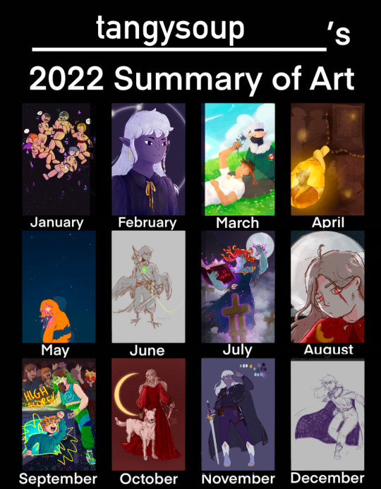
Hii lookie! Even though I only made like 4 fully rendered pieces this year, I'm happy with what I've done this year!
(For months where I dont't have fully rendered finished pieces I put in the next closest thing I have that month.)
Ramble under the cut where I try to go over each month
General overview:
Funny thing I've noticed is how often I used cool tones this year bc my older art (that ive never shown from like 2 years ago) was characterized by warm tones
Even though I work through fully rendered pieces super slowly and barely come out of the year with any, I'm super proud of my progress this year! I've learnt and grown a lot as an artist and have also realized my potential. With that though also comes my fear of not being able to top what I've done, which I'm trying to work on! My issue is I tend to produce a lot of art when feeling highly inspired by a media, and right now I don't exactly feel the same kind of spontaneous and passionate inspiration as I did during the year. I'm definitely dealing with some sort of mental block right now when it comes to digital art and I'm hoping to get through that soon because I miss the process of making something I love through drawing!!
January:
honestly thought the boatem piece was done last year so I was surprised to find it in my January files! This piece was kind of a turning point for my art as it was my first more complex pieces (i had not previously done a piece w more than 1 character in it really). It was a lot of work and I was very nervous about it but I'm quite proud of what I was able to do!
Late january is also when i started sketching out the ethubs piece actually (i work slow)!
February:
I didn't actually do a ton of art this month, as I tend to take a break and slow down right after finishing a piece. At this point I was very keen on doing pose studies traditionally. I posted some of these and most of them were desert duo.
This month i started to really figure out my dnd character Ethe's main design as our campaign was starting. So, i did a portrait of her for that. The rest of February was working on ethubs and studying how to paint grass and clouds and just sketching here and there. I think desert duo brain rot was strongest this month
March:
March was also a mix of pose studies and random sketches and FINALLY FINISHING ETHUBS. I was also doing some art for dnd ^_^
April:
I finished the dragonborn npc centered dnd piece this month, and also began sketching out the cleo piece. In between working on cleo I did some joe art including an animatic featuring the wordle boarder and the sketch for biblically accurate joe :D
May:
Pretty much anytime i had procreate open in may I was working on Cleo. This is the most ambitious art project I have taken on and I wasn't sure if I was able to make it how I wanted, so I was kind of slow and on and off with it. I ended up putting it down towards the end of the month and did some more personal illustrations
June:
Big month for my dnd blorbos tbh! I introduced a sister for Ethe and was working on her design and their interactions. I also got a bigger sketchbook this month and did a bunch of traditional studies. I finished the flats for cleo this month and took a break so most of the art I did were sketches
July:
I was in the home stretch for cleo and with the help of my friends telling me to finish it i finally pushed through and finished it. I couldnt be happier w the results!! it's one of my proudest pieces this year and I put in so much work for it. But after I finished it i took a huge break from mcyt art and focused on dnd art yet again.
August:
My work for the multidimensional big bang started this month!! I worked out the character design early august and had a sketch for the full piece by the end of the month. In the meantime I was actually working on a cat painting I never posted... maybe I'll post it in an end of year art dump
September:
This month was all about the big bang piece. I had so much fun doing it and am super proud of the finished product. Im especially happy with the composition and inclusion of the background characters!!
October:
Again. Major break from making full pieces after finishing a huge one last month. I think I spent more of my creative energy elsewhere like my writing. Also school started again and I had moved apartments and there was a lot of irl stuff preventing me from drawing. I did try to do traditional studies if I could
November:
Kind of a dead month for drawing. Super busy w school, chugging my way through Ethe's ref sheet i started months ago.
December:
Literally haven't drawn anything new besides a new years illustration for greeting cards. I picked up crocheting again and have been spending a lot of creative energy on that instead, but to keep my drawing going I've been doing more figure studies in my sketch book i guess!
10 notes
·
View notes