#AppAccess
Explore tagged Tumblr posts
Text
The Impact of Typography on Mobile App Design

In the ever-evolving landscape of mobile app design, typography plays a critical role in shaping the user experience. The right choice of fonts, sizes, and layouts can make a significant difference in how an app is perceived and utilized. In this article, we will delve into the profound impact of typography on mobile app design, exploring its importance, best practices, and the psychological effects on users.
Why Typography Matters in Mobile App Design
Typography is not just about choosing a pretty font; it’s about creating a seamless and engaging user experience. Good typography enhances readability, guides users through the app, and reinforces the brand identity. In contrast, poor typography can lead to confusion, frustration, and ultimately, app abandonment.
Readability and Legibility
The primary goal of typography in mobile app design is to ensure readability and legibility. Readability refers to how easily a block of text can be read, while legibility concerns the clarity of individual characters. Given the small screens of mobile devices, achieving these two elements is paramount.
Font Selection: Choose fonts that are easy to read at various sizes. Sans-serif fonts like Arial, Helvetica, and Roboto are popular choices for mobile apps due to their clean and straightforward appearance.
Font Size: Optimal font size is crucial. Text that is too small can strain the eyes, while text that is too large can disrupt the layout. A common practice is to use a base font size of 16 pixels for body text.
Line Spacing: Adequate line spacing (leading) improves readability by preventing lines of text from blending together. A acceptable location to start is with a line height that is 1.5 times the font size.
Hierarchical Structure
Typography aids in creating a visual hierarchy that leads readers logically and naturally through the information.
By differentiating text elements such as headings, subheadings, and body text, designers can highlight important information and improve the overall user experience.
Headings: Use distinct font sizes, weights, or styles for headings to make them stand out. This helps users quickly identify key sections of the app.
Contrast: For better readability, make sure the text and background have enough contrast. Dark text on a light background is typically more readable than light text on a dark background.
Consistency: Maintain consistency in font choices, sizes, and styles throughout the app. This results in a unified and clean look.
Psychological Impact of Typography
Typography also has a psychological impact on users, influencing their perception and emotional response to the app. Different fonts and styles can evoke various feelings and associations, making it crucial for designers to choose wisely.
Serif vs. Sans-Serif: Serif fonts, with their decorative strokes, can convey a sense of tradition and reliability. Sans-serif fonts, however, are thought to be modern and clean. Depending on the app's purpose, one might be more appropriate than the other.
Font Personality: Each font carries a unique personality. For example, a playful, rounded font might be suitable for a children’s app, while a sleek, geometric font might be better for a tech-focused app.
Emotional Response: Typography can influence users' emotions and engagement levels. Well-chosen typography can make an app feel more inviting, trustworthy, and enjoyable to use.
Best Practices for Mobile App Typography
To harness the power of typography in mobile app design, follow these best practices:
1. Prioritize Clarity and Simplicity
Keep text clear and simple. Refrain from using excessively ornate typefaces as they may impede reading. Stick to a limited number of fonts and styles to maintain a clean and professional look.
2. Optimize for Different Screen Sizes
Ensure that your typography looks good on various screen sizes. Test your designs on different devices to make sure that text remains readable and well-organized.
3. Use Typography to Enhance Branding
Typography should align with your brand’s identity. Choose fonts and styles that reflect your brand's personality and values. Consistent use of typography helps reinforce brand recognition.
4. Implement Responsive Typography
Design your typography to be responsive. This means using relative units like ems or percentages for font sizes, allowing text to scale appropriately across different devices and screen orientations.
5. Focus on Accessibility
Accessibility is a key consideration in mobile app design. Ensure that your typography choices accommodate users with visual impairments. This includes providing sufficient contrast, using readable font sizes, and supporting screen readers.
Case Studies: Successful Use of Typography in Mobile Apps
1. Airbnb
Airbnb’s mobile app is a prime example of effective typography. The app uses a clean and modern sans-serif font, with a consistent hierarchy that guides users through listings, reviews, and booking details. The typography enhances readability and reinforces the brand's friendly and approachable image.
2. Instagram
Instagram utilizes a simple and elegant typography system. The use of bold fonts for usernames and light fonts for captions creates a clear visual hierarchy. This makes it easy for users to distinguish between different types of content and interactions.
3. Medium
Medium’s app focuses on readability, using a serif font for body text that mimics the experience of reading a printed article. The typography choices contribute to a comfortable and immersive reading experience, encouraging users to spend more time on the platform.
Conclusion
In conclusion, typography is a fundamental element of mobile app design that significantly impacts user experience. By prioritizing readability, establishing a clear visual hierarchy, and considering the psychological effects of font choices, designers can create more engaging and effective apps. Following best practices and learning from successful examples can help ensure that your mobile app's typography is both functional and aesthetically pleasing.
Website Here:- https://intorque.com/
#Typography#MobileAppDesign#UXDesign#UserExperience#FontChoice#Readability#Legibility#DesignTips#VisualHierarchy#PsychologicalImpact#AppDesign#DesignBestPractices#ResponsiveDesign#AppAccessibility#BrandIdentity#DesignInspiration#TechDesign#DigitalDesign#UIUX#GraphicDesign#DesignTrends
0 notes
Text
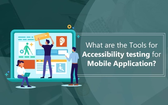
What are the Tools for Accessibility Testing for Mobile Application?
Accessibility has become essential for businesses to stay compliant and drive growth. Check out crucial accessibility tools that can help your app become accessible. More@ https://qainfotech.com/what-are-the-tools-for-accessibility-testing-for-mobile-application/ #BlogPost #MobileAppTesting #AccessibilityTesting #AppAccessibility #MobileAppAccessibility

0 notes
Text
Accessibility Testing Services
QA InfoTech follows a unique pair testing approach to deliver state-of-the-art accessibility testing services for your web app. The pair testing team is a combination of sighted & non-sighted engineers who simultaneously check for critical accessibility issues. To know more, visit https://qainfotech.com/accessibility-testing-services.html #WebAccessibilityTesting #AppAccessibility #WCAG #ADA #AccessibilityTestingServices

0 notes
Text
Accessibility Testing Services
Facilitate learning and reliable information dissemination with QA InfoTech’s effective accessibility testing services, be it for leaning or for other digital interaction. As per Gartner reports, the differently abled people holds more than 1 billion people worldwide. People are choosing digital touchpoints as their primary means of interaction, our services enable you to place high emphasis on creating inclusively experiences for audience of all abilities. Visit us at https://qainfotech.com/accessibility-testing-services.html #AccessibilityTestingServices #a11y #WebAccessibility #AppAccessibility

0 notes
Text
Why Digital Accessibility is Imperative in the Travel Domain?
Why Digital Accessibility is Imperative in the Travel Domain? The current aging population is extremely digitally savvy compared to our parents and grandparents. We will soon require solutions that are engineered for digital accessibility. Enjoy @QAInfoTech blog post at https://qainfotech.com/why-digital-accessibility-is-imperative-in-the-travel-domain/ #AccessibilityOfTravelApps, #AccessibilityTesting, #AppAccessibility, #DigitalAccessibility, #StrategicAccessibilityTesting, #WebAccessibility

0 notes
Text
Accessibility Testing Services
Our strategic #AccessibilityTestingServices ensure that your web application, mobile app or digital platforms are compliant with various #accessibility standards. For enhanced customer experience, consult our experts @QAInfoTech #WebAccessibility #AppAccessibility #StrategicAccessibilityTesting #WCAG #ADA #Section508 #a11y

0 notes
Text
Accessibility Testing Services
For mobile app and web accessibility testing consult experts @QAInfoTech Get paired testing approach following #WCAG and Section 508 Compliance. To know more visit https://qainfotech.com/accessibility-testing-services.html #a11y #AccessibilityTesting #AccessibilityTestingServices #WebAccessibility #AppAccessibility #Section508 #ADA

0 notes