#And the one thing I'll openly criticize MAWS for is how basic their character design process seems to be
Explore tagged Tumblr posts
Visit Tumblr Blog
Explore Tumblr blogs with no restrictions, modern design and the best experience.
Last Seen Tumblr Blogs


Fun Fact
Tumblr has been providing a Korean-language service since 2013.
Text
Ok... I swore to myself I wasn't gonna make another negative MAWS post, that I was just gonna leave it at the Twink Slade disappointment post.
But apparently there's this trend that's been happening on Twitter, where people are trying to bring up the 2004 "The Batman" designs to try and defend the designs of the MAWS rogue gallery. And that was the territory I CANNOT let go, as someone who is a fan of Jeff Matsuda and his character designs.
SO FIRST, LET ME CLARIFY: I'm simply making ONE post about ONE factor of MAWS that irritates me. I'm not here to just sit and constantly bash on the show. I wouldn't do that, I have a personal close friend of mine who enjoys the show and I'm happy for her and I want her to enjoy the show. I have SO many gripes and reservations but I recognize those are personal.
I'll be putting this under a Read More and tagging it as Anti-MAWS so MAWS fans don't have to read/deal with this post. Probably just don't read my tags as well.
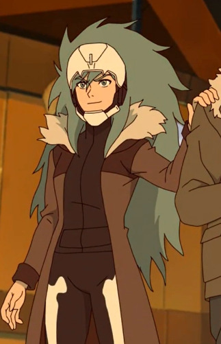
So if there's one thing that has irked me the most about MAWS, it's the redesigns and rewrites of Supes' rogue galleries. Mostly the redesigns though. MAWS took a bunch of colorful, diverse, and fantastical designs and made them monotonous, bland, and simply not fun at all. And yes, while the in-universe explanation (Being that they're all mechanically enhanced rather than freak accidents or born that way) makes sense, it still makes the villains incredibly un-appealing. EVERYONE is in boring black, white, and gray armor (aside from Parasite and while I think his physical design is neat I have issues with his character rewrite too, I'm just not here to discuss that). Everyone who had incredibly fun or creative designs was horribly washed out. Silver Banshee went from being a literal ghostly wraith to a boring motorcycle-looking chick. Livewire went from a vibrant blue lightning motif (that SHE herself created) to boring merc armor. And yes, I have issues with Slade's armor, the head was promising but the overall design has color-balancing issues.
Now let's look at the redesigns of the rogue gallery for the 2004 "The Batman" show. These are mostly drastically different from their original design counterparts, just like MAWS. But the massive difference is that most of these designs are still colorful (where it applies, obviously not to Penguin), recognizable, and push the borders of imagination; They're so ludicrous and exaggerated in their design and their physical features. Even if I was disappointed in some of the character rewrites (Like Mr. Freeze having only a small cameo to Nora in the flashback, but mainly being another selfish thug), the designs are still great. You can look at The Batman villain designs and easily recognize them because they follow the basic structure of their original designs.
Joker:
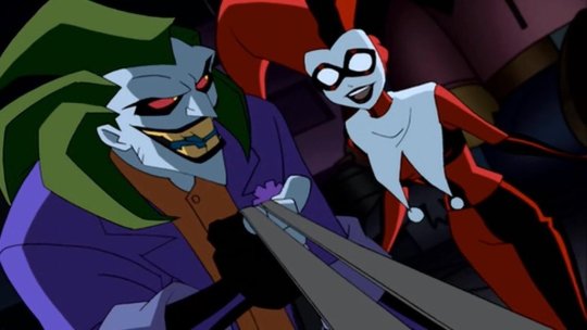
Is still in his green, purple, and orange color palette, with his trademark freakish grin. The design takes creative liberties with the spiked hair, the more athletic physique, and the actual clothing style of his outfit, but this is clearly meant to be Joker.
Mr. Freeze:
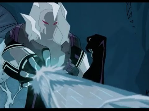
Is now essentially a cryomancer thanks to his mutation, but this is still obviously Mr. Freeze. Some kind of helmet (in this case encased in his own ice) wearing a thermal freeze suit, and his red eyes invoking the red goggles he wore in his original iteration.
Catwoman:
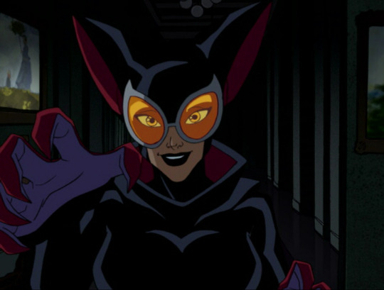
The design exaggerates a lot of features of the OG outfit, like the ears and the goggles (though the OG design really just has eye spaces), and uses shades of crimson and purple, but you look at the black bodysuit and the whip around her waist and she can clearly be identified.
The main argument I'm making with the 2004 Batman designs is that they're A) recognizable to their original counterparts by invoking the same color scheme and basic design points, B) Colorful and pushing the lunacy of a world full of supervillains, and C) Completely stand out from each other, no two villains look as though they're of similar origins (besides obvious pairs like Joker/Harley Quinn and the two Clayfaces, the latter which was a guy who took concentrated serum made from Ethan Bennett's Clayface DNA). The Batman designs are good because while they ARE drastically different from their original counterparts, they honor the original designs.
Whereas in the MAWS redesigns, none of the redesigns are reminiscent of their original counterparts (besides the obvious Brain and Monsieur Mallah, kind of hard to fuck that up), and lack the fantastical element that The Batman redesigns (And the original Superman show, where it applies) had.
Livewire:
Looks nothing like her original counterpart. The armored clothes, the lack of lightning motif, lack of color to her outfit (I'm not here to talk about the race-swapping), none of it is supposed to tip you off to being Livewire, especially when her character is written so drastically different. You should be able to tell who Livewire is BEFORE you see her powers.
When OG Livewire looks like this:

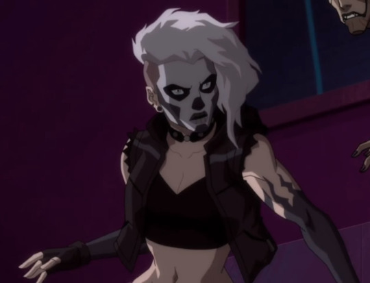
Silver Banshee:
Is just a regular human in drab clothing. There's some kind of attempt to give her the hint of a ghost motif with the bone legs, but then that disappears in her later costume design. Same later costume that tries to half-ass a skull motif on the helmet but it doesn't work with the helmet's angles.
When this is Silver Banshee's original design (going with a still from Batman Unlimited)

And if they wanted to stray from the whole "supernatural" aspect, they could have compromised like they did in Suicide Squad: Hell to Pay:
Which I mean I still don't like that redesign as much as Silver Banshee's OG design, but it's still recognizable and it's still cool.
The bottom line is basically this: You don't have to justify liking this new Superman show and its take on new characters. But to try and say the character designs on MAWS are like the 2004 "The Batman" cartoon redesigns is such an unequal and imbalanced comparison. The thought process for the character designs in these shows are so drastically different from each other, and the execution of said character designs aren't comparable.
#discourse#Anti MAWS#Anti My Adventures with Superman#Listen I'm not saying any other gripes publicly about the show; Again I have an irl friend who watches it#and I'm absolutely not about to drag her down or just rag on the show; so I get it#But if there is one thing that can really make or break something for me it's character design#And the one thing I'll openly criticize MAWS for is how basic their character design process seems to be#The showrunners FROM THEIR OWN MOUTHS said that they purposely made Lois look like Luz from Owl House#So there is NOT a lot of creative thought process going into these redesigns#And to compare that to Jeff Matsuda who is an industry veteran and who's worked on MANY shows with incredibly kick-ass designs#Well that is a stick in my craw that I can't let slide#'BUT AURA DON'T YOU LIKE THE 3D HE-MAN SHOW AND THEIR DESIGNS?!'#Yes I do but A) I'm not out here claiming that they're faithful designs to the original characters (Because Duncan and Teela clearly aren't#B) Nor are they badly designed characters that I'm trying to compare to a whole different level of character design#The Batman 2004 show was an incredibly fun show that captured the dark and melancholy nature of Batman; and the villain designs were fun#MAWS isn't on the same level as The Batman
34 notes
·
View notes